From the earthy 60s to 80s pastels, Douglas Lloyd Jenkins laments interiors being dipped in bland
Why a neutral colour palette isn’t always the answer
When I first started writing about interior design, one of the early pieces I submitted was in response to a photograph in the newspaper. It featured a then-prominent Indian New Zealander pictured in his apartment, the walls of which were painted a dramatic dark blue. New Zealand was going through a period of obsession with neutral paint and I thought this man’s sense of himself – expressed as it was through colour in his home – was something from which we might all learn. Fast forward a quarter of a century and what I hoped was a passing fad – the cult of neutral colour schemes – seems to have stuck to our homes in the same way that black has adhered to our wardrobes. New Zealanders are, it seems, a culture of people who dress in black, and live in neutral.
This situation has been in my thoughts again because I recently presented a decorating scheme to a group that I advise on interiors. My proposal was to paint a large formal dining room in bright red. The proposal had gone down well at first but then there’d been rumblings. I was summoned, with a friendly enough request, to please explain? The colour refuseniks had the painter on their side. He preferred a neutral scheme. Armed with that and the thoughts and opinions of other alarmed friends, who had not seen the original presentation, they now thought perhaps red was a mistake. Red, I was a told, was a dark colour.
As I sat in the stream of light that flooded through large windows into the room in question, I wondered when it was that red – the colour of fire engines – had become a dark colour? I soon realised that having lived at least the past 25 years of their lives in neutral interiors, and working in corporate offices, not one of them really had any personal experience of a red room to which they could connect. All they could conjure was an old-style Chinese restaurant. Needless to say this was not the look I was working towards.
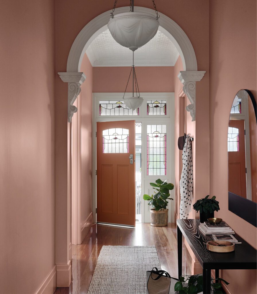
Way back in the 90s, when the neutralisation of our domestic environment first began, ask any Kiwi about colour and they’d answer, only partially genuinely, that ‘they loved colour’. It seemed that they’d ‘love’ to paint their homes in lovely bright colours but one thing stopped them – resale. Living life in a bland house because of eventual resale is an essay in itself. That aside, there was the idea that houses were primarily commodities to be sold and, in order to sell, the blander the better. Things have changed significantly, particularly in parts of the country where the capital value of houses marches ever upward. In a country where no one talks timidly about resale value, but instead brags about record sale prices, you should be able to paint your living room puce and your hallway primrose and it not affect resale price one jot.
As yet, I’ve seen no sign of a return of the earth tones of the 60s, the bright primaries of the 70s or the sophisticated pastels of the 80s. The 90s ushered in neutral and there we’ve stayed. For an approach to interior design to remain largely static for a quarter of a century is unheard of.
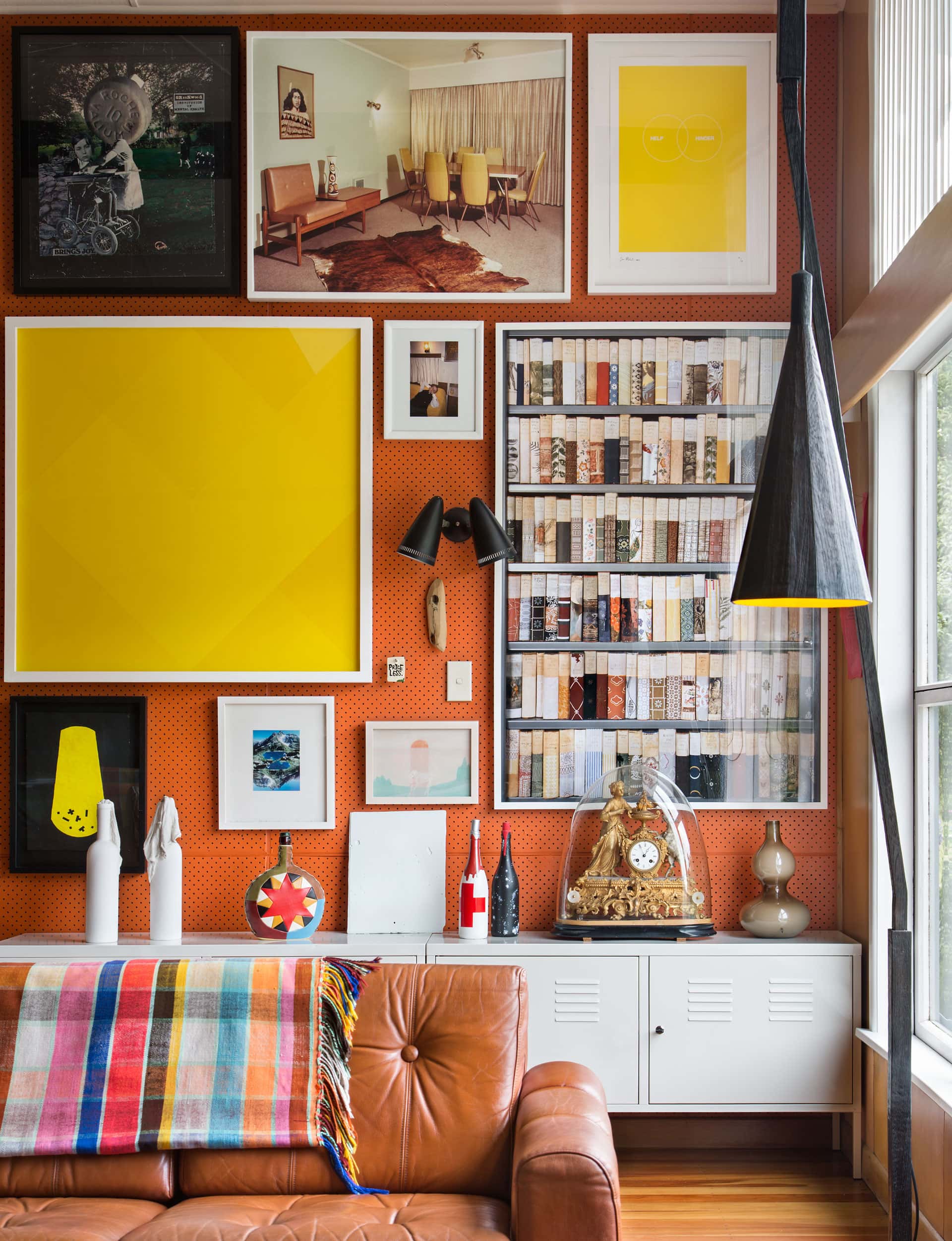
Ask the question now about colour in the home and only one part of the answer has changed. It seems ‘we’d love to paint our homes in bright colours’ but – ‘we have art’. Art, it seems, has become the reason for the artlessness of our interiors. The sophisticated use of colour and an interest in art are, in my mind, both markers of sophistication within a culture. But it seems that somewhere in the early part of this century, the road markers were switched and we reached what was thought to be a fork in the road – one sign reading ‘colour’, the other reading ‘art’.
It’s pretty easy to figure out where the source of this art-goes-on-white-walls thinking comes from – art galleries. But I think, too, we can look to artists. Often, when people say art, they mean contemporary practice. Contemporary art, although heretical to say, has so often become surprisingly timid – art that does indeed require a white wall because a simple bucket of paint can be more attention getting. As contemporary art gets more emphatically neutral, shades of white are replaced with ‘quarter’ shades of white, and the downward spiral begins. It’s a measure of good art, any good art of any period, that it can survive and even thrive surrounded by puce or primrose.
In the end, my clients – meeting alone behind closed doors – came out unanimously in support of the red scheme. I was thrilled not only because I’d won my case, but because the result will, once complimented with new curtains and rehung with original, period artworks, be a dazzling experience that few will forget. Not everyone will love it but most will recall the room being as imposing as it is comforting. It will, I hope, become a second home – a holiday from the land of neutral.
Words by: Douglas Lloyd Jenkins. Photography by: Paul McCredie.
[related_articles post1=”76097″ post2=”74642″]