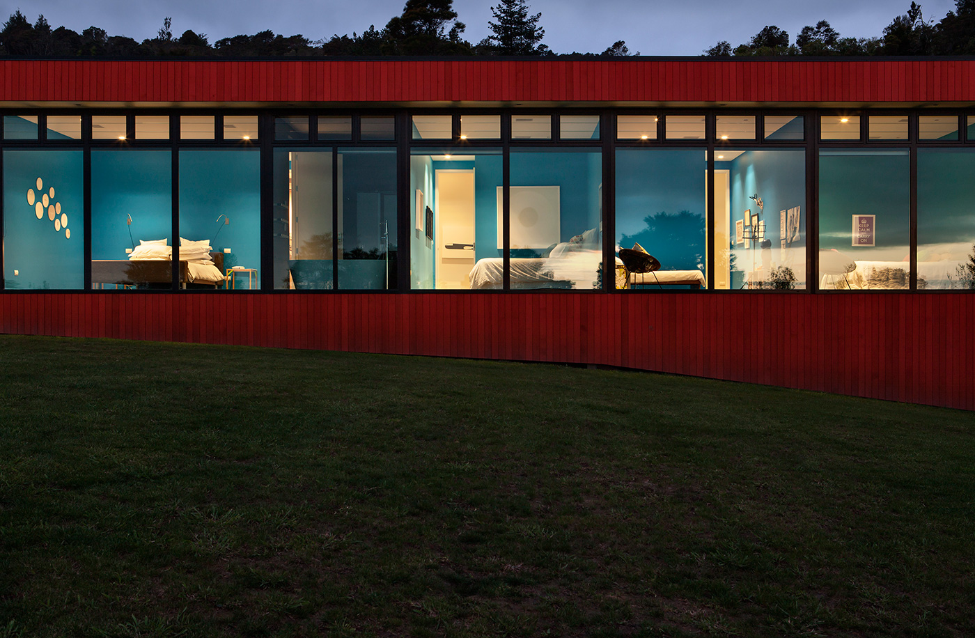
This home’s vivid orange exterior is a sparky contrast to the green setting. We discover why this family chose the colour for the “the absurdity of it”
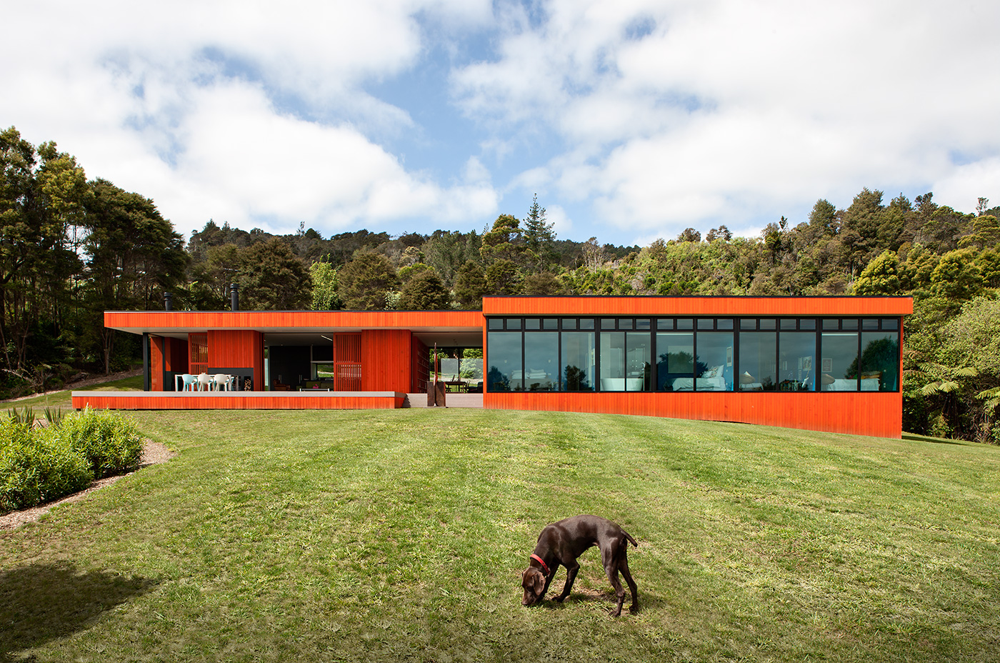
An introvert family goes for an extrovert colour on their hillside home
I’m 20 minutes late to meet Emma and George Bettle at their house in Maungakawa, northeast of Cambridge. I’ve been up and down a windy hillside road looking for the bright orange house that I assumed, from photographs, would be as conspicuous as the sunset. “There are a couple of spots from the road where you can see it,” Emma tells me when I finally find it, having caught a glimpse of a mailbox number obscured by trees, “but you need to look fast. And you need to risk your life.”
“The idea was that you can’t see the house from anywhere, except when you’re in it,” George explains. “Part of the reason why we wanted to live half way up a hill surrounded by native forest is because if we want people to come and visit us, they know where we are, but other than that, we’re quite happy to lock the world out when we come home in the evening.” So, why would a family that so values its privacy build a bright orange house? “The absurdity of it,” George tells me. “In abstraction, you assume it’s an extroverted approach, but it’s not. It’s quite the opposite. It’s purely for us. It’s selfish.”
The orange was not part of the Bettles’ brief to architect Davor Popadich, who worked with Andrew Patterson, the founder of Auckland firm Patterson Associates, on the project. The house was designed to be stained black (and remains grey in renderings on the architect’s website), but when the family and architects had a roundtable discussion about colour, one of the Bettles’ daughters suggested orange, George’s lifelong favourite.
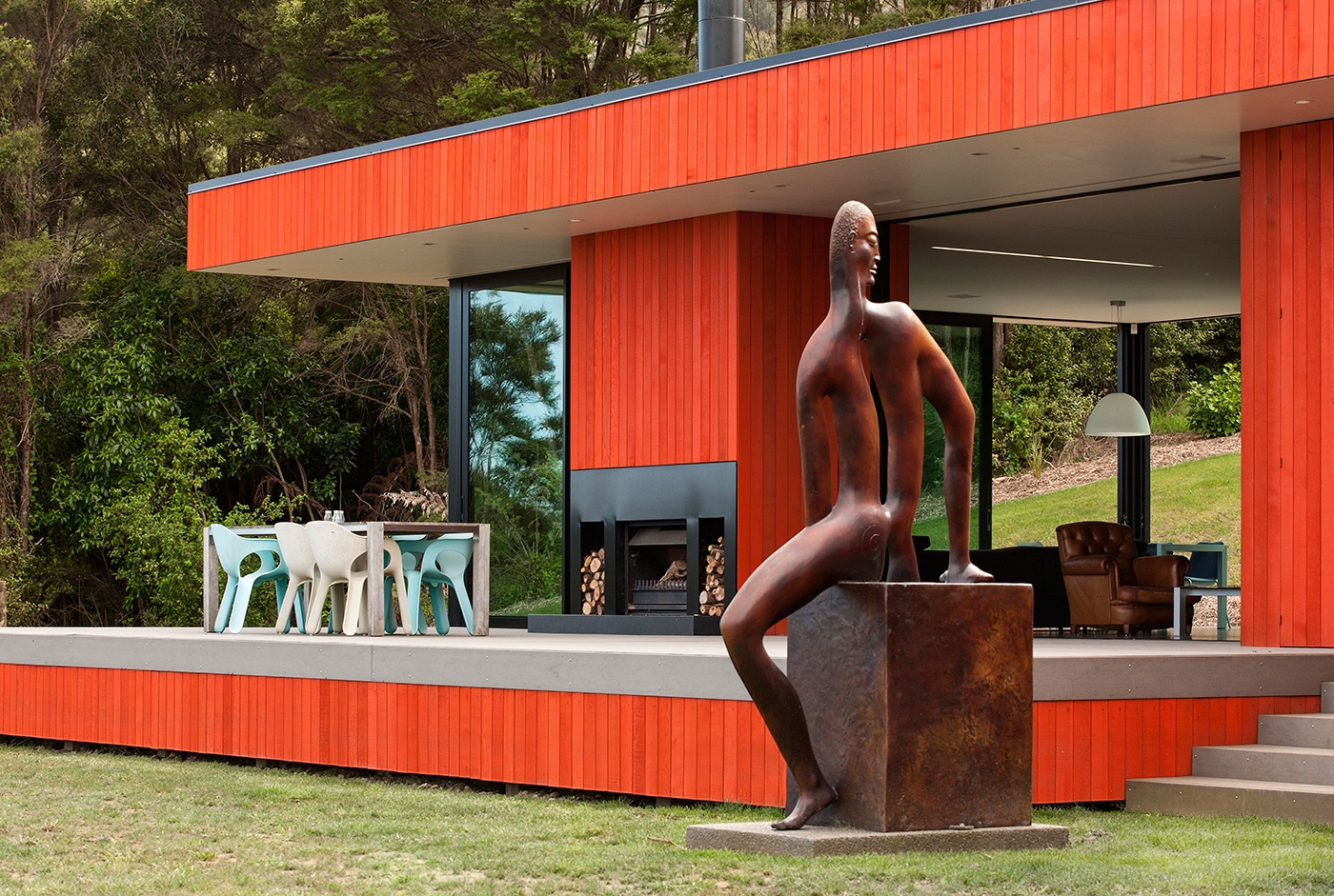
“It was about having fun,” George says of the custom-made Resene shade they named ‘Maungakawa Orange’. “You can make a house a very serious object or you can have fun with it. I guess there’s a certain amount of seriousness to the architecture, but we wanted to mitigate that by having some fun with the colour without ruining the whole thing.”
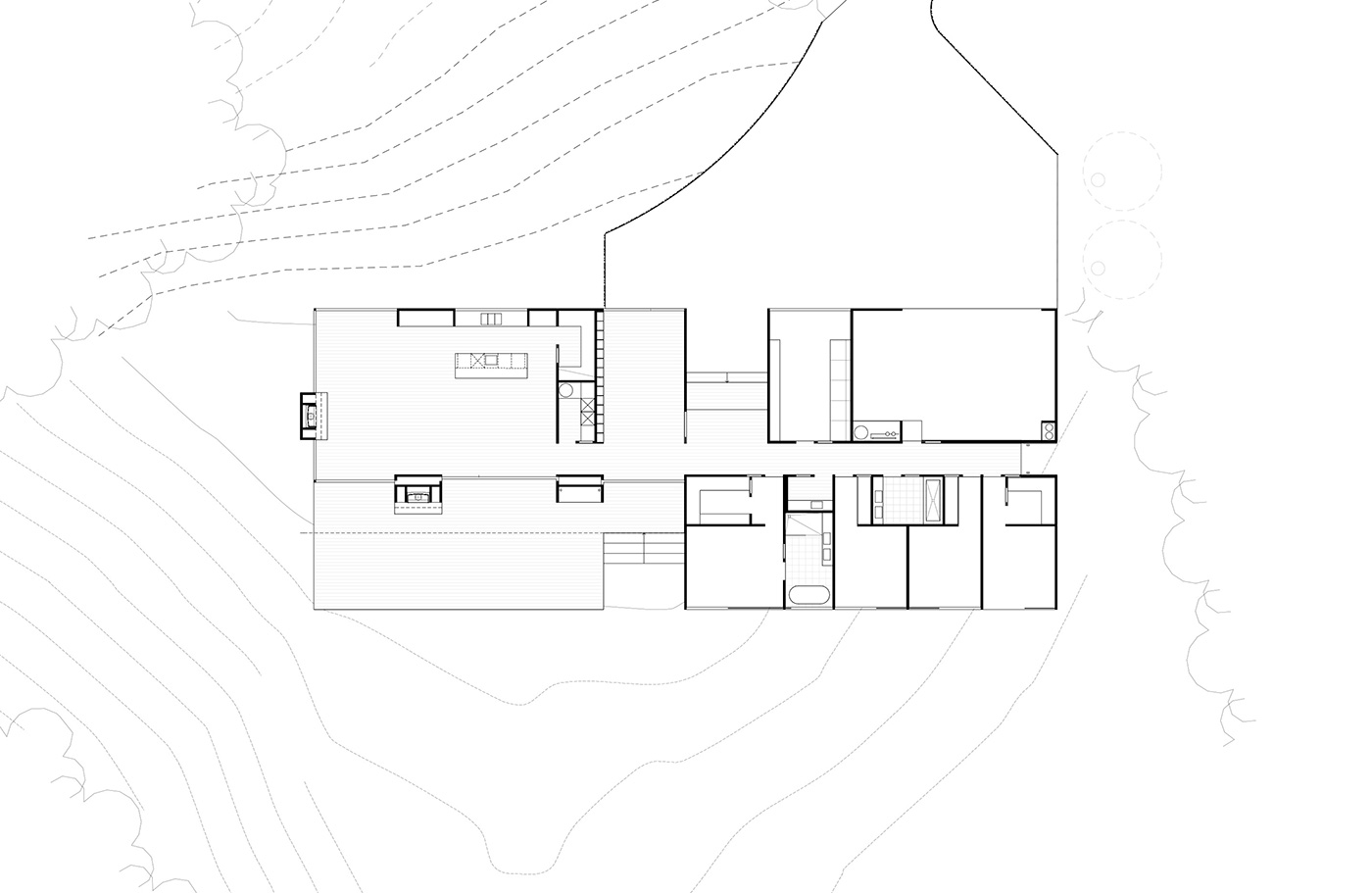
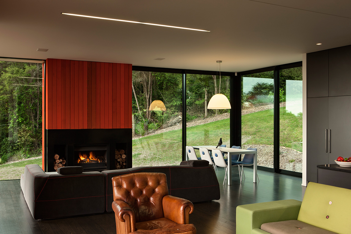
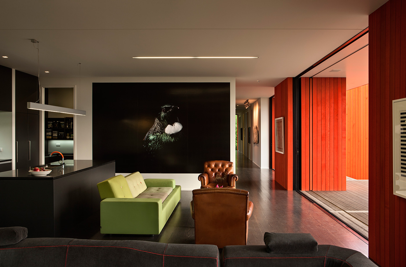
The Bettles’ love of contemporary art can be seen not just on nearly every wall of the house, but in the very architecture that shaped those walls. Emma and George’s favourite piece from their collection is a Gordon Walters print that hangs prominently in the living room. Their brief to Popadich was “to create the house that Gordon Walters would have created if he’d chosen architecture instead of art,” George explains. “We wanted absolute geometric simplicity but of New Zealand, of this place.” Popadich translates Walters’ koru abstractions in the placement and proportion of the rooms and courtyards, all extending off the central hallway. “There was a lot of talk of Gordon Walters,” Popadich recalls, “so the whole thing was radially symmetrical in plan to reflect the motif that he uses in his paintings.”
Gordon Walters isn’t the only artist to influence the architecture. Rodney Hamel, a friend of the family, had often painted the Waikato landscape from the vantage point of the Maungakawa hills, composing his paintings around a carefully considered horizon line. The Bettles wanted the home’s elevation to replicate the horizon line of the Hamel painting that hangs on their wall. It works. The house looks out west over the expanse of the countryside – elevated to optimise the view, but not so high as to look down on houses further down the hillside.
Sculptor Paul Dibble is also prominent. During the refinement of the design, George fell in love with the Dibble sculpture ‘Haeta Dawn, Porehu Dusk, After Michelangelo’s Tomb for Medici’ – two bronze figures, sitting on cubes, looking over their shoulders at one another. He decided to split the pair up, putting one in each of the recesses on either side of the house. The recesses were originally designed to have a single tree in each, but “it felt like an affectation when you’ve got eight acres of native bush to plant a bloody tree,” George says with a smile.
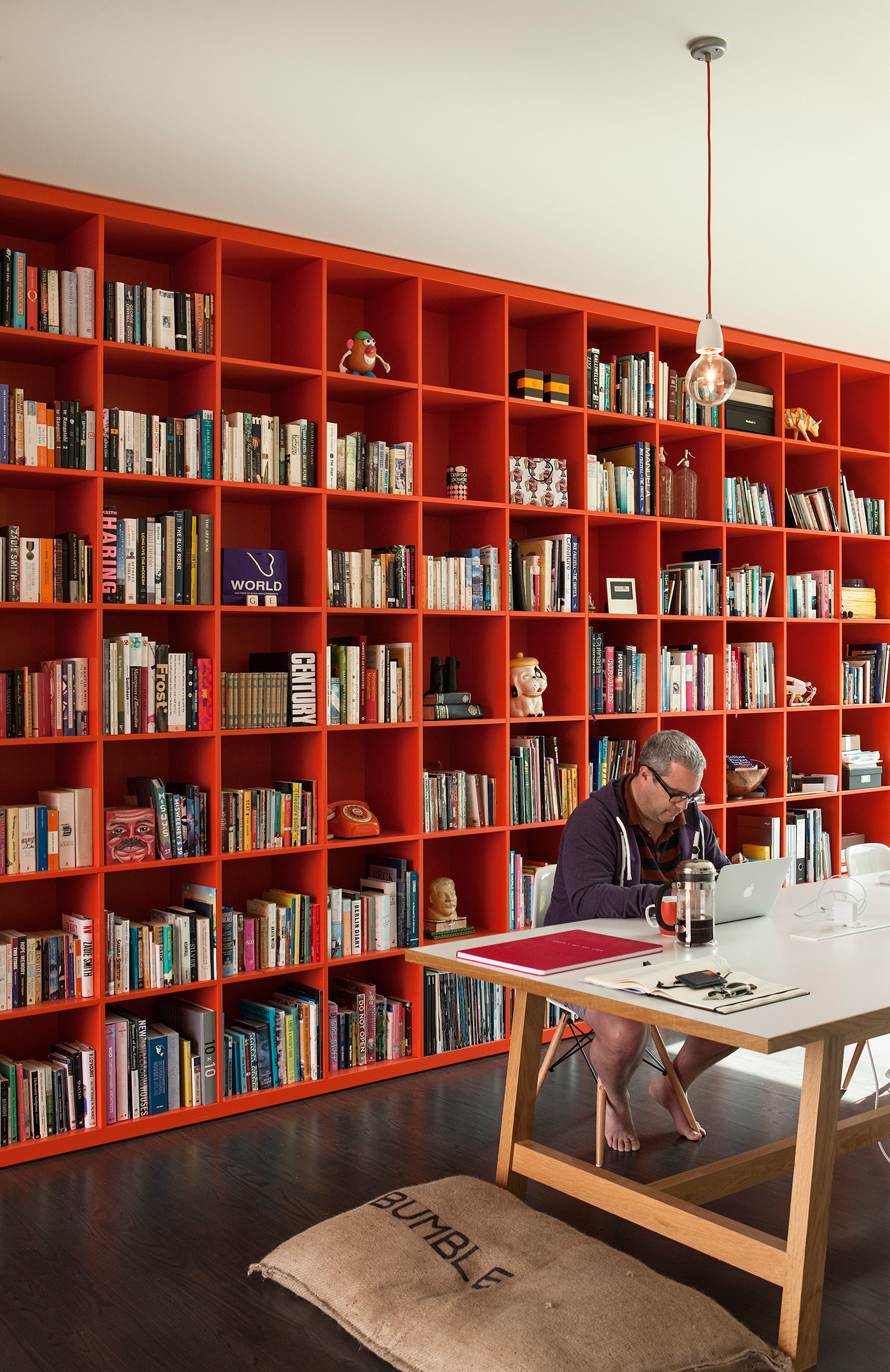
The family library, with a large wall lined with hundreds of books and a long desk with multiple computers – more start-up office than family study – is the focal point of the house. “Most houses have the kitchen at their heart and they’re about entertaining,” George says. “We’re very private, we’re not about entertaining. We thought, rather than having a heart, it’s going to have a brain. We like the library to be the central thing that everything else revolves around and the spaces are about us interacting with each other and a small group of people rather than having enormous banquet areas. That’s just not how we live.”
“They have quite a unique way of living and working together,” Popadich says. “The whole family gathers around that table and they all work together. We really wanted to give them the best possible space to do that – one that’s open and inviting and friendly with plenty of light and cross-ventilation. It’s a central element of the house and it’s the first thing you see. I’ve never done anything like it before. It’s an insertion of their specific lifestyle – the rest of the house very much follows the normal requirements of a household. It just shows how uniquely these guys live – that work and learning is a huge part of their family.
“The way they live is quite inspirational and what they’ve done with the house after we left is beautiful. It’s well beyond what we could have imagined. The house feels like it’s living.” -Henry Oliver
Q&A with Davor Popadich of Patterson Associates
HOME Gordon Walters was an important touchstone for the Bettles. What influence did you take from his work?
Davor Popadich There was a lot of talk of Gordon Walters, so the whole thing was radially symmetrical in plan to reflect the motif that he used in his paintings. If you rotate his motif of the line with the circle at the end, and there’s another line with the circle going the other way around – that’s radially symmetrical. When you look at it on a plan, the two courtyards and the living room and the bedrooms are all radially symmetrical in a similar way to the motif.
HOME Was the art collection a consideration in the design?
Davor Popadich We’ve given them some blank canvases and they’ve just attacked it. It shows how amazing it is to work with a creative client – they use the house to such a full potential. We knew we had to have some beautiful walls but we didn’t know how they’d use them, so it was quite a beautiful surprise to rock up there and see what’s been done.
HOME What were the difficulties in achieving the right shade of orange on the cladding?
Davor Popadich What was quite difficult from our end was to get the vividness in the colour without painting it. It’s cedar cladding and you really kill the wood with the paint, so we went through God knows how many samples to get that orange, that density, we had to go through quite a process.