The annual Dulux® Colour Awards reveal a palette of creative riches. We take a closer look at the inspiring winners and finalists from the 2019 awards
It’s possibly a long hangover from previous, more colourful decades. New Zealand architecture always seems to do texture and materials beautifully, but when it comes to colour, we’re a wee bit timid.
Done well, colour is adventurous and bold, but also rational and clever. It can help delineate spaces and function, create mood and texture, and help – rather than impinge – our understanding of what buildings do. So, when Dulux asked me to help judge their annual Australasian awards for colour, I said yes on the spot.
Colour trends
Themes this year? Colour blocking is going strong – we saw a number of projects with one colour applied across a whole section of a room, covering everything from the ceiling to ducting and services. Red – in shades of maroon rather than poppy primaries – is still having a moment, as is blue, in royal and navy. But it was green that really came through, especially in shades of avocado and olive – dirtier, dustier colours, often used in monochromatic ways.
Collected here are some of our favourite projects from the winners and finalists – on both sides of the ditch.
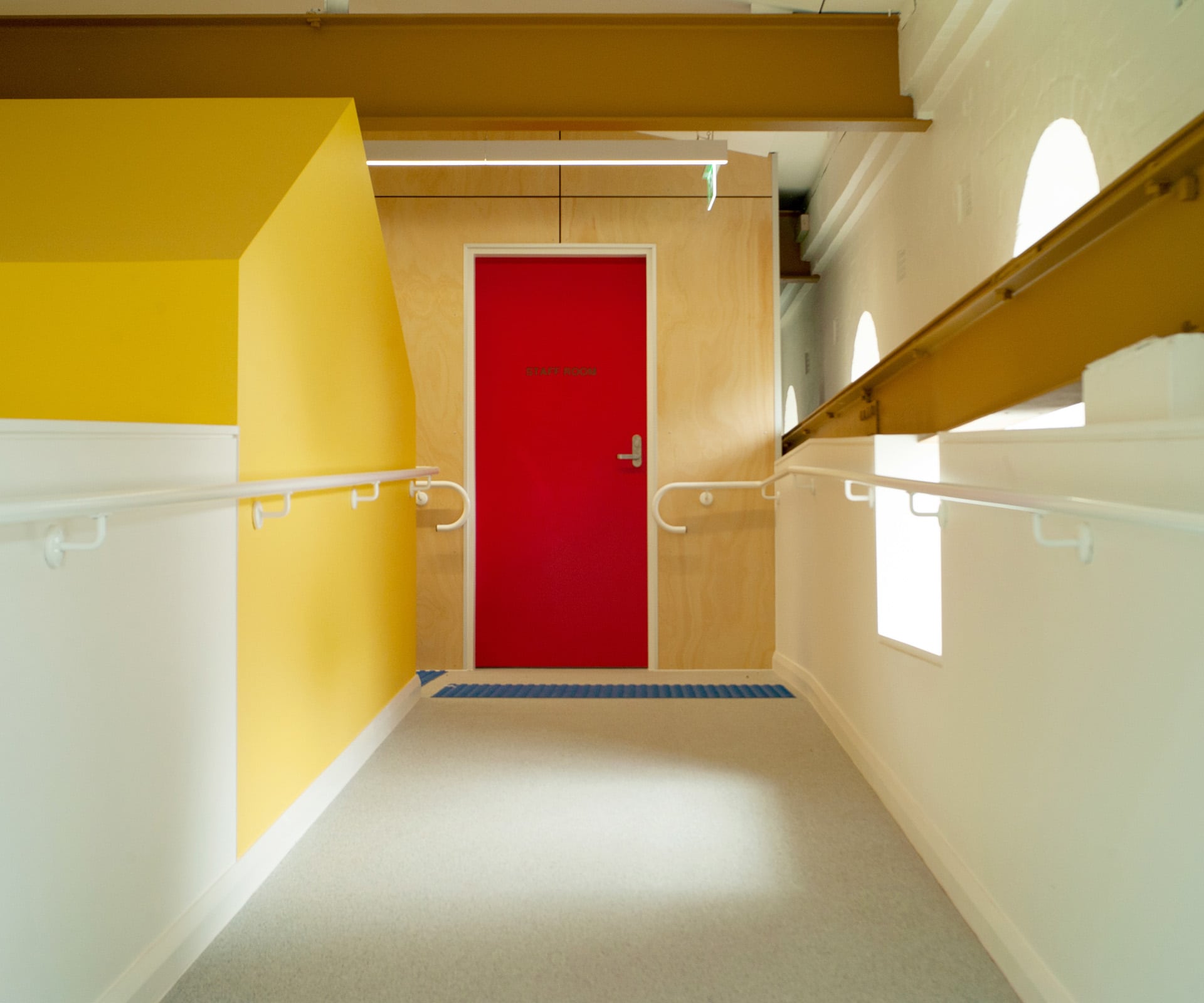
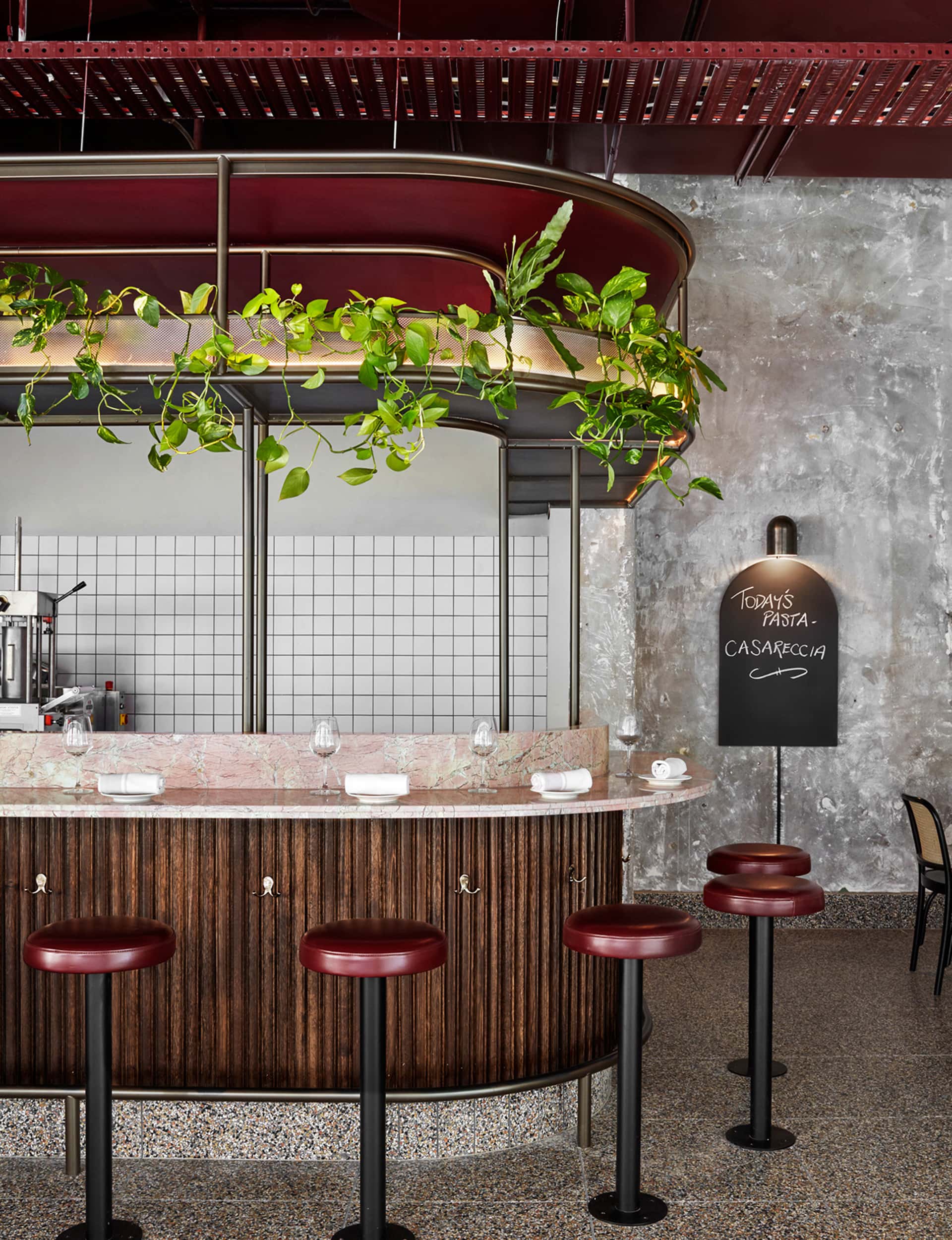
Giraffe Learning Centre
Supercontext Architecture Studio
Sydney
A thoroughly deserving winner of both the Australian Grand Prix award, and the Commercial Interior: Workplace and Retail award. The young practice’s first built project entailed the conversion of a heritage-listed power station into a day-care centre. With a tight budget and a brave client, colour is used to delineate spaces and functions in bold and innovative ways – Dulux ‘Pink Dust’ on the air-conditioning ducts and mustard on the steel beams. “This learning centre may have gone the way of many of its ilk and become either patronisingly cute or just plain bland,” noted judge Rosa Coy of Coy Yiontis Architects. “Instead, every opportunity has been taken to achieve the opposite.”
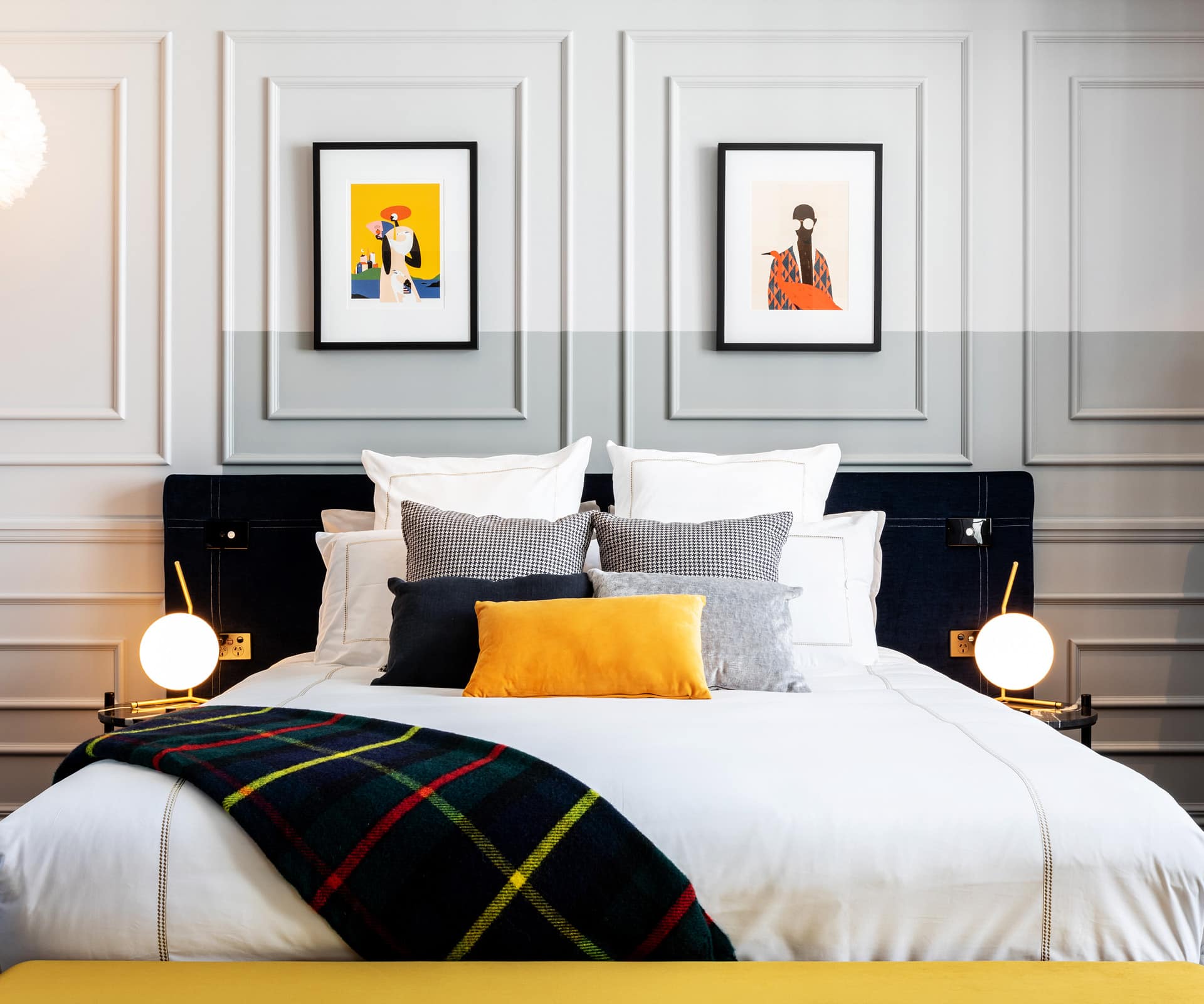
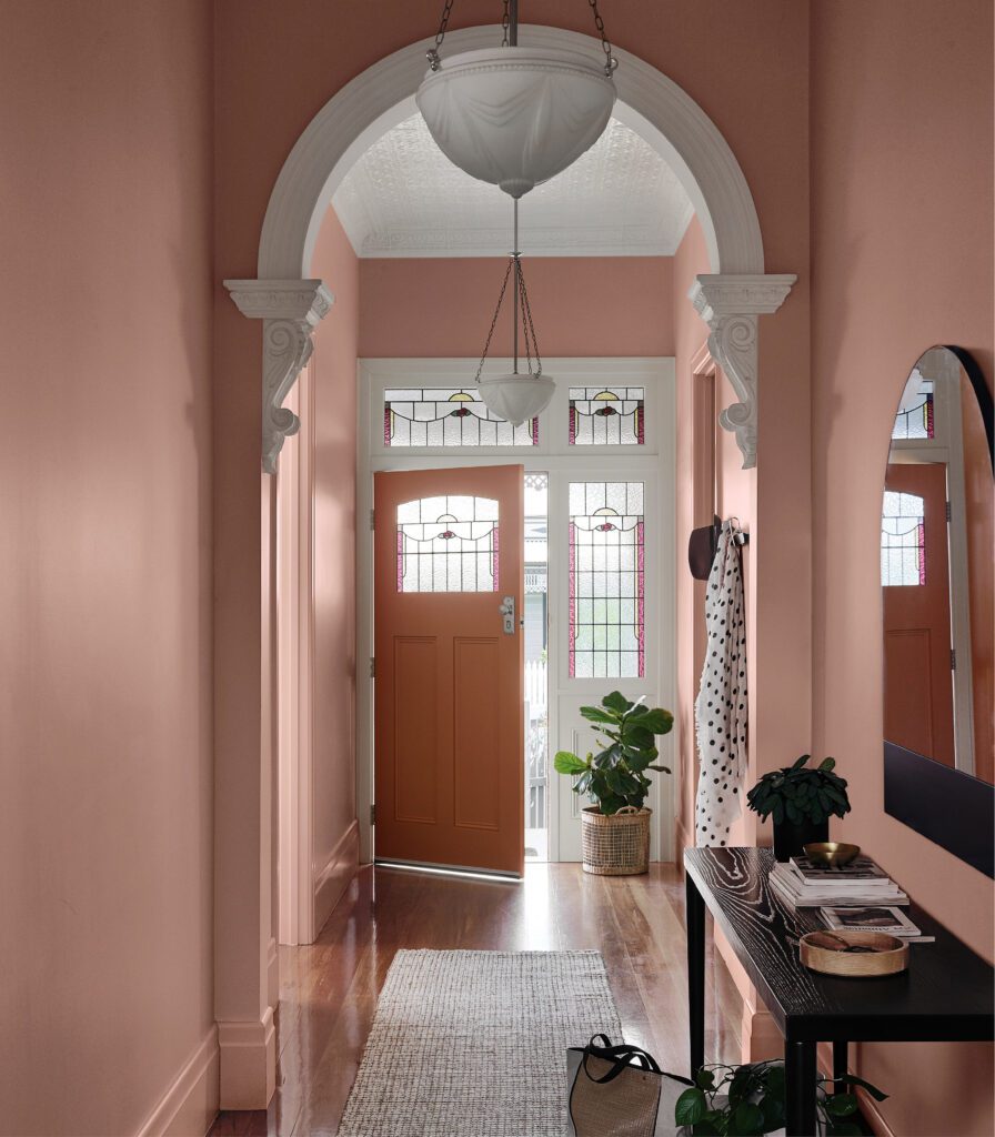
Wains Hotel
Yellow6
Dunedin
For the first time, Dulux awarded a New Zealand Grand Prix winner, which went to the Wains Hotel, a refined reworking of a Victorian building that combines modern tones with tradition. The subtle use of colour blocking in soft greys and neutrals enhanced the traditional mouldings, while Dulux ‘Tuatapere’ makes a dramatic appearance on a feature wall.
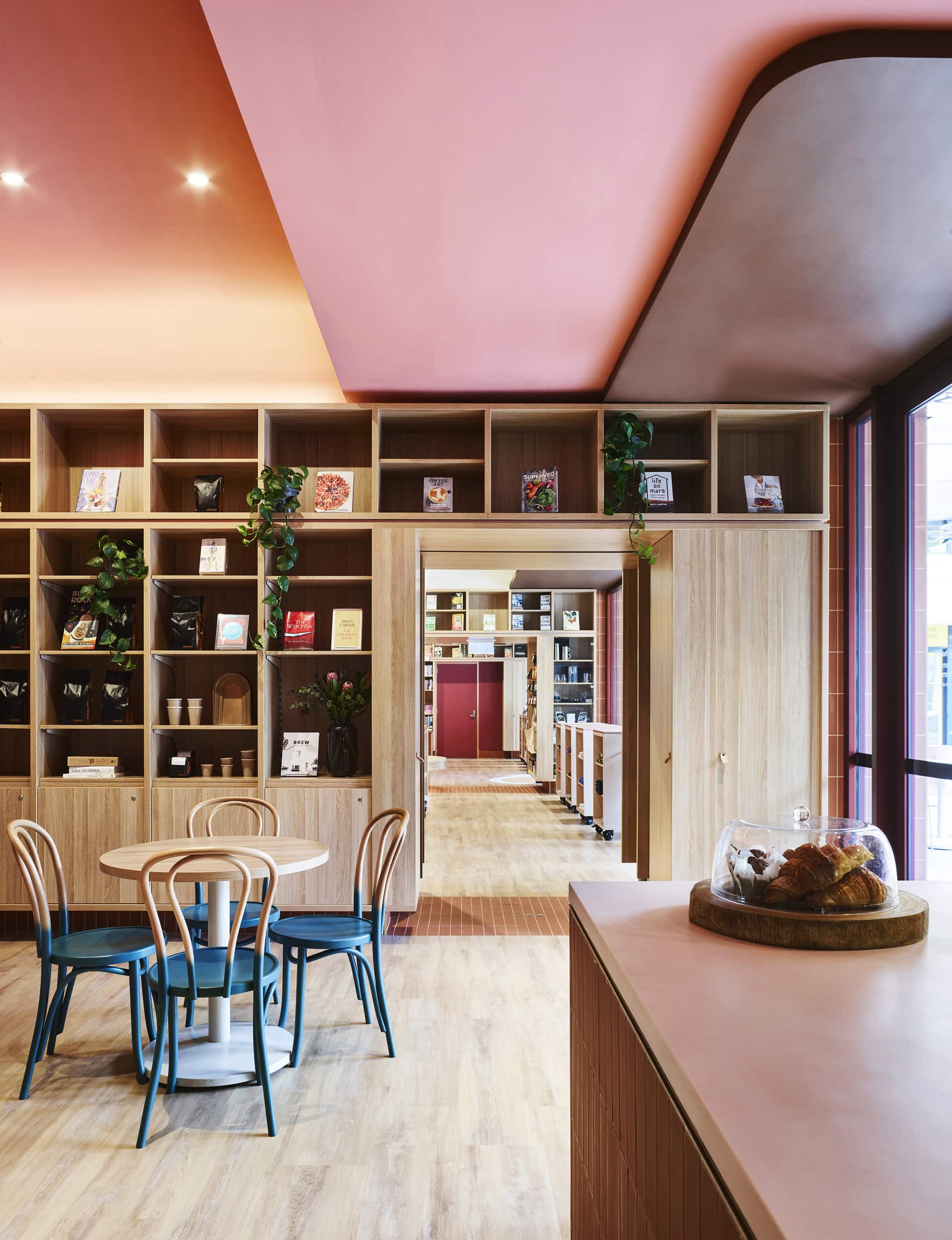
UNSW Bookshop
SJB
Sydney
‘Nuanced and detailed, the palette and saturation of colour is purposefully designed,” says Rosa Coy, “from the colour-blocked, curved ceilings to graduating shades on the chairs.” This enveloping retail space creates an intense experience without overcoming the very things it’s designed to celebrate.
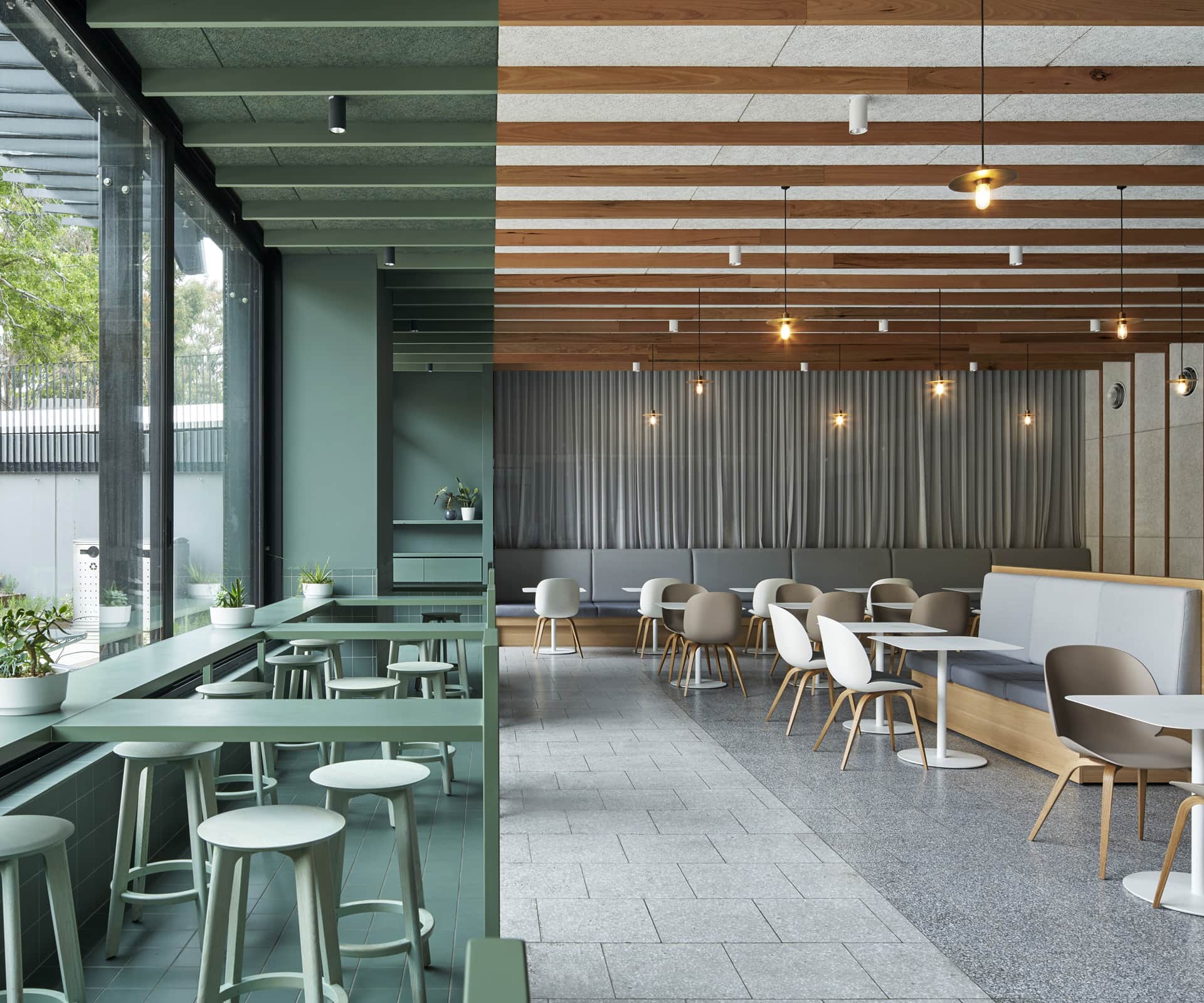
Sable Drop
JCB
Melbourne
A cafe on the campus of Monash University takes one idea and pushes it to its limits. A crisp line divides the space in two: everything on one side is on-trend green (Dulux ‘Hockham Green’), while the other is timber and white. It’s technically demanding, visually arresting and beautifully executed.
Pentolina
Biasol
Melbourne
Pentolina is a casual trattoria owned by Matt Picone, who spent years working at the famed Pelligrini. The influence is clear: it’s resolutely Italian, with distressed concrete walls and a pink marble bar; a glamorous single colour – Dulux ‘Red Marble’ – reaches across the ceiling, covering ductwork and concrete alike.
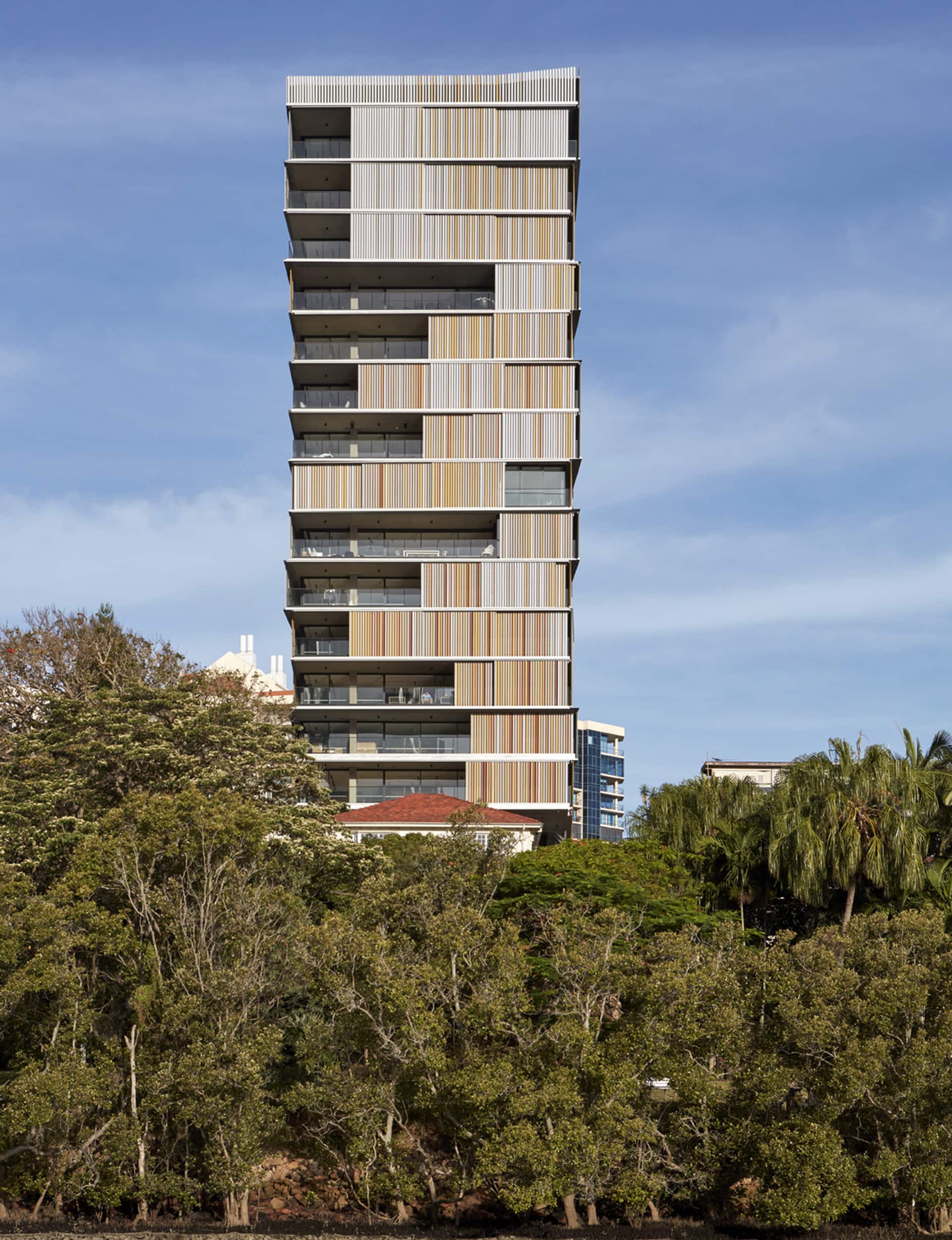
Walan
Bureau Proberts
Brisbane
In converting a multi-storey building in Brisbane into a residential tower, Bureau Proberts wrapped the whole thing in multi-coloured steel fins to provide privacy and shelter to outdoor living spaces. “In ochres and reds, derived from ancient rock faces, colour has been used to create a sculptural effect,” noted Gibson. “The detailed facade is variegated and refined, and its patterned screens are reminiscent of a traditional Queenslander.”

Captain Kelly’s Cottage
John Wardle Architects
Tasmania
In some ways, Captain Kelly’s Cottage is an exercise in colour removal rather than addition. Wardle’s meticulous restoration saw layers of paint removed to expose the history in the original cottage, with a modern extension in timber grafted to one side. Careful insertions of Dulux ‘Leaf Tea’ through the house are an inspired touch.
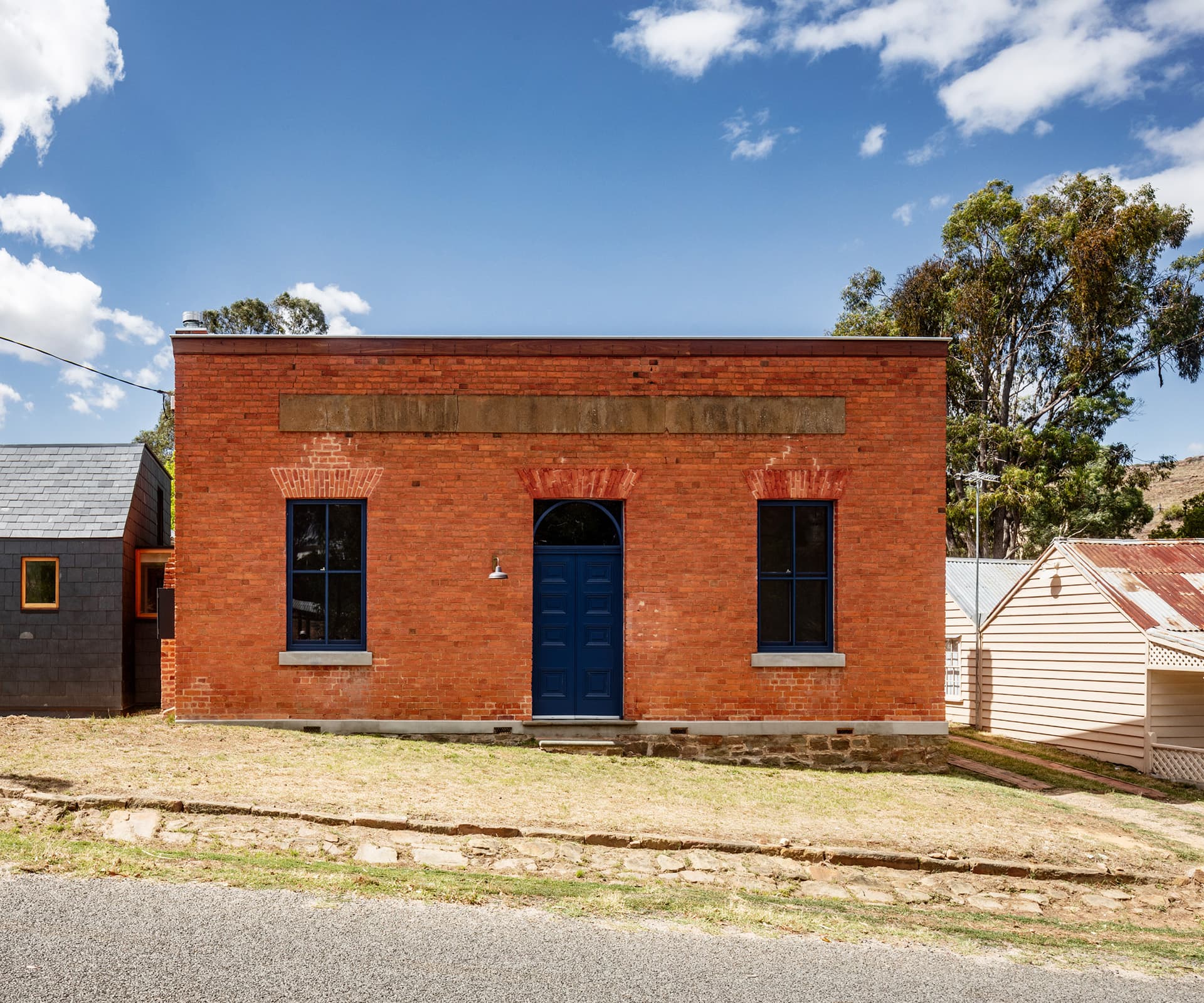
The Bank
Maria Danos Architecture
Vaughan, Victoria
This is a very clever rework of an historic bank built during the gold rush. Danos left the original building largely intact, adding a bathroom and kitchen extension that’s distinct from the original. Strategic use of colour – including Dulux ‘Blue Expanse’ on the doors and windows, and red under the verandah – pack a delightful punch.
The Pines
Glamuzina Architects with Dessein Parke
Auckland
This wholesale reworking of a classic 1960s apartment uses a delightful, shifting dado line to delineate spaces throughout the apartment. The green line shifts and moves throughout the space and across walls, skirting boards and cabinetry.
For a full list of all the winners, see dulux.co.nz/colourawards
Words by: Simon Farrell-Green. Photography by: Supercontext, Peter Clarke, Jack Lovel, Trevor MeinTrevor Mein, Christopher Frederick Jones, Jono Parker, Sam Hartnett, Anson Smart.