This year’s NYC x DESIGN Festival was a snapshot of both established directions and developing movements in American interior design, reports Sam Eichblatt in New York
Endlessly customisable and modular products, ethical production, reworking American design heritage, art-design-fashion collaborations and surprising materials (tables made of salt, anyone?): this year’s NYCxDesign festival was a snapshot of both established directions and developing movements in interior design.
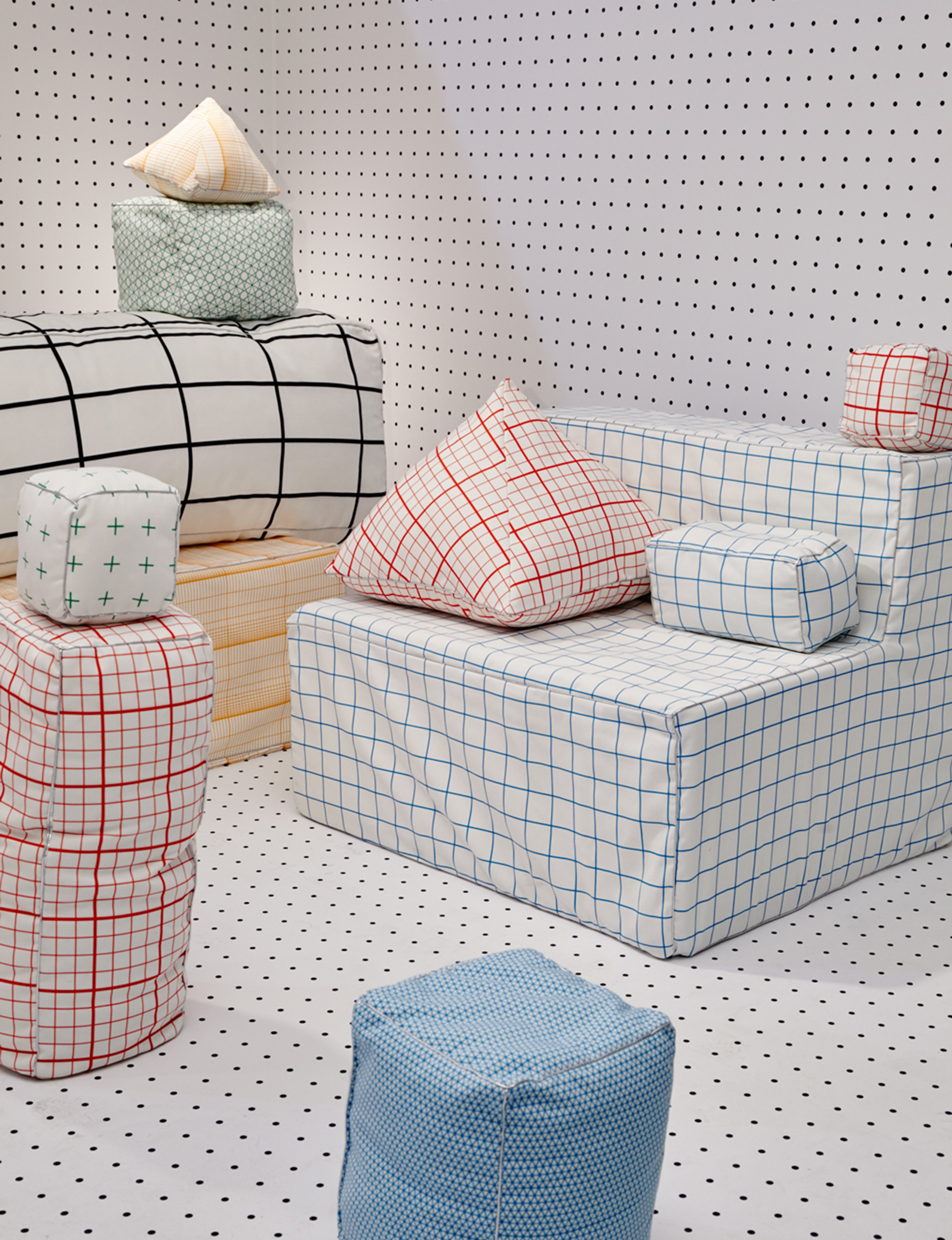
1. ‘Print All Over Me’ by Fort Standard, Eric Trine, Will Bryant and Erich Ginder (above)
Print All Over Me started as a print-your-own-pattern service that gave fashion designers the ability to upload any graphic onto plain white pieces of clothing. This year’s Sight Unseen OFFSITE event saw the process extended to “print-all-over furniture”, teaming graphic artists with furniture designers Fort Standard, Eric Trine, Will Bryant and Erich Ginder, to create this super-bright, cheerful showcase.
PAOM’s first home collection uses blank IKEA products — pillows, throws, beanbags and slipcovers — teamed with prints from four powerhouse female design studios (Caitlin Mociun, Pia Howell, Studiopepe and Alex Proba), and its site will offer the same functionality as the original, allowing users to upload patterns to housewares and print them on demand.
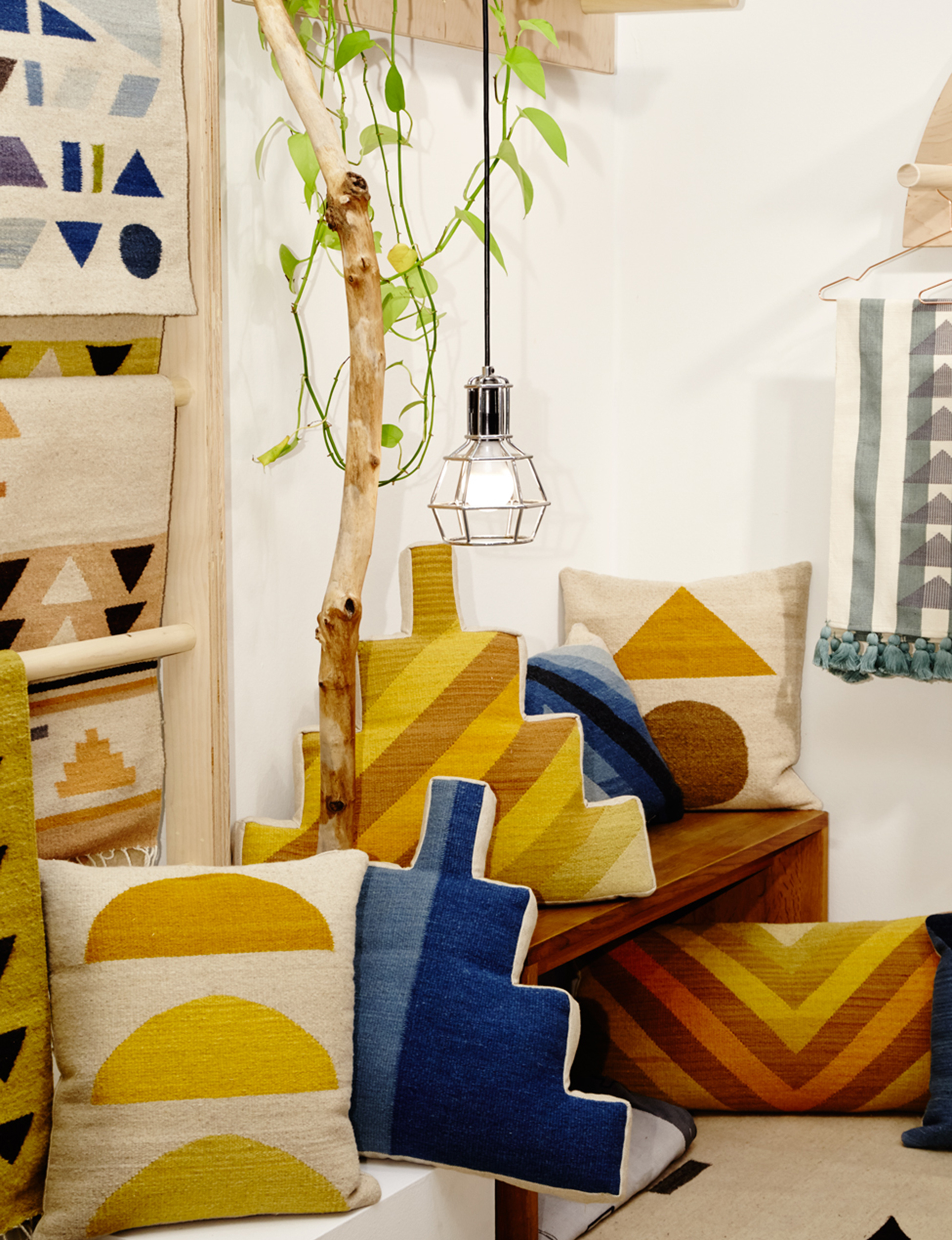
2. ‘RUGS’ by Dana Haim (above)
The gentle, muted colours of Colombian-American artist and designer Dana Haim’s textile designs come from the all-natural dyes and materials used by the Mexican artisans with whom she collaborates. A proponent of craft preservation in the digital age, the Brooklyn-based Haim hand-draws or paints each beautiful, minimalist Zapotec-inspired pattern, which is then translated into a tapestry by traditional craftspeople in Oaxaca using locally spun wool to create ‘modern heirlooms”. In turn, this collaboration economically empowers the artisans, while preserving their cultural heritage.
danahaim.com
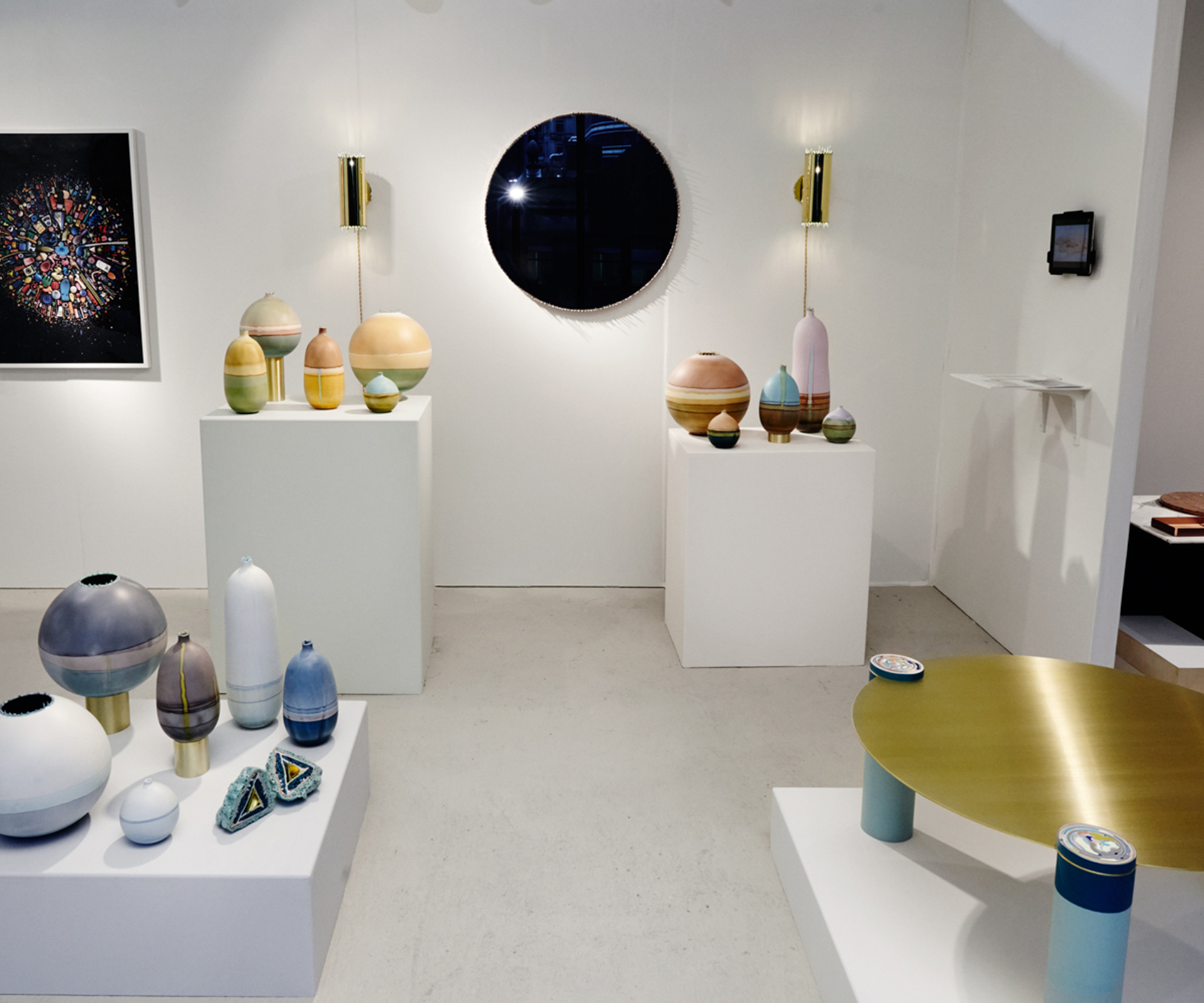
3. ‘Core Sample Coffee Table’ by Elyse Graham (above)
Elyse Graham, who was a sculptor and jewellery designer before also moving into furniture design, says she “likes to be surprised” by her own processes. Often derived from or using natural forces, these include casting vases from human breath, a mesmerising process where the Los Angeleno pours fast-setting resin into an inflated balloon and gently spins it — effectively roto-molding it by hand — to coat the inside, or drizzling layers of resin to create a border of stalactite drips used to frame her Drip Mirror. This table has an intricate, candy-swirl detail in each leg, which were individually hand-cast from pigmented resin and brass tubing, echoing scientific core samples taken from rock and ice.
elysegraham.com
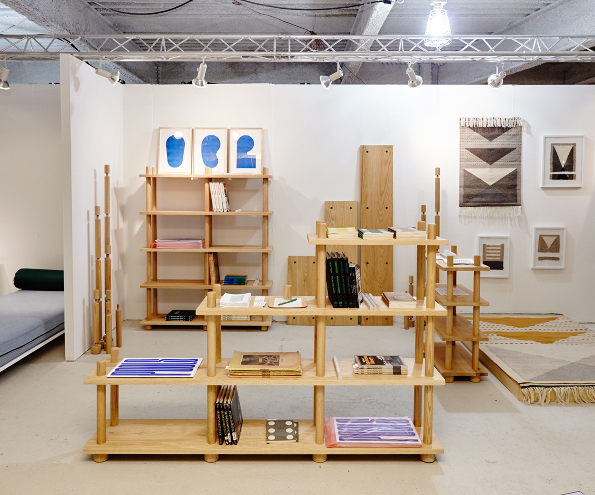
4. ‘Bookshelf’ by Norma (above)
Norma is Benjamin Critton and Heidi Korsavong, a graphic designer and interior designer respectively, who created the super-simple but aesthetically pleasing and surprisingly solid freestanding Bookshelf as a nights-and-weekends project. The all-wood (red oak) design comes flat-packed and is assembled without the use of hardware from six basic components — three shelves of different standard lengths, and a foot, post and cap with screw threads — into a seemingly infinite number of scalable configurations to suit any room.
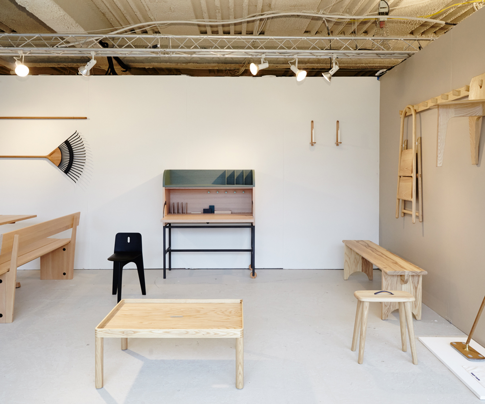
5. Furnishing Utopia: Shaker Design Reinterpreted (above)
As the USA starts to explore its own design heritage in more depth, the Shaker movement is an obvious place to begin. Often credited as being “the first minimalists”, the plain-living religious sect has almost died out, but the hand-crafted, timeless pieces they made are influential, and preserved at former settlements that are now museums, including the Hancock Shaker Village and Mt. Lebanon Shaker Museum. For this project, a group of 11 contemporary designer studios spent a week at the two sites, with access to their object archives and curators, developing 32 beautiful, Shaker-inspired pieces that range from lighting and furniture to baskets to brooms.
The studios involved in the project include Ladies & Gentlemen Studio, Studio Gorm, Tom Bonamici and Gabriel Tan, the creator of the three-legged Stove Chair, which is designed to take up as little space as possible, and can be hung on a matching wall-mounted peg rail.
shakerdesignproject.com
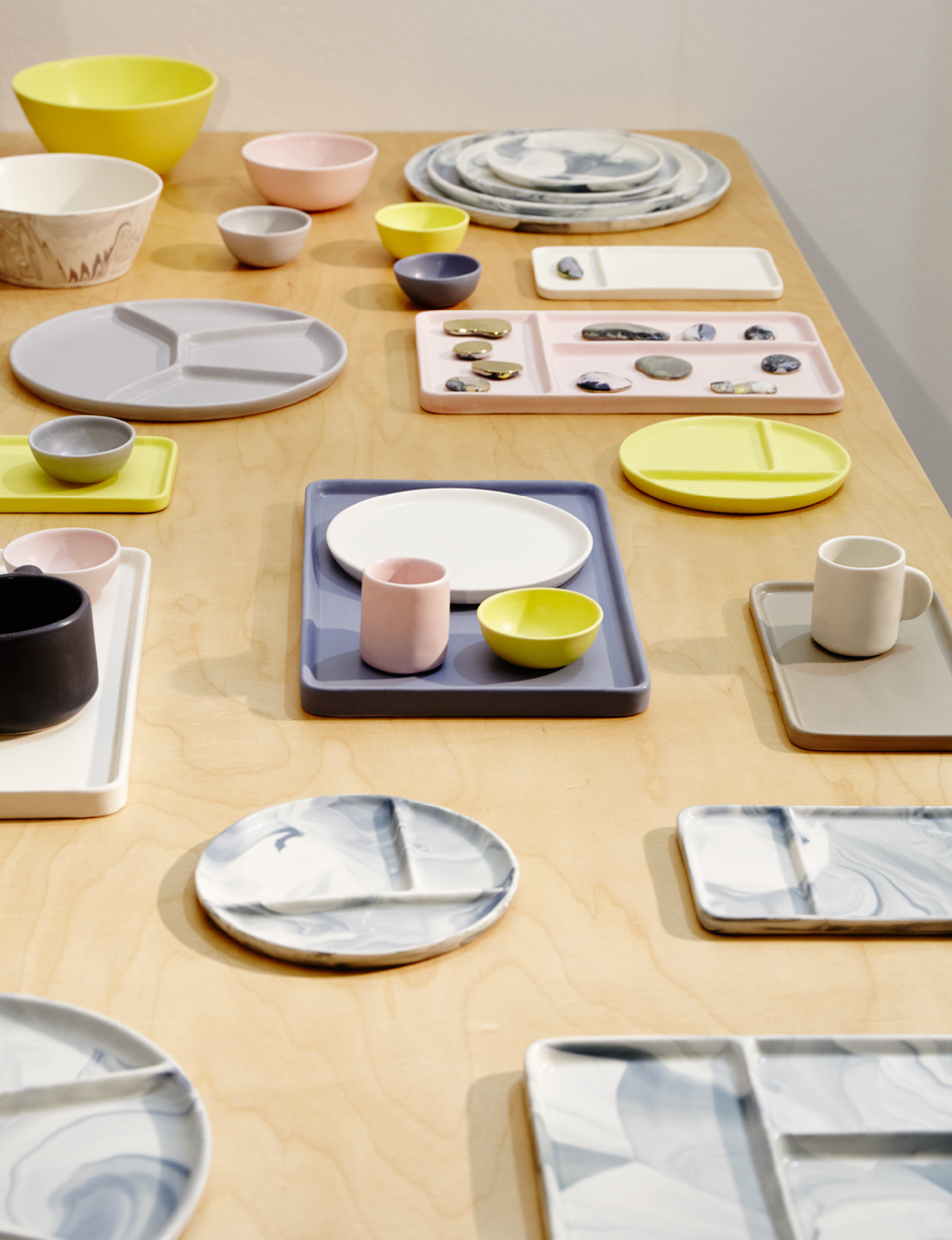
6. ‘Felt + Fat: CAFETERIA PLATE’ (above)
Coming out of Philadelphia’s burgeoning creative scene, ceramics studio Felt + Fat specialises in slip-cast porcelain, and regularly collaborates with restaurants and chefs — including Matt Lambert of the Musket Room in New York — to create small, custom runs of tableware.
Founded in 2013 by Nate Mell, who began his career as a server before attending art school, and Wynn Bauer, the studio is one of the new breed of small-scale manufacturers, making all of its pieces using clay and glazes formulated and mixed in-house and cast in handmade molds. As a result, each piece — like these newly released sectional plates, a play on the idea of cafeteria trays developed in collaboration with chef-owner Elise Kornack at Brooklyn’s Take Root — is proprietary, unique and maintains subtle differences in finish and size while remaining consistent overall.
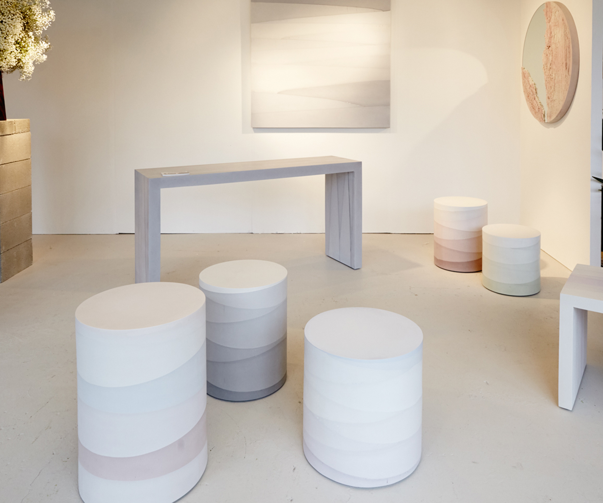
7. M-Material: FADE STOOLS (above)
Experimental designer-artist Fernando Mastrangelo has a fascination with granular materials, and over the last decade of his sculpture practice has cast unexpected organic substances like salt, sugar, coffee grounds and sand into his work: an earlier series of coffee tables, for example, was framed in cement, with white rock salt crusted on the inner walls, in the manner of a geode. Another new piece was the Drift sculptural mirror, which placed polished glass alongside textural drifts of hand-dyed sand (frozen in space with resin) inspired by earth formations and retreating glaciers. This year, he presented this range of refined outdoor stools with a subtle colour gradient, created using industrial concrete.
8. Graphic Textile Project by Aya Kawabata
Graphic designer Aya Kawabata’s pair of intensely coloured tapestries stood out in a refreshing way against the tasteful neutrals on display at the ICFF, America’s largest furniture fair. Using a jacquard loom, an 18th-century tool that allows the user to create complex patterns, she wove the fantastical digital landscapes she usually generates in a two-dimensional format.
There’s a similarity between the pixels of a digital rendering, and the way the traditional weaving technique creates chemistry between different colours of thread and forms tiny structures within the finished fabric that fascinates her, she says. These “graphical textiles” can dramatically change any environment by adding a new, three-dimensional skin. Part of a larger showcase of new Japanese work, these two pieces also won the recent graduate a pink dot student award at the latest Milan Salone del Mobile.
ayakawabata.com
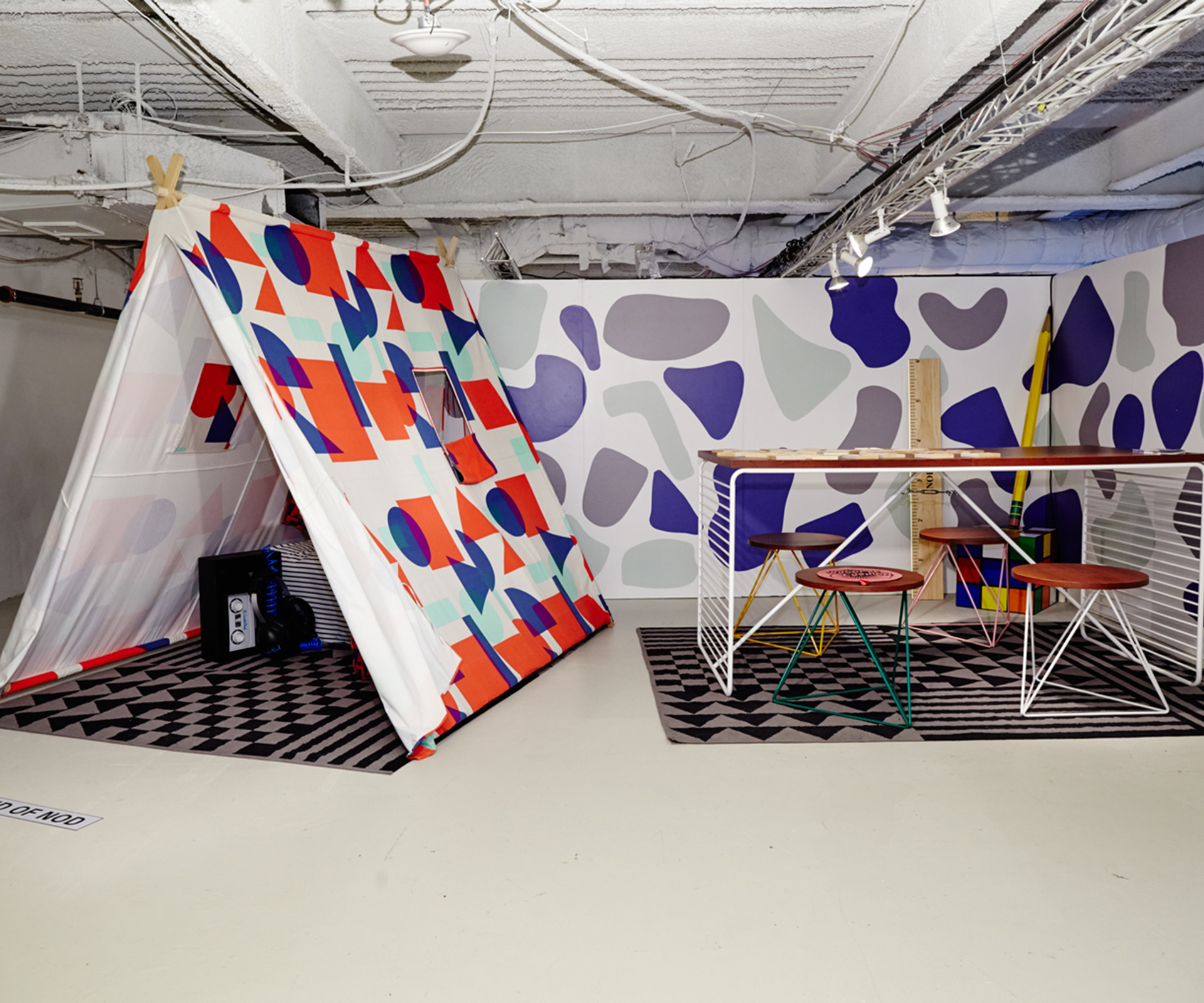
9. The Land of Nod & Dusen Dusen: Playhouse (above)
Ellen Van Dusen, doyen of super-bold prints and founder of womenswear line Dusen Dusen, released a homewares line last year, and this year collaborated with children’s furniture company The Land of Nod to create this tent-playhouse so even the kids can keep their design cred intact.
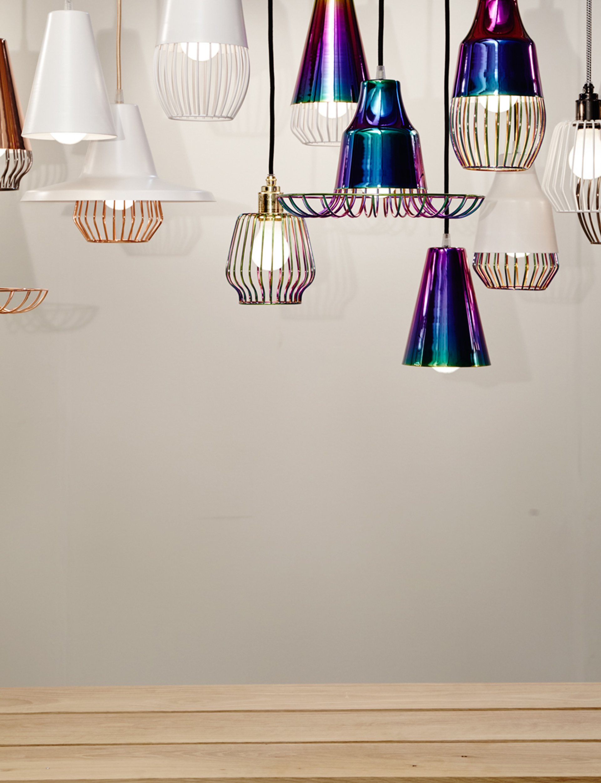
10. Shelter Bay: Union Lighting Collection (below)
Toronto-based studio Shelter Bay was founded in 2015 by Sarah Cooper and Rob Southcott, and this year released a novel line of mix-and-match lighting components. There are eight modular shapes in four finishes (white, black, copper and aurora, an iridescent finish), and three socket and cord set colour combinations, which are sold separately and can be assembled by the user into one of dozens of different potential combinations.
Story by: Sam Eichblatt.
