Daniel Marshall gently updates and extends a secluded 1970s home, originally designed by Robert Railley for his family
The young couple in the old photograph sits cross-legged on a poppy-red shagpile, a collection of vinyl records spread before them. A Gordon Walters painting hangs on the wall behind and a Barcelona chair is placed, somewhat incongruously, in front of the entrance to this formal living room.
The scene, shot in 1973 for Australian Home Journal, is patently staged, yet intrinsically redolent of its time. Robert Railley doesn’t quite recall how the feature on his first home, in Auckland’s St Heliers, ended up in this trans-Tasman magazine, but he has vivid memories of designing and building the house. “I was a struggling young architect with limited resources, so I got pretty involved,” he says. “I loved the physical endeavour and on-site problem solving.”
Forty-five years later, architect Daniel Marshall may not have poured concrete or wrestled laden wheelbarrows up timber ramps, but he certainly had a mental workout re-shaping the home for contemporary expectations. “I always point out to clients that the renovation process can be more arduous and expensive than building new,” he says. “You really have to love the home to start with.” They did.
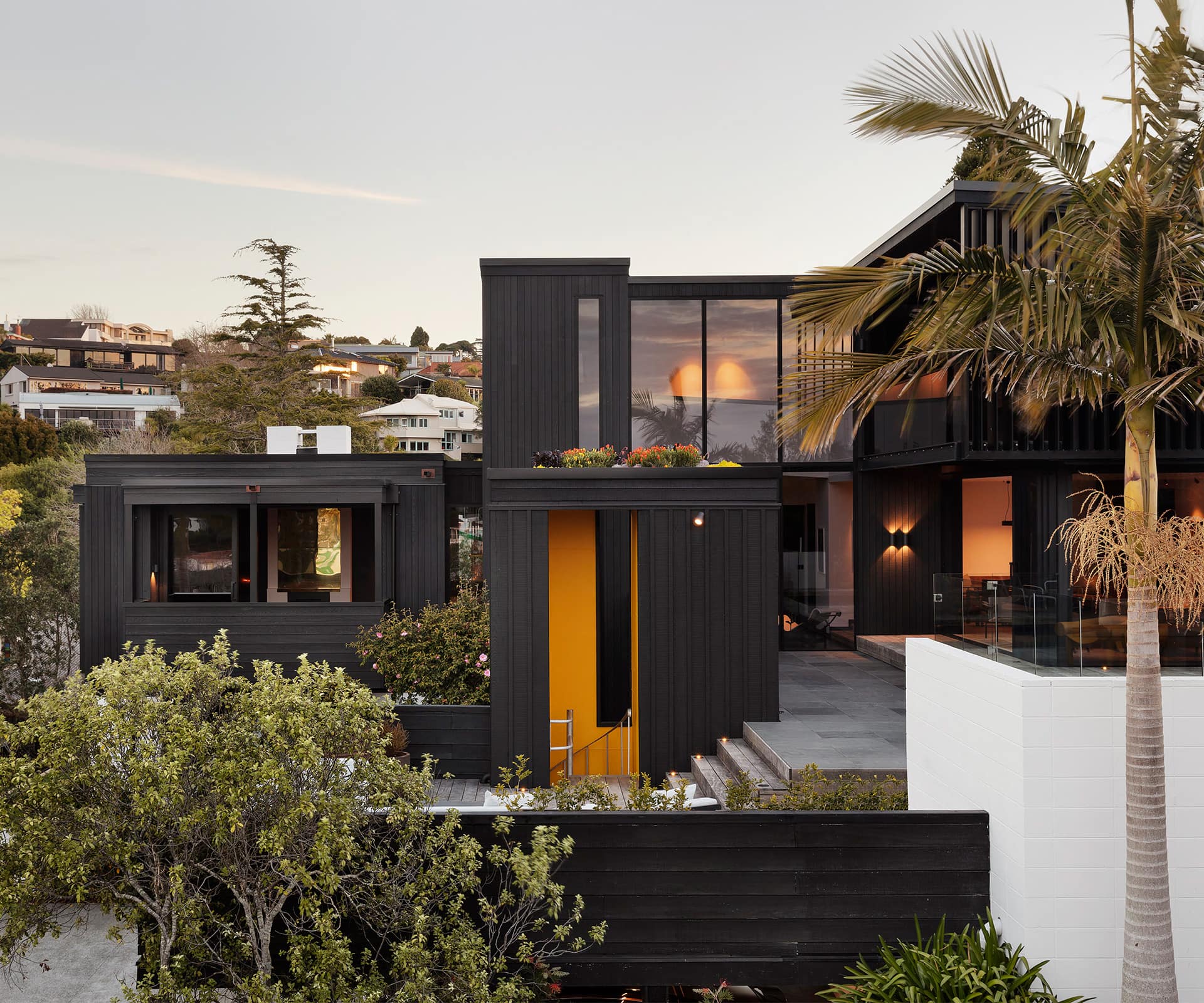
At the open home, now-owners Jeremy Fergusson and Emma Winsloe were intrigued by the elegant, L-shaped form that stepped down the hillside. They couldn’t wait to see inside. They found spatial personality by the bucket-load, a swimming pool their youngsters would enjoy and, from the deck on the upper level, a secluded aspect overlooking a suburban valley. “We could see there were issues but we put in an offer the next day,” says Fergusson.
Railley had not long returned from six months’ working in Copenhagen when he began designing the home. It started with a concrete-block retaining wall running north-south on the east-west-sloping site. The house, clad in vertical band-sawn cedar boards, was perched low and long on top of it. Although Scandinavian influences were evident inside (dark-stained cedar joinery contrasted with white walls) and the furnishings (Marimekko bed covers, a Saarinen dining table and Poul Kjaerholm chairs), the form itself paid gentle homage to an influential New Zealander. “Claude Megson and I were at school together; we were friends since we were 10 years old and colleagues after that,” says Railley.
When Marshall first saw the house, he instantly picked up on the cubist Megson effect. “It wasn’t extreme,” he says. “Seventies homes have some interesting spaces – there are lots of little places to sit. And if you look at them in plan form, you can see the proportions are in harmony.”
Still, after more than four decades, there were concerns. The roof of the bedroom wing was irreparable, hundreds of mosaic tiles had fallen off the pool, and the kitchen was, by today’s standards, tiny and inward facing. Railley had paid homage to the modernists and to Megson, and Marshall returned the respect, redefining the layout and canvas with an eye ever on the original.
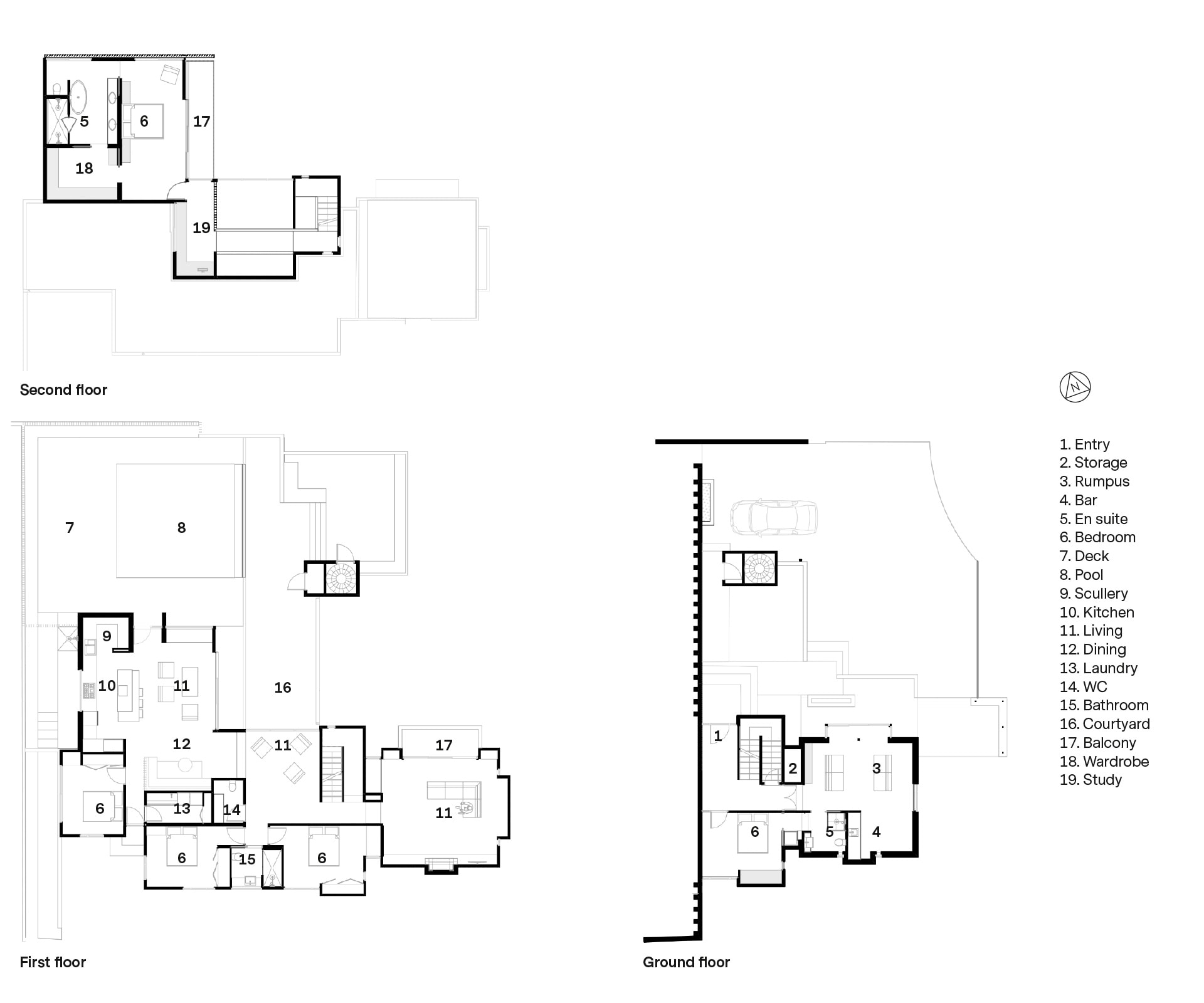
On one hand, the alterations are pragmatic – the footprint is the same with reconfigured rooms – and on the other hand, the changes are dramatic. The bedroom wing was rebuilt as an open-plan kitchen, living and dining space. Above it is an entirely new level, with the main suite accessed by a floating walkway. “We had to replace the roof, so we took advantage and popped up a mezzanine,” says Marshall.
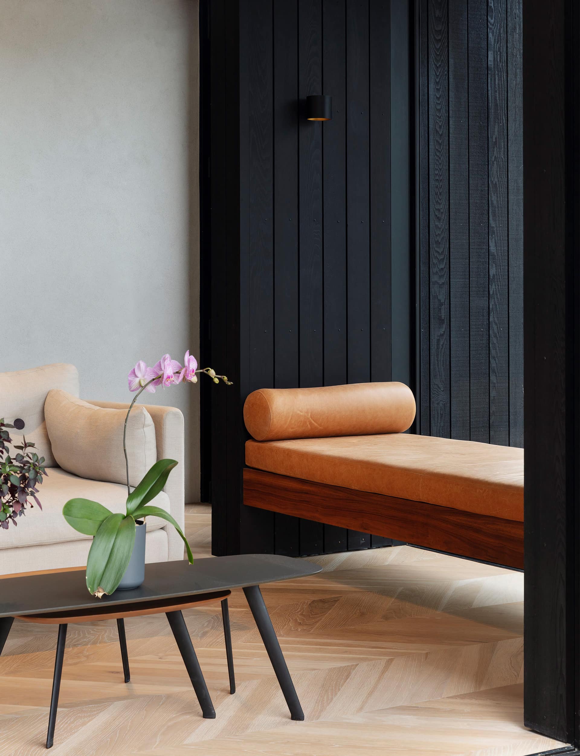
Where possible, the primary language is reinterpreted in subtle gestures such as the height of transoms and identically sized slot windows. Much of the cladding has been recycled in retaining walls around the property. Echoes of 70s styling include mosaic tiles and dark walnut cabinetry in the bathroom. A built-in diner with banquette seating that cantilevers off the end typifies what Marshall calls “humanist modernism – it’s in an open-plan living room deliberately devoid of televisions”.
It’s an interesting comparison to set photographs of today’s home against those in the 1973 publication. Where once there was a garage for Railley’s yellow Alfa Romeo Sprint Speciale, there is now a self-contained studio where the owners decamped while the controlled chaos of renovation took place.
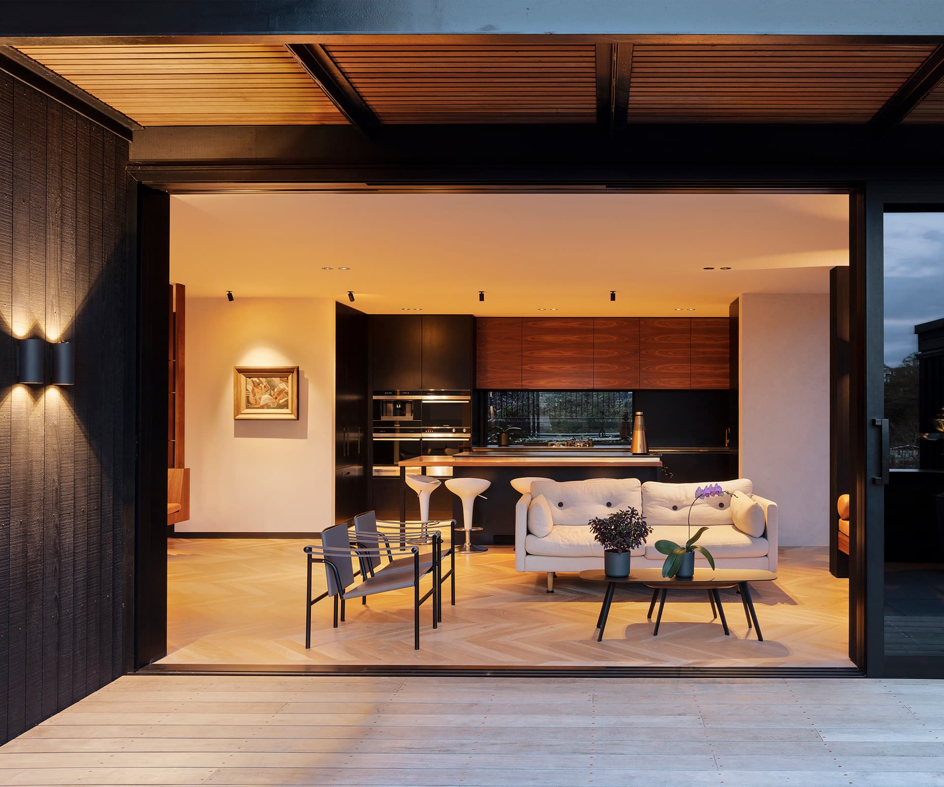
The kitchen, described in Home Journal as “very functional with a walk-in pantry” is now a sunny sitting area beneath a double-height void and looks out to the deck. “Where we could, we provided more connection with the outside,” says Marshall.
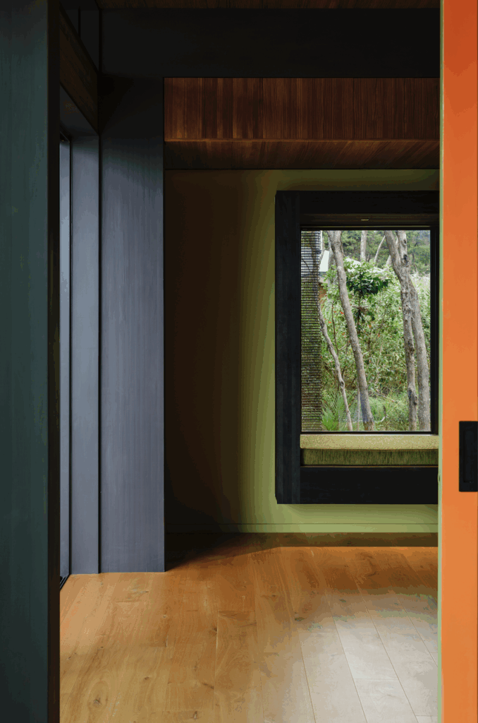
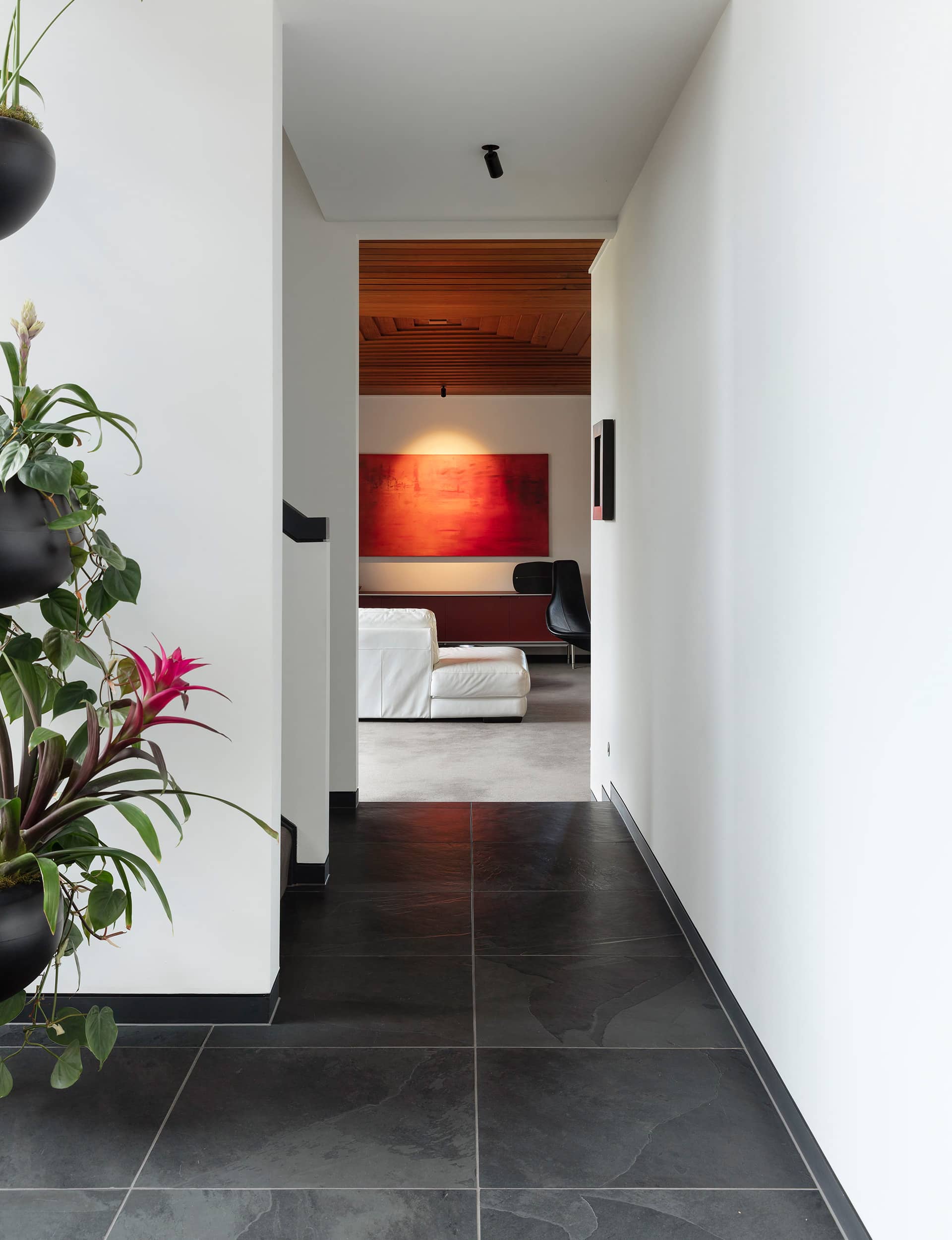
Gone are the cork floors in the kitchen and red mosaic flooring in the bathroom. Parquet in the living zone and slate tiles in walkways are lighter in aesthetic, more robust. Gone, too, are the black, folding louvre doors leading from the living room, and the front door has been replaced by plate-glass with a bespoke timber handle.
[gallery_link num_photos=”12″ media=”https://www.homemagazine.nz/wp-content/uploads/2019/02/StHeliersDanielMarshall_HOME_4.jpg” link=”/real-homes/home-tours/architect-daniel-marshall-renovating-earlier-designs” title=”See more of this home here”]
The article was published too soon for stage two to be shown: a bedroom terrace leading to a six-metre square swimming pool and an extra garage beneath. (While Railley remembers experimenting with a mosaic motif that mimicked the pattern on a Persian carpet and setting up a system fashioned from tyre inner tubes so he could swim against them for exercise, Marshall recounts a Pompeii-style excavation to remove layers of tiles from the pool before it could be resurfaced in hydrazzo with a glass mosaic waterline.)
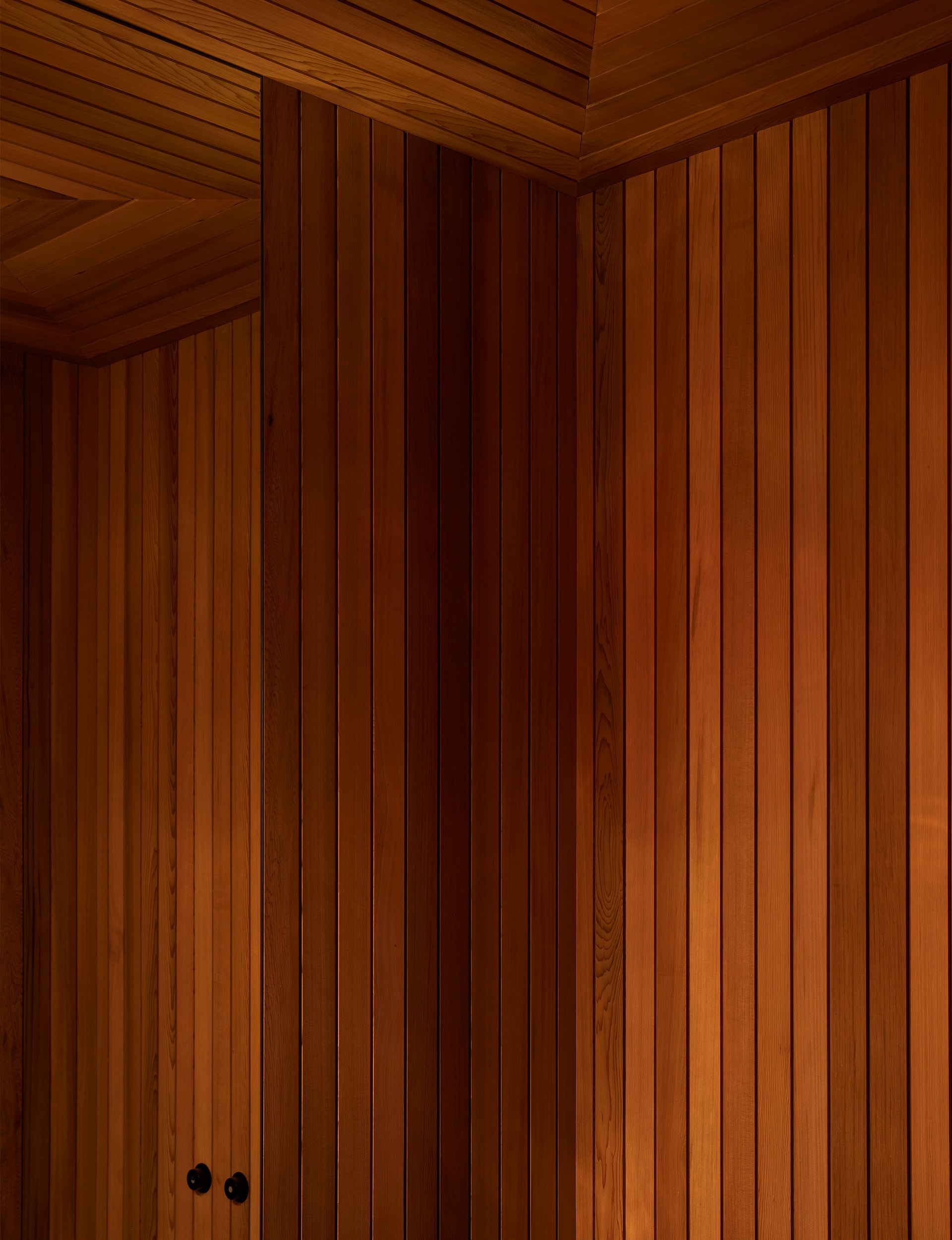
While decorative elements have been upgraded, the major design set pieces are sacrosanct. The showpiece sunken living room remains and has a distinctive stepped ceiling of overlapping cedar boards. For good measure, Marshall has added a built-in bar with brass shelving and a mirrored backdrop. Inspired by the pyramid form, he has designed a referential tiered ceiling in the nearby powder room.
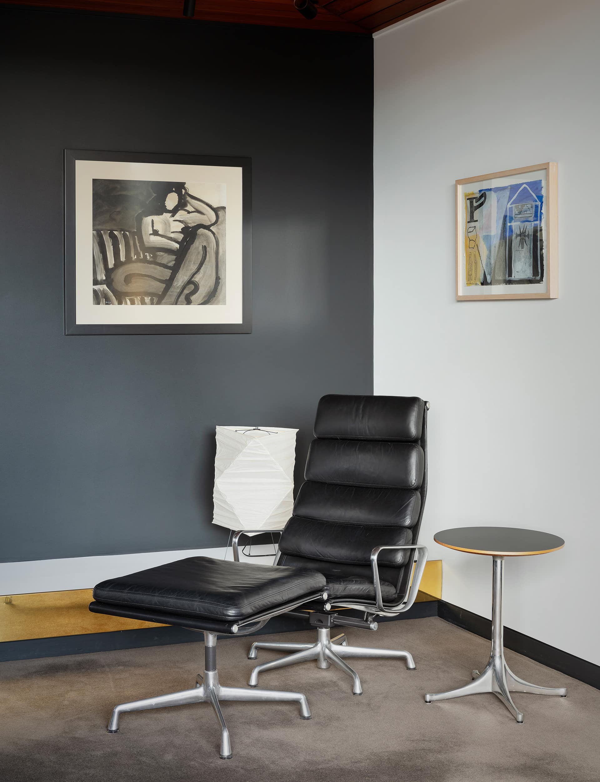
The Railleys moved out in 1978, taking their Scandi-modern finds with them, but in the ‘LC1’ chairs and other mid-century pieces that furnish the home now, a like-minded spirit lives on. Outside, the steel spiral staircase that allowed quick access from the pool to the Alfa still serves the same function. Only now the stairwell sports a living roof and a yellow-painted interior that explodes with colour under illumination. History repeats with a different hue. Love it, they did. Love it, they do.
Words by: Claire McCall. Photography by: Sam Hartnett
[related_articles post1=”90691″ post2=”90663″]

