The 2013 Home of the Year winner is a curvaceous home designed by Stevens Lawson Architects that perches on the headland on Waiheke Island
2013: Stevens Lawson and an organic plan
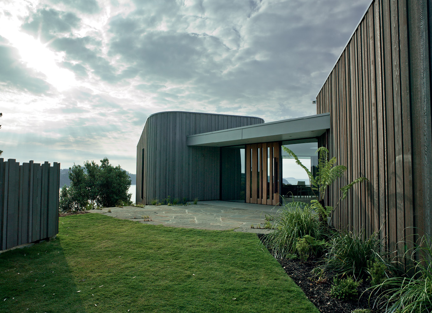
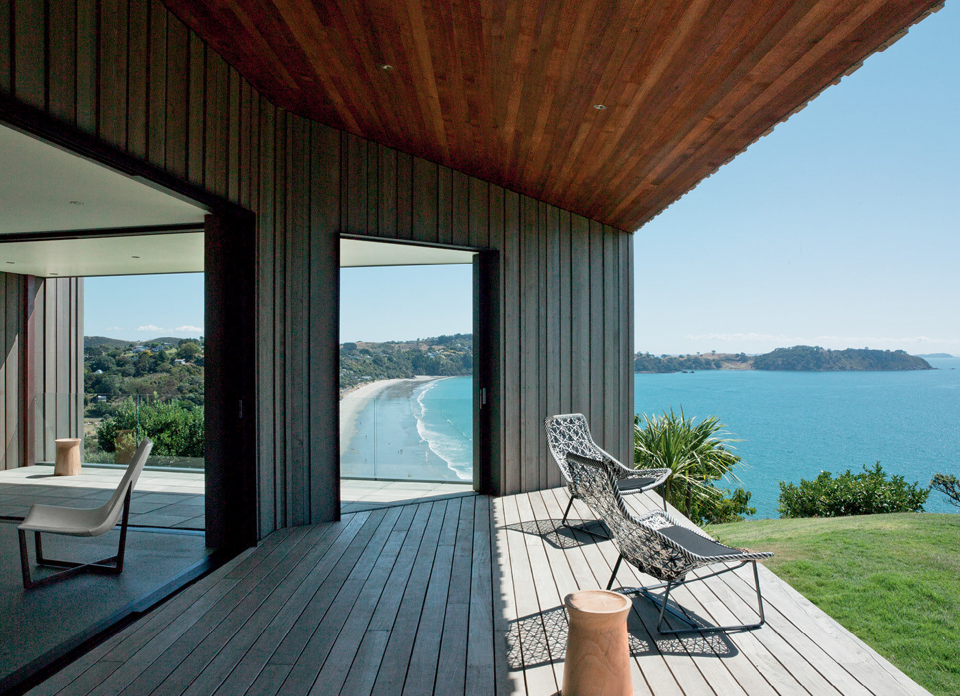
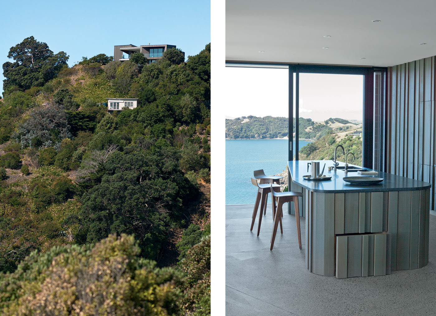
To the east, waves crash over black rocks. To the west, a vertiginous drop to a gorgeous white-sand beach. Directly north, through the gnarled bows of a beautiful pohutukawa, sunlight glitters on the ocean all the way to the horizon. On this lofty headland on Waiheke Island, Nicholas Stevens and Gary Lawson of Stevens Lawson Architects have designed a one-of-a-kind home that is neither cowed by its surroundings nor vainly competing with them.
The Home of the Year 2013 is a building of curvaceous rooms with swooping ceilings and secret doors, a home with a sense of adventure that also possesses a deep respect for its location. It is not a machine for living hell-bent on efficiency, as the Swiss architect Le Corbusier would have it, a vessel of studied neutrality from which to observe a magnificent view. Instead, this is a house deliberately crafted to create delight, a place with a presence very consciously its own.
It is a home that fuses diverse influences: in the woody curves, there are hints of the deeply humane work of the Finnish architect Alvar Aalto, while the unconventional layout suggests the futuristic spatial arrangements of the Japanese firm SANAA (who also happen to like curves, although they usually deploy them in steel and glass). Yet the dwelling is also unmistakably a Stevens Lawson creation, sharing a material palette and a rich sense of craft with many of its predecessors.
The duo have used curvy forms frequently in earlier buildings, but this house represents one of the first built signs of an aspiration to break free of conventional spatial arrangements and explore a more fluid way of creating a home. “We wanted a design that was relaxed, not too formal or ordered,” Gary says. Adds Nicholas: “It’s totally rationally laid out, but the rationale is relative to how it fits with the landscape and its wider environment. It’s very much an idea of how to build an organic house.”
The home is owned by New Zealander Linley Butler and her English husband Peter, whose main concern in their loose brief to Gary and Nicholas was that the dwelling not overwhelm its site, which is highly visible from the beach below. This need for discretion was something their architects agreed with entirely. “We didn’t want the house to feel like something that had dropped in from the Starship Enterprise or was a mega-structure that didn’t relate to its site,” Nicholas says.
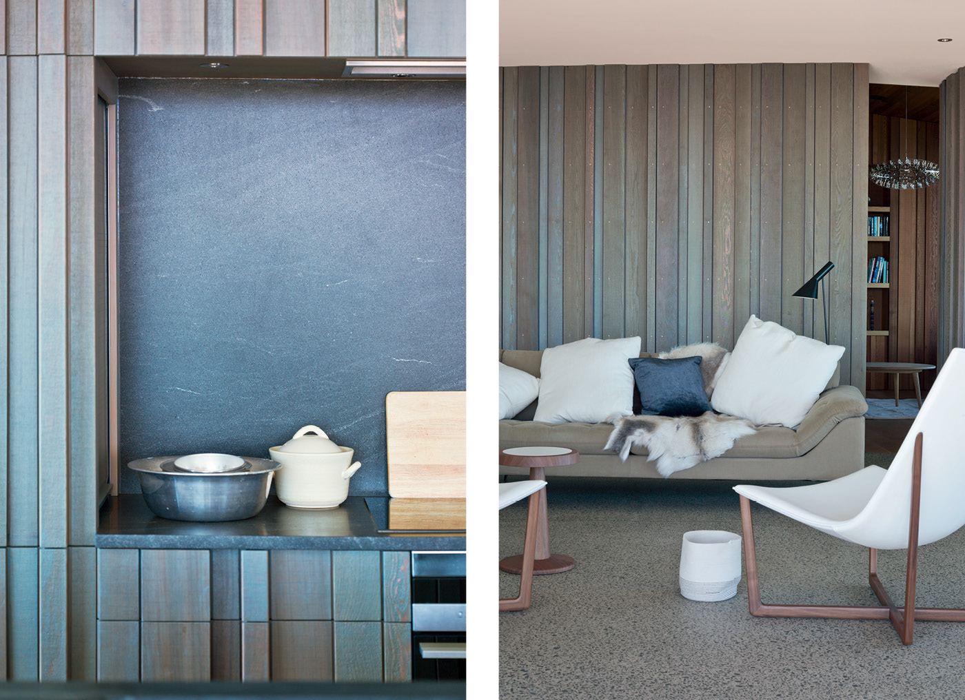
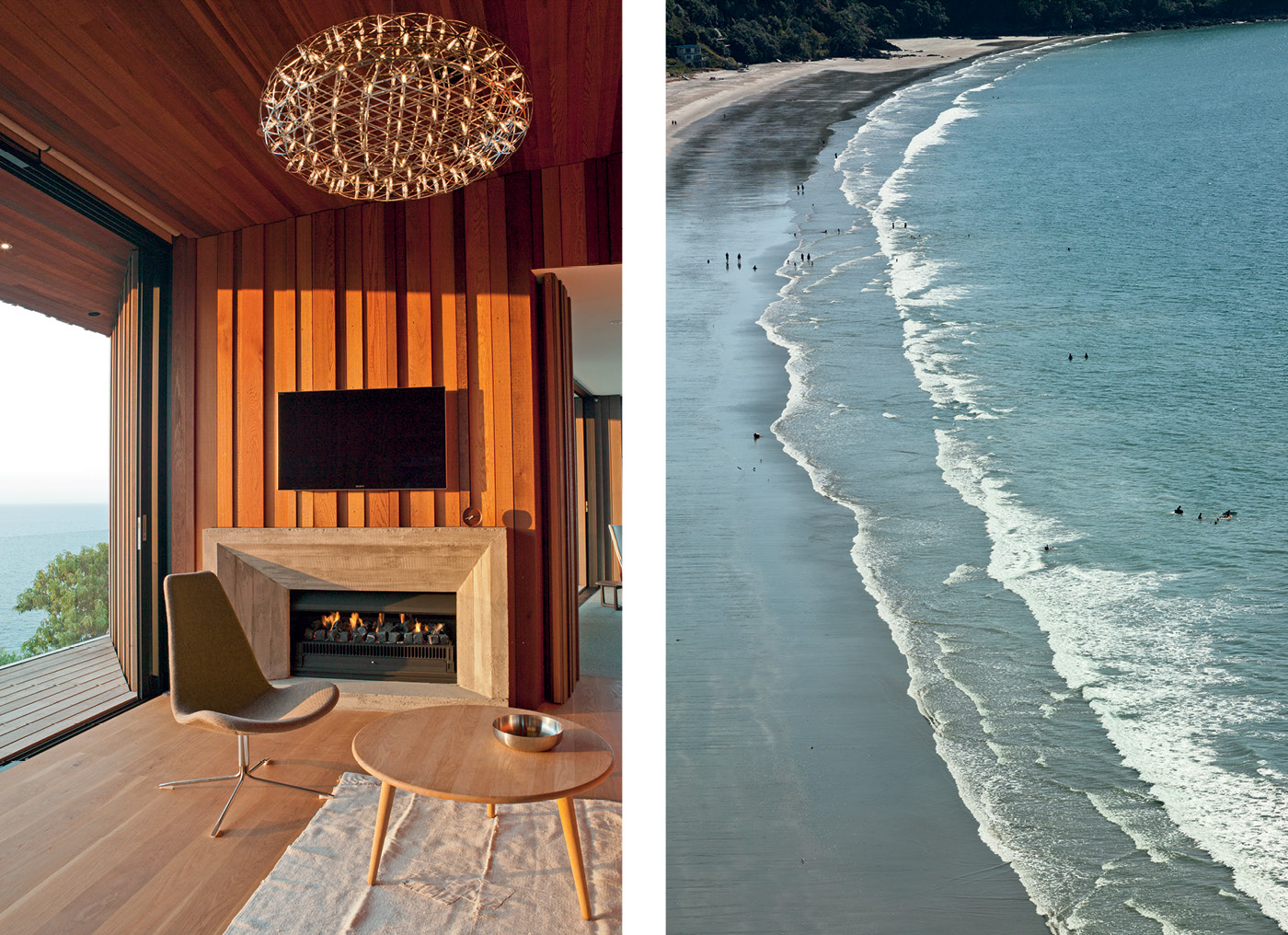
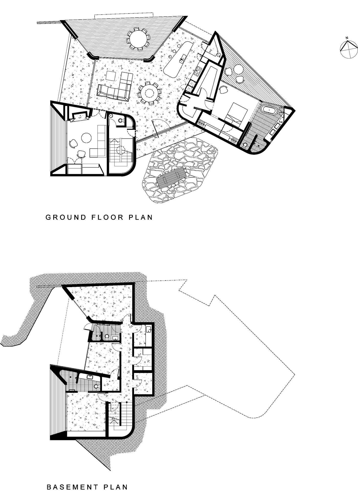
The duo developed a plan that broke up the building into three timber-clad pods loosely arranged on the site in the manner of “pebbles scattered on a beach”, as Gary describes it. The pod forms – one of which contains the main bedroom, another a west-facing living area with a fireplace, and the third a sheltered, north-facing verandah – occupy the same footprint as the two small dwellings that were previously on the site, and edit the panorama into carefully framed chunks. (To build the 285-square-metre home, the site was partly excavated to accommodate three guest rooms on a lower level that can’t be seen from the beach.) The space between the pods is enclosed to form a kitchen, dining and living area that feels, with its circular skylight, grey-stained cedar walls and concrete floor, like a futuristic type of verandah.
This departure from convention means the home is not immediately easy to understand. The entry, through a grandly pivoting timber and glass door, leads not into one of the pods, but the living, dining and kitchen area that occupies the space between them. The backs of the pods, clad in the same cedar battens as their exteriors, form the interior walls of this space, the battens cut and crafted in a variety of widths and depths that call to mind the undulating surface of driftwood. “The intent behind having the same material on the inside as the outside is to make the interior feel like an outside space,” says Nicholas.
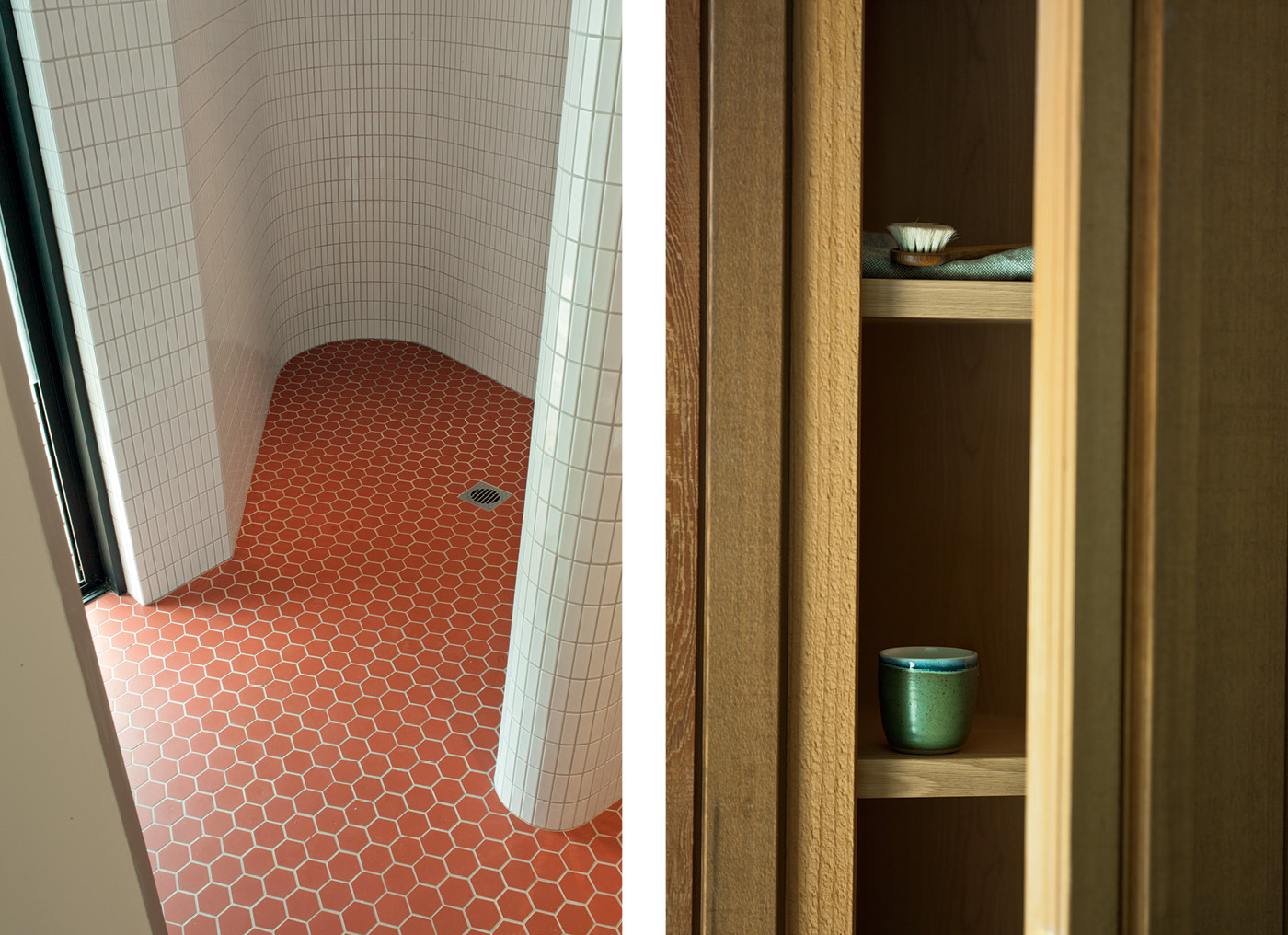
It initially seems as if this is all there is to the house, as if the only option is to move onto one of the decks, because the pods look impenetrable from inside and out. That’s because the doors to the pod’s interiors have been concealed in their cedar skins. Through these doors, once you find them (their handles are indicated by battens of a specific width), the interiors of the pods are deliberately different, more intimate worlds.
The concrete floor of the living area yields to wide oak boards, and the grey cedar battens that clad the pods’ exteriors give way to walls of warmly toned cedar boards that swoop upwards and overhead to form ceilings much higher than that in the home’s living area. (The other hidden door opens to a stairway that leads to the downstairs bedrooms, its concealment meaning it is easy to forget the spare bedrooms exist when only two people are occupying the house.)
These so-called ‘secret’ doors are not solely there for the fun of it – if they were obvious, the main living space might risk feeling like a thoroughfare. Instead, with the doors closed, the cedar walls of the pods possess a sense of solidity that helps anchor the central living space. Similarly, the richness of the home’s timber palette provides plenty to look at when the exterior fades to black. “At night, when there’s no view, we wanted the interior to look and feel special,” says Nicholas. “The interior has its own sense of quality. You can be in there with no view and it’s still a satisfying space to be in.”
This rich variety of spaces, Gary says, makes for “a house that’s surprising and engaging as a series of spatial experiences. It’s a thrilling series of spaces to move through and engage the senses.” Adds Nicholas: “We wanted to create a bit of mystery.” It’s a richness that extends outdoors: on a site this exposed, there is almost always a breeze coming from somewhere, but decks off the main bedroom, the central living space, and the western living room mean there is always a sheltered outdoor space. On a site this beautiful, it would be a pity not to be able to enjoy it as much as possible. Here on Waiheke Island, that’s a responsibility the home’s architects have taken to heart.
Q&A with Nicholas Stevens and Gary Lawson
HOME Why the concept of dividing the home into three pods?
Nicholas Stevens We were looking for an organic language, like the way shells on a beach might naturally fall – although the pods are specifically placed so each one has a different view. Instead of trying to achieve an uninterrupted panorama we’ve framed the various views. Also, we didn’t want the house to feel like something that had dropped in from the Starship Enterprise or a mega structure that didn’t relate to its site. Dividing up the space into pods also gives shelter. There’s always a part of the house that is protected from the wind no matter what direction it comes from.
Gary Lawson We also wanted a design that was relaxed, not too formal or ordered.
HOME The cedar cladding of the pods continues inside to the living area in the space between them. Why?
Nicholas Stevens The intent behind having the same material on the inside as the outside is to make the interior feel like an outside space. If the cladding line changed it would confuse that language, so we’ve been thorough in the use of materials. At night, when there is no view, we wanted the interior to look and feel special. The interior has its own sense of quality. You can be in there with no view and it is still a satisfying space to be in.
HOME The doors to go downstairs and to enter the living room and main bedroom pods are hidden. What was the reason for this?
Nicholas Stevens We wanted to create a bit of mystery and an intriguing journey through the house. When you are in the main living space you’re not aware of the downstairs at all.
Gary Lawson The result is a house that is surprising and engaging as a series of spatial experiences. You push open secret doors and walk into the main bedroom suite, which is a completely different spatial experience to the central living area. It’s a thrilling series of spaces to move through and engage the senses.
Photography by: Mark Smith.
[related_articles post1=”176″ post2=”43079″]
