Cheshire Architects win the 2014 Home of the Year award for their tiny, twin cabins nestled in an inlet of the Kaipara Harbour
2014: Nat Cheshire’s tiny, brooding cabins
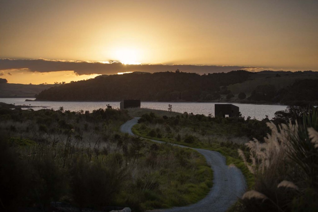
Let’s begin with the back story. About three years ago, two friends pooled their resources to buy land beside an inlet on the Kaipara Harbour just over an hour’s drive north of Auckland. They kitted out a small shed on the land with a bed, a gas stove and running water so they could take turns to stay there, but soon decided to ask Nat Cheshire of Cheshire Architects to design a little cabin for each of them.
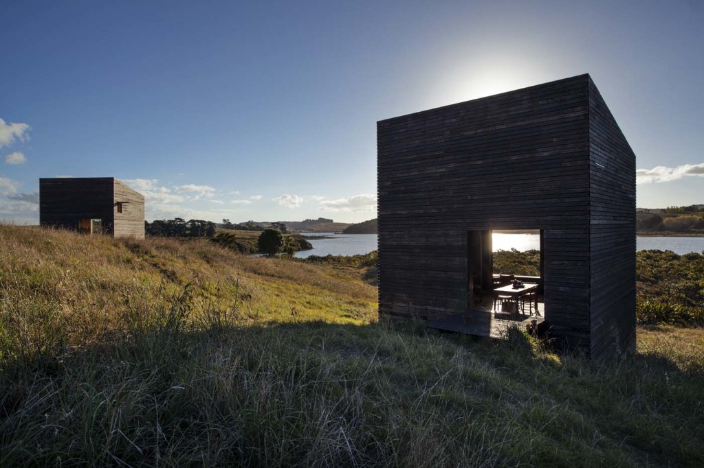
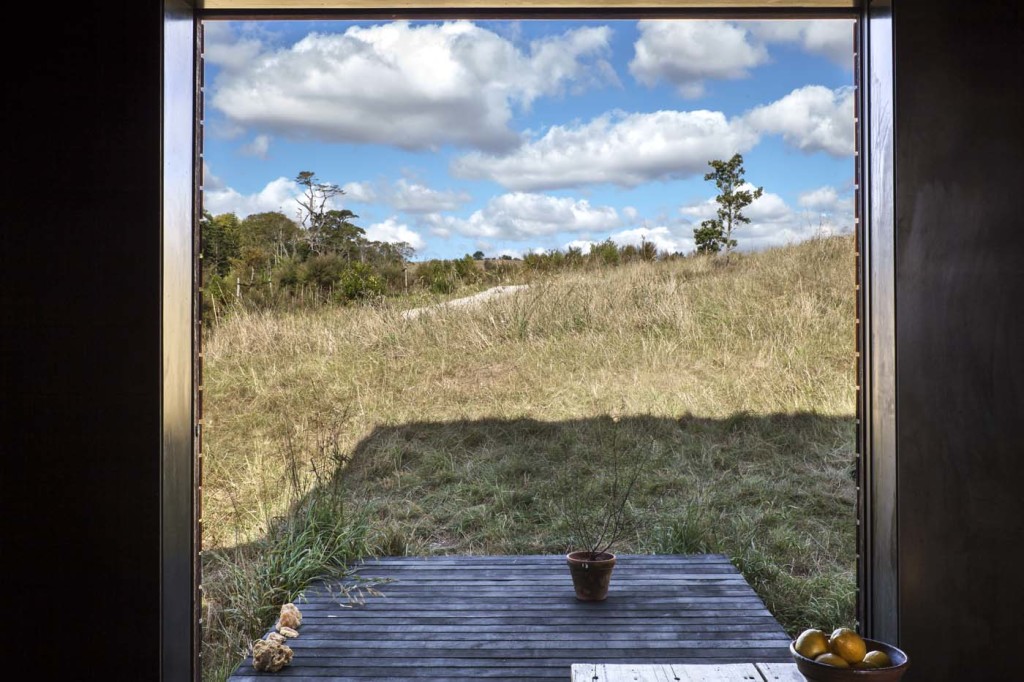
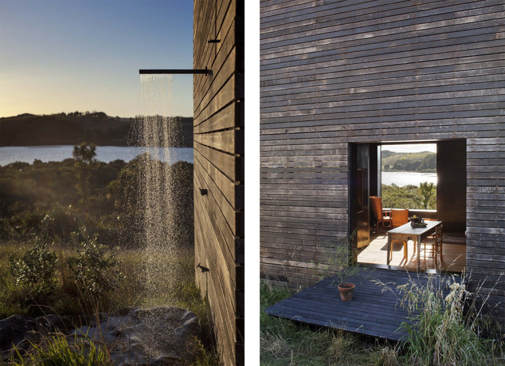
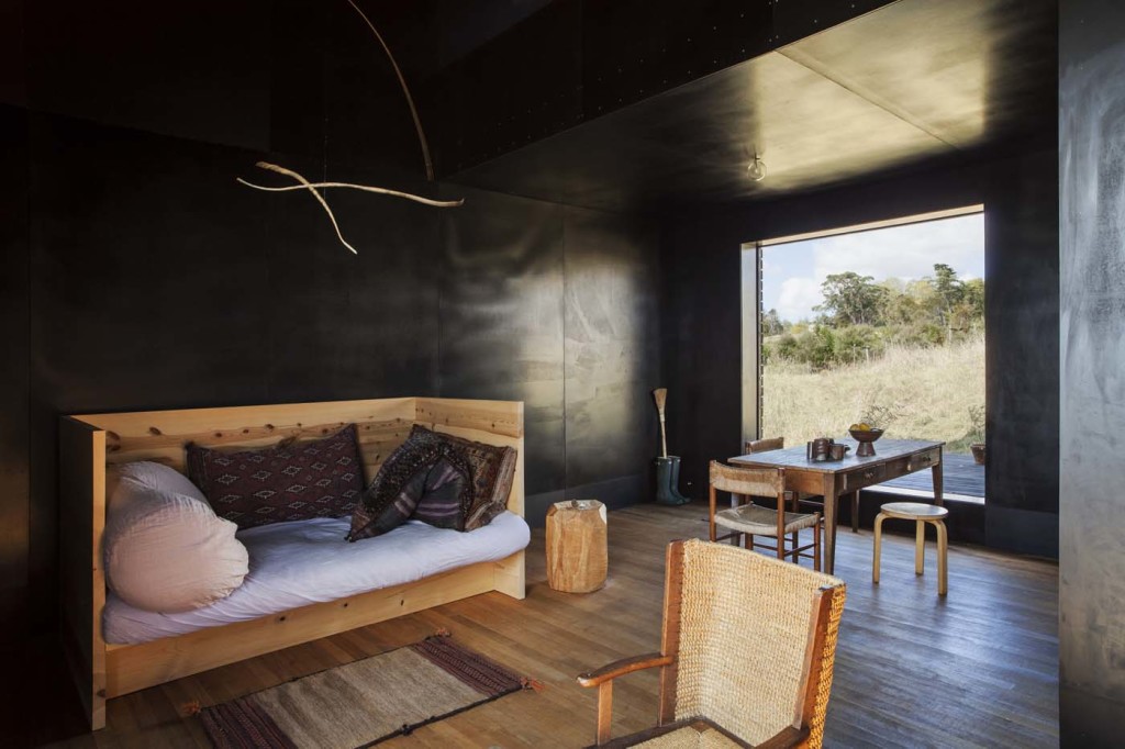
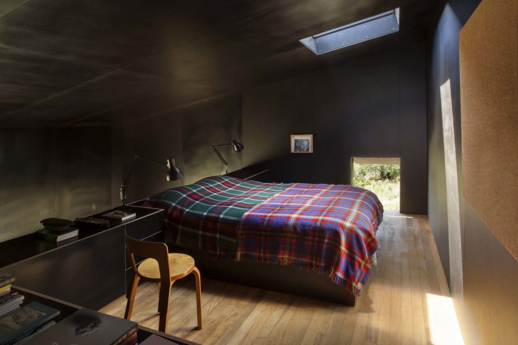
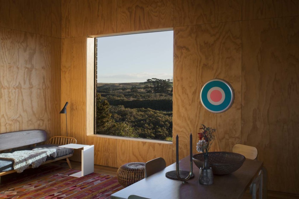
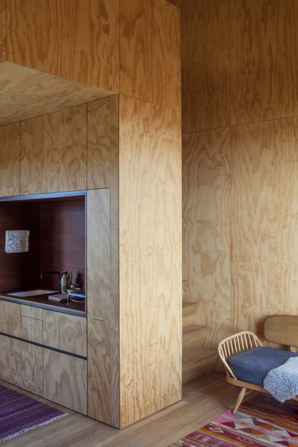
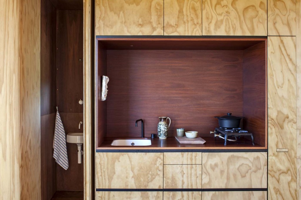
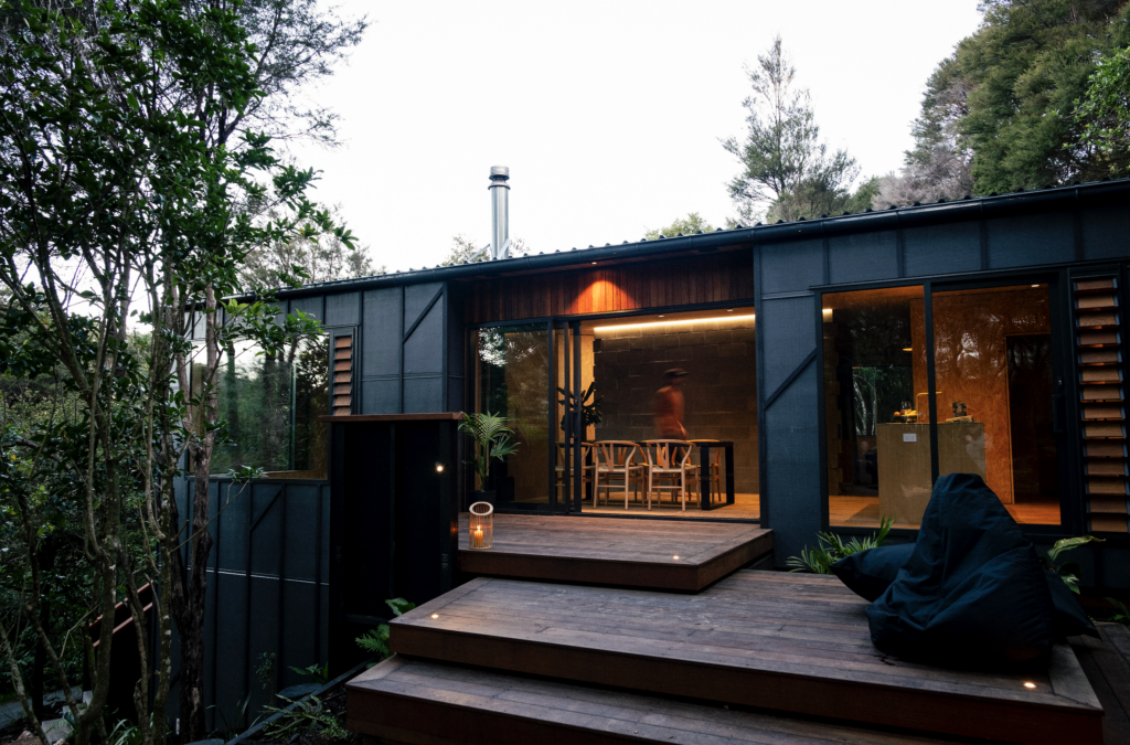
The cabins, which collectively take the title of the 2014 Home of the Year, each have a footprint of just 28 square metres. Each of them is entirely off the grid, with a little bathroom (although both cabins’ showers are outdoors), a kitchen (with a small fridge, gas hob and DishDrawer), a sparsely furnished sitting area and a sleeping loft. Each has two large windows, one functioning as an entrance, the other framing inlet views, while wooden hatches allow ventilation of the bathroom and sleeping areas. A window in each cabin’s ceiling allows a view of the stars at night. The interior of one of the cabins is covered in honey-coloured ply; the other is inky black.
These little buildings, with their air of thoughtful austerity, are among the few contemporary structures that can boast a genuine lineage to New Zealand’s bach heritage. There is something profound about their modesty. They are proud to display the beauty that lies in subtraction, and how liveable small spaces can be. They show how designing something elegant needn’t cost a fortune. They show how a small view of a quiet landscape can be as uplifting and alluring as a larger, more glamorous vista. They are tiny, but they possess a sense of enormous calm.
The project began, in part, as a response to a provocative question: why would you stay in New Zealand? The owner of one of the cabins asked himself this a few years before purchasing this piece of land. Like many young New Zealanders, he had been visiting friends in alluring cities and, he says, “trying to clarify in my head what holds me here”. The answer was “not about living in a way that mimics a life you might have in London or New York. I wanted friends to be able to visit a place like this and instantly understand what living in this part of the world brings”.
A conventional response to such a question might be to build a glassy palace overlooking a glittering blue bay, but this moody inlet with its mangroves and mudflats stood out “because it wasn’t Omaha-like. It felt more genuine. There’s something very restful about the feeling of isolation this place brings”.
Nat Cheshire is well known for his work in shaping Auckland’s Britomart and CityWorks Depot precincts, where he and his team have designed new buildings and heritage conversions and many of the interiors that fill them. The cabins are only the second stand-alone residence for Cheshire, but the owners liked the idea of working with someone their age, and of utilising a superior talent in the early stages of his career.
The owners’ limited budgets meant larger dwellings were never going to be feasible, but neither were they required. Cheshire says the project was partly conceived as “a reaction against the wasteful way we occupy land in this country”. Ironically, the district plan allowed for a home of approximately 1,500 square metres to be erected on the site, but because they counted as two dwellings, special consent was required for these tiny cabins.
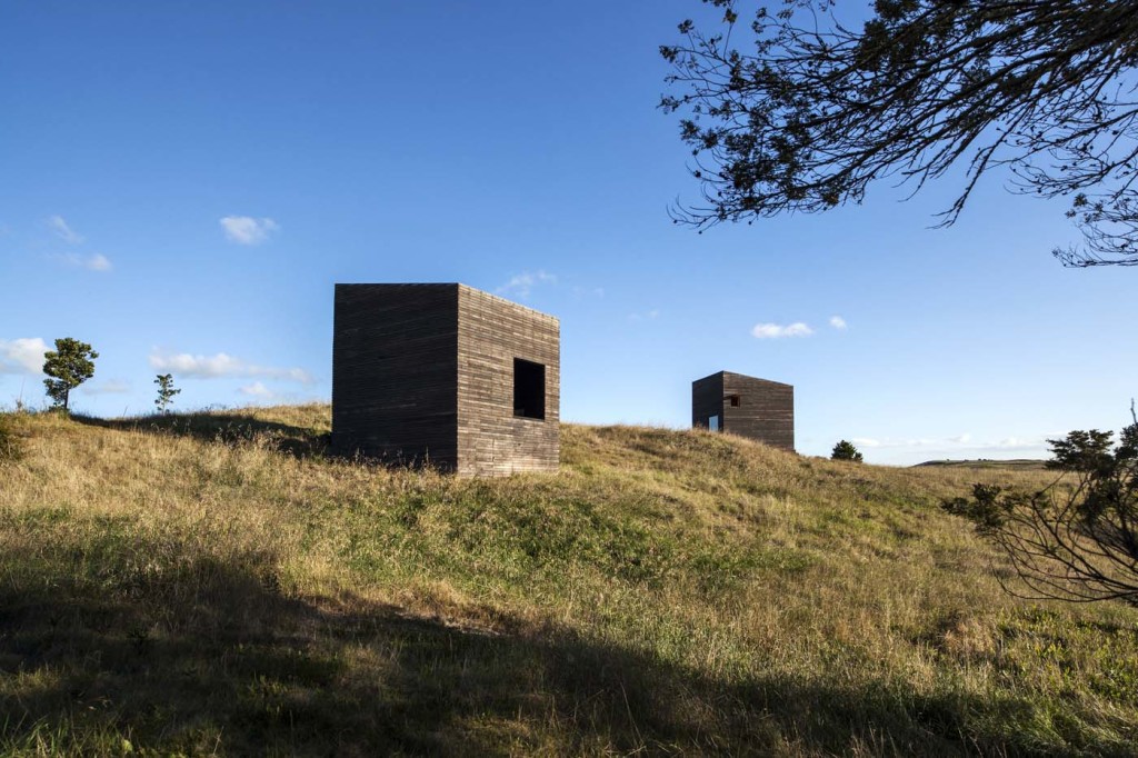
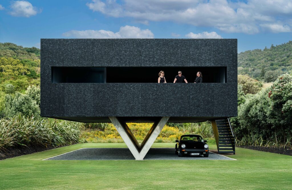
At their second meeting, Cheshire presented the owners with a model very close to what was eventually built. The idea of these structures occupying the land lightly became metaphorical as well as literal: In the long grass, Cheshire hoped the cabins might feel “like boats tied up at moorings in a slow-motion ocean – the idea that one might be adrift above the land was important.” As objects, they are extraordinarily beautiful, their impassive faces registering minute changes in light throughout the day.
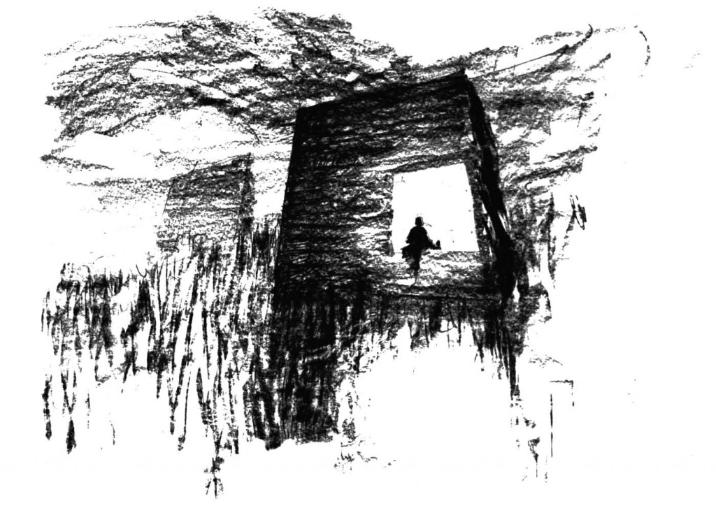
Despite their diminutive size, Cheshire did not want the cabins to recede apologetically into the landscape but to be bold, intriguing objects that “invoke the kind of dislocation that might stop you in your tracks, and help you see anew”. In this he was inspired by Kazimir Malevich and his bold experiments in abstract painting.
He eliminated elements that would make the cabins legible as regular buildings, such as flashings and normal-sized doors and windows, so that they appear monolithic. The sense of abstraction was enhanced by the selection of a fine board for the exteriors that was charred instead of stained, and the way the upper and lower edges of the structures were designed with the same pitch so “they weren’t houses with mono-pitched roofs, but complete prisms,” Cheshire says.
Being small was an advantage. “Small houses offer the possibility of perfection in a way big houses rarely do – they approach the scale of furniture,” Cheshire says. (They also allow the chance to obsess over every detail. His office spent days, for example, investigating ways to lock the doors without the mechanisms being visible). The cabins’ size, in other words, was treated as an invitation to be brave.
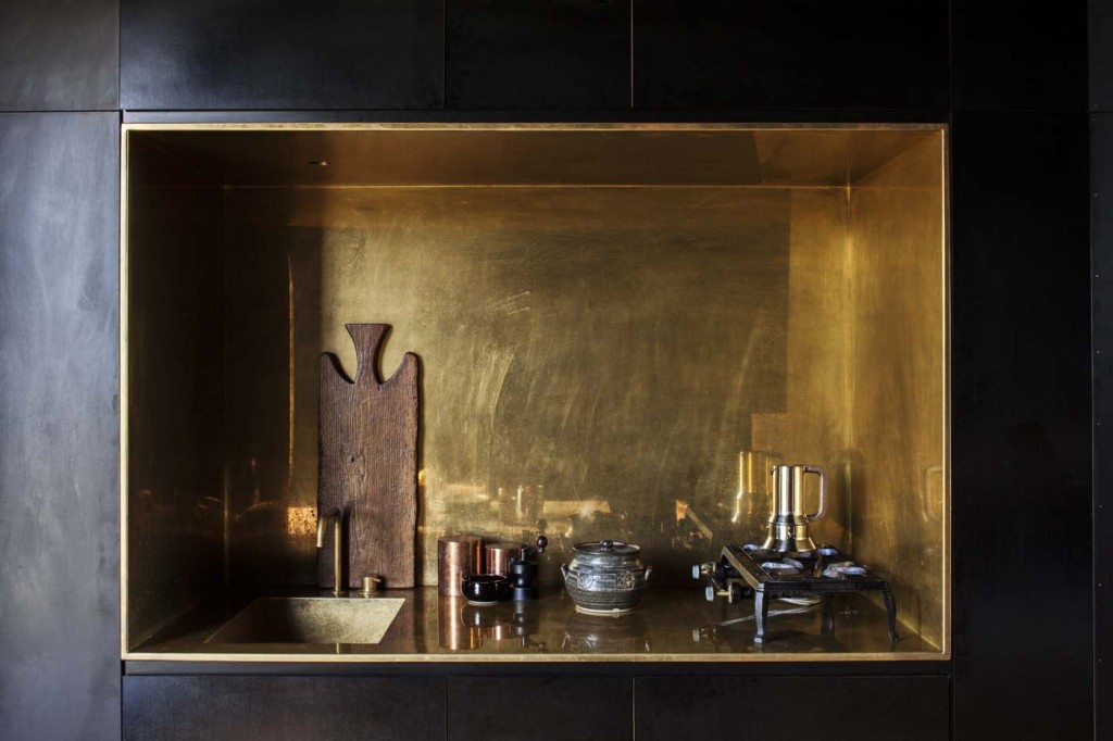
Cheshire and his clients liked the idea of using touches of luxury to enliven the interiors, to tease out what Cheshire calls “the tension between humble and special”. The cabin with the black interior is lined in form ply, cheap timber panels covered in a dark, polished coating for use in the concrete-casting process. Here, their sheen creates a deep sense of space, rendering the ceiling almost invisible.
“At night if there’s just a couple of candles going, the panels have a sheen that’s quite disconcerting; it’s like you’re sitting in a void, or outside,” one of the owners says. The black cabin’s kitchen is a small brass insertion, a jewel-like touch of luxury in the darkness. In the other cabin’s kitchen, the rich grain of oiled jarrah contrasts with the lightness of regular construction ply.
Most coastal homes include as much glass as they can to allow their occupants to soak up the landscape. The cabins adopt an entirely different strategy, with each of their single square windows creating a trapezoid of light on the floor as the sun moves through the sky during the day.
This makes the cabins a deeply interior experience, a feeling so resonant it makes you realise how uncommon it has become in contemporary New Zealand architecture. “There was a resistance to the idea of indoor-outdoor flow and all this real estate vernacular,” Cheshire says. “The cabins are a retreat from the landscape rather than a saturation in it.”
There is a kind of poetry in this resistance, and in the determination to create something marvellous from something small. The quiet, contemplative power and self-assurance of these tiny structures can teach us all a lot: big lessons about needs, wants and having just enough.
Q&A with Nat Cheshire of Cheshire Architects
HOME Was it good to design small?
Nat Cheshire Yes. Small houses offer the possibility of perfection in a way big houses rarely do – they approach the scale of furniture. Right from the outset scale was a subject and a strategy. There’s a responsibility with objects of that scale that someone who is bold enough to commission it deserves to be delighted in every junction. It’s [also] a reaction against the wasteful way we occupy land in this country. And there was a resistance to the idea of indoor outdoor flow and all this real estate vernacular. The cabins are a retreat from the landscape rather than a saturation in it.
HOME How did you choose where to put the cabins?
Nat Cheshire Standing on the site there are only two or three locations that have sufficient stillness to hold houses of that scale. A small house is buffeted by the landscape in a way a big house is not. In that big long grass it feels more like these were boats tied up at moorings in a slow-motion ocean – the idea that one might be adrift above the land was important. The position of the two relative to each other is not radically opposed or discordant. We rotated them so they were not too similarly skewed. It was just about asking, does this seem about right?
Photography by: Darryl Ward. Words by: Jeremy Hansen.
[related_articles post1=”43079″ post2=”44283″]
