HOME and Fisher and Paykel have searched and found New Zealand’s best new designs. Here are the finalists and winner of the 2018 Design Awards
[jwp-video n=”1″]
9 of New Zealand’s best new designs from the 2018 Design Awards
1. ‘Curve’ wall shelf
by Rowan Jackman for Rowan Jackman Design
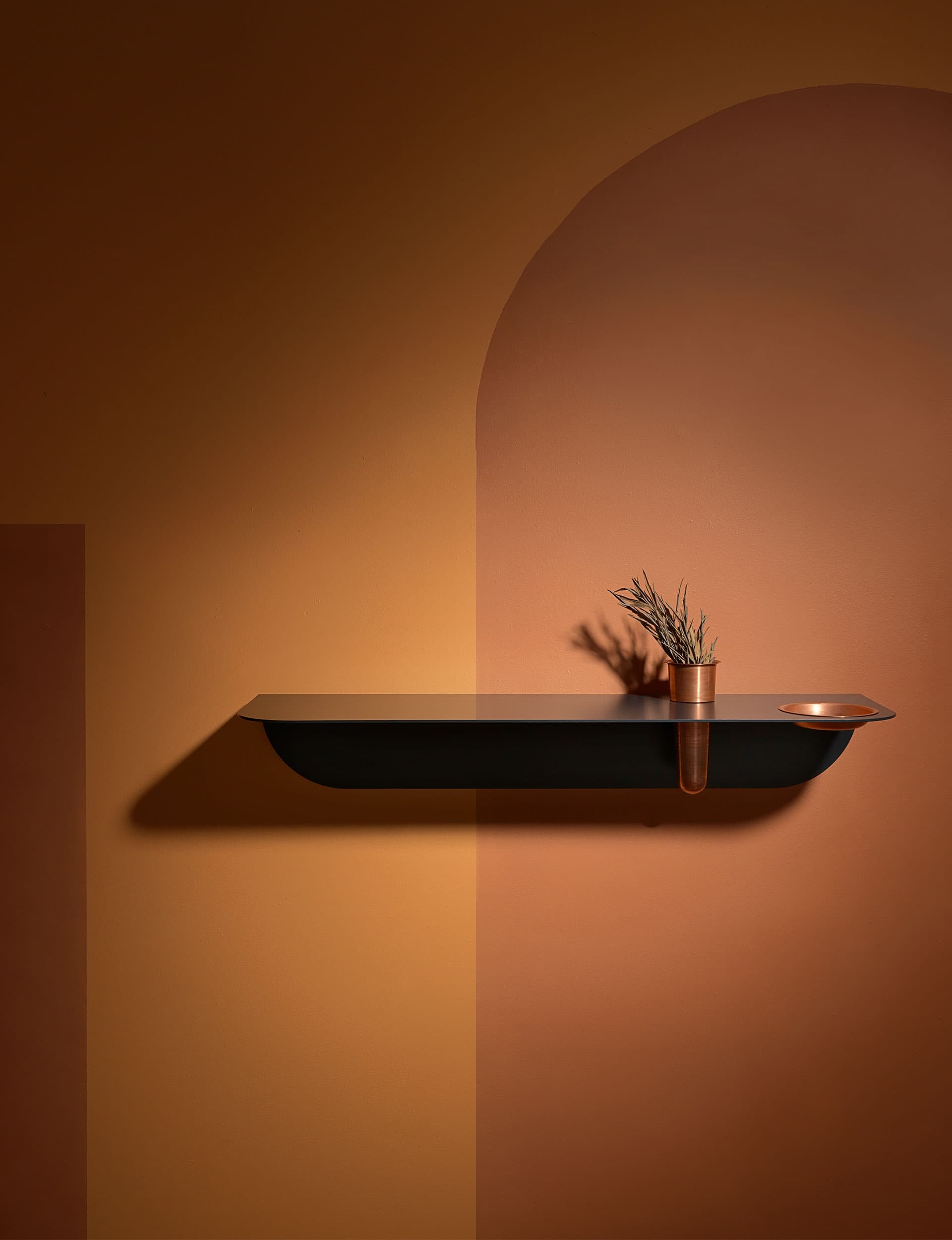
After contemplating the possibility of making a wall shelf visually appealing as a standalone object without sacrificing versatility and function, Christchurch-based industrial designer Rowan Jackman spent several months refining ‘Curve’.
Jackman, who studied Design Innovation at Victoria University of Wellington, enjoys working with materials that allow him to best express his minimalist sensibility.
Hand-spun copper vessels slot into an elegantly curved shelf that, without visible mounts, floats effortlessly on the wall. With vessels to safely contain valuables, Curve adds another layer of practicality to the solution, but does so with a twist – the shelf divides the larger vessel from its smaller lower half, inviting a closer look.
‘Curve’ is made in New Zealand and is available in white, charcoal, soft grey and custom colours.
$255 | Rowanjackmandesign.com
2. ‘Dowel’ pendant
by Tim Webber for Tim Webber Design
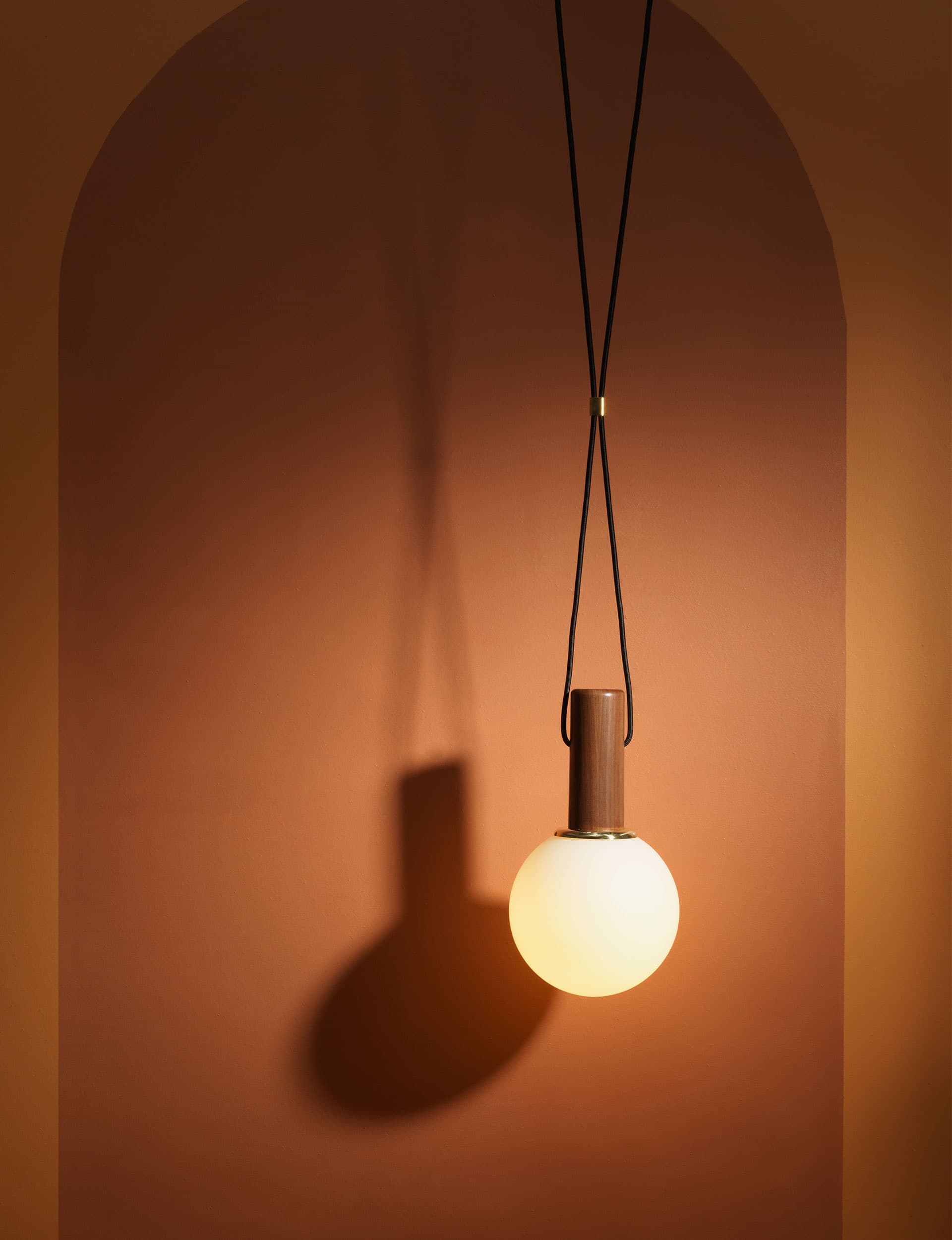
Its name belies the harmony of elegant materials used in its construction. The ‘Dowel’ pendant combines hand-turned walnut, spun brass, milled solid brass and blown glass with an LED light to achieve a strong form.
“Early on in the design process I decided that the pendant’s shapes and forms would be bold and powerful, but assembled in such a way that would still feel delicate and considered,” says Webber.
The pendant is suspended by power cables that enter either side of the timber, reading less like a cable, more like fine rope. The cables can be placed as wide apart or as close together as desired. A brass connector on the cables can also be adjusted to suit. ‘Dowel’ successfully melds sculptural form and function with a customisable element.
From $994 | Timwebberdesign.com
3. ‘Aspen’ lounge chair
by David Moreland and Nikolai Sorensen for Città Design
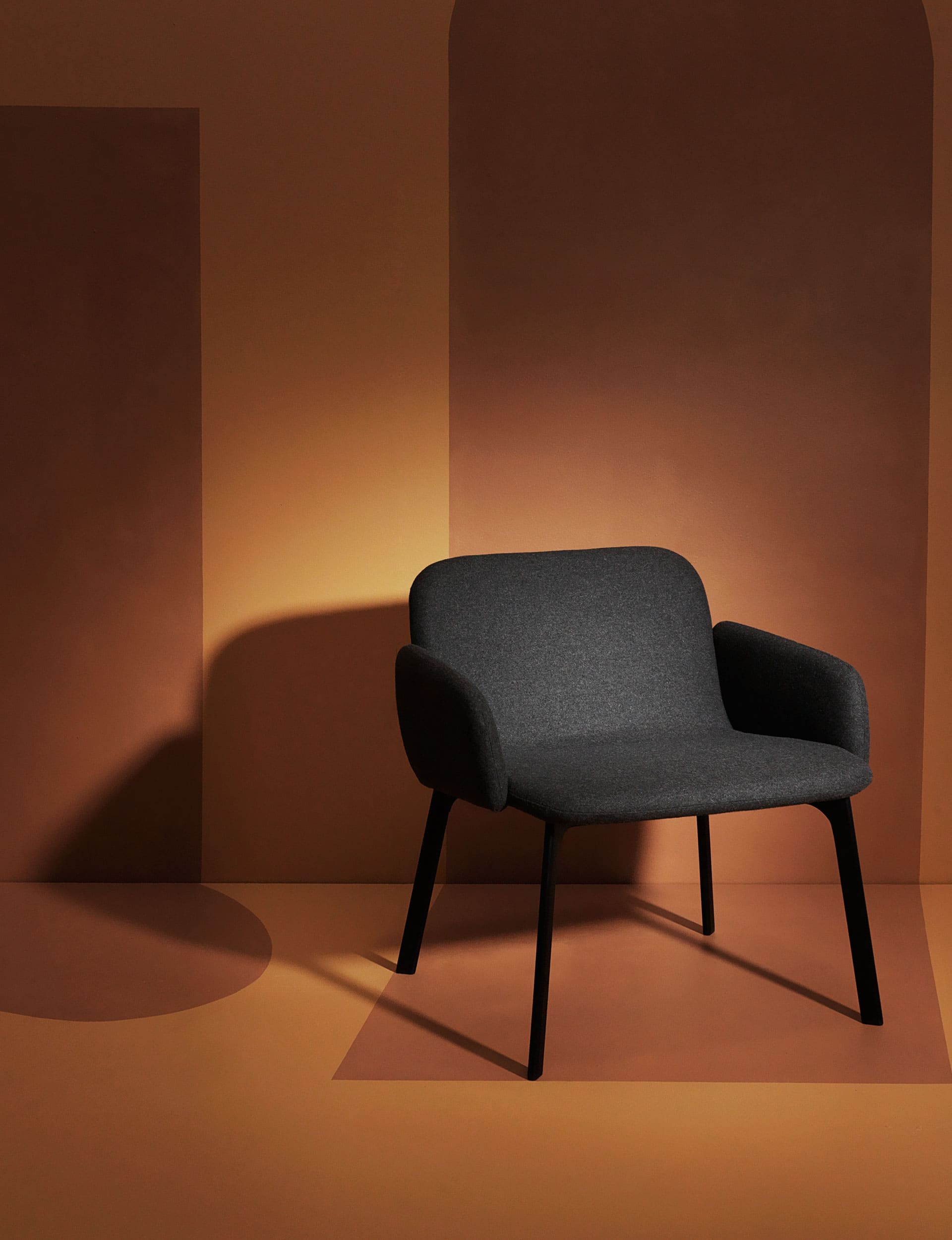
The ‘Aspen’ lounge chair combines a clean-cut silhouette with a generous seat and compact footprint. The “mindfully distributed” design approach formed part of the brief, says David Moreland, as did Città’s desire to use skilled local upholsterers. “This meant we were able to seamlessly fit the arms on to the seat, which is one of the strongest features,” says Moreland.
In combination with the continuous seam that envelopes the seat and a rounded metal base, the chair achieves a crisp profile. The seat’s relaxed curve, arms and laser-cut rails drive a visual tension between soft and hard.
‘Aspen’ works in both commercial environments and tight residential spaces. It can be tailored with natural oak, optional armrests and upholstery.
From $490 | Cittadesign.com
4. ‘Elevation’ leaner
by David Moreland
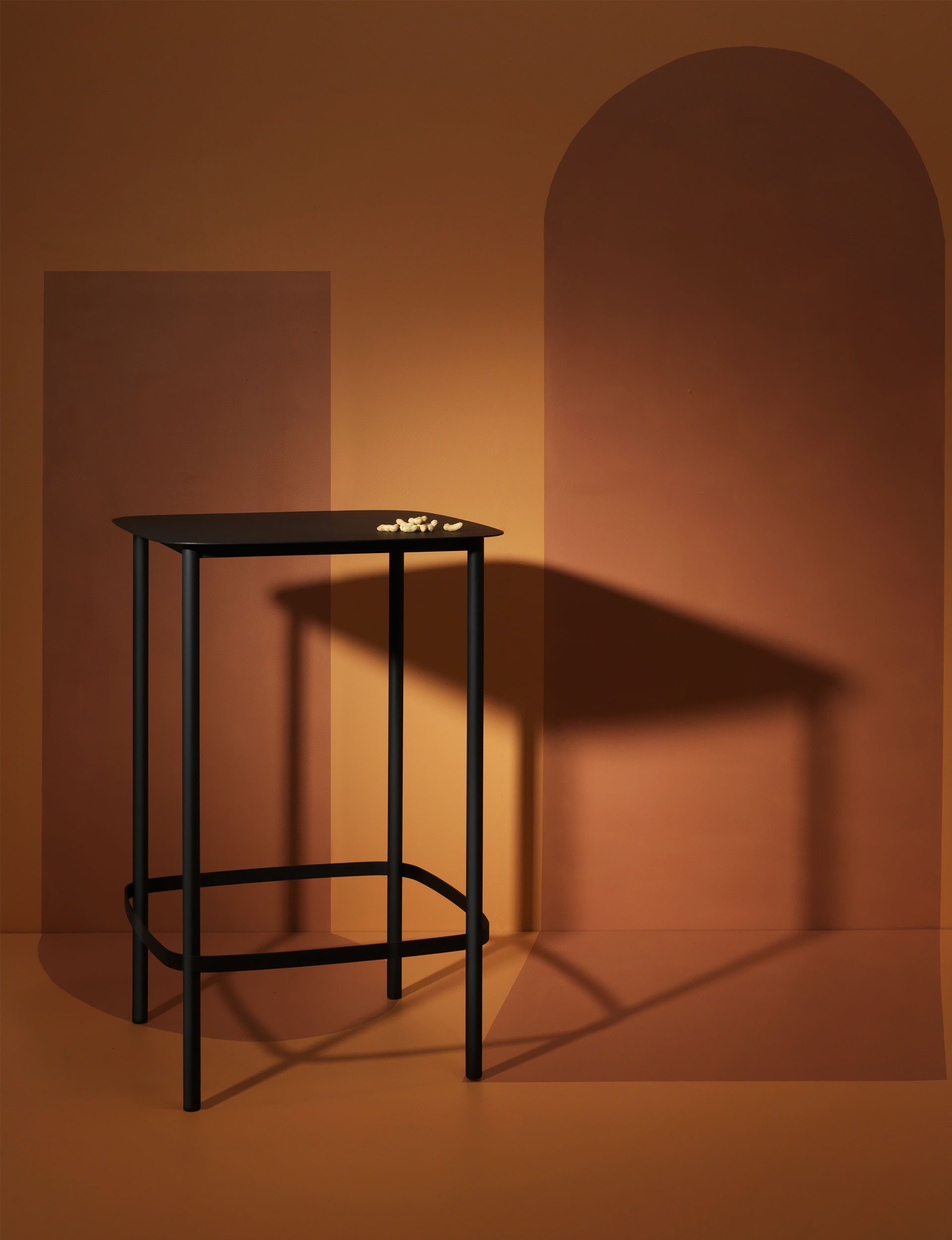
David Moreland’s ‘Elevation’ family of tables first came into being in 2013, comprising coffee and side tables. Moreland’s objective with the bar leaner – a natural extension of the range – was to create a table that worked well with or without a bar stool. “I began sketching possible footrest details. I tried dozens of versions before settling on one that replicated the elegant rounded form of the steel top into the footrest,” he says.
The product’s hard-wearing materials have a lightness, particularly at the junctures where the rest connects with the leaner’s legs. “It’s a detail I found really interesting with a material that’s welded junctions are often quite heavy,” says Moreland.
$1077 | Davidmorelanddesign.com
5. ‘iO2’
by Mat Macmillan for Maker Design Studio
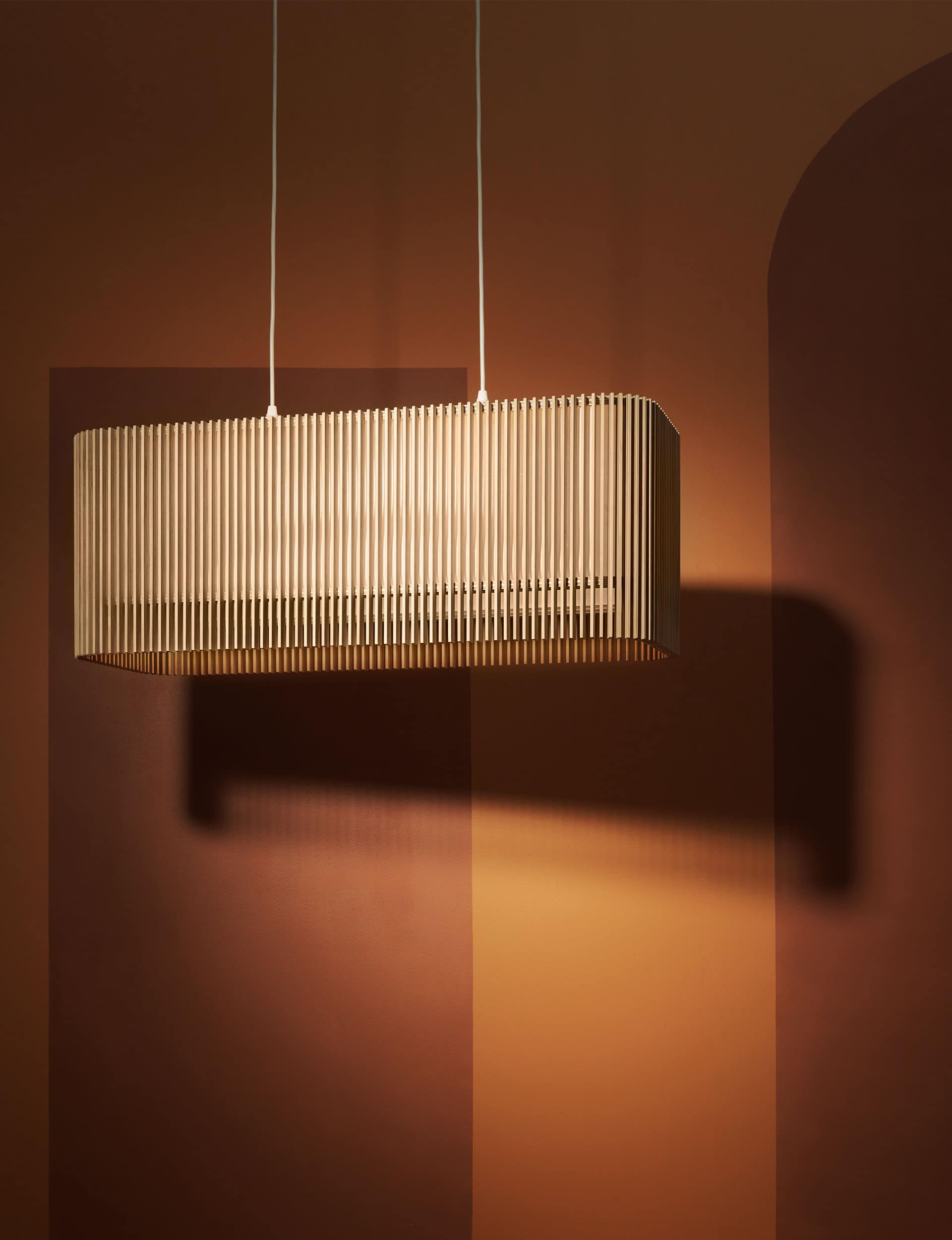
Designer Mat Macmillan has evolved his ‘iO’ lighting range of 2013 with the ‘iO2’. The new addition applies ‘radius’ corners, while retaining reference to the design’s origins and its twin themes of light and beauty.
The flat face and curved corners of the ‘iO2’ vary the light array as it’s experienced from different angles through the wooden fins. Macmillan says it was a challenge to conceive a cost-effective solution to the corner components, which are relatively expensive to produce. The result is interlocking puzzle-like pieces that allow the range’s six standard sizes almost limitless variations and configurations.
With its seemingly delicate suspension, the ‘iO2’ shines singularly from above. Macmillan, who is trained in carpentry, joinery and shop fitting, makes the range in a rural workshop near Tauranga, using premium
New Zealand plywood from South Island forests.
‘iO2’ range starts from $569; the ‘iO2 Rectangle’ (above) is $1114. | Makerdesignstudio.co.nz
6. ‘Turn’ light
by Rebecca Dowie for Douglas & Bec
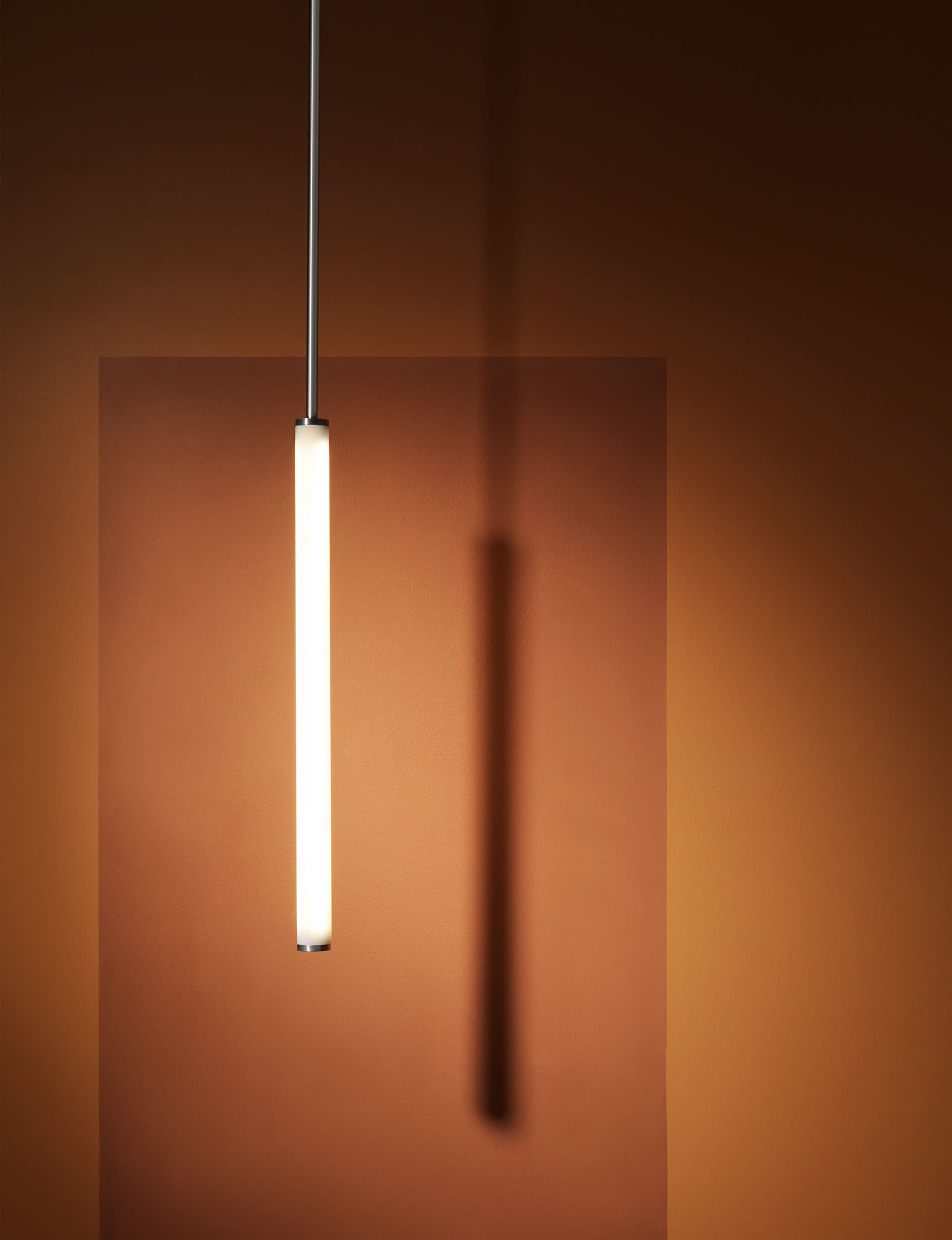
Inspiration for the ‘Turn’ pendant and wall lights originates from Douglas & Bec’s ‘Arch’ collection. ‘Turn’ strips out the
glass tube at the centre of the ‘Arch’ lights, bringing it to the fore and celebrating its simplicity as a hand-assembled double-ended tube.
Comprising an LED light source, glass and various metals, the tubular form serves both functional and – with a dimming option – ambient purposes.
“The lights adapt seamlessly to an array of spaces, making them our most flexible offering yet,” says Rebecca Dowie.
Components are CNC machined to a precise finish, before being assembled by hand.
From $1360 | Douglasandbec.com
7. ‘Pivot’ table
by Tim Webber for Tim Webber Design
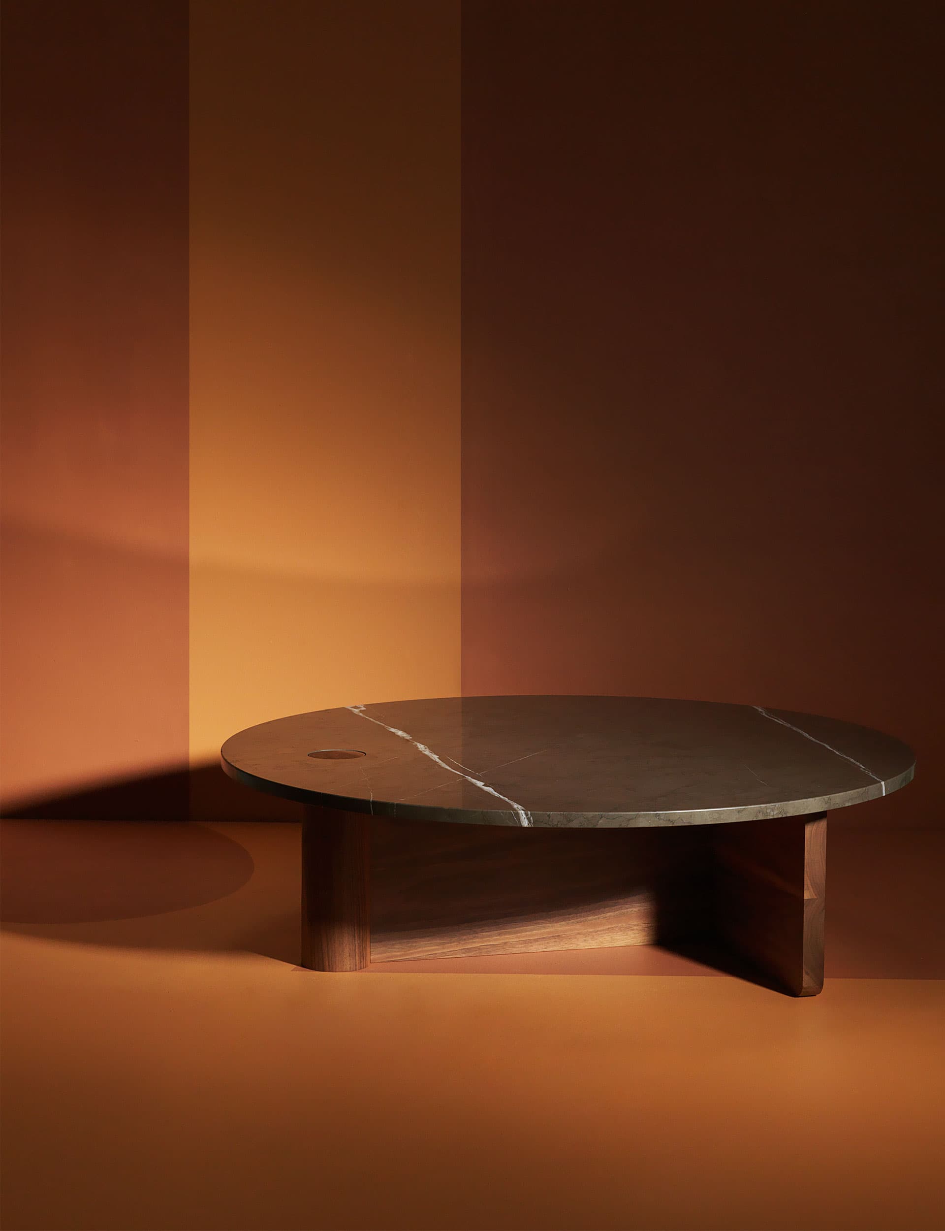
Tim Webber designed the ‘Pivot’ table as a statement centrepiece, working with the bold, solid shapes of Piet Mondrian artworks as his initial inspiration. “Like Mondrian, who radically simplified the elements of his paintings, the concept began with a goal of using minimal components that work together to create a striking piece,” says Webber.
From there, the design evolved from a 100mm-diameter hand-turned, cylindrical walnut table-top support, like a giant dowel. Webber worked through various iterations of the dowel’s accompanying form – ranging from a solid timber triangle to large steel tubes – before striking on a simplified solution: the T structure. The ‘T’ meets a flattened side of the dowel to provide the remaining support and stability for the 20mm polished limestone table top.
With Webber expanding into export markets, practicality was a driving design force. “We are considering how items can be flat packed without affecting how beautifully they’re made,” he says. “The ‘T’ features a halved joint to allow the table to be flat packed into a crate one third of its assembled size.”
Iterations include a 1000mm-diameter circle top and a 1300x800mm rectangle, also available in oak or Carrara marble.
From $4662 | Timwebberdesign.com
8. ‘Another Round Table’
by Christopher Beer
Architect Christopher Beer designed ‘Another Round Table’ for Drawings, a cafe and gallery that adjoins the winning Home of the Year 2017, which he designed for a family in Cambridge.
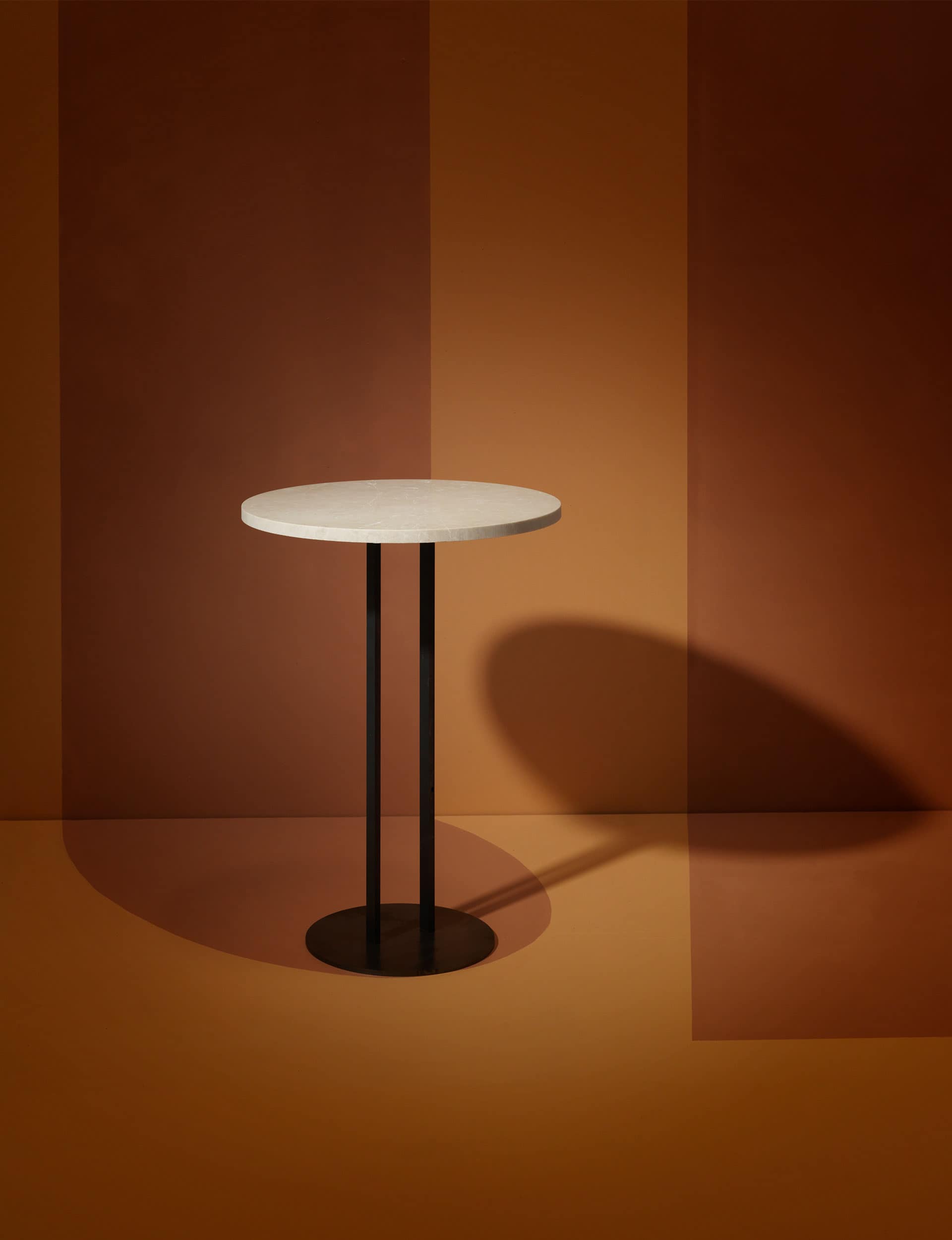
Beer describes the two-person cafe-style pedestal table as “an exercise in reduction, a reworking and refinement of a common object conveyed in four pen strokes”.
Visual balance is provided in the circular top and base, which are anchored by two slender legs. The small, 4mm mild-steel base affords an easy interface with chair legs and the table’s users. Beer let function drive surface finishes – the 500x20mm Carina marble top is honed and polished, whereas its water-jet-cut sides are rough and unpolished.
‘Another Round Table’ was initially produced as four units – Beer is now looking into manufacturing a low-volume run.
$725 | Christopherbeerarchitect.com
WINNER
9. ‘Circus’ floor lamp
by Resident Studio
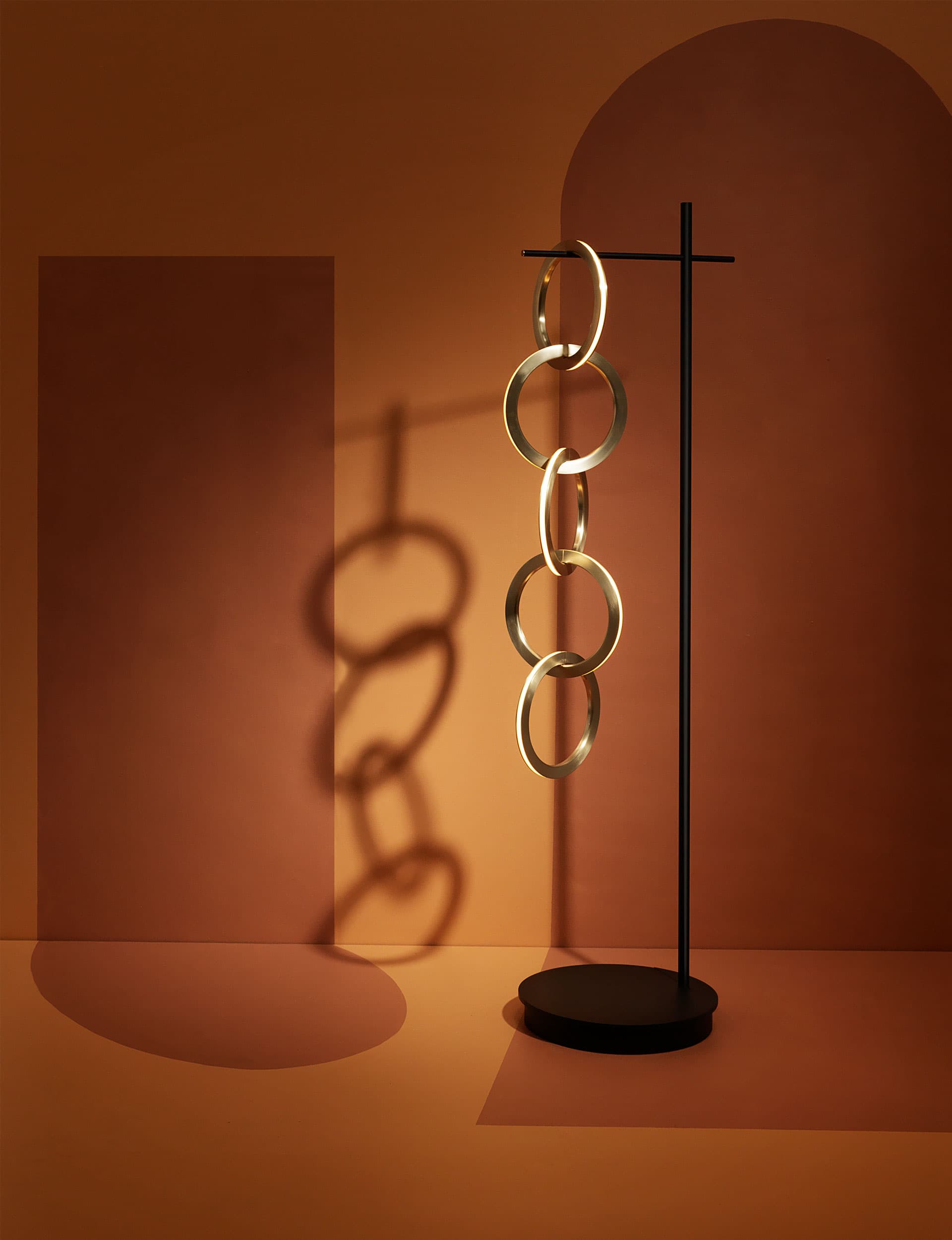
Aptly named, the ‘Circus’ light is a deft arrangement, a delicate balance of light and technology, which makes you contemplate how it was achieved. Handmade in New Zealand, the floor lamp is an evolution of the ‘Circus’ pendant, a finalist in last year’s awards. The interlinked rings are inspired by jewellery stands that traditionally adorn a woman’s makeup table.
“We wanted to celebrate the beauty and simplicity of the circle,” says Scott Bridgens of Resident. “We especially like the form because it’s feminine and non-contradictory to nature.”
The brushed brass rings hang from a matte-black base and stand, which has a small footprint. Each ring emits an ambient LED light and power is transferred from one strip to another. An integrated brass button at one horizontal end acts as the on-off switch and dimmer when touched. Bridgens: “It gives the user a unique physical interaction with the light.”
Words by: Jo Bates. Photography by: Toaki Okano. Styling by: Sara Black

THE JUDGE
Mark Elmore
General manager of design, Fisher & Paykel
What do you look for in a winning design?
Enduring, beautiful design that celebrates materials and is a delight to live with.
What did you like about the ‘Circus’ floor lamp?
The materiality, human scale and contrasting relationship between the base and the lamp. But, mostly, the magic of how it works, including the lighting control.
What else came close?
There are some great finalists this year. I really enjoyed the ‘Aspen’ chair by David Moreland for Città Design and also the ‘Pivot’ table by Tim Webber.
Why is it important to support this award?
New Zealand has a thriving design-led furniture industry – it’s world-leading and we should celebrate this.
You’ve spent a lot of time overseas this year – how does New Zealand design stand out?
There’s a growing confidence in New Zealand design that is reflected in our work – especially the way we interpret our local environment and context to produce a pragmatic design that’s also beautiful. Globally, there’s a growing appetite for this fresh thinking.
$6950 | Simonjamesdesign.com
[related_articles post1=”84963″ post2=”76104″]
