First, a confession. When I first saw the image of Crosson Clarke Carnachan’s ‘moveable’ beach house being loaded onto a Freight Link ferry, I totally bought it. The structure is certainly small enough to qualify as cargo, and the scale of it relative to the vessel is convincing. Maybe this really is how it came to rest on the eastern side of the Coromandel Peninsula at Whangapoua – barged right up to the beach and hauled onto its new site.
It’s only when Ken Crosson points out the disclaimer attached to the picture that I realise I’ve been gently duped. Blame Photoshop and the architect’s sense of whimsy. But in my defence, if ever a house looked as though it could be shipped across the Hauraki Gulf on a ferry, it’s this one.
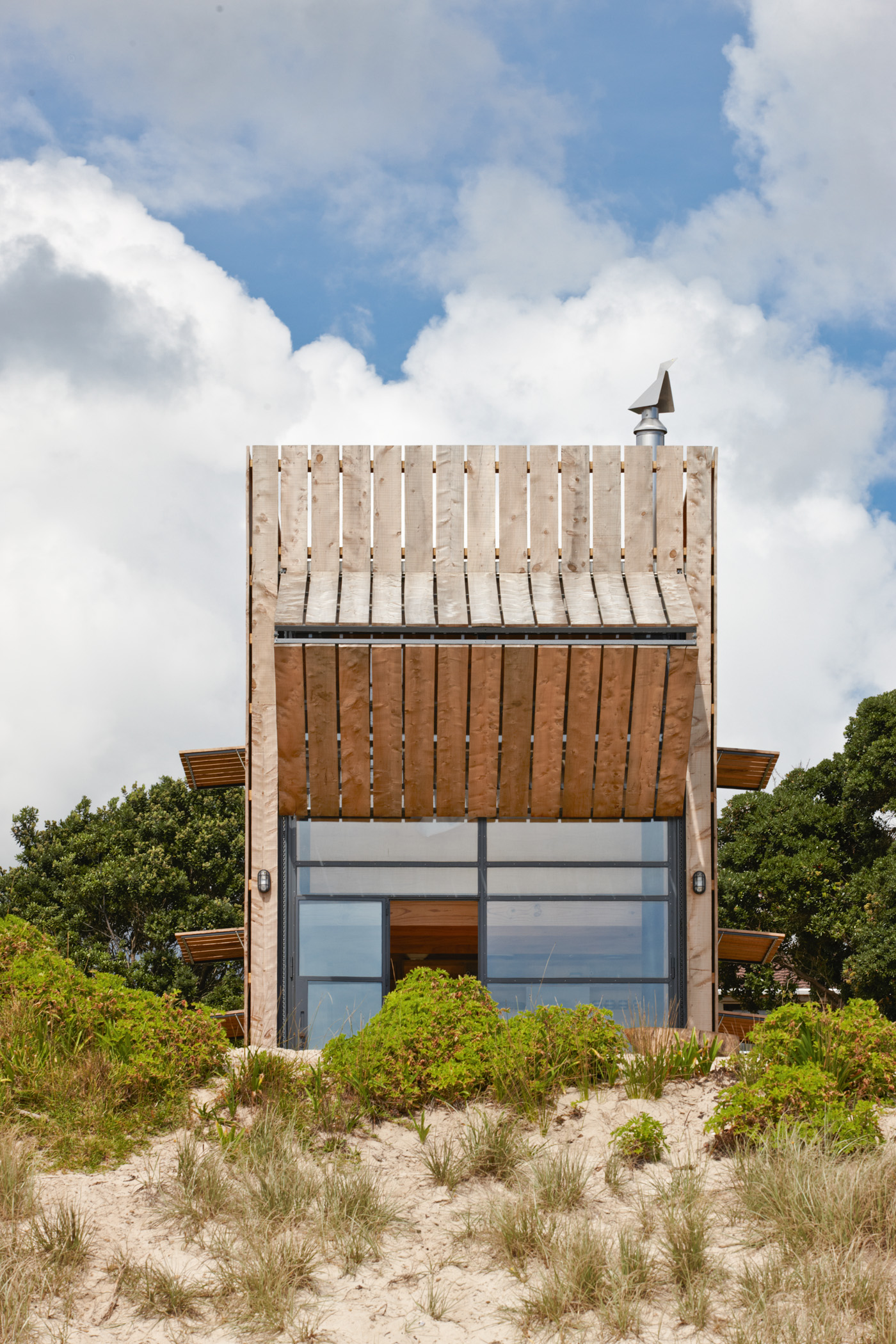
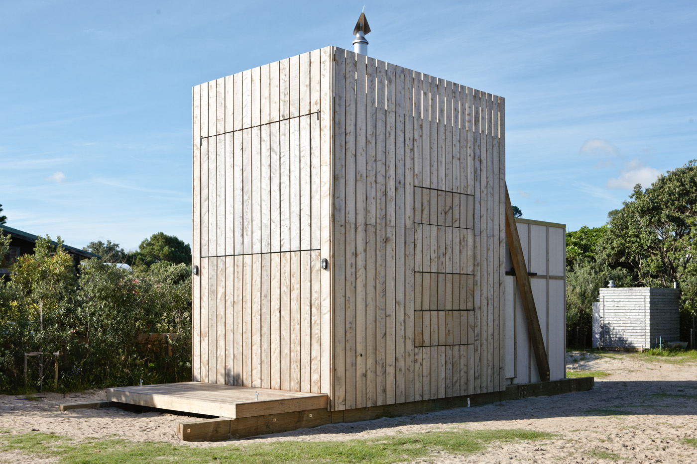
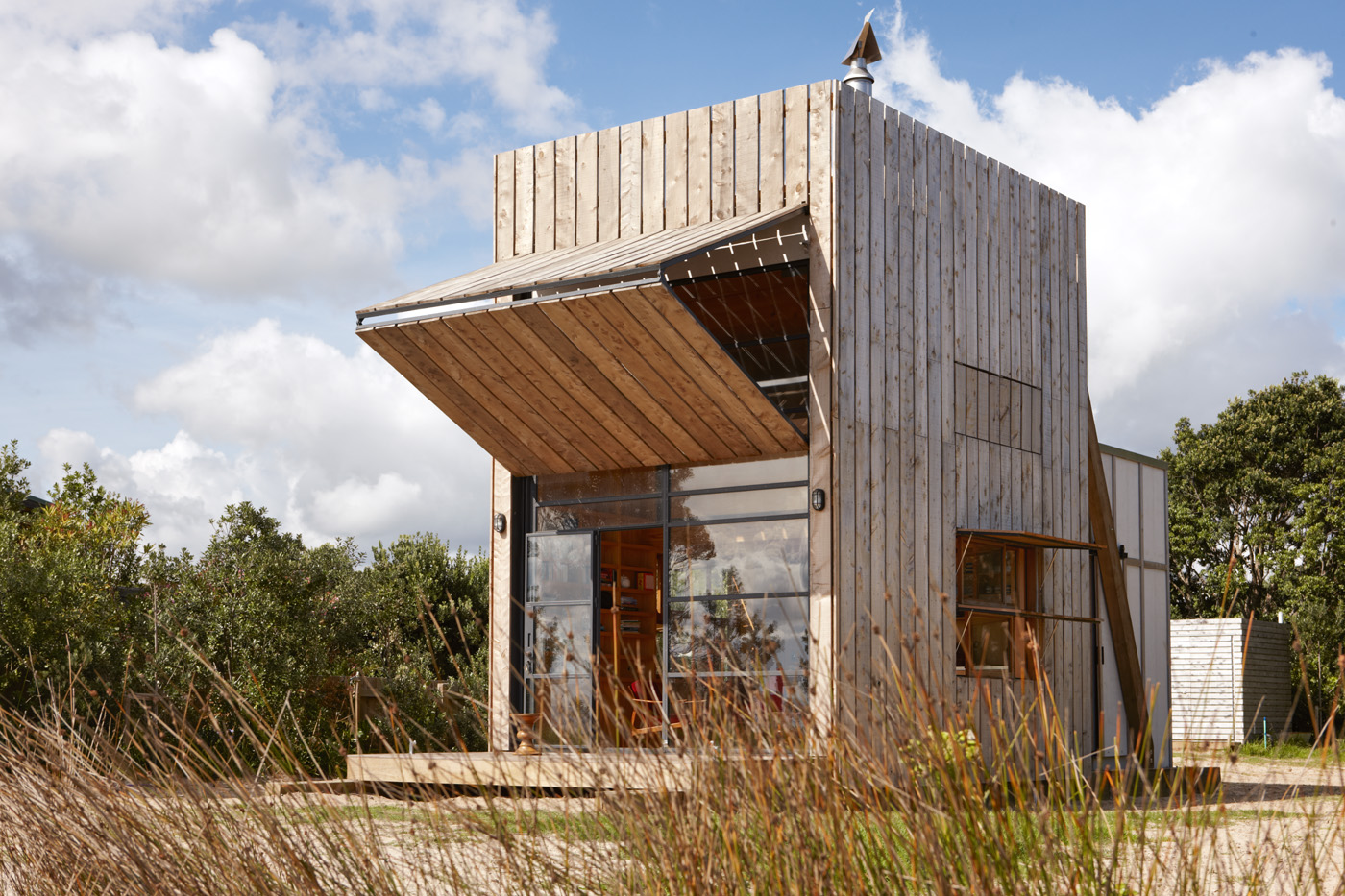
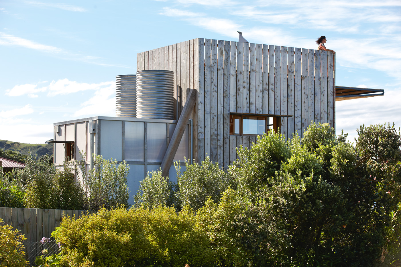
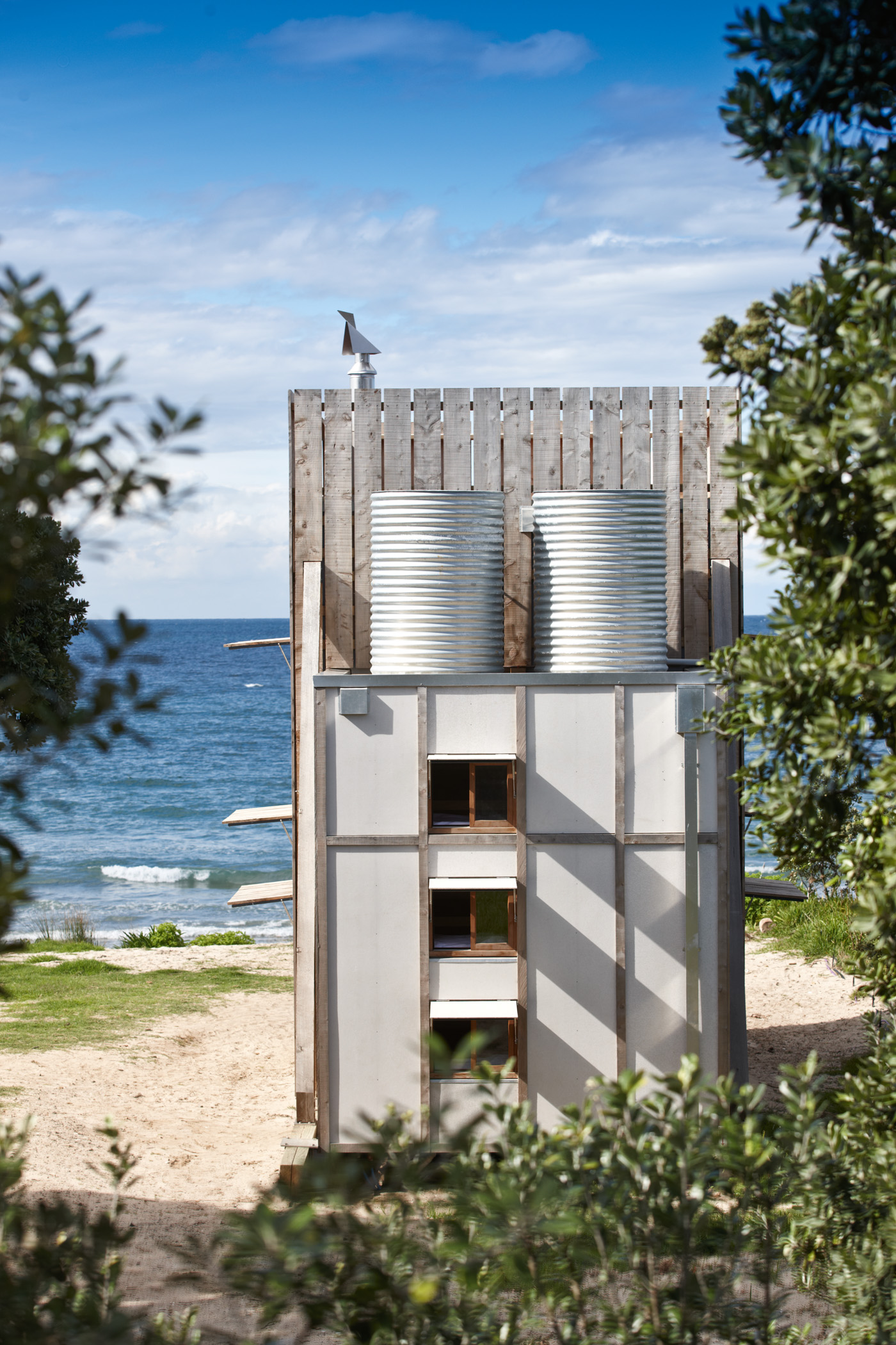
Designed to close up against the elements (and other unwelcome intrusions) like a large and somewhat elegant packing crate, the building measures a mere 40 square metres and rests on two thick wooden ‘sleds’ that allow it to be shifted – literally dragged – around its sandy beach-front section in one relatively easy operation. Once uncoupled from power and wastewater, and untied from the concrete pads beneath the sleds, it lends another meaning entirely to moving house.
It’s the latest evolution of a style Ken has developed through various projects along this coast, including one further along the Whangapoua beachfront, and his own award-winning weekender at nearby Otama. He was the logical choice for an adventurous Auckland-based couple who wanted something more – or perhaps less – than another beachside McMansion.
The reason for its innovative portability is the location within an erosion zone on the Coromandel coast. Since the first baches were knocked up on this legendarily beautiful beach, the sands have been shifting around and under them. Photographs from several decades ago show the unmistakable retreat of the dune line, drifting back in seasonal ebbs and flows towards the front decks and gardens facing the beach.
“It had to be a de-mountable house,” says Ken of the council requirement that all new dwellings in the zone be future-proofed against potential further erosion. “But every house is essentially de-mountable, even if you sometimes have to do it brick by brick. So this one is actually moveable.”
There’s another reason, too, beyond the vicissitudes of nature. The house is the first of two stages of development on the site. Looking at it now, boldly announcing itself to passersby on the beach below, one can easily imagine it adapting to a secondary role as annex or bunk house of a larger home. For now, though, it is a remarkable thing in its own right; a perfectly realised solution to both the clients’ desires and the demands of its setting.
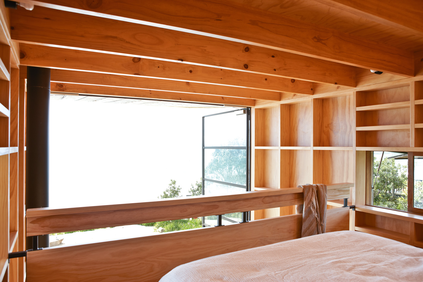
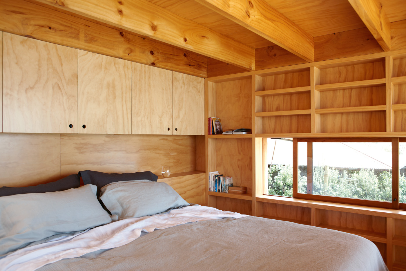
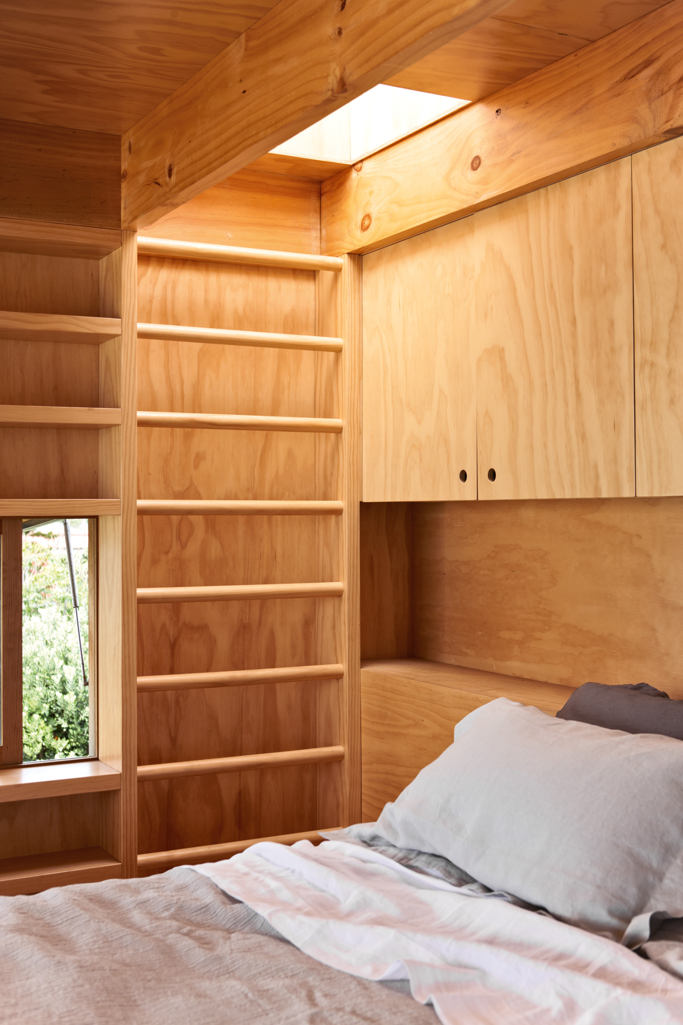
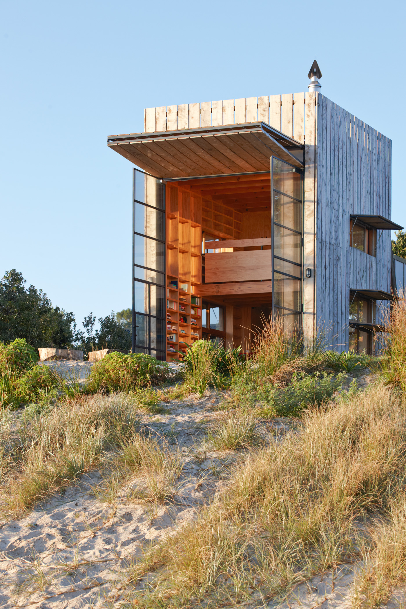
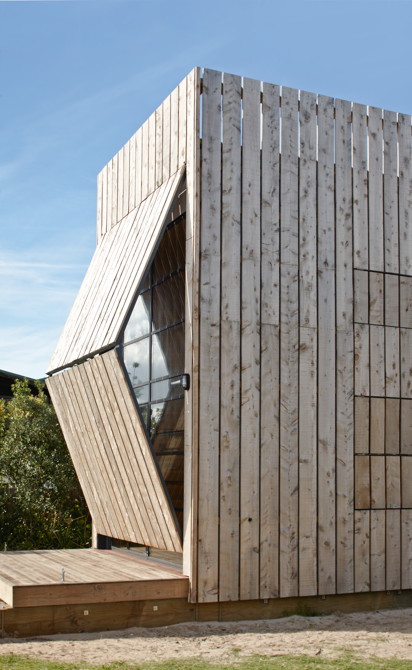
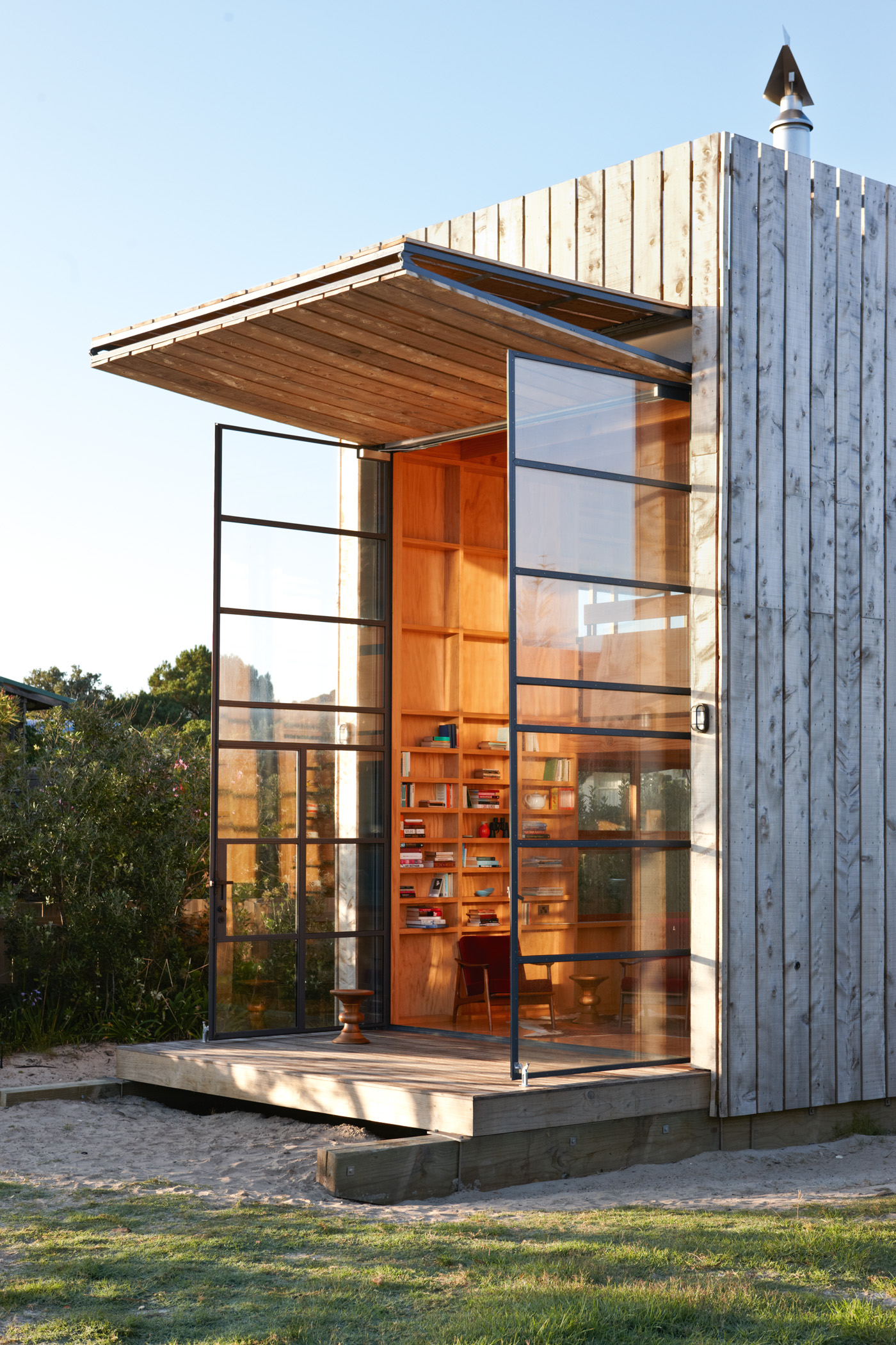
Slatted in rough-hewn macrocarpa, supported at the rear by two large and visible braces, and with its rear section clad in flat sheet, the packing crate aesthetic becomes even more evident when you open it up. On its northeast front an enormous double shutter winches skyward to form an awning, revealing two-storey high steel-framed glass doors that are the main entrance point. To one side is the kind of sliding door you might find on a shearing shed, behind which another translucent slider gives access to the house via the shower and bathroom. At which point the first-time visitor is struck by the fact that this is an unconventional building in much more than just outward appearance.
“For the clients it was all about examining what was the real essence of a bach versus a beach house,” Ken says of the intentionally enforced proximity imposed on its occupants. “They wanted something small and experiential. It’s just 40 square metres, two bedrooms, bathroom, living and kitchen. It’s tiny… so the challenge was making it as bachy as possible and not wasting any space in doing that.”
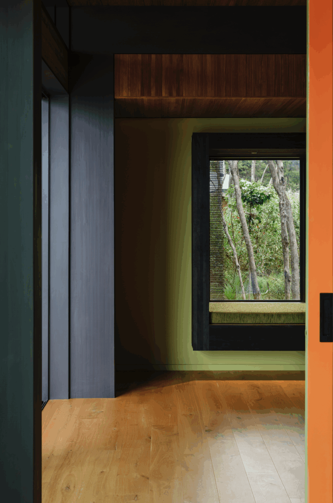
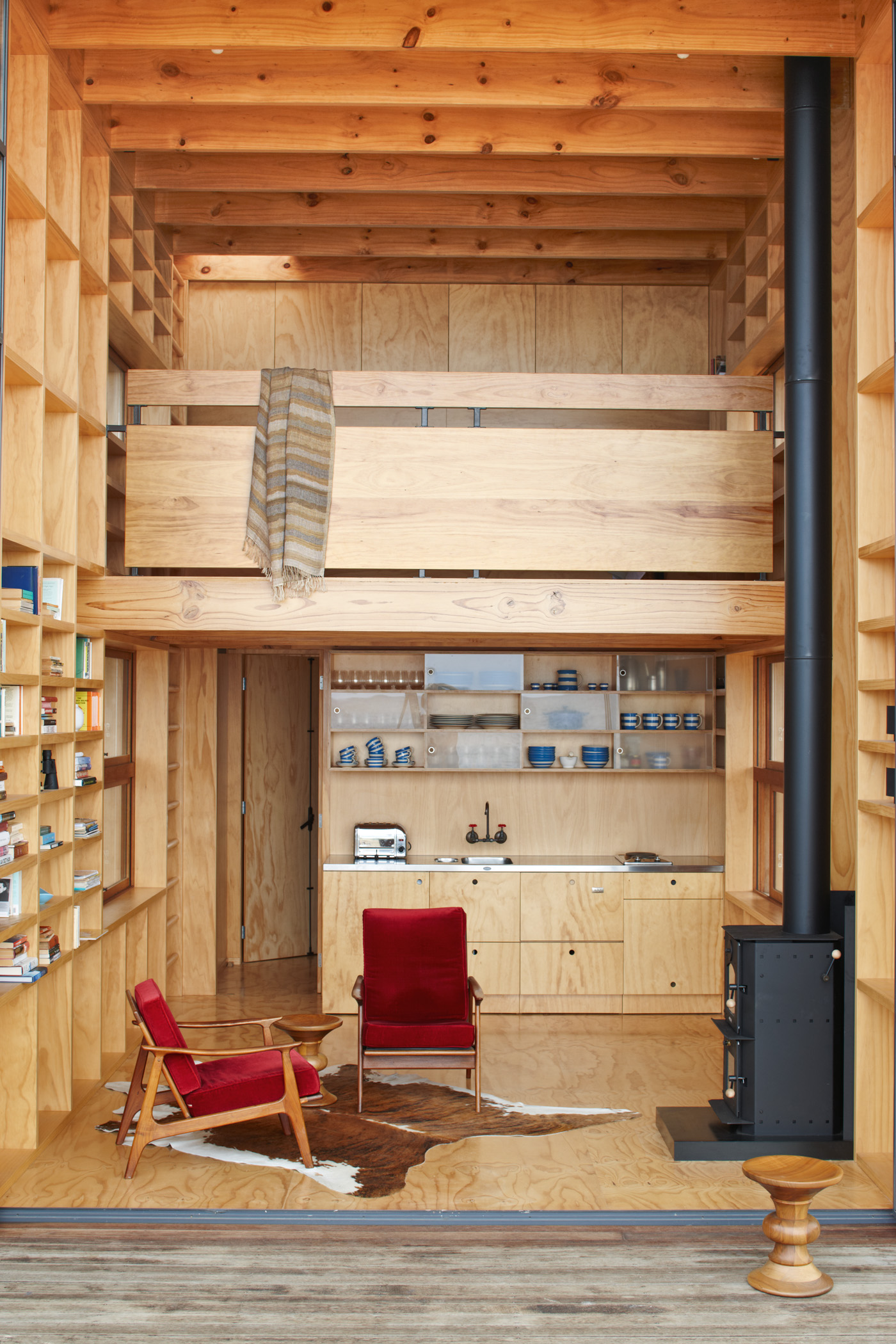
If the house resembles a kind of rustic Tardis from the outside, the analogy holds within. A compact living and kitchen area flows through to a rear bunkroom for the owners’ three young children. Each of the tiered beds is a little pod-like space unto itself, explains Ken, “with their own storage spaces, secret cubby holes, their own lights and windows.”
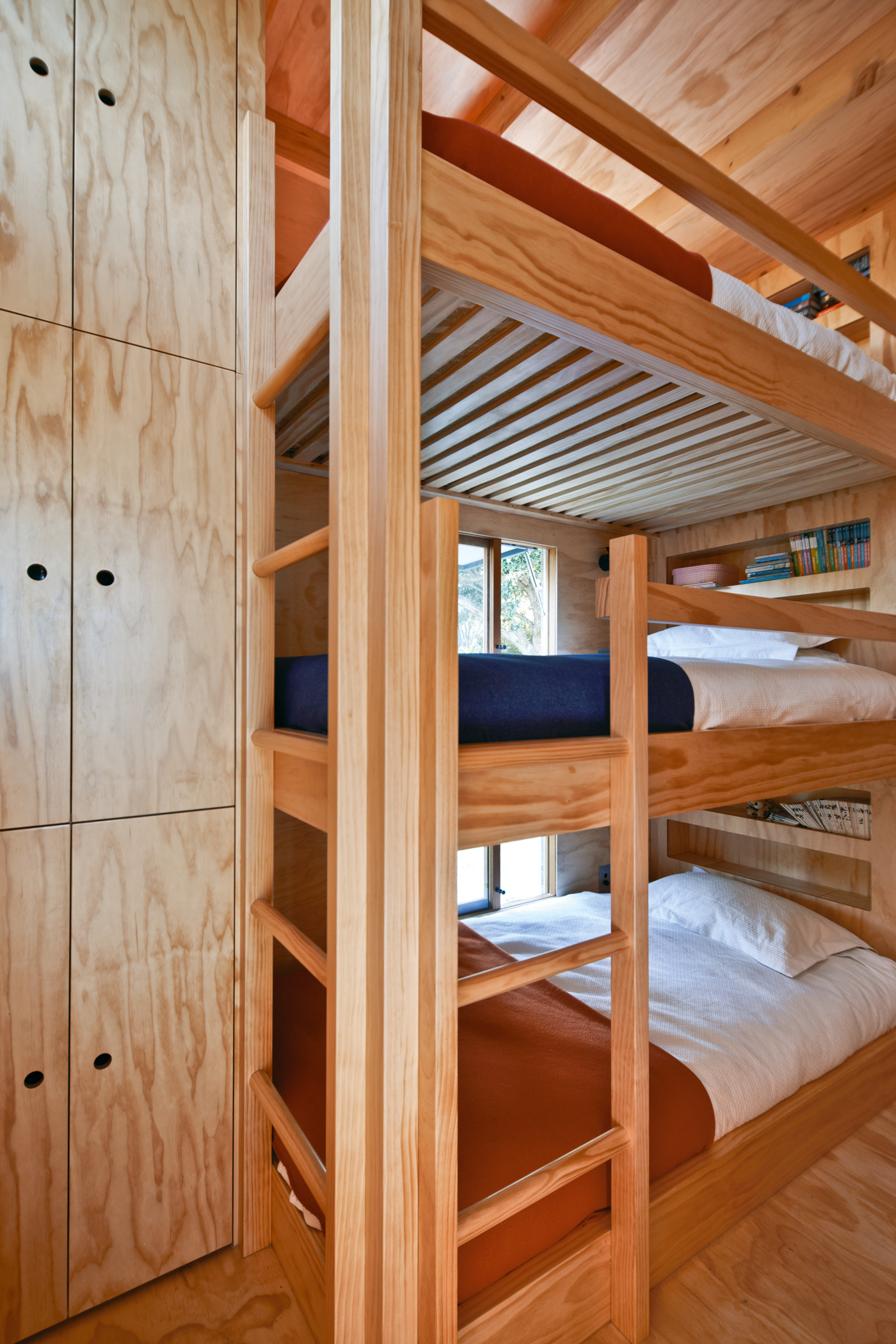
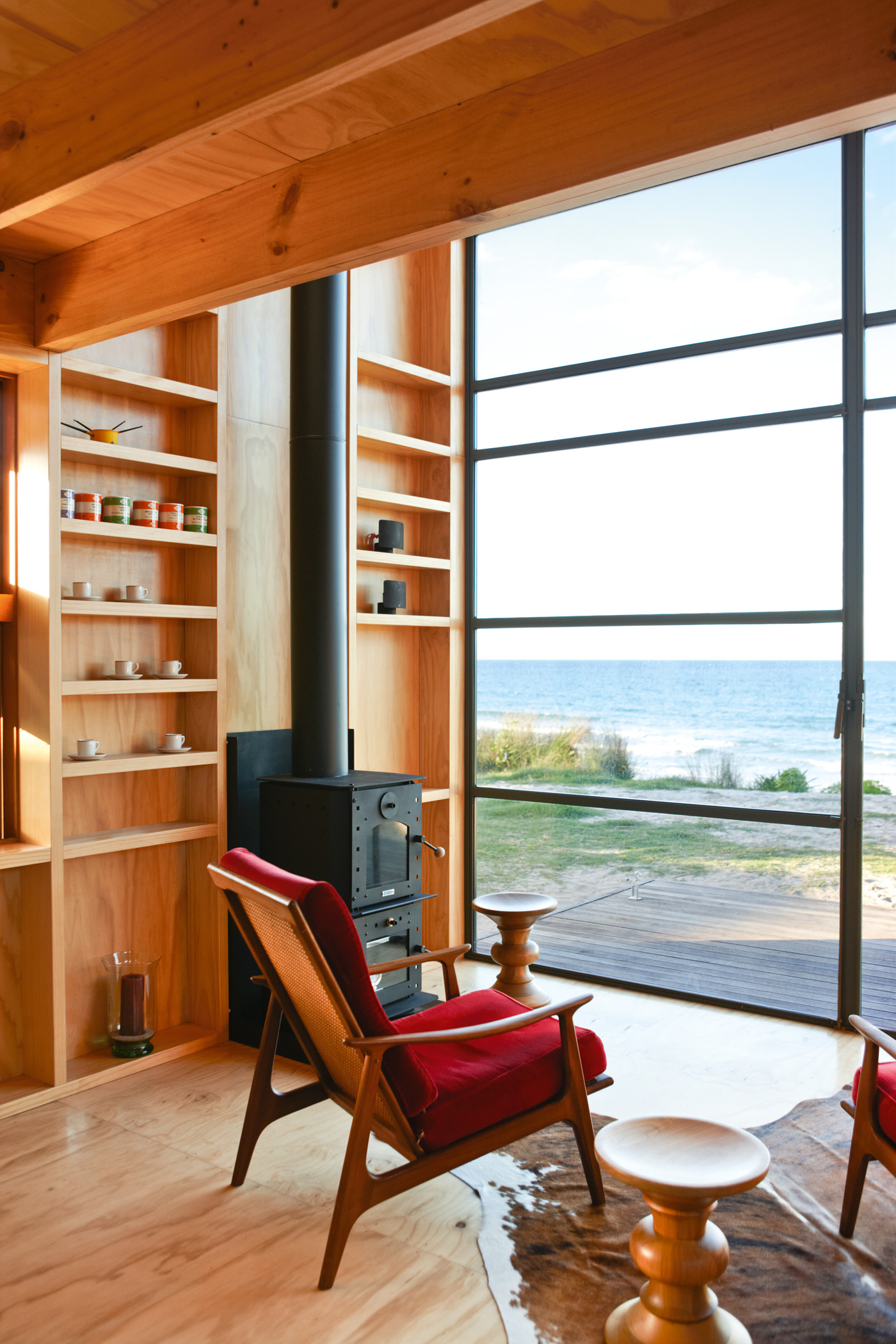
Every available space has been given over to storage, right down to a tall but extremely narrow and shallow cupboard off the kitchen. The walls themselves double as floor-to-ceiling shelf space that Ken hopes will accumulate the personal histories of the occupants.
To reach the main bedroom, you climb a wide wall-mounted ladder through a closeable hatch into a mezzanine that shares the same view as downstairs through the huge glass doors. Again, the attention to storage detail is remarkable. There is probably more cupboard space in this micro-home than in many larger but less well-designed houses.
Climb the ladder again and you arrive on a roof terrace which catches rainwater for the gravity tanks behind, and affords great views of the beach and the hinterland. This is also where the sun sets, so it’s the place to be with a G and T. Just the one, mind, because you have to navigate that ladder to get back downstairs.
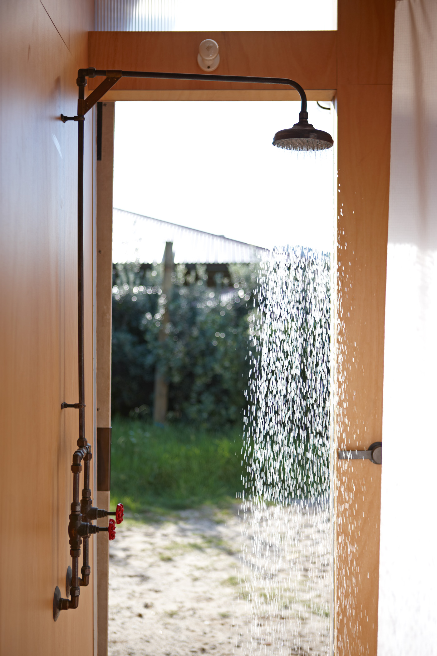
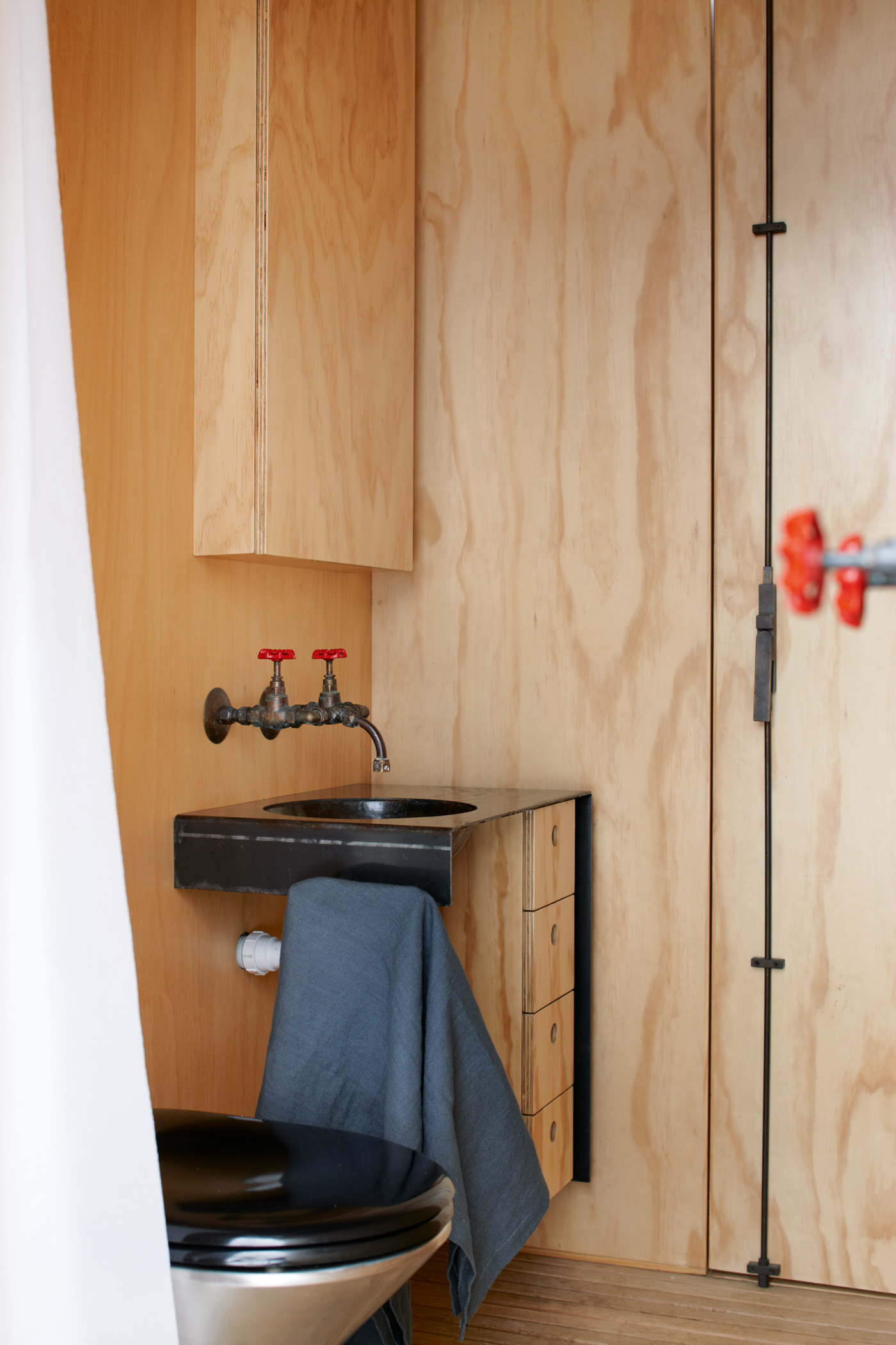
The tap and shower fittings are uniformly light industrial, an intentional reference by Ken and his clients to the campground kitchen block. “You know, where you fill your bucket. It’s that kind of idea.” Indeed, the entire structure plays with the idea of that most egalitarian of Kiwi recreations. “It’s kind of like a tent,” Ken says, “It’s dramatic and vertical. The tent flap is this big door that opens up – a big gesture that embraces the view.”
The trick, of course, is to achieve those reference points without a hint of self-conscious irony or twee homage. That Ken has done it is, he says, a tribute to his “savvy” clients. “They didn’t want it to be ostentatious or showy. They and I wanted it to be something that is appropriate for its setting. It is kind of a beach artifact.” –Finlay Macdonald
