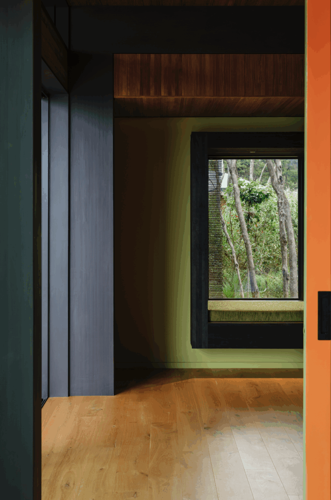
This Waiheke house may look like a cold, metal box but inside it’s offset by a warm, wooden interior that garners inspiration from traditional villas
A warm, thrifty and inventive Waiheke Island home
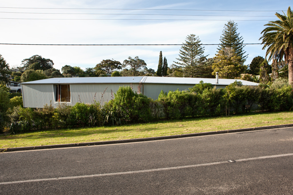
The Beniston family home on Waiheke Island has no obvious street number. I’d been told to simply ask the taxi driver to take me to the “long metal house” at the bottom of Ostend Road. On approach, there’s no mistaking it.
From the street you are confronted by a long slab of corrugated iron that, if not for a single window and the protruding slatted detail, would look at home on a farm or a factory yard (“Not my cup of tea,” the driver told me before checking that I was not a friend or relative of the owners).
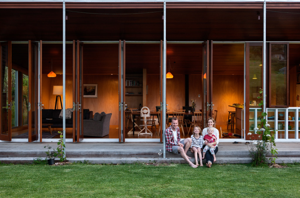
On arrival, there is no welcoming entrance. A small break in a row of pre-adolescent trees leads to a discreet path and the front of the house. Facing north, away from the street and towards the sun, the iron turns to wood. Cold becomes warm. The shed becomes a home.
Richard Beniston moved to Waiheke Island from his native England with his New Zealand wife nine years ago and the two have lived there since, both commuting five days a week to the city. With their two young children, Nina and Sid, in an increasingly crowded Palm Beach house, the couple searched the island for something bigger.
When they couldn’t find anything suitable, they found a plot of land with enough space for a family and a garden, thinking they would relocate a villa and modernise it to their needs. “We wanted something big enough for us as we grow as a family to being four adults living in a house,” Beniston says, “but not so big that we couldn’t live here once the children are gone.”
Architect Michael O’Sullivan of Auckland’s Bull O’Sullivan Architects convinced the couple not to relocate an old house to the land they’d purchased. “It’s a lost opportunity for someone to come from the other side of the world and live in a villa in the South Pacific,” O’Sullivan says, “so I suggested they could take the key elements of the materiality of a villa and treat it in a more site-specific way.”
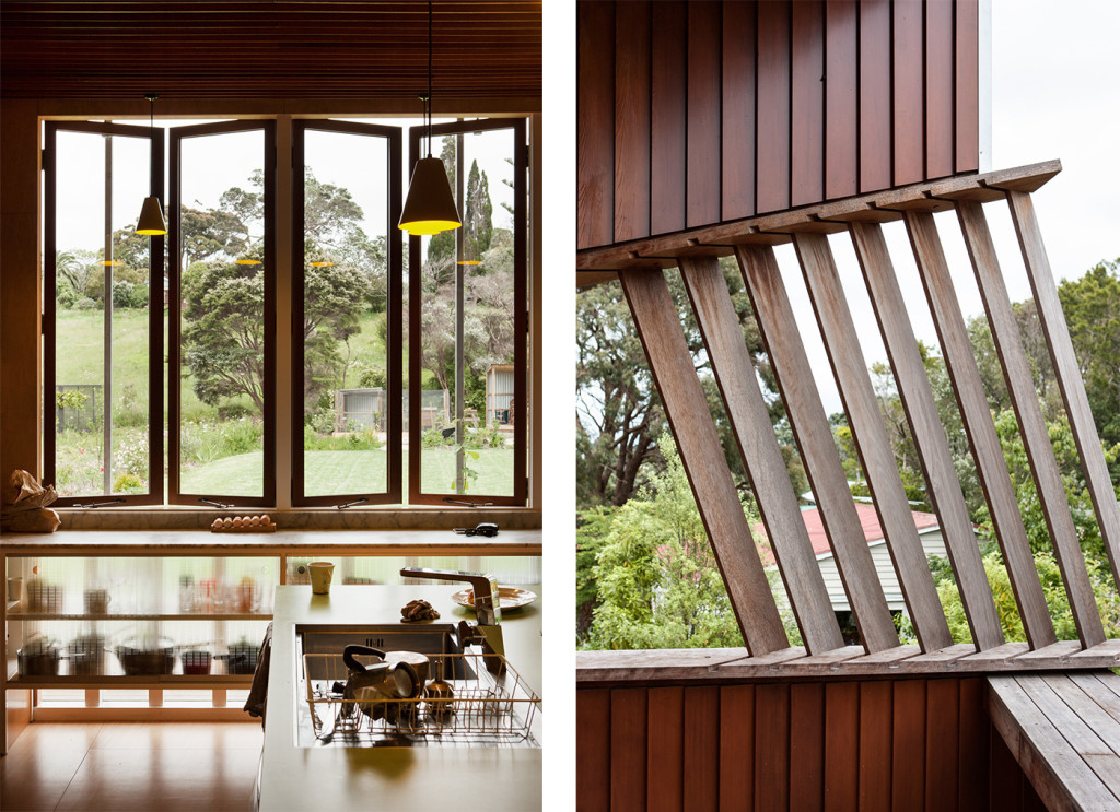
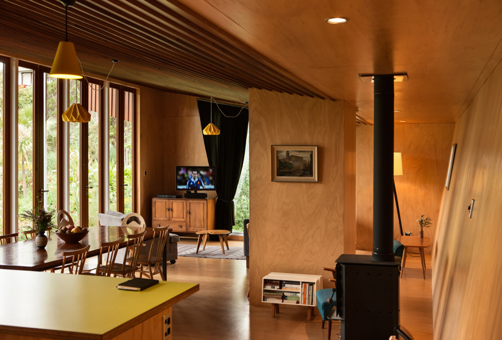
Those key elements are evident throughout the house. The weatherboard cladding on the front exterior is reflected in the soffit and extended to the ceiling, creating a distinctive pattern which is both a reference to the traditional villa and to the ceilings, which are an O’Sullivan design trademark.
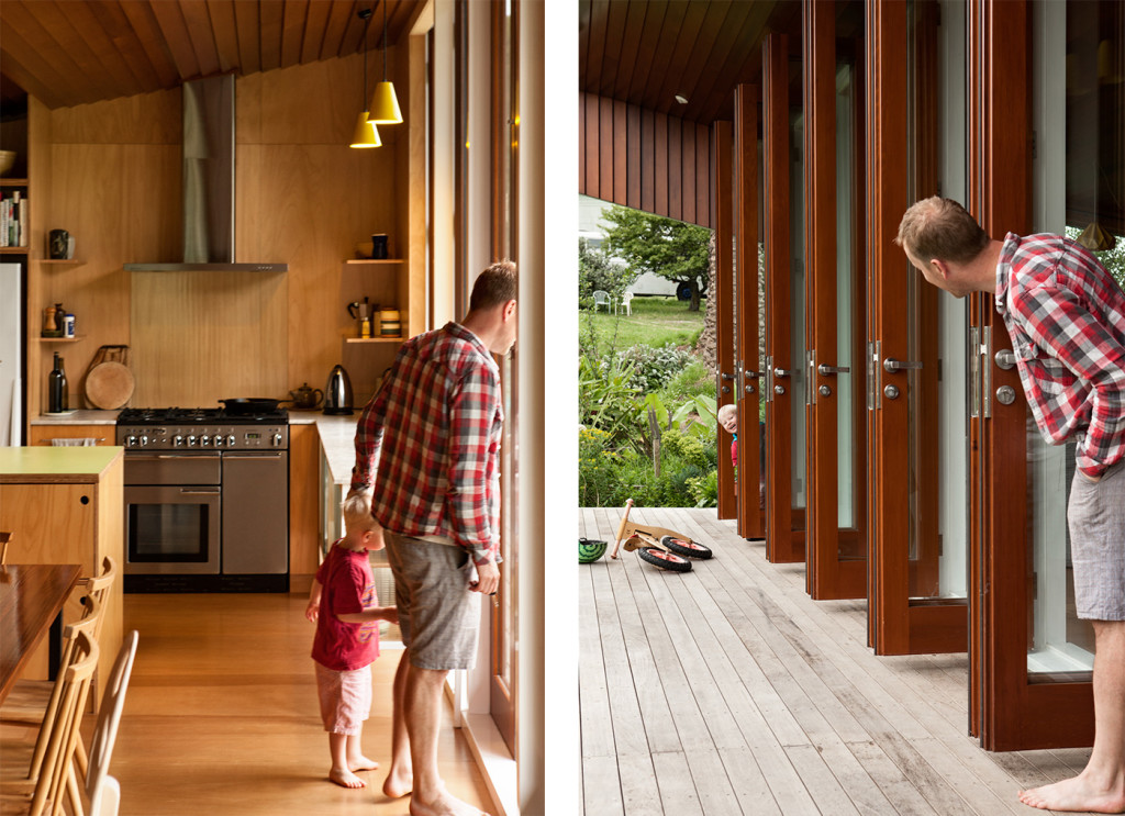
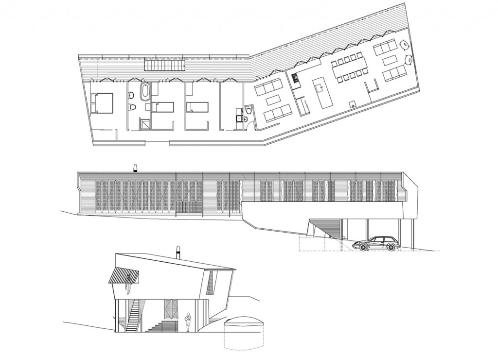
But there are major differences to a villa, too. The entrance to the house is not a single front door leading to a central hallway, but a row of six sets of stained cedar French doors leading to an open-plan living, dining and kitchen area.
Moving west, the French doors meet the glass exterior of the kitchen – under tall windows, a marble and glass cabinet displays plates and bowls to the outside world and, from the inside, becomes a prism in the afternoon sun.
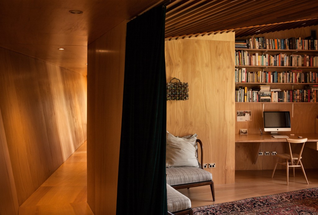
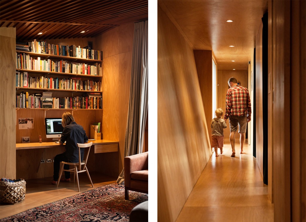
A string of six rooms (study, laundry, bathroom, two children’s bedrooms, master bedroom) sit side by side, linked by a 20-metre hallway featuring the home’s only street-facing window. The street-side wall inclines to create space in the narrow hall, which bends in the middle so when standing at one end you cannot see the other.
Measuring an economical 170 square metres, the home opens to a 40-square-metre deck, with every room facing the sprawling, almost rural garden – a former tennis court of vegetables, fruit trees, flowers, a chicken coop, and a simple shed, which mirrors the home’s corrugated exteriors. The garden meets a low hill where the trees will some day be tall enough to hide future neighbours.
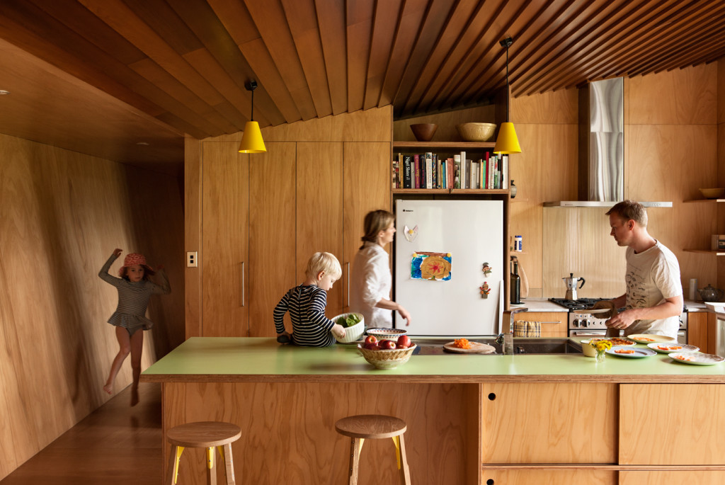
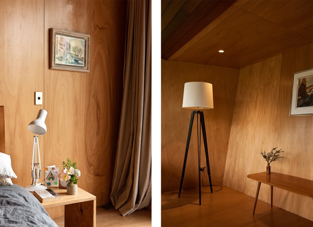
Inside, stark elements are softened by the use of natural materials and comfortable furnishings. The Fijian Kauri walls, floors and cabinetry glow in the ample sun. The interior has a considered aesthetic without being oppressively architectural, angular without being sharp – children live here without being impaled on its edges.
Another trademark O’Sullivan touch: the house has few internal doors, opting instead for hanging velvet curtains, something that adds to its ease and homeliness (this is an approach O’Sullivan deployed successfully in his own warm, charming family home in the Auckland suburb of Mangere Bridge, a finalist in our 2009 Home of the Year award).
In designing the home, O’Sullivan squeezed the most out of a strict budget, advocating an austere approach to secondary aspects in order to elevate the spaces where the family would live. “The cladding to the street can be as utilitarian as corrugated iron,” O’Sullivan says. “Going for cheap corrugated iron at the back means you can put something sensuous, warm and alluring in the way of cedar joinery and beautiful materials in the interior.”
On paper, the house seems full of detail and design but, in person, you are struck by its deceptive simplicity, its functionality as a family home. With children around your feet and their drawings taped to the walls, you feel the lightness and comfort of life within.
“Michael’s approach was ‘family life is family life’ and it’s cool to crunch everyone in together and share space,” says Beniston. “That’s what family life is. You don’t need all this extra stuff. It’s about whittling down to what you really need to live.”
Q&A with Michael O’Sullivan
Why did you use curtains instead of internal doors in certain rooms?
Michael O’Sullivan, Bull O’Sullivan Architects Doors just take up too much space. And they make a horrible noise when they close or somebody shuts them in anger. It’s just dreadful for the whole essence of the home. And if it’s a family home, then nobody needs to hear that sort of stuff. Curtains are a much more graceful thing to move through spaces with.
Is it difficult to convince clients to give up doors?
Michael O’Sullivan It wouldn’t cross most people’s minds to do without them. Yeah, man. People think you’re nuts. People think it’s a complete breach of their public and private realms.
How did you decide on a weatherboard ceiling?
Michael O’Sullivan It was what they could afford for cladding. The effort to get the door full height without a lintel and using the mullions as a load-bearing capacity meant that there was a seamless transition between the soffit and the ceiling and I suggested that they use the same wall cladding on the soffit and to pull the soffit through into the actual space. So we didn’t start with the ceiling and move out, it started from the cladding and retracted.
Are these design moves of yours references to the traditional New Zealand villa?
Michael O’Sullivan Damn right. It’s the inside out of the villa. It’s the scrim. The wind doesn’t whistle through it.
Words by: Henry Oliver. Photography by: Simon Devitt.
[related_articles post1=”61416″ post2=”54346″]
