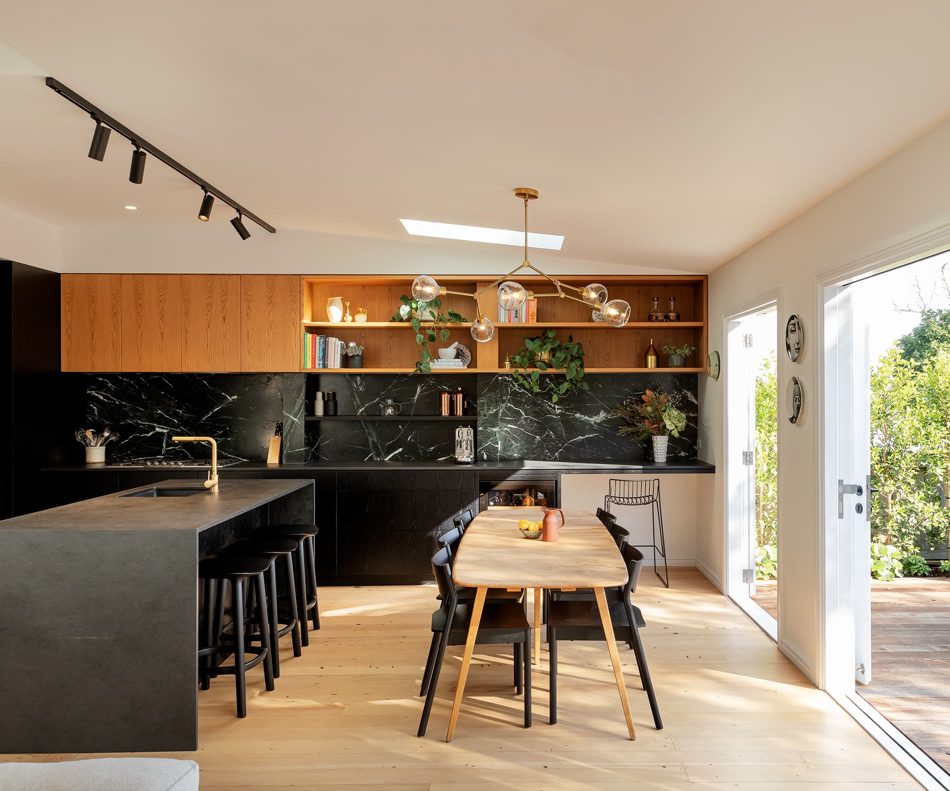
As part of a larger renovation, this villa’s kitchen got a dramatic new look, green marble splashback included.
Project
Villa renovation
Architect
AJ Sutton with designer and client Natalie Moinfar
Location
Ponsonby, Auckland
Brief
Update the kitchen as part of renovation for a family
Briefly describe the project.
AJ Sutton—We initially designed an addition at the rear of the villa, but decided during this process to scale back and concentrate on a renovation of the existing house. The focus of this new brief was the kitchen.
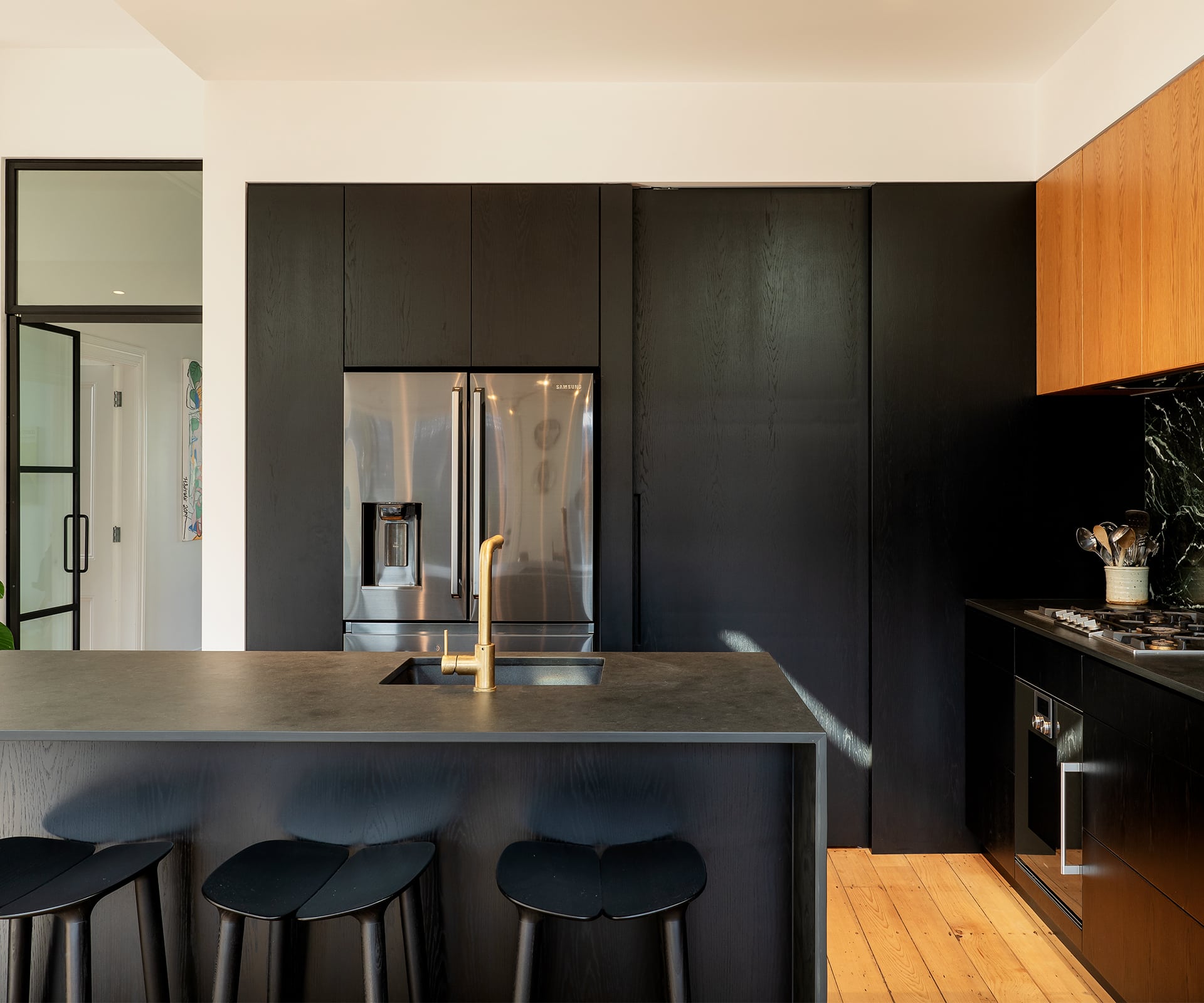
We decided early on to set the height of the joinery with a bulkhead at the height of the rear villa wall – this establishes a subtle connection to the existing space. Once the kitchen layout was designed, we worked closely with Natalie on finishes and fine-tuning the details.
Who is the kitchen designed for and what were their requirements?
The kitchen is designed for a couple with young children. They both have a great eye for detail and wanted a kitchen that connected with the existing space and had a richness of materials.
You’ve used a dramatic contrast in materials – what was the thinking behind these choices?
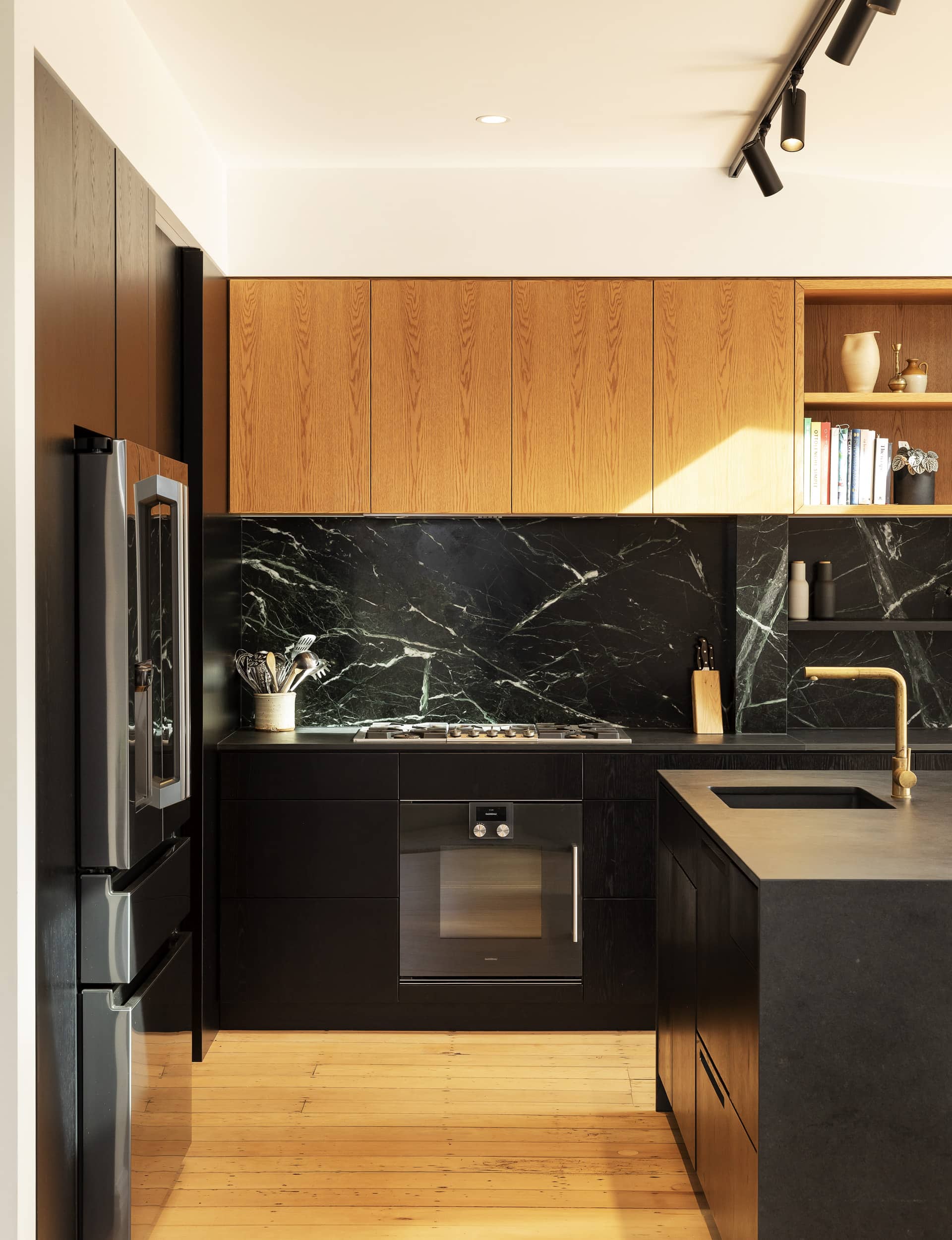
Natalie and her husband love natural stone. I suggested they visit Artedomus and they selected black slate and emerald green marble, which come together very well. They also complement the black oak veneer and contrast with the lighter oak joinery. The light oak is based on the existing dining table and Natalie worked with Form Design cabinetmakers to get the colour match right.
A long, multifunctional bench takes up one side of the kitchen.
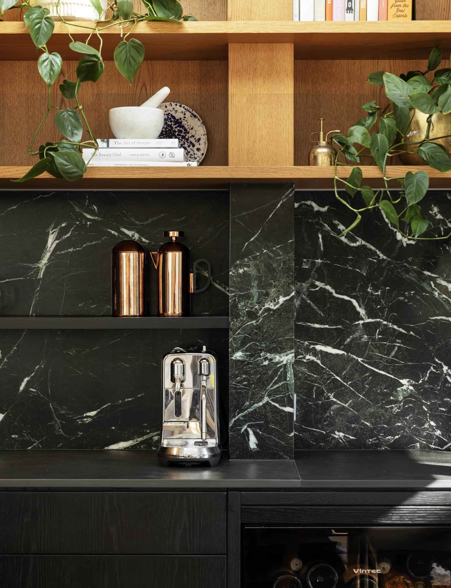
I love this aspect of the plan. We ran the bench and splashback all the way along one wall, using it both as a practical addition and as a feature. The natural stone is sandwiched between black oak below and light oak above. We created a small desk at one end with open shelving above to allow for books, plants and objects. There are closed cupboards at the other end.
Steel-framed glass doors separate the rest of the house from the kitchen. Apart from allowing light, why did you choose this design?
This was Natalie’s idea. They have young children and the doors allow the living space to be separated, but visually open to the rest of the house. The black steel sits well with both the modern kitchen and the traditional villa. Although the steel is black, there’s a lightness in the slim frame.
Appliances
Fisher & Paykel dishwasher, Samsung fridge, Gaggenau oven and cooktop, Vintec wine fridge.
Benchtop Black slate in natural finish from Artedomus. Joinery American oak veneer.
Lighting ‘Y Chandelier’ by Douglas & Bec; ‘Tuba II’ track and spotlights from Inlite.
Splashback Marble in ‘Green Emeraude’ from Artedomus. Tapware ‘Buddy’ kitchen mixer from Plumbline.
This article was first published in HOME New Zealand. Follow HOME on Instagram, Facebook and sign up to the monthly email for more great architecture.
Photography by: David Straight.
