When Dan Heyworth, director of architecture and design firm Box, first came across what was a tired, mostly original 1970s house in 2011, it wasn’t exactly what his wife, photographer Sophie Heyworth, had in mind.
Situated at the end of a long, sloping driveway on a quiet street in St Heliers, Auckland, Sophie was adamant the family wouldn’t ‘move into a ditch’. However, that quickly changed once they saw the potential. The house was designed by Mark-Brown Fairhead and Sang Architects in 1973 and is typical of Ron Sang’s style, with many similarities between this and Sang’s other houses of the period, including the much-admired Brake House in Titirangi — the red corrugated roof, clerestory windows, and floating decks.
The interior was mostly original with detailing synonymous with the 1970s. Angular skylights are cut from the flat roof and elevated to draw in the light from above, coloured glass allowing it to dance in different hues across the striking timber ceiling.
After five or so years of living in the house, Dan and Sophie decided it was time to renovate and open up the interior spaces — with the landscaping becoming a key part of the modern iteration of this house and section.
When they first purchased the house, Dan and Sophie came into possession of a 1973 drawing by Sang Architects that depicted a pool and landscape of striking proportions, with modular floating decking stepping down the site, which has a two-metre fall from the floor level in the main living area down to ground level at the site’s western boundary.
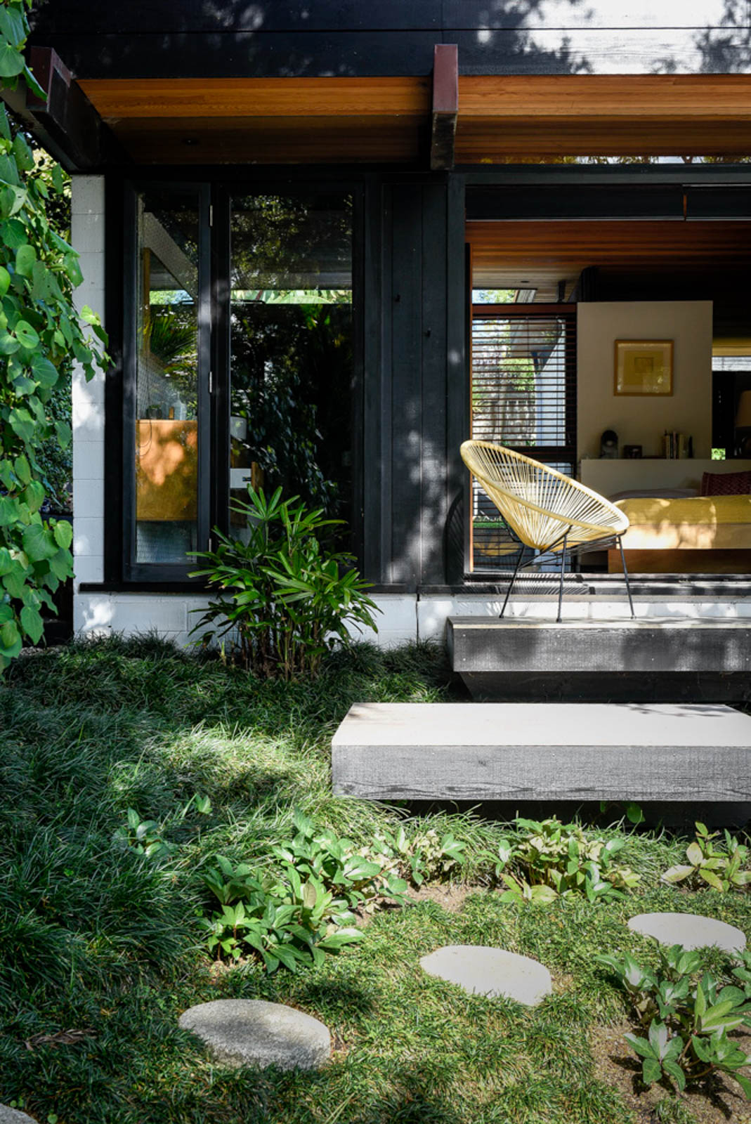
The design had never come to fruition —only one small deck was built with steps down to a basic lawn area — but ultimately provided the inspiration for this modern take on a vision now approaching 40 years old.
Significant changes in local regulations since then meant Sandii McDonald and her design team at Babylon Gardens faced a complex challenge to stay as true as possible to the original design.
“There was a bit of a Japanese feel to the house and we’ve tried to retain that in the landscaping,” Sophie says.
After an elongated design process incorporating expansive floating decking at varying levels, an above-ground concrete pool, complete with a bridge made compliant with elegant timber battens, and a vibrant planting scheme where texture and foliage combine with stone and paving, the result is both calming and spectacular.
“A key part of the design process was about ensuring there was as little fencing around the pool as possible so it was about playing with heights and pushing the boundaries to deliver a solution that complied with the regulations but stayed true to the original 1970s design.”
The house itself covers an L-shaped footprint, and the above-ground, rough-cast concrete pool mimics this, but in a mirrored layout allowing the two to create a dynamic play of forms, between which the floating, multi-levelled decking and planting becomes a central feature, and the minimal glass fencing that was required falls away into the background.
A mature kowhai tree was retained and has become another key feature of the landscaping, providing a beautiful dappled light on a tier of decking to the north-eastern end of the house’s upper level. Here, round Japanese stepping stones of natural granite lead around through mondo ‘nana’ to the bridge, one of Sophie’s favourite parts of the landscape.
“It lends itself to the Japanese aesthetic of the garden, with the concept of a bridge over water. The L-shape of the pool and the bridge are a bit of fun but also practical. It allows us to relax in the pool while the kids are splashing at the other end, but it always needed to become part of the architecture and provide aesthetic value when looking out from inside. It’s done that really well.”
Sophie’s not much of a flower person, preferring foliage and greenery to blooms — a key basis for the planting scheme that needed to be both low maintenance and resilient to the likelihood of children playing in and around it.
It’s a common requirement in a brief, but the scheme Sandii and her team devised is anything but, expertly selecting a mix of natives and exotics to create a synergy that has both an undeniable Japanese aesthetic and a uniquely New Zealand feel where ponga and acorus thrive.
Drops between the tiered floating decks are lessened with the use of Helleborus and asplenium, while Japanese maples give way to Coprosma ‘hawera’.
A later addition to the landscaping was completed by Dan and Sophie; a section of crazy paving in European bluestone, between which Selleria radicans now thrives — a touch that works perfectly with the 1970s home and layered, unexpected delight of the garden and poolscape.
