No white in the common areas was a key part of the brief for this boutique Wellington hotel—a place for bold, whimsical spaces with a certain intrigue.
Naumi Hotels are synonymous with whimsical spaces, imaginative micro-experiences and prime locality, and the group’s latest boutique offering, Naumi Studio Hotel on Wellington’s Cuba Street, is no exception.
Designed by Material Creative, the brief for the hotel was to be bold, whimsical, colourful and intriguing—and there was to be no white in the common areas. In achieving this, it was also important to emphasise the heritage features of the 1900s Edwardian building formerly known as ‘The People’s Palace’, a space operated by the Salvation Army.
Essentially, Naumi Studio Hotel is curated around the idea of bohemian literary character Lady Naumi, who captures the zeitgeist spirit, thought and feeling of both the Edwardian era and the surrounding bohemian culture of Cuba Street.
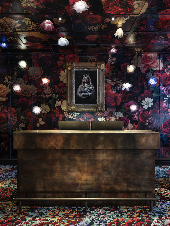
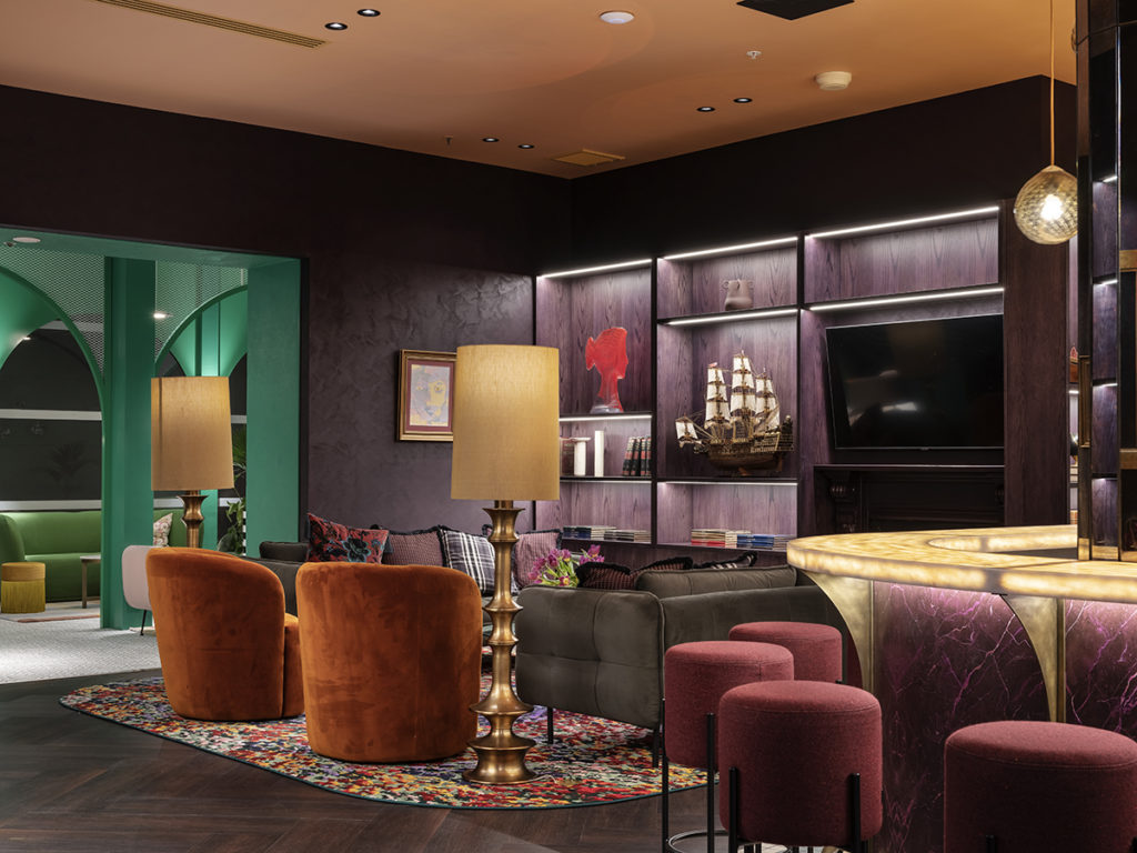
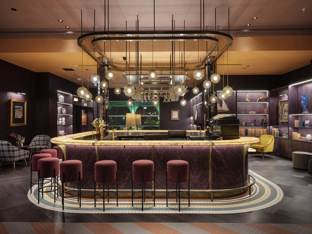
Upon entry, maximalism takes over. Lush florals are showcased within an Edwardian-style garden. Step into the lounge bar, and you are immersed in Lady Naumi’s Wunderkammer-like home. Collected curiosities line walls, making for a cosy and exotic space.
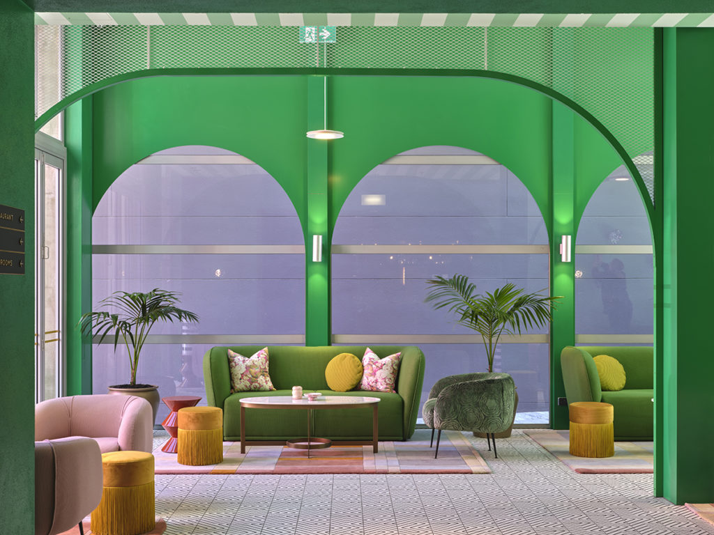
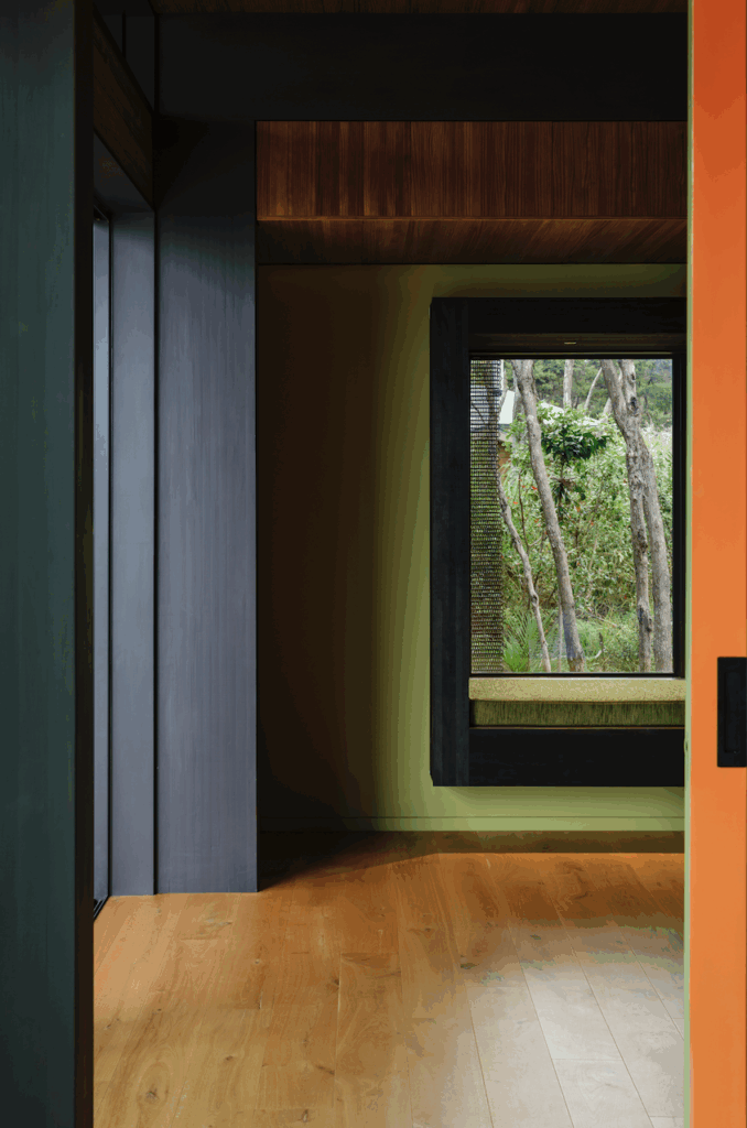
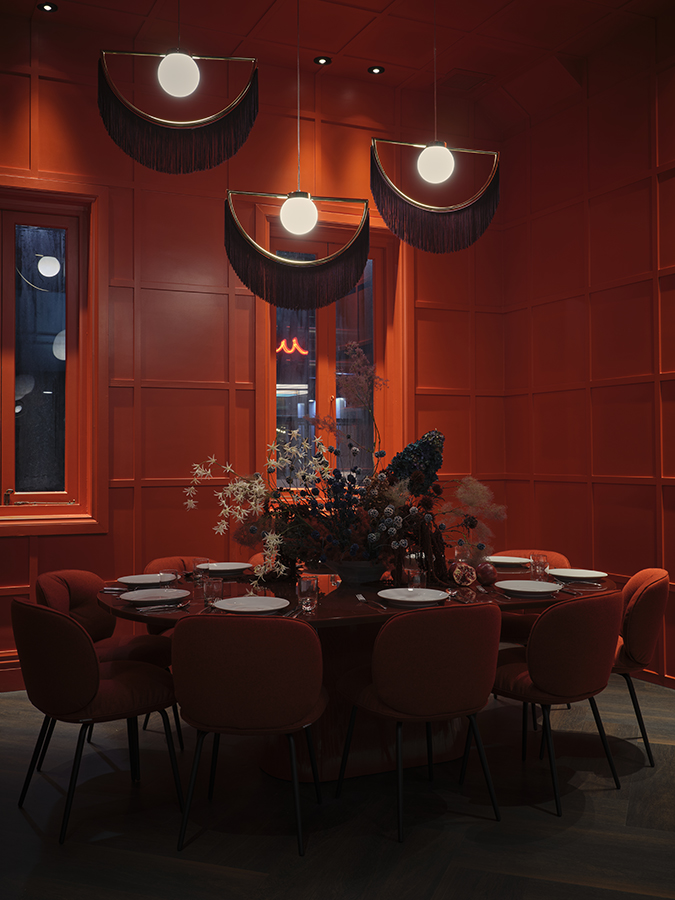
Naumi Studio Hotel takes inspiration from subdued Edwardian tones reimagined into a bright and bold future for the colour palette. Vibrant reds, cobalt blues, deep purples and wild oranges are weaved throughout the building.
Of note are the upper three levels – each featuring a gradient of red, purple or blue. The colour gradations mimic the changes in hue at sunset and sunrise and different terrains and landscapes along the way—transporting guests on a Laudy Naumi-inspired journey along the Silk Road.
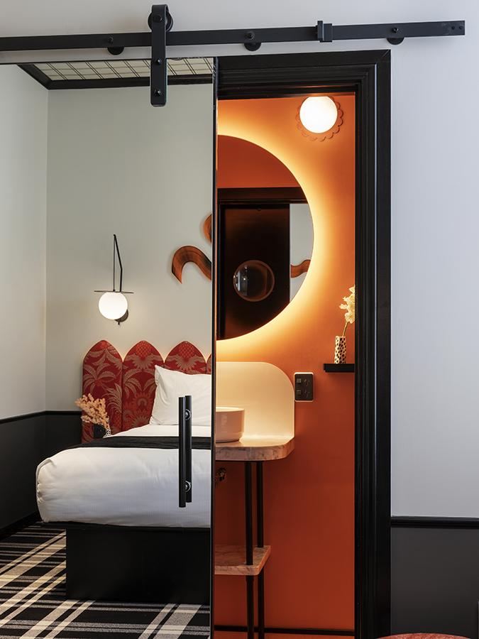
Each of the four guest room types feature a different bathroom colour of red, blue, purple or orange. The walls of the guestrooms are the only spaces in the hotel that utilise white, providing an illusion of space and fostering a sense of retreat. Tartan carpet on the guestroom floors is reflected on the ceilings through the use of tartan wallpaper. The rooms also feature silk thread artwork and headboards inspired by the forms of the turn of the century logo that still adorns the building’s facade.
Toni Brandso, director of Material Creative, explains that colour is used to “bridge the gap between residence and hotel to bring an unexpected sense of theatre”.
The critical role that colour plays in bringing Naumi Studio Hotel’s imaginative spaces to life has sparked a phenomenal response from guests—many surprised by the maximalist design and immersive experience.
“The clever ways colour and pattern are cohesively combined and the adventure and experience of the space takes visitors by surprise—which, might we add, is what a hotel is supposed to do!” says Brandso.
Naumi Studio Hotel is a 2021 Dulux Colour Award finalist in the Commercial Interior category.