We explore Bill Culbert | Slow Wonder (currently at the Auckland Art Gallery) through the lens of residential architecture and interiors.
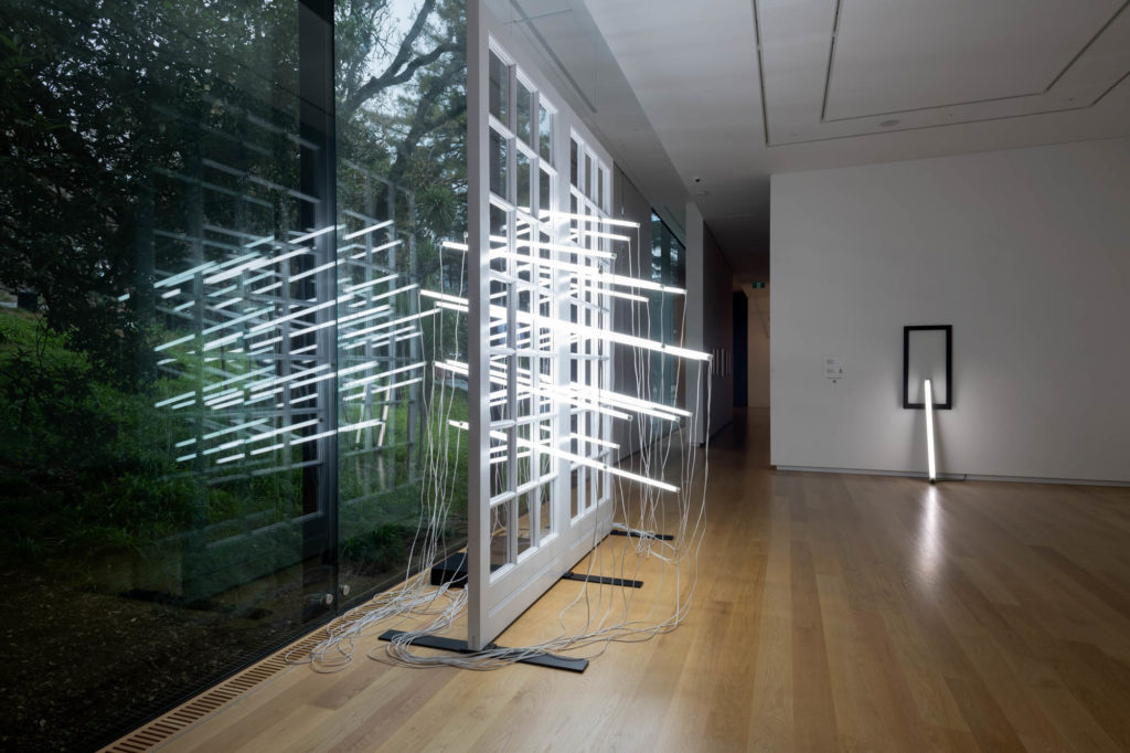
Launched on July 3, Slow Wonder reveals the boundless experimentation of New Zealand’s acclaimed conceptual artist Bill Culbert.
It brings together a selection of pieces including photography and installations, most of which have light – in its incandescent or fluorescent form – as its running motif.
Dadaism and the artist’s concern with light and camera obscuras are often spoken about when it comes to this work, but there is also plenty for anyone approaching his oeuvre from an architectural or residential perspective.
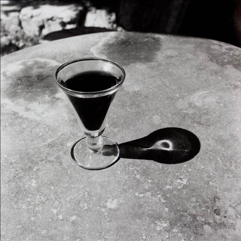
In a lot of the pieces in the exhibition, Bill Culbert interacts with and manipulates objects of everyday, domestic life. Standard paraphernalia that populate our homes – lamp shades and stands, tables and chairs, wine glasses, wall hangers, detergent containers – are changed both by bisecting neon light tubes and their privileged position within the walls of the art gallery.
Was Culbert’s fascination with industrial design (mainly packaging, homewares and furniture) a sign of his time? Was it purely a response to Duchamp using a urinal as a piece of art or was it a larger concern with the residential; with the interiority of domestic life?
“If you pay close attention to Culbert’s choice of objects in his photography, sculpture, and installation, you will see an eye which is quite particular,” says Julia Waite, curator, New Zealand art, “he had a retro aesthetic that favoured enamelware, wood grain furniture, and Tupperware.”
“His choice of objects, particularly the plastic bottles and fluorescent tubes, reflect the times in which he worked. Some of Culbert’s materials are becoming obsolete which makes them extremely difficult to replace.”
Although most of these items have been amassed with the care and attention of a product design collector (proportion, thickness of the plastic, the translucency and refraction of materials), they are also all tainted by a certain past-its-use-by date patina.
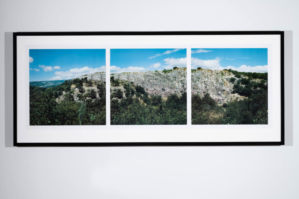
They are glorified rubbish, in a way, and many of Culbert’s work did, indeed, come from the local dump near his home in France.
Is he, in any way, making a statement about the throw away nature of these objects? Is he concerned at all with the ‘environmentalist’ movement in art?
“Culbert had a strong interest in environmental issues”, affirms Julia, “his rejection of painting in the late 1960s was tied to a belief that he did not need to bring more finely crafted objects into the world, that he could work with things already in circulation, and thus work more sustainably with recycled materials.
“His ideas were informed by the Italian art movement Arte Povera of the 1960s and ‘70s and their adoption of unconventional art materials. The exhibition includes a colour photograph ‘Decharge, Sault’, 1991, which shows the artist’s local dump. I included this rather unidyllic landscape to reinforce its significance as a site of discoveries, imaginings, and creativity,” says Julia.
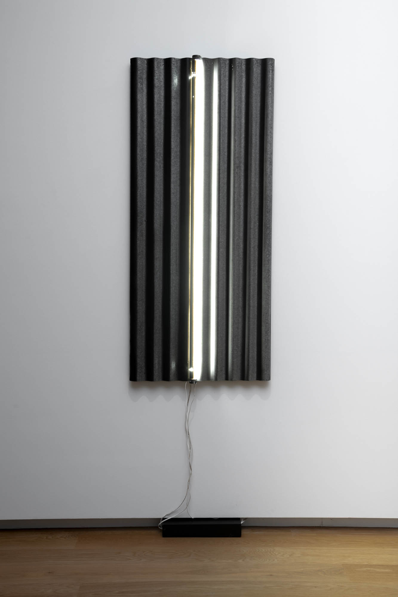
There is another aspect to Culbert’s work that keeps it somewhat bound to the residential context, and that is his usage of building materials. It’s as if the artist had stepped out of the confines of his interior space – with its homewares and furnishings – and begun to explore the cladding, the structure and the glazing of his living environment. Windows and French doors are recurring and, in his stunning work influenced by or in collaboration with Ralph Hotere, corrugated iron sheets, charred, weatherboard-like timbers and stones make a poetic, potent and architecture-alluding appearance.
According to exhibition material, Hotere’s biographer Vincent O’Sullivan, says: “The experience of being brought up in a house without electricity was a key imprint in Hotere’s work; those years of dark windows, reflecting surfaces, the flicker of flames on glass, metal, and so on.”
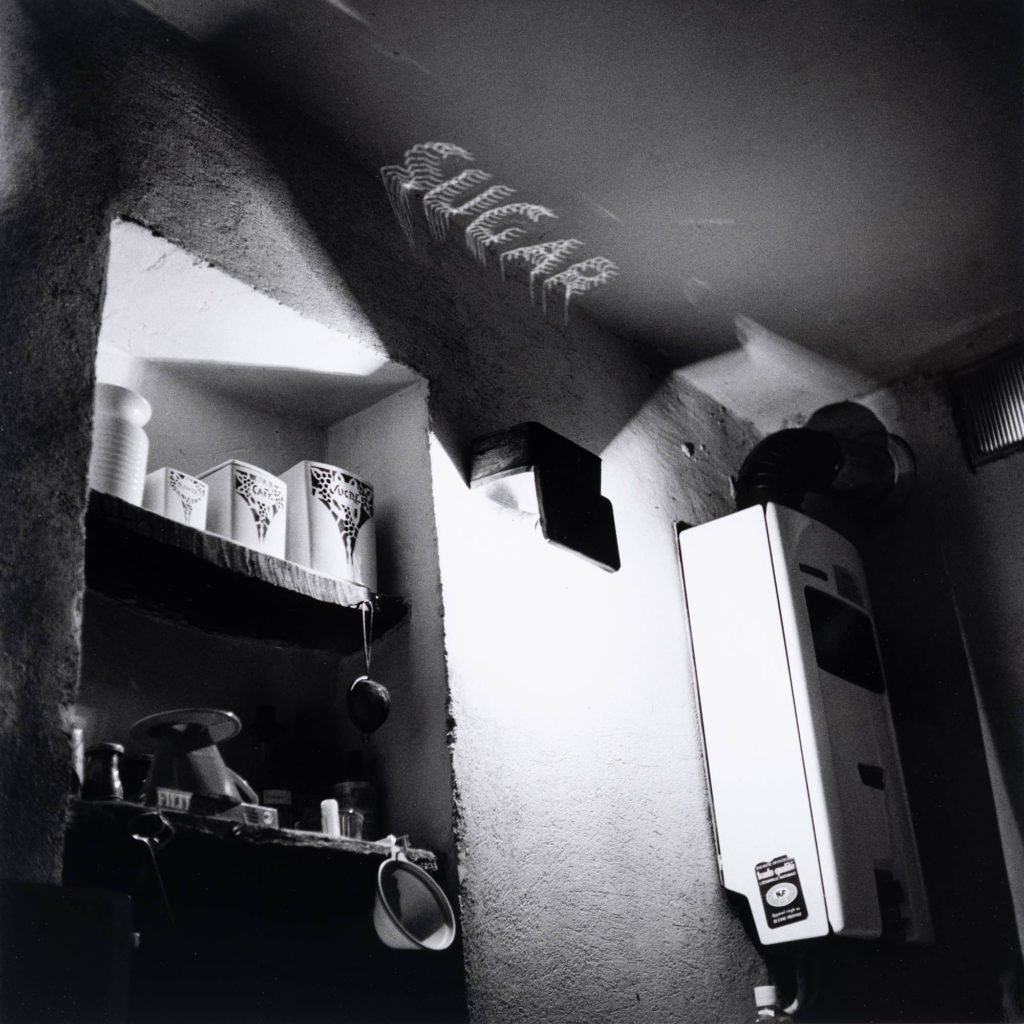
In photography, as well, Bill is often attracted to the way natural and man-made light interacts with the mundane objects and spaces of everyday life, as well as with some built structures (like in his ‘Sugar, Kitchen’ photo or ‘Light box, Gargas’).
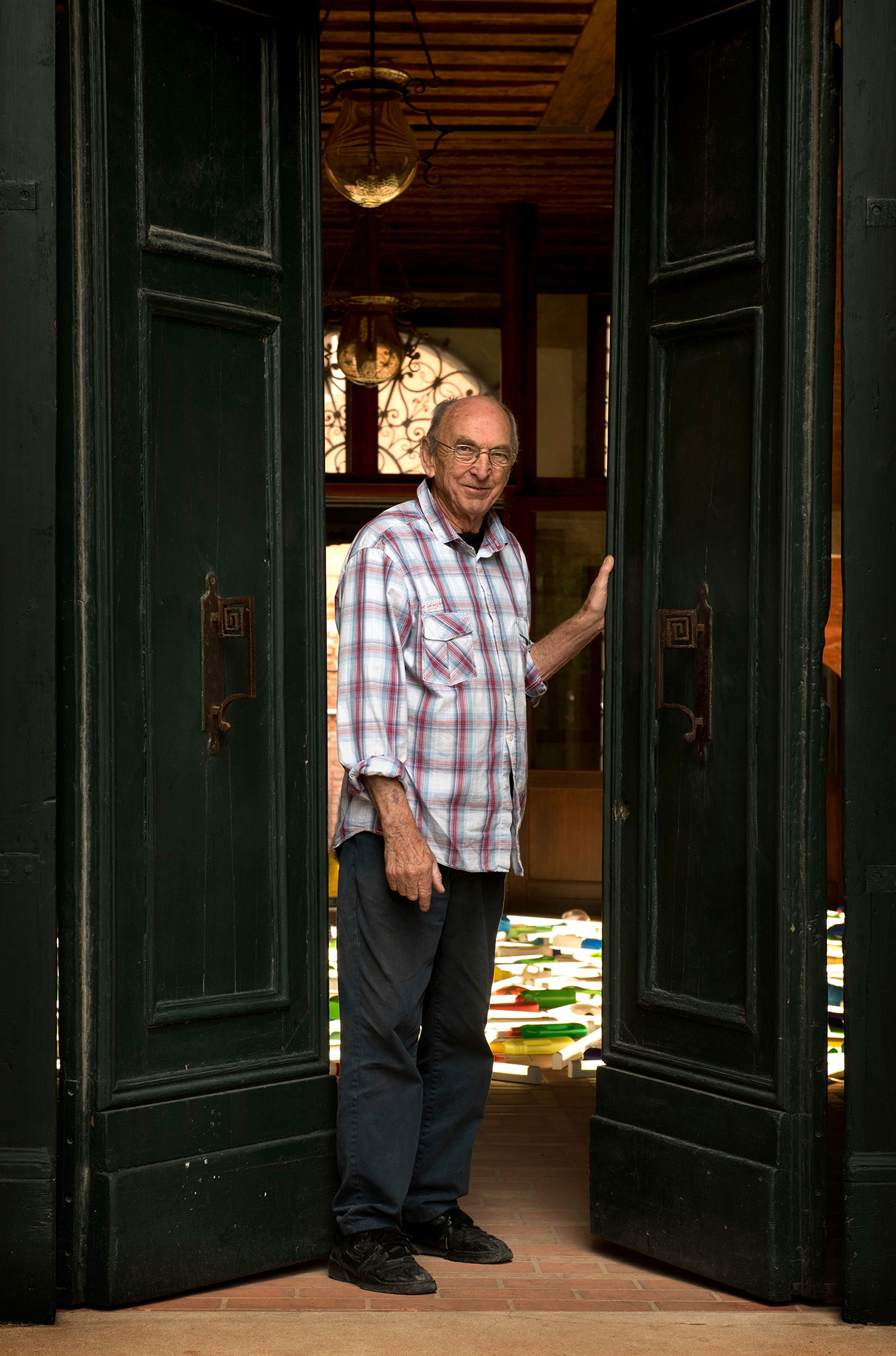
For the home and architecture minded, Bill Culbert |Slow Wonder is a fantastic, conceptual exploration of ideas and form.
Bill Culbert | Slow Wonder is on show at the Auckland Art Gallery Toi o Tāmaki until Sun 21 Nov 2021, www.aucklandartgallery.com
Words Federico Monsalve
Photography Courtesy of Auckland Art Gallery Toi o Tāmaki

