Partly inspired by Josh Emmett’s home kitchen, this space in Auckland’s Mt Eden is versatile and highly customised for its client. HOME spoke to Hewe’s designer Gunnar Friese about its detailing and brief.
HOME: Can you describe the family that lives here?
Gunnar Friese: The house is situated in one of the upmarket neighbourhoods near Auckland’s city centre next to a green park, in a perfect place for a busy family with four kids. For a family of six, you need large areas for food storage; we have integrated the large French door fridge freezer and a large bifold door space tower as a main place to store food. The scullery also has lots of shelving for additional storage.
The kitchen is designed with the option of having multiple persons working at the same time. With the fridge and main food storage right at the entrance to the scullery, someone could be cooking dinner in the main kitchen while someone else bakes a cake in the scullery without a lot of crossover of the working triangles. We also have the bar stool seating on the island for the kids to do homework, while a separate table with a booth seat can be set up ready for dinner.
H: What was the brief?
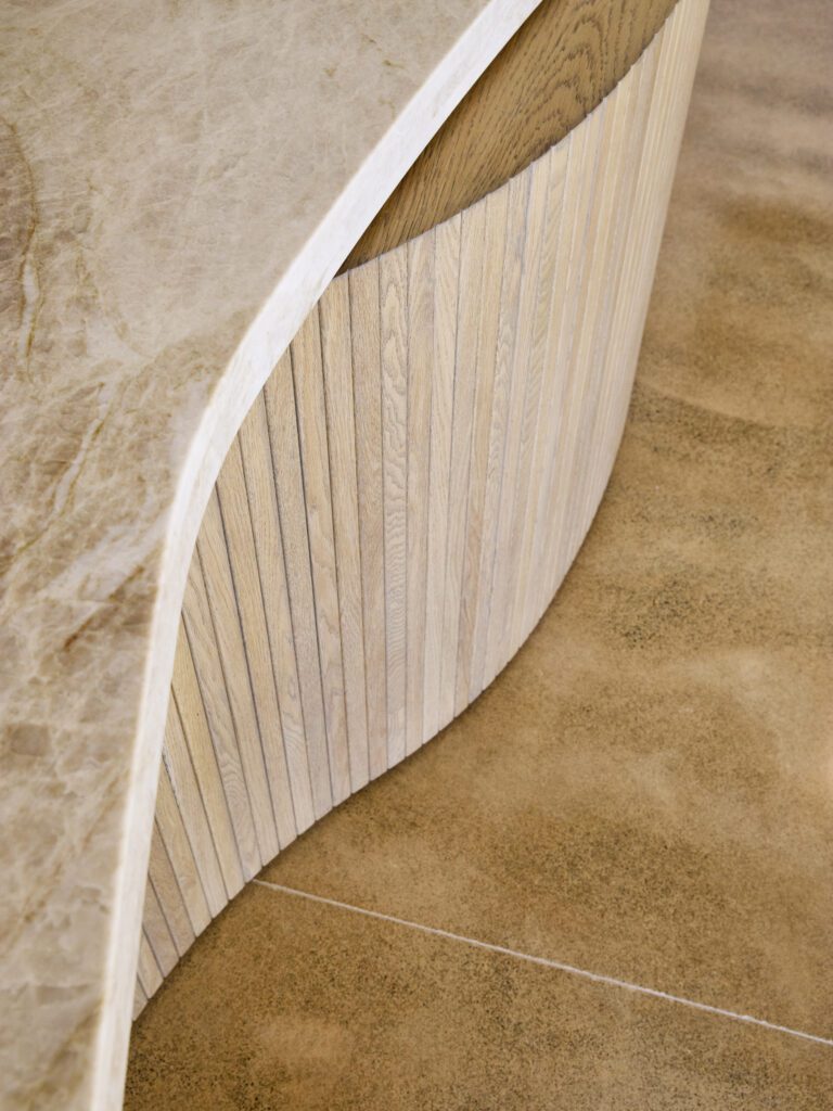
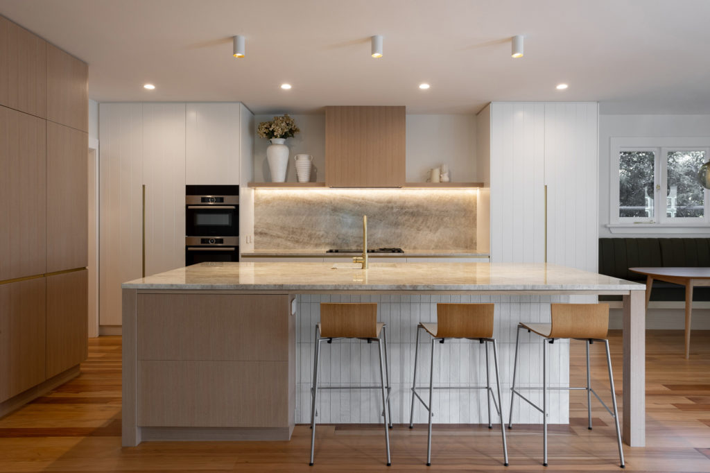
GF: The aim was to create a warm and functional kitchen for the client’s family. First inspiration was drawn from master chef Josh Emmet’s kitchen, which features warm timbers and benchtops. But, after a visit to the client’s house, it became clear that the new kitchen would have to have a tongue and groove pattern somewhere, as the existing house has tongue and groove details in the entrance and living areas.
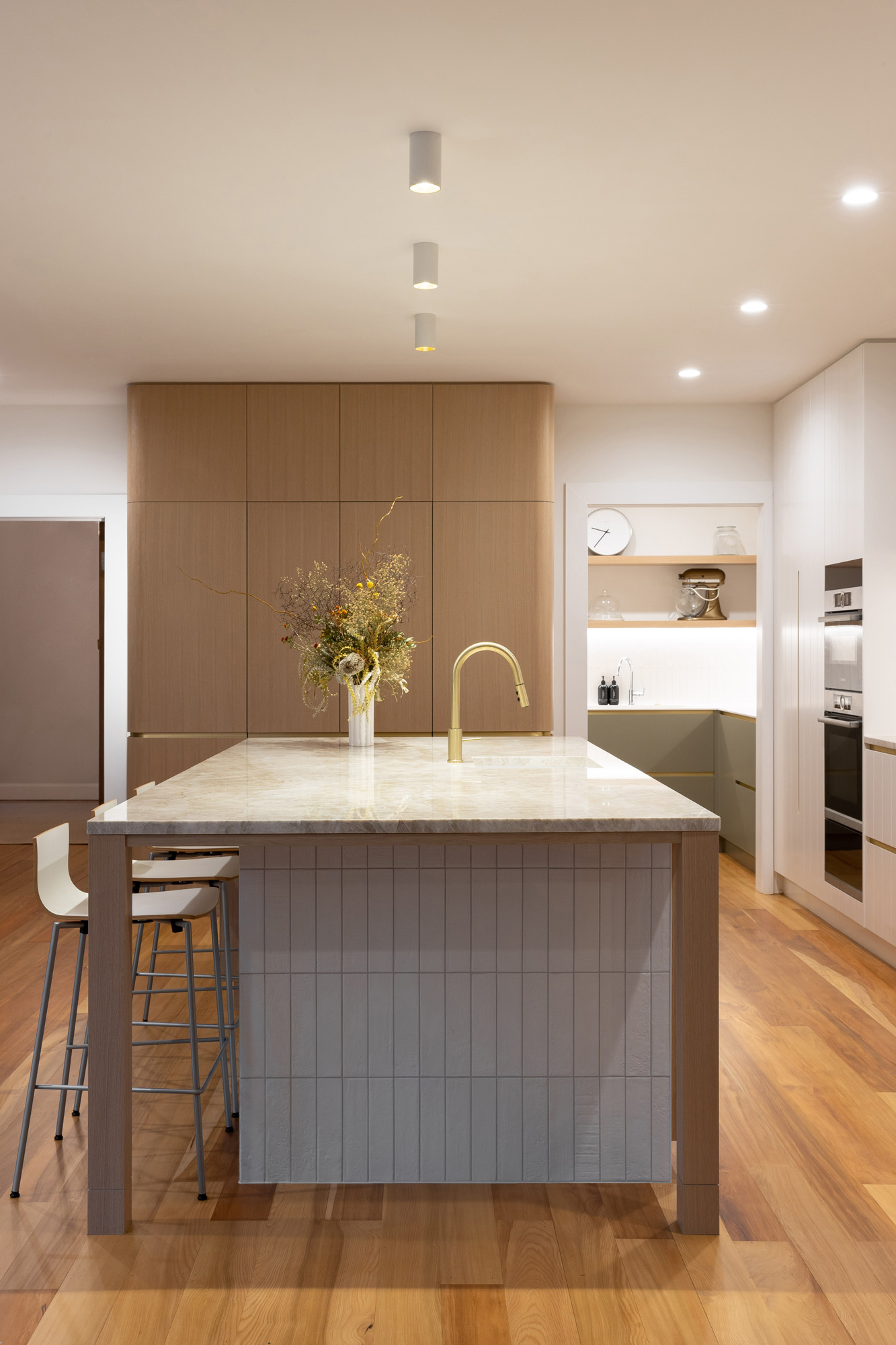
My client mentioned she would like a bar that could be closed off when not in use. We also wanted to introduce a little bit of bistro feel with the textured tiles on the back of the island and the booth seating.
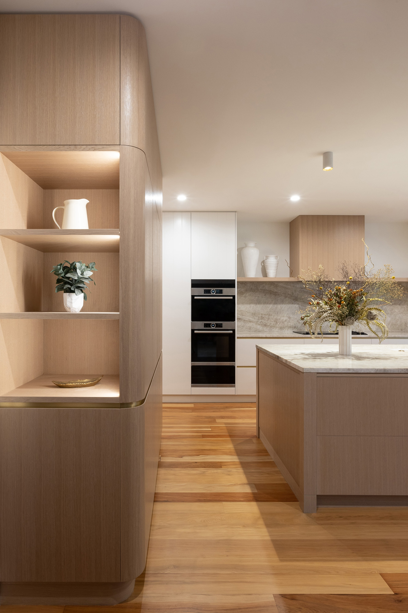
During the concept design phase, my client and I discovered we both love natural timbers and the colour green. I also love clean lines and integrated appliances. One of the challenges I set myself was to make the fridge visually disappear — we actually turned the fridge cabinet into one of the features of this kitchen. The integrated Fisher & Paykel fridge is hiding between two tall cabinets with curved doors and only one custom handle detail, with brass inlay running through horizontally. The bench seat bordering the kitchen on the living room side flows elegantly around the corner. Olive-green squabs match the green scullery fronts.
A great design is nothing without great craftsmanship bringing it to reality, and that requires excellent teamwork between designer and cabinetmakers. Curved doors with matching timber grain and curved custom handle details call for a special set of manufacturing skills.
H: What product did you use on the main working surfaces?
GF: [We used] the Sensa Taj Mahal stone from Cosentino. It was chosen not only for its beauty and warmth but because of its protective coating, which makes the natural stone very hard-wearing. It goes perfectly with the white and timber cabinetry. We were set on that stone from the very beginning of the project and it turned out to be an absolute stunner. We have used it on all the kitchen’s work surfaces, as well as the hob bench, island benchtop, and bar benchtop. We have used white sinks and brass tapware and handle details, and have also run the stone up the wall behind the hob as a splashback. The Taj Mahal is one of those stones you just want to hang on the wall as a piece of art.

H: There is a new colour introduced in the scullery; what is it and why did you choose to do that rather than keeping the same colours as in the main part of the kitchen?
GF: The colour palette in the scullery is intentionally kept different to the kitchen, and the sage green fronts complement the green leather squabs on the kitchen’s booth seating. We have also used Dekton Uyuni in the downstairs powder room.

H: The open shelving unit with inbuilt light is quite an interesting move. Why was that done?
GF: The open shelving unit on the fridge cabinet was an idea to keep the cabinet looking light when you open the door to the kitchen, rather than looking at a solid panel. It also acts as a ‘drop zone’ for keys, mail, and everyday items and a display shelf, with the strip lighting running vertically up the sides.
