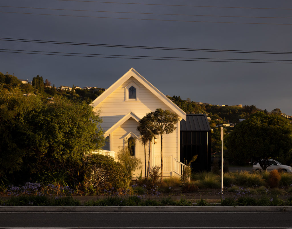
An old church on a prominent site in Nelson has been deftly and daringly brought back to life by Crosson Architects.
History tends to assign a level of responsibility to whoever makes a home in a place like this: a 110-year old, deconsecrated Presbyterian church on a highly visible corner site in suburban Nelson. From the moment one approaches, it is obvious that this project has been designed as a humble monument to the memories that were made within it.
“People had worshipped here,” says one of the owners, who asked for anonymity. “They had gone to blue light discos here. One lady came in and said, ‘I had my confirmation here, [and, later on] my daughter got married here. My husband had his funeral here.’”
“Everything was about respecting the integrity of space,” explains Ken Crosson, the architect responsible for the redesign of the building.
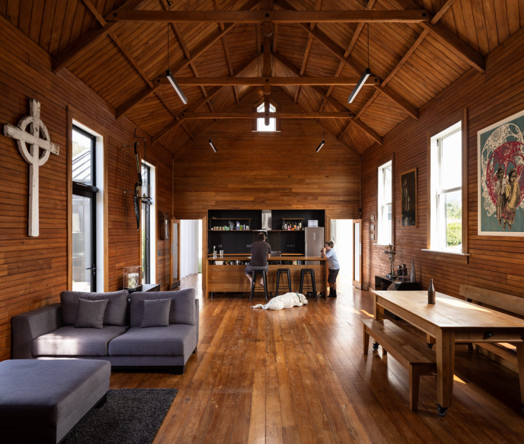
Early on in the process, he discovered that behind the ’60s and ’70s board and plaster panelling, the grey institutional carpet, and the nondescript light fittings was a treasure trove of centuries-old rimu and shellac. The intention was to get back to the original materials in all their tongue and groove glory. They proceeded to strip the interior, reinforcing rafters, improving insulation and cladding, reinstating a vestibule at the entrance, and treating any significant addition in a way that would be easily identifiable as such. The process was one of reinstating a former glory rather than reinterpreting it.
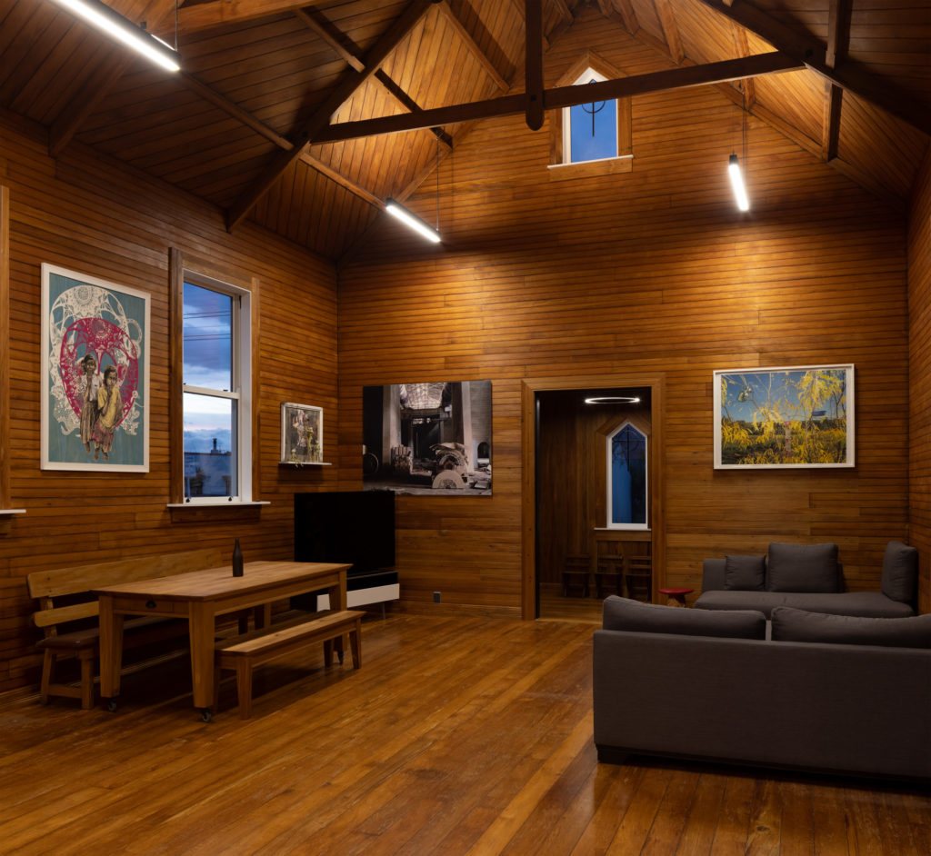
“We had ideas of what we wanted to do,” says the owner, who was very hands-on during the renovation process, which was undertaken by Decade Homes, “but as we took the shellac and the walls off, and put seven or eight coats of oil on all the skirtings and all the arcs … there was that lovely moment where we realised that she was going to do her own thing.”
And that she did. A series of simple, exposed, timber rafters, with strutless, king posts that beautifully extend to just below the beam, seem to hover on a chevron-patterned ceiling. The wall boards are marked by signs of time and usage; a sort of cartography of indents and woodgrain with sporadic, dark holes where nails once resided.
Some of the materials that were removed during the renovation have found their way to other places in the neighbourhood. Weatherboards and the distinctly reddish roof ended up shielding four houses, a few sheds, and a bike storage unit nearby. A handful of pews — in well-worn timbers — are still here, while others are reportedly supporting a different sort of communion at a pub a few hundred metres down the road.
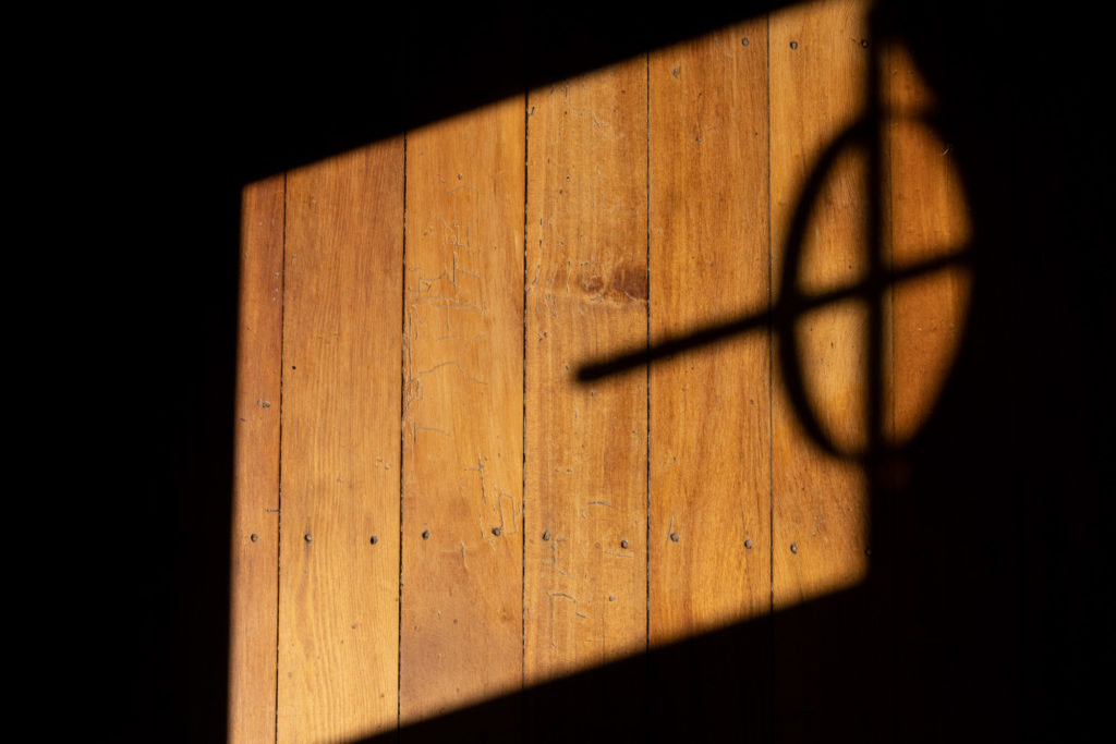
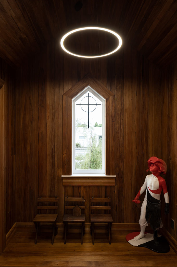
The exterior was reclad, its colouration lightened so that it took an even stronger pride of place on the highly visible corner site. The form remains distinctly religious, although the iconography has been removed from the gable’s apex and brought inside. From the street and at the right angle, a couple of the Celtic crosses are visible as interior elements that complement the refreshingly unique art collection here.
There is something fitting in the fact that parts of the old church are now contributing to the streetscape, like little mementoes or visual reminders of the civic space they originally came from.
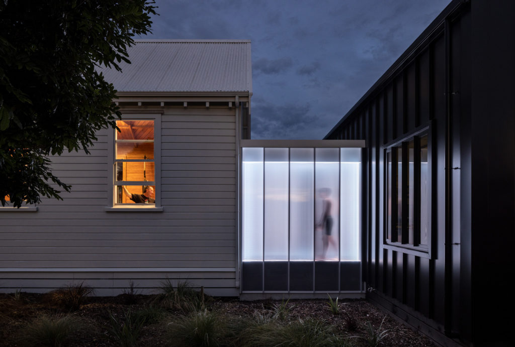
Yet it is not all about tradition and beliefs here. At the back of the church, behind where the pulpit would have been and where the open plan kitchen is, the heritage and olde-worlde vocabulary seem to fizzle and morph into something entirely contemporary. Small, almost tunnel-like corridors at each corner have been clad on translucent materials. Much like Crosson’s elevated, lantern-like second storey in the firm’s Light and Clay House in Westmere, Auckland, these passageways have been fitted with LED lights that pulsate in varying colours from the inside.
If these walkways have been conceived as some sort of visual metaphor for the transition between ‘faith and doubt’ — as this project has come to be known — then the trip from one to the other is brief and easy, discernible to anyone outside, and leads from ‘faith’ into a black-clad structure of steel and heft.
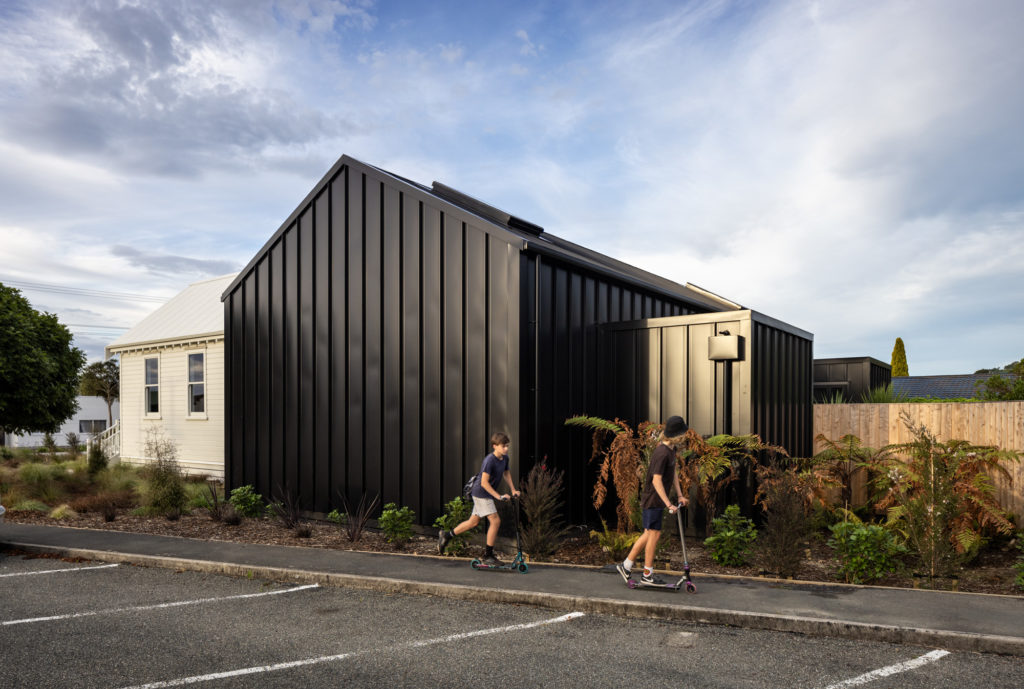
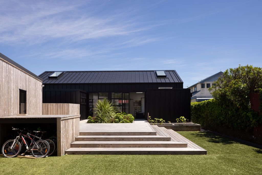
The exterior of the ‘doubt’ part of this house — where the church hall used to be — is a simple form, shorter, and as different as possible from the church.
“We wanted a contrasting cladding … we had white horizontal texture; we wanted black vertical texture,” Ken reveals, saying that the idea was to create a “subtle play on the theme of ‘faith and doubt’.”
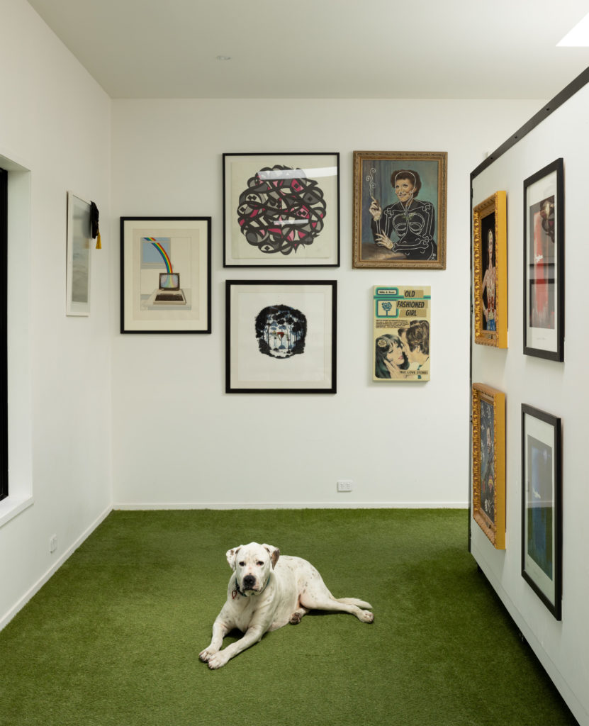
The interior, however, is not for the meek. The floor is clad with Astroturf, that green faux grass better known for indoor sporting venues than cosy home interiors. The walls have been left as utilitarian as possible, to accommodate the large art collection that includes graffiti, travel photography, glass pieces, and even original storyboards from Francis Ford Coppola’s Apocalypse Now.
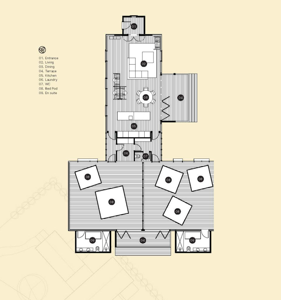
Then there are those pods. Instead of traditional bedrooms, the house has individual pods, each the width of a king-size mattress. Much like the rest of the furniture in the church, they are set on castor wheels to ensure multiple arrangements and flexibility.
According to Ken, this is very much a response to the clients and their way of living. In part it was done so that “you can appreciate the whole volume,” he says. “You can actually move stuff, get it out if needed, push those things outside, have a game of indoor cricket, play on the floor.”
For the owners, the impetus for these small, enclosed pods also had to do with parenting.
Because of “the way that kids interact with screens now … we wanted to reduce the size of their bedrooms, so that whenever they were on the screen it would at least be in a public space,” says the owner, while, a few metres away, on impressive set-ups, their young boys toil away at a first-person shooter.
“They might not talk to us,” he continues; “they might not tell us what’s going on, but we can see their body language.”
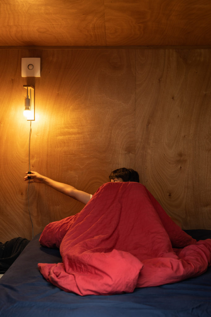
The family is very open about the peculiarities of these spaces. Are they super dark? Yes, but they like them that way. Stuffy? They open up and, if angled correctly, harness the breeze billowing from large, open doors that lead onto the backyard. Does the need for a ventilation system create a constant hum? Yes, but the white noise is something they got used to while living in heavily air conditioned houses in Dubai.
“This design is very much about them, as a family,” states Ken, emphasising that, although unconventional, it is purposefully done to suit their lifestyle. Never mind the idea of potential on-selling, then?
“It’s a blank slate,” he says of this in-built flexibility and lack of walled-in bedrooms. “The next client can come in and just roll out a few boxes and turn it into an office or go back to a church, This is the ultimate flexibility, and the least imposing built alteration that you could do.”
“We know it is weird,” says the owner, with a smile that seems to hide a touch of pride.
“The more we push people to the edge,” Ken tells us, “the more memorable and the more resonance it has with their lives.”
As their initial brief to the architect a couple of years ago, the family wrote a concise and eloquent manifesto about the values they hold dear and which they hoped would influence the design. From maxims about laughter, dancing, experiences rather than possessions, the phrase, “No brands, only function and beauty,” seems to echo loudest in the many choices made during this construction.
“Hopefully,” concurs the architect, “it’s a courageous response to a courageous client.”
Words Federico Monsalve
Images Simon Devitt
Videography Paul Brandon
Gallery
Judges’ Citation:
The repurposing of a church and its hall into an active, quirky, fun family home that respects the building’s history yet offers something entirely new and positive for its architectural — and urban — future. A poetic and highly personal brief from the clients has resulted in a bold and experimental as well as respectful and light-handed proposition from the architect. An architecture resulting from the delightful tension between opposites.
In partnership with

