As flexible arrangements continue to dominate our working life, we take a look at well-designed spaces that perfectly blur the line between home and cubicle, between smoko room and family dinner table. The office is dead — long live the office.
Ponting Fizgerald
The Royal Antediluvian Order of Buffaloes was a British, pub-founded, slightly tongue-in-cheek fraternity started by actors and stagehands back in those insalubrious days of London in the early 19th century. After the ‘Buffs’ moved out of its Ponsonby, Auckland, HQ on Islington Street, the simple hall became a community police hub, then a karate dojo, a photography studio, and a film post-production house.
At one stage, dormer windows and a kitchenette were added upstairs, making it into accommodation for whoever owned the downstairs business.
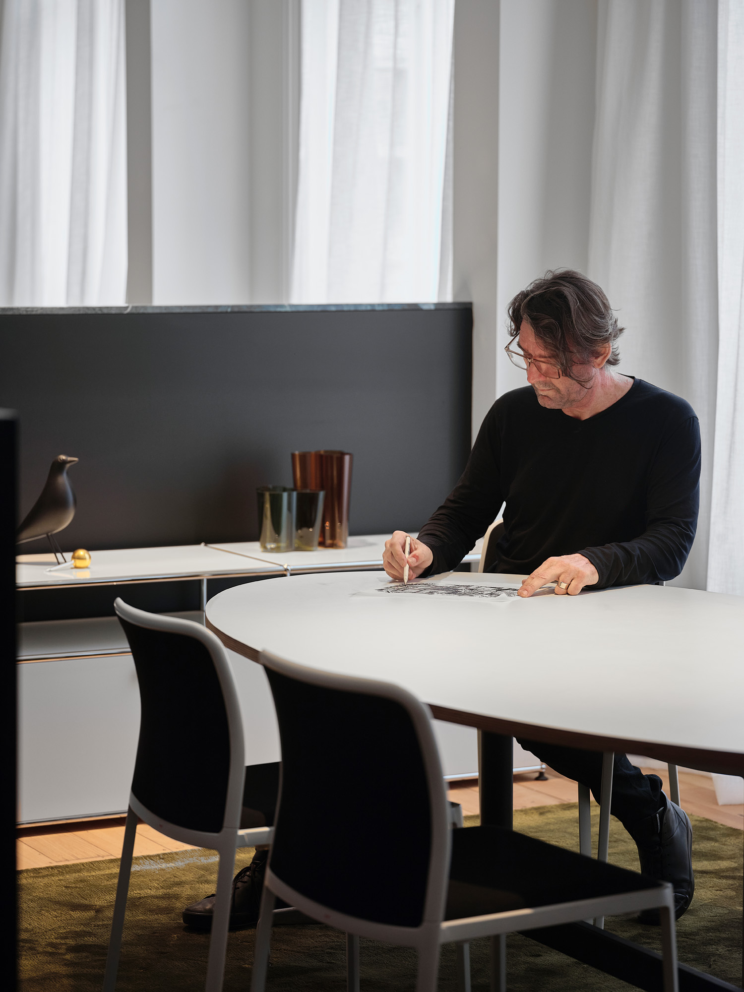
When David Ponting of Ponting Fitzgerald Architects took over the heritage space, approximately 85 per cent of it had to be rebuilt, including its poorly laid out concrete foundations, in order to turn it into the firm’s office while the back and upstairs areas became the city home for David and his family.
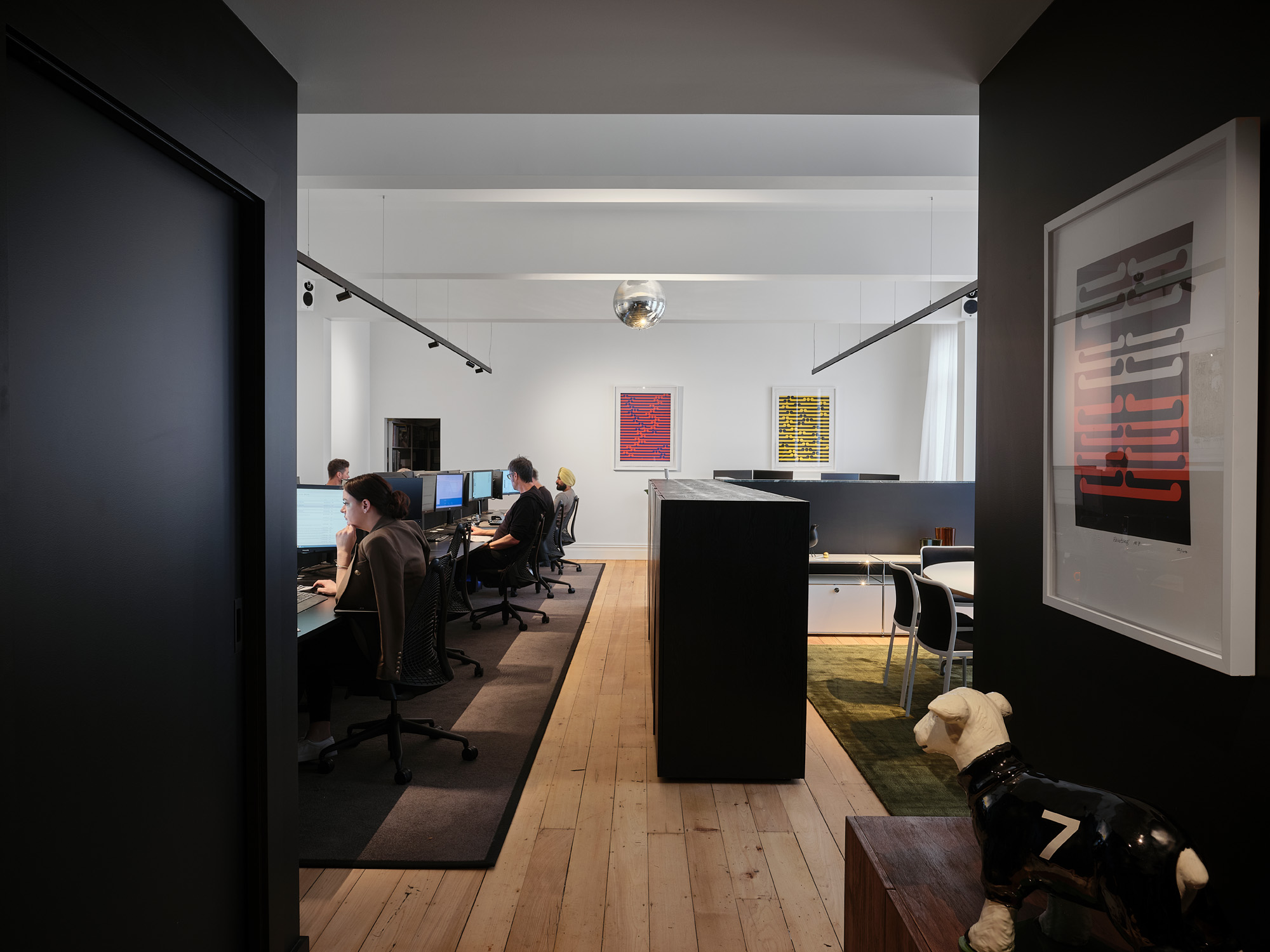
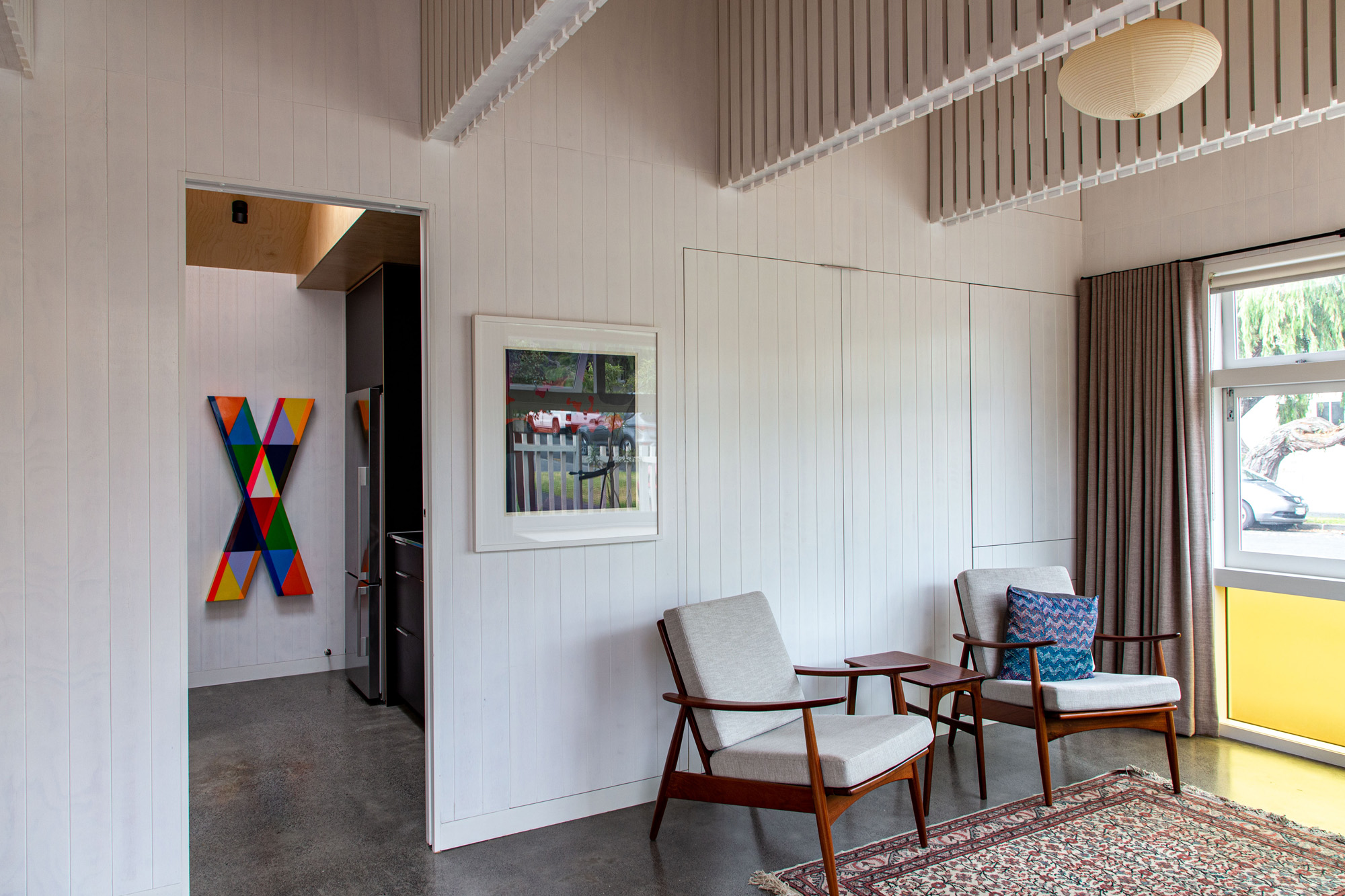
The office is a fairly classic open-plan affair, with desking for around 10 people in the centre, a meeting table at the edge, and a kitchen and bathrooms facility towards the street entrance. Classic French doors open up onto the sunny, side, paved alley, where the architect intends to place a long, Italian-styled, alfresco dining space with its own set of creepers and olive trees. At the back of the site, the home’s living room and kitchen are lined by a small garden. Lots of natural light streams into the space and, although there is no internal entrance to the home from the office space, there seems to be a perfect cohabitation between the two.
Images: Sam Hartnett
Kowhai Studio
In the Auckland suburb of Mt Eden, a couple of soon-to-be empty nesters decided to subdivide their site and downsize to a smaller house. During lockdown, however, the two owners found the house too small when working from home.
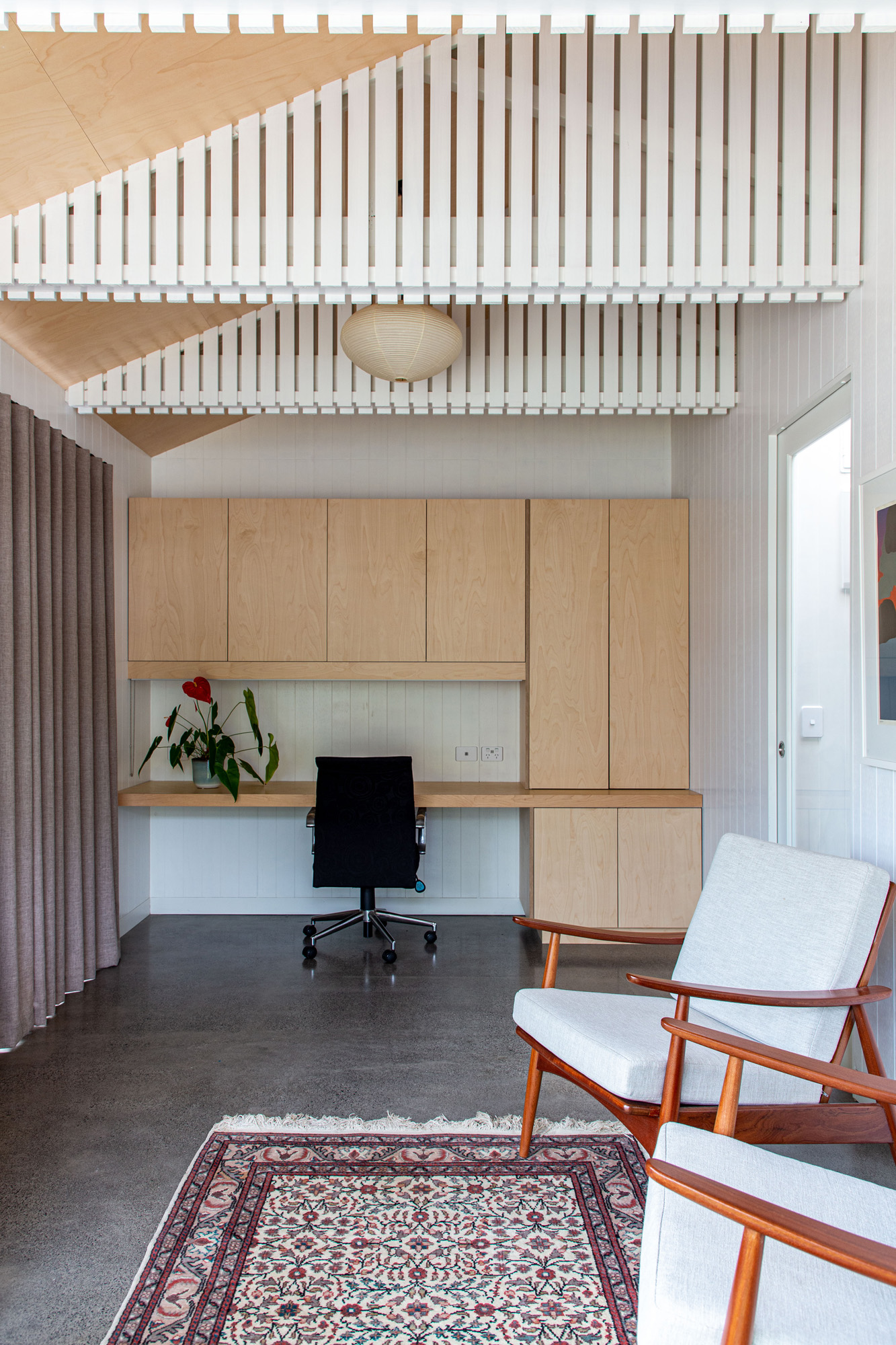
Strachan Group Architects (SGA) was brought in to take the double garage — which until then had been used only for storage — and turn it into this stunningly detailed 36m² office with a kitchenette and full bathroom. To turn this client-ready office into a guest room, a secondary desk folds discreetly away and, from the wall, a drop-down bed has been hidden by perfectly lining the timber cladding with a similar treatment on the bed’s underside.
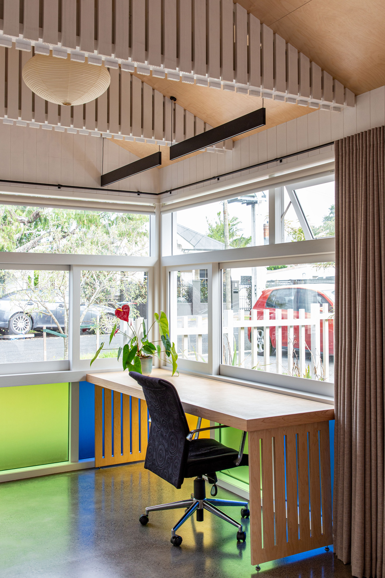
The SGA team, lead by Pat de Pont, upcycled a garage to something that is useful 24 hours a day.
“In terms of intensity of the site,” says Pat, “it went from one house for two to four people into six or seven bedrooms and two workspaces for six to eight people. So, you’ve effectively intensified the site without actually building too much but just making use of what was there, but better.”
Rosenfeld Kidson
This is one of those perfect examples of how the aesthetic lines between the home and the office are blurring. Although this social space for Rosenfeld Kidson — a timber importing and processing company — remains quintessentially professional, the details speak of comforts and palettes more reminiscent of a luscious home interior than of an industrial facility.

SGA took the opportunity to let the interior be a showcase of the company’s product, doing away with superfluous and bulky display units but treating the space like a piece of cabinetry, with interior and exterior including cedar, oak, garapa, and other hardwoods in a wide variety of stains and applications.
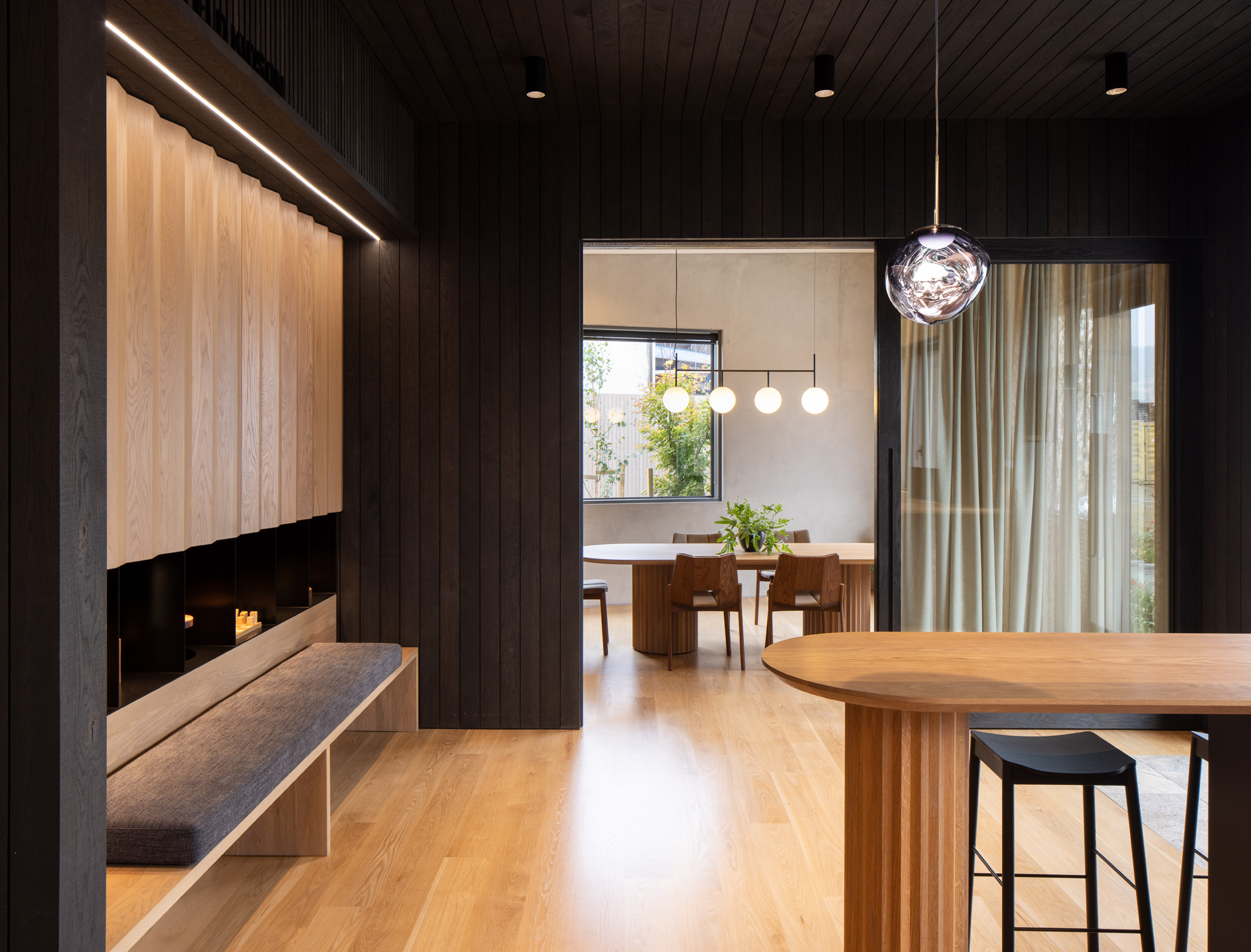
“The office was set up a lot to do with feeling warm and welcoming when you come in,” says project lead Roy Tebbutt, “removing the need for a formal receptionist and also in a way that showed no sort of hierarchy so everyone felt equal in that space.”
Beyond the soft material and colour palette, the usage of lighting and furniture objects as features, rather than as mere functional objects, gives the space a more curated, residential vibe.

