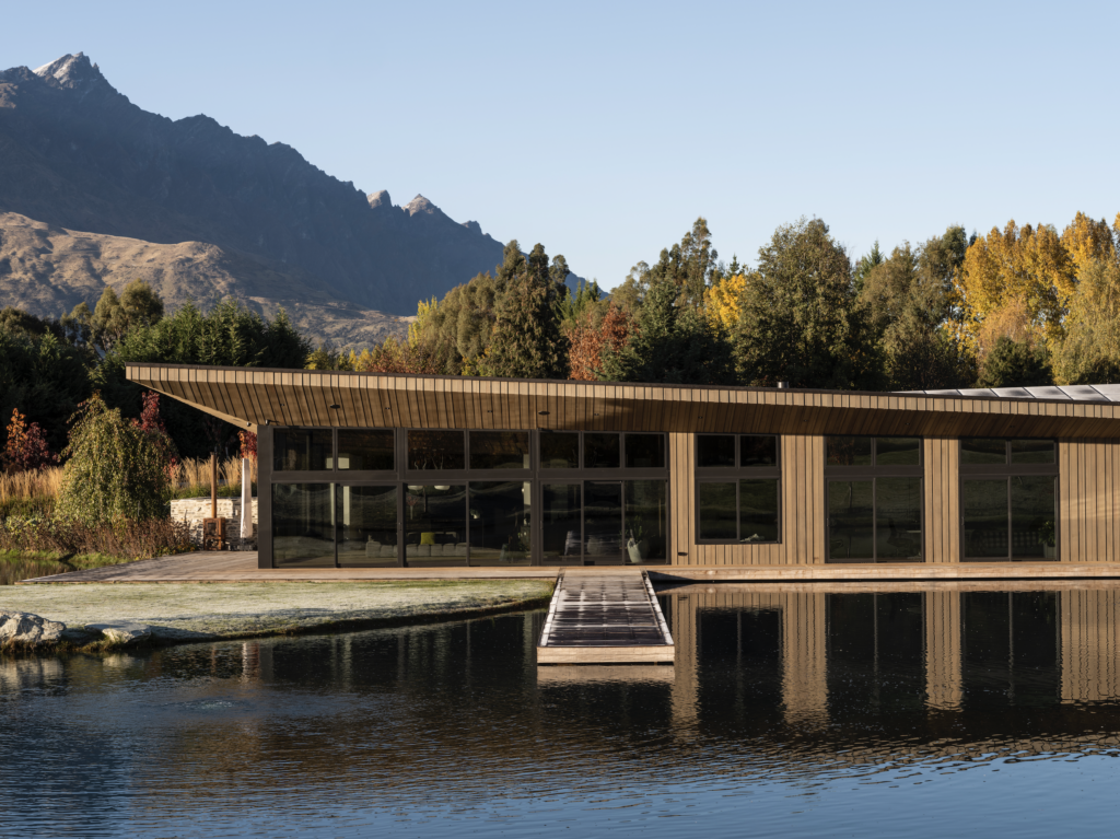
Just outside of Queenstown, this highly sculptural home reaches out and responds to the water below and the peaks that rise around it.
Some of us are lucky enough to make a sea or tree change, swapping our busy city lives for a simpler, slower-paced life by the ocean or in the bush. For the owners of this Queenstown property – Wendy du Toit and Bob Bell – while the serenity of the location was all-important, the change in lifestyle has been anything but slower.
“We absolutely love everything about Central Otago: the snowboarding, skiing, the mountain biking, the hiking trails – just the lifestyle here is wonderful,” says Wendy. “It was important for us that the home we built not only functioned for us but was also a testament to that lifestyle and the incredible environment we have down here.”
The journey from vision to reality was a well thought out one, with the couple ensuring the process was considered from all angles before commencing each stage.
“We purchased the section around 10 years ago and then set to the task of interviewing various architects before settling on Frans Kamermans,” says Bob. “From there, we asked Frans to put a number of concepts forward, from which we chose the design we wanted. Then we took a bit of a hiatus, in terms of the actual house, during which time we employed a landscape architect to design the grounds specifically matched to the chosen design.”
The couple says the landscaping took the best part of a year, but by doing it first the result is something that could not have been achieved any other way.
“When we bought the section, it was pretty much completely flat, so the amount of earthworks required to create the ponds and the hillocks was quite staggering,” says Bob. “There is absolutely no way you would have been able to build the house first and still achieve the same outcome. So, all the hard landscaping, the drive, the power and the water, the potable water tanks, the ponds and the more than 100 trees were all in place before work on the house was even started.”
Wendy adds: “We knew early on in the process that we wanted to make the landscape part of the house and focusing on the landscape first actually allowed us to achieve that. So, if you look at it now, it’s almost impossible to think of the house as being separate from the garden because it actually forms a cohesive whole.”
“When Wendy and Bob invited us to have a look at the site, they already had a fairly firm idea of what they were hoping to achieve with this build”, says architect Marina Leenman, director of Kamermans Architects. “Frans (Kamermans) had designed their Auckland home, so we knew that sustainability would be high on the list, as would a sense of being at one with the environment.
“From that initial visit emerged the three key elements that would inform the design: the site; the brief – align living spaces to the north, capture views, indoor/outdoor relationship; and the incorporation of passive solar design to catch the low winter sun and block the higher summer sun.”
The couple was also keen to distinguish their home from the usual Queenstown vernacular and had just the design element in mind, says Wendy.
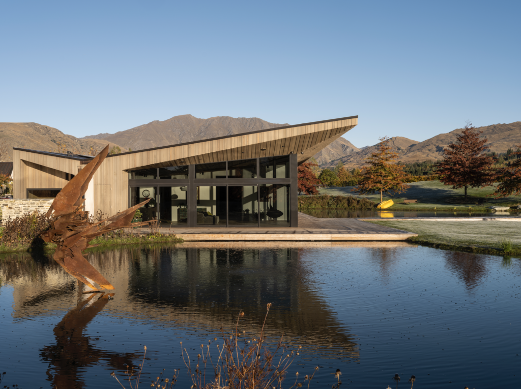
“We took Frans to a local Queenstown winery, Peregrine, which has this great sweeping wing-like roof, to which we pointed and said, ‘What we’d really like is a house that has a statement roof; the roof must be different to what you typically see in the local architecture.’ And Franz has delivered that and more. The butterfly shape lends the house a dramatic profile but also allows for the promotion of solar capture and water collection. So, we’ve ended up with this beautiful home with this quite amazing roof.”
As well as the roof form, the Kamermans team was eager to explore the notion of connectivity between the built and natural environments, which has resulted in an interesting dynamic within the building’s envelope, says Marina.
“In a bid to maximise the views while minimising solar gain, we’ve ‘pushed and pulled’ the eaves – pushing them up in the living areas so that they appear to be reaching out to the mountain ranges and pulling them down on the north-facing bedrooms. Likewise, we’ve ‘scooped out’ sections of the floorplate to create a series of private and public decks, each designed to look like an integrated part of the form, rather than being ‘tacked on’ as an afterthought.”
The stunning result is not only a masterclass in design but also one in construction, the job of which was given to Edd Bragg of Shore Construction.
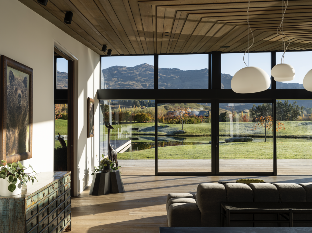
“The intricacies related to the construction of the living room ceiling, where it runs to the soffit outside, meant that, mathematically, it was nearly impossible because the corner wasn’t a right angle, but rather an acute angle of less than 90 degrees.
“The resulting irregular shape means you actually run out of room to have consistent gaps between the top and the bottom. The solution, therefore, was to fan out each board slightly so that, visually, all of the shadow lines appear to be plumb – we’re talking increments of mere millimetres. On more than one occasion, we spent more time working out the details than we did constructing them.
“It’s funny because at the time I was literally tearing my hair out, but I look at that soffit now and it really is a thing of beauty. We made a commitment, right at the start, to setting a certain standard for the building, one that would match the incredible landscaping already in place, and I’m proud to say that in the end the result is as near to perfect as we could have got.”
An opinion shared by Wendy and Bob.
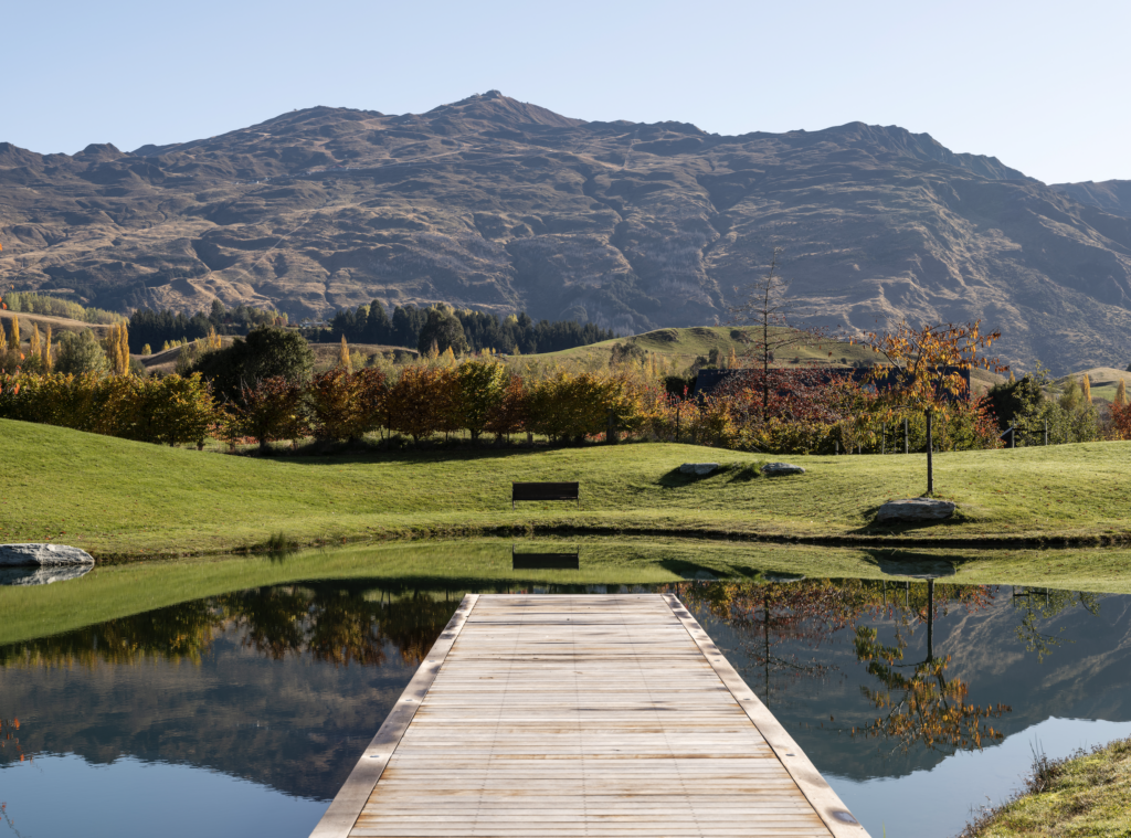
“It’s one of those amazing, beautiful houses,” says Wendy. “Every single room opens onto water and has a view of a mountain. For me, the beauty of this house lies in the simplicity of how it interacts with the garden. When you look at it, it looks like a boat that’s floating on the water. Whenever I look at it, I love how it’s got such clean, simple lines and how it doesn’t dominate the landscape but rather is a part of it.
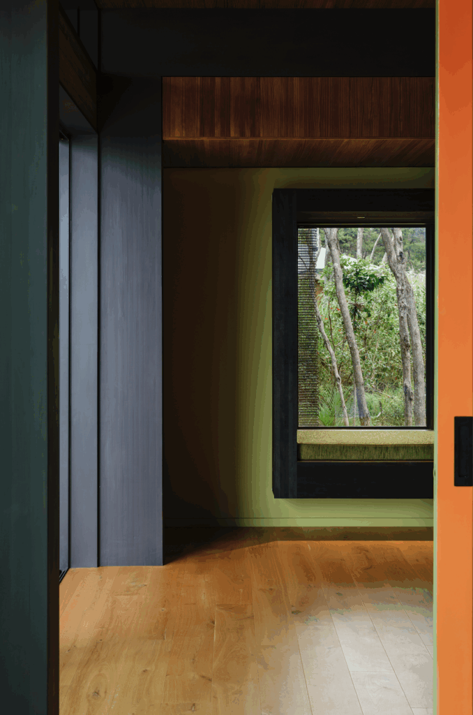
“It’s hard to pinpoint a particular standout, but one room that I really enjoy is the library. It’s probably one of the smallest rooms in the house but that means it’s very intimate. It has a daybed that allows you to relax during the day and in the winter it gets really nice and warm and you can see all the vistas from there, so that’s probably the one that I like the best.
“Less tangible, but no less important, is the sense of connection we feel to our surroundings,” adds Bob. “On a still day you get the mountains being reflected in the ponds. And then with all the decks, providing a physical connection between these fantastic, beautiful vistas and the house, and what you see when you’re looking out and then what you see when you’re in the garden looking back – that’s what it’s all about for me.”
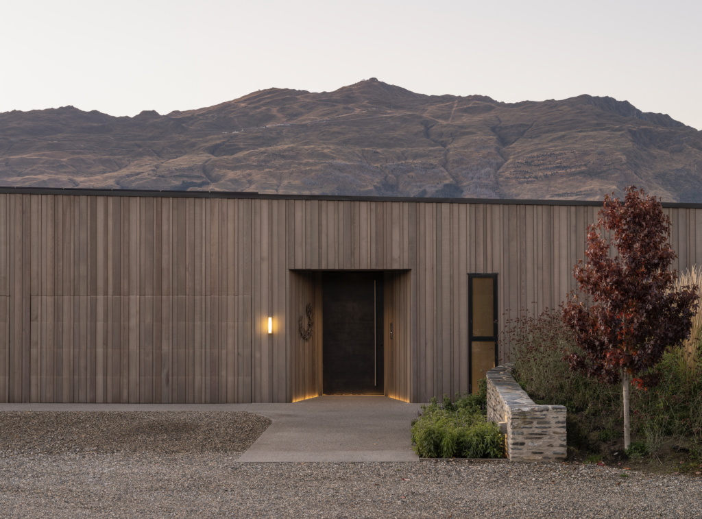
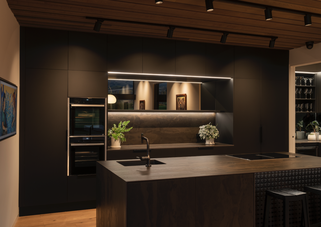
“The design intention was to mimic the natural environment,” says Marina. “There is such a beautiful colour palette in Queenstown, what with the grasses and deciduous trees, so we were keen to capture as much of that natural colour palette as possible. Externally, natural stain in combination with different depth boards creates a shadow play, which mimics the surrounding trees, while the use of schist helps ground the form within the landscape. Internally, the dark-coloured joinery helps to blur the line between indoors and out.”
Whilst form is an important aspect of any design, function, too, plays a key role, especially in architecture. How, then, does the home perform in terms of liveability?
“Obviously, we wanted to make sure that the house met the requirements for living here in Otago, meaning it had to be comfortable all year round,” says Bob. “One of the aspects we did change was to go from double glazing to triple glazing. Architecturally, there’s not a lot of difference between a triple-glazed and a double-glazed house, but the difference to the refractive values makes a huge difference. You can stand outside in the morning when the sun’s beating down on the windows and you can feel the heat bouncing off; it’s quite noticeable.
“All in all, the house has performed exceptionally well, to be fair. It’s very, very warm in winter and very, very cool in summer. It’s not mechanically ventilated, so relies on natural ventilation, so perhaps during the cross seasons, autumn and spring, where you might get an unseasonably hot day, we just open a few more doors. But typically it’s been designed for that and it’s worked particularly well.”
