The extensive renovation of this 1980s Ponsonby apartment by Four Walls Architecture offers a refreshing take on city living at height.
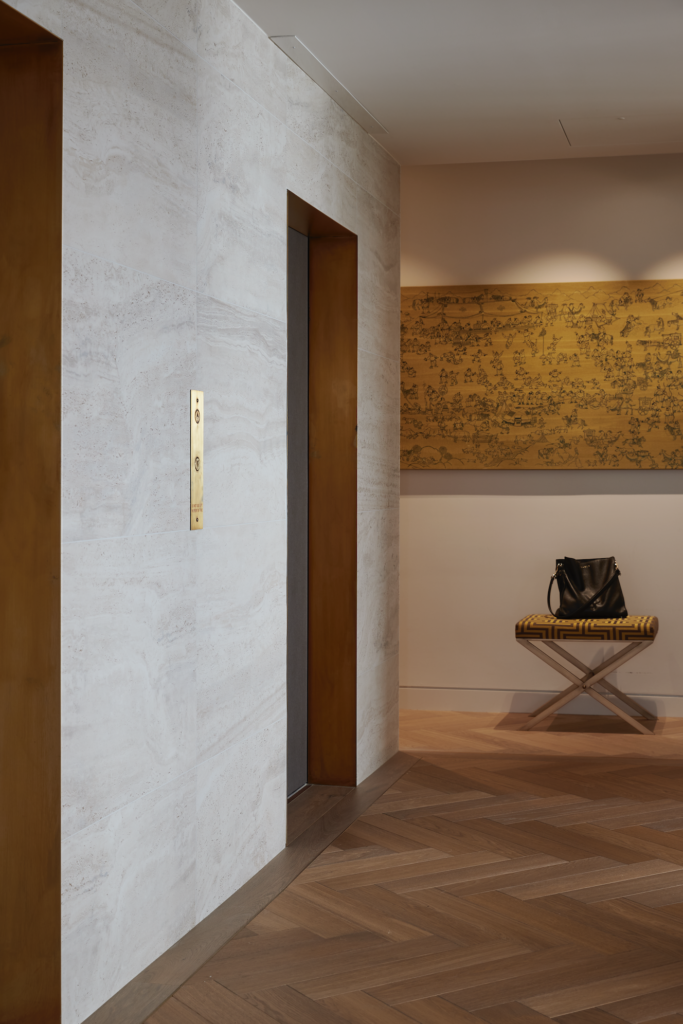
When the lift doors open into this central Auckland apartment, there’s an immediate sense of calm. A small lobby creates a transitional space and introduces a meticulously crafted material palette that enhances the sense that this apartment is a place of refuge and quiet warmth.
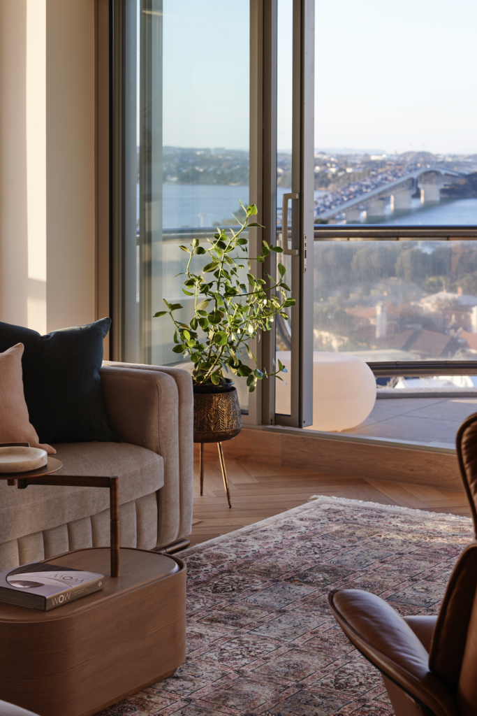
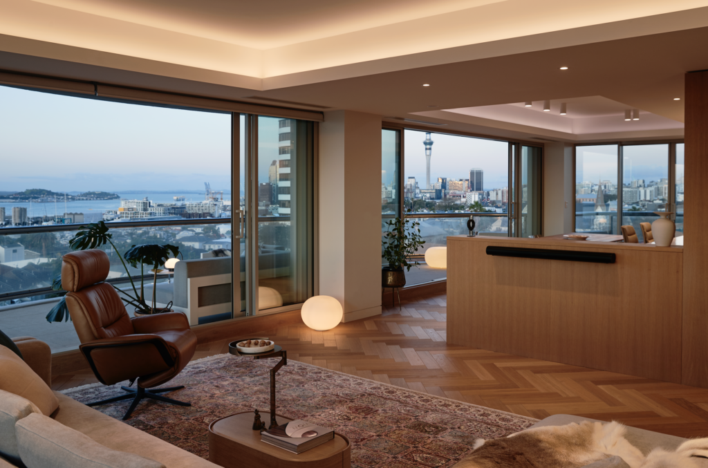
It’s an enticing space that unfolds slowly the more time you spend here — small details at first unnoticed offer themselves up one by one. It is the striking views that first capture your attention; in the realms of this building of curvature, there are vistas in every direction, stretching across the Harbour Bridge to the North Shore, back towards the city, and out to the east and west. While familiar, from this vantage point, these views are immersive.
The project began sometime before Auckland’s lockdowns, when clients of architects Claire Paterson and Amy Hendry popped into their office out of the blue with some flooring samples. After a year or so, the clients came back, having thought about it, so, what began as some help with flooring turned into a full renovation.
Constructed in the 1980s, this apartment, which is located on the sixth floor, had a mostly original fit-out that felt very much more suburban home than city abode. Two of the three bedrooms were spacious, and a small office worked well, but the placement of the rooms did not.
“The plan originally orientated towards the Harbour Bridge and Waitematā Harbour. The main bedroom faced the city, and the kitchen and dining room faced the sea. From our first impression of the apartment, it was obvious to us that the living spaces wanted to face the more lively city views, and the bedrooms wanted to have a calmer outlook, so we swapped the master bedroom and the kitchen and dining area,” Claire explains.
“The whole plan opened up, and we could achieve cleaner, more free-flowing open-plan living spaces with a more private and quieter master bedroom wing. In addition, creating a proper sense of arrival was very important; previously, the lifts opened onto a dark hallway, whereas now it’s a light-filled proper lobby with direct access to the living areas and views to the city that invite you in.”
Construction was a challenge; while working at height always is, there were additional challenges here. The lifts, for example, were too small to bring many of the construction materials up, so staff had to be contracted to walk them up the stairs one by one; the new Thermosash joinery was craned into place; and cabinetry had to be considered in terms of lift dimensions.
Despite the challenges, the benefits of completely gutting this apartment and starting again are evident from the moment the lift doors open. A view shaft allows for sight-lines out over the water, while the subtle material palette is embracing; the warmth and calm it creates is immediately immersive.
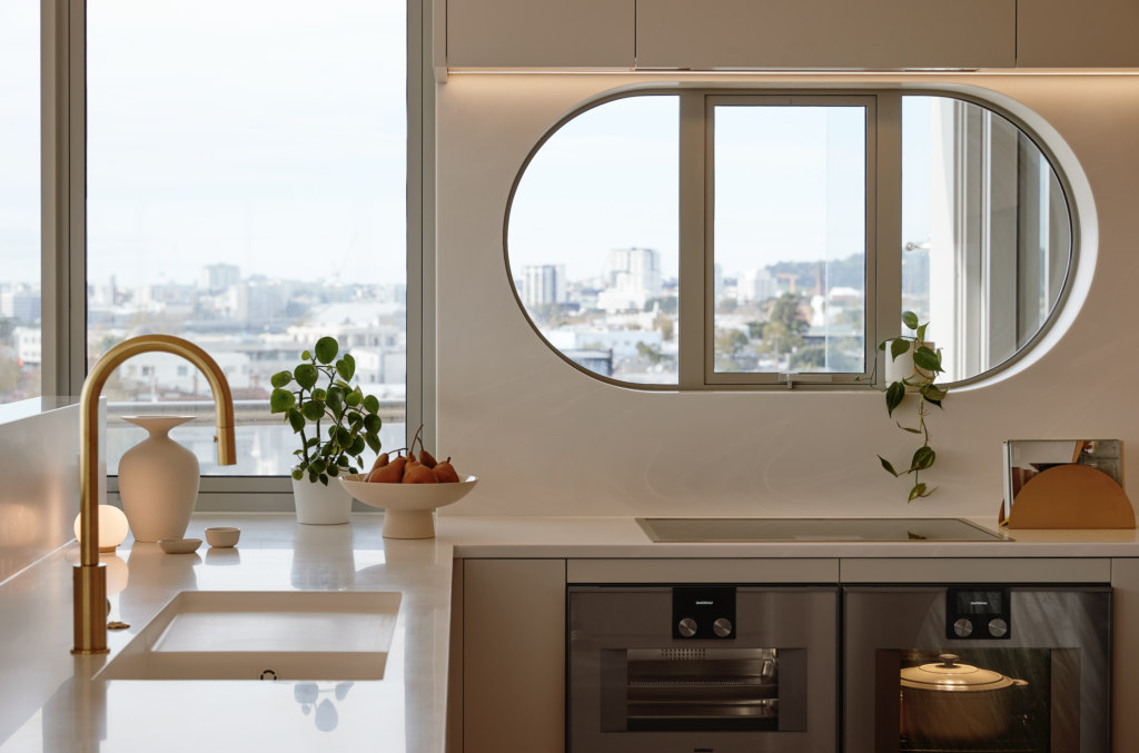
“Our clients wanted to avoid any cool hues like greys or grey tints, so we started with the warmth of the VidaSpace parquet timber flooring, then added the stone, the timber cabinetry, tiles, and brass highlights. Subtle pops of texture or colour, such as the stone benchtop and blush-pink basin in the powder room, provide moments of surprise,” the architects say.
Brass was a natural choice to complement the warm-toned palette. Here, it is used in more ways than just tapware and bathroom fittings, with subtle touches added to edge the flooring in the lobby, in the lift door reveals, and in the mirror trims and edging of wall tiles.
“This gives a soft energy and subtle visual lift to the materials,” Claire says.
It’s a subtlety that the duo’s work is known for — across different styles and contexts, there always remains a similar sense of warmth and calm, something the pair say is achieved by spending a lot of time on “the clarity of our planning, the flow between spaces, and the proportion and hierarchy of each space. We also don’t overdo our finishes; we keep our material palette pared back and consistent throughout each project, and we are drawn to rich but calm-feeling materials and textures that don’t overpower the senses.”
The soft rhythm of the materials and spatial dialogue are echoed in the rhythm of the curvature of the building’s outer shell; together, these elements offer an aesthetic tinged with nautical references — perhaps somewhat unexpected but beautifully narrated.
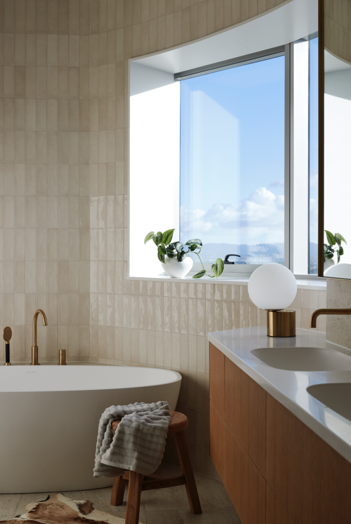
As you spend more time here, the finer details start to emanate — from the fine leather covering the lift doors to the soft hues of the bathroom tiling, from the directed sight-lines to different aspects of the views to the inbuilt bedroom desks that curve around the walls; no detail is overlooked.
The apartment feels both contemporary and timeless, an adage to the way we live now, and a project that underscores just how much our ways of living have changed over the past four decades.
As Amy and Claire see it, “Our work here is just one piece in the progression of how we plan and style our homes today.” As to whether the duo’s work is more timeless than the former 1980s fit-out, they say, “We’ll see in another 40 years.” For now and the foreseeable future, though, this is a home that delivers a great deal in a calmly layered and beautifully subtle way.
