From the street, this little house is barely visible; it’s tucked away neatly on a rear site. There’s a hint of the gabled red brick form but little else.
As you walk up the driveway, it slowly reveals itself — at ground level, the brick is broken by a small entry; there’s an industrial flavour to the steel canopy that shelters the front door and an adjacent window. On the other side, a small low window is the only break in the rhythm of the lay.
In its setting, it marks a notable departure from the predominant vernacular of the weatherboard villas and bungalows that Devonport is known for. However, it offers a more subtle nod to the heritage of the area, particularly in the ecclesiastical buildings built around the suburb in the 1960s and ’70s — and of which intricate brickwork was a central feature. “You can see a couple of them from the site, so it felt fitting in the context,” architect Jimmy Lawton of Geoff Richards Architects explains.
The clients had lived in the house at the front for some time, and the idea with the subdivision and second house was to create a multi-generational environment: two houses that open onto the same central garden area.
The form of the new house was about simplification — it is an expression of reduction. “The clients wanted a house that was simple and robust,” Jimmy says. This house is definitely that; it’s a highly functional place devoid of the superfluous.
At every level, the concept was about creating efficiencies, while weaving a clear design language into the functional spaces. That’s evident at first from the corbelling exterior brickwork, its indents creating distinctive shadows and light play. The use of numerous skylights creates similar moments of directed light and shadow inside.
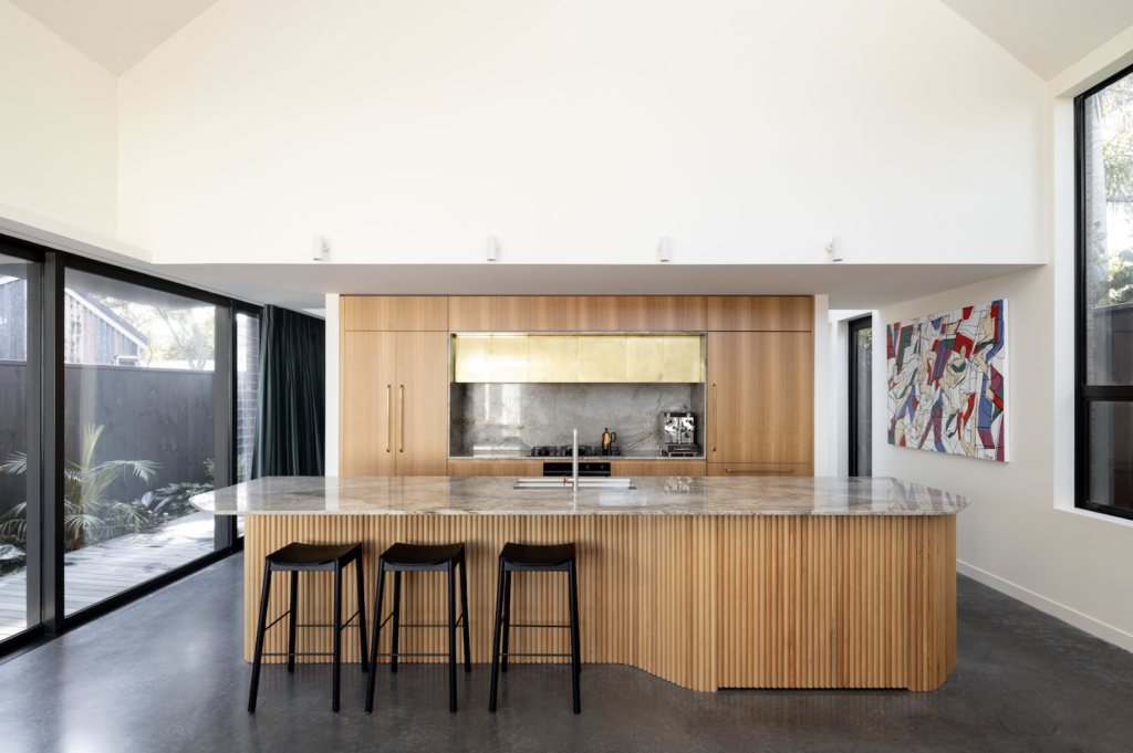
A double-height volume over the kitchen draws attention to what is definitely the heart of this home. “The clients are interested in nutrition, and the kitchen was important to them. Other spaces weren’t so much — where they dined, for example, didn’t matter,” Jimmy says.
“With the outside particularly focused on reduction, the inside needed warmth within its function,” the architect says. The volumes are substantial, with the clients opting for one expansive upstairs bedroom with a large bathroom rather than two bedrooms. The ceiling follows the pitch of the gable, and downstairs a double-height space offers a dramatic volume to the kitchen. “Alongside the kitchen, there are these jewel-like pockets in the house that they inhabit in beautiful ways. Everything beyond those are just spaces to reside in flexibly.”
That’s where the skill of Phill Badger of Fieldcraft came in — the jewel-maker of these interiors: “We looked at how ‘living’ occurs for this couple. A barrister and a critical-care paramedic, both of them worked long hours, so the idea was to weave in elements of luxury to otherwise very carefully thought-out spaces designed for functional efficiency.
“To bring warmth and rhythm to the white walls and concrete floor of the lower level, the kitchen was broken down into tonal blocks,” Phill says. Tasmanian oak was chosen for the cabinetry, which frames a bespoke aged brass extraction by Powersurge. “Over time, it will develop a rich golden-brown patina.” Aged brass Powersurge Hex handles — a slimline hexagonal handle moulded from a singular stretch of brass — were chosen to continue the elemental central feature.
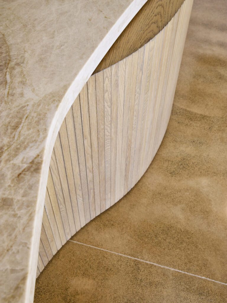
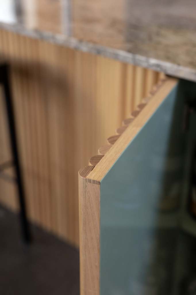
Silver Roots marble was selected for the island and benchtop for its silver-grey tones and distinctive gold and dark grey veins that hint at the tones of the brass and equally pull in the hues of the floor and the cabinetry. The island is softly curved and clad in wooden split dowels, creating a linear feature of rhythmic repetition. “Their tonal variation and curvature provides visual relief and dynamism, inviting people to congregate around the angular counter,” Phill says.
The island holds a secret: a concealed drinks cabinet, its lining painted in high gloss Resene Summer Green — an unexpected pop of colour that the clients requested, and one that connects to a similar tone in the main bathroom’s tiling. An IB Rubinetti tap with a red handwheel adds a quirky touch, tying in with a Holly Schroder artwork that hangs adjacent.
In the living area, bespoke cabinetry was designed primarily to store guitars — the curvature of its cork lining echoing that of the split-dowel island — and encloses a seating nook below a low-placed window.
Upstairs, the split-dowel language is continued — and defines the main bedroom and adjacent bathroom.
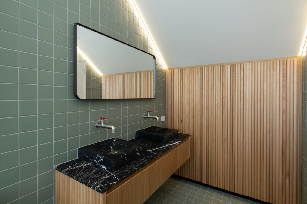
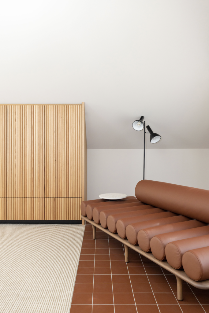
Here, the cabinetry had to follow the pitch of the roof and bring warmth to the simple spaces. “Two generous wardrobes flank either side of the bedroom, one of which incorporates a playful blue tartan reading nook below a skylight,” Phill says.
“The wardrobes are built into the pitch of the roof but fall short of the wall’s length to both highlight the room’s unique shape and emphasise the volume of the cabinetry. The wardrobes are clad in wooden split dowels, with negative detailing around the doors and drawers. Their warmth and linear detail provides a sense of tactility and movement — a welcome embrace to counter the stillness achieved through the room’s pared-back materiality.”
In the bathroom, material choices reflect the language of the kitchen; here, there’s a dose of whimsy. The vibrant white veining of a black Nero Marquina stone vanity is a playful inverse of the Silver Roots in the kitchen, while green tiles echo the colour of the drinks cabinet, and split-dowel cabinetry offers a vibrant departure from the tiled grid of the walls.
This project definitely subscribes to the notion that a house is a machine for living, revealing a collection of spaces of seamless functionality interspersed with just the right amount of beautifully considered moments to pause — upholstered nooks; tactile cabinetry; and accents of brass, tone, and texture.

