On a hillside in the Los Angeles suburb of Mount Washington is a small and precise abode designed by a Kiwi architect that flips the notion of a house on its head.
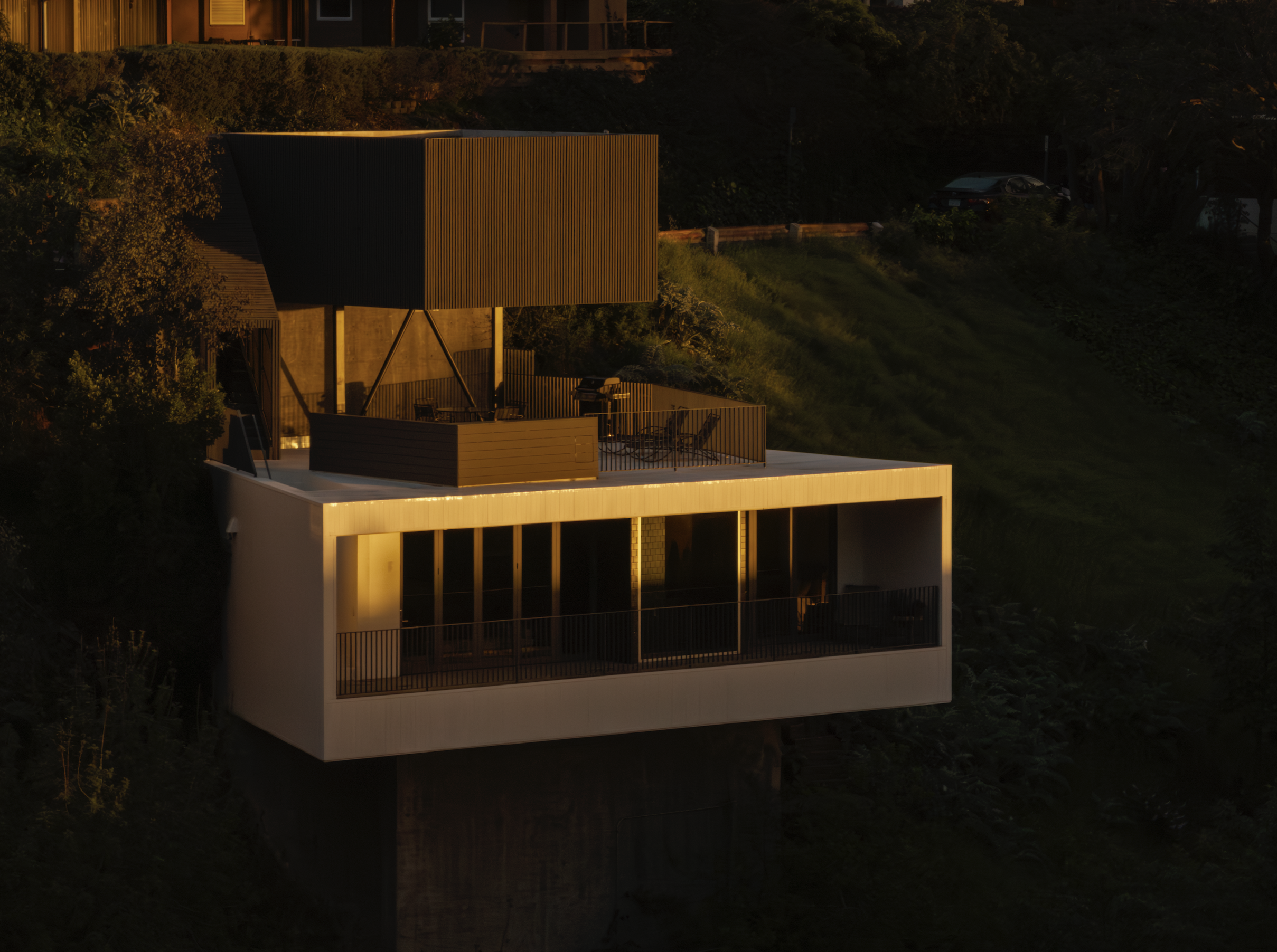
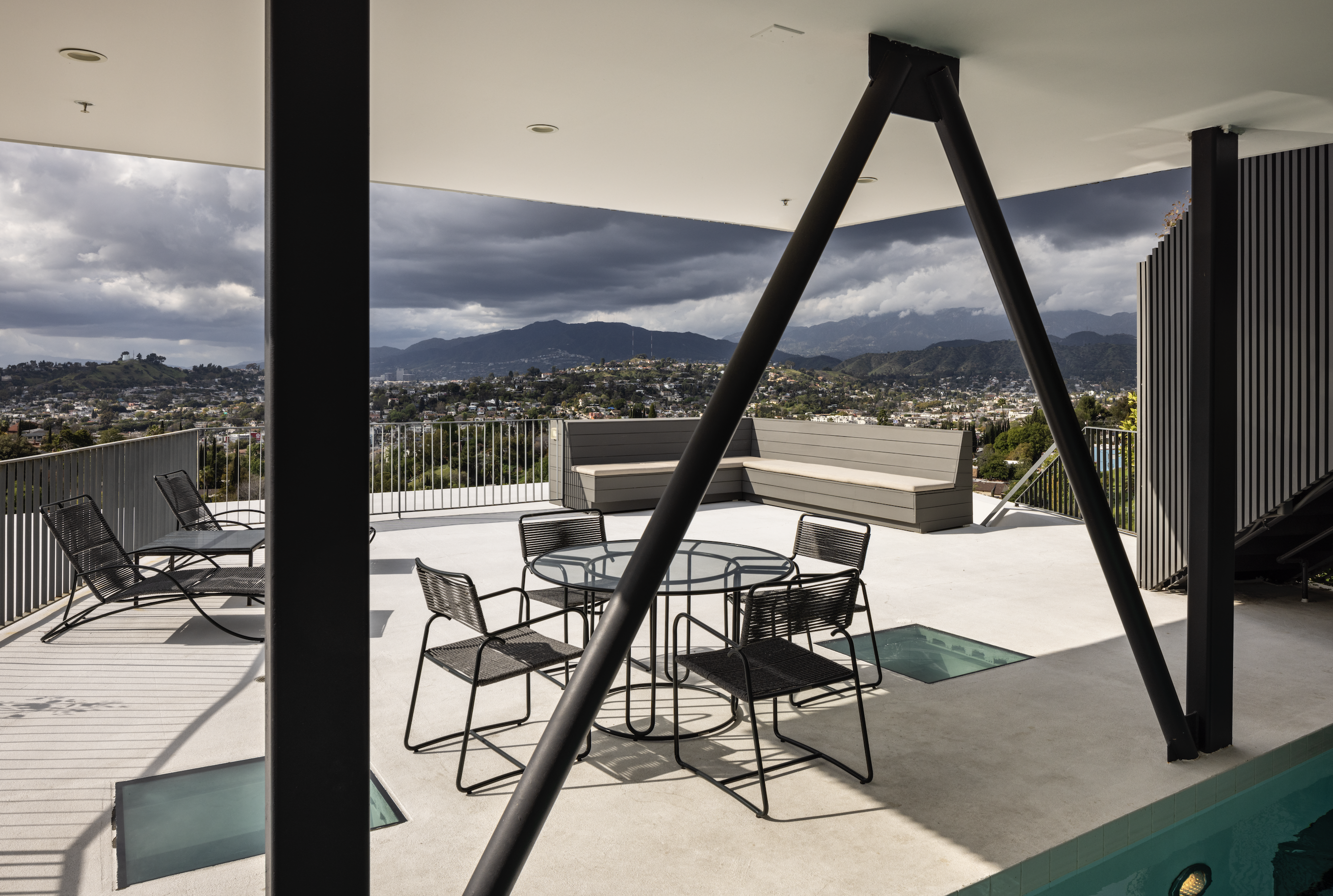
There are no rooms in this structure, and entry is via the roof; plumbing and electrical utilities are used as design objects; the kitchen window frames a view into the pool, creating an aqua glow; and outdoor living is a deck and pool on the walkable roof.
Designed by New Zealand–born, US-based architect Simon Storey, the building has inferences of Aotearoa infused with a decidedly local LA anonymity.
“The sequence of space and programme is vertical not horizontal — an inversion of typical residential experience in California, [which] blends inside and outside on one single level,” Simon explains.
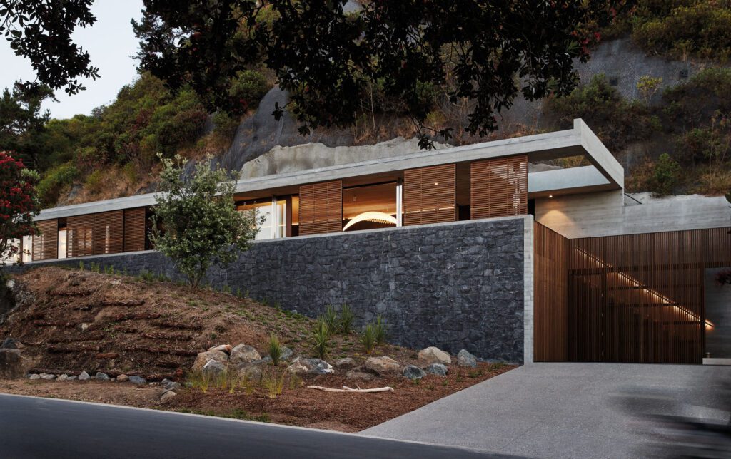
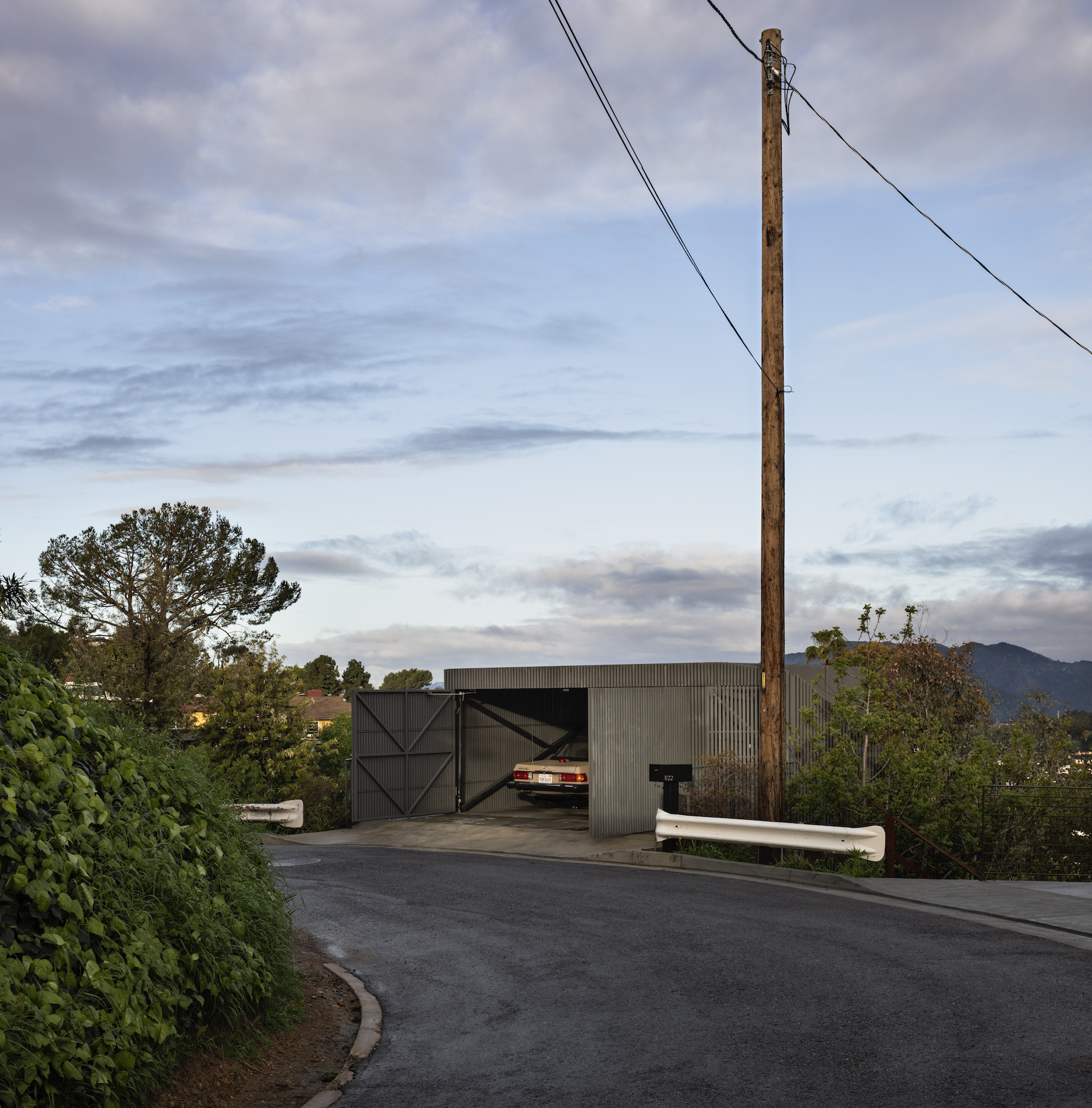
The house is inconspicuous from the street. The covered parking garage wrapped in a timber screen is attached to the side of the hill, cantilevering out into space. When closed, it gives nothing away, presenting itself as a simple, rectilinear box.
“Because of the screen, it acts like a lantern. From the street, the garage is the only thing you see. At night, you come around the corner and you just see this glowing box, lighthouse-like, with the void of darkness below,” the architect continues.
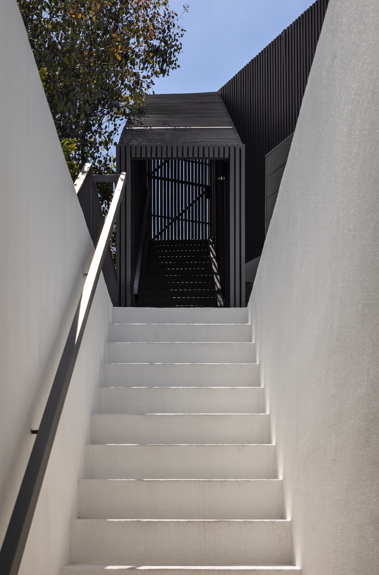
Pedestrian entry is via an adjacent covered stair, also wrapped in a timber veil. This deposits visitors onto the rooftop deck and poolscape, which is partly shaded by the form of the garage that reaches out over it.
Another stair leads into the belly of the house, where the open-plan, single-level space splays out on either side of the garage above. Two skylights cut into the roof deck draw additional light into the interior.
The whole building hangs from the side of the hill — giving the appearance of doing so somewhat perilously — jutting out into the negative space around it.
“We do a lot of work on really difficult, steep hillsides, but this is probably the steepest one we’ve ever worked on. It’s a contradiction. It’s very small, and what the client needs — he lives very minimally — but it is built to commercial standards with steel and concrete.
Despite its size, working on a steep lot like this is a very big undertaking. There’s a delicious irony here: a tiny home built to skyscraper standards,” says Simon.
Inside, all parts of the house exist in one area; there are moments for different functions but the edges are heavily blurred, forcing an interpretation of space that is a step away from the expected. As the house was designed for one person, there was no need for privacy or delineation, and that led the architect to explore a raw and abstracted interpretation of what a house needed to be.
“Even the shower has a giant window that opens out to the view. [The owner] doesn’t care if the neighbours see him, which they probably could if they looked.
“The floor area is small, at just under 1000 squar e feet. To account for this smallness, many parts of the house were designed to perform more than one function. There are movable partitions that turn an open den into a guest bedroom, and a bed that folds down from the wall.”
It’s a raw material palette in which the elemental aspects of the structure are used to articulate an industrial ideology. “The ceiling is a waffled metal ont o which they pour the concrete — it’s formwork of sorts,” says Simon.
“Essential electrical and plumbing infrastructure [was] exposed to become a visual component of the interior design.”
Finely detailed wood cabinetry balances the rawness of the materiality as a whole while block colours were selected for different elements of the soft furnishings, to provide some definition within the open plan and to introduce textural layers.
The kitchen island runs adjacent to a concrete wall, where one window is carved out to frame a view directly into the pool, creating a watery, ever-changing aqua light.
“That window is a really nice way to bring some natural light into that space. It’s a crazy view. The quality of light is really nice back there because it is always moving and filtered through the water so you get that classic aqua colour.”
With the house being built into the side of the hill — on three sides there are no windows — the outlook is exclusively to one direction, focusing the eye on the views out over Los Angeles.
This is a house that has a distinctly North American feel to it. However, there are elements of familiarity in Simon’s work, something he attributes to growing up in New Zealand.
“There is one element to New Zealand architecture that separates it from all other countries, and that is how the buildings are placed in the landscape. In New Zealand, there is a desire to be sensitive to, and aware of, the natural environment. New Zealand architects have an innate ability to build with natural surroundings playing an equally important role [to that of] the building itself. We always try to design with the same mindset.
“I always try to convince my clients to build no more that what they actually need, rather than what they think they need. This typically results in a smaller building of higher quality, and more preservation of the natural environment — which is, of course, a trait carried over from New Zealand.”
For Simon, whose firm, Anonymous Architects, takes its name from the company’s central ethos of avoiding a certain ‘style’, this house was about encapsulating a fresh approach — something the designers aim for with every new project; here, it was one with the landscape wholly at front of mind.
“We want to approach every project in a different way. As much as style is unavoidable, the concept is [that] if you approach every project completely differently, with a clean slate, you get a different result, and therefore our work is completely anonymous. It’s an aspiration that in reality is very difficult to achieve because you always have some repeating elements, but, if you look at the subtleties, I think we have achieved that objective here.
“Abstraction also ranks very highly in our design objectives. This house is abstracted to the point where it doesn’t really read like a home at all. It could almost just be a lantern, for example.”
