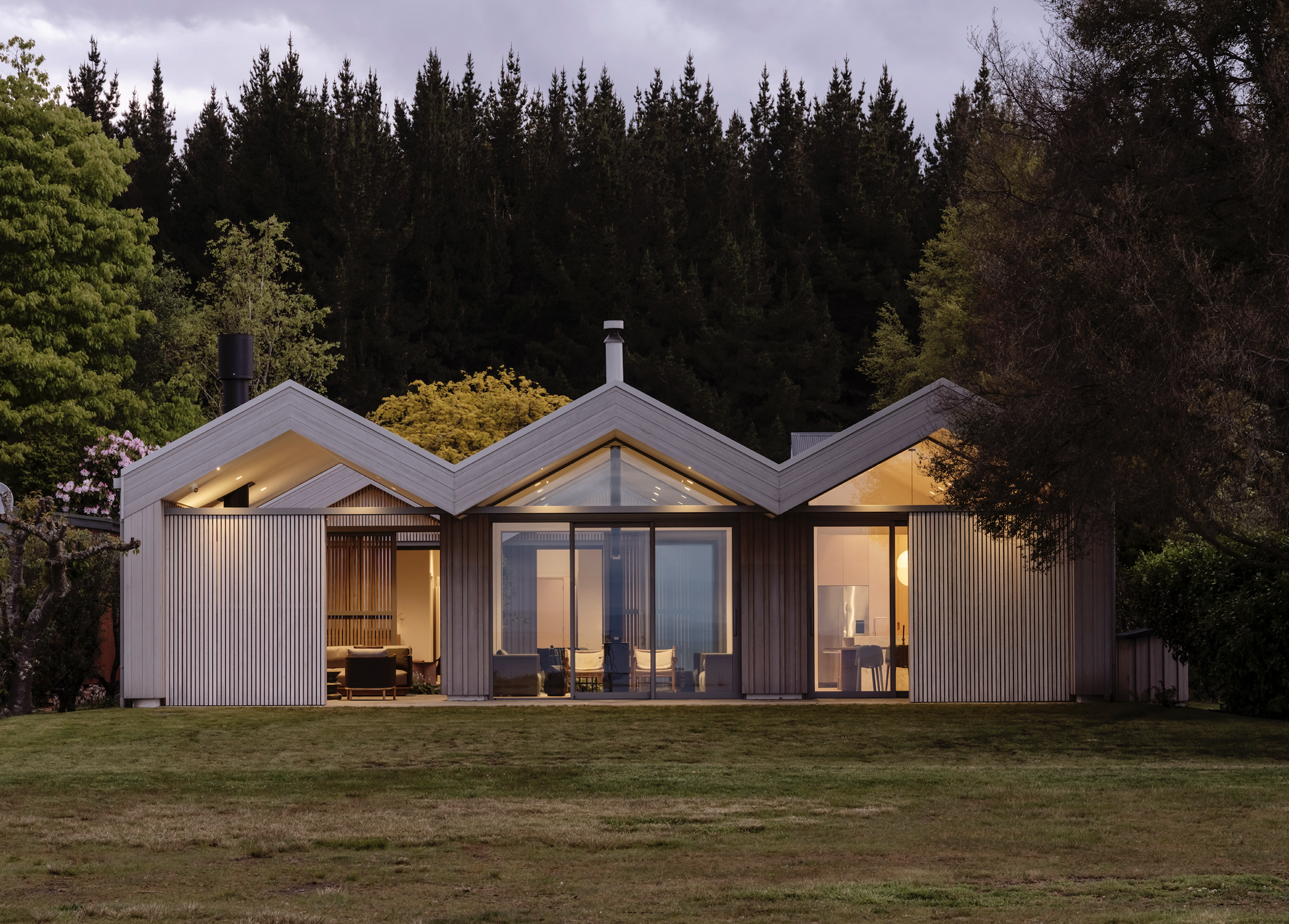
RTA Studio uses three boat-shed forms — at some points staggered and at others stitched into one — to create a flexible, multigenerational, lake-front, holiday house that succeeds on many levels.
The concrete-box bach on a ‘blink-and-you-miss-it’ settlement between Taupō and Tūrangi had been with the same family for well over 30 years. There are a handful of similar holiday houses here, with their backyards defined by a strip of 30-or-so metres of public reserve followed by the south-east edge of Lake Taupō.
“It was a classic ’70s bach,” says Rich Naish of the architecture firm RTA Studio, which was commissioned to undertake the pad’s rebirth, “built reasonably robustly and cheaply, but it was a refrigerator in the winter.”
“We’ve had a few little extensions added on over the years,” says Kate, who was closely involved with the project and who is one of the family members that own the property. “The windows were leaking, and we couldn’t have any heating because the heaters would blow up trying to heat the place. So we decided to rebuild.”
Kate and her sister — who are both involved in interior design — were very familiar with RTA’s work and decided to approach the Auckland firm because they are “always really sympathetic to the environment,” says Kate, “and their structures are relatively simple and fit really beautifully into the landscape.”
The idea was to build a new bach that would allow three generations to come together comfortably as well as reflect the family’s passion for boating.
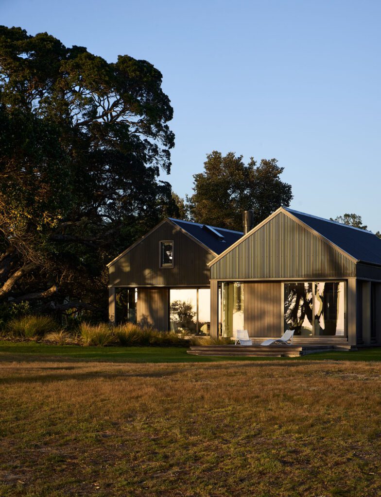
“The boating thing was pretty big,” says Naish, when discussing the brief and how that informed the home’s overarching form: three adjacent, elongated, and seemingly separate rectangular forms that run from street to lake-front and are capped by steep, highly expressed gables.
The challenge, according to the architect, was to try and place a house that captured some of the nostalgia of the old Taupō fishing baches, while offering a sort of larger, modern programme.
“We felt that analogy or allusion to a boat-shed form was quite a nice one for the family and works well, [given that] our team has been working a lot with the vernacular New Zealand gable form.”
Given the context of the public reserve as well as the family’s usage of the lake (both at the back of the property), the question arose as to what constituted the most important facade of the house.
“The street front is not necessarily the most prominent piece of these houses,” Naish says, referring to the group of abodes in this secluded settlement, “so it was really about which is the front end, which is the back of the house.
“We felt that it was appropriate to align the sheds in a more formal arrangement towards the reserve, and then stagger [the three forms] back to the street,” he continues.
The fully expressed triple boat-shed facing the lake makes the house seem large and impressive, with its separate components aligned and presenting themselves in unison. It is here that the three gables meld into a three-peaked chevron, a zigzag of sorts that is both nautical and mountainous, architectural and graphic, while materiality and detailing express something simple yet highly enticing.
Although the building is heavily glazed at this elevation, the RTA team instituted timber sliding shutters with generous separation between planks, a treatment — similar to that used by RTA in its Fale Marker and Bob’s Cove House projects — that lends privacy, security, and shade while retaining ventilation, views, and dappled light.
Meanwhile, the street side, with its three independent forms staggered — starting with the tractor garage and working its way to the main entrance — gives the house the illusion of being smaller, somehow inward looking.
“We divided the bach into three modules to try and break that bulk down into what is read as cute little four-metre-wide modules,” says Naish. “That was the challenge, and probably the success of it; although the house is quite large, it is not a monster that landed there from Auckland.”
“[With ours being one] in a row of about eight houses, it was quite a big thing to take out one house and put in a new one. We didn’t want it to be too different or stand out,” Kate explains, describing how the staggered effect makes the structure blend in better with the other houses “while still looking amazing”.
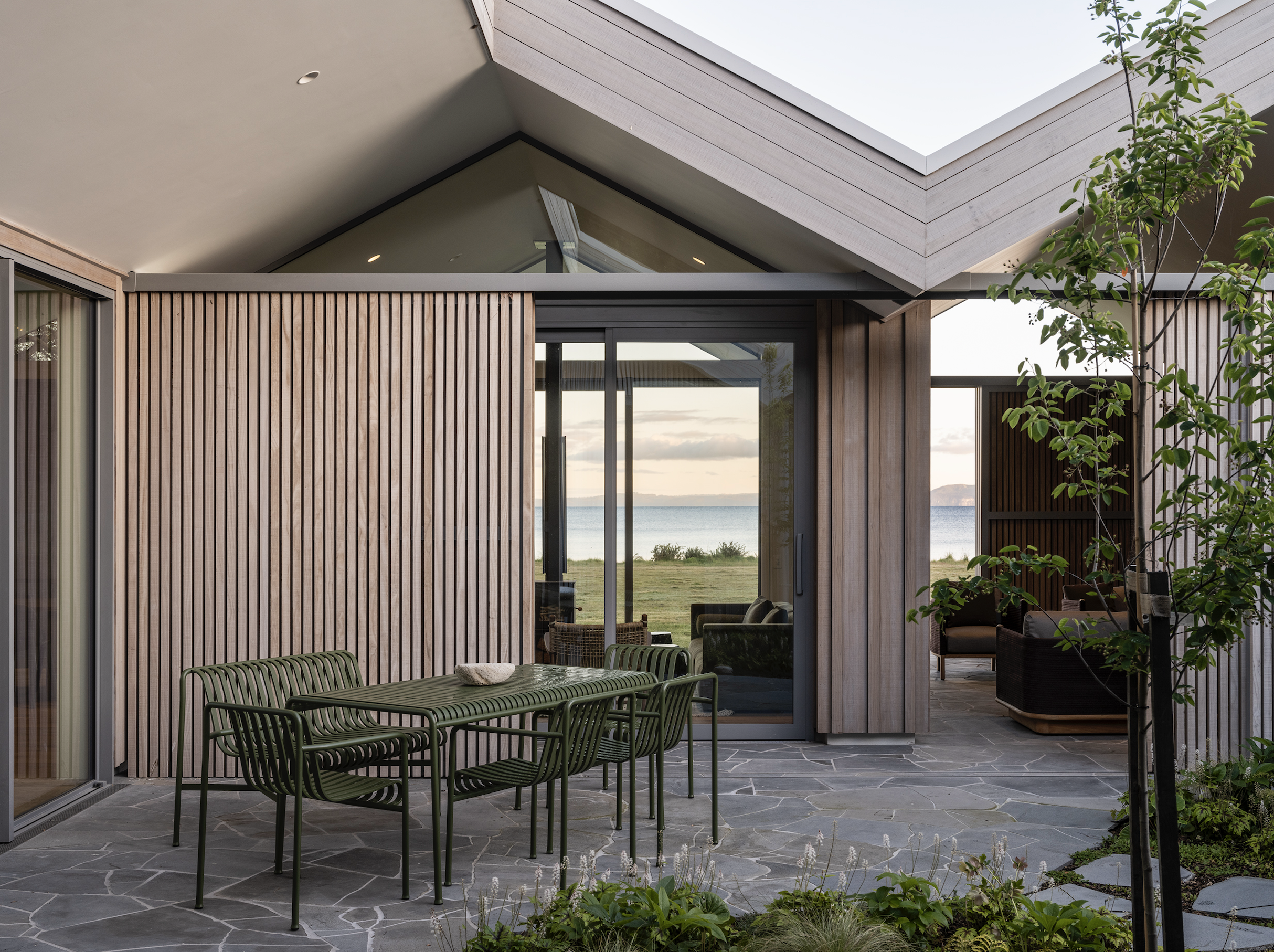
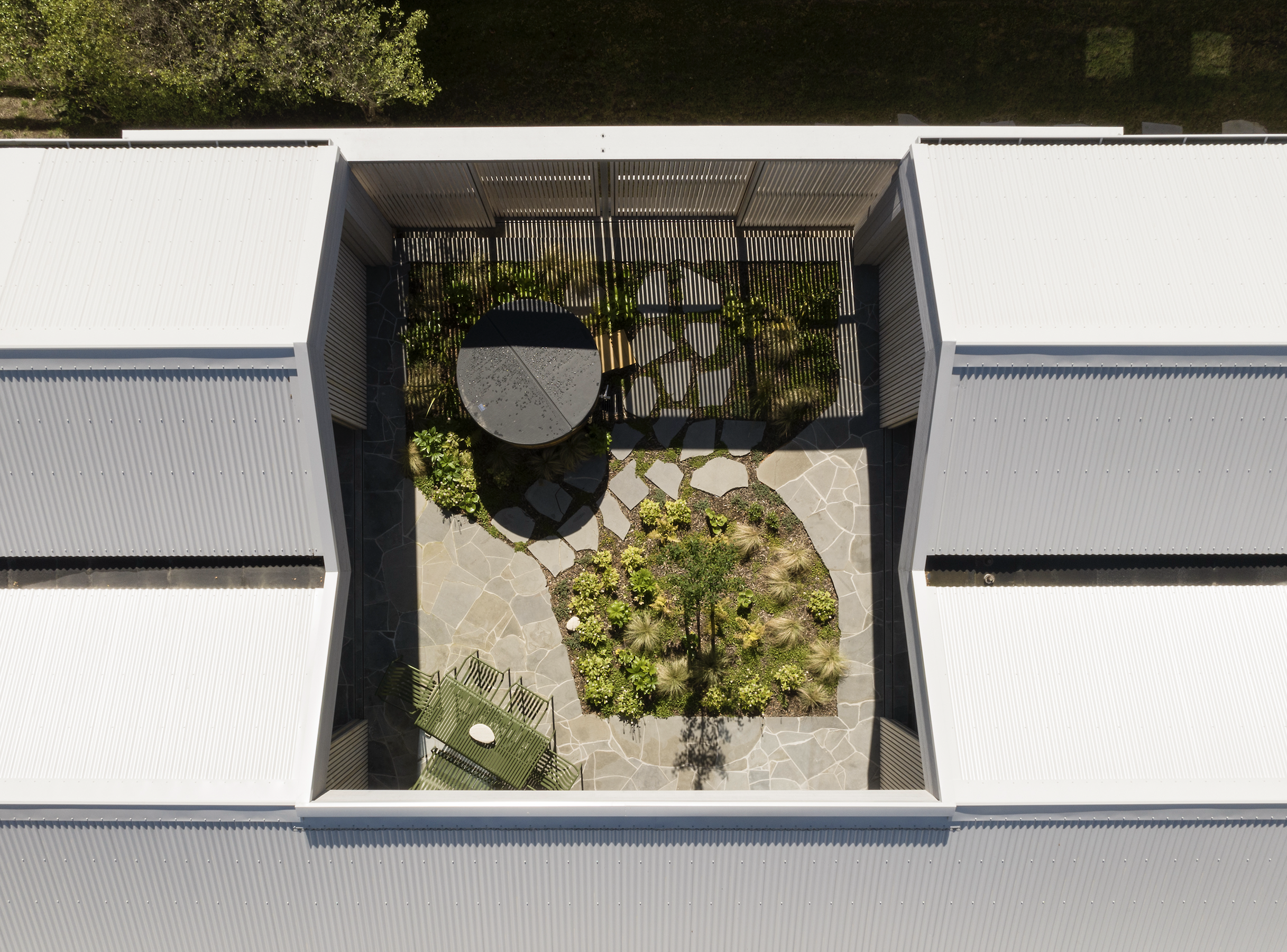
As there are hardly any fences between the closely grouped houses here, the RTA team needed to find ways of bringing natural light into the central core while avoiding openings that stared into other facades. This, combined with the need to provide some respite from the glacial winds that howl from the nearby Mount Ruapehu in the winter months, led the team to replicate and improve an internal courtyard.
“It was about trying to give bedrooms a tranquil open space with daylight and ventilation,” says Naish, of the tiny oasis from which light and greenery suffuse two bedrooms and most of the social spaces.
This openness to the courtyard — modulated by glazing — further connects to lake-front social spaces, which are, in turn, able to be closed off by timber screens, making this an interior that is very modular and highly flexible.
Inside, the bach feels urbane — due to the high quality of finishes and artwork — yet very much of its place.
Aesthetic Consulting and Amy Gillespie Design collaborated in making an interior that radiates with light and reflects some of the colours and textures of its surroundings.
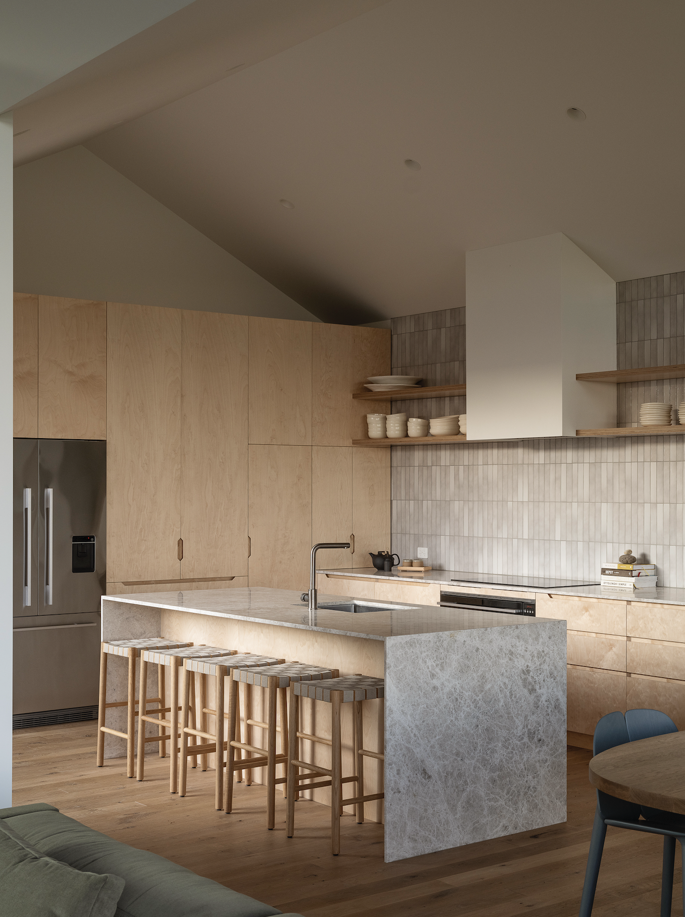
Kate tells us that neutral fabrics, Tundra marble, greens, and blues were all chosen to work with the lake and the outdoors, yet they offer variation from room to room, usually inspired by the significant art collection.
She says they initially chose a neutral colour palette to allow artworks to stand out, yet, at some point, started using a palette that complemented rather than framed. In the TV snug, for instance, an Imogen Taylor artwork (Spit Roast, 2018) dictated the use of Aalto’s Bernini, a deep, dusky pink, and a deep green couch that highlights some of the complexities of the artwork.
Furniture from Studio Italia, Simon James, and Cult Design further drives the point that, although grounded in bach-era nostalgia, we are not dealing with utilitarianism or simplicity but a much more sophisticated architectural conversation with the local outdoors.
Architecture: RTA Studio
Interiors: Aesthetic Consulting and Amy Gillespie Design
Landscape: Xanthe White
Words: Federico Monsalve
Photography: David Straight
