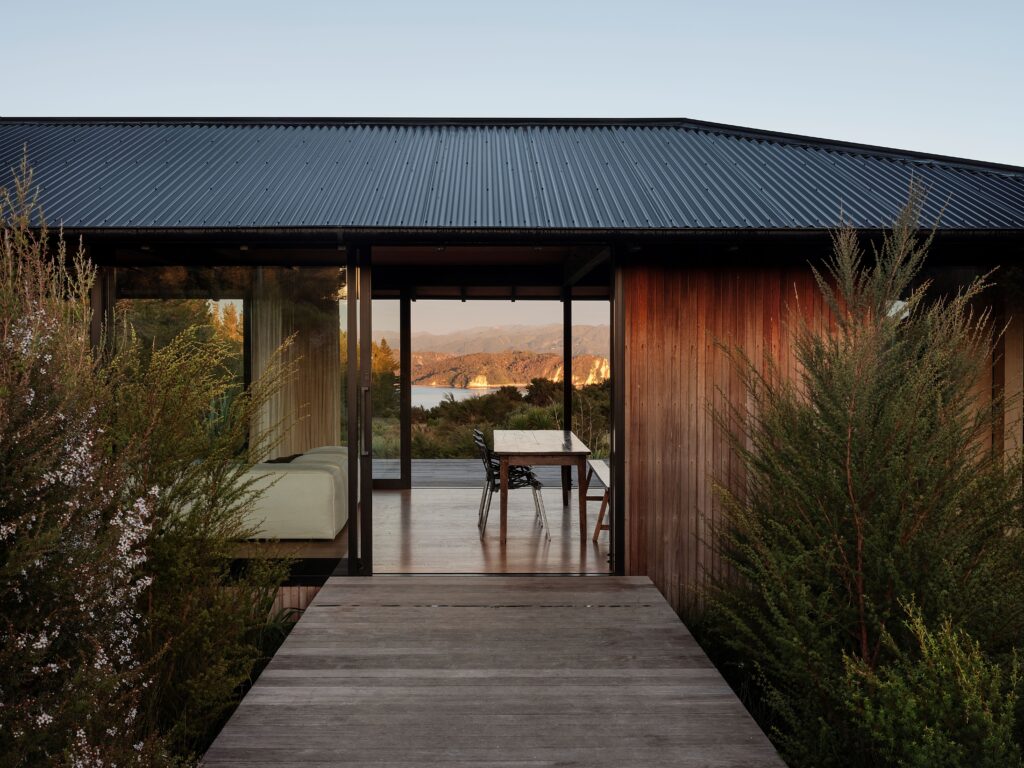
Jose Gutierrez Architects transformed this character villa, located on a typical Grey Lynn street, into a contemporary oasis — a place that moves between lightness and solidity with a fluid grace.
The owner had lived in the villa for many years, and from the outset wanted to create a piece of architecture to admire. The problem lay in how this would be achieved while maintaining the character of the original home.
“She wanted to be in the house and look out at the architecture and enjoy it, so, from early on, the design process became about creating a series of moments and views,” Jose Gutierrez explains.
The original villa was tidied up and “given a bit of a facelift”, which allowed the building to retain its part in the wider character of the streetscape. “From the road, there’s only a glimpse of what’s beyond — you have a little nod to the new building down one side of the house.”
Step inside and you are met with the traditional villa hallway; at the same moment, the unexpected is offered in the form of a vista — to a pavilion-style building at the end of a long reflection pool surrounded by lush greenery.
“It’s very different to the typical villa extension, where an open-plan room is added to the rear and opens to the garden. That’s what was here before, but it felt a bit one dimensional and wasn’t working.
“The client had an interest in creating a calm haven to enjoy. She’s a busy person and lives in a bustling inner-city suburb, so [a haven] was an important part of the brief. The rear courtyard offers that calmness with the central element of water, which bounces light around and sets a general mood.”
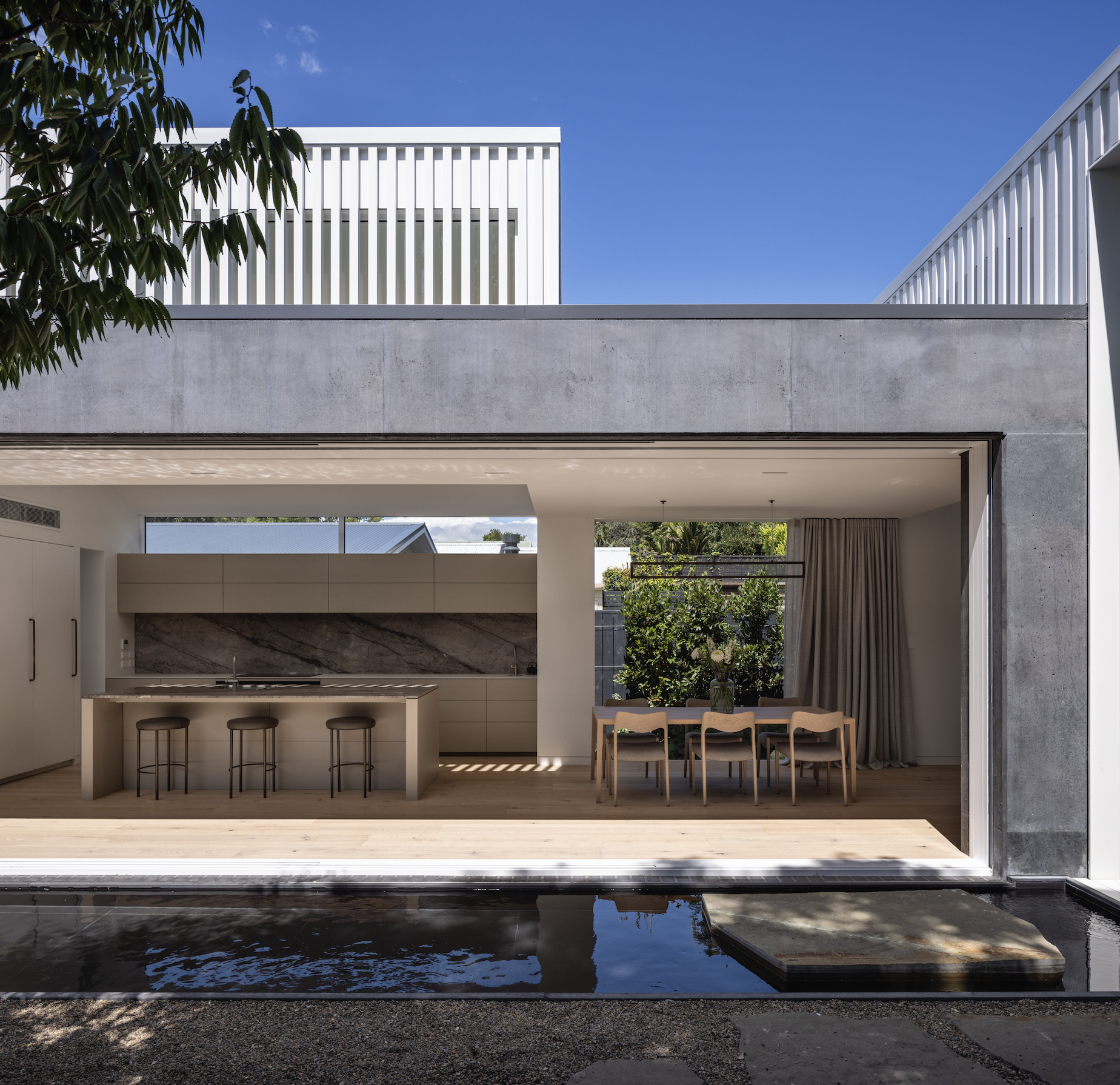
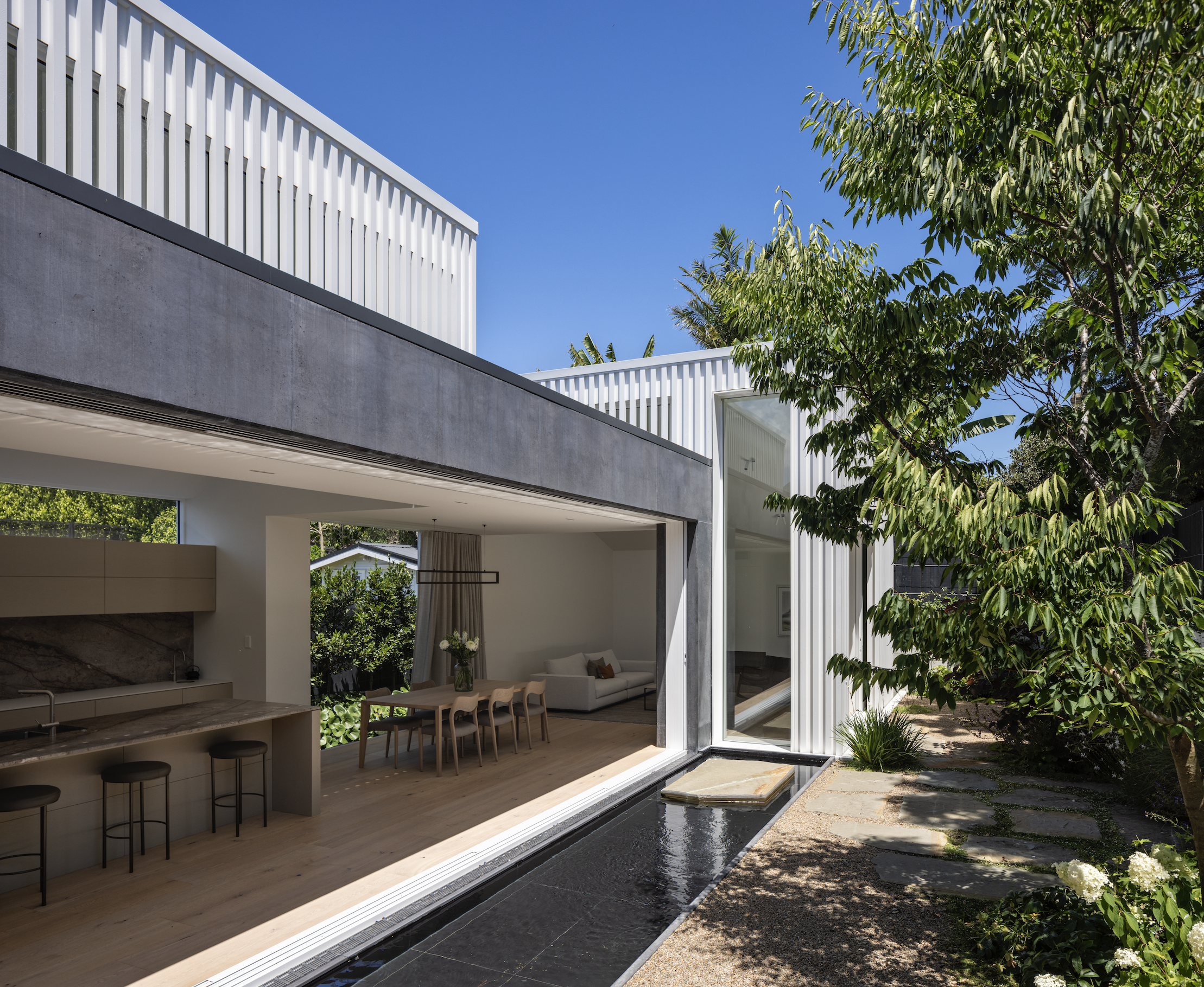
The extension is separated into two parts, creating spaces that interact and connect with one another across the water. Stepped down from the original dwelling, the larger of the two extends out to the rear boundary, where a second west-facing living room is located. Adjacent is the kitchen and dining area, which becomes the central hub of the house and opens to the reflection pond and courtyard with large cavity sliders.
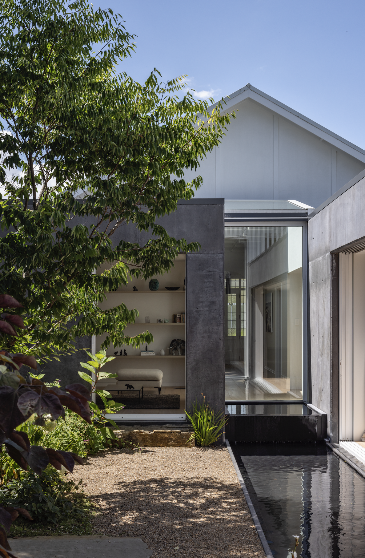
The second part, also west facing, is framed in view from this area; a counterweight to the light dancing across the water, its rectilinear concrete form is darkened with PeterFell black oxide. Inside is a separate living nook, a more informal space for reading and television, where the view again turns in on itself with the other part of the addition the focus here.
“The architecture creates an internal experience but can also stand alone as an architectural form — the view for the building is created within, the experiences inward focused,” Jose says. This allows for a strong sense of privacy despite the closeness of the neighbouring houses.
The kitchen/dining area is framed within the same coloured concrete, a move that creates a tension between the heavy concrete and the finer, lighter interiors. Above it, Jose’s delightful approach to creating a dialogue with the white picket fences the suburb is known for has resulted in a striking external timber screen wrapping around high windows to filter the light.
Inside, this creates a buoyancy, a sense of the spaces being alive — draped in ever-changing light, with certain textures heightened as it changes throughout the day.
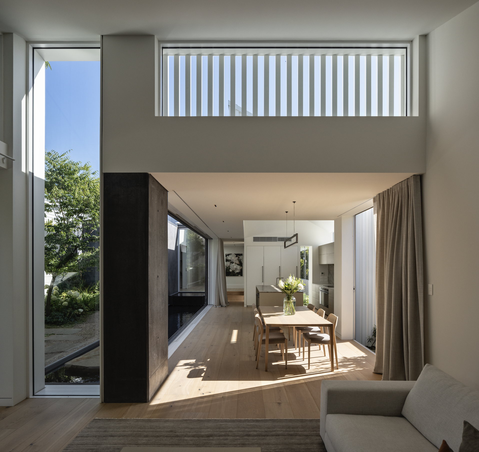
“The placement of these timber battens across the elevated windows creates shifting patterns, illuminating the interior walls with a golden light,” Jose explains.
The interior palette is intentionally subdued, each material selected to complement the next, and to reflect the natural tonality of the courtyard. “Attention is drawn to the raw beauty and texture of the materials, which speak to each other and are given space to breathe,” Jose says.
The original floorboards were in a state of disrepair and had to be replaced. Oversized boards in a neutral tone were chosen, and continue throughout old and new, creating a smooth transition between areas.
The kitchen is the hero of the interior; it presents as a piece of art — simple forms defined by material and light. A marble island and splashback draw the eye in; overhead cabinetry gives way to a clerestory window framing greenery and the sky beyond.
“I think the kitchen really complements the building; it’s the central sculptural heart. The slabs were hand picked, appliances were integrated. I wanted everything to feel effortless and easy, calming, and, up close, to create a depth with the natural textural elements of the materials.”
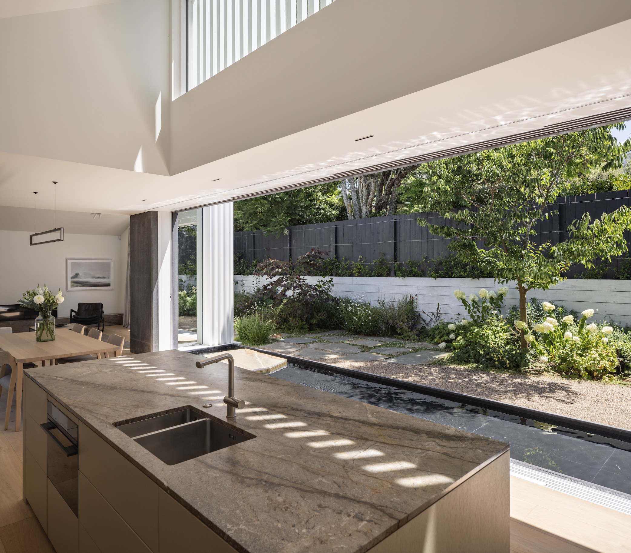
This minimal palette continues into the bathroom, where a floating vanity carved from stone makes reference to the concrete exterior. “The house is a collection of heavy masses but it has a lightness to it, created with the ever-changing light, water, and views.”
In the courtyard, landscaping by Andy Hamilton adds a soothing variety of sumptuous organic textures and colours. In the reflection pond, a single stepping stone appears to float. “The size, orientation, and placement of it were carefully thought out to create a sense of weightlessness. In essence, it’s a summary of the whole building: heavy materials that feel weightless.”
Jose speaks of his desire to “catch the light” and create dynamic spaces that move and change. Here, he’s done that and much more. This is a place of serene tranquillity; a calming home that invites contemplation within its many moments of gentle interaction.
