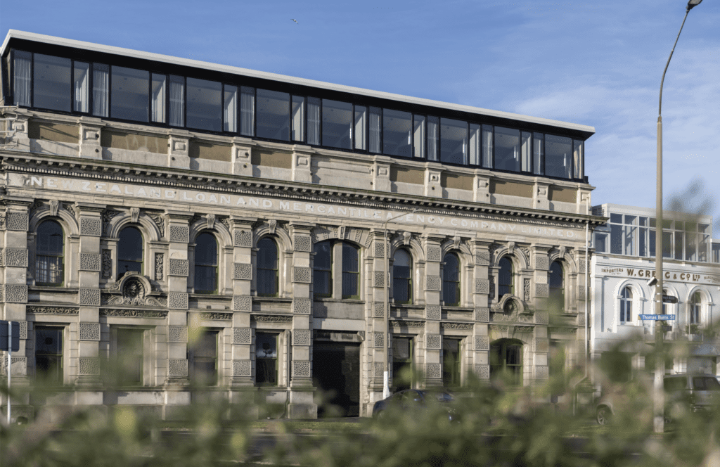
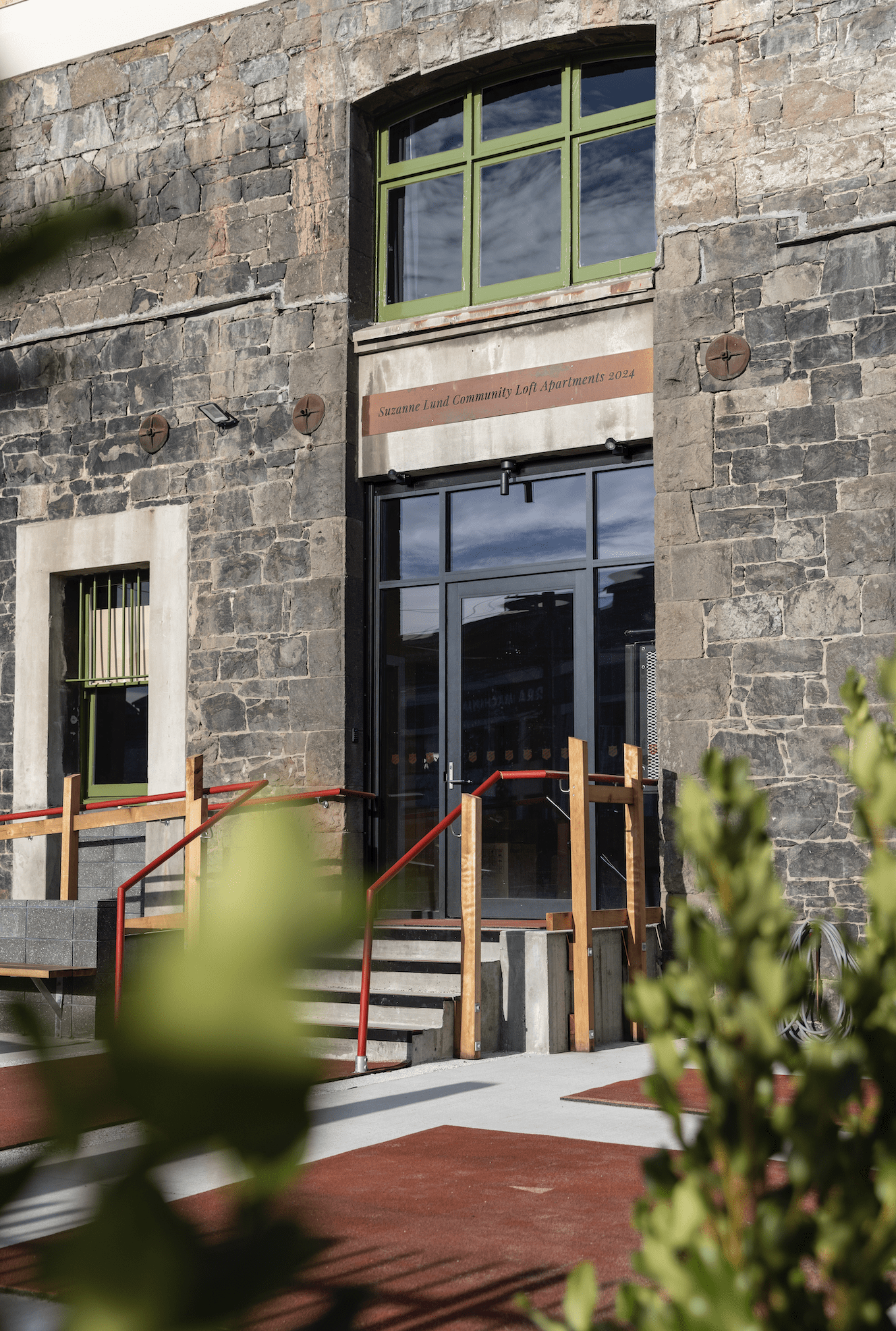
In a first for New Zealand, 30 new social housing apartments were opened last month in a heritage building in Dunedin, designed in a creative cross-Tasman collaboration between a Dunedin couple and an architecture firm in Tasmania.

Spearheaded by Russell and Suzanne Lund — Russell a builder and developer, and Suzanne a celebrated painter — the apartments were shaped within the existing fabric of the Loan and Mercantile building structure, which Russell and Suzanne have owned for 25 years. It comprises two buildings, one of which was completed in 1873 and the other in 1883.
When Russell first walked into the building, it was with the intention of renting a studio space for Suzanne, who is well known for her vibrant floral paintings.
“I had just come back to Dunedin after spending time working in Seattle and Portland. Portland was one of the first cities to really embrace adaptive reuse in its industrial buildings. I had worked on some really interesting warehouse conversions, so, when I saw the studio, I asked if I could have a look around the rest of the building. Forty minutes after I had first walked in, I left as the proud owner of the building,” Russell tells us.
At that stage, the building was being used primarily as an auto-parts warehouse, and on the top storey was an operational go-kart track. As the Lund era began, little changed except that the items being stored were those reclaimed from construction projects Russell and his team were undertaking around Otago. Fast forward 25 years and the building was full of ad hoc parts — from doors to timber, front desks, and everything in between.
It wasn’t until Russell was on holiday in Tasmania and stayed at the Henry Jones Art Hotel that an idea started to emerge. He was so taken with the way the old building had been redone, in a manner that celebrated its history, that he sought out the architect behind it. That architect was award-winning Robert Morris-Nunn of Circa Morris-Nunn Chua, and, as it happened, his office was in the building.
“I walked in, and he was so generous and gracious. He talked me through the ideas, how it was done. I walked out knowing I wanted to work with him.”
It took a few more years before work would get under way. There were various hurdles relating to the zoning of the area, heritage restrictions, and appeals to the initial resource consent application. Ultimately, a new zone was created to allow for the development of the building.
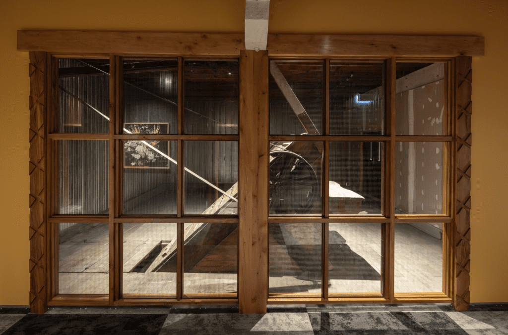
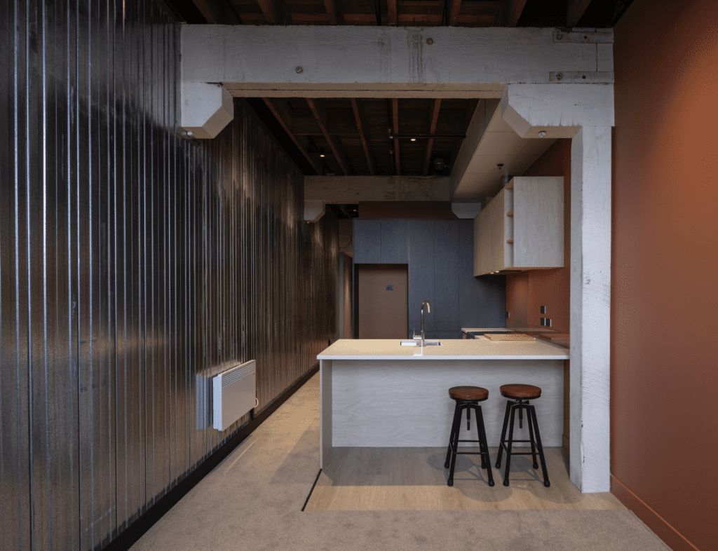
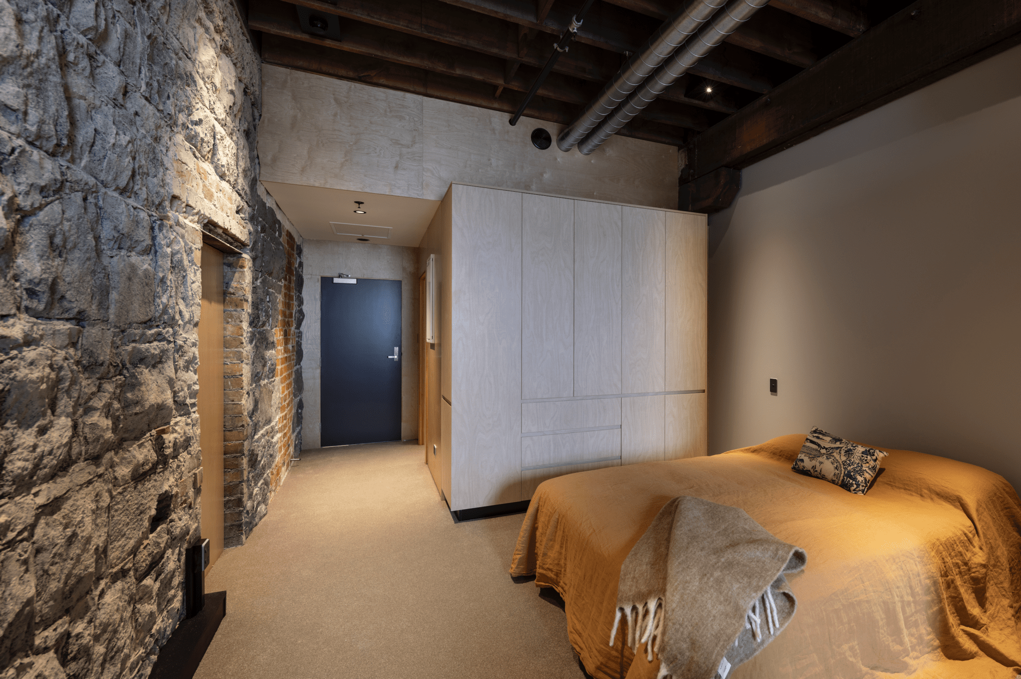
Most of the interior was relatively unscathed, including the original hoists that were used to transport grain from ground level to the store on the upper levels. A challenge was how to thread apartments in between the 128 concrete columns that pierced the floor-plan at 3.5-metre intervals.
“The idea was always to create true New York loft-style apartments with the structural elements exposed,” Russell says.
By threading 30 apartments, predominantly studio and one-bedroom dwellings, between the columns, and celebrating the original material fabric, the Lunds and their architect have created something quite spectacular.
Russell tells us, “Robert said from the beginning, ‘When our clients walk in, they are going to feel like they are in a five-star hotel.’”
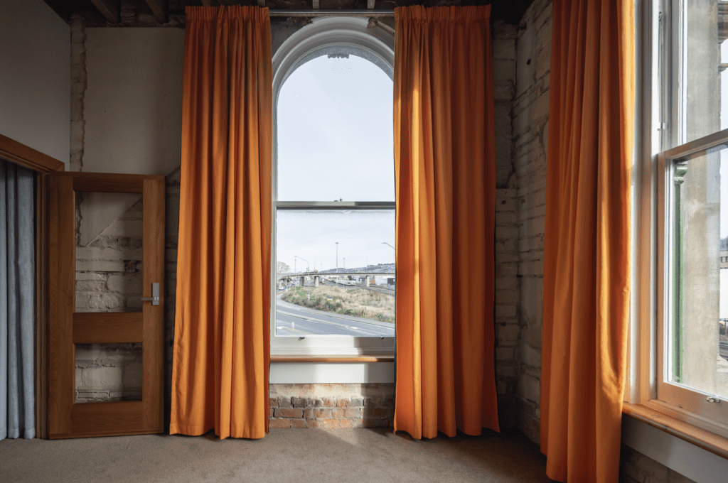
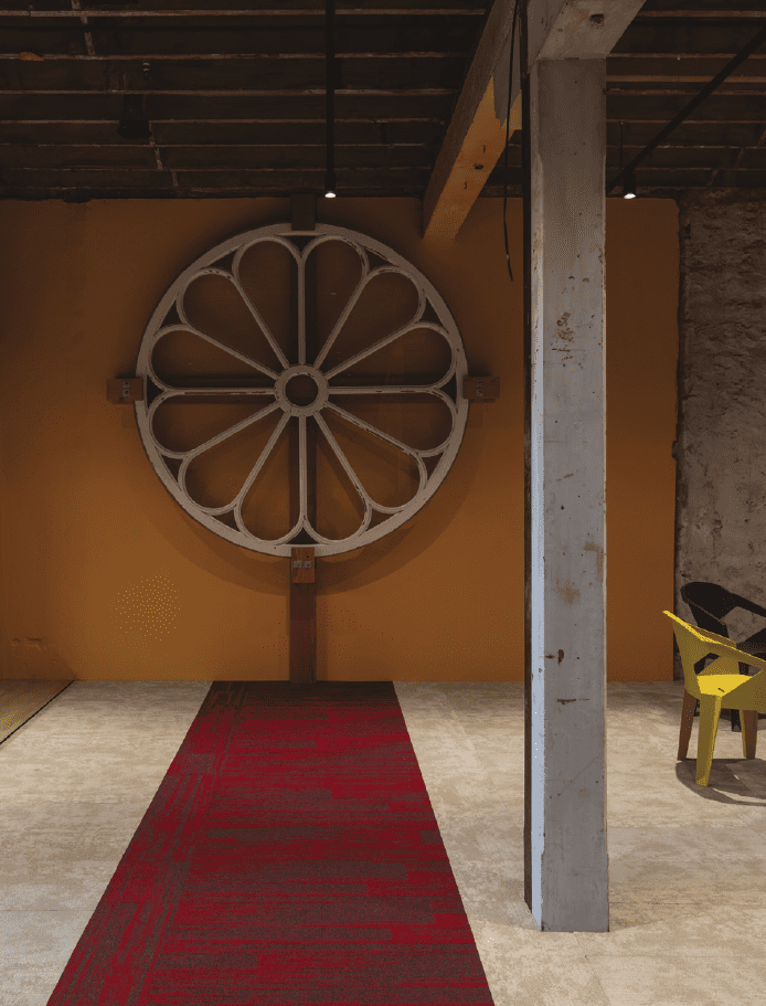
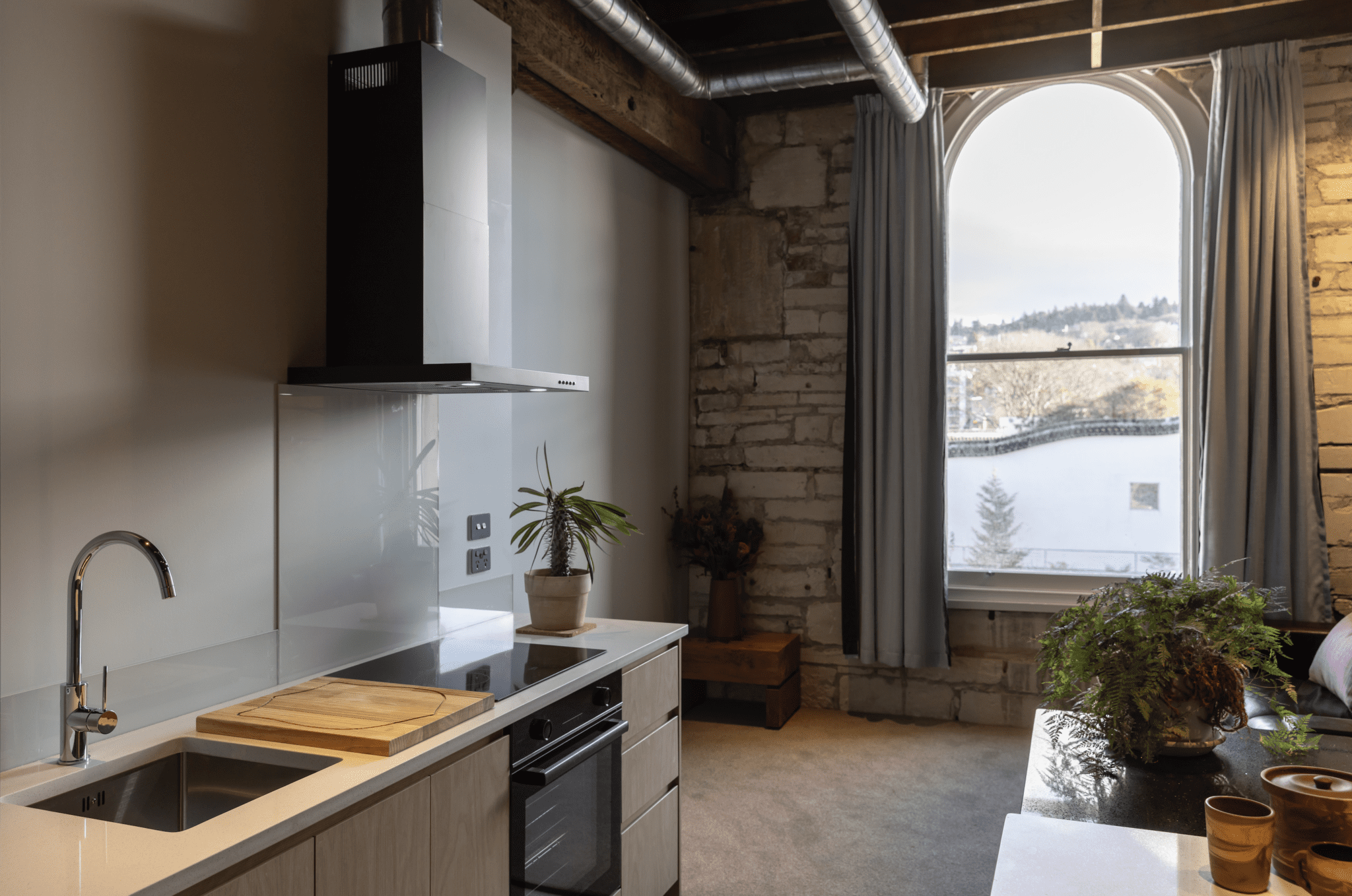
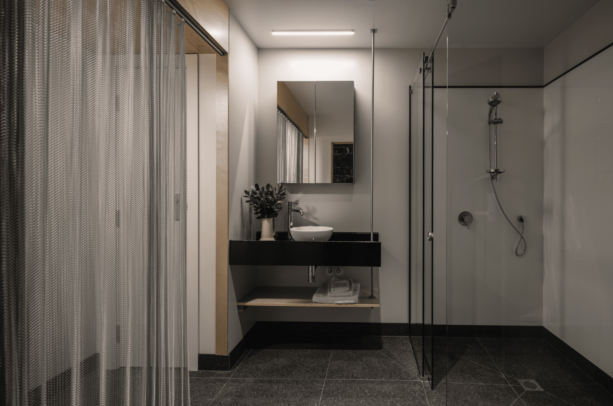
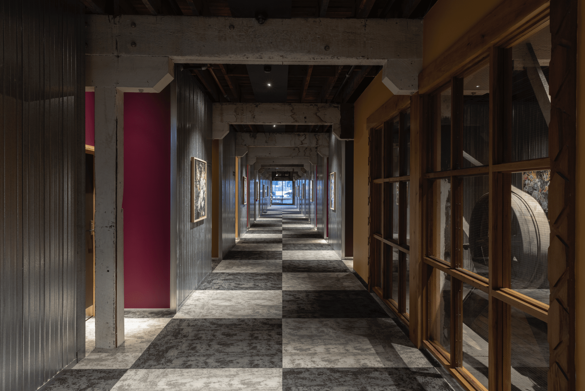
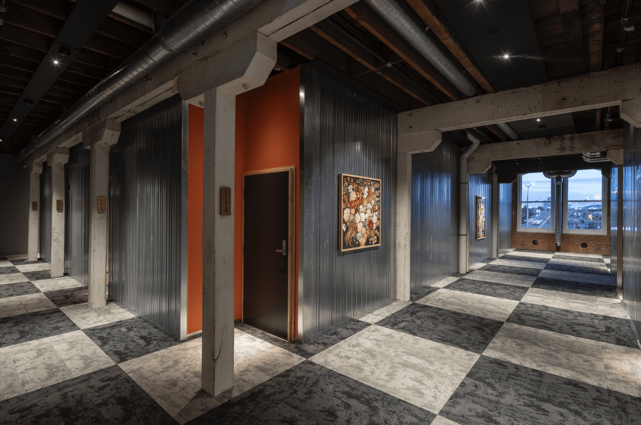
The first Salvation Army tenants moved in last month, and that’s undoubtedly exactly how they experienced it. The apartments are fitted out with birch ply veneer, engineered stone, coloured glass splashbacks, terrazzo-tiled bathrooms, and bespoke glass showers. Five colour schemes have been used throughout, creating a striking character within the heritage fabric. The hallway is a statement in itself, clad in Korok, a clip-together metal system primarily used for industrial purposes. Here, it was installed vertically. Chequered carpet underfoot offers a nod to the old go-kart track.
“We wanted to celebrate every chapter of the building’s history, because each has value,” Russell says.
The grain elevators are surrounded by glass and offer a compelling glance into the past. Their timber architraves are etched with the marks of days gone by; they were once stair stringers. Oamaru bluestone, brick, and concrete were “tidied up” where needed; rough edges were smoothed — but other than that the marks are windows to days gone by.
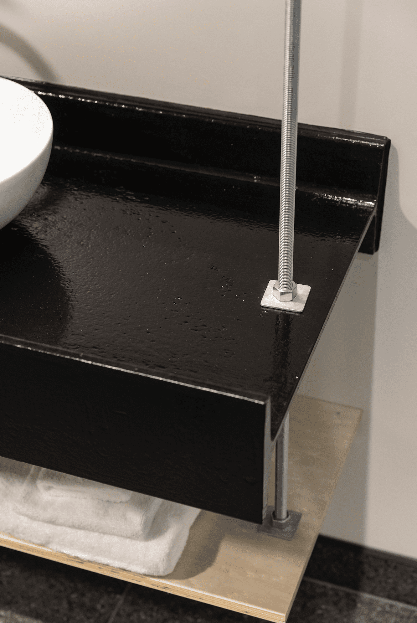
High-end French fabric was used to manufacture the colourful drapes that anchor the colour schemes in each apartment. The recycled steel beams suspended from the ceilings to form vanities are 100 years old. The result is a beautiful amalgamation of old and new, and an insightful narrative into adaptive reuse and the creation of invigorating living spaces for vulnerable community members.

On the upper storey, the Lunds had a similar vision of New York loft-style apartments; these ones utilise a similar design ethos except that they are high-end dwellings — and therein lies the complete social fabric of the building.
As Russell puts it, “It’s about social cohesion and the creation of mixed-use living spaces, reusing what we have and creating something for different people to enjoy.
“This project was a highlight of my career; if we can do more projects like this in New Zealand, that would simply be a good thing.” We wholeheartedly agree.
Colours that sing
Dunedin painter Suzanne Lund designed this playful but timeless colour scheme using her art as a starting point.
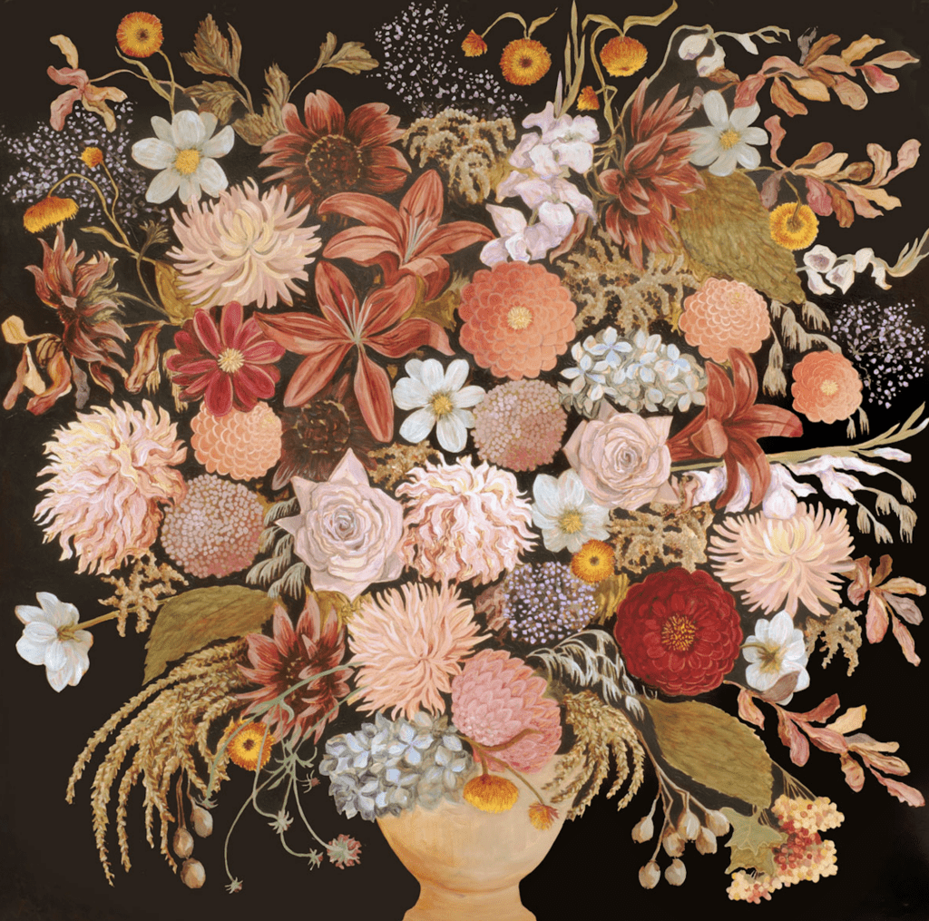
The hallway of the Loan and Mercantile building, which is now home to New Zealand’s first social housing development in a heritage building, was wrapped in an industrial steel product. Adorning the steel are prints of Suzanne’s paintings. From within their floral blooms, she devised a colour palette of nine hues, which were used to paint the door recesses of the apartments.
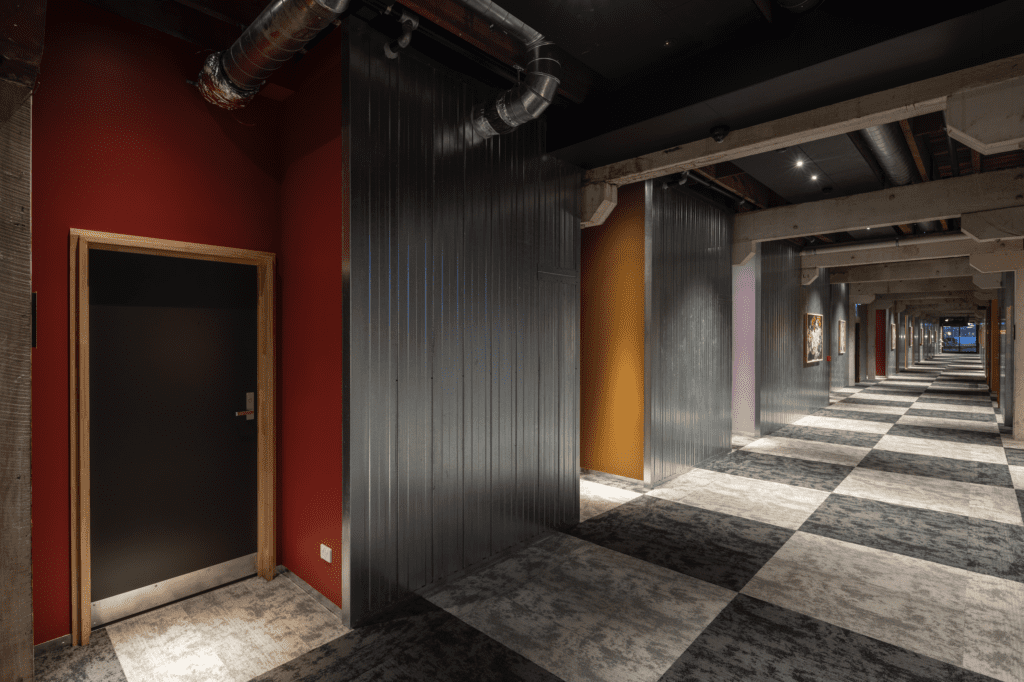
Moving through the grounded Resene Yukon Gold, a handsome khaki tone, to the vivid Resene Pompadour, a rich plum violet, and the feverish pink of Resene Disco, the spirited colours create a compelling and characterful statement. Resene Festival, a mellow yellow, meets a feisty Spanish orange, Resene Valencia, while the nostalgic oxide red of Resene Old Brick pairs perfectly with the mauve of Resene London Hue; Resene Chocolate introduces a rich red brown.
Four different colour schemes were used for the interiors of the apartments, which, like the hallway, Suzanne speaks of in terms of “what sings together.”
“It’s all about what works together. While it’s always easier to do something more conservative, we wanted to create something special here. We’ve seen a lot of social housing and there’s no need for it to be bland. I spent a lot of time in each apartment, looking at the light throughout the day and considering what would work. I’m always drawn to complex and interesting colours,” she tells us.
The interior colour schemes move through earthen palettes, from Resene Wild West and Resene Route 66 to the more vibrant Resene Tulip Tree — each grounded with the use of Resene Half Tea.
The colourful canvas of this building, set against original stonework and the exposed structure, tells the story of the historical and the contemporary, the two perfectly paired to begin the next era of this landmark building.