When you devour design in all its guises, it’s natural to want to test out ideas you pick up along the way. Fortunately for Kate Rogan and Eva Nash of Rogan Nash Architects, their business is fertile ground for such evolved experimentation — and when it’s your own home you’re building … well even more reason to push the boat out.
An unusually shaped section and seen-better-days house might have put other buyers off this Grey Lynn property, but for Kate and her husband, Matthew, it was gold. Situated in a quiet ‘tree-tunnelled’ cul-de-sac, the ’50s dwelling was not subject to heritage regulations and, while it was rundown, the location was mint.
“The second time I visited, kids were playing rugby in the street; it was like stepping back in time,” says Kate.
Kate and Eva, who have been friends since school and tend to operate as a tag team, saw that this was the canvas on which they could design a modern family home for the Rogans and their two children — Hugo (9) and Rose (6) — within a community they already loved.
The 200-square-metre newbuild, with a two-storey main form and a single-level wing at right angles, slots distinctively into this neighbourhood of character villas, a welcome latecomer. Its simple gable envelope reflects the language of heritage but is clearly up to the minute.
Vertical black-metal cladding is a low-maintenance choice but far more than just pragmatic.
“It’s a strong, singular block of colour that doesn’t give anything away,” says Eva.
That’s because, inside, the house is as playful, warm, and inviting as they come. Each room pings with personality.
When it came to the interior palette, fashion was the firestarter.
Kate explains, “I love the colour blocking of Missoni and the way Diane von Fürstenberg uses bold prints including triangular motifs.”
She determined that these concepts would be translated into the architecture, assigning a tone-on-tone palette to each stand-alone space.
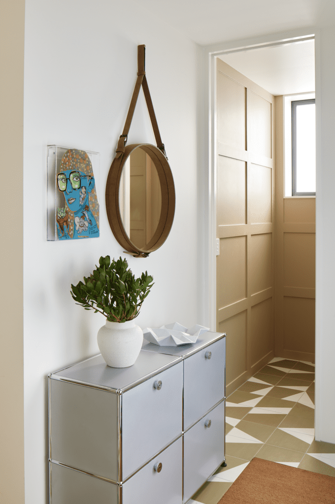
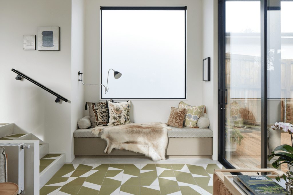
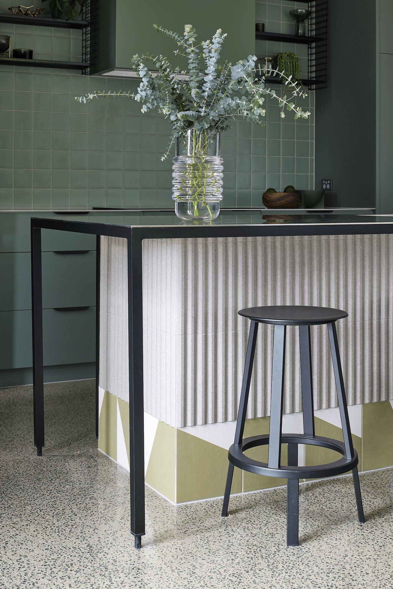
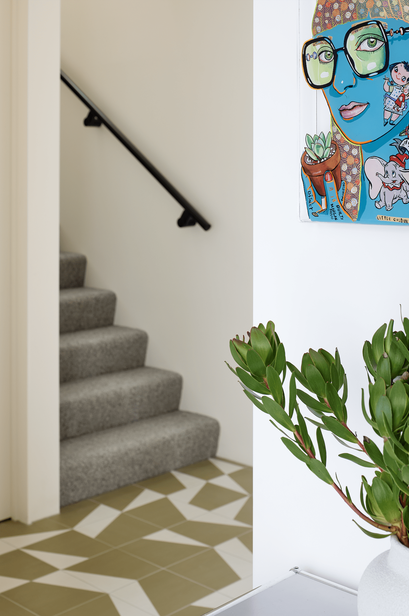
The chromatic fun starts in the entrance hall, where a haphazard olive-toned floor tile, aptly named Puzzle, is like a geometric river that flows through the plan.
“It acts as a path through rooms and leads right the way to the outside decking,” says Kate.
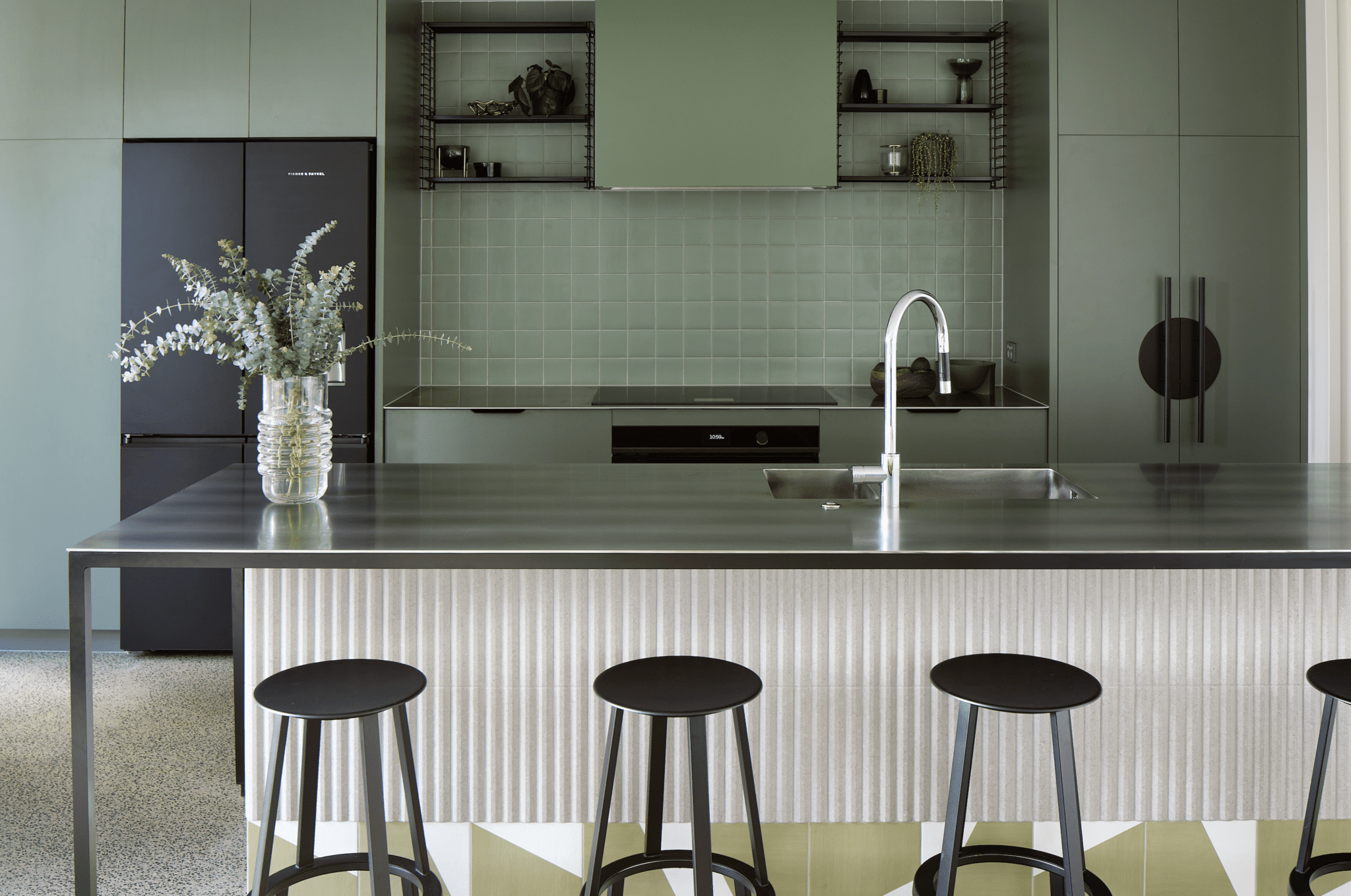
It also unexpectedly travels up the base of the kitchen bench as a toe-kicker.
“We’ve seen that done in European bars and tabacs, where the floor tile wraps up the counter,” she explains.
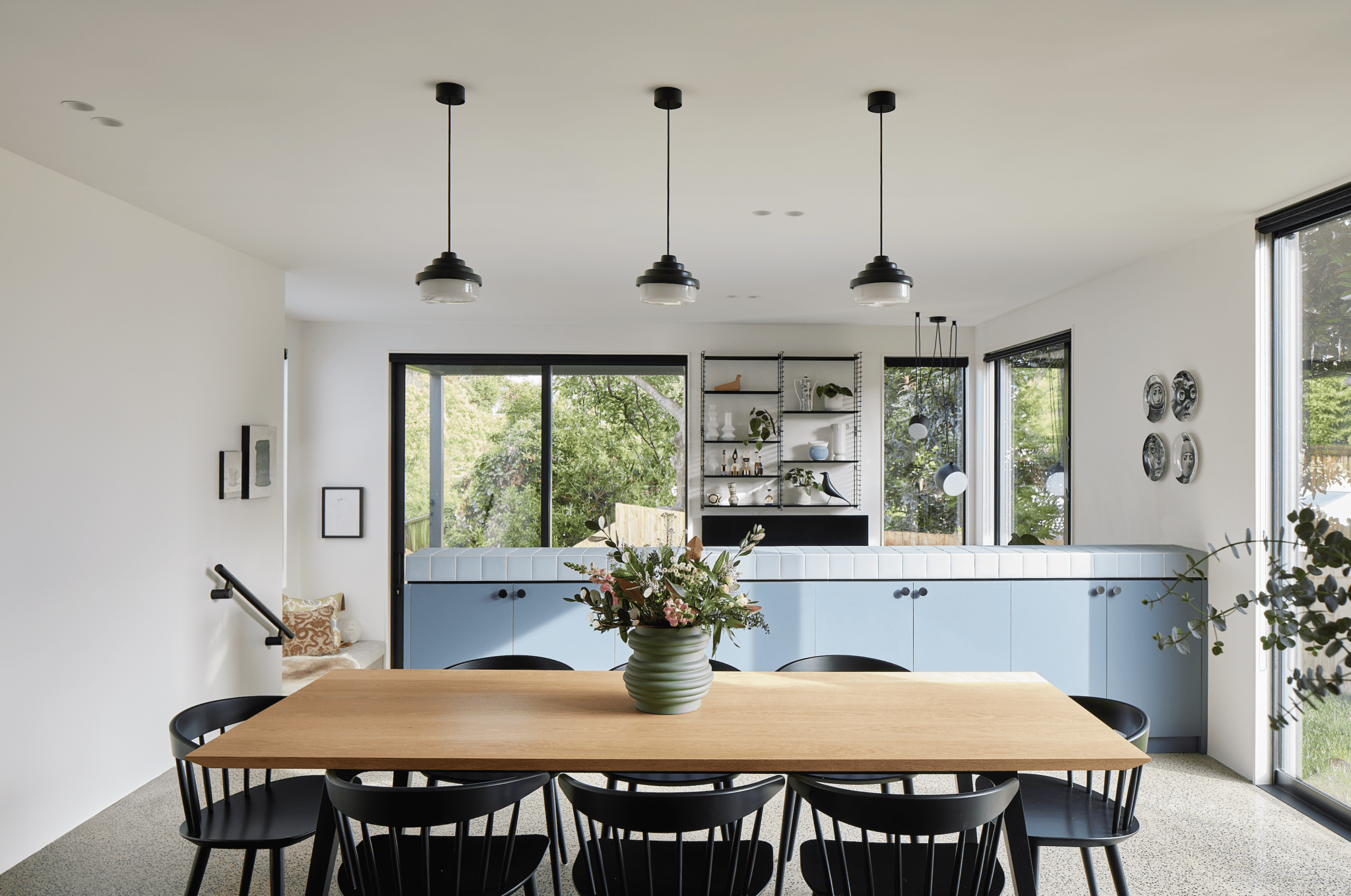
The kitchen is a study in colour blocking — in this instance, green. “Although green can be seen as the new neutral, that wasn’t the intention here,” remarks Eva.
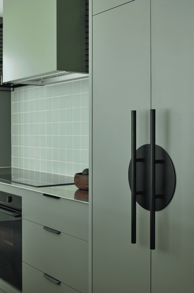
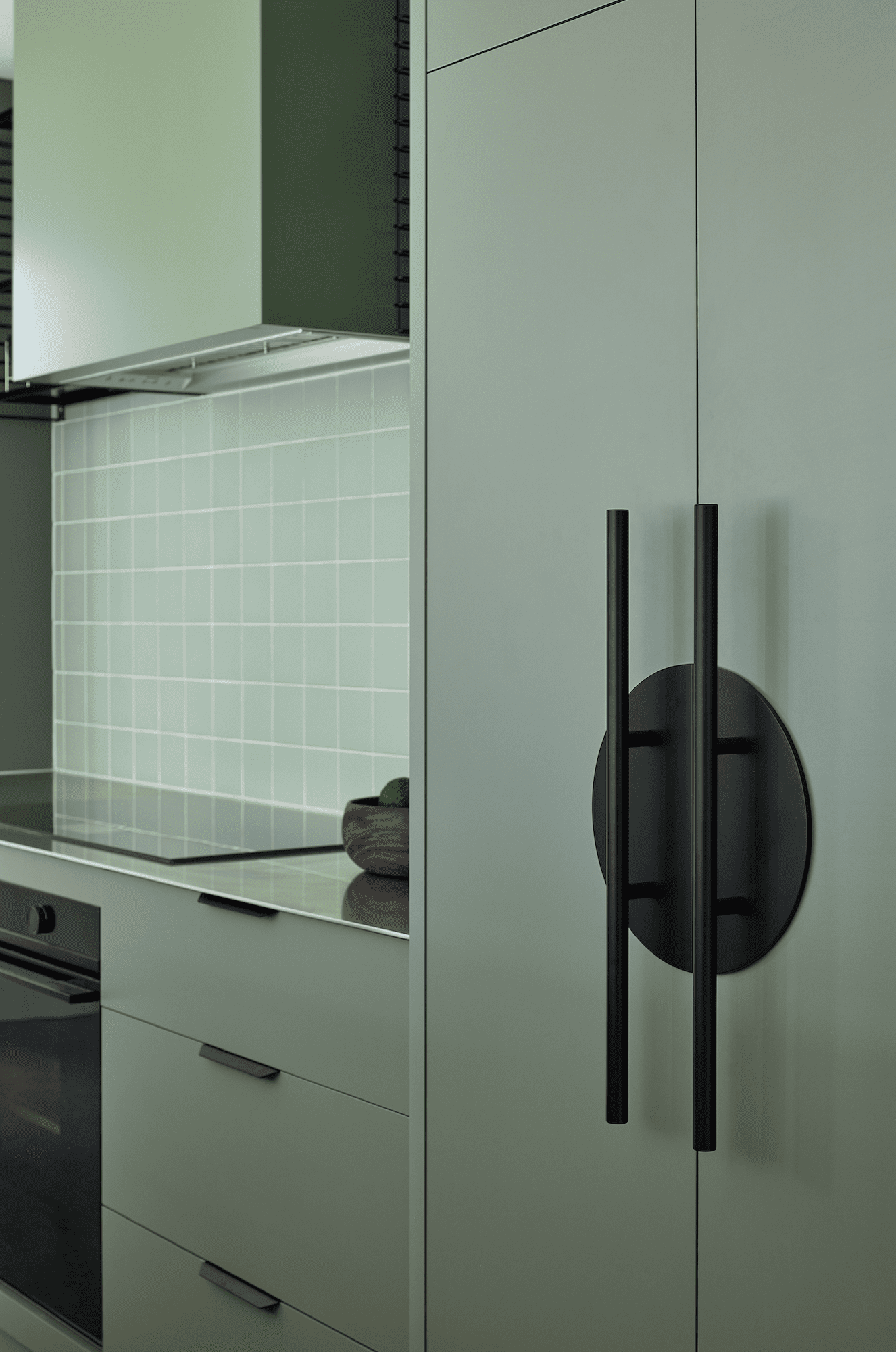
Teaming off-the-shelf slate-green laminate cabinetry and a tiled splashback in a similar green, it is a veritable shout-out to the power of this shade. A statement handle pastes a large black circle onto the ceiling-height pantry.
“We’ve used black as a colour accent throughout,” says Kate.
In the open-plan living area, black is also found in dining chairs, in circular pendants (another recurring motif), above the table, and in a metal modular shelving system that reaches to the ceiling in the stepped-down living room. It adds to the verticality of the 3.3-metre stud here, although this sense of spaciousness is balanced by the embrace of the connecting wall to the dining area. This backdrop, in a warm teal-blue laminate, is a sideboard that faces into the dining room and is topped by a cloud-blue tile.
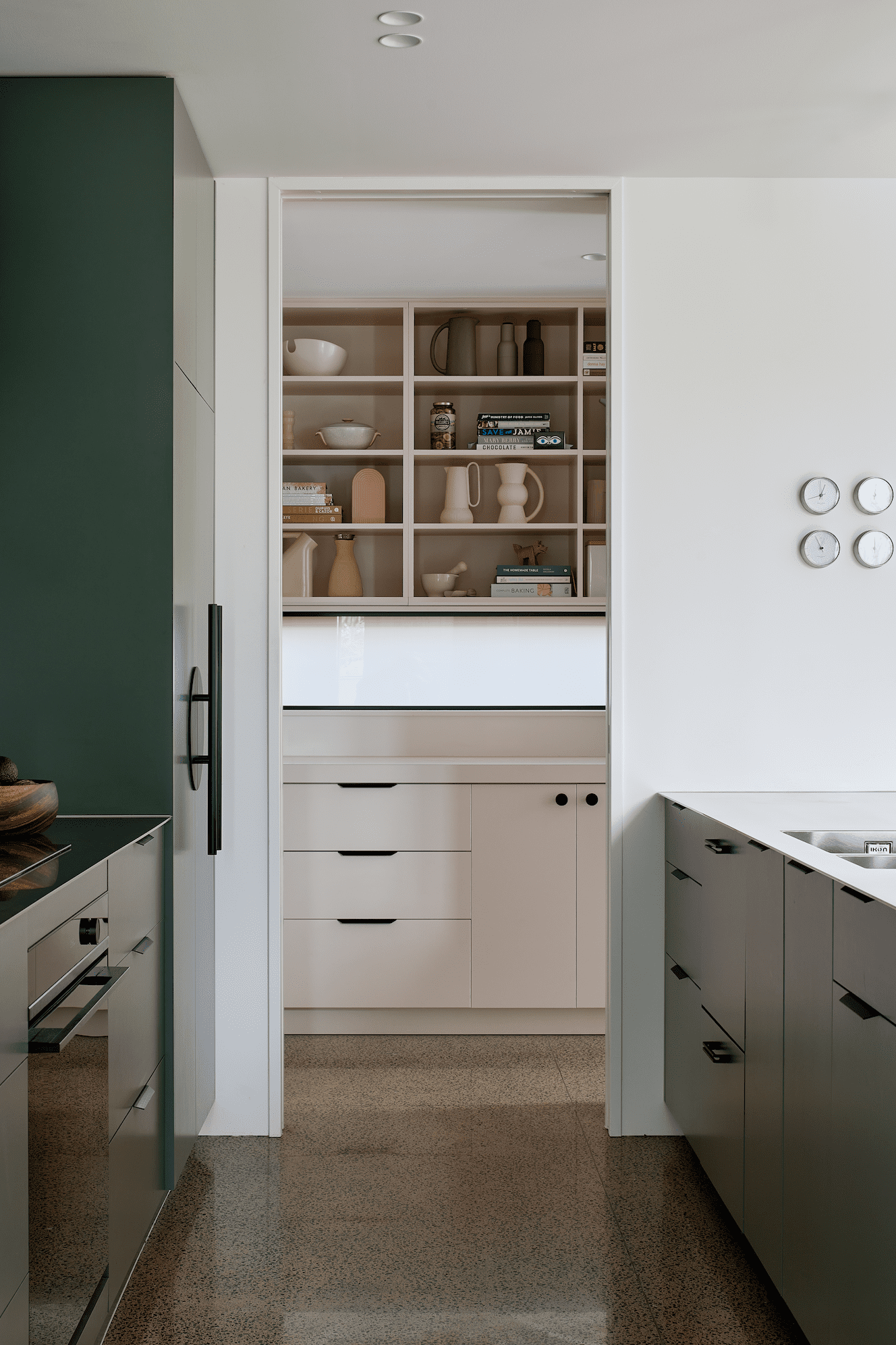
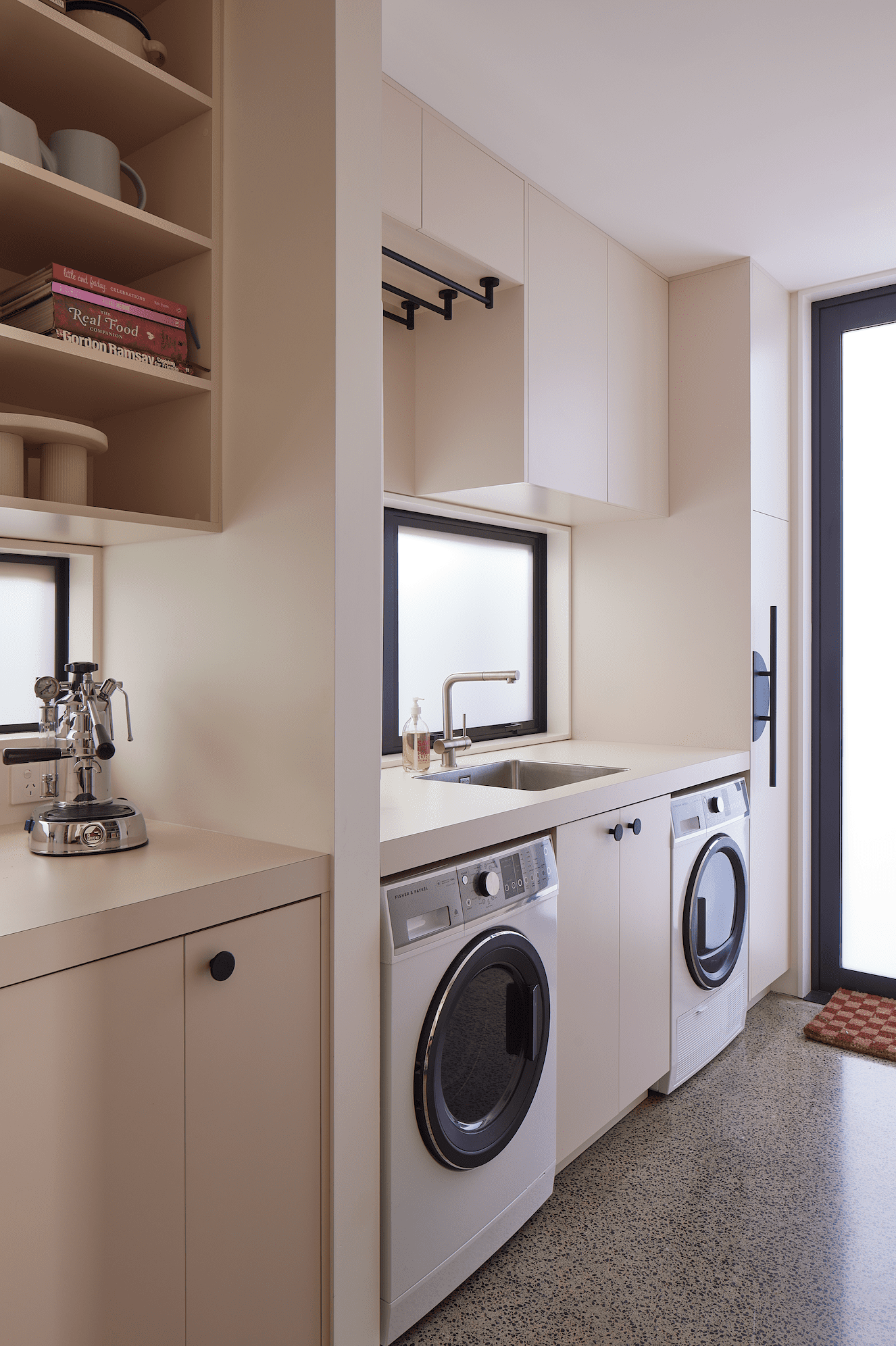
While blues and greens predominate in the communal zones, smaller spaces have their own colour vibe. The walk-in scullery cum laundry, for instance, is blush pink and perfectly planned for the family of four. Here, small appliances are kept tidily out of the way — as are the cereal boxes that are in a cabinet that is out of view of the main kitchen. What visitors can see when they gather around the peninsula island is a set of open shelves where Kate has her collection of ceramics and cookbooks, impressively colour co-ordinated in soft shades of cream, taupe, brown, and pink.
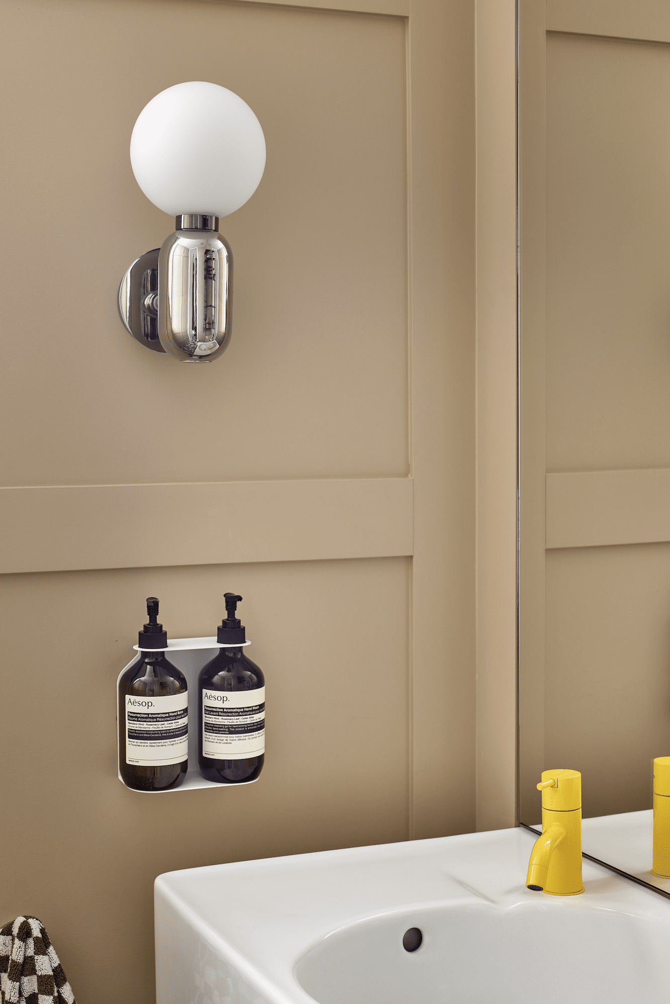
Alongside the separate snug — a favourite spot for snuggling up on the corner sofa for movie nights — the wall panels of the powder room are painted in Resene Desert Sand. This warm-caramel tone is a counterpoint to the Resene Pearl Lusta walls in the rest of the home. A bright yellow tap on the hand basin is echoed upstairs on the bedroom level, where the same taps, in a blue and dark blue version, are used in the family bathroom and main en suite.
The children, who have marked the house as home by strewing Lego all around the living room (as you do), were able to choose their own wallpaper.
“I gave them the pick of two I had pre-selected,” laughs Kate, who is wise to the ways of the young.
Hugo’s, a New York cityscape, features UFOs and Godzilla but is nevertheless tonally in keeping with the pinks and greens that make up Rose’s paper, a graphic of undersea corals.
Not to be outdone, a wall papered in bold foliage backs the bed in the main bedroom — an artful reflection of the backdrop of established neighbourhood trees that surrounds the compact site.
Finished in 2023, this house may be the new kid on the block but, for Kate, Matt, and the children, it has already instilled a sense of belonging. Homestar-accredited, colour-dashed, and filled with imagery and ideas, it’s been easy to settle into.
“As soon as we moved in, it felt exactly right,” says Kate.
Words: Claire McCall
Images: Simon Wilson
Judges’ Citation
Walking the talk, it’s Colour with a capital C — confident, original, unapologetic, and joyful. Combinations that are refreshing and exciting without screaming, while a clever use of pattern makes the interior multi-layered and different at every turn.
