This clear insertion into the back of a century-old Wellington villa provides an extra 135 square metres and a myriad of spatial experiences for the owners.
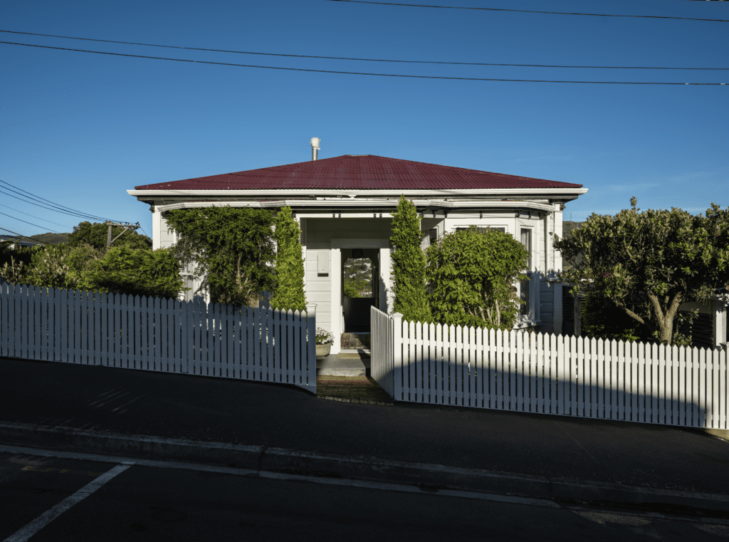
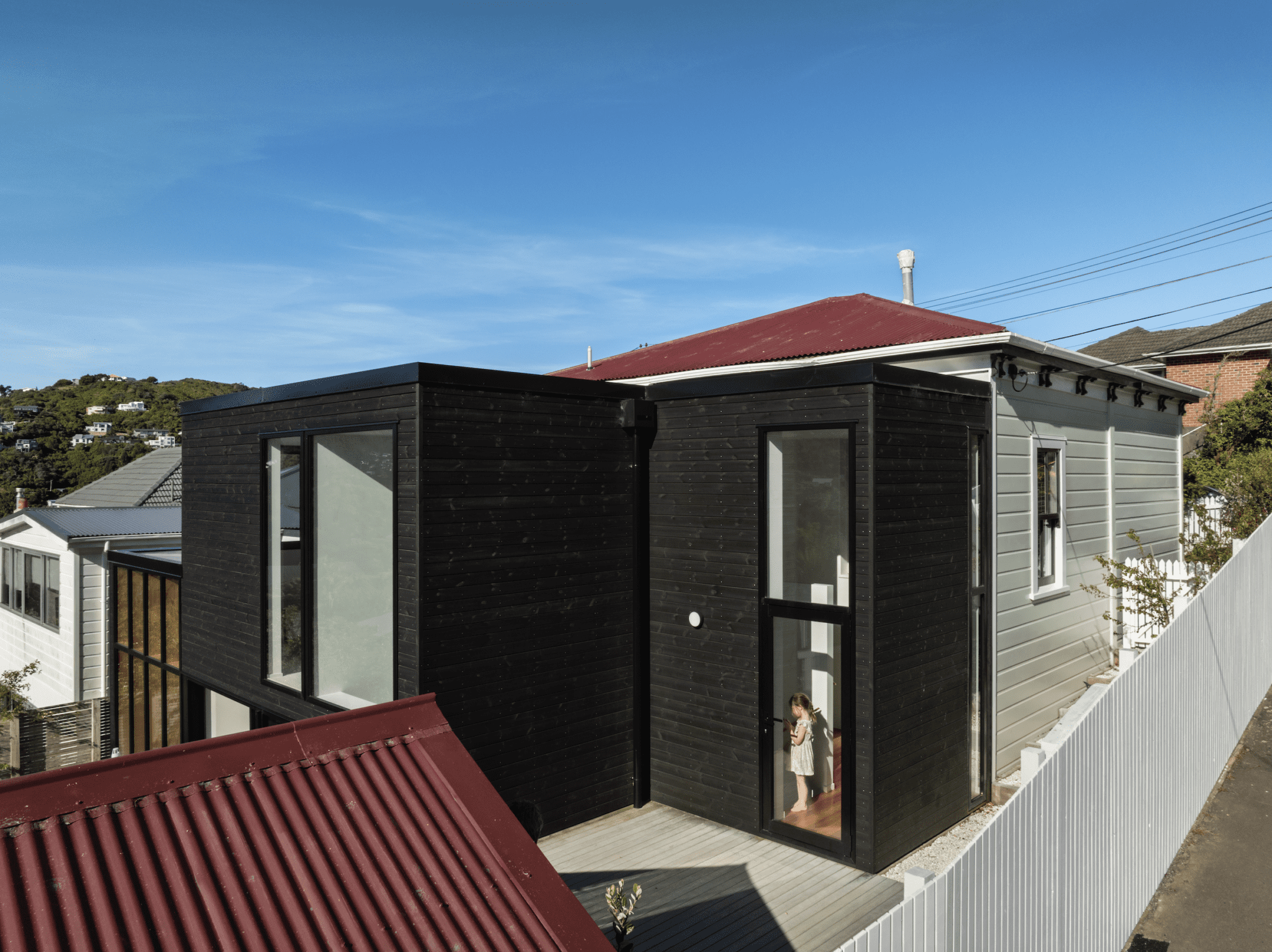
Although beautifully maintained, the mint-coloured home with pioneer-red corrugated roof was very much a product of the 1920s, and failed to meet the needs of the young family of four that resides within it.
Andrew Sexton Architecture was engaged to expand the old, weatherboard-clad villa, which was situated on a relatively typical Wellington suburban site — steep, compact, and in close proximity to its neighbours.
Many of the neighbours have also extended at the rear of their property, using a vocabulary that seeks to imitate the original structure. However, Sexton opted for a very clear insertion.
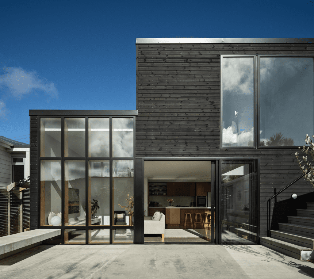
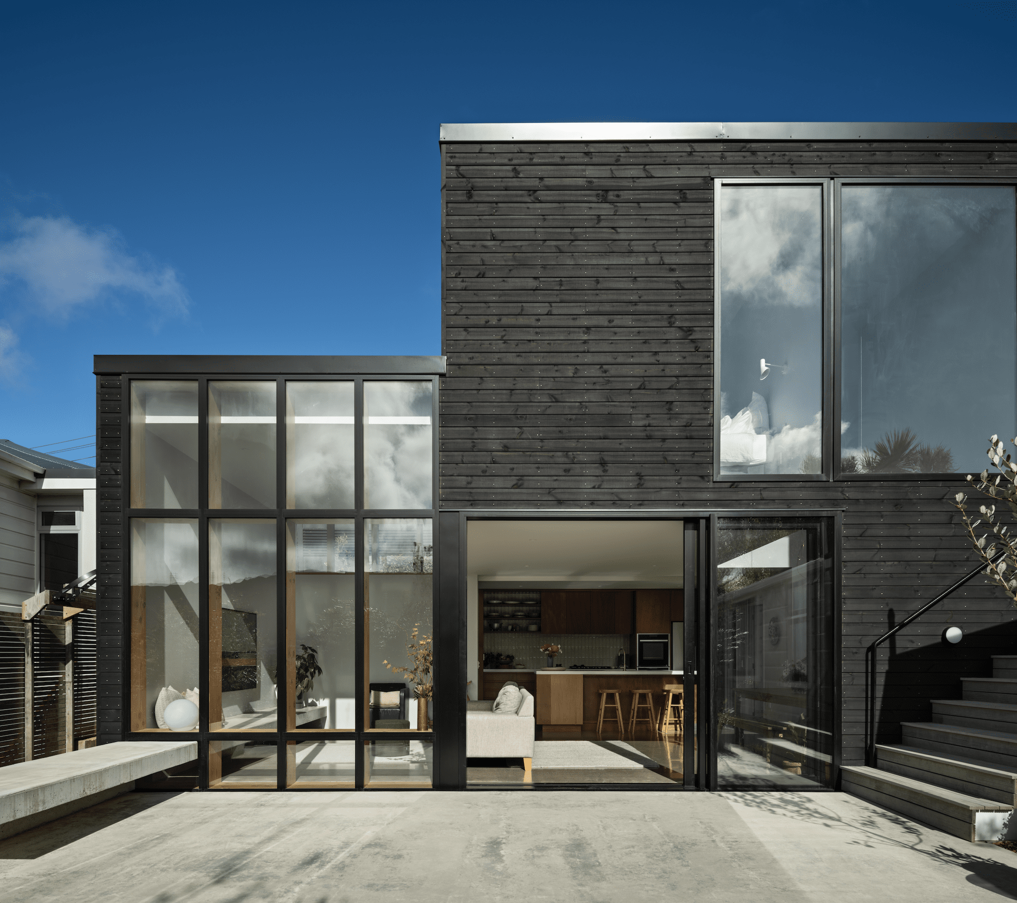
“We tried to contrast the extension with the existing house,” he says, pointing out that, instead of emulating the light-coloured weatherboard with a wide profile from the villa, “we used a heat-treated pine in a charcoal colour.”
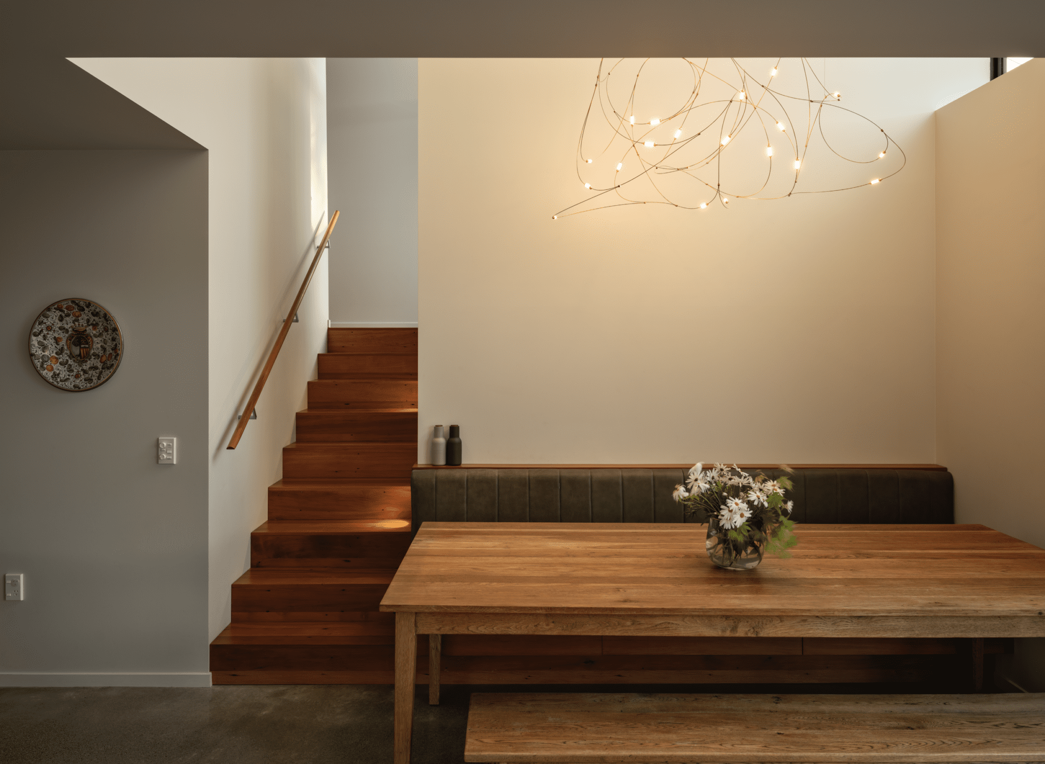
This marked differentiation was carried through to the interior, although with a slightly more subtle palette.
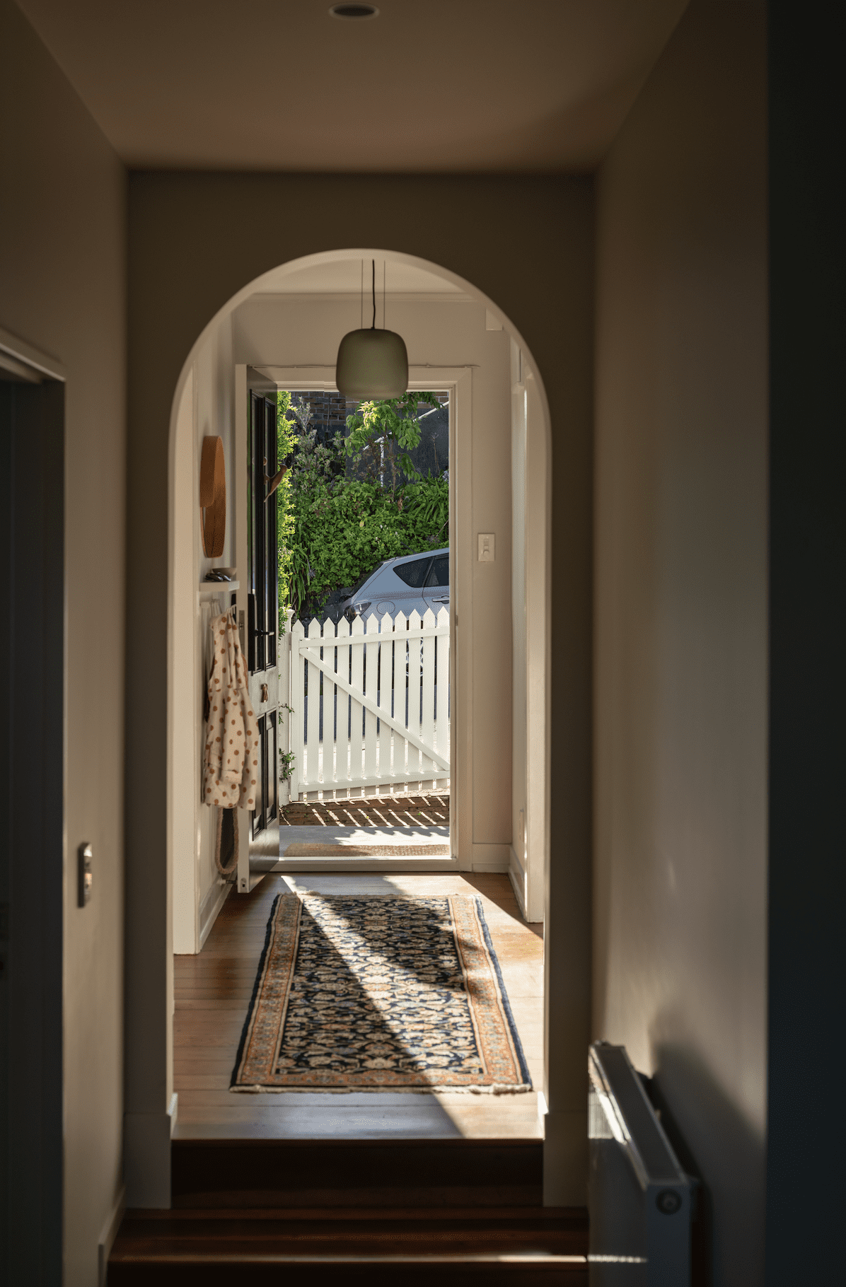
“The front half of the villa is basically exactly as it was,” continues the architect. “However, at the end of the upper level hallway there are a few steps and we ended up inserting an archway as a way of correcting a couple of misalignments on the existing hallway walls.
“[On one side of] that archway are original skirting boards, architraves, etc.; then, when you come through, things start to change slightly — it’s all flush detailing, etc.”
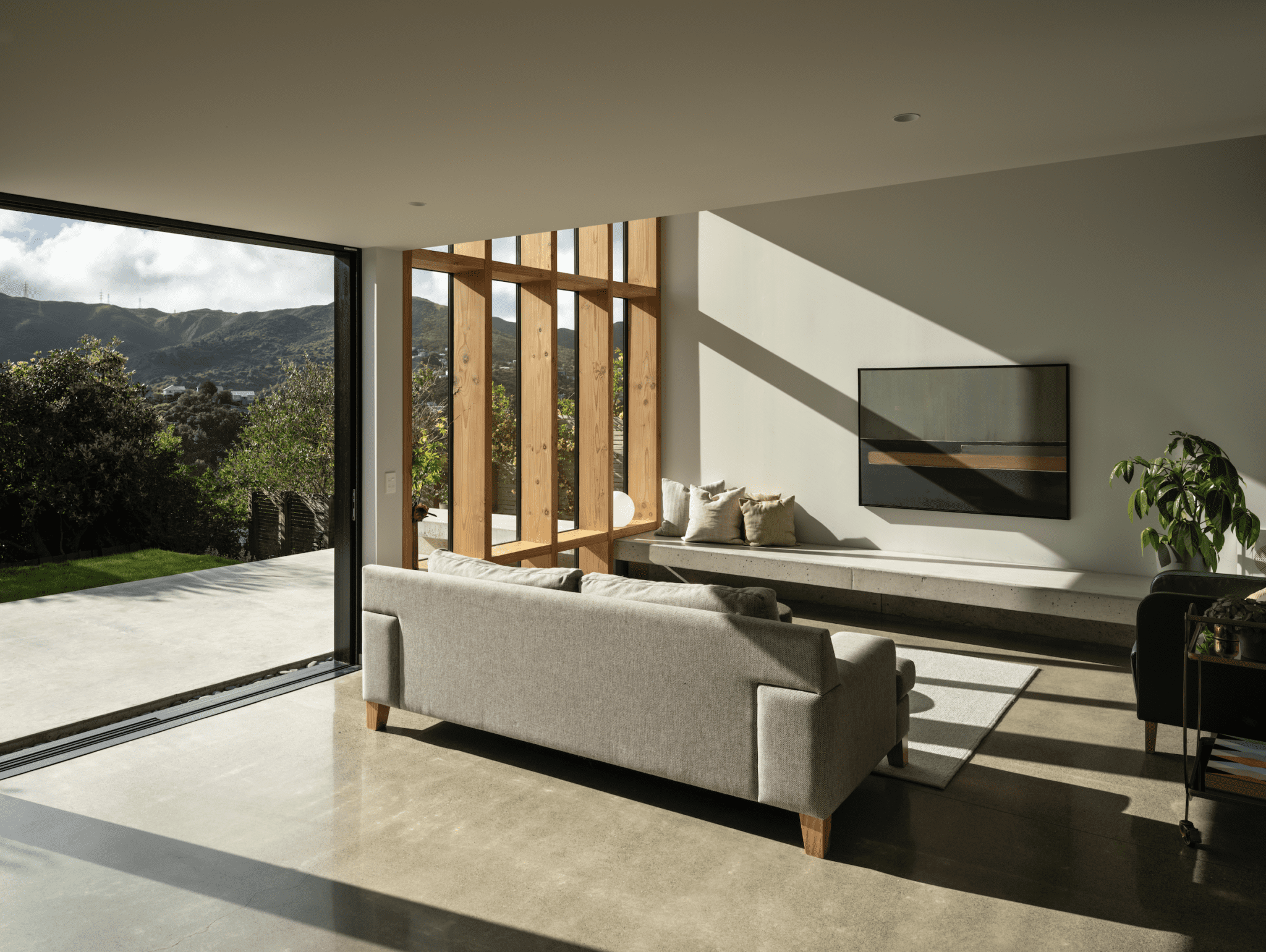
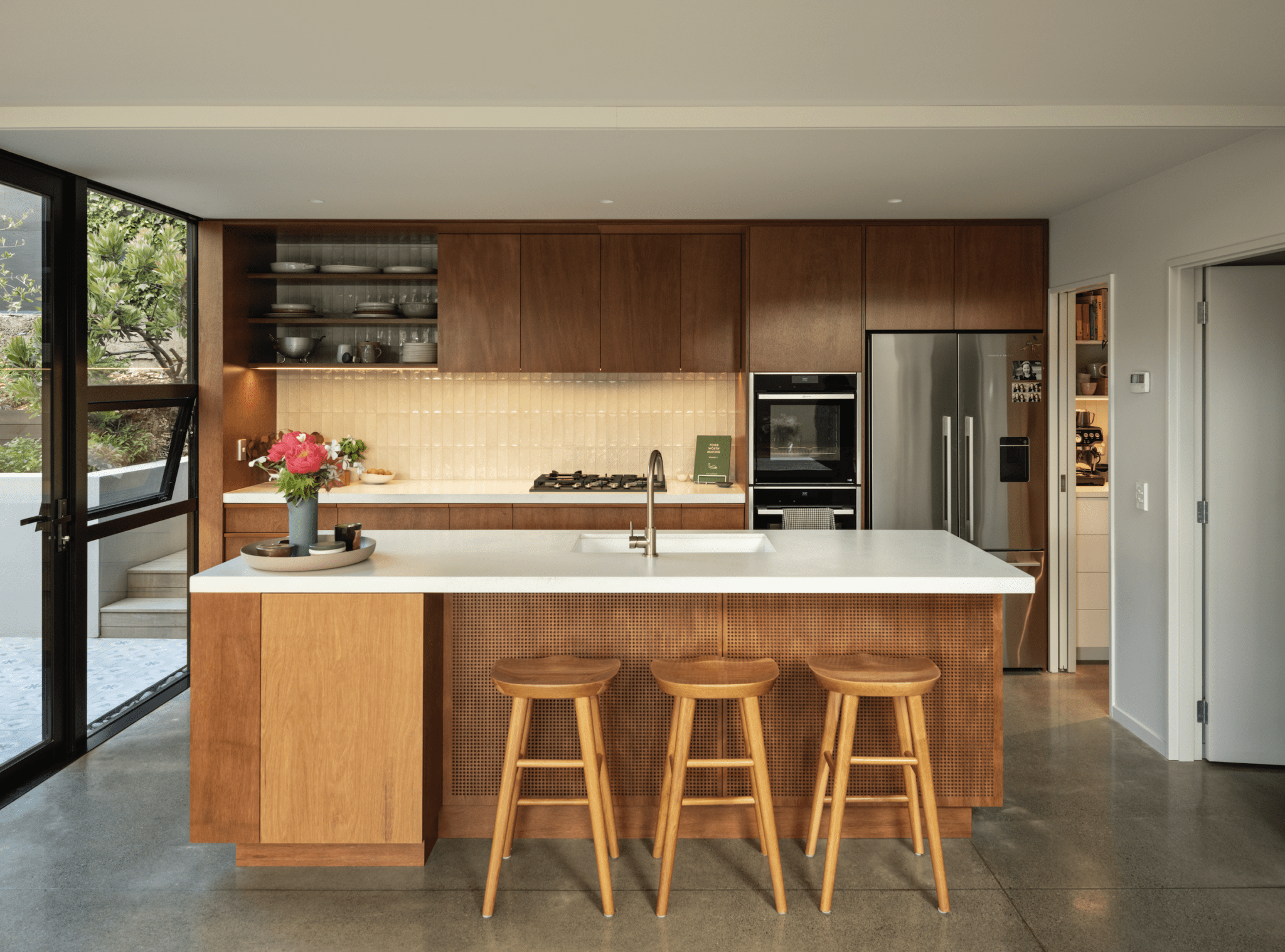
As the corner site slopes north-west towards the back garden, one of the early decisions was to excavate into the hill, with the kitchen area burrowed right under the existing structure and the main social spaces also situated within this lower level.
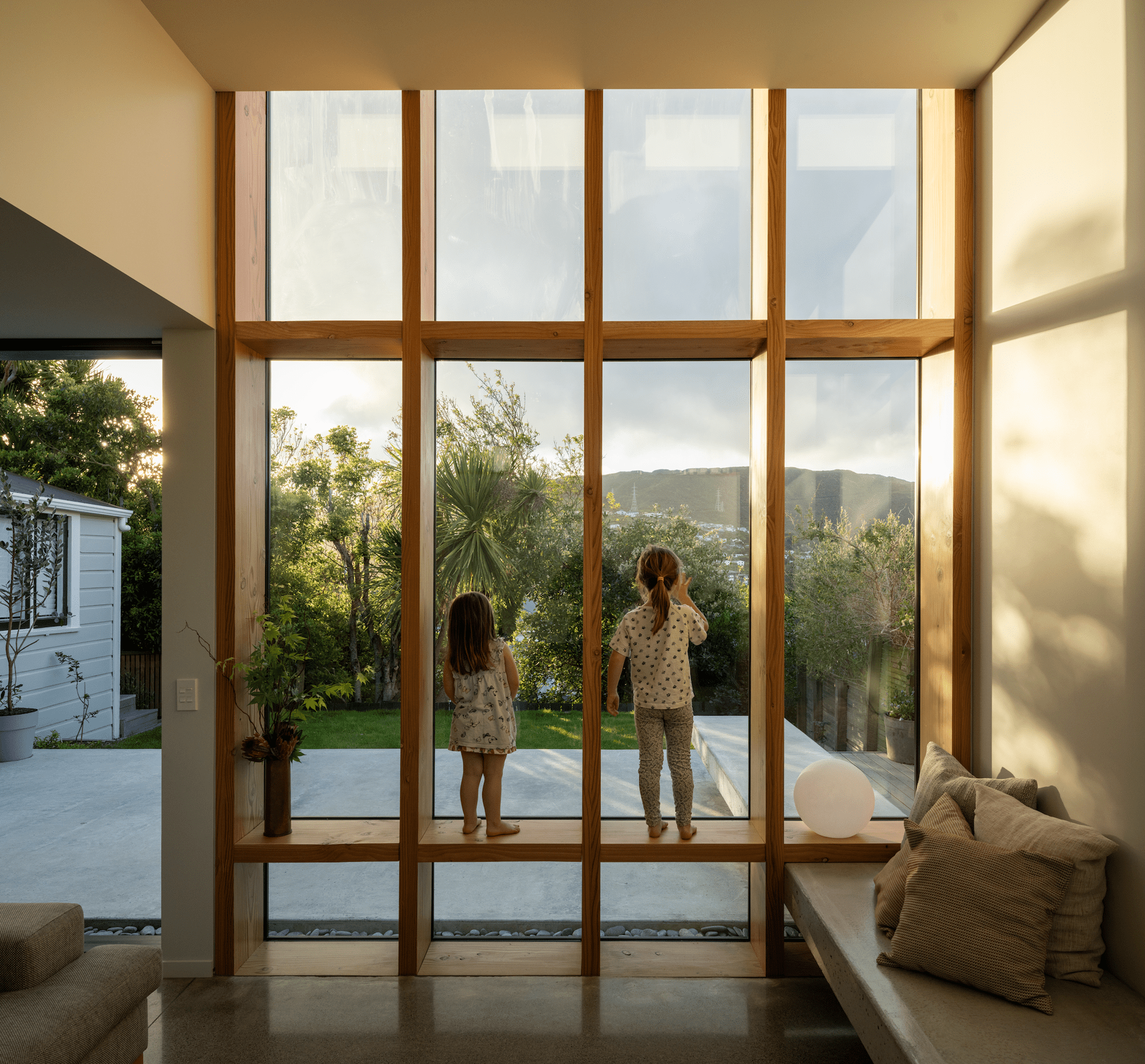
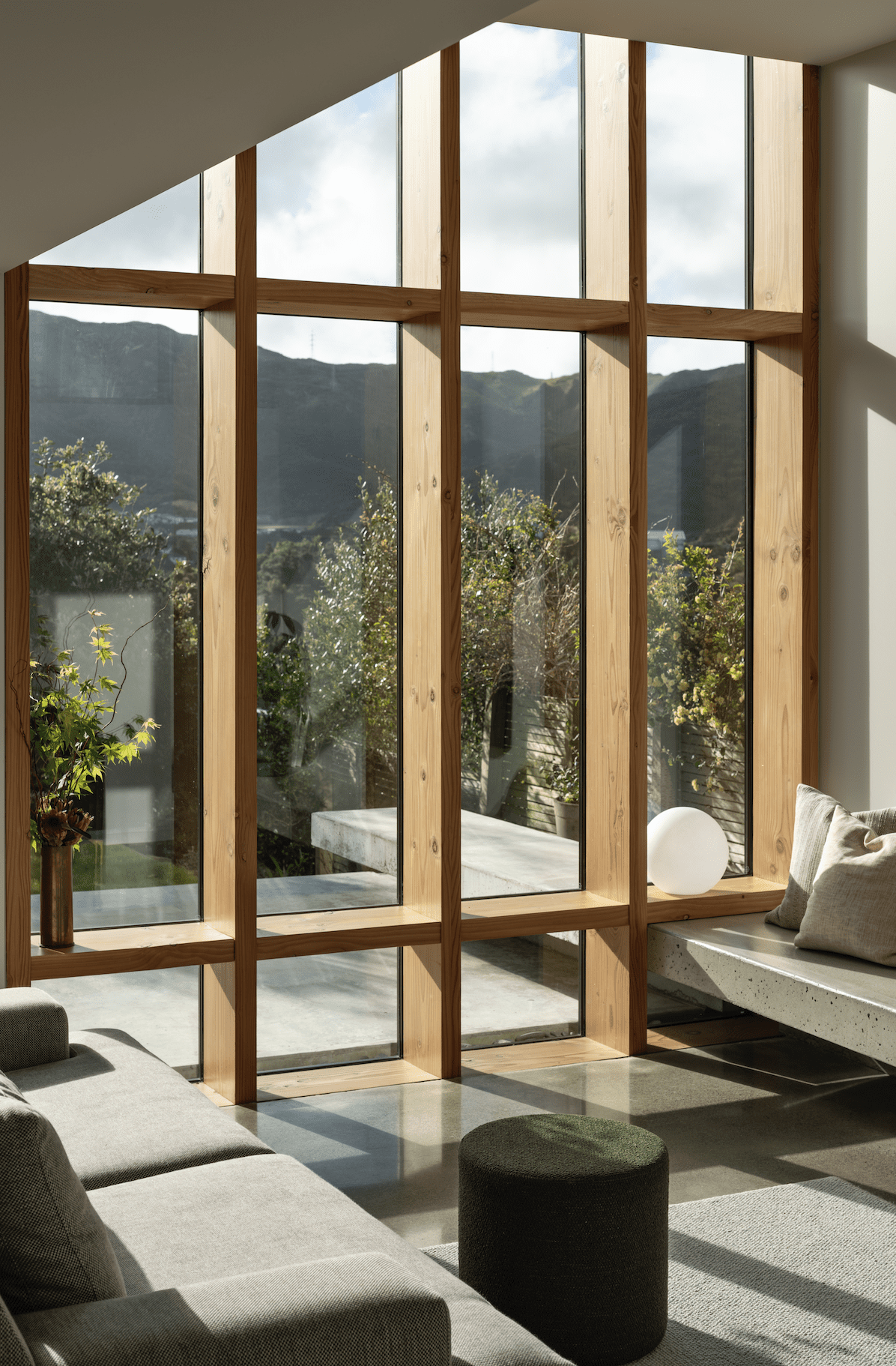
This allowed the architect to play with varying heights and voids, insert some inbuilt pieces of furniture (such as a concrete bench that extends from the interior into the backyard), and install an impressive window one and a half storeys high.
“That’s a detail we’ve actually used quite a bit in our work,” says Sexton. “Since the glazing is so high, it has a 70mm aluminium glazing bar on the outside. On the inside, we have matched that but used Douglas fir timber as a sort of shelf.”
This solution breaks the flatness of a single panel and adds depth and shadow play internally. The window becomes somewhat habitable, with great connections to the garden.
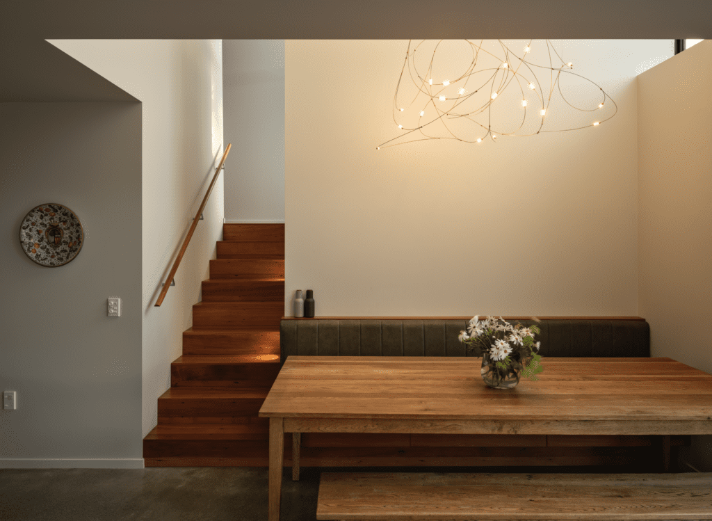
One of the successes of the plan is the circulation, the way the interior and exterior spaces connect to each other. The house can be approached from both the north and south elevations, with the main entrance on the east. Internally, there are regular visual connections to the three patios that the house’s corner location (with its unique relation to the boundary) has afforded it.

“The living space is surrounded by these outdoor spaces that sort of pinwheel off it,” says Sexton. “There is a little courtyard, with beautiful tiles, off the side of the kitchen on that more eastern side. Then [there is] the patio straight out of the living room, which faces west; afternoon sun pours straight [onto] that side of the house in both winter and summer. Then, on the next level up, accessed off the stair landing, is a small space one of the owners calls his ‘gin deck’!”
This 135 square metre extension is a well-crafted family haven, a modestly sized space that works incredibly hard and offers a wide array of spatial experiences, heights, and light modulation, as well as a circulation that makes the home seem stitched to its surroundings.