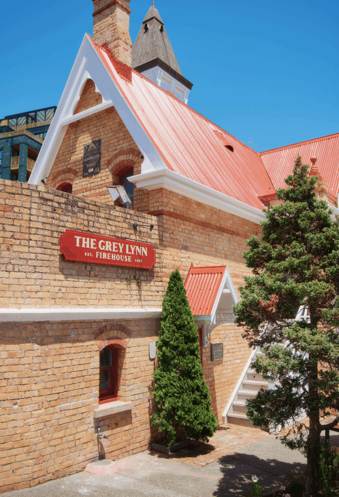
Approach this 100-year-old villa in Auckland’s Remuera and there’s a beguiling sense of history and character, but there’s also a sense of something more. From the moment the front door opens, that imperceptible allure draws you in towards an unexpectedly restful setting of decadent minimalism.
This is the work of Chris Tate, who initially viewed the house on behalf of clients who were, at the time, based in the United States.
“They had seen some of my work online and reached out, wanting to know what was possible and what wasn’t. So I met the real estate agent and went on a bit of a recce … and ended up going up into the roof and saw an opportunity,” Chris says.
That opportunity has unfolded in a series of invigoratingly uncomplicated forms with a decidedly contemporary appeal — in complete juxtaposition to the ornate detailing of the villa that now forms just part of the new house.
The front has remained virtually untouched, while the back has been extended to incorporate a large kitchen, living, and dining area that folds seamlessly onto a covered terrace. Above, the gable was extended and the ceiling dropped by nearly a metre in the extension to make room for a primary bedroom suite upstairs. A pool was cut into the garden, providing an inviting backdrop to daily life.
It’s characteristic of Chris’s work: crisp, clean, and perfectly outspoken in its clarity. There’s not a hint of the structure visible, just inviting spaces that strike the perfect balance between embrace and expanse.

Inside, spaces are layered with textural meetings in a palette consisting primarily of coloured concrete and timber, surrounded by muted soft greys and white tones. Echoes of industrial undertones fold into homely moments of refuge.
A delicately manicured cloud tree makes a dramatic sculptural statement in the centre of the terrace; the planting cut out in the coloured concrete is echoed above in a roof cutout that draws in the sun and rain.
“I always wanted a beautiful piece of foliage there; it almost becomes part of the house. It’s the first thing you see from the entrance, and with uplights at night it adds this little moment of surprise when you walk in.”
Chris sprinkles these moments of surprise into every project he undertakes. Here, they comprise the kitchen island continuing onto the covered terrace — doors sliding flawlessly in between the fragmented form that links interior with exterior; the transitions between old and new, the unfolding layers delighting as you move through the villa; the loft-like primary bedroom; the drama of the bathrooms, where deep-green tiles offer a moody appeal; and the surprising juxtaposition of stained glass and coloured concrete, of mantels and minimalism.

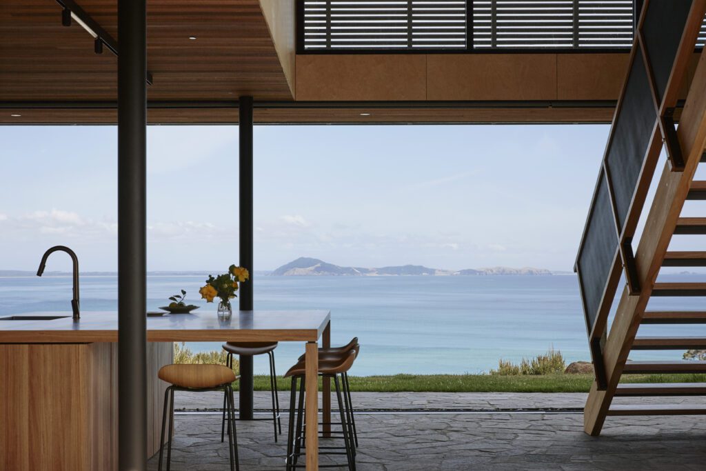
The plan of the extension is straightforward: the kitchen occupies one side of the space, with a scullery tucked away under the stairs, dining is in the middle, and the living area occupies the other. Sliding doors allow the space to open completely to a covered entertaining terrace, allowing for an almost imperceptible change of pace between indoors and out. That’s thanks in part to the continuation of the kitchen island and the use of Peter Fell coloured concrete in the same colour (PF 155) indoors and out, albeit with a different finish in each area.
The interior backdrop is a full-height wall of vertical timber panelling, which presents a beautiful warmth against the concrete, the light-toned kitchen and the decor.
The terrace is divided at its centre by the cloud tree and roof cutout; its functions separated to either side. At one end is the al fresco dining space, anchored by a fireplace; at the other, the kitchen island and a barbecue area. The symmetry is appealing in its simplicity — a language continued above in the crisp lines of the gable that houses the primary bedroom suite. An exterior timber screen shields its occupants from the gaze of neighbours; aesthetically, it provides differentiation, and a nod, perhaps, to the horizontal weatherboards of the villa behind.

“It doesn’t compete with the beautiful clean lines of the floating box below. It also means the two large doors that open inwards can be left open in summer and the room is still secure. You get a beautiful breeze blowing through it.”
As Chris sees it, the beauty of this home is that it isn’t just lovely — or functional; it is a piece of art, and designed to be appreciated as such. “A house shouldn’t just be beautiful and functional; it should be a piece of art as well, and in every project we always look to create a place to enjoy that art.”
Here, arguably, the best view is from the poolside loungers along the boundary fence — a view made better thanks to the lack of pool fencing. (In its place is a moat planted with oioi, emulating a native wetland.) It’s from this resort-like, poolside setting that the house generously offers itself up to the viewer’s gaze — and what a sight to behold!
