Dulux has unveiled its highly anticipated 2026 Colour Forecast, and the message is clear: in an era marked by global uncertainty and digital overload, our homes, more than ever, are sanctuaries of calm, warmth and reconnection.

Curated into three distinct palettes — Ethereal, Elemental, and Evoke — this year’s forecast celebrates warm earth-based neutrals, grounding greens, and tender pastels, alongside vintage-inspired hues that bring depth and optimism to interiors. While each of the three palettes is distinct, they present a universal yearning for wellness, stability and reconnection.
“In times of uncertainty – including today’s cost-of-living pressures and geopolitical unrest – consumers tend to gravitate toward stability in design. That’s why we’re seeing a continued preference for warm, comforting colours in this year’s palettes. Colour has the power to lift spirits, offer emotional reassurance and bring a sense of calm into our homes,” Dulux Colour Specialist Davina Harper explains.
“New Zealanders are feeling digitally overwhelmed. There’s a strong shift towards emotional reconnection — with ourselves, with others and with nature. This translates into a need for warm, calming interiors that encourage reflection and joy.”
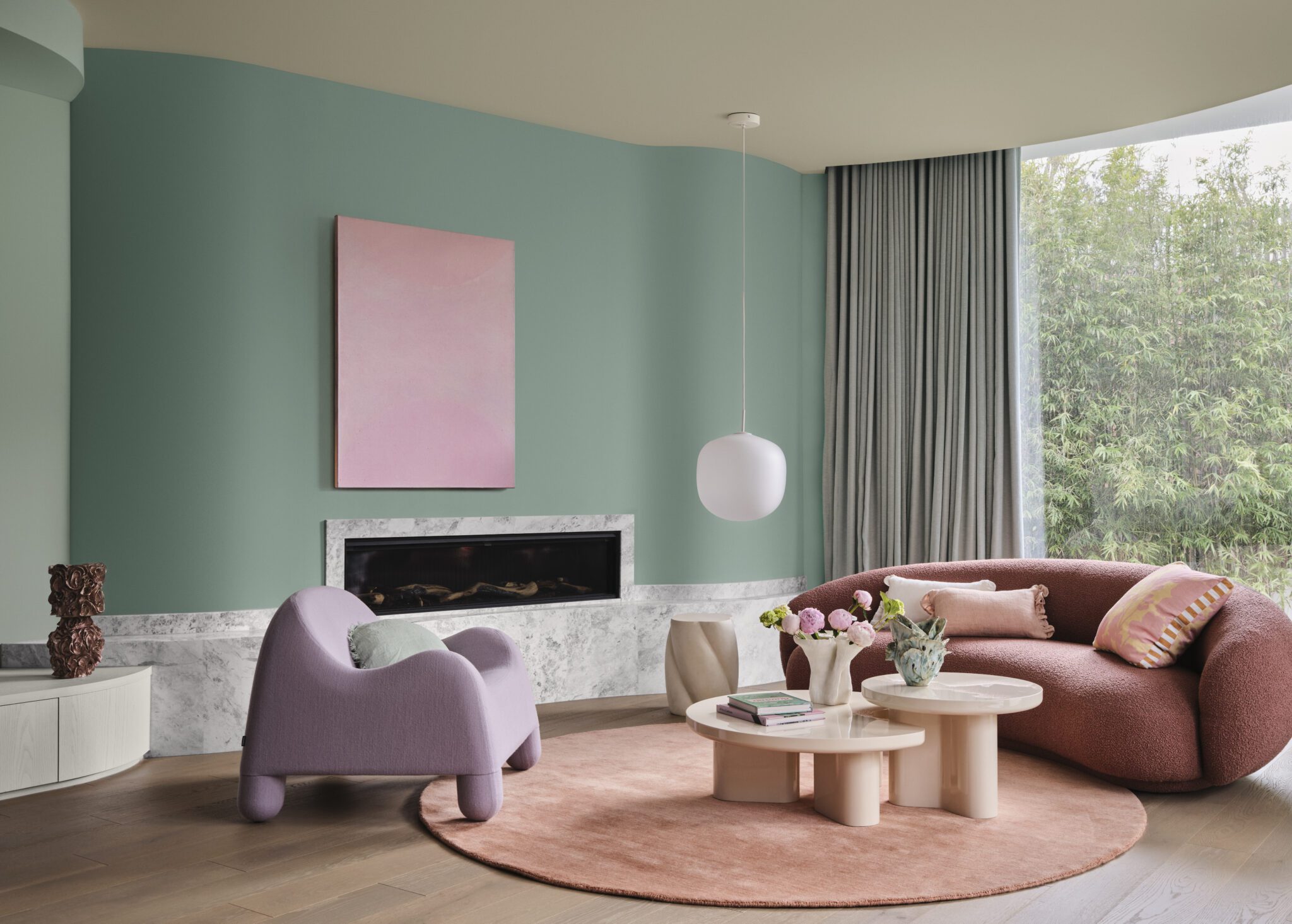
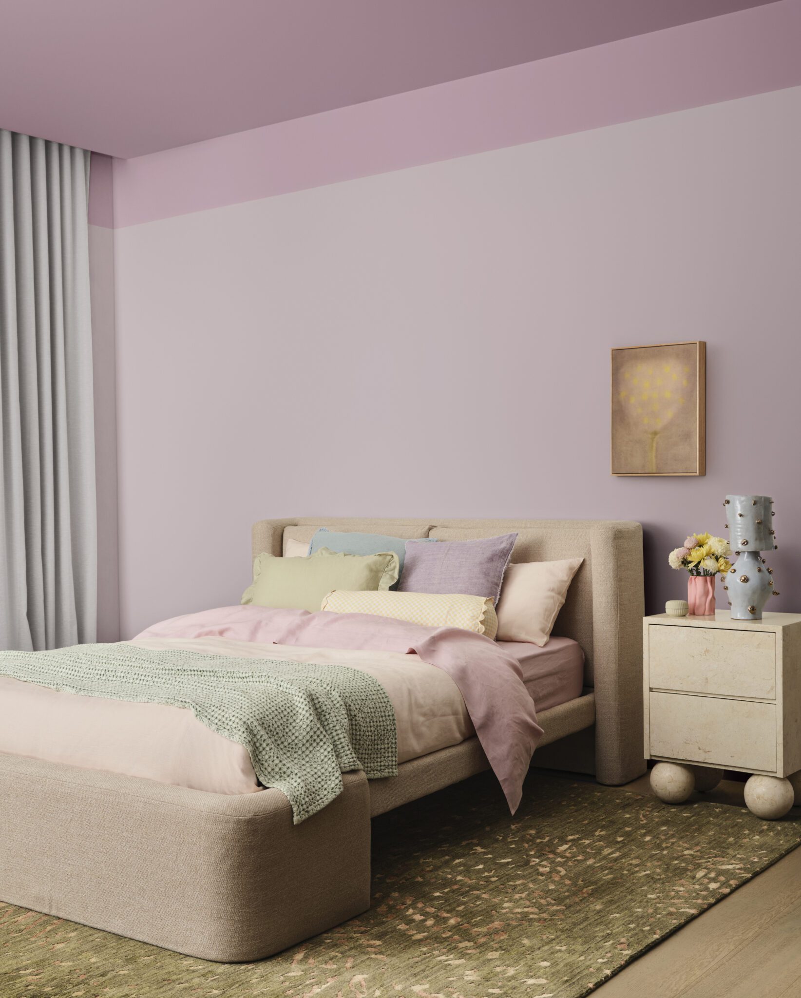
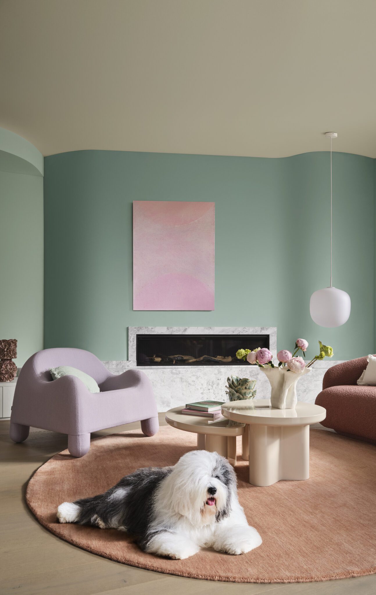
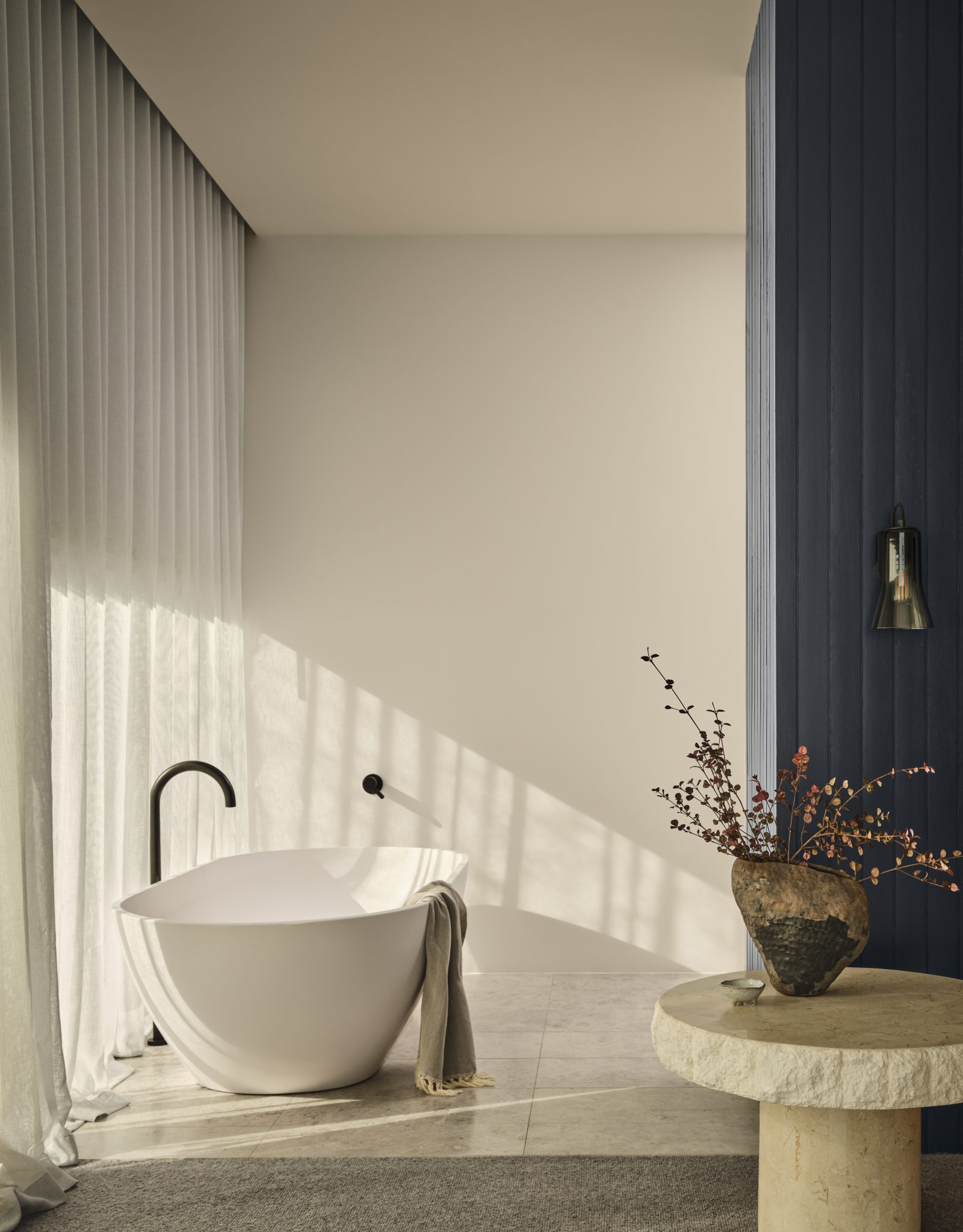
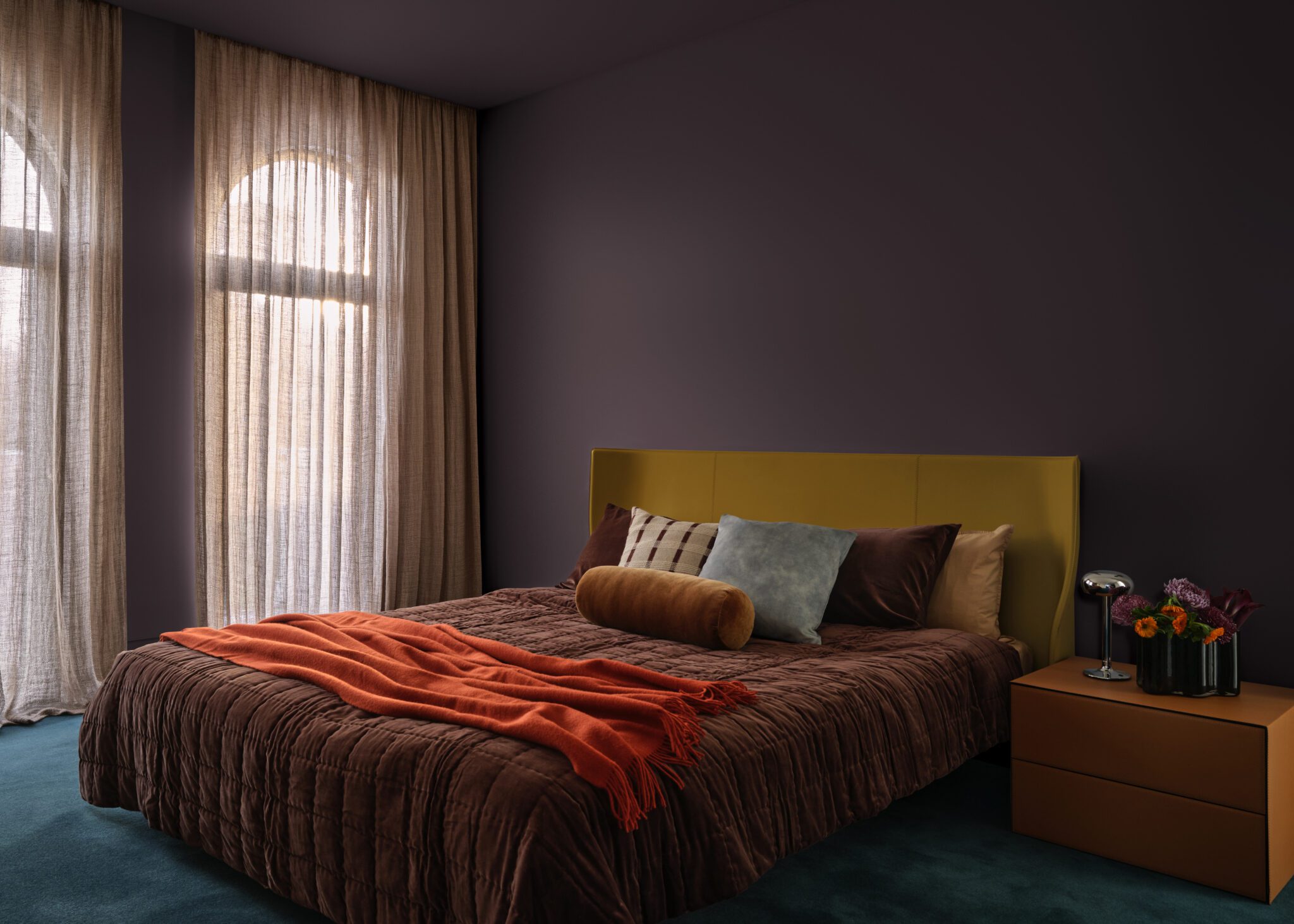
Ethereal
A soft, feminine and whimsical palette that offers a magical celebration of nature’s nurturing power. Designed to uplift and soothe, it draws on themes of wellness, quiet strength, and spiritual self-care.
“Dulux Ethereal features a delicate pastel-like blend of soft and mid-tone hues — gentle greens, mauves, and blush pinks — that evoke a sense of serenity and joy,” Davina says. “With romantic tones like Dulux Snowdon Forest, Dulux Different Pink, and Dulux Mask, alongside subtle pastels such as Dulux Wainui Beach, Dulux Lake Camp, and Dulux Waitiki Landing, this palette feels playful, uplifting, and quietly luxurious.”
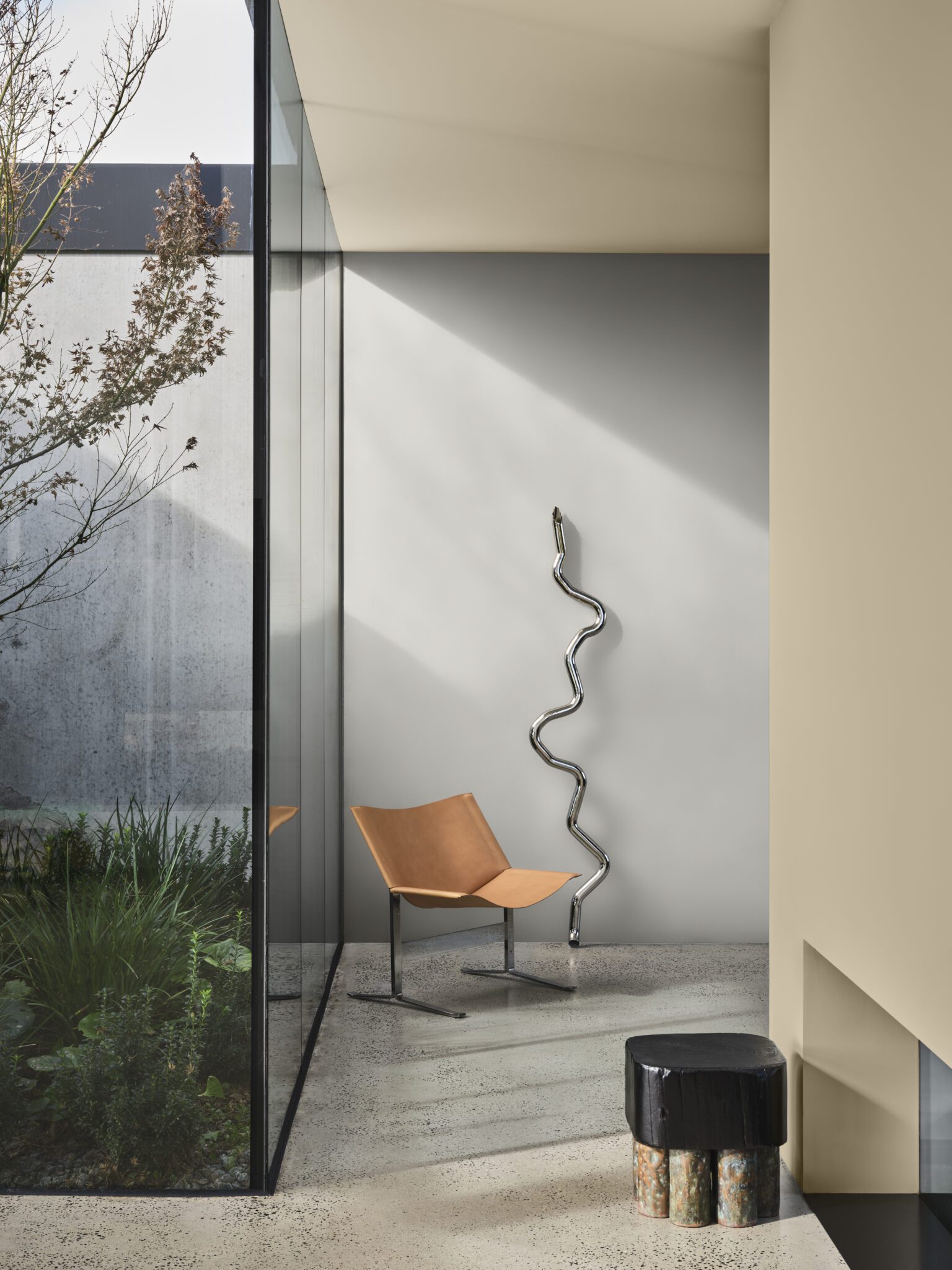
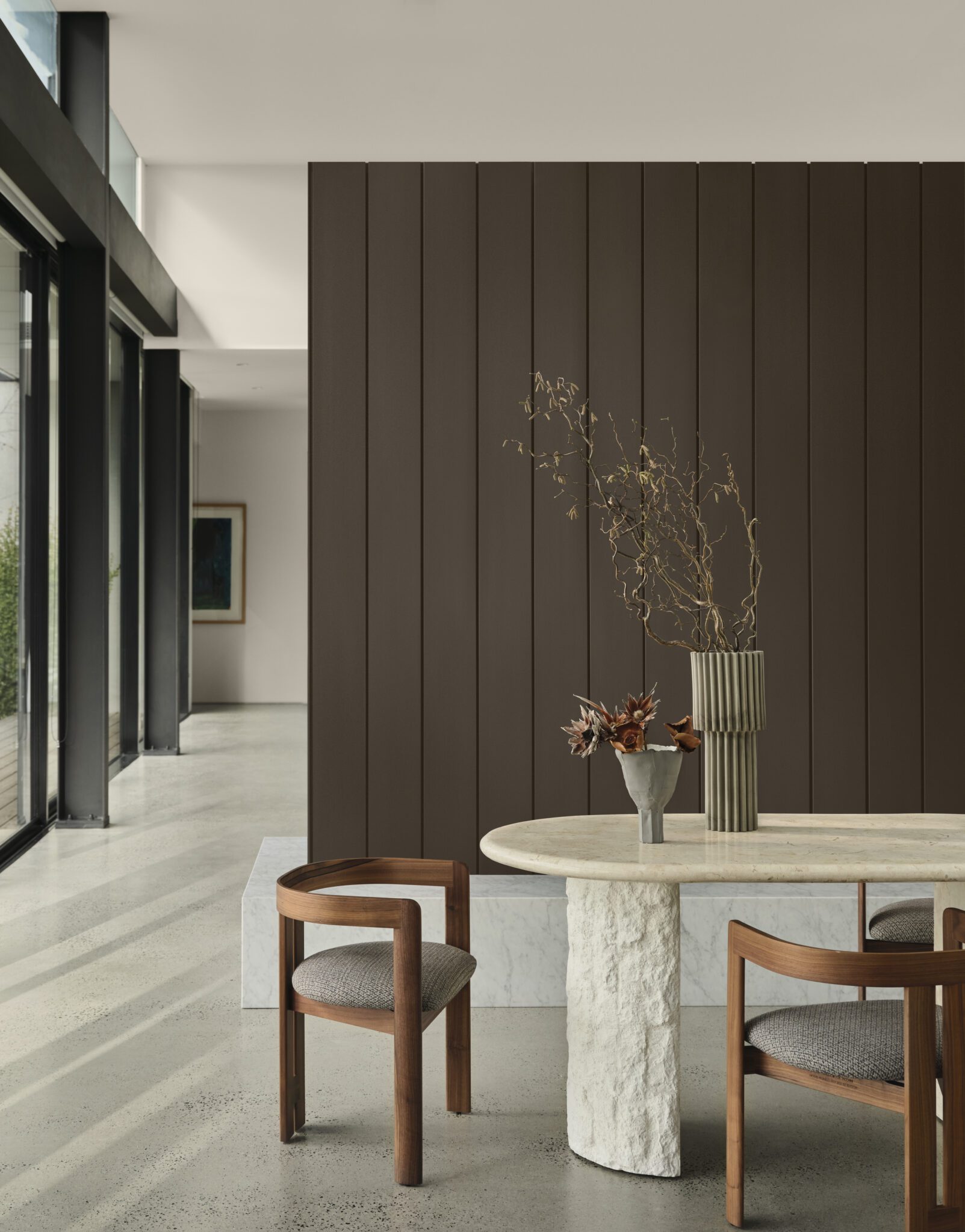
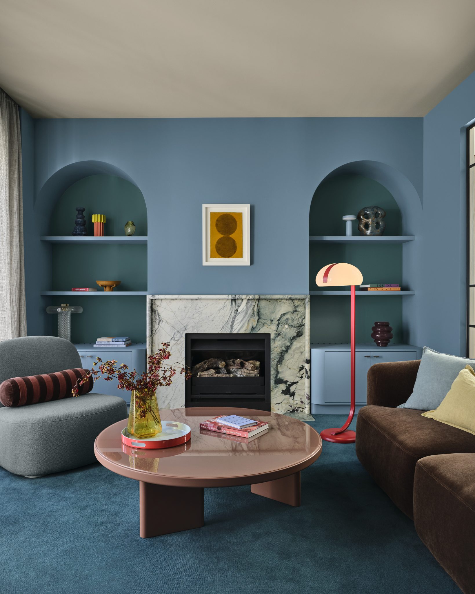
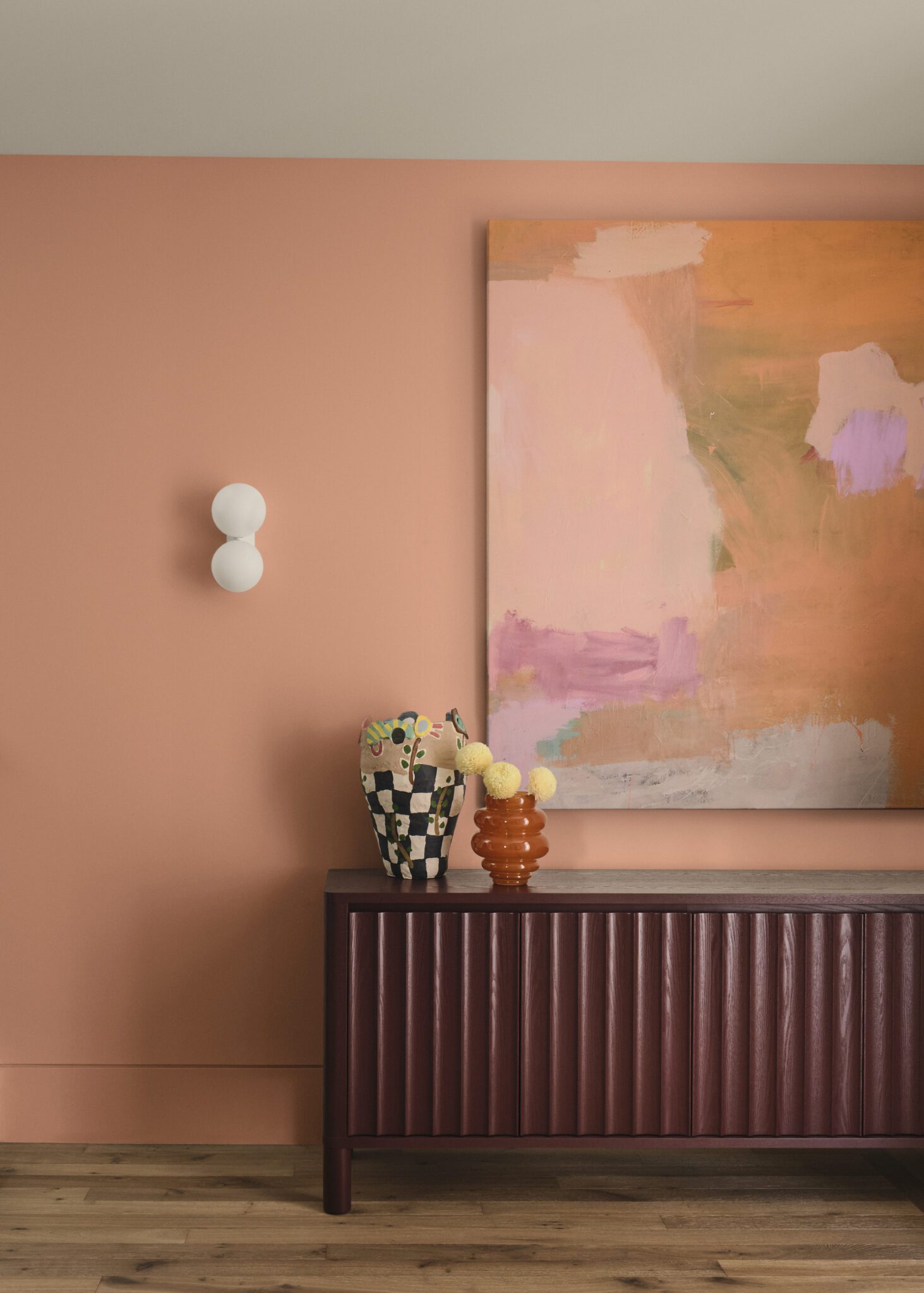
Elemental
A calm, grounded response to overstimulation. Rooted in anti-burnout culture, this brutalist-inspired style embraces slow living, emotional clarity, and purposeful simplicity.
“Dulux Elemental is a tonal, grounded palette built around warm whites and neutrals such as Dulux Duvauchelle and Dulux Tōrere Quarter and enriched with golden brown hues such as Dulux Kingsland and Dulux Herald Island,” Davina explains. “Subtle layers of grey, including Dulux Godley Head and Dulux Boulder Beach, bring stillness and structure, while darker charcoal tones add depth and dimension. The result is a timeless, cohesive palette that feels quietly confident.”
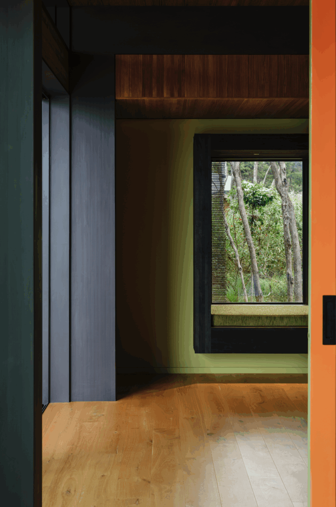
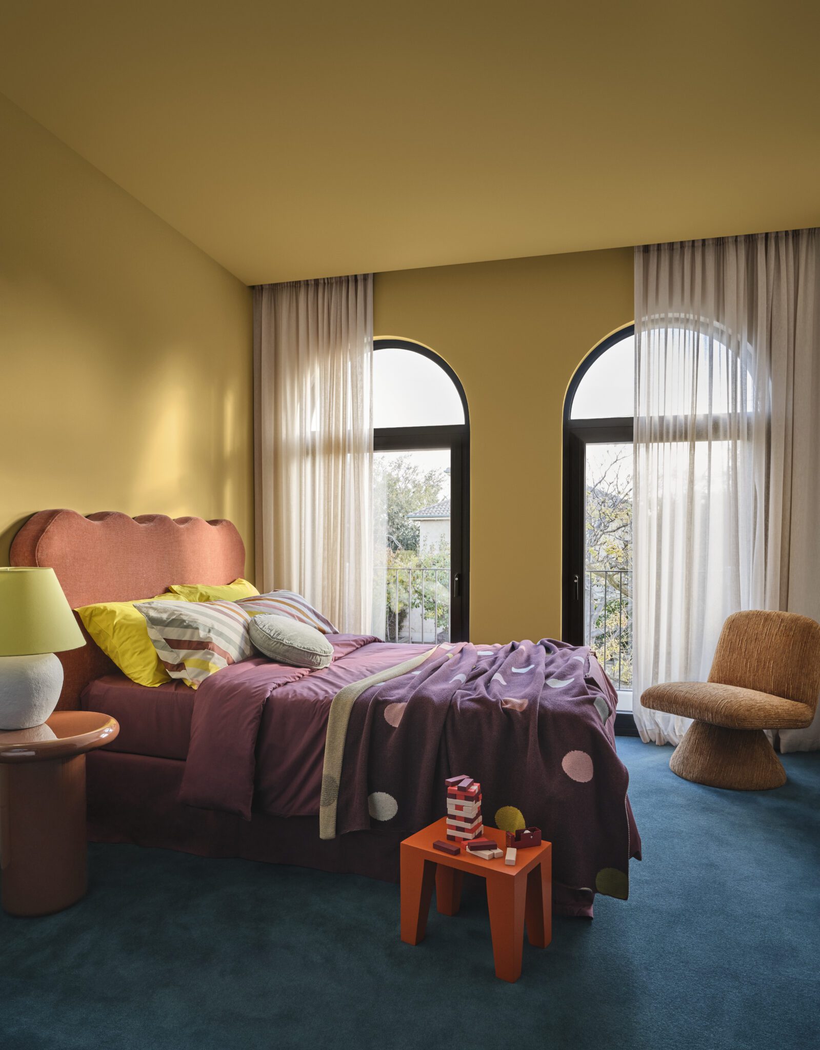
Evoke
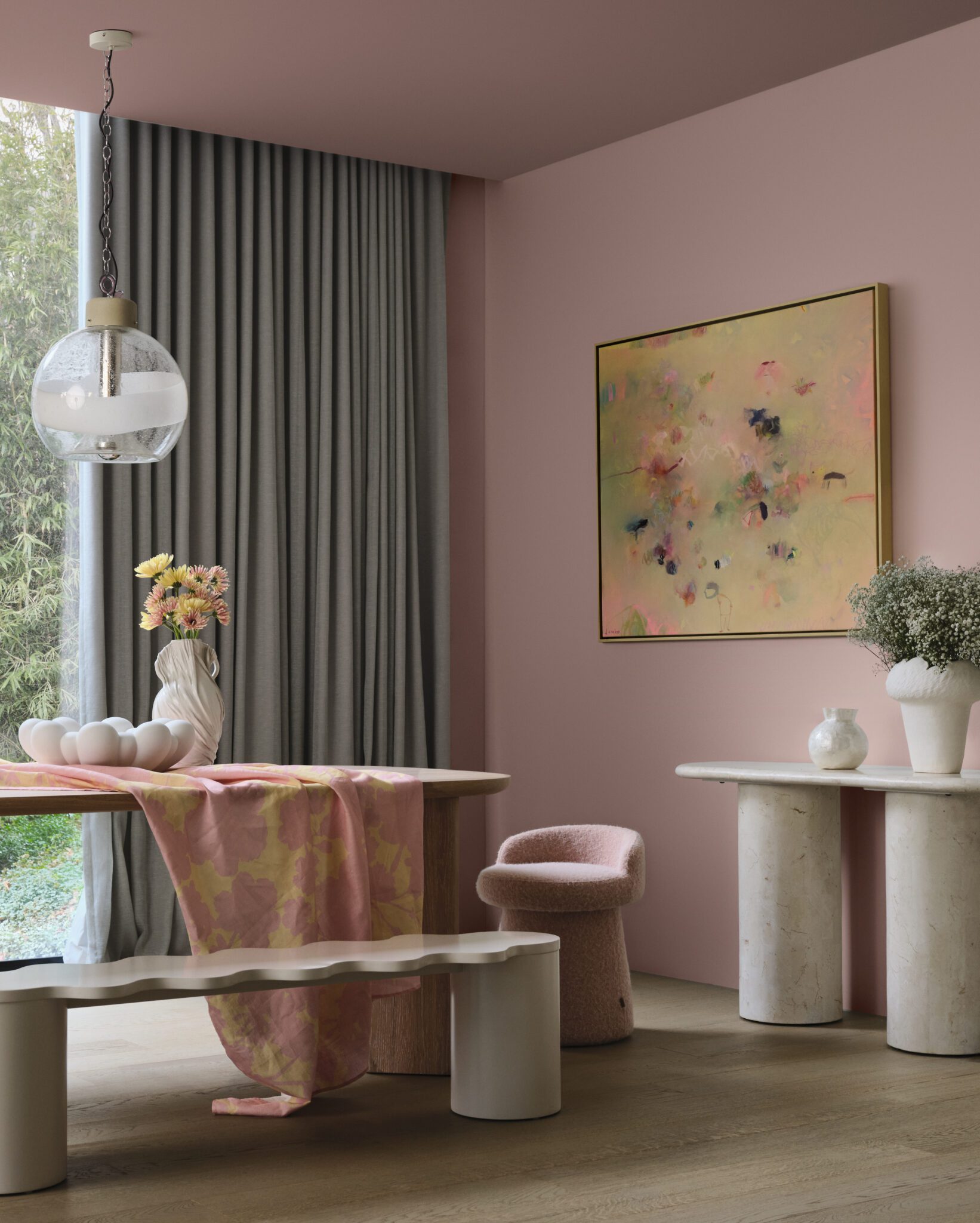
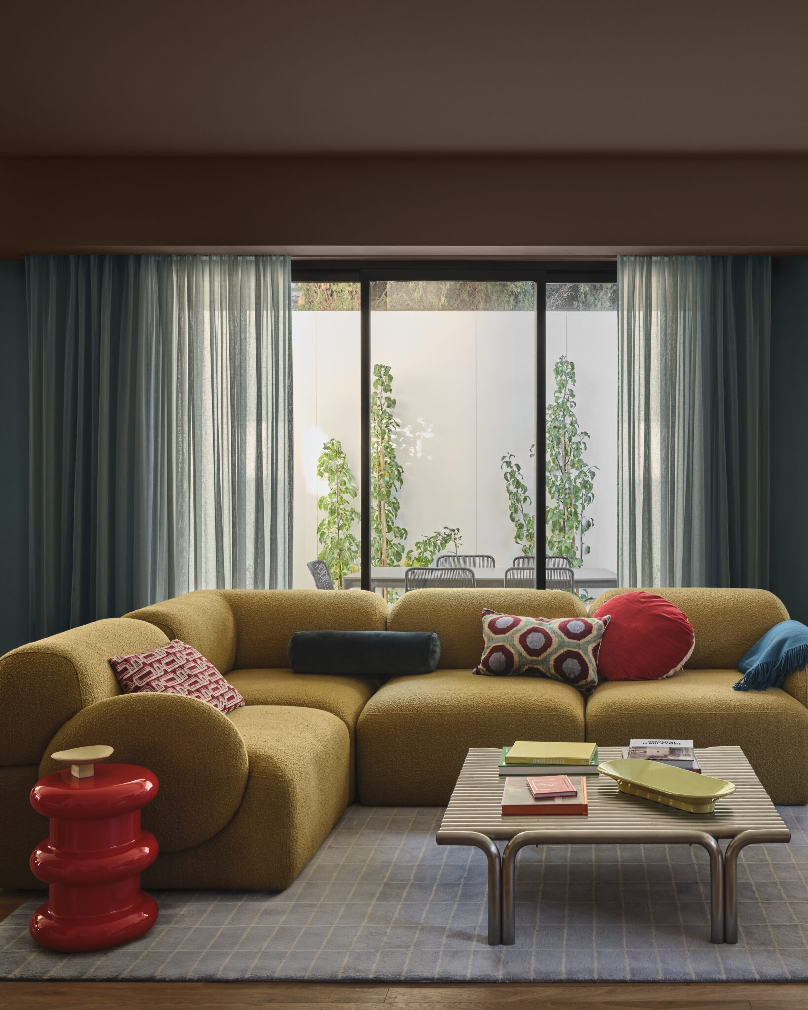
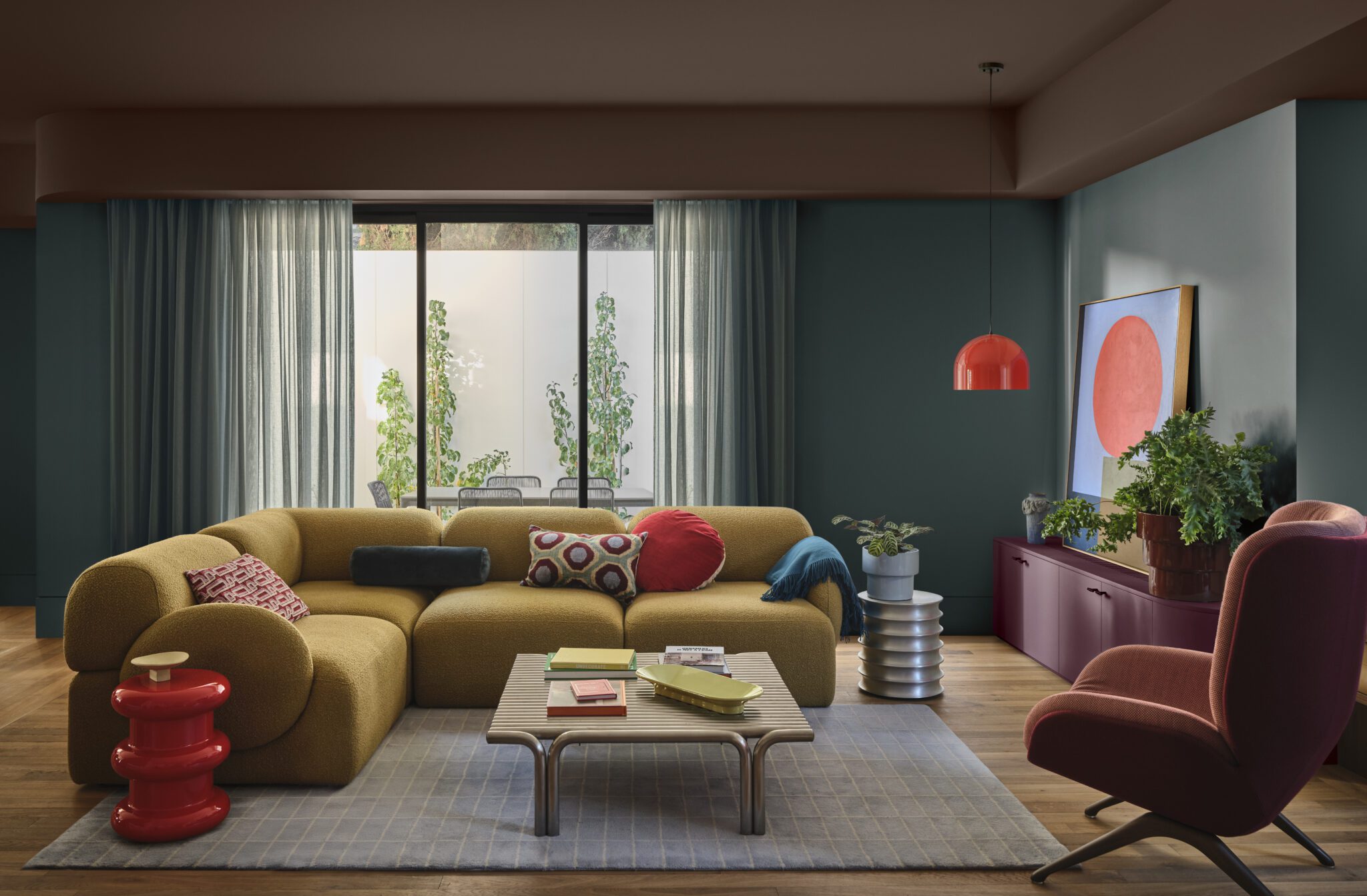
An optimistic, bold, and expressive palette that channels individuality, reminiscence and emotional warmth. Inspired by maximalist interiors and ‘nana chic,’ it reflects a conscious shift towards circular design.
“Dulux Evoke favours eclectic, character-filled styling. The colours lean into deep, comforting tones rather than bright hues,” Davina says. “Clay pinks like Dulux Benhar, burnt oranges like Dulux Ligar Bay, and warm golden tones such as Dulux Desert Road are layered with deeper hues like Dulux Warkworth, Dulux Wink, and Dulux Red Jacks to create personality and depth.”