A seemingly simple, two-bedroom box on stilts above a precipice in Rangiputa hides a microscopic level of detail and clear-headed architectural thinking.

When a well-known and stylistically strong architecture firm takes over a portion of a site that has an existing structure with little or no architectural or heritage pedigree, there can often be a desire to pull the whole thing down and start afresh. A little rot here or a poorly conceived alteration there can become the perfect excuse for a full demolition in an attempt to ensure cohesion with whatever new building the architects were brought in to erect.
However, when the structure is functional and sound, when the clients are emotionally attached to it, or when the budget doesn’t quite stretch to a full tabula rasa, the existing building can pose an interesting design limitation.
Another, more environmentally sound response in a scenario like this is to lightly modify the older building, and have it lend some of its DNA to the newer one, ensuring that at least visually they pretend to be of the same authorship.
“At first we thought, ‘How do we bring it into the language of what we are trying to do?’,” says Lance Herbst of Herbst Architects, of the existing large garage and sleepout on this long, hilltop site overlooking the ocean in Rangiputa.

Instead, Lance explains, pointing out that there are other houses very close to the site’s boundary, they decided to treat it like just another neighbour.
“In the same way that you’ve got a building [to the north] and a building [to the south], you’ve got another building here” — at the eastern end of the site.
Mostly ignoring the existing structure works well here, in this densely packed suburban context where architectural diversity is the norm and an odd couple of buildings will not raise any eyebrows.
The question then became not only how to assimilate but also how to separate the new building from, first, the existing structure and, second, the neighbouring houses “so that [they] didn’t look like three perfectly aligned statues, all in a row staring at the ocean,” jokes Nicola Herbst, the firm’s co-principal.
The answer was simple and clear-headed: you dig.
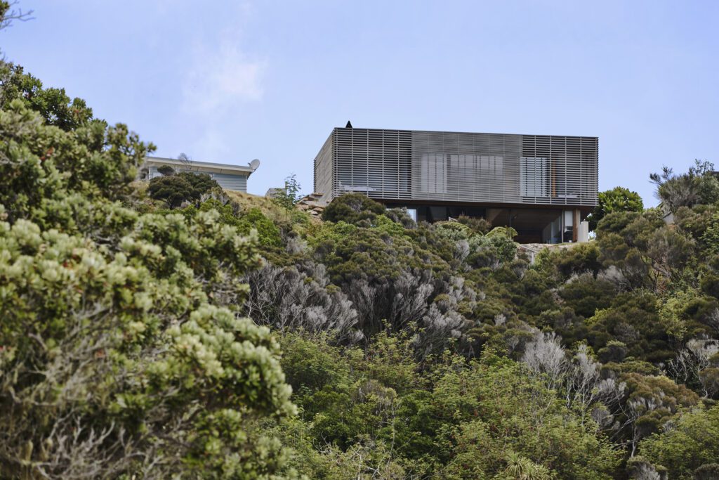
The western boundary of the site is right up alongside a dramatic precipice, with the roaring sea below. Most houses here do, indeed, line up and face forward, to capture the painterly outlook. Nearby, and over the waves, is the jagged Mount Camel, with its distinct sandy scars — said to have been mistaken for a whale by Kupe and now carrying the te reo name for a southern right whale (Tohoraha). It is believed that spirits go through this peninsula on their way to Cape Reinga and further on to Hawaiki.
The plan drawn up by the Herbsts pushed the building as far as possible towards the edge of this exquisite tableau. It also involved digging more than a metre into the soil — a move that further dislocated the building from its neighbours, giving it vertical rather than horizontal separation, shifting the height-to-boundary restrictions, and turning the older structure into both an arrival sequence and a foreground.
According to Nicola, this gave the older building a sort of “balcony effect” that also took in the views, and turned retaining walls — which the Herbsts refer to as brackets — into privacy solutions.
An added bonus is that the timber building looks less imposing from the beach below, like a geological or botanical afterthought.
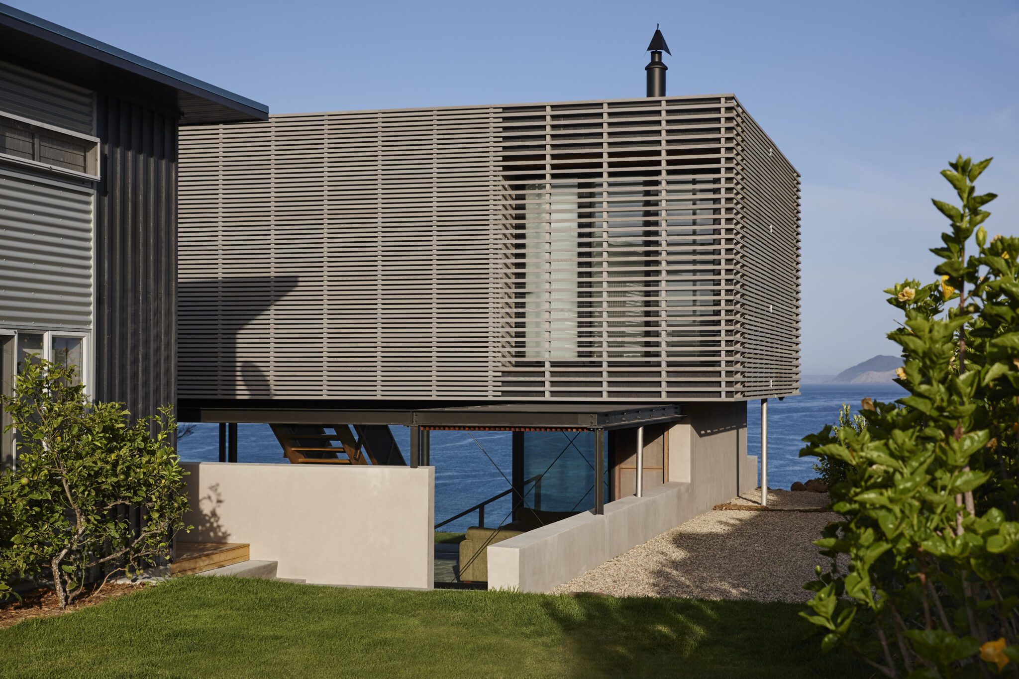
The form of the new house is simple: just a box, but with millimetric attention to detail.
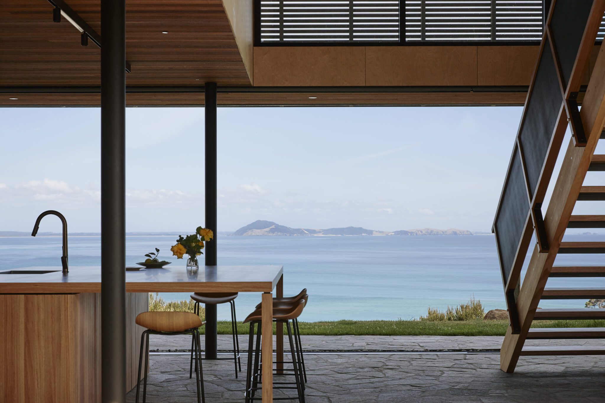
The ground floor can be opened up entirely — via retractable, sliding, glazed doors — and continues the outside courtyard’s language of crazy paving that helps to define this area as a lanai.
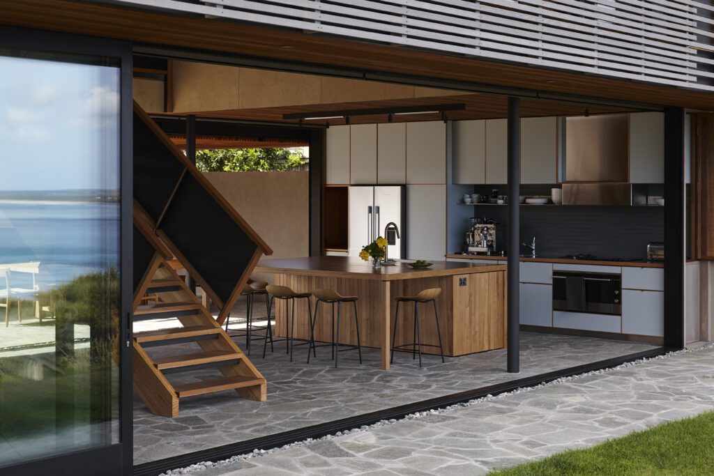
“It’s an outside courtyard that looks through to the view,” says Lance. “The bracket wall comes around and becomes a cradle that essentially holds this timber box, which houses all the rooms and has a void in the middle.”
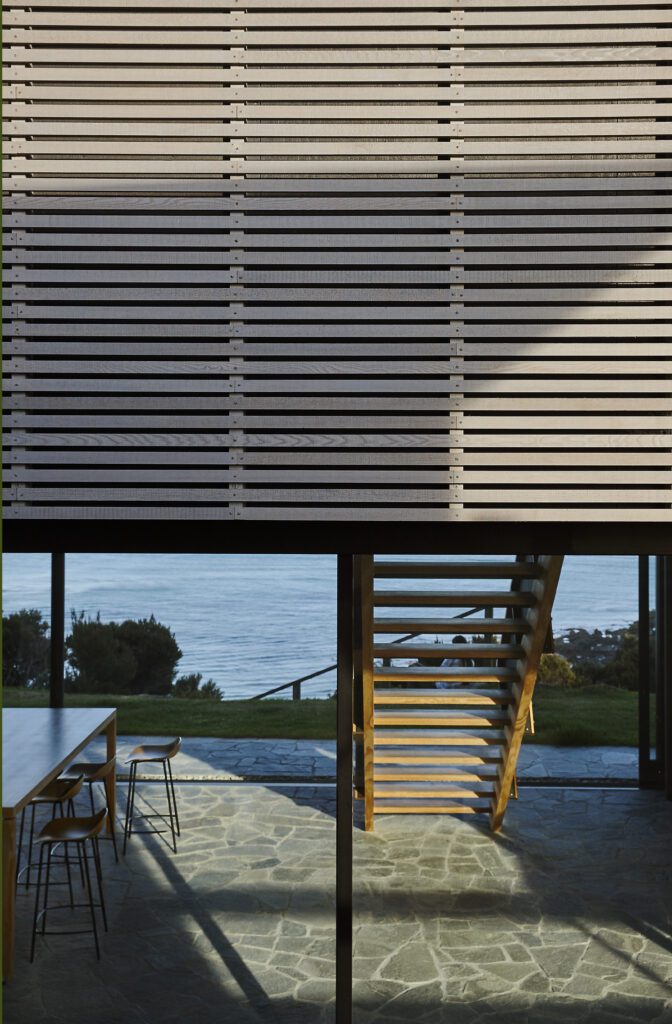
Strategic cantilevers of the upper level provide buffer zones between the interior and exterior, while the exposed steel beams at the edges add solidity and anchorage to a building that could otherwise seem as if it would want to fly with the spirits into the vast horizon.
The stilts holding the upper level are elegant, round, black metal ones that seemingly disappear against the ocean. The ground floor is entirely open plan, with the separate functions flushed against the walls. On one side is a living room facing a fireplace. The other houses an open plan kitchen with its corresponding island. Although the cabinetry and splashback tiles use a popping colour palette, the space is entirely congruous and discreet.
A roof over the portion of the courtyard directly next to the kitchen, and its outdoor fireplace, offers the possibility to expand the dining area in the right weather conditions.
“A stair drops down in the middle like a gallery connection between the two [areas around the] big open void,” says Nicola, “and then, to offset the transparency of the lower floor, this crate-like timber-sheathed first floor needed to be dense … to kind of counterpoint.”
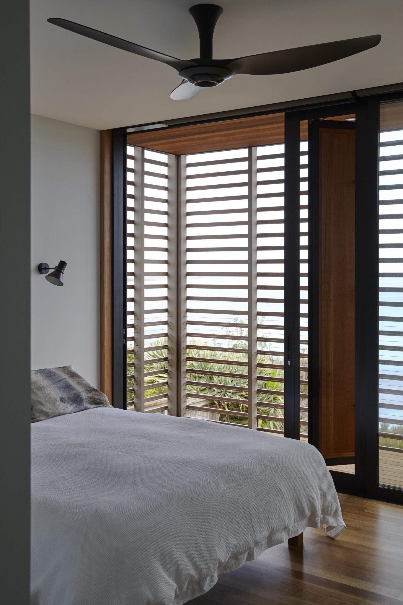
The beautiful woodcraft and perforated metal of the stairs ensure that the transition between lower and upper level is subtly sculptural without detracting from the views or upsetting the finely tuned proportions of it all.
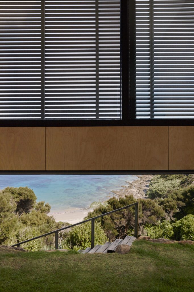
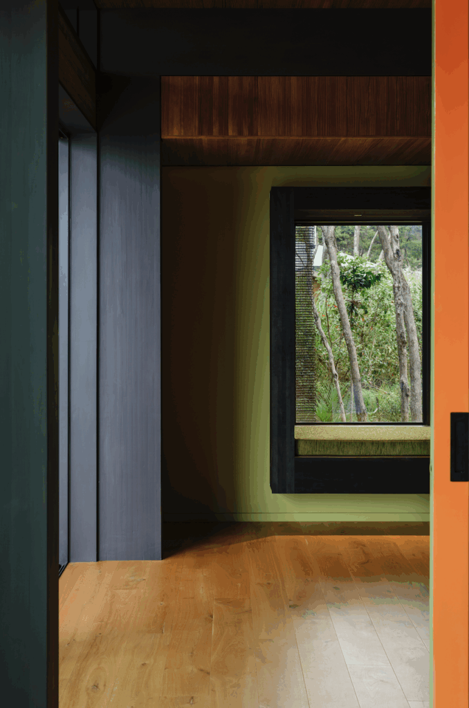
There is something slightly Japanese at play here: the restrained material palette and compositional clarity; the light timber — expressed with minimal finishing — foregrounding the grain and craftsmanship in a way that echoes traditional joinery’s honesty and precision.
The open risers and perforated metal balustrade introduce a sense of ma — a play between solidity and void— while subtly recalling the translucence of shoji screens. The rhythm and proportion align with the modular rigour characteristic of Japanese architecture, reinforced by the cabinetry’s geometric continuity. The dialogue between warm wood, cool stone (with a wabi-sabi vibe to it), and black metal embodies the Japanese modernist balance, producing a space that feels both grounded and quietly elevated.
Add to that the Herbst predilection for woodcrafted ventilators, and for engawa-like, cedar-slat–covered verandahs between the bedrooms, bathrooms, and the exterior, and the whole thing feels truly cohesive, meditative, and picture perfect.
Architecture: Herbst Architects
Build: Bell Construction
Words: Federico Monsalve
Images: Jackie Meiring