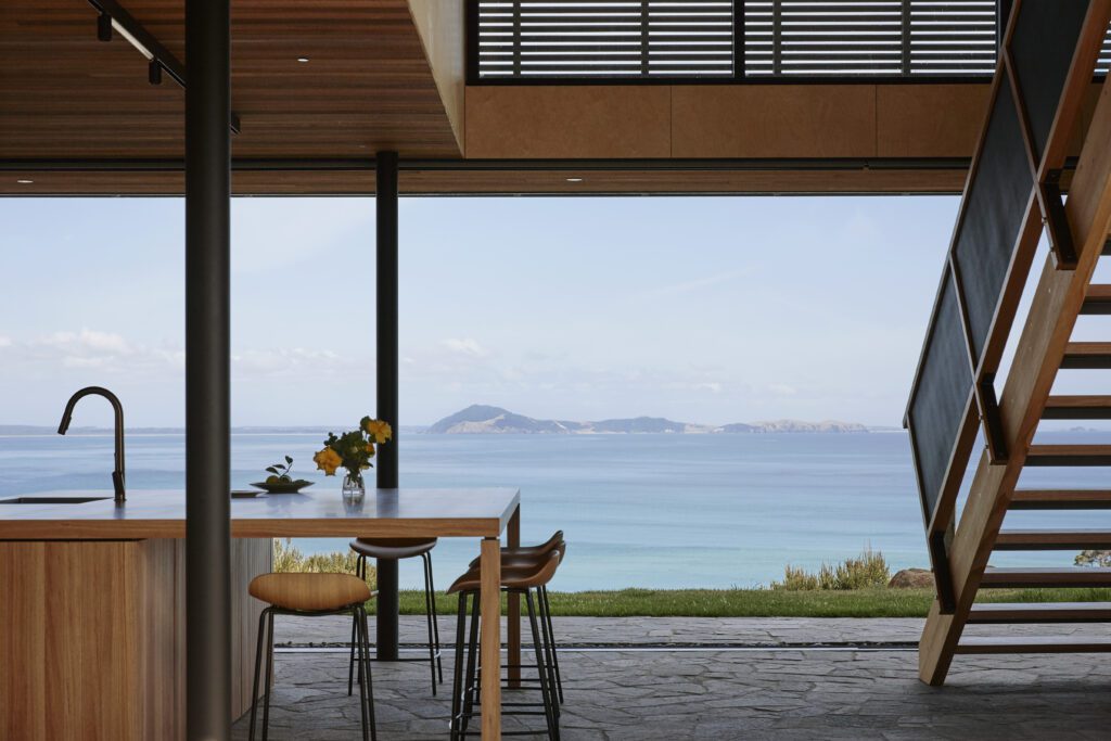
It is small – 120 square metres – and perfectly formed. It is also a lesson in how a little can turn out to be just enough. It is a guest cottage on a central Otago property that was originally envisaged as the first piece in a larger puzzle that included a new family home
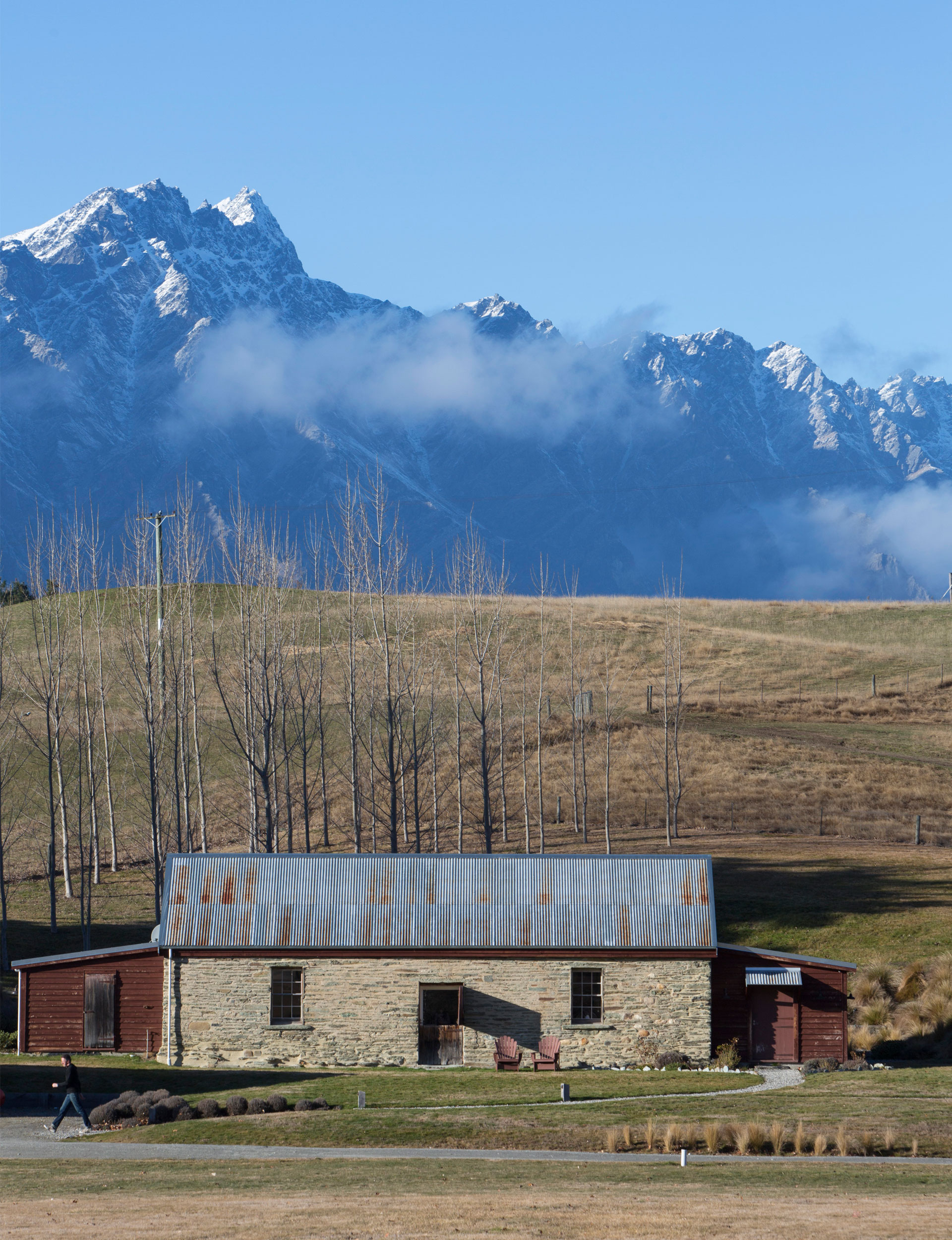
The property, with its 1870s stone stables, a chicken shed and a collapsing cottage, was purchased by a couple with two children who returned to New Zealand almost a decade ago after 13 years abroad. After a long, careful development process, the old stables are now the family’s compact two-bedroom home, and the chicken shed has been thoughtfully converted into an office.
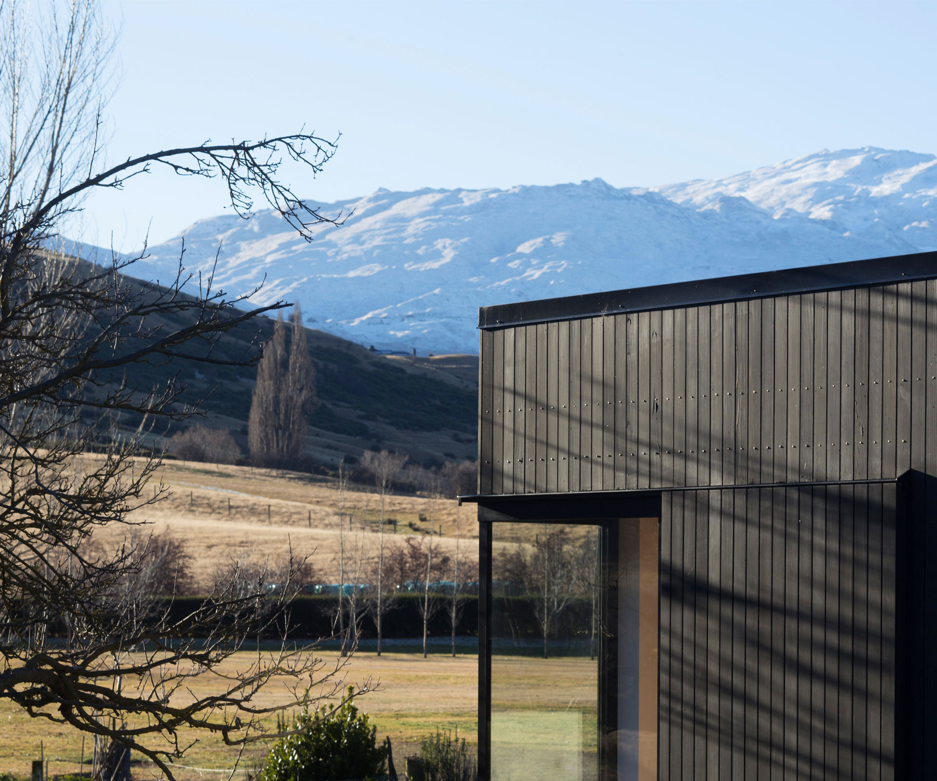
What the property lacked was space for visiting friends and family. The original 140-year-old cottage was so dilapidated it was deemed irretrievable, even by heritage consultants. So a plan was hatched to build a guest house on the cottage’s 100 square-metre footprint. It was a way of retaining the presence of the original building that had the added bonus of avoiding the host of resource consent issues that a larger dwelling would have triggered.
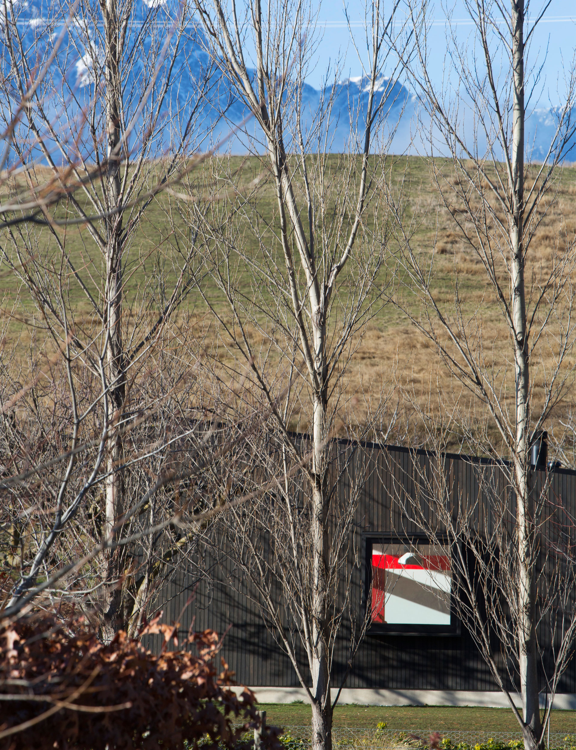
The owners wanted something “that wasn’t the design du jour – something that would still feel classic in 50 years.” They admired the simple practicality, muted material palette, and low-maintenance air of vintage Scandinavian ski lodges. They liked the idea of a contemporary cottage that was built to last.
Otherwise, they went to Sydney-based architect Domenic Alvaro with a fairly open brief. They got to know Alvaro when he worked on an Australian project they had commissioned from his firm, Woods Bagot, when they were living there. (As well as many large Australian buildings, Woods Bagot is working on the design of Christchurch’s new convention centre, although Alvaro isn’t directly involved in that project).
Alvaro came to Queenstown and liked what he saw. “It was a breathtaking site,” he remembers. “I loved the context of the existing mountain ranges, but I also liked how the New Zealand authorities thought in terms of heritage: that it’s not just what things look like, but they’re interested in a broader reading of the context of site.”
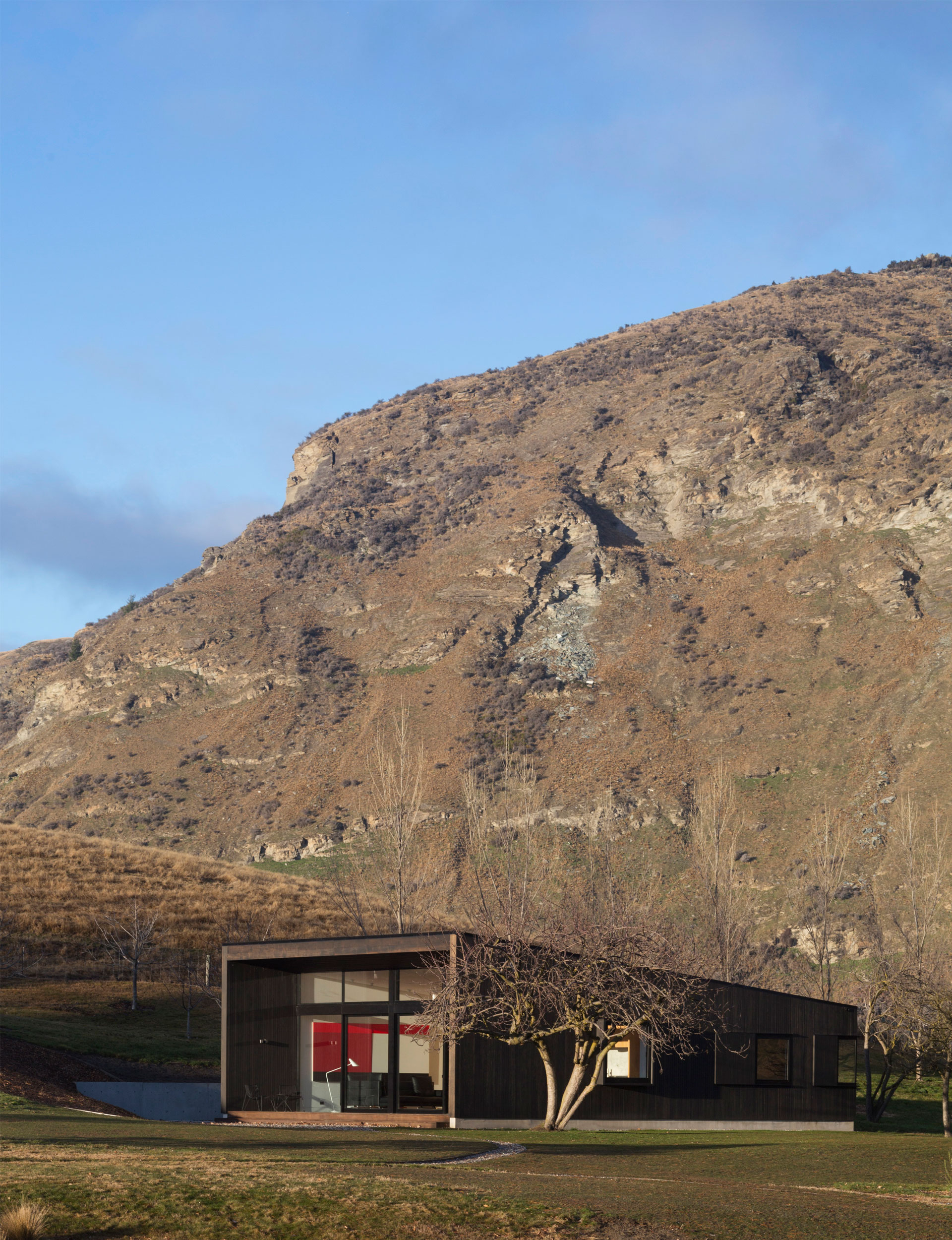
This meant the council was happy for a contemporary building to be erected to replace the original cottage as long as it emulated its scale and placement on the site. As it turned out, the original cottage also governed the design in ways that aren’t initially obvious. The highest point of the new building’s monopitch roof is the same as the peak of the old cottage’s gable, for example. And the old building’s orientation turned out to suit the new structure, allowing its generous glass frontage to soak up the morning sun and stay warm throughout the day in winter.
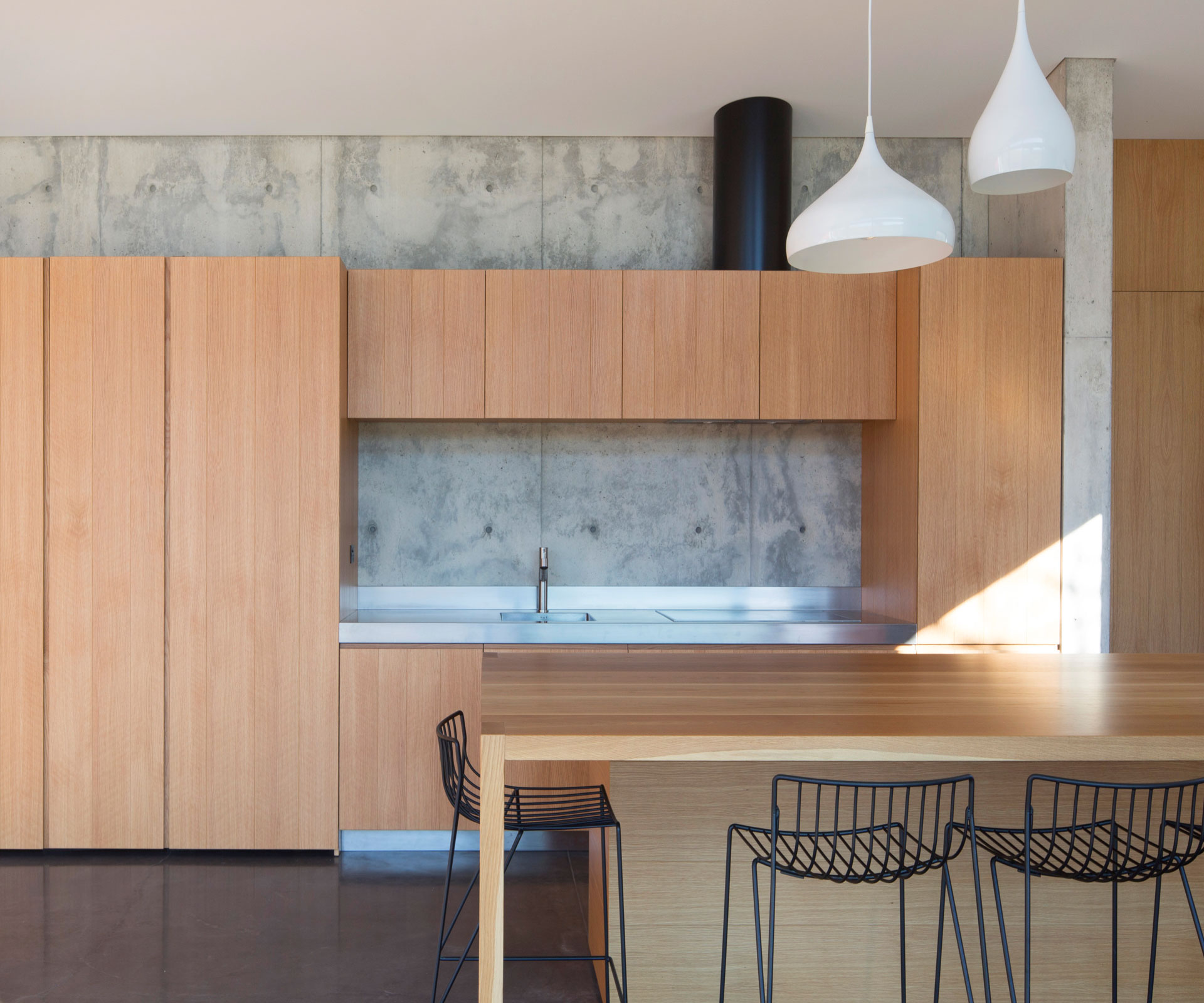
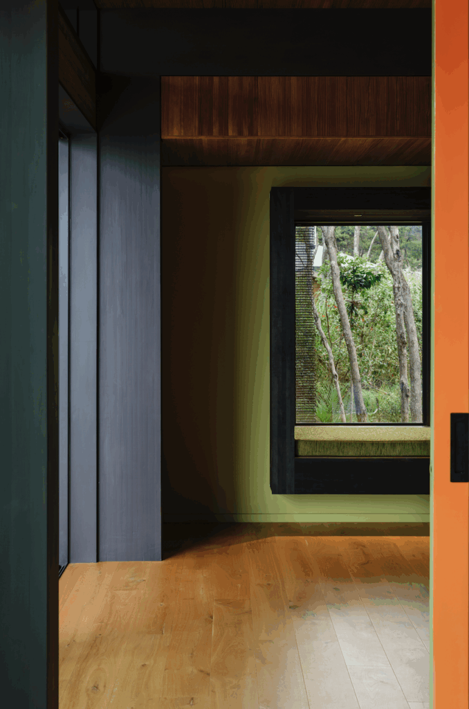
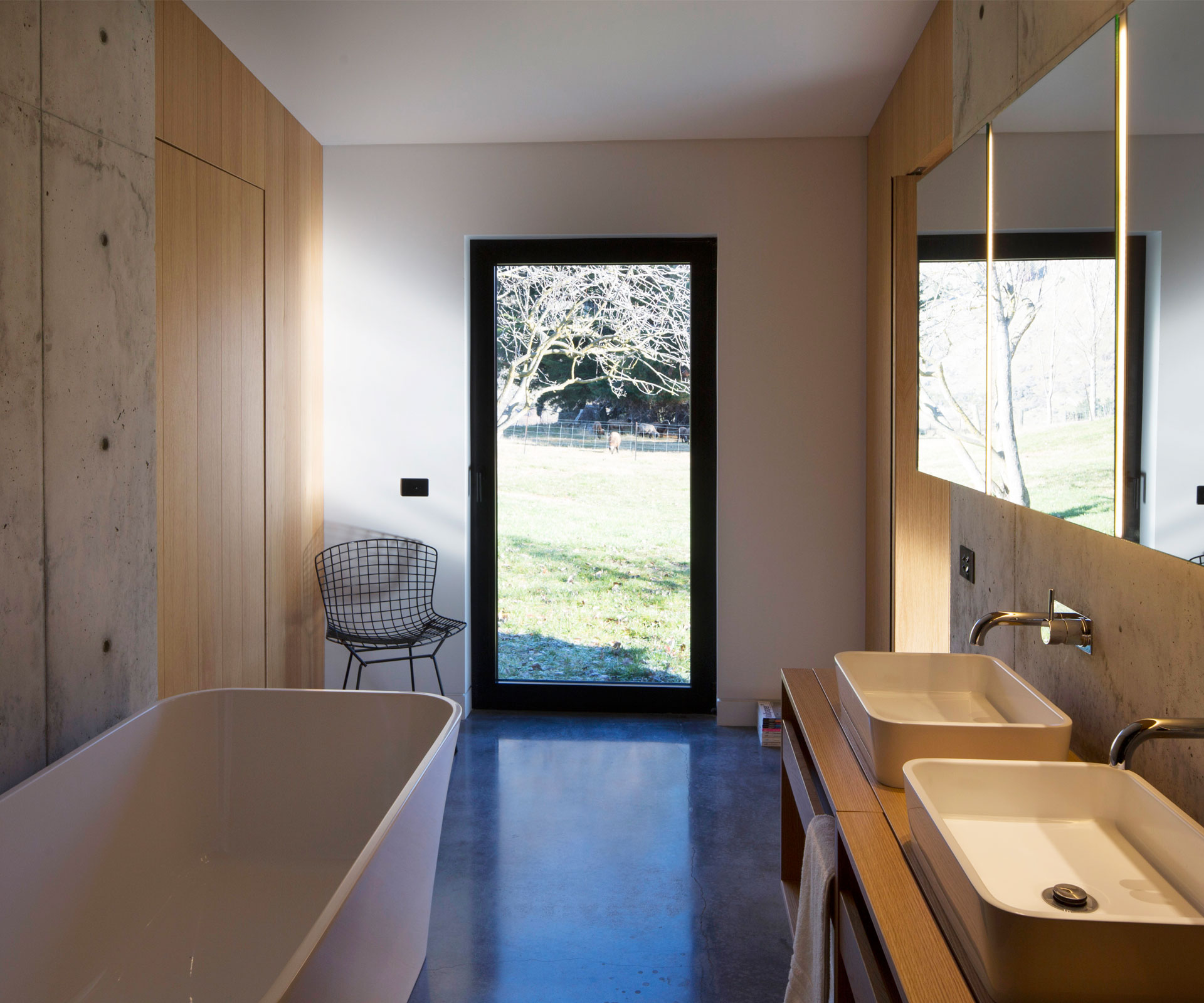
Despite the new building’s relatively small footprint, “the scale of the living area is quite spectacular, quite tall”, Alvaro says. The reason for this sense of spaciousness is not just the volume, but that the architect and his clients worked so hard at paring everything back. There are no circulation spaces in the new building, for example: oak panel doors on either end of the living area open directly into each of the two bedrooms, which in turn open into the shared bathroom that separates them (the roof pitch dives lower over the bedrooms, lending them a sense of intimacy in contrast to the larger volume of the living space). The interior material palette is restricted to concrete and oak, while dark cedar clads the exterior.
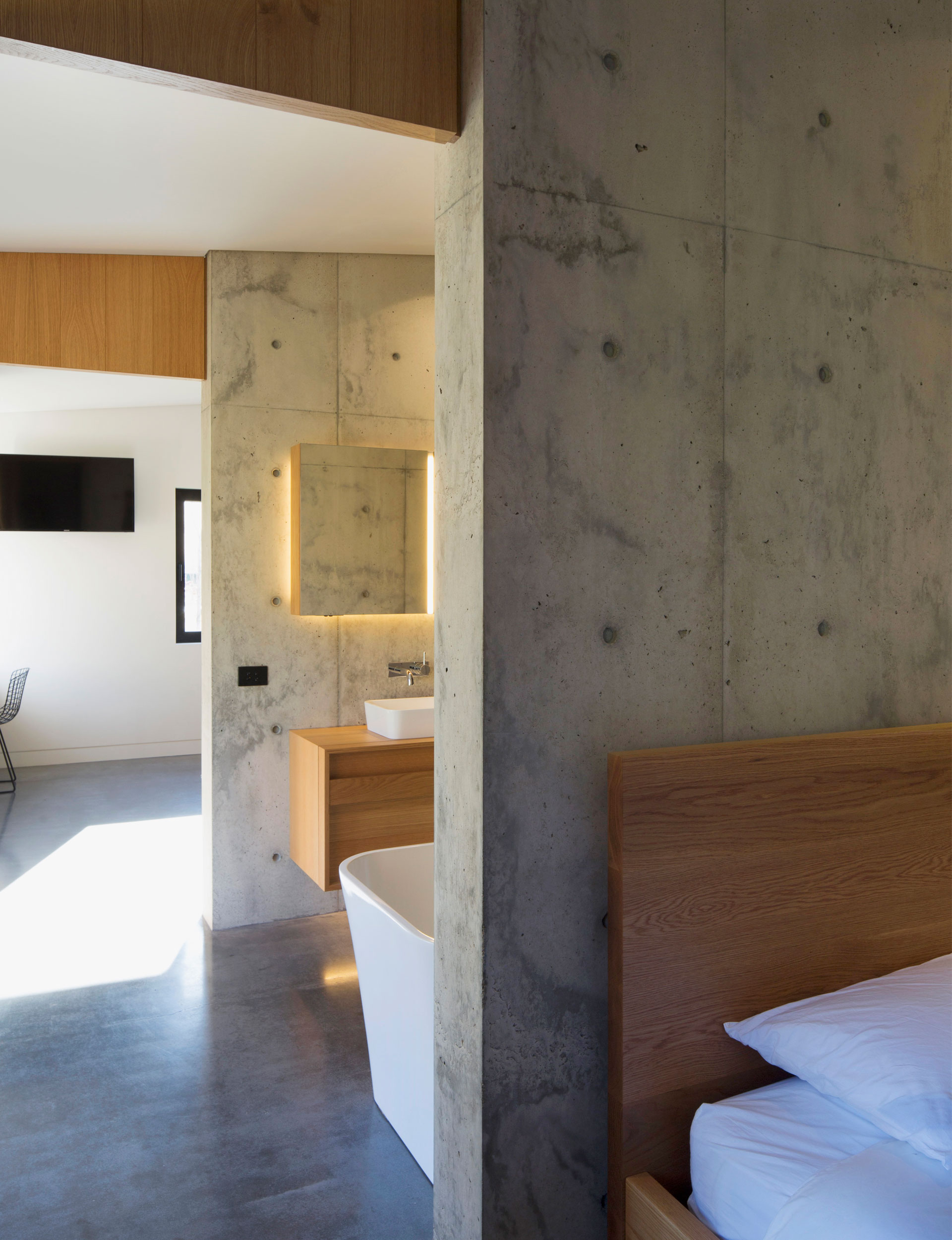
The building is constructed around a core concrete wall that was poured on site and left exposed. All the services – the oak cabinetry of the kitchen, the fireplace, the plumbing and plenty of storage – are placed against it. The kitchen island was designed to double as the dining table. This reductiveness means a simple square window framing a perfect view of Coronet Peak at the end of the kitchen island feels like a luxurious indulgence.
Ah, luxury: it is, Alvaro says, “such a misused word.” To him, luxury in a location like this is providing warmth, shelter and access to the view. “Rather than focusing on finishes and cladding the whole thing in granite or stone, it’s about building moments, about it being a beautiful experience.”
Alvaro doesn’t work on many stand-alone homes these days, as his time is mostly occupied with the design of multi-storey apartment buildings in Sydney. But the techniques he’s applied in this small building can be easily adapted in those projects. “The cost of apartments is getting higher so there’s pressure to keep affordable product on the market,” he says. This means finding ways to make smaller spaces seem more liveable or, as Alvaro puts it, “to improve your ability to live within the available space”.
Back in Queenstown, these lessons have already been absorbed by Alvaro’s clients. He has designed a larger family home on the same property for them, but none of them seems to think ever they’ll bother building it. They’ve learned their current arrangement – the converted stables for themselves and the new cottage for guests – is all they need. Nobody is expressing any regrets about the big dream home that will probably never be. “We are really embracing small,” one of the owners says, happy that they already have enough.
Words by: Jeremy Hansen
Photography by: Patrick Reynolds
