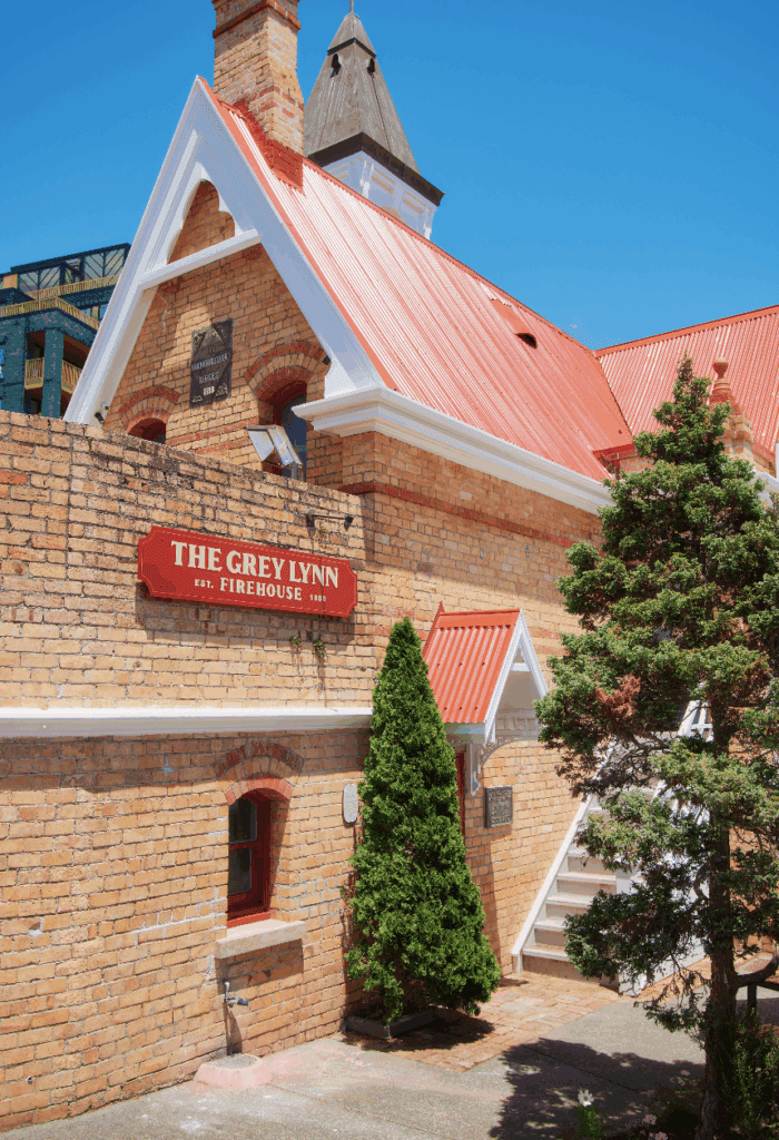
A traditional villa facade hides a soaring, chapel-like quality at the rear of the house, with monumental walls of concrete, a huge window and triangular skylight
DESIGN NOTEBOOK
Q&A with architect Malcolm Walker
Do you relish villa renovations or sigh deeply each time you take one on? I never sigh. Some are more of a challenge than others, but it’s never dull. Although the villa itself is fairly repetitive, a modern house demands much more and that’s where the fun starts – issues of sun, social organisation, relationship to the outside, and clients’ lifestyles are issues the original villa never addressed. It’s putting all these into the renovation, yet respecting the original house, which is tricky and fun!
What was different about this renovation? Firstly, it was a very big house on a very small site. Everything was oversized and it was very dark. It was crowded by neighbours, so easy sun, outlook and wide-open outdoor space wasn’t available. And, of course, they were particularly special clients.
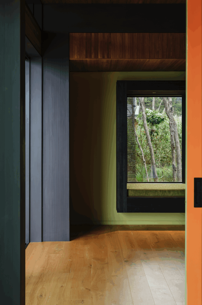
There’s a playful quality to the way you manipulate scale and light here. Thanks. Light was particularly important and a driver for what we did and we had fun with it – skating light along ceilings and down the rough-formed concrete. Windows are all varied and spread throughout the house, central and external, high and low, so the light changes utterly during the day.
What are the key design decisions you are most pleased with? Closing the plan down so it is a sequence of spaces and doesn’t reveal the outside, except in an intimate way. There’s not much of the outside but what there is is interesting. That’s what those concrete walls are doing – obscuring and revealing. Splitting the corridor into two and adding the clerestory window to the hall livens the place up and breaks any preconception of a villa you may have after the front door is opened.
Words by: Maria Majsa. Photographs by: Patrick Reynolds.


