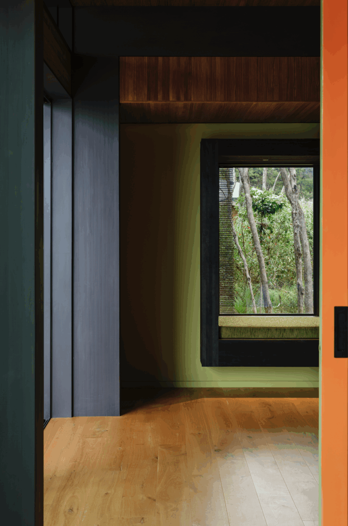
Rather than seek to respond to the site, a new home at Waimauku by Herbst Architects defines the landscape around it with an interplay of solidity and transparency
Q & A with Lance and Nicola Herbst of Herbst Architects
How did you position the house without many natural elements to respond to?
Lance: We were looking to find some good reason to put the building in one place or another. There didn’t seem to be one, as the site was uniformly the same. So we inverted it and defined the site with the house. We made two cross-axes with the gabion walls which start as very faint gestures way out into the landscape and then rise out of the ground. That gives us four quadrants, which is what we needed because the dogs need to run in one, the horses need to run in another, one is private, one is public. That gave us a sense of the site. It suddenly had a definition to it.
There’s a familiarity in the arrangement and materials of the house for anyone who’s followed your work – gabion walls and covered ‘negative’ spaces. But this is a permanent home rather than a bach. How did that change the way you approached the house?
Nicola: Developing the bach typology has affected the way we design primary residences. As with baches we feel that a covered outdoor room designed for all weather conditions is essential part of a house. As to the arrangement of spaces, with baches we fracture the building into pavilions with covered outdoor links. With this house a similar pavilion plan arrangement allows a strong connection with the outdoors, while placing the main circulation indoors for an appropriate level of comfort. More and more clients come to us with an interest in incorporating the principles of bach design into their houses.
You deliberately raised the house up on a concrete plinth. How did you make it feel connected to the site?
Nicola: We deliberately wanted to elevate the building off the ground for a few reasons. The plinth becomes a unifying element to the separate pavilions. The plinth allows the house and occupants to stay dry in winter when the paddocks get very soggy and the idea of being elevated enough to see over the vineyards and beyond was desirous.
The materials are recognisably agrarian – faded timber and stone – but the house doesn’t feel unpolished. How did you strike that balance?
Nicola: In using these textural, natural materials we find simpler forms and crisp edges are required for the roughness to be beautiful. There is also some deceptively tricky detailing to give a sense of sophistication.
Words by: Henry Oliver. Photography by: Patrick Reynolds.
[related_articles post1=”56169″ post2=”55032″]
