This kitchen in Mt Eden, designed by Joanna Hoeft, takes contrasting elements and blends them to create an inspired space
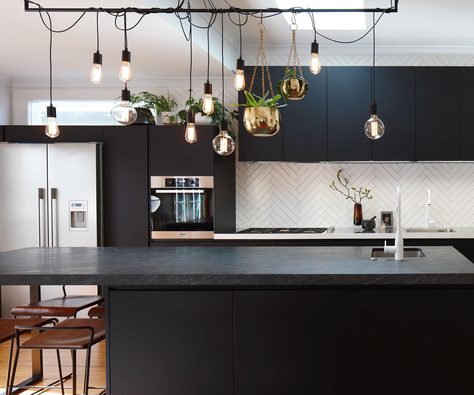
Black and white textures add drama to this light-filled kitchen
Designer: Joanna Hoeft, Studio Italia
Location: Mt Eden, Auckland
Brief: To redesign a kitchen, laundry and bathroom space in the designer’s own home.
You chose black to lessen the impact of the floorboard tones. How did you choose the material for the cabinets?
Joanna Hoeft: The timber floor runs through the entire house. The black material on the cabinet fronts is a new advancement in laminate called Touch – it’s resistant to fingerprints, which is often a major problem with black finishes. State-of-the-art laser edging and an integrated black anodised handle further showcase Varenna’s quality manufacturing.
There are two taps in the main kitchen, one with pretty snazzy lighting
The tapware is ‘Eve’ by KWC in white for the main kitchen. The island tap has the added feature of an LED light. It’s a bit of a toy for my husband – he does the cleaning up, so I needed something he could play with! It’s also great for checking the waste disposal.
The tiles are a real feature
We love the Artedomus tiles. Their undulating surface appears handmade and laying them in the herringbone pattern adds texture.
What storage ideas can you share?
The pantry by the fridge has a series of pull-out drawers with everything in its own section.
Tell us about the lighting
We needed to work with the position of a skylight and different ceiling heights, so lighting over the island needed careful consideration. We decided on a semi-industrial style, reminiscent of a café fitout, to finish the space. The hanging bar with the looped bulbs also caters to hanging plants. There’s scope in the future for this element to change and the position of the lights to be altered.
Was it difficult or easy to design your own kitchen?
Much harder. As a designer, you are all too aware of the vast array of options available in terms of finishes, layout and detailing. As a designer, you filter these things before presenting options to a client, but as the client this is impossible. With each new idea I posed to my husband he would say, “I thought you had decided and the kitchen was ordered!” I’m lucky he is very easy going and trusts my decisions.
Photography: Jackie Meiring.
[related_articles post1=”51960″ post2=”51935″]
