The 2017 Home of the Year is a house for a young family by a young architect in a provincial town – and yet it has much to teach city dwellers about how to live
[jwp-video n=”1″]
A courtyard home in Cambridge is the ultimate in urban living
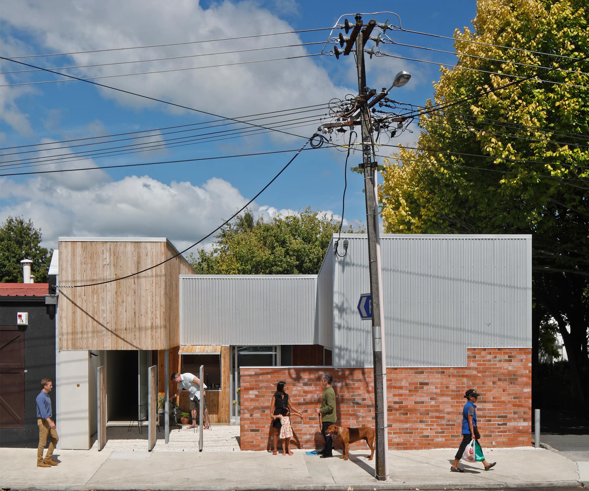
Walking through the township of Cambridge in the heart of provincial Waikato, a building appears that strays far from the norm. It sits surrounded by a supermarket, a carpark and a mishmash of shops on an oddly shaped 315-square-metre section alongside service lanes and a commercial building. The home of Grant and Karen Jack, an artist and a teacher, and their daughter Sadie (four) is an intriguing addition to the streetscape: the family often arrives home to find people standing outside in a state of confusion, unable to work out exactly what the building is.
The whole site is wrapped with a red brick wall, off which the house’s various elements spring . Bold hints at what goes on behind it pop up at different angles, with flashes of more timber and brick, and corrugated steel. Architect Chris Beer says creating this sense of mystery was kind of the point. “We wanted the house to be abstract,” he says from his laneway studio in a former denim factory, just minutes away from the Jacks’ house. “It’s more about forms, and a composition of materials without the need to have conventional doors and windows. From the outside, it doesn’t really look like a house.”
Grant and Karen’s home was the first project for Beer after moving back to Cambridge in 2013, and he couldn’t believe his luck. His approach as an architect had been shaped by the principles of his former workplace in London, William Tozer Associates – where homes are treated as a single open-plan space, loosely separated according to the level of privacy that’s required. Grant and Karen, who were already friends of Beer’s, embraced this design framework and the project became a creative collaboration between architect and client – an ongoing conversation over many months.
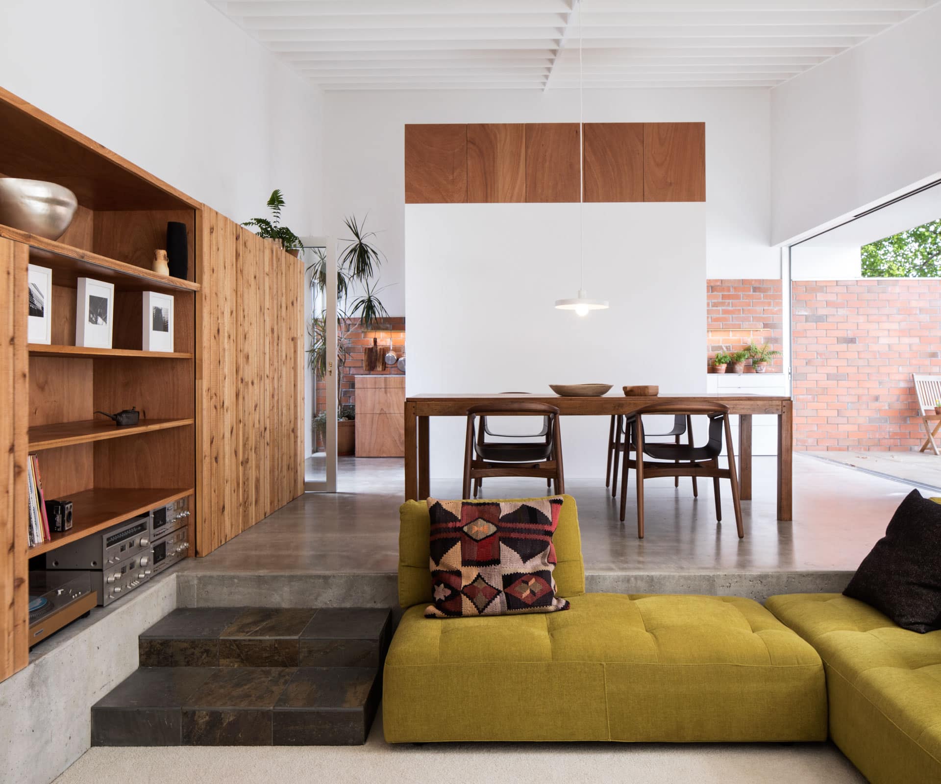
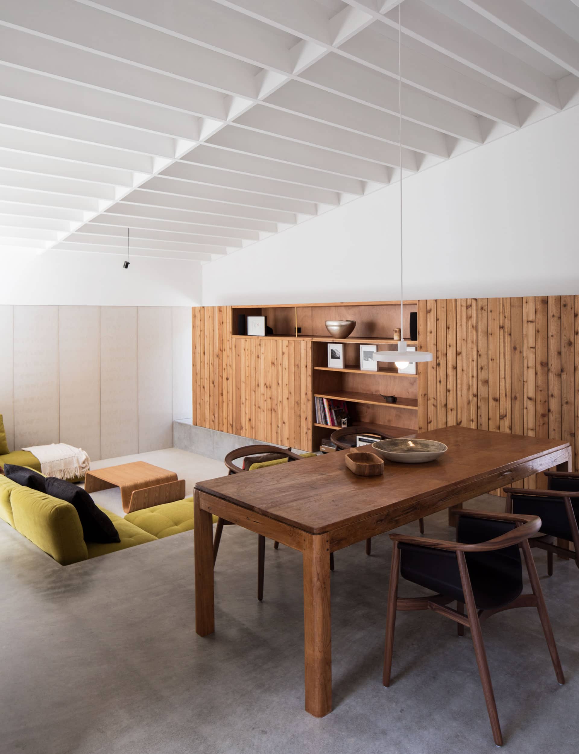
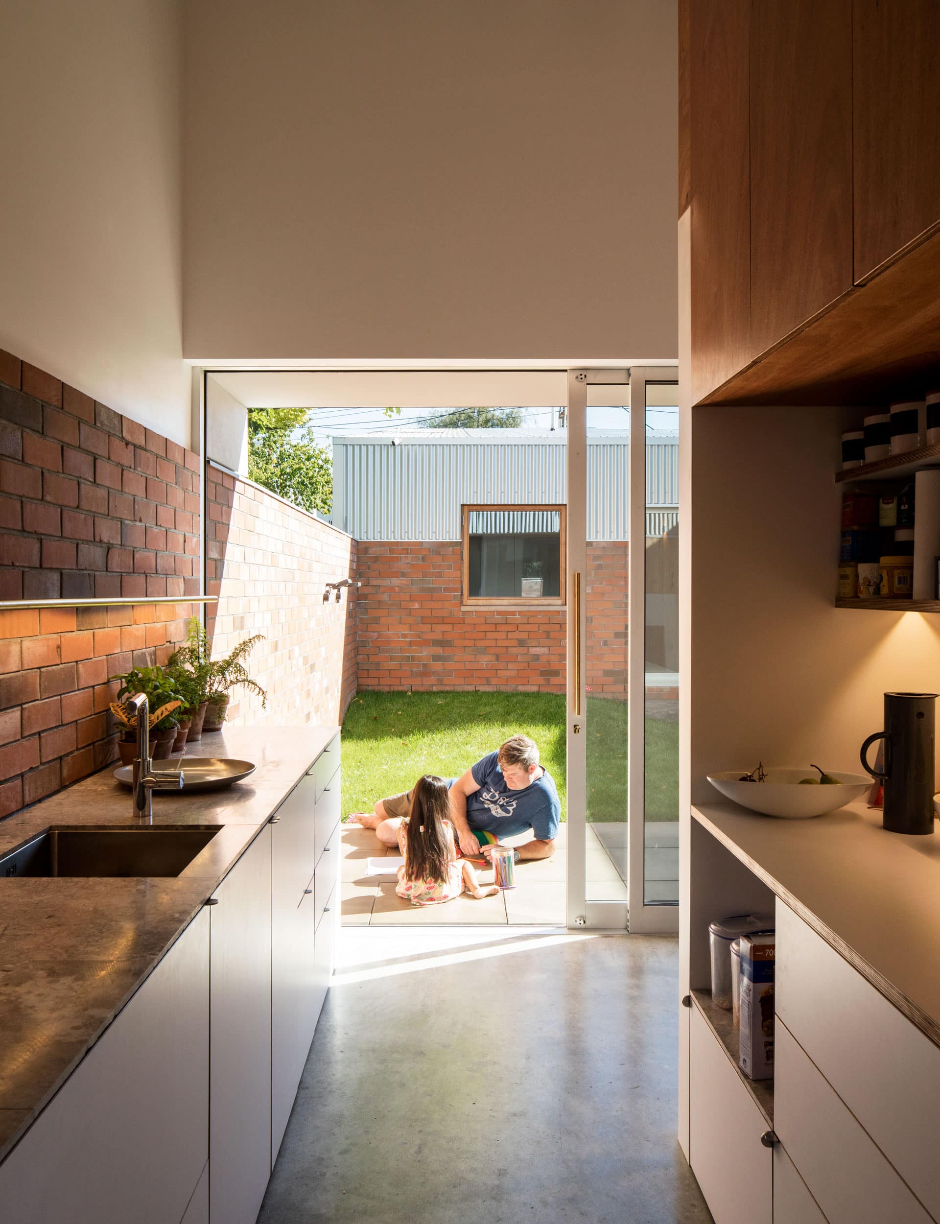
The home is evocative, even poetic – but it was made on the slightest of budgets thanks to the creative use of prosaic materials, such as discarded bricks from a Tamahere retirement village project, second-grade cedar, and marble floor tiles as benchtops. Grant spent the better part of a year making the cabinetry.
The Cambridge home embraces the family’s creativity – and their resolve to live in the middle of a village, somewhere. Together with their architect, the three of them had flatted in Greenwich, London, where they walked everywhere and never needed a car. Returning to live in Auckland in 2009, they longed for such urbanity – but realised they would never be able to afford it. Eventually, the pull of family in the Waikato trumped big-city life in Auckland.
Grant and Karen initially felt tempted by the idea of living in a suburban neighbourhood with a large section for their daughter to play and ride her bike. “Then we realised we would have to get another car,” says Karen, “and that we were going in the opposite direction from where we wanted when we thought about our lifestyle.” Grant, a stay-at-home dad, says walking Sadie to the park means she is able to interact with others and the family all benefits from being able to access the community at their doorstep.
Grant, who had been scouting sections for a while, with no luck, emailed Beer about a quirky Cambridge property that backed onto a service lane for a local supermarket: “Do you know if we could build a house in the corner by the carpark?” he wrote. “I know it’s a bit stupid but I like what they do in Japan with sites like this and it’d be a handy place to live.”
Grant recalls taking Karen to visit the proposed site: “It was a patch of grass that looked pretty tiny. It looked like a little strip of nothing. It looked like someone’s berm,” she says. But she soon came onboard and they presented Beer with short brief. The architect went to work, energised by the idea that he was starting with such a strange piece of land. “The site was so different,” he says, “that we could push any idea of a normal house aside and start from scratch.”
The site’s zoning as a commercial property “opened up a whole lot of opportunities around how we could occupy the section”, says Beer. He proceeded to design right up to the boundary, providing a good-sized family home and studio with plenty of outdoor space.
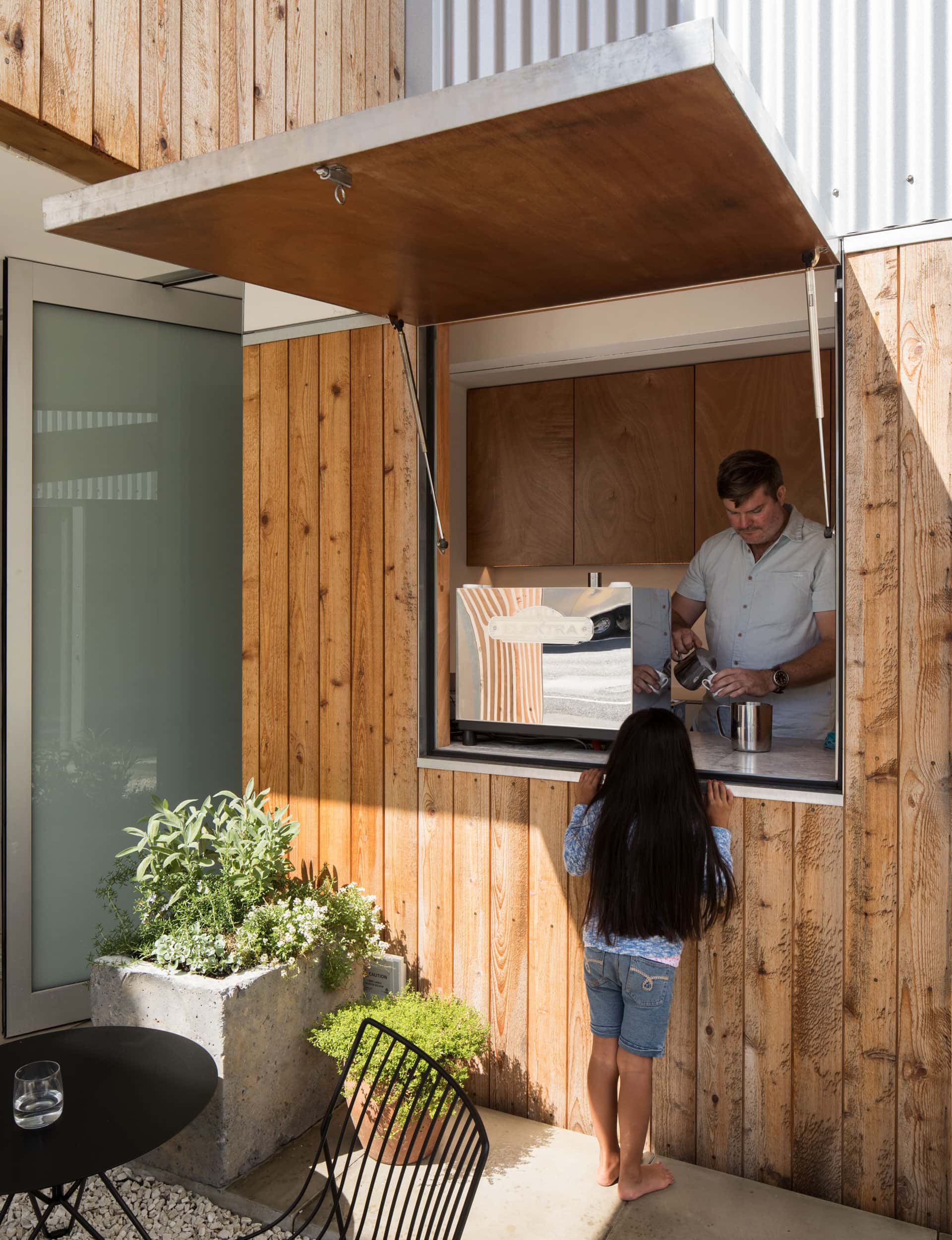
Beer internalised the exterior spaces, placing courtyards inside the wall as part of a carefully layered series of experiences. The entrance to the house is through three steel-and-timber gates that swing 90 degrees, either closing securely or opening completely, and into a courtyard, onto which Grant’s studio and a coffee hatch open.
Once Sadie is off to school, there are plans for a gallery selling his own and others’ art, zines and coffee here: it’s a porous intermediate space between the street and the family’s private living areas. Beyond that, two bedrooms and two bathrooms, then the main living courtyard, followed by the open-plan living area and a service courtyard at the back of the site.
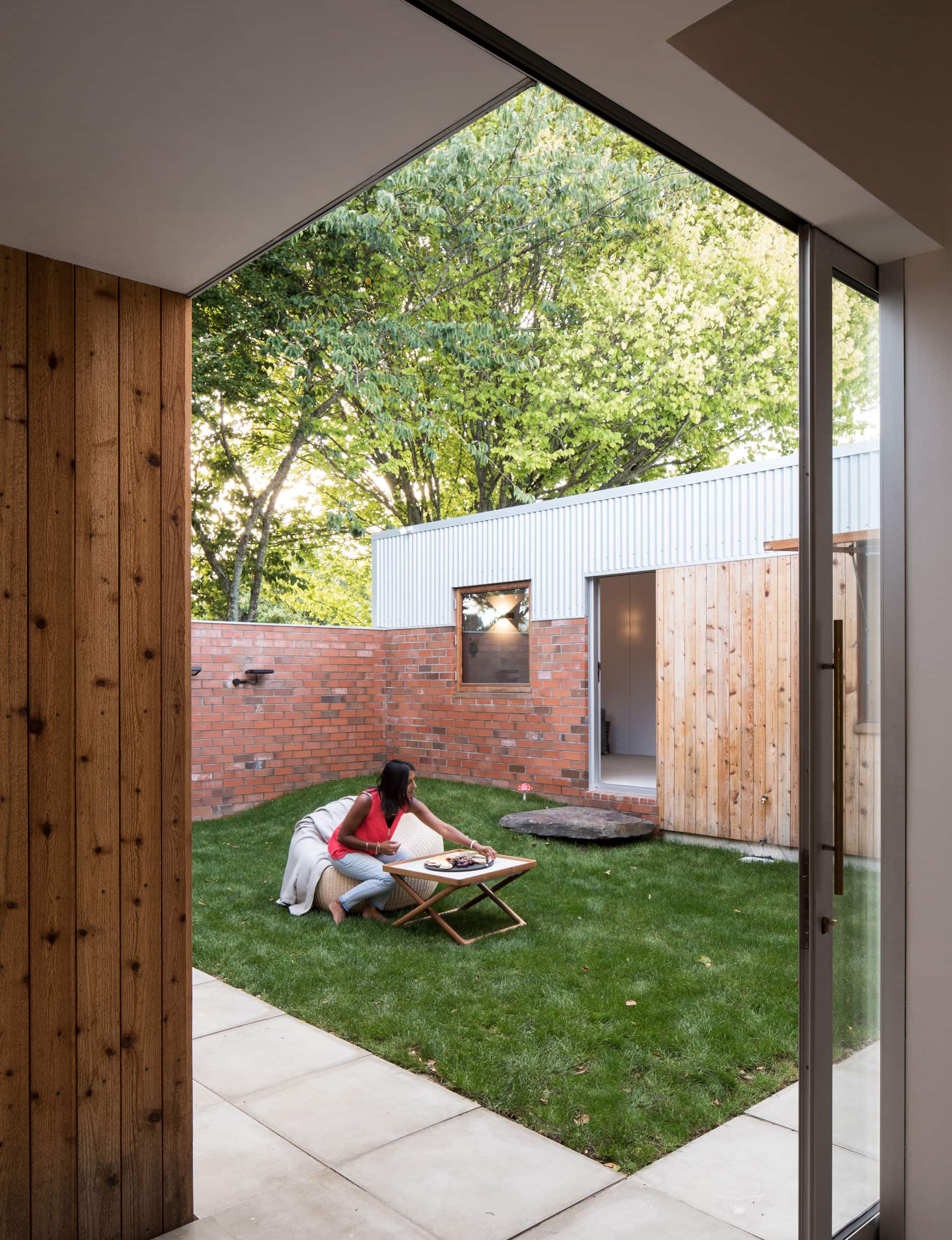
People who have only seen the exterior of the home have suggested to the couple that it looks claustrophobic because of its lack of doors and windows. The effect, once inside, is the opposite. Thanks to high ceilings, doors that sit flush in crisp white walls, carefully composed surface materials and cleverly designed narrow spaces that open to large living areas, the house feels much larger than its 159 square metres.
There are only two internal spaces within the home – both of them bathrooms that open up with skylights. Everywhere else, sliding glass doors and oversize windows offer views across and through the home. “Having the courtyard in the middle of the house is great,” says Karen. “It’s like our backyard; it’s part of the house and when you’re out there you feel like you’re not inside, or outside – you’re just there, in our home. That’s kind of the feeling wherever you are.”
The Home of the Year judges discuss why they liked the winning home
[jwp-video n=”2″]
Words by: Aimie Cronin. Photography by: Patrick Reynolds.
[related_articles post1=”67671″ post2=”66259″]
