10 years ago a restrained holiday home by Herbst Architects was named the runner up for the 2007 Home of the Year. We revisit with the judge and architect
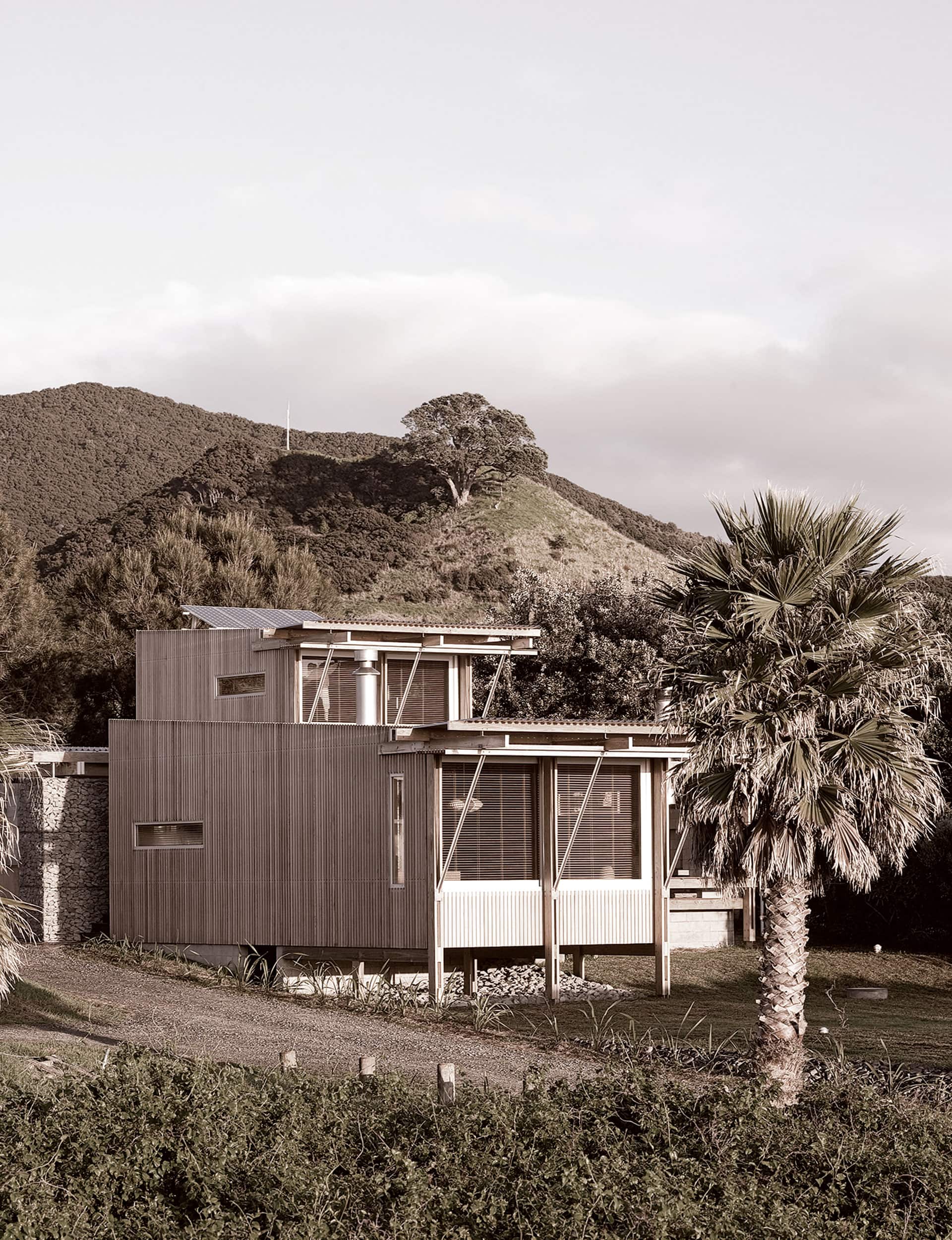
Herbst Architects bring design led style to humble bach living
Sir Edmund Hillary returned to Antarctica for the celebration of the 50th Anniversary of Scott Base. Apple released the very first iPhone. The KiwiSaver retirement scheme was introduced. Corporal Willie Apiata was awarded the Victoria Cross for bravery in Afghanistan. And a moody clifftop house in Auckland by Stevens Lawson won 2007 Home of the Year.
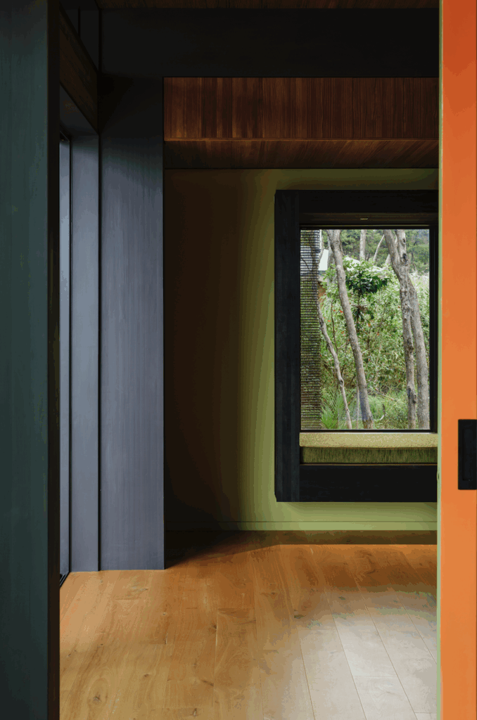
The finalists included the Tindale bach on Great Barrier Island, by Lance and Nicola Herbst – part of a collection of projects on the remote island in which the South African-born architects showed New Zealanders how they could live at the beach.
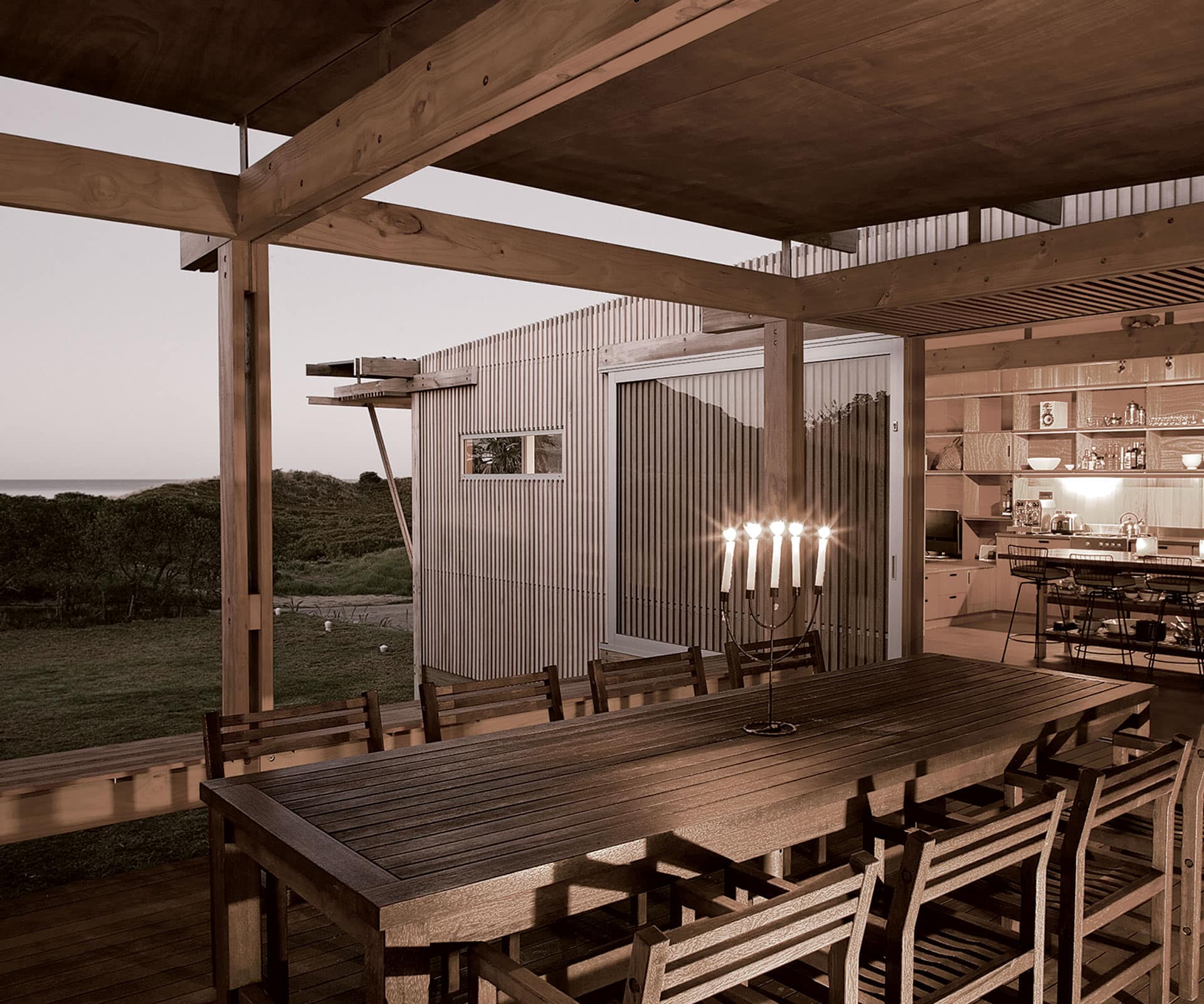
“The culture of beach houses in South Africa had got to the point where they had become replicas of city houses, but on the coast, so we were very taken with the humility of the structures that we found in the most exquisite landscapes,” says Lance Herbst now. “What we set out to do was make structures that not just deprived one of modern conveniences, but romanced the notion of doing so.”
What does it share with the other baches you designed on Great Barrier, and how is it different?
It shares a number of the starting points: the idea that the building is made up of a number of smaller parts that make the whole in order to keep the structures sympathetic in scale to the surrounding built form; the notion of having to move from inside to outside to get from living spaces to the bathroom and bedrooms, forcing an engagement with the outside even in bad weather; the premise that with baches the primary space around which the building works is the ‘lanai’ – a covered outside living area.
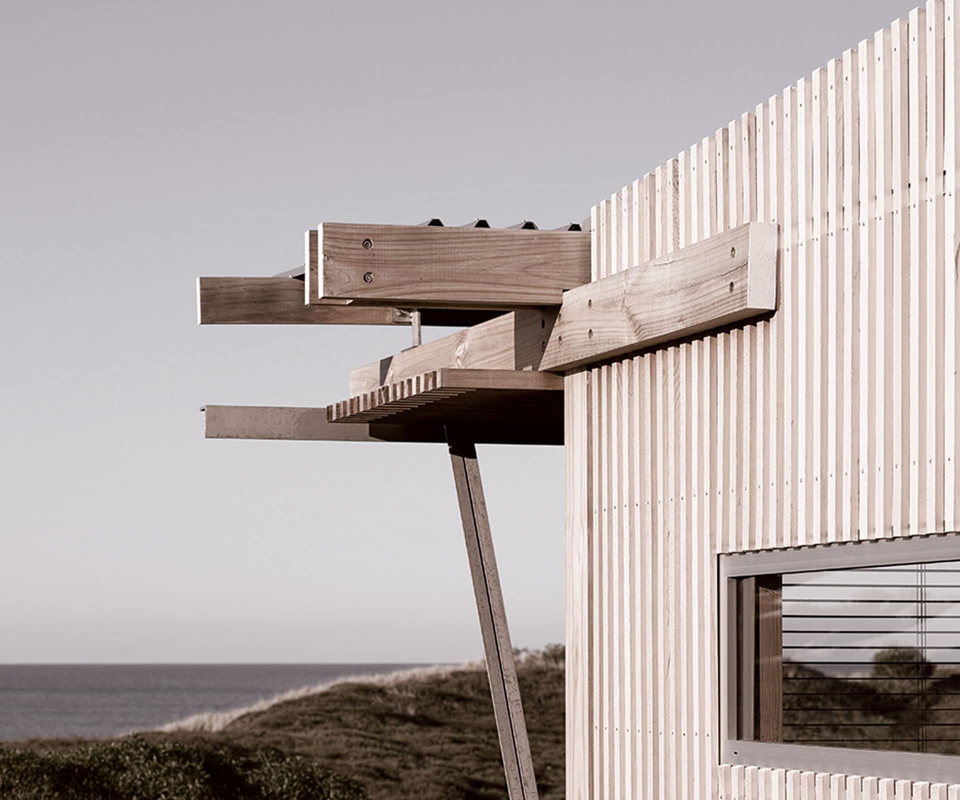
It differed in that this was the first that needed to provide a higher level of comfort and amenity. We gave a lot of thought to the line between convenience and delight and how far you can step off it before losing the notion of bach – or, alternatively, making the building uncomfortable.
What did you learn on this project – how did it influence the rest of your work?
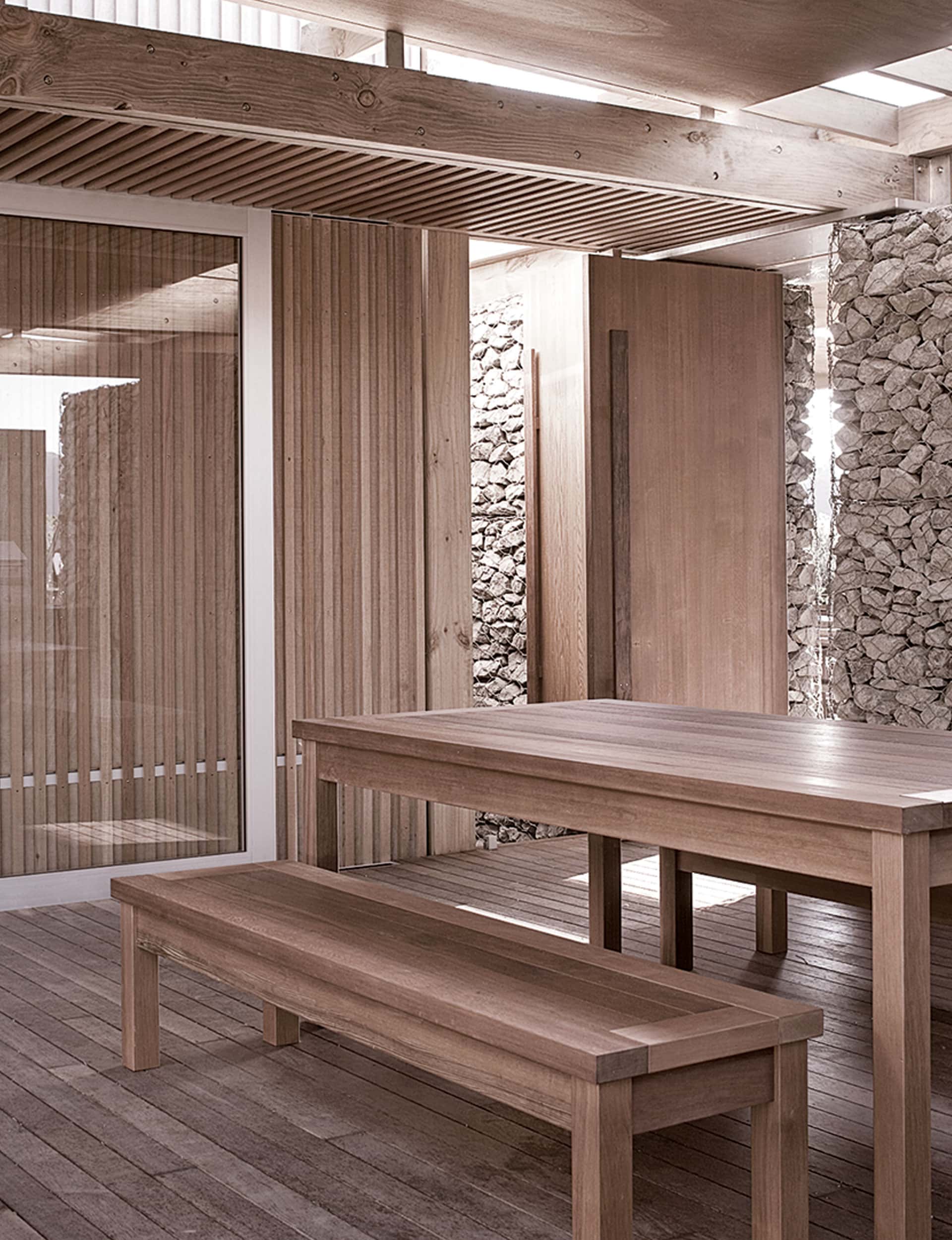
We learned to keep our nerve and hold onto what we believe makes a bach a bach. We also developed a lot of the language of how we make timber buildings: we still use a lot of the thinking today.
What is it about small structures like this that is so compelling?
The romance of them. It’s also a lot easier to control these small buildings than large houses.
The Barrier is a tough environment, Medlands more so. How has the house fared?
The client is fastidious about maintaining the house. It looks as good as it did the day it was built.
Former editor Jeremy Hansen, who launched and now edits Paperboy, judged the 2007 award with Julie Stout and Mark Dytham.
Judging Home of the Year can be a dizzying experience. There are dazzling pieces of architecture. There are also the logistics of dashing to multiple destinations and keeping everyone happily fed, watered and on schedule along the way. Amid this deluge of detail, I found the easiest way to keep everyone’s eyes on the (literal) prize was to keep asking: “What’s the winner so far?” This meant my fellow jurors and I would weigh the merits of every home against those of its competitors until we’d talked ourselves in circles and needed a drink. Then the debate would begin again.
In 2007, Julie Stout of Mitchell & Stout Architects and I were joined by Mark Dytham, a indefatigable Englishman who lived in Tokyo, where he designed audaciously playful buildings. Soon after he arrived, we walked onto Medlands Beach at Great Barrier Island on a perfect autumn day.
Behind us was the Lindale Bach, a gorgeously restrained house by Herbst Architects. Mark described the contrast of this beautiful beachscape to Tokyo as some kind of out-of-body experience. There was no need to ask him my standard-issue question. The Herbst house had obviously leapt to the front of the pack.
Our last stop on the judging journey was the Cox’s Bay House by Stevens Lawson Architects. Dark, mysterious, and a little stealth-bomber-ish from the outside, it opened to a wide terracotta-tiled hall as alluring as an ancient street meandering its way to cliffs above a beach. Mark’s elation at its pitch-perfect blend of rustic materials and refined details, its elegant mix of historical references and effortless modernity, was evident as soon as we walked in the door.
For the second time on that trip, my question was redundant. I asked it anyway – the jury was unanimous. Stevens Lawson had their second Home of the Year title. The Herbsts would wait five years to claim the top award: the house they designed in Piha was one of the first stops on our 2012 judging journey – though that design never lost its lead.
[related_articles post1=”44283″ post2=”43079″]


