A soothing design by Pennant & Triumph provides the perfect neutral backdrop for the colourful food at Comes and Goes
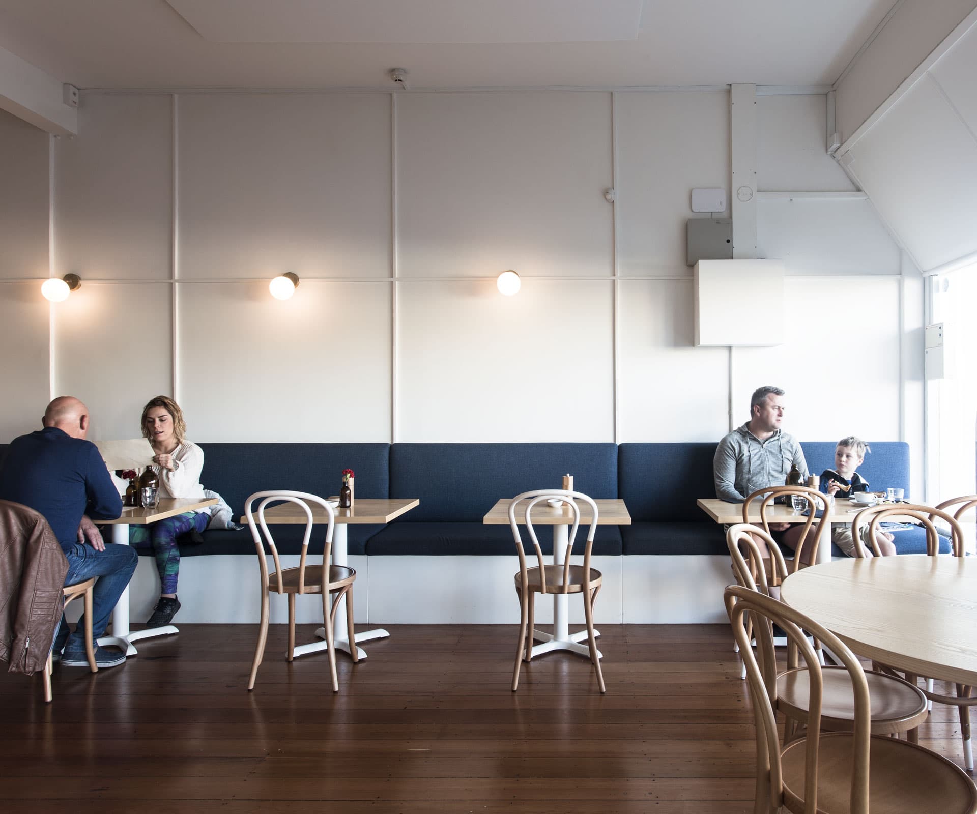
The paired back interior of this Wellington restaurant complements its colourful menu
The circle of life tastes of sweet meringue, lychees and black sticky rice at chef Sean Lim’s Wellington establishment, Comes and Goes.
Lim chose the name to represent the constant hum of cafe life, with customers coming and going; an idea which designer Justin Roderique took on board. He created a giant circular hole in the wall that showcases Lim preparing his signature bacon waffle or crumbed-egg dishes.
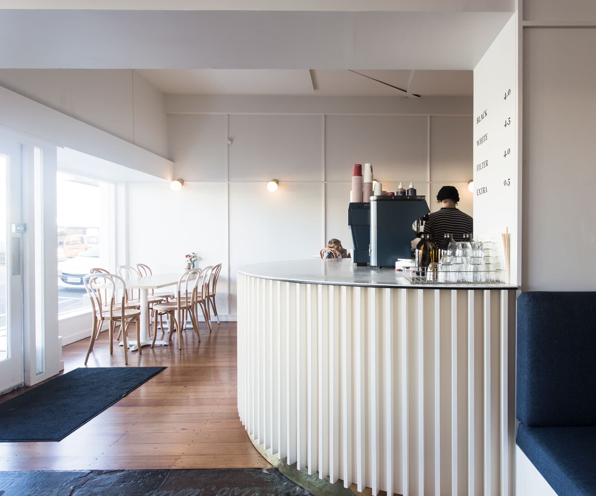
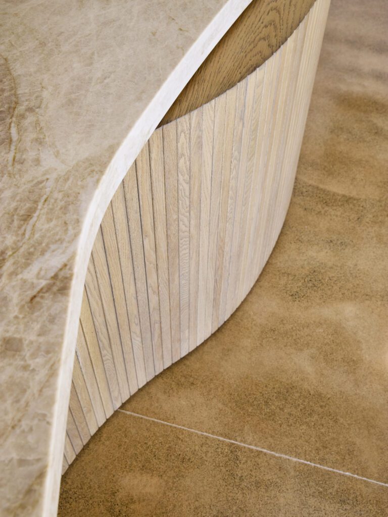
A curved counter with white timber battens curves from the kitchen, past ‘No 18 Bentwood’ bar stools by Thonet and a slim wall-mounted oak leaner. In the adjacent room, deep-blue banquettes face each other – along with the polished timber floors, they bring a crisp contrast to the white walls. Douglas and Bec lights brighten the pale walls and oak tables are paired with ‘No 18 Bentwood’ chairs by Thonet.
Lim’s vision was for “something modern and simple, with comfortable features” and Roderique credits his client’s trust with enabling him bring about the transformation from shabby shop to polished cafe.
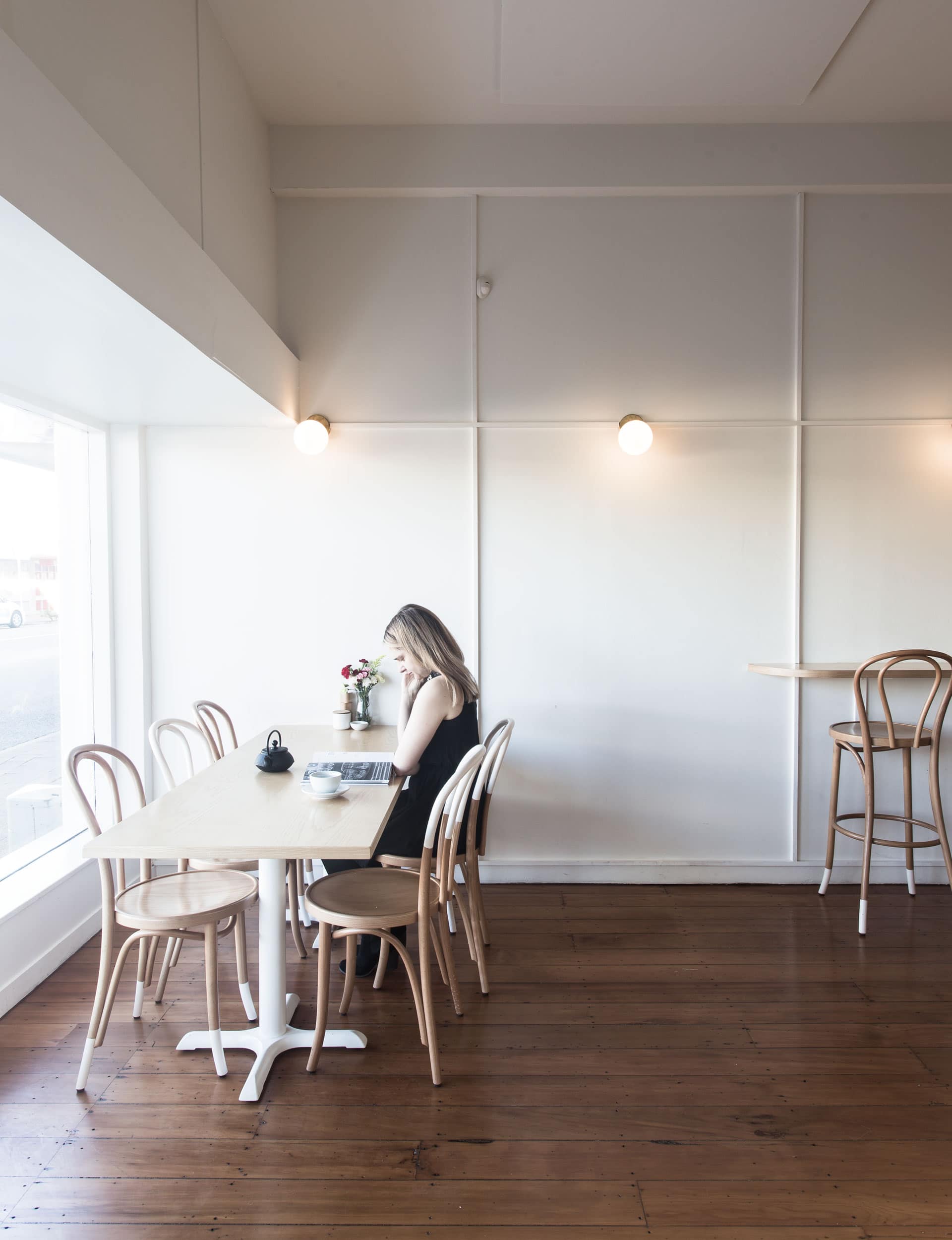
“The original space was in very poor condition and had a number of challenges, including a low ceiling, dark finishes and a large structural wall dividing the space,” says Roderique. “We introduced a light colour palette, including native timber floors with a whitewashed finish, white walls with pale-pink highlights and white oak to help soften and lighten the cafe.”
That customers have been queuing out the door every weekend since Comes and Goes opened is testament to the kitchen – but also to the design.
Words by: Talia Carlisle. Photography by: Thomas Seear-Budd.
[related_articles post1=”65519″ post2=”44424″]

