Objectspace has pulled off the almost impossible: a new space with a ground-breaking exhibition originally curated for the Venice Architecture Biennale 2016
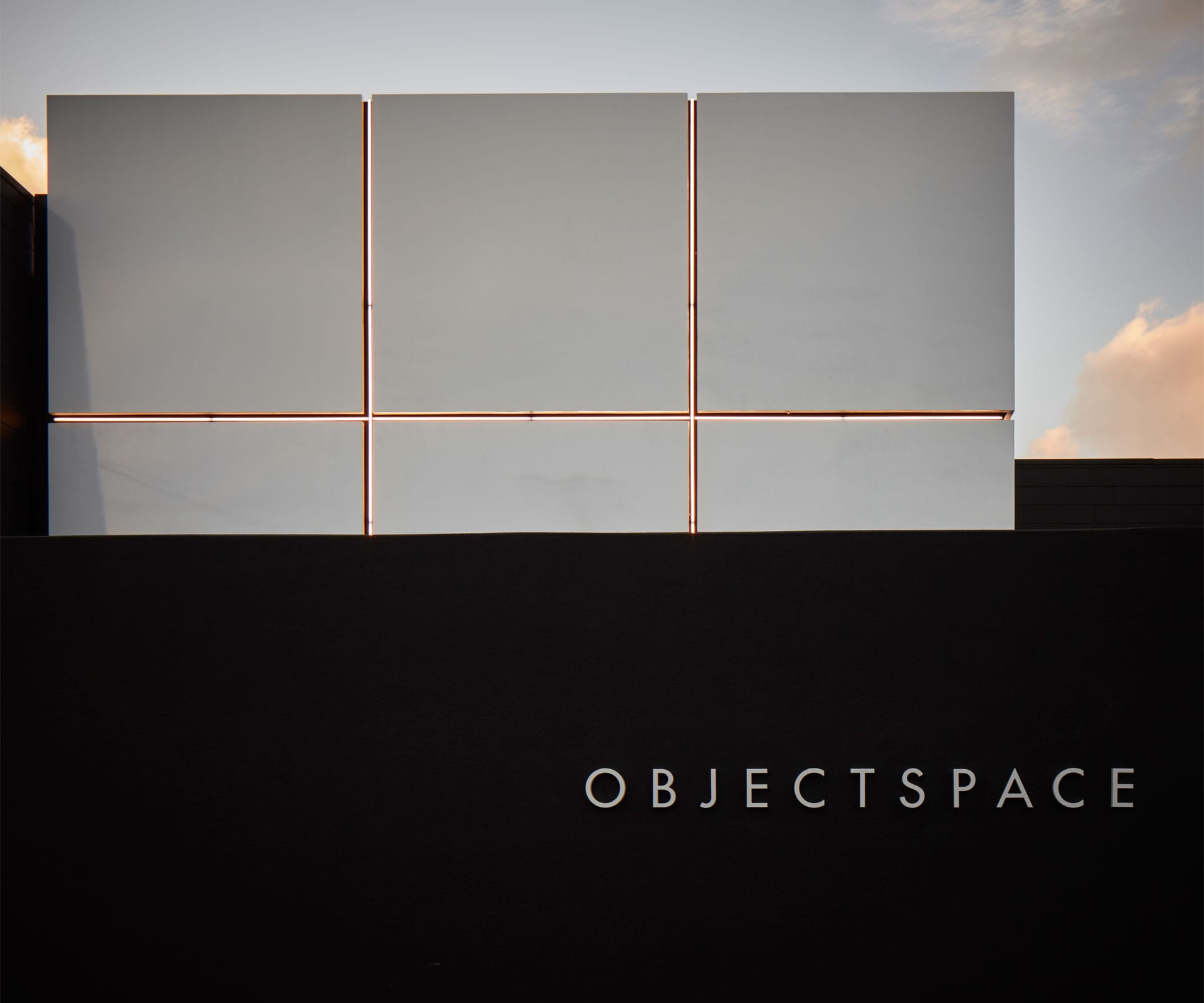
Ground-breaking exhibition Future Islands showing at Objectspace
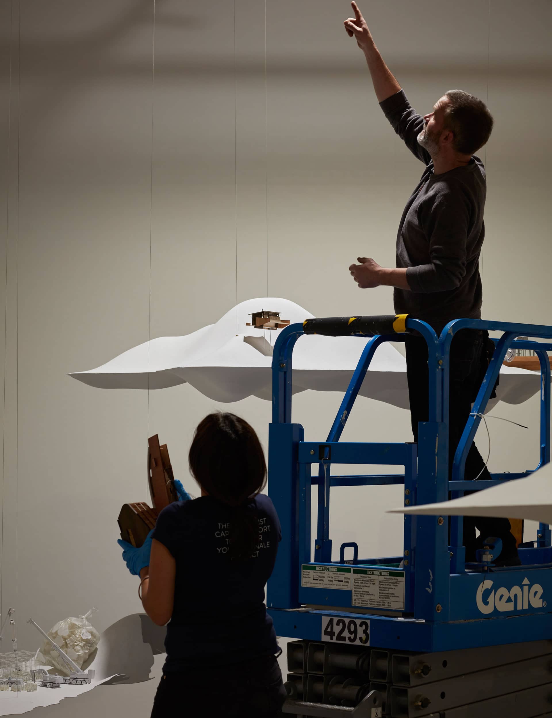
A day out from the opening of Objectspace’s new gallery and the New Zealand debut of Future Islands – the New Zealand Institute of Architects’ exhibition at the 2016 Venice Architecture Biennale – and the site is swarming with men in high-vis gear. The building is running late, timelines have been stretched. The show’s ‘islands’, carbon fibre platforms on which models of New Zealand architectural projects sit, float in space, while painters touch up the walls around them.
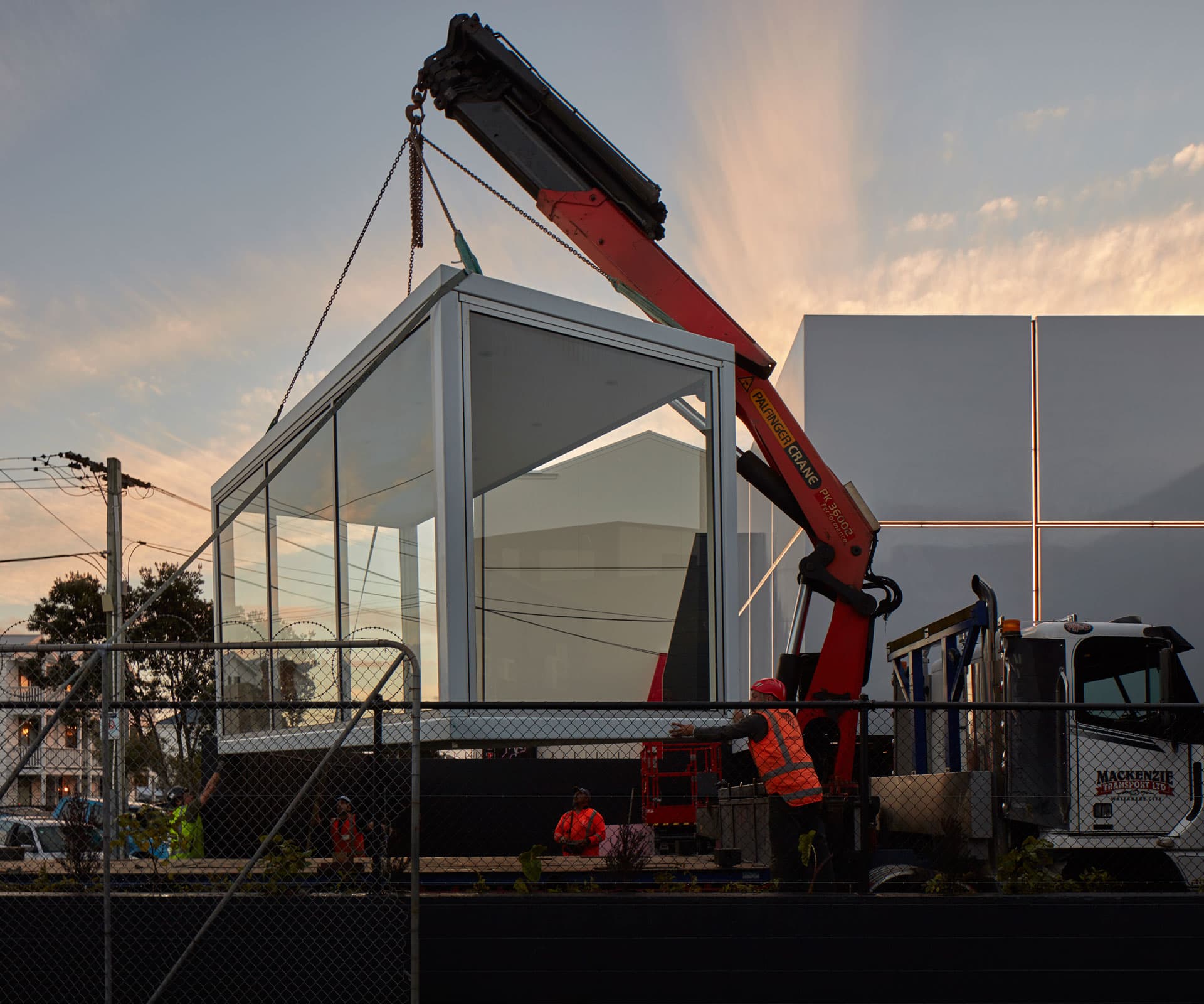
And yet, suddenly, a prosaic 1980s industrial unit on a back street in Ponsonby, Auckland, is a gallery, thanks to a crisp façade of white aluminium panels, sliced through with lights, designed by Richard Naish of RTA Studio – built on the slimmest of budgets.
Late last year, Objectspace announced it was shifting from its charming home in a former bank at the top of Ponsonby Road to a new space, with an expanded focus on architecture and design. Despite the ever-growing influence of these disciplines on our lives, there had never been a dedicated home for them in a museum context. That was about to change.
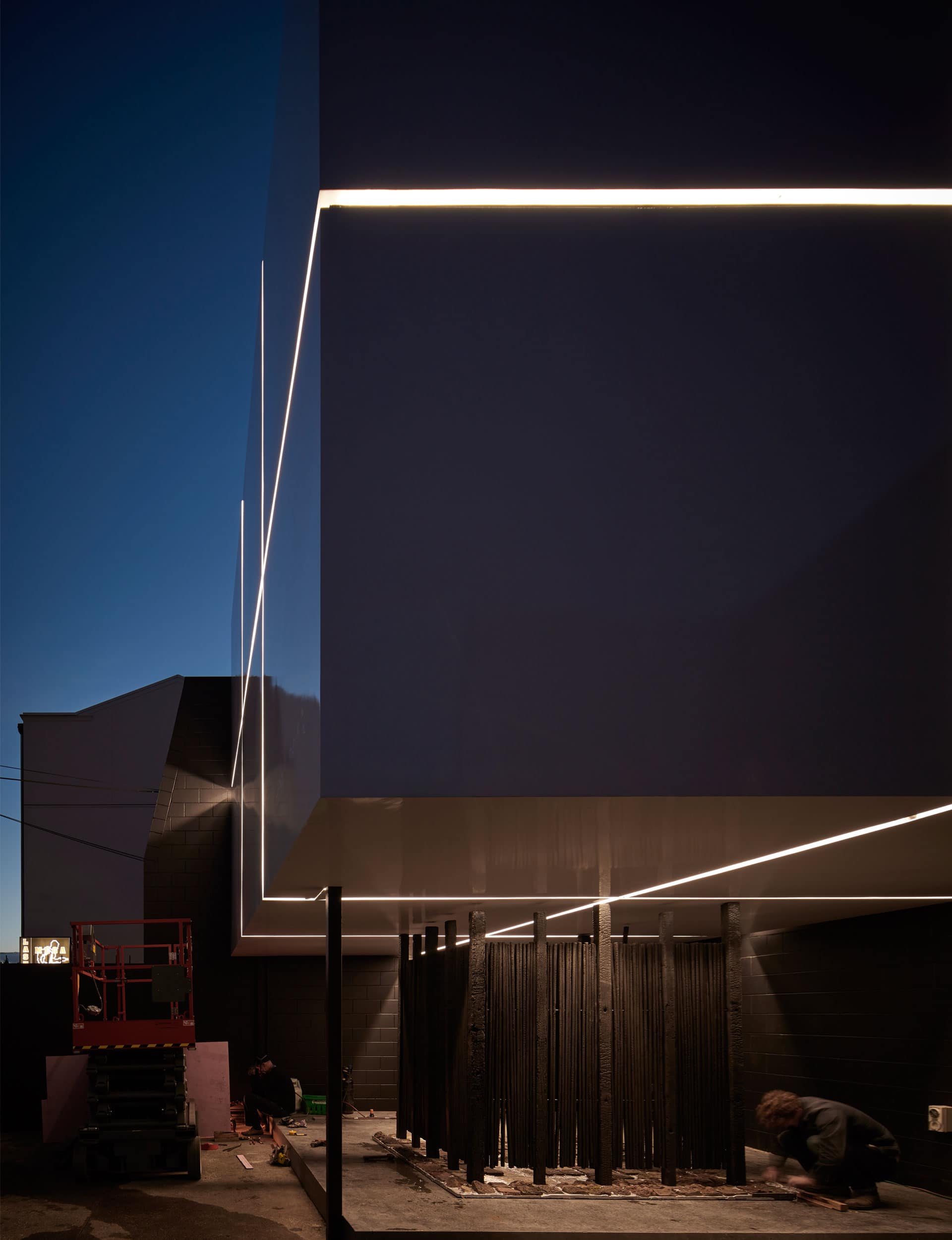
By February, the organisation had building consent and in July, the lights were turned on in the façade. After the numerous stresses of the project – which included raising the modest budget from a host of partners including architects, makers and corporate sponsors – it was the ‘aha’ moment Paton had been waiting for. “It’s not a massive $20 million building, but it’s a massive thing for an organisation of our size,” she says.
Inside, there are crisp white walls and scarred concrete floors that show the history of previous uses, and the services are on display above the block walls. In short, it shows you what you can do with simple materials and some good thinking. “There is simplicity and a modesty to it,” says Paton. “It’s not pretending it’s not a 1980s industrial unit, yet it has this magic. I don’t think it’s trying too hard. It’s better than I had hoped.”
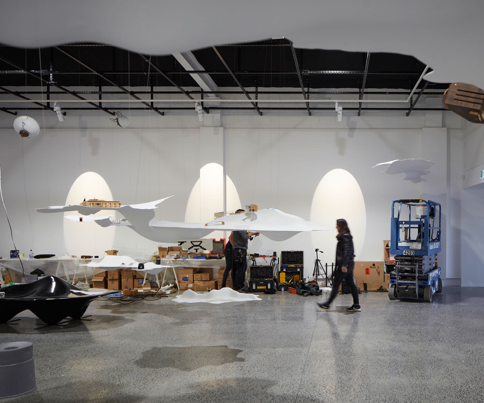
Charles Walker, creative director of Future Islands, discusses lessons from Venice and restaging the show in Auckland
What did you learn from Venice?
We made a fairly provocative curatorial decision not to include explanatory texts or display captions in the show itself, so as to heighten the sense of drifting into an unknown place. The island metaphor draws on narratives of islands as sites of possibility or places of discovery, so there is no formal route through the show. Many spoke of a surreal experience, of familiar yet strange objects that looked as if they had floated in from another world.
Many said it was beautiful, which we’d hoped it to be. We did have some feedback that the lack of writing was frustrating or confusing, but I still feel we made the right decision. We wanted to inspire a sense of curiosity and wonder, and to unsettle some assumptions about architecture in New Zealand and how we exhibit it.
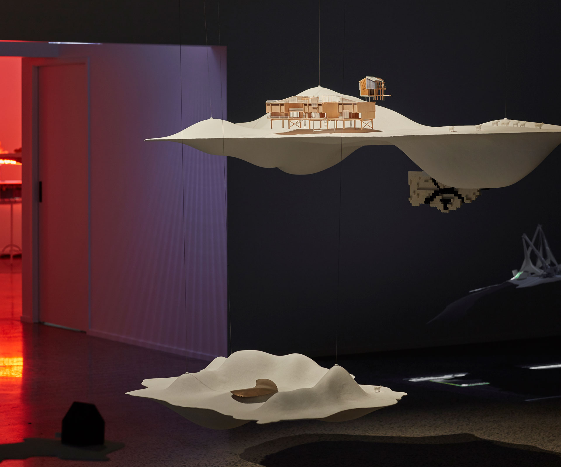
Did that change the way you installed it here?
We’ve been able to stick fairly closely to the original layout, and keep the explanatory text to a minimum. The only change has been to acknowledge our team member, Rewi Thompson, who passed away earlier this year. His own house in Kohimarama, which was in the original show, is now sited on a pink island – a reference to an irreverent and provocative project of his.
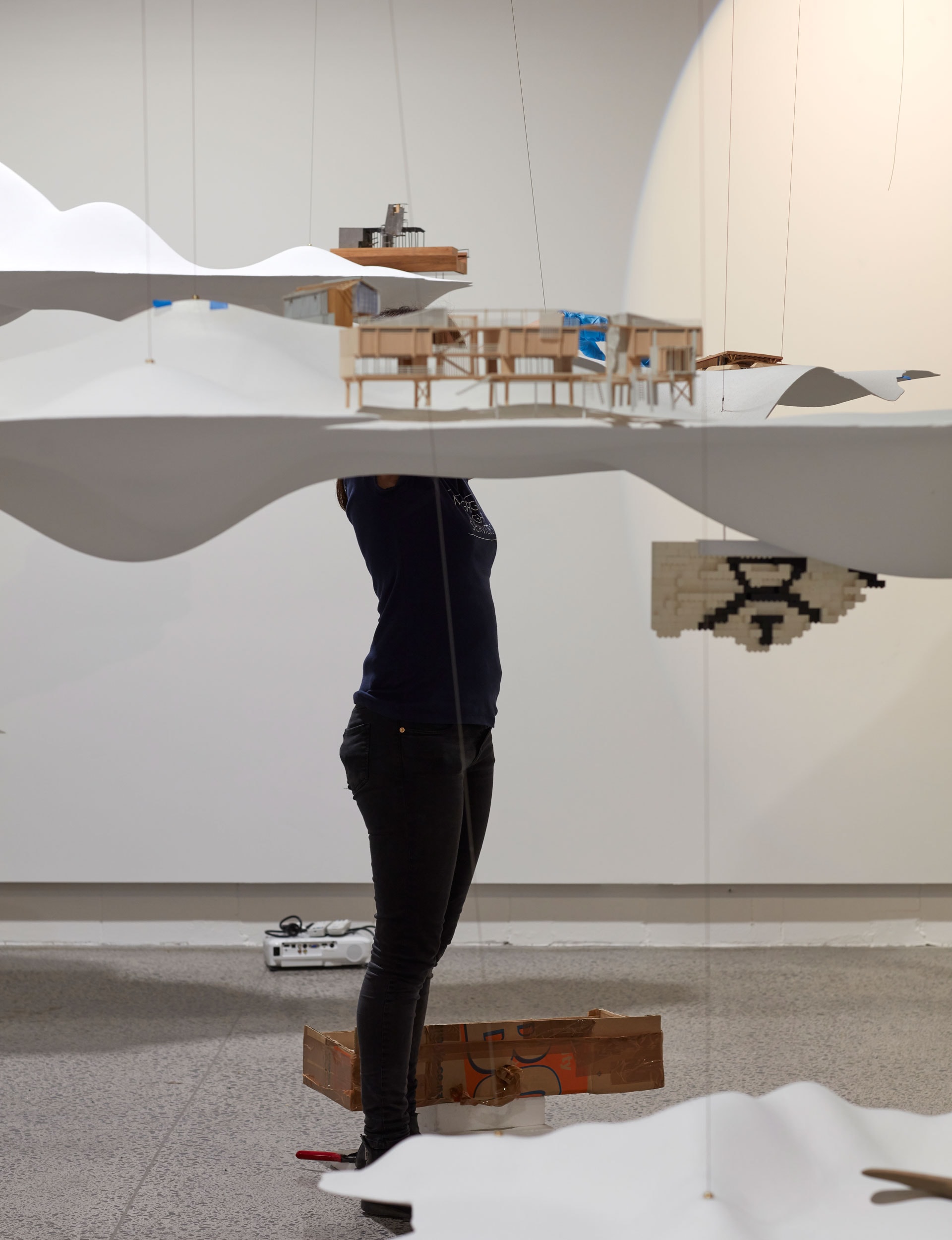
It’s a radically different context, isn’t it?
In Venice, we had a large palazzo with big windows: rather than try to control the space by blocking out the light, we allowed a play of light and shadow over the islands. The windows were also open to the sounds and smells of La Serenissima.
The site was important to us in a way that is not necessarily the case for other exhibitions at the biennale. Objectspace is essentially a black box so we had to redesign the lighting to suit. The show now looks quite different – and possibly even more dramatic than it did in Venice.
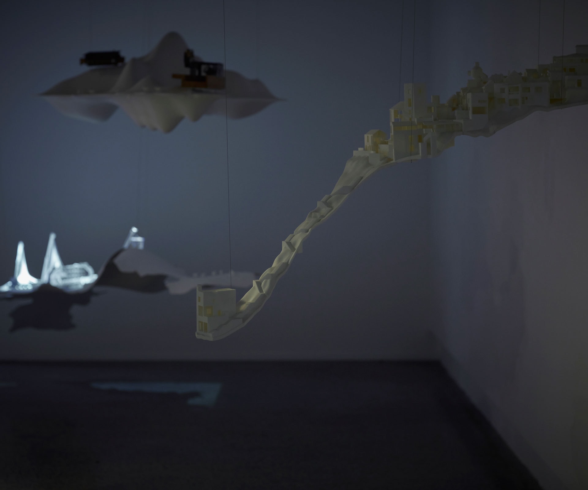
What was it like seeing it hung again?
Seeing it again is like seeing it in a dream. That ‘familiar yet strange’ thing again, but we had never really seen the exhibition in the dark. The effect has been to focus more attention on the project models, but perhaps also to make the whole appear even more playful.
Future Islands at Objectspace
13 Rose Road, Ponsonby, Auckland
objectspace.org.nz
Photography by: Sam Hartnett.
[related_articles post1=”71939″ post2=”71363″]
