As a champion of space-efficient building it was only natural that this young Christchurch designer would build two homes on a 300-square-metre site
[jwp-video n=”1″]
Two compact homes squeeze into a tiny Christchurch site
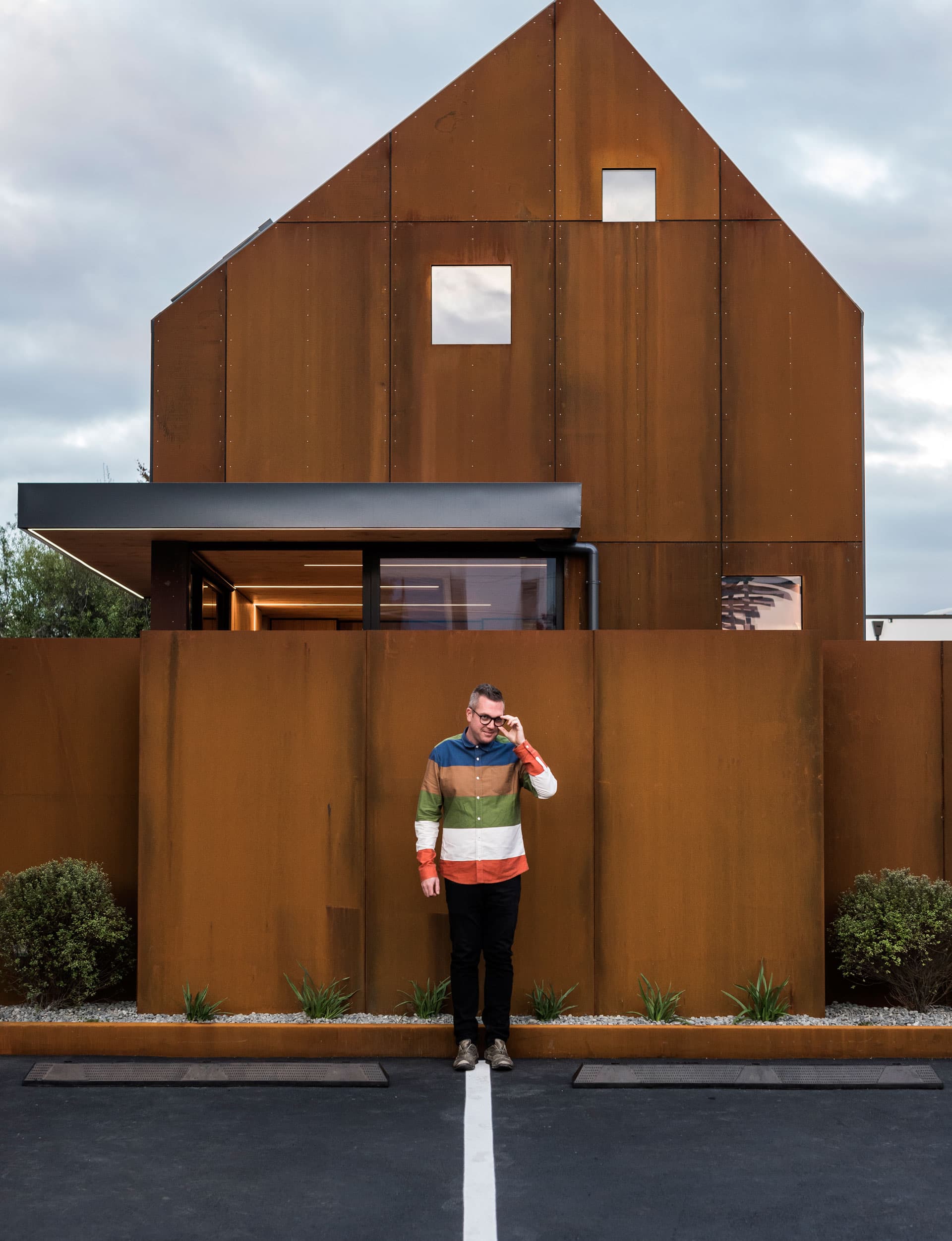
Sharp angles against the sky, tiny square windows, rusted steel and rivets: from the street, Mitchell Coll and Amy Douglas’ two-bedroom house looks impenetrable, like a tank that’s been left in the rain. Nestled between two 1990s dwellings – concrete on the left and stucco on the right, and situated across the road from a building-supplies warehouse, their two-storey inner-city home both blends in and stands out. “It has its own contemporary style but it’s designed to fit within the context of the surrounding buildings,” says Coll.
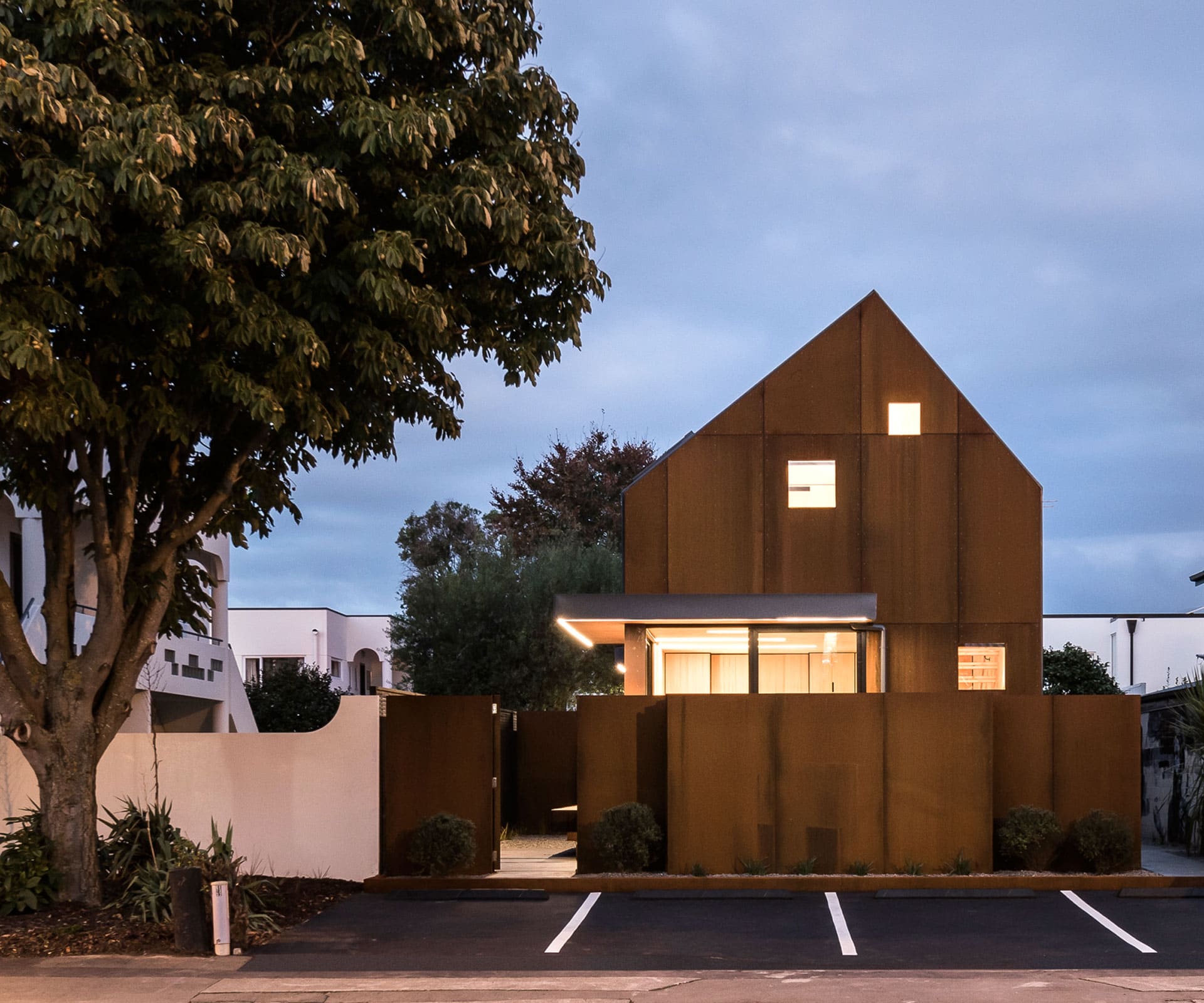
Coll – of Coll Architecture – never thought he’d get to build one of his own creations, let alone live in it. Instead, he ended up building two. He could have designed one house for the site, but as someone who spends a lot of energy promoting high-density, space-efficient buildings, it wouldn’t have felt right. “I really only needed 150 to 200 square metres of land for the house we wanted,” he says, “but the site was 300 – so I just did what was best for the site really.”
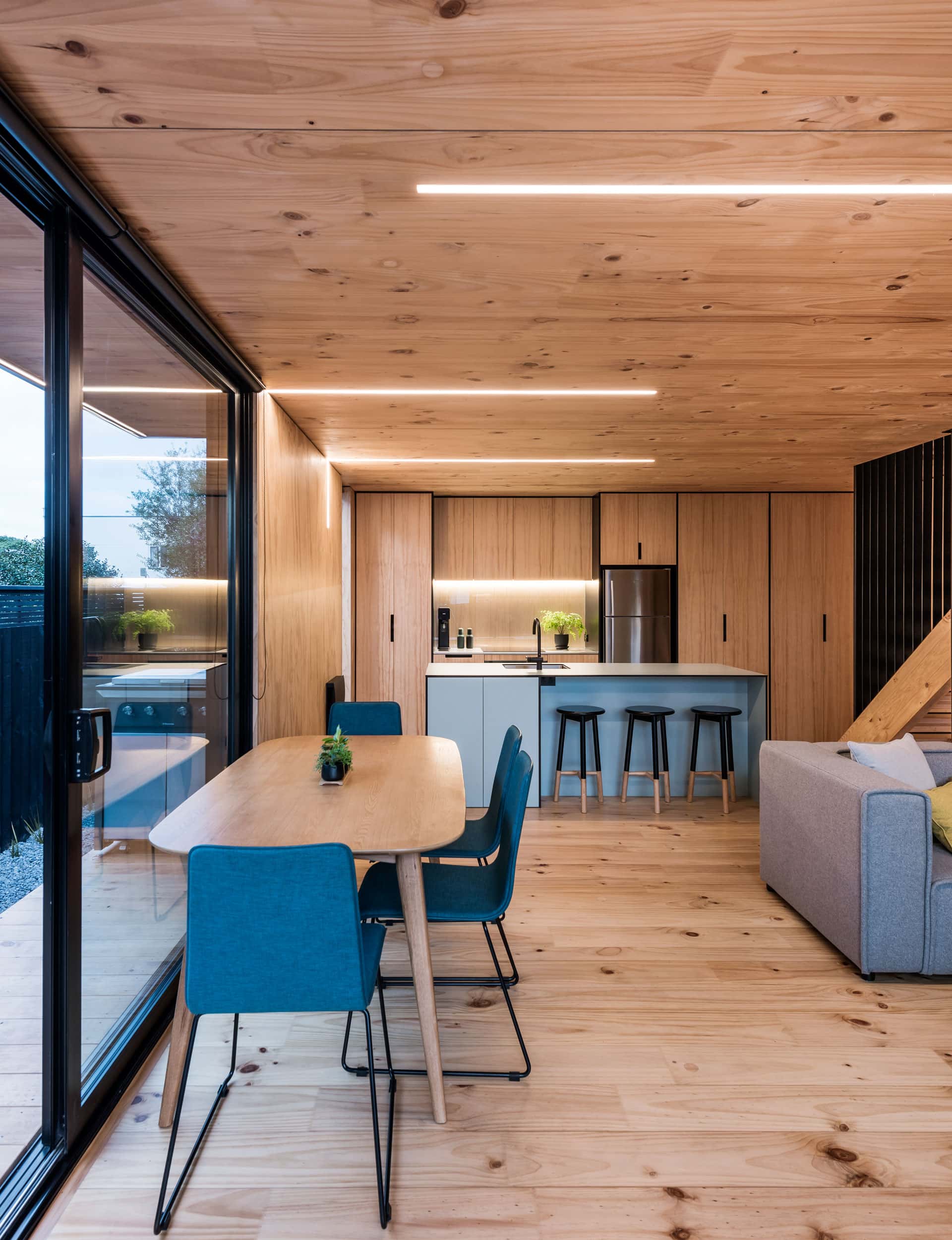
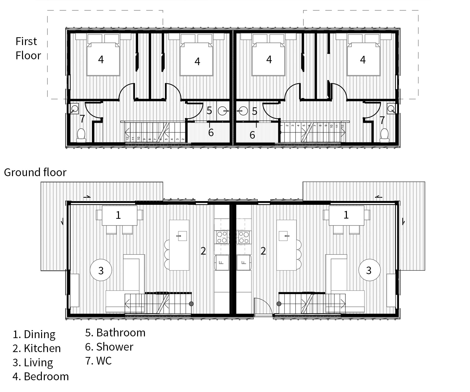
The long, narrow site has two 74-square-metre dwellings with mirror-image floorplans, split by a common wall. Coll and Douglas live in the front house, and rent out the rear dwelling. Parking is out the front, on space ‘borrowed’ from the setback front fence – an area that’s often mistaken for public parking. Access to the rear house is down an alley on the southern side, flanked with a mural by local artist Joel Hart. The entrance is so private that it was two months before Douglas even ran into their tenants after they moved in: even though the site is only 300 square metres, each house has a private outdoor living space and storage shed – useful when there’s no garage.
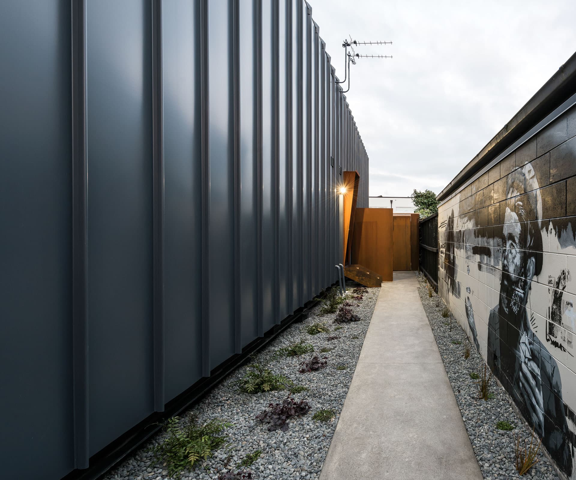
Coll and Douglas chose to live in the front house because they thought the rear one would be easier to rent out. Their entrance is through a sliding door, where an open-plan room with ply and cross-laminated timber walls offers up a warm, contained feel. LED strip lights are recessed into the timber ceiling, reminiscent of a Bill Culbert installation. An eggshell-blue kitchen island made from compact laminate – a durable material commonly used for hospital wall linings – provides a dash of colour.
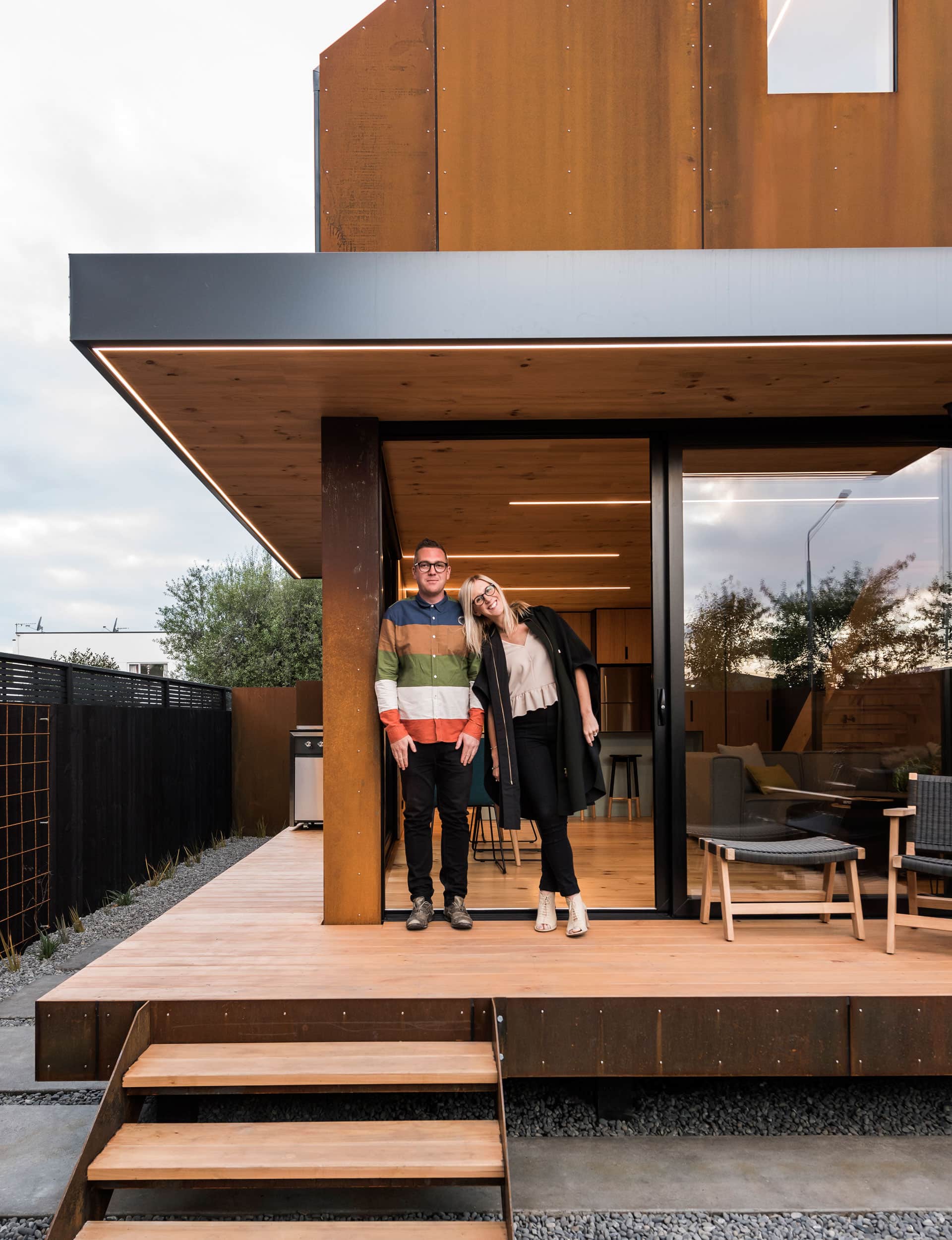
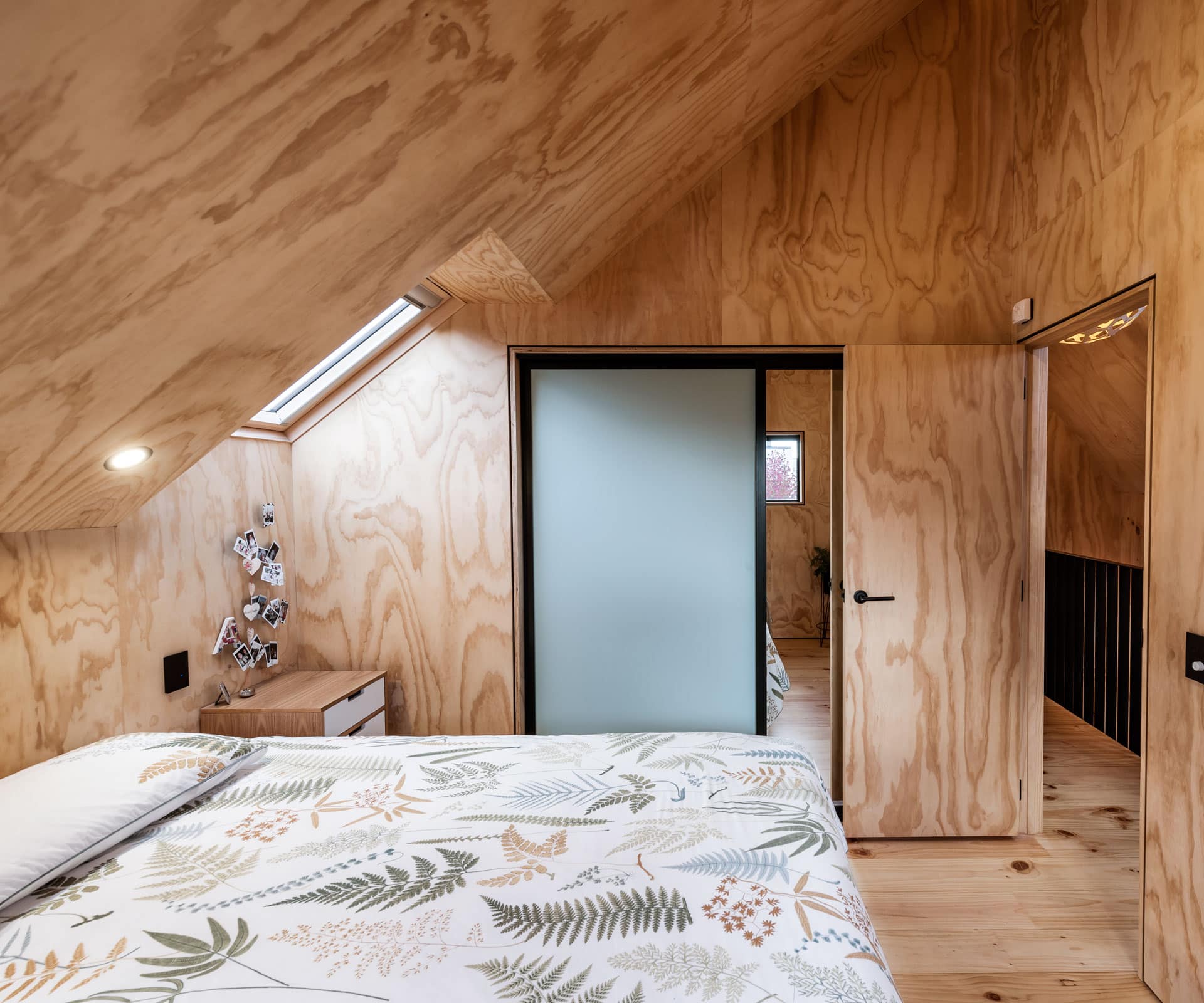
Upstairs, rather than traditional windows, skylights in the steep skillion ceiling let light into the hallway, bedrooms, WC and shower. “It’s a little alpine lodge in the middle of the city,” says Coll, who admits to having a penchant for New Zealand Forestry huts. The couple doesn’t have a lot of stuff, “but what we do have means something”, says Douglas. Like the dinner-plate sized leaf made from earth that hangs on their bedroom wall – something Coll carried back from Mexico. And there’s a plant in every room.
Coll’s design incorporates several possible adaptations which, along with the use of durable materials, he hopes will give the buildings an extra-long life. Should another owner want a four-bedroom dwelling, all they’d need to do is knock through a kitchen cupboard and insert a door to the rear house.
If an earthquake affected the land, rated TC3 due to its poor soil condition, a foundation system of steel bearers on screw piles with adjustable brackets would allow one person to easily re-level the dwellings by up to 120mm in less than two hours. And should the land value balloon in the next 50 years, rendering the houses vulnerable to demolition – a fate Coll believes has befallen too many decent buildings in post-quake Christchurch – they can be unbolted from each other, picked up and moved on.
[gallery_link num_photos=”15″ media=”https://www.homemagazine.nz/wp-content/uploads/2017/08/CompactHomes6.jpg” link=”/real-homes/home-tours/small-homes-christchurch-sustainable-design” title=”See more of the home here”]
Coll says costs were similar per square metre to most architectural builds, yet he scrutinised every element and “cut back as much as possible through design” – both in terms of cost and use of space. For example, ply and cross-laminated timber made for speedier construction. LEDs avoid the clutter of hanging fixtures. At more than 200mm thick, the lower level’s solid wood ceiling doubles as a structural support and floor upstairs, eliminating the need for chunky rafters. The low-pitch roof, meanwhile, saved on materials and also moderates heat.

The dwellings incorporate other energy efficiencies such as fibreglass window and door frames, a material that holds heat better than aluminium. And windows are cleverly placed – one downstairs opens at foot level to ventilate the entire house through the ‘stack effect’. And when the sun beams through north-facing skylights in the master bedroom, the heat rises to holes near the apex of the gabled ceiling and a low-wattage fan redirects it downstairs.
“We made these houses as small as possible without losing functionality,” says Coll. The logic is simple. “If you halve the size, you can spend twice as much.”
Words by: Anna Frances Pearson. Photography by: Stephen Goodenough.
[related_articles post1=”68887″ post2=”71419″]
