Architect Henri Sayes was careful to blur the lines between new and old in the extension of this duplex in Point Chevalier. Discover how he created a sympathetic modern addition
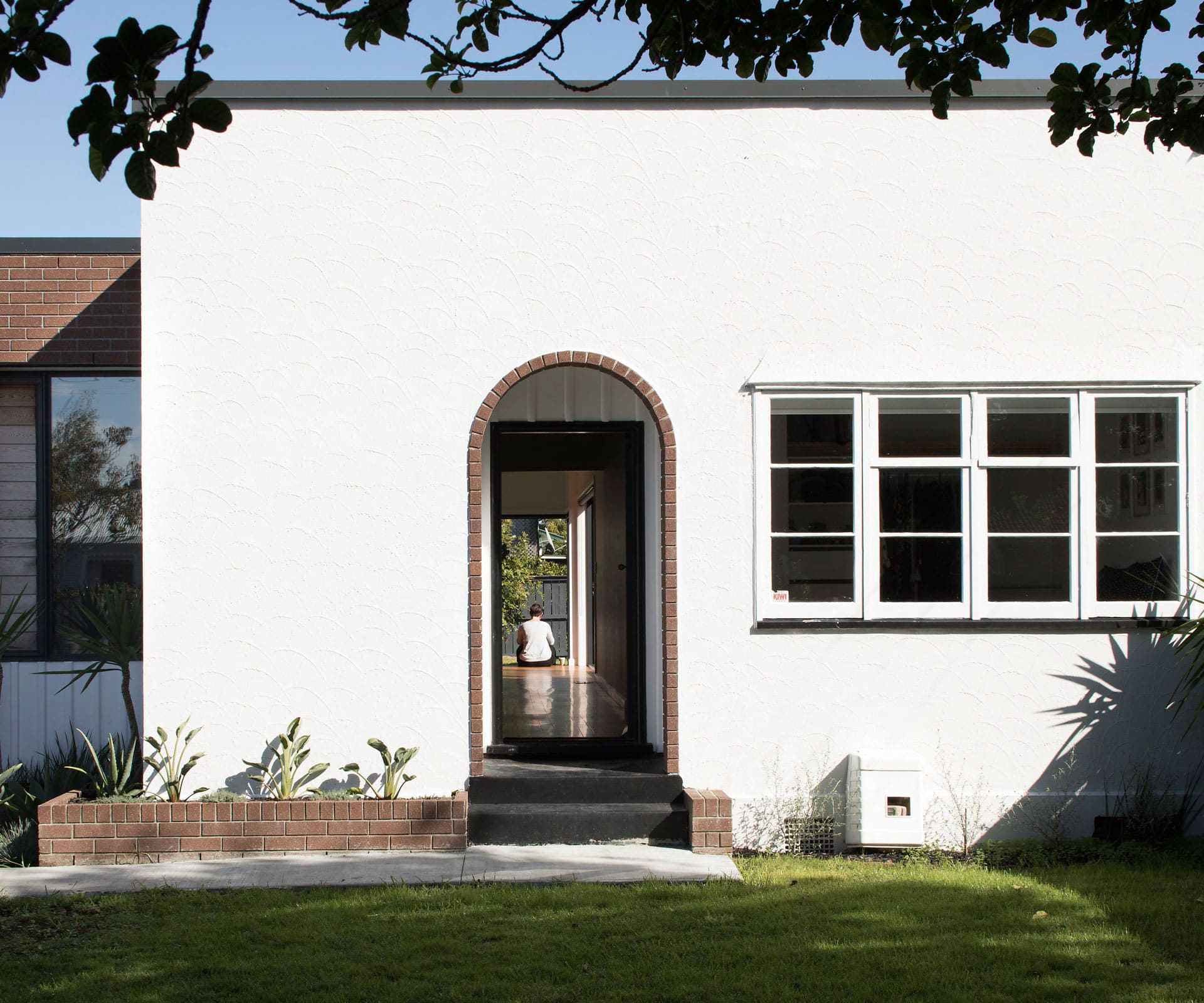
How the extension of this 1930s duplex state house retained a heritage feel
Project: Duplex Extension
Architect: Henri Sayes
Location: Pt Chevalier, Auckland
Brief: Extend a 1930s duplex state house to provide a living space, new kitchen and en suite.
“Essentially, it was a one-bedroom suburban apartment,” says architect Henri Sayes. “It was very small and very roomy – but in the 1930s sense of roomy, in that it had a lot of poky rooms.” The house was charming but impractical for modern living, with a small kitchen and living spaces that were impossible to entertain in. The owners liked the area and the heritage of the place – small, square and stucco, it had an elegant simplicity, with brick detailing around the front door and a built-in planter box at one side.

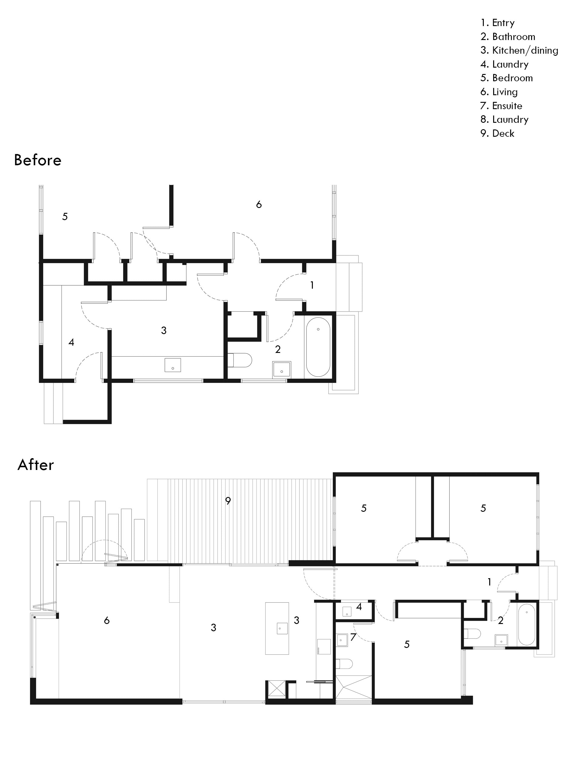
After a year of living in the little house, they called in Sayes – an old friend – to renovate, asking for more living area and three bedrooms, one with an en suite, and a modern addition that was sympathetic to the era, not a white, glassy box.
The house is part of a duplex: it sits on the south side, so Sayes decided to extend it close to the boundary (a decision that required resource consent), building around a north-facing courtyard that runs off the kitchen-dining area. He left the original house, with its white stucco walls, largely untouched, but clad the extension in brick, a reference to the entrance.

“There was such a strong language to the existing house and it had such a great presence in the street that we decided to work off what was there,” he says. “Being a duplex, it had a lot more presence than a standalone house – it was really wide. It was very much a box, which you either latched things onto or punched holes into.”
Inside, Sayes tried to retain as much as possible – the bathroom was left but the fittings replaced; the original rooms were re-purposed into bedrooms. “If we were spending money, we tried to spend it on a new part rather than fixing up the old part,” he says. “It was quite a tight little house and we haven’t changed the proportions, we’ve just re-purposed the original front rooms.”

Now, from the street all you can see is a small extension that pops off the side. Out the back, the open-plan living area extends into the garden, housing a kitchen-dining area at the level of the original house, and a living area a couple of steps down on the same level as the garden. “I was trying to create some separate spaces,” says Sayes. “Living areas are funny – you want to glance around the edge of them, so we used this window seat to give the house a termination point and a sense of enclosure.”
[gallery_link num_photos=”7″ media=”https://www.homemagazine.nz/wp-content/uploads/2018/02/pointChev3.jpg” link=”/real-homes/home-tours/art-deco-home-renovation-sayes-studio” title=”See more of the home here”]
And, where brick references the original house on the outside, inside Sayes was careful to blur new and old. The timber floor has been laid in a contrasting direction to the original and delicately feathered into place. There are chunky architraves and skirting boards, and a beautiful sloping ceiling that gains height over the living area; lined with white-painted timber battens that the owners had to save up for at the end of the project, but which makes it entirely.
“We tried to make it look like it wasn’t trying too hard, rather than ripping off what was there or creating a whole new language,” he says. “We didn’t want you to walk through the existing house and then pop out into this entirely modern thing. You need a level of detail to know you’re in a heritage house – it’s kind of why the owners bought it in the first place.”
Words by: Simon Farrell-Green. Photography by: David Straight.
[related_articles post1=”74547″ post2=”75572″]
