The small changes made by architect Megan Edward’s in this villa renovation have made a big impact to to its feel and function
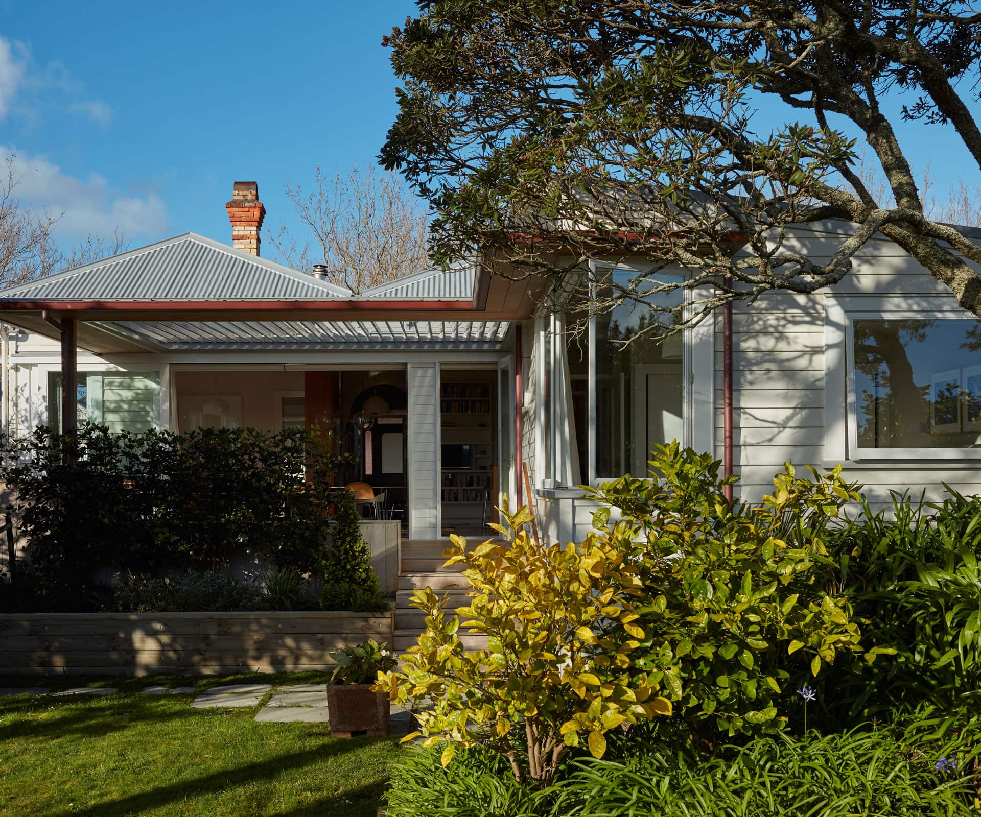
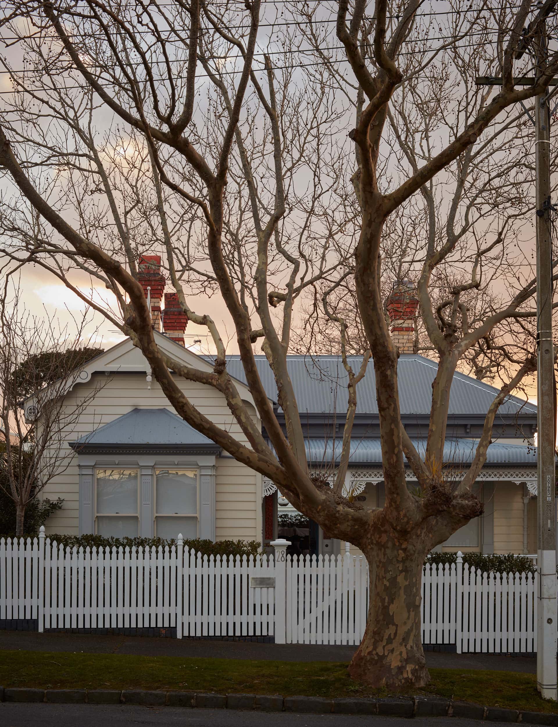
This 100-year-old Herne Bay villa has received a sympathetic update
Project: Villa renovation
Architect: Megan Edwards
Location: Herne Bay, Auckland
Brief: Redesign living spaces and create new connections to the outdoors.
In a street lined with heritage homes in Herne Bay, Megan Edwards has sympathetically renovated a 1900s villa, creating a sophisticated series of living spaces that extend to the garden.
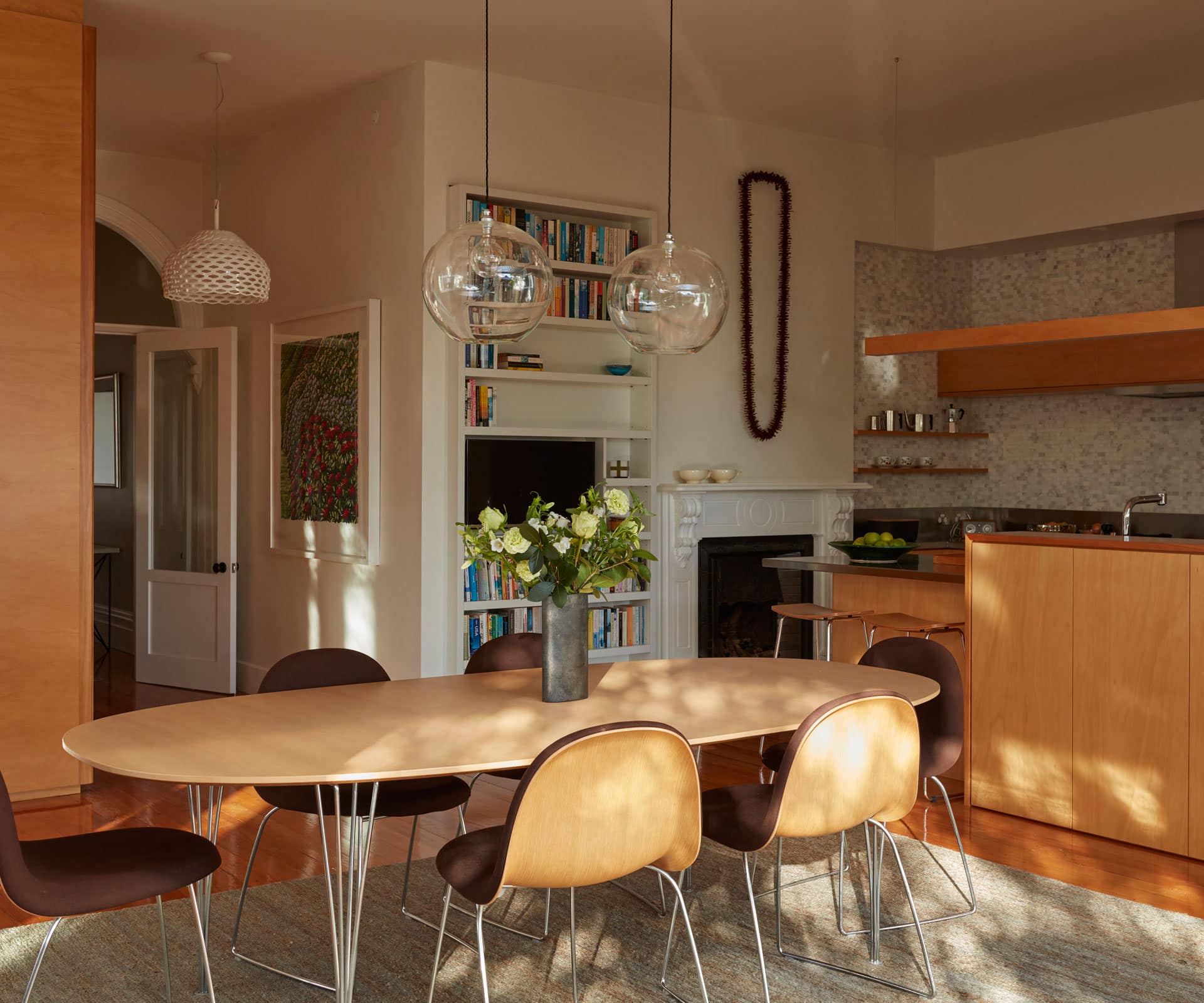
The owner asked Edwards to bring light into her existing living spaces, so that they were both comfortable and elegant. “We wanted to create a sense of luxury with interconnected indoor and outdoor spaces that took advantage of the light and the garden in the way that the original house hadn’t,” says Edwards.
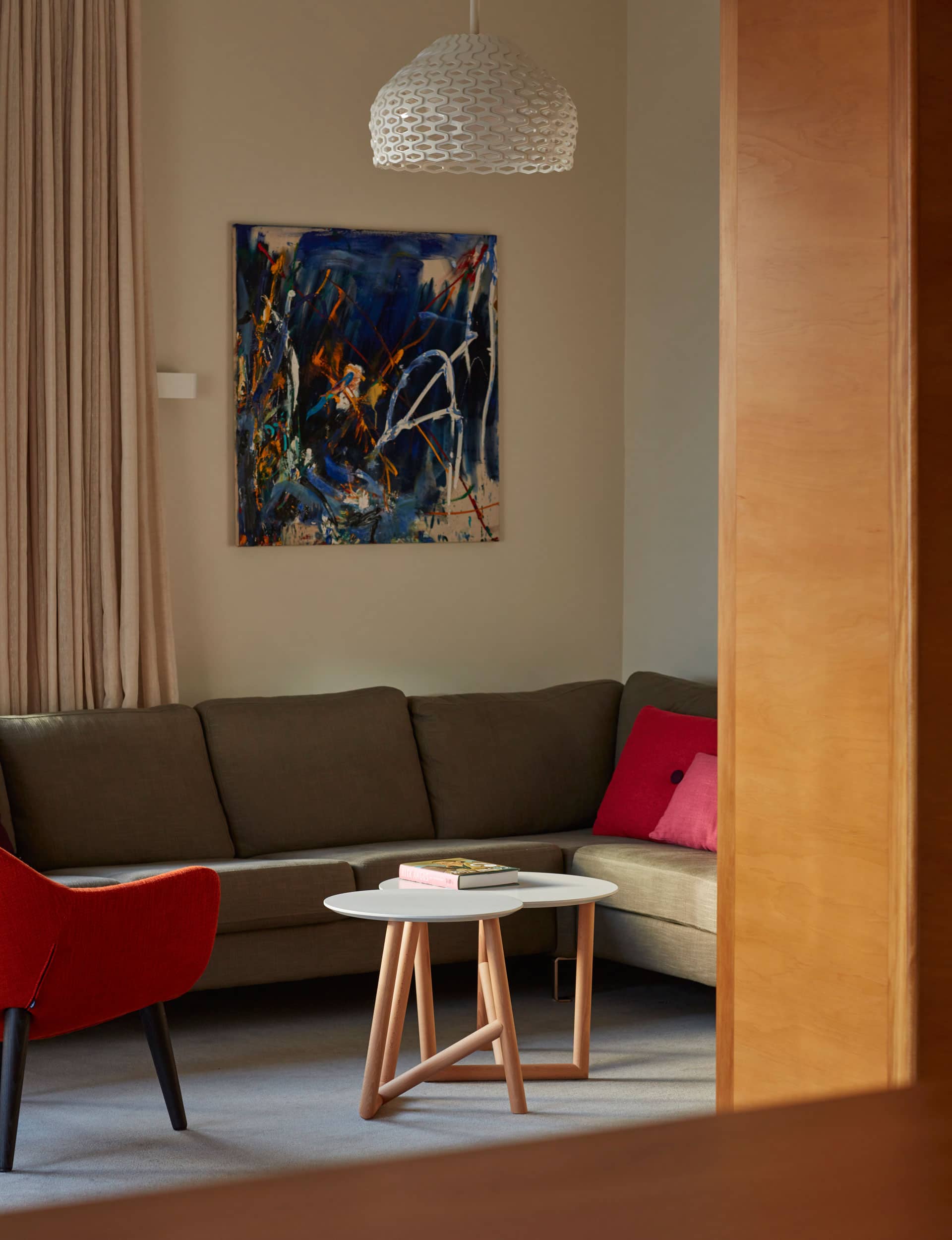
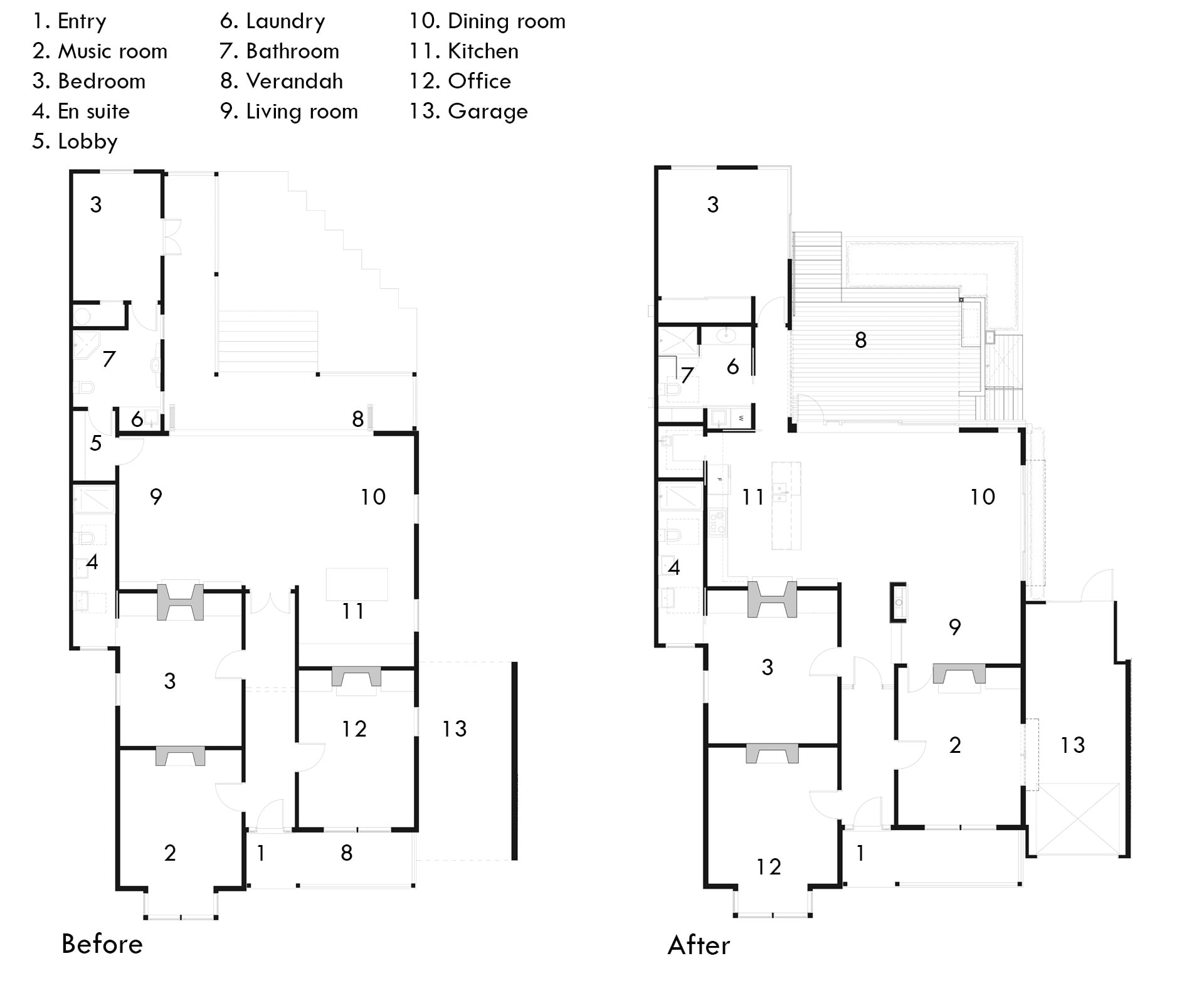
While the rooms at the front of the home – main bedroom, music room and office – remain relatively unchanged, the back of the home has been reworked. The kitchen has been moved from a corner on the north side of the room to the south side, while a new living space is nestled back into the rear of the space, behind a new freestanding fire and cabinetry screen which displays the owner’s ceramics and art. The new location allows views back out to the garden and across to the kitchen. The entrance to the renovated living area now sits inside an original arch in the hallway. “These three moves made the space seem bigger, more interesting and comforting,” says Edwards.
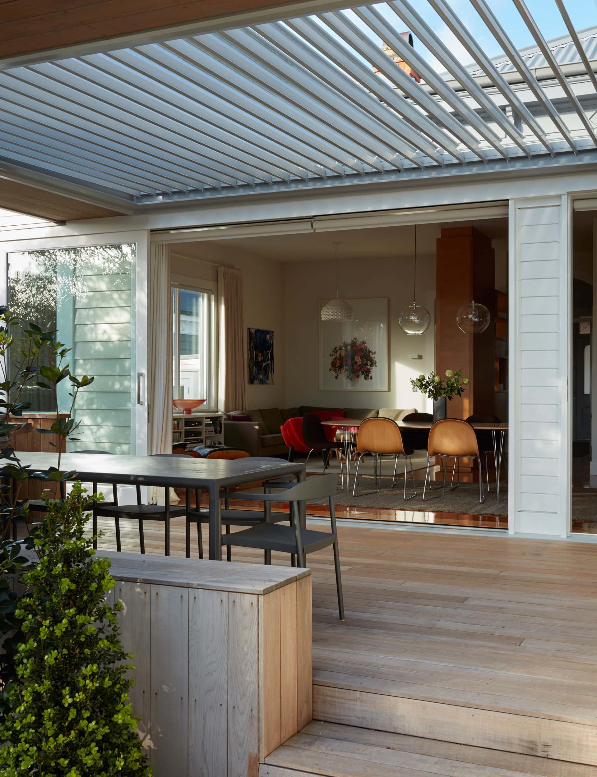
Full-height sliders, meanwhile, flood the area with light and provide direct access to a new covered deck with Louvretec roof, from where steps lead to the garden. “The beautiful thing about the project was the gentle progression towards the light and openness of the garden, from the interior through the outdoor space and past the planter and wide steps to the open yard.”
There’s a sense of ease and craft in the interior. Bringing light into the living spaces highlights the original kauri floorboards and new Fijian kauri cabinetry; the dark marble of the restored fireplace in the living area is offset by the splashback in the kitchen. “There’s a sense of craft in what we’ve done so that the changes are not stark, bland, modern additions, but are nuanced and connected to the spaces,” says Edwards.
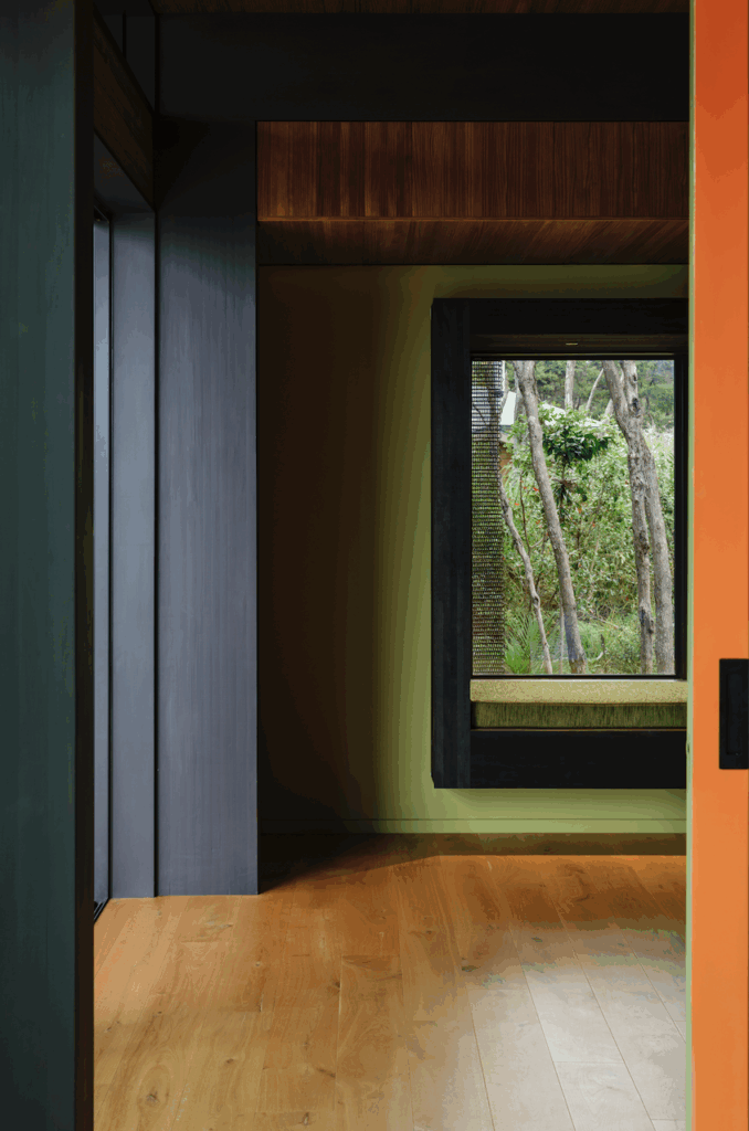
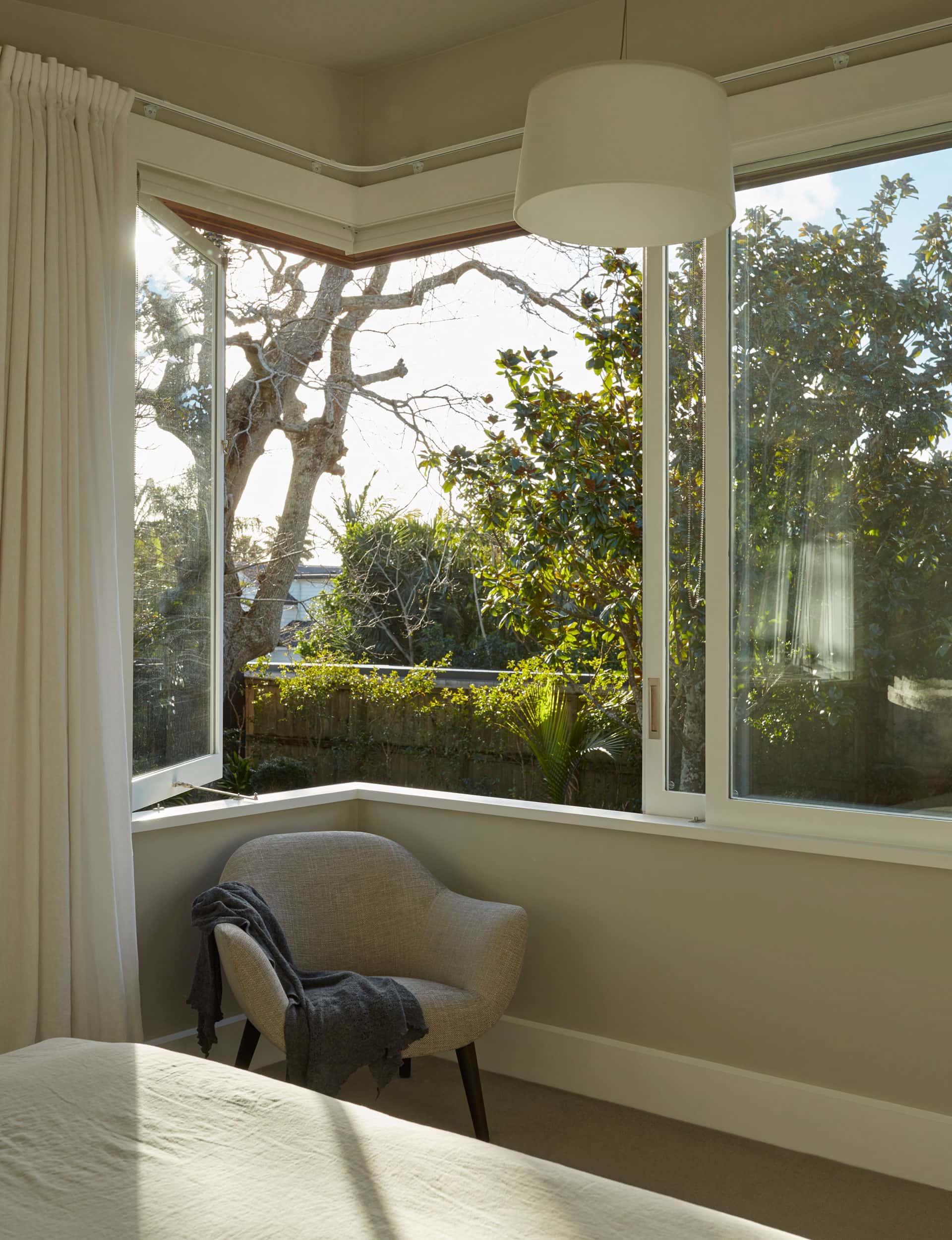
A problem area for the home was an unusual monopitch lean-to next to the kitchen and a kitsch rear verandah, which led to a bedroom through a bathroom. In response, Edwards widened the space to allow a hall connecting each room. What was an awkward add-on at the back of the house is now a well-integrated feature, the bedroom’s large corner window brings the garden into full focus.
“They weren’t major changes,” says Edwards. “But they had a major impact.”
Q&A with Megan Wdwards of Megan Edwards Architects
What did you set out to achieve with this renovation?
A transformation of the existing living spaces, so that they were light and enjoyable to occupy. The project involved a modest change to some spaces that were average – they were stiff and dark. In terms of light, the larger northern window was transformative. An unusual verandah on the rear of the house – probably not original – was changed to become a usable outdoor room with the Louvretec roof allowing moderation of westerly light. The effects of light enliven the room now. We also created a garden bedroom using the old monopitch lean-to.
We know creativity loves restraint. How did the consent process for a 1900s villa in a conservation area impact the plans?
I originally had more radical plans for a clerestory cut into the living spaces but it was considered too assertive by Council’s heritage advisors. The more restrained scheme delivers essential elements while preserving the dignity of the villa in this street of villas.
You’ve described the approach to this renovation as nuanced. How has that transpired?
Given that we weren’t adding much in terms of space, the scheme was all about nuance: making existing spaces work better. I do like the new verandah, incorporating the Louvretec roof with the feathered-edge cedar soffits and copper spouting. This new roof unites the villa with the unusual existing monopitch lean-to.
Talk us through one of your favourite features – the arch and doorway into the new kitchen and living room.
We located the new door to the living rooms under the arch, making the new work distinct from the old – frameless glass separates the new door from the old arch. And the new transom and mullions provide a great contrast to the shape of the arch.
Words by: Jessica-Belle Greer. Photography by: Sam Hartnett.
[related_articles post1=”72851″ post2=”70103″]
