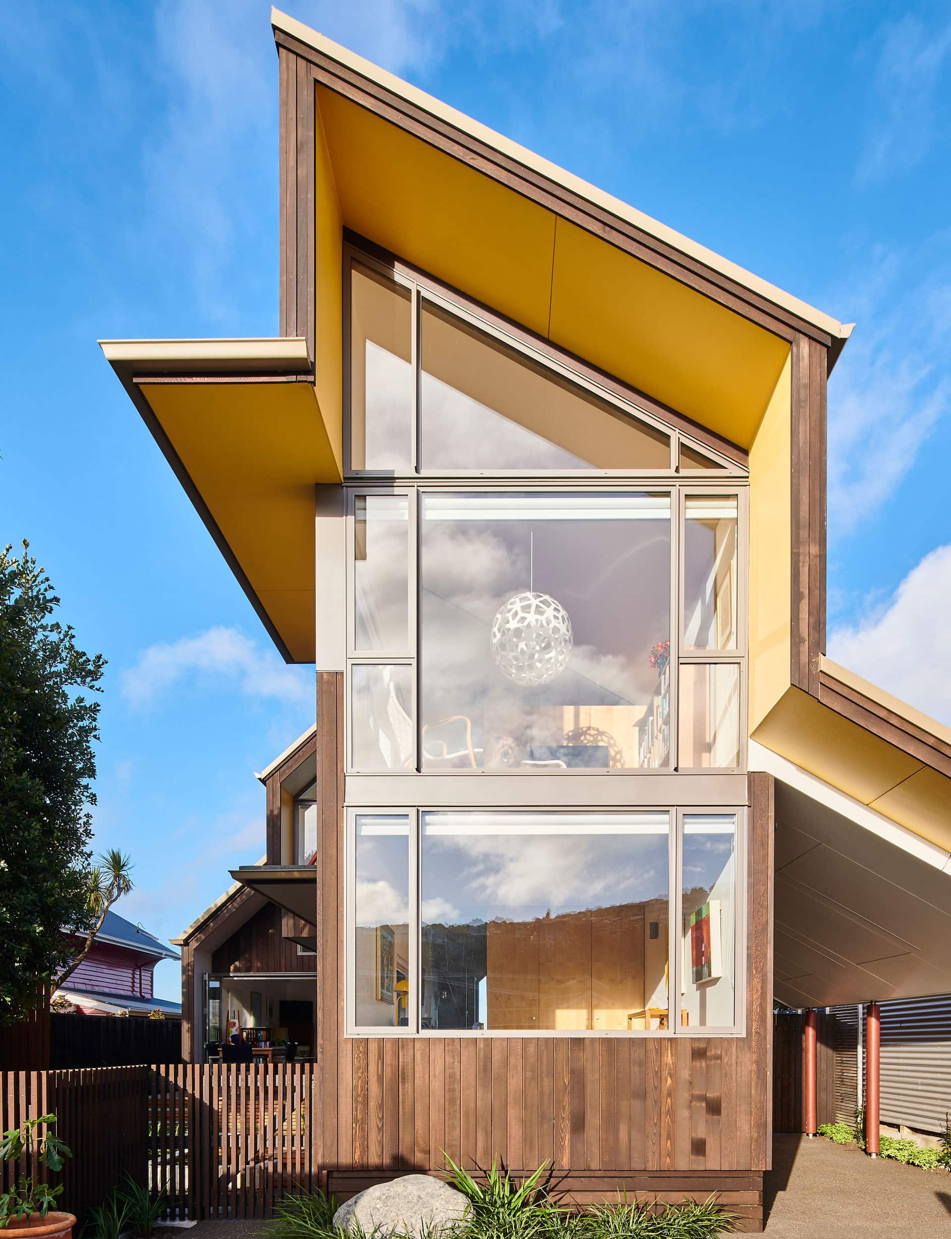
Both playful and rational with punchy yellow accents, the last house designed by the late David Mitchell is a bold feature in the Christchurch streetscape

Q&A with Julian Mitchell of Mitchell Stout Dodd Architects
Both owner and architect were sailors. How did that influence the design?
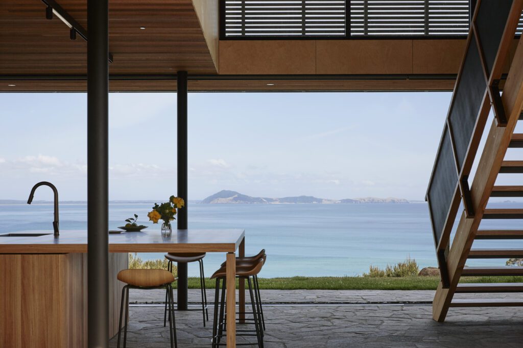
Well, they got on really well for a start! While there are some nautical aspects to the house – such as the boat hull form over the main living space, the use of ropes and pulleys to haul in the big awning window, and the relaxed openness of the house – it is perhaps the way the house sits on the banks of the bay, bow to the sea, eagerly anticipating a lift in the wind that is the strongest thing about it.
This was David’s last house. What did it share with his previous work?
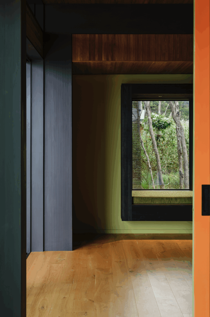
It exemplifies David’s usual attention to detail using relatively run-of-the-mill materials to produce well formed, rich and delightful spaces designed around human habitation and activity. Colours and forms are strong, clear and uplifting and the plan is economical in its proportion, but never tight.
[gallery_link num_photos=”5″ media=”https://www.homemagazine.nz/wp-content/uploads/2018/06/MoncksBay4.jpg” link=”/inside-homes/home-features/christchurch-david-mitchell-house” title=”Find out more about this home here”]
He only designed two houses in Christchurch, and those toward the end of his career – why is that?
Christchurch is a hard nut to crack and it was only after the earthquake that we found work there, despite being keen to do it. There’s a distinct Christchurch style that is generally more restrained than David’s fairly idiosyncratic work. However, in this case it was what attracted the clients to him.
The owners’ response to the initial design was to ask for something bolder. Do you remember what David said?
He’d really struggled fitting the house in, given the tight height restrictions and a new requirement to lift the floor up a metre above the flood plain; he had to work it hard to shoehorn it in. When the clients came back wanting more he said something like: “Gee, sounds like I’ve undercooked it. I’d better give it a few more revs!”


