Andrew Sexton designs a wheelchair-friendly home beside Wellington Harbour for his brother, and his other brother builds it
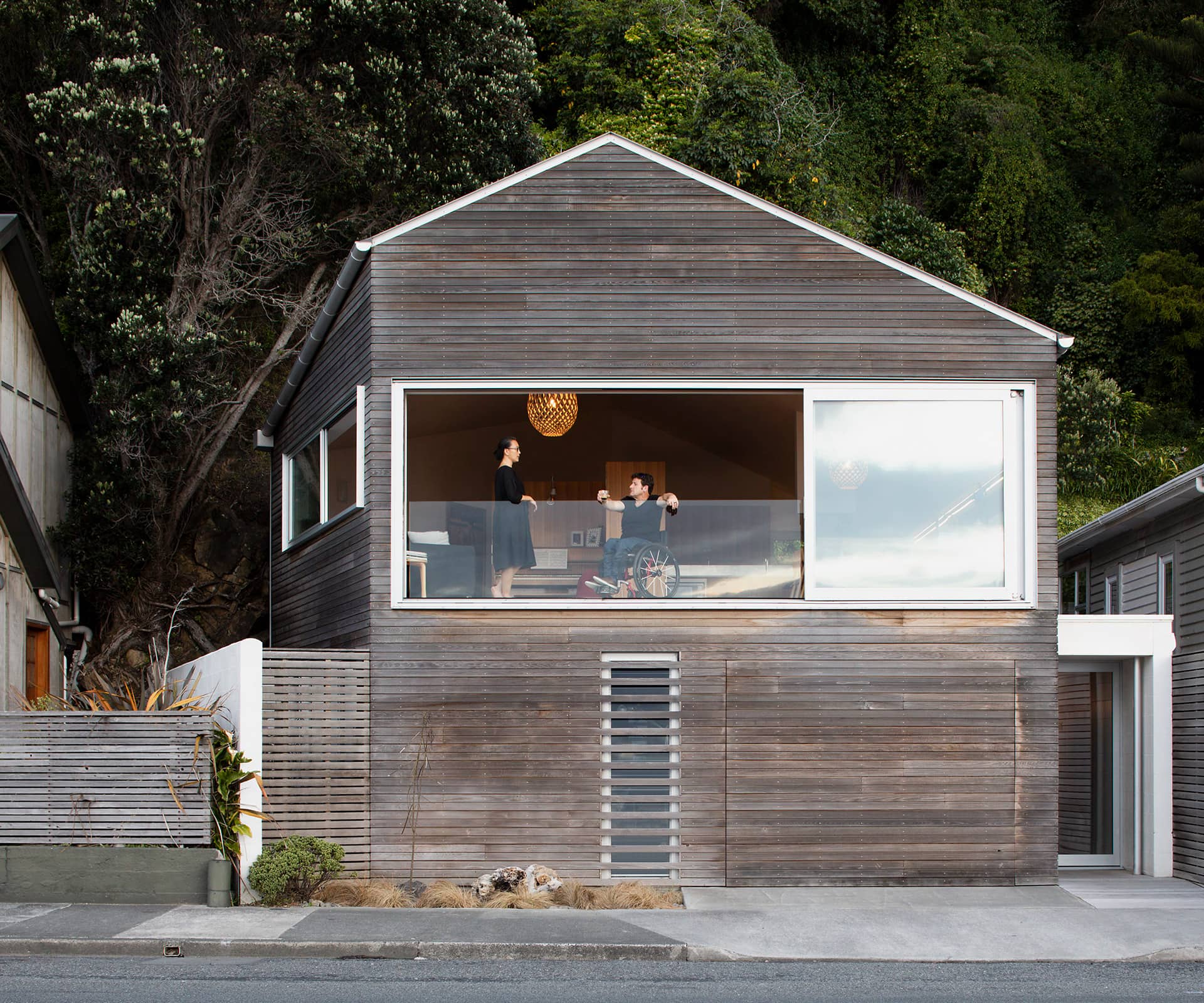
It wasn’t quite a miracle, but it was something special all the same. Stew Sexton drove from the supermarket to his new home in Wellington’s Eastbourne, parked the car in the garage, got the groceries out, took them upstairs to his kitchen and put them away in the pantry. Then he rang his wife Doreen, who was at work, to tell her the good news.
Stew, you see, uses a wheelchair. The otherwise unremarkable business of getting the shopping into cupboards felt remarkable to the disability educator, who is a long-time campaigner for improved accessibility for people with disabilities.
“It was liberating. I knew we’d done the right thing in making our home completely accessible,” says Doreen. The making of a home so thoroughly in tune with its owners’ needs was a thoroughly family affair: the cedar-clad home was designed and built by Stew’s brothers, award-winning Wellington architect Andrew Sexton; and Richard Sexton, an award-winning master builder and carpentry lecturer.
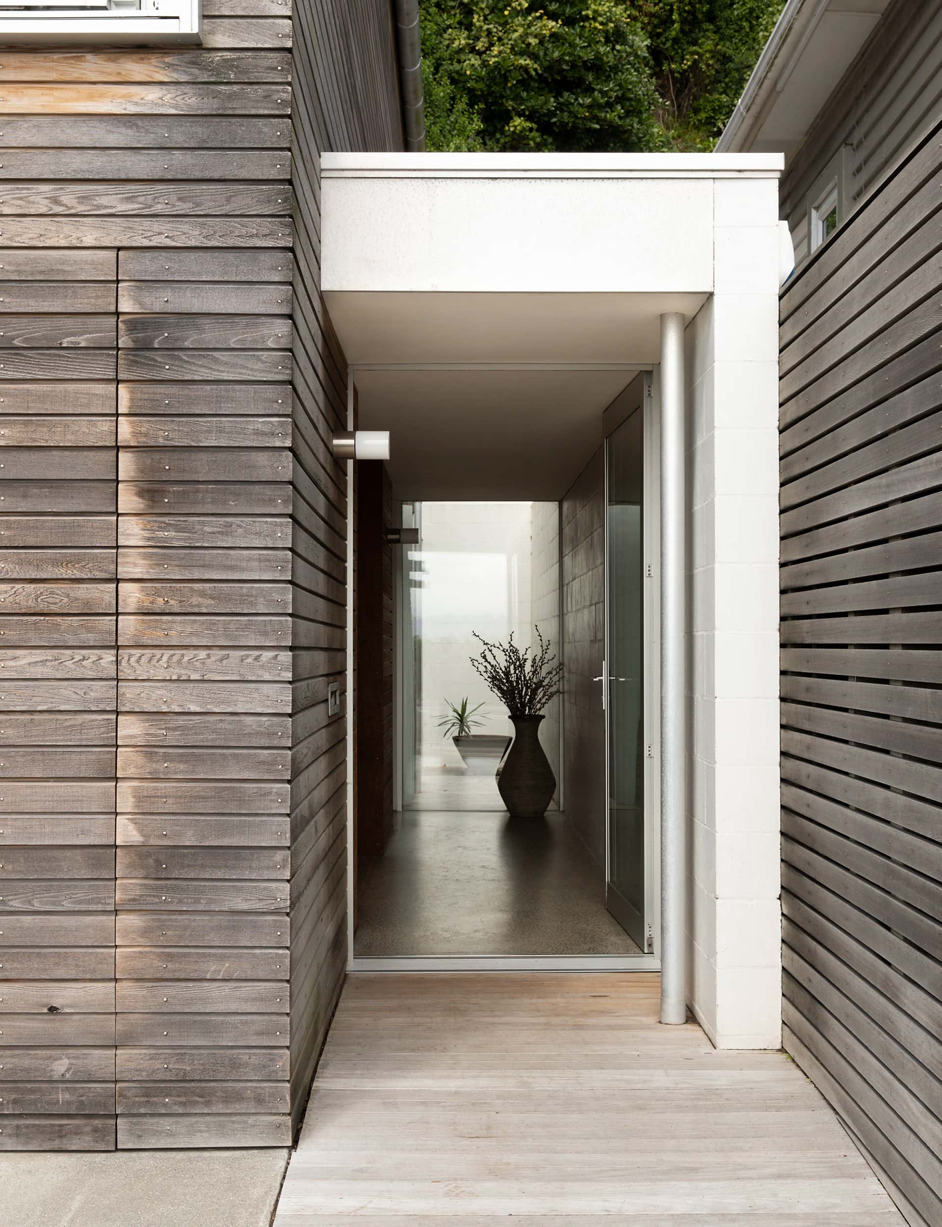
With its back to bush-clad cliffs and face to the wide, sometime wild, waters of Wellington Harbour, it’s a much-loved site. Doreen and Stew have lived here for 20 years. The former cottage that had occupied this spot since 1912 was tiny and cosy but not exactly suited to someone with a chair. It was on a typically Wellington section, too – most of its 700 square metres is “goat country”, with only 90 square metres of it usable, says Stew.
“The section has its challenges,” says Doreen. “It’s called Windy Point for a reason and, with the cliff behind us, it doesn’t get the sun until later in the day. But we just love the spot and views; it’s Wellington without being Wellington.”
By the mid-2000s, the much-loved cottage was very much in need of attention. “You could bounce up and down on the floorboards in the lounge,” says Stew. “We needed to do something.” After considering a renovation, they decided to build a home truly designed for the them both, with Stew’s chair at the heart of the architectural project.
“It was a big starting point, conceptually, for the house,” says Andrew.
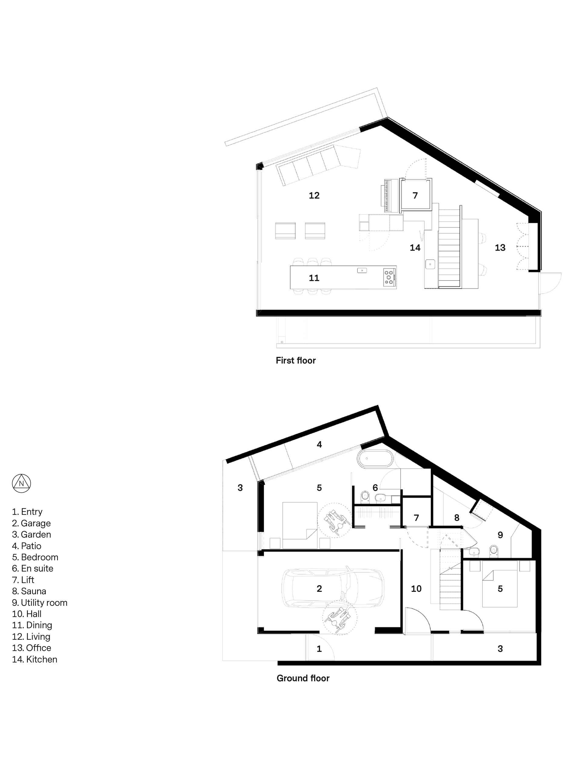
The plan, which moved through many permutations, delivers both home and home office – despite its modest 90-square-metre footprint. It has stairs, as well as a hydraulic lift to carry Stew between floors, two double bedrooms and a spare bed that folds into a wall, two spacious bathrooms, an internal garage and, at Doreen’s insistence, a handsome blonde-wood sauna. “I love them,” she says. “I come from a tropical country, Malaysia.”
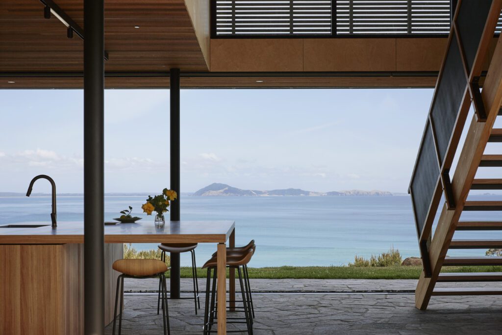
The upper storey is dominated by the view of the harbour and Matiu, which is also known as Somes Island. A deck wasn’t permitted here because of the section’s proximity to the street. Instead, two of the three huge picture windows recede, bringing the outdoors inside. The living room effectively becomes the deck.
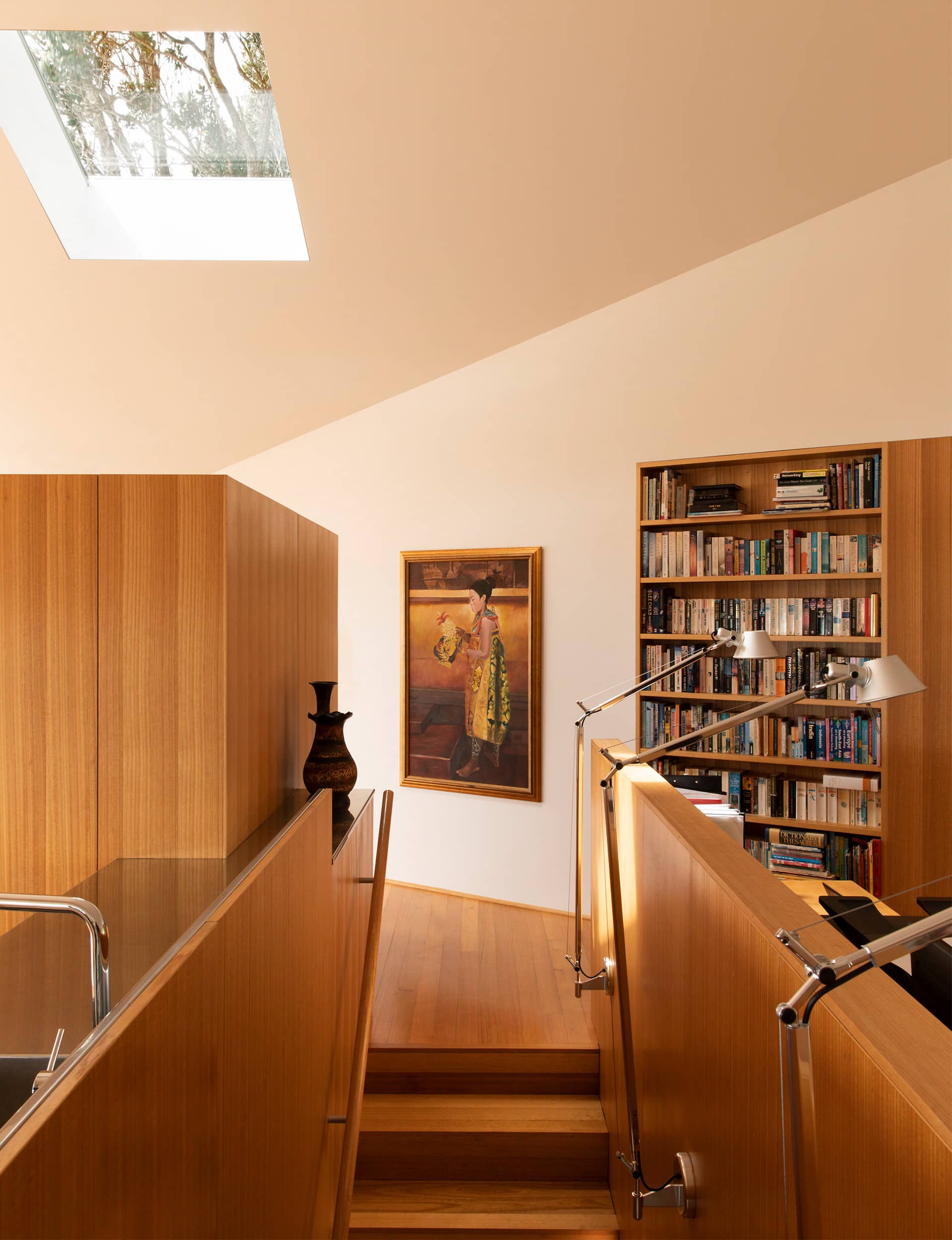
A vaulted ceiling and white walls give the open-plan living and office space a wonderful, airy volume. The room’s bespoke furniture and cabinetry – made from the same timber as the polished floor (Victorian ash) – cleverly combines a number of elements. The central island integrates Stew’s lift, kitchen cupboards and pantry, and a space for the piano, while one end of the dining table includes a sink and cook top for Stew. Meanwhile, Doreen’s full-height bench hides the couple’s workspaces.
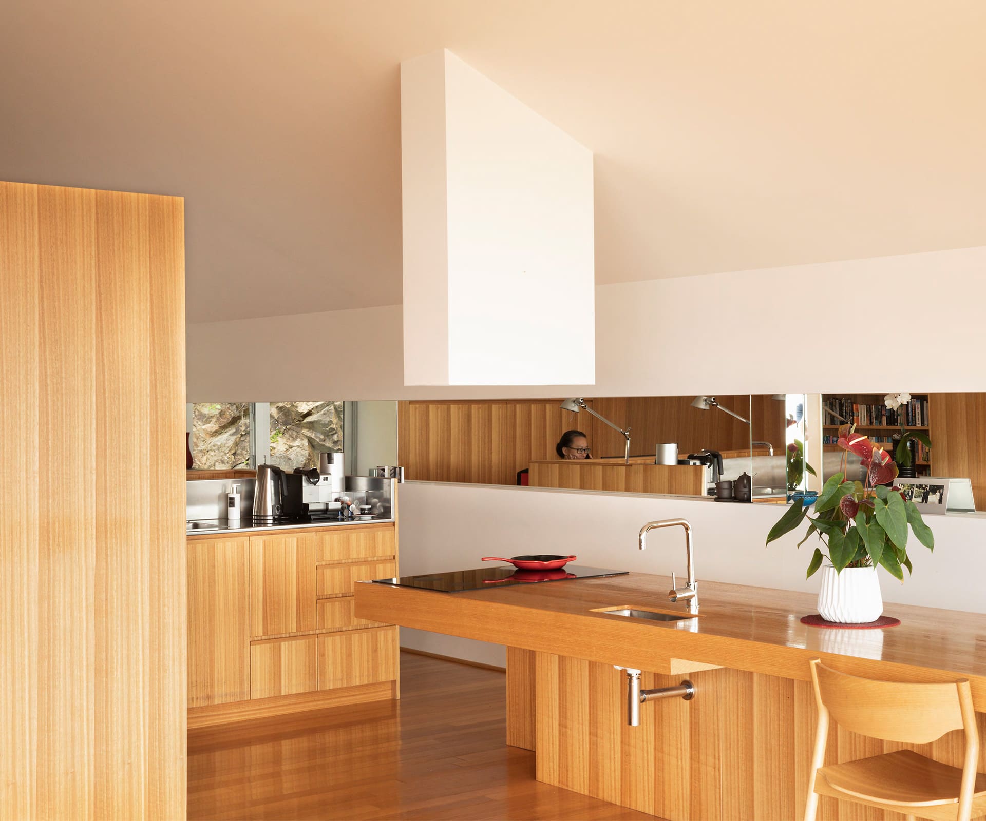
“The idea is that all the furniture acts as islands within this big space,” says Andrew. “It frees the room up in terms of circulation with the chair. It’s pragmatic and drove the concept for the house.”
With the cliffs behind blocking the rising sun, the design seeks to bring more natural light with a skylight, as well as a long narrow mirror strip along the southern wall. This reflects light from the picture windows to illuminate the interior.
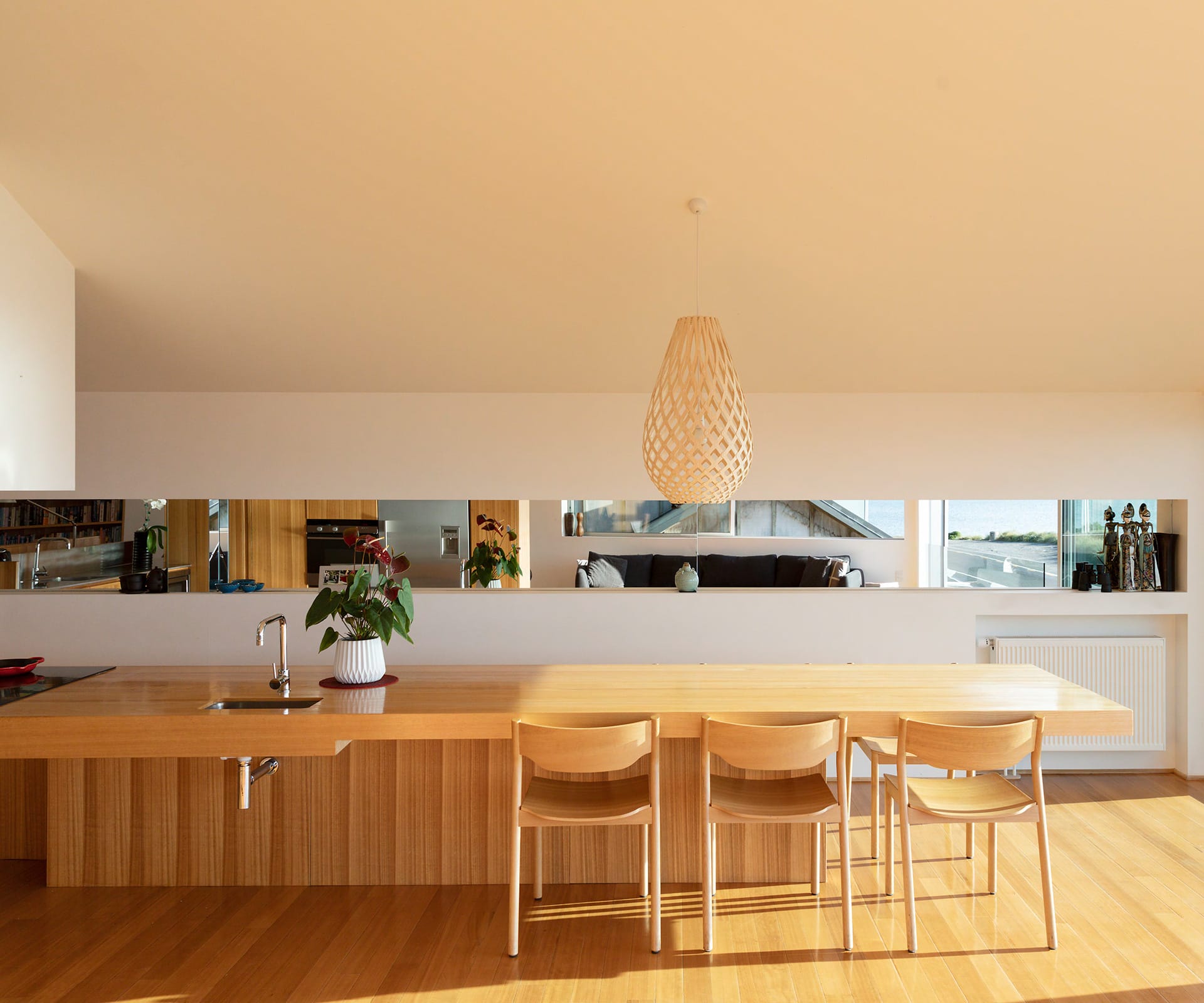
“I remember when Andy suggested the mirror,” says Doreen. “I said no way; I don’t want to see myself 20 times in a mirror. What I think now, looking at it, is that I love it. I never anticipated that it would bring Petone into our living room.”
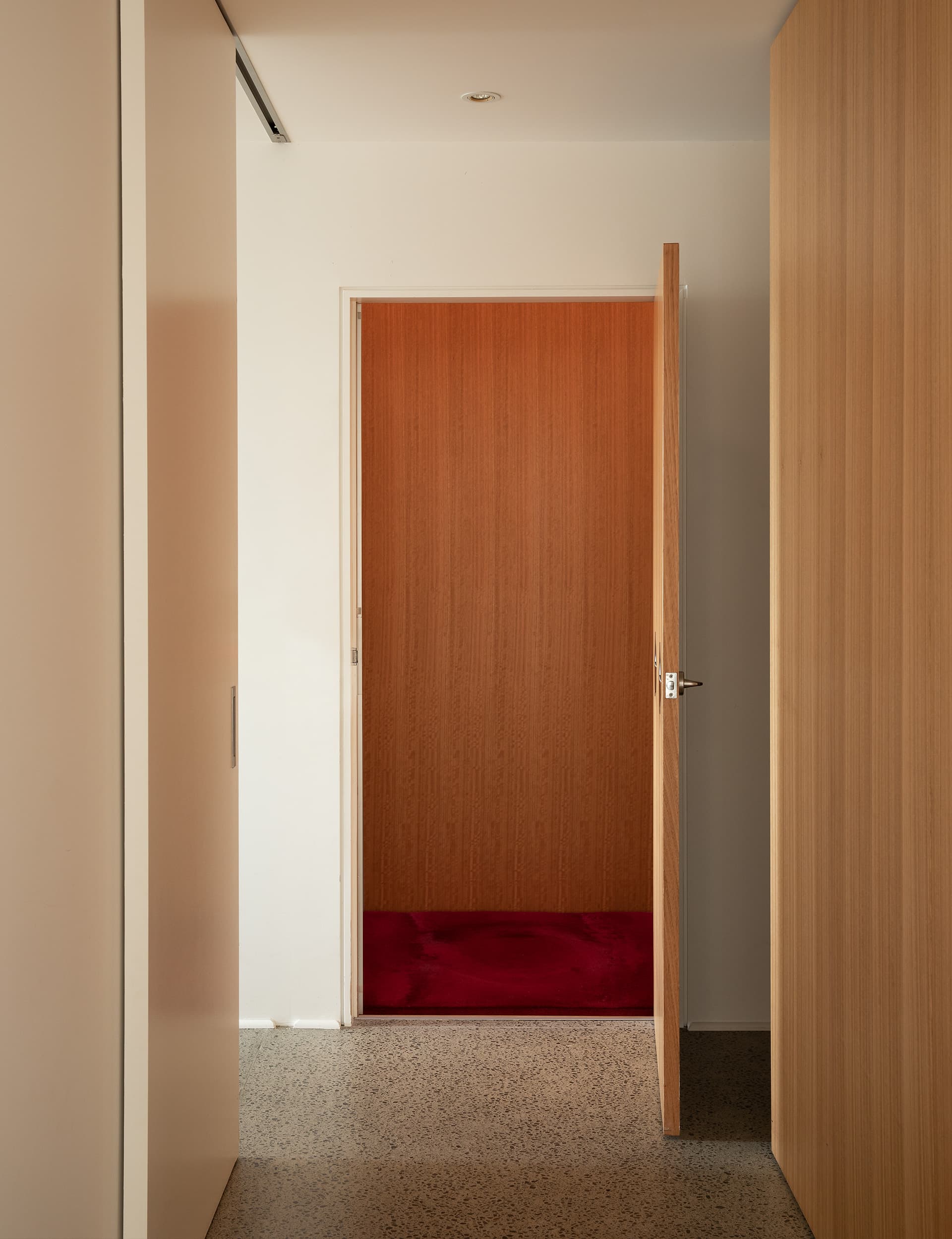
Downstairs, light wells do the same work, illuminating, even on a dull grey afternoon, the generous main bedroom and guest room. However, it’s in hidden design details – from a wardrobe with a low clothes rack near the main bedroom to a low pull-out spice rack in the kitchen – that make this house very much Stew’s home.
[gallery_link num_photos=”13″ media=”https://www.homemagazine.nz/wp-content/uploads/2019/02/WellingtonAndrewSextonHome_6.jpg” link=”/real-homes/home-tours/wheelchair-friendly-house-maximise-light” title=”See more of the home here”]
“The design is very well thought out,” says Doreen. “There has been a lot of consideration into how Stew does a lot of things – and he’s able to do everything.”
Including, of course, bringing in and putting away the groceries. “You’ll get me out of here in a box,” says Stew, “just make it of cedar.”
Words by: Greg Dixon. Photography by: David Straight
[related_articles post1=”32090″ post2=”32289″]
