Gerald Parsonson crafts two exquisite apartments – one to live in and one to rent – for a retired couple
It’s hard to know where to look in John and Heather Hutton’s handsome central Wellington apartment. There are fabulous views everywhere. If you face north west, you can see over the top of the well-ordered wilderness of the Botanic Gardens to Tinakori Hill.
To the north east, your eye is carried across the central cityscape and wharves to the expanse of Wellington’s harbour and beyond the Hutt valley and the eastern bays. Finally, to the southwest, there’s the shallow curve of Oriental Bay, the heights of Mount Victoria and Miramar peninsula beyond.
Even on a bleak day it’s a wonderful panorama, a capital view, if you will. And the couple’s apartment – one of two they’ve built, perched on top of the other on this beautifully positioned site – presents the viewer with the opportunity to consider it all.
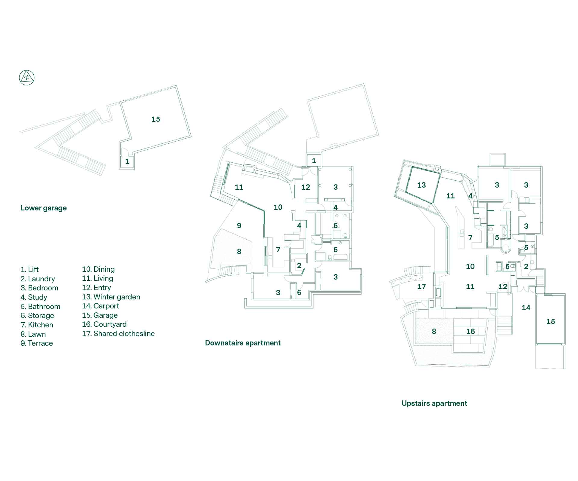
Designed for the couple by Parsonson Architects, the two-apartment project in Kelburn has given them what is likely to be their final home, but also, with the lower apartment, a rental property – a retirement project for John, who gave up clinical medicine four years ago.
“This will see us out,” says Heather. “And that’s why it’s all on one level,” says John. “I imagined sitting here in the wintergarden in a wheelchair, with my legs under a rug and my dentures in a glass over there, looking at that view.”
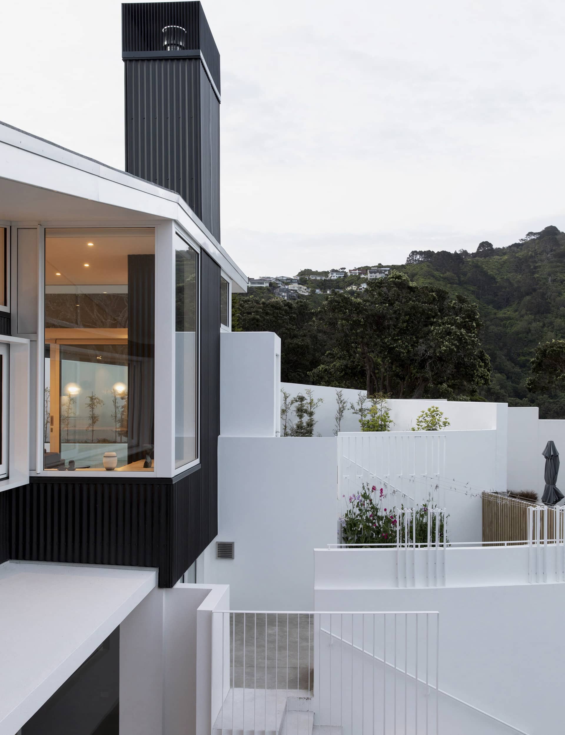
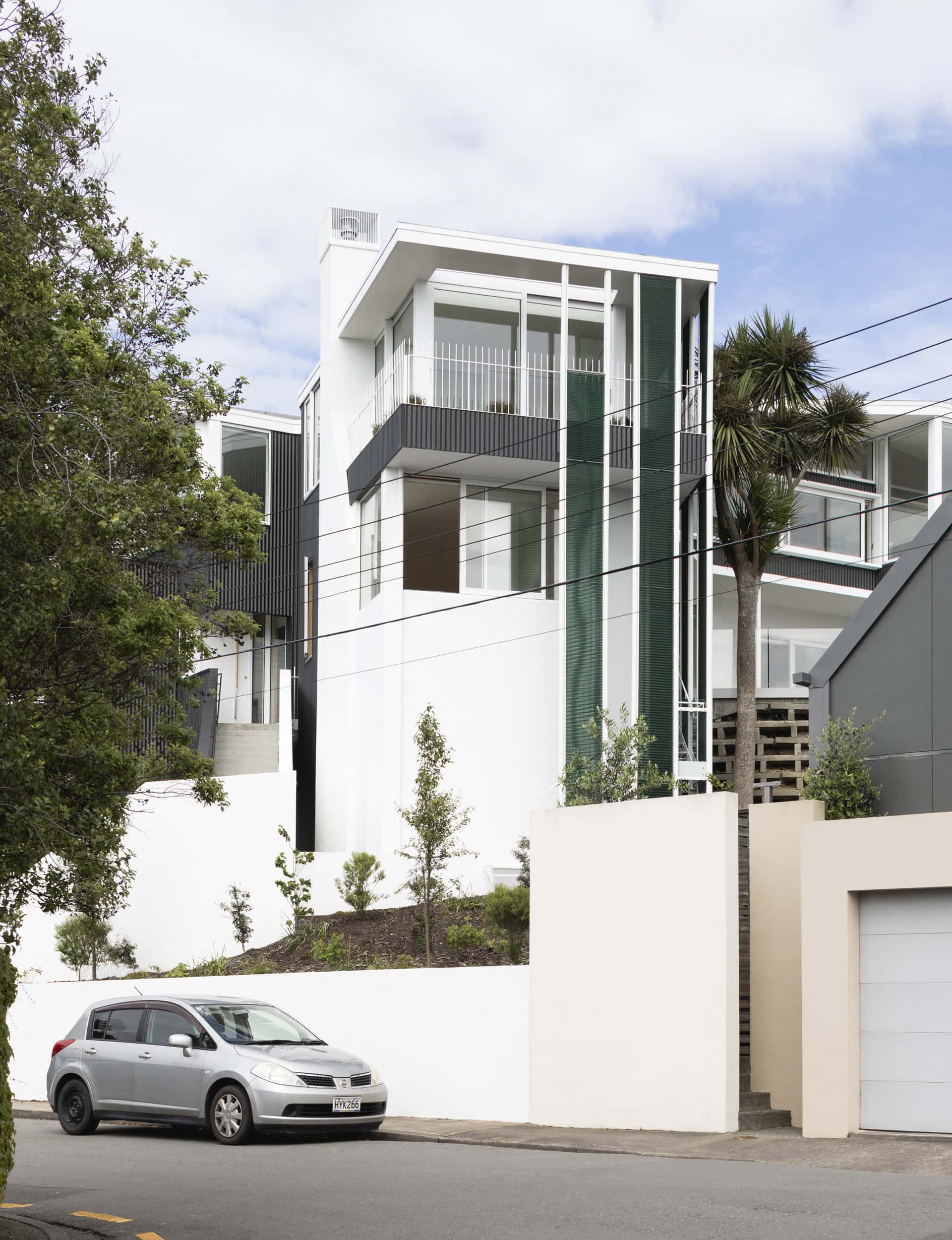
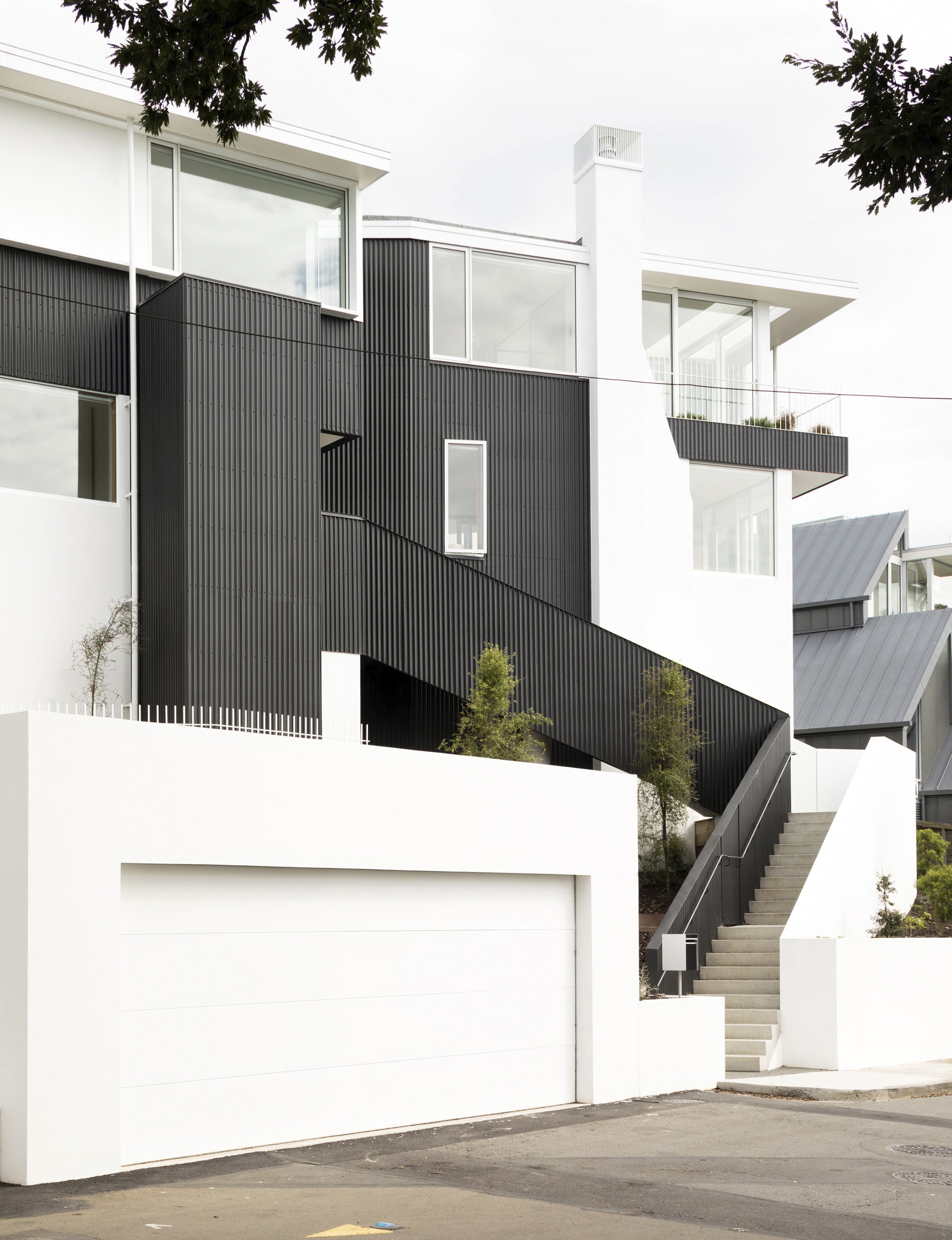
On a site that sits between two streets – one 12 metres below the other – architects Gerald Parsonson and Craig Burt have created a richly complex and compelling building that offers two quite different profiles. From the lower road, the apartments are seen as a combined two-storey structure, one dominated by vertical lines, emphasised by the use of corrugated zinc cladding. The form holds its head high above the street below. From the upper road, it has a pleasingly low silhouette, with the flat-roofed form laying low behind a white concrete wall, screening all but the top of the house from the street.
It’s striking, but not the original idea for the site. When the couple bought the property, they intended to knock down the 1950s Structon-designed house and build three apartments. Resource consent was granted, but the plan was shelved. “The surveyor came back with an earthworks and foundations cost in seven figures before we got anything above ground,” says John.
Parsonson and Burt returned to the drawing board and delivered a plan that avoided expensive earthworks by preserving the original home’s footprint and its lower concrete structure – and almost stayed within the permitted building envelope. The couple was entitled to build another storey and others would have, says Parsonson. “The neighbours above were obviously very concerned about their view, because it is a fabulous view,” he says.
In the end, those neighbours were asked to approve a plan that pushed the envelope only by pressing the upper apartment’s garage to the boundary, but preserving the neighbours’ view by retaining the original home’s flat-roofed profile. “They signed off very quickly,” says Parsonson. “It took them only four paces to get to their pens,” says John.
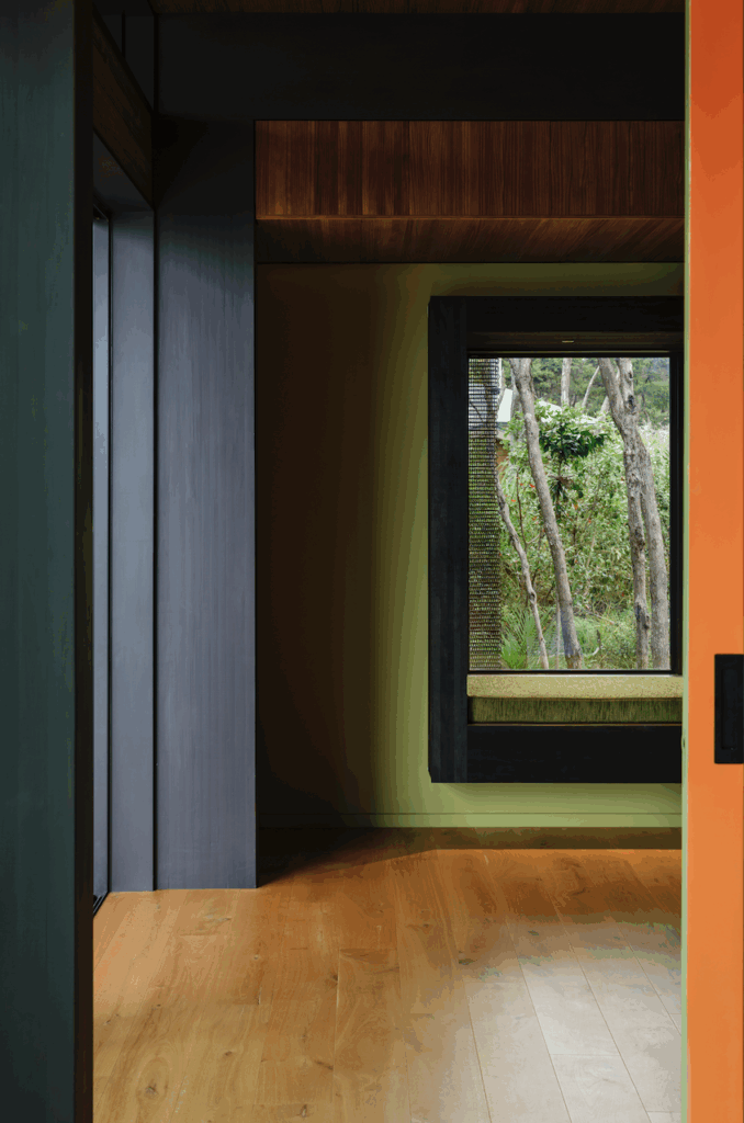
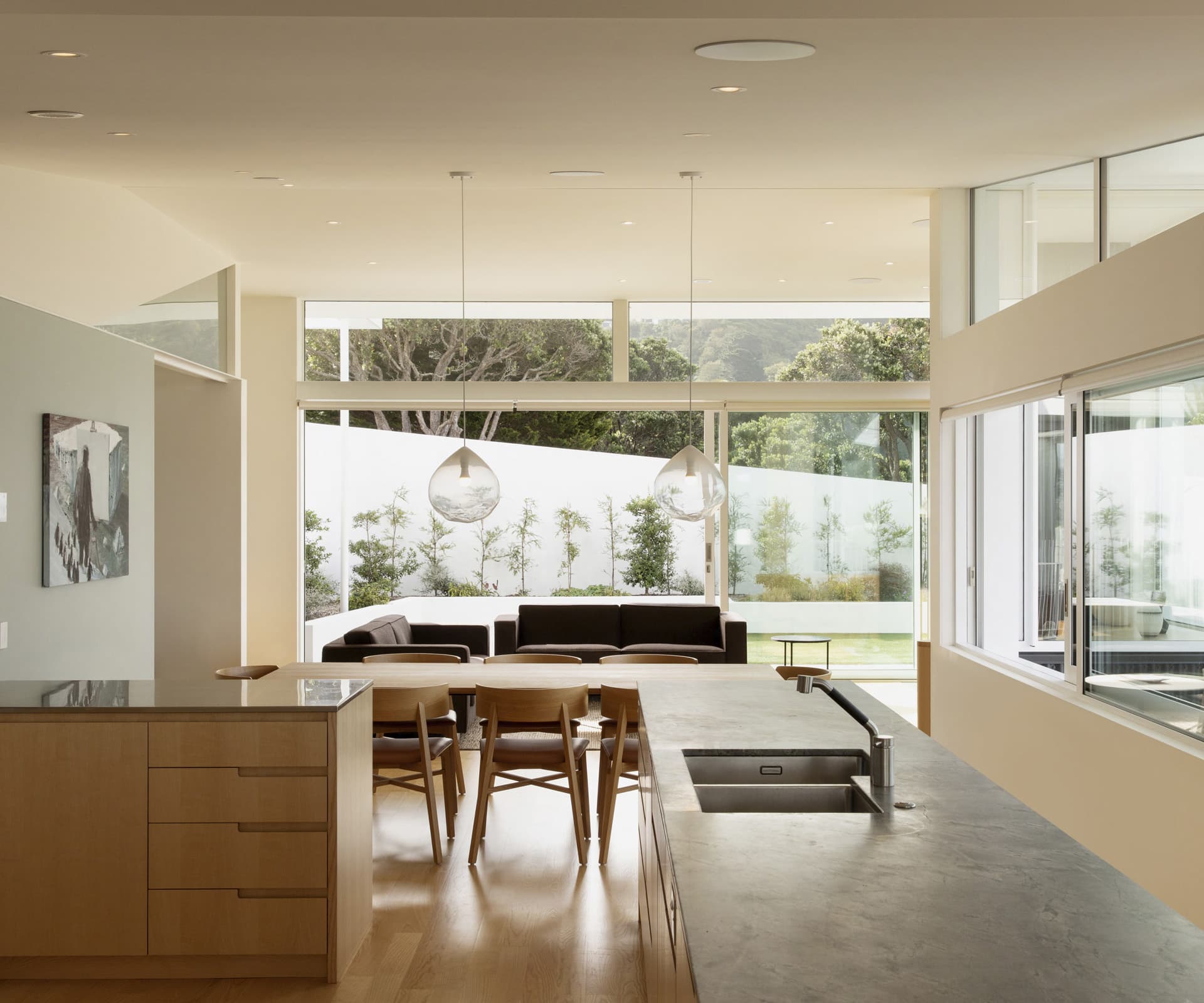
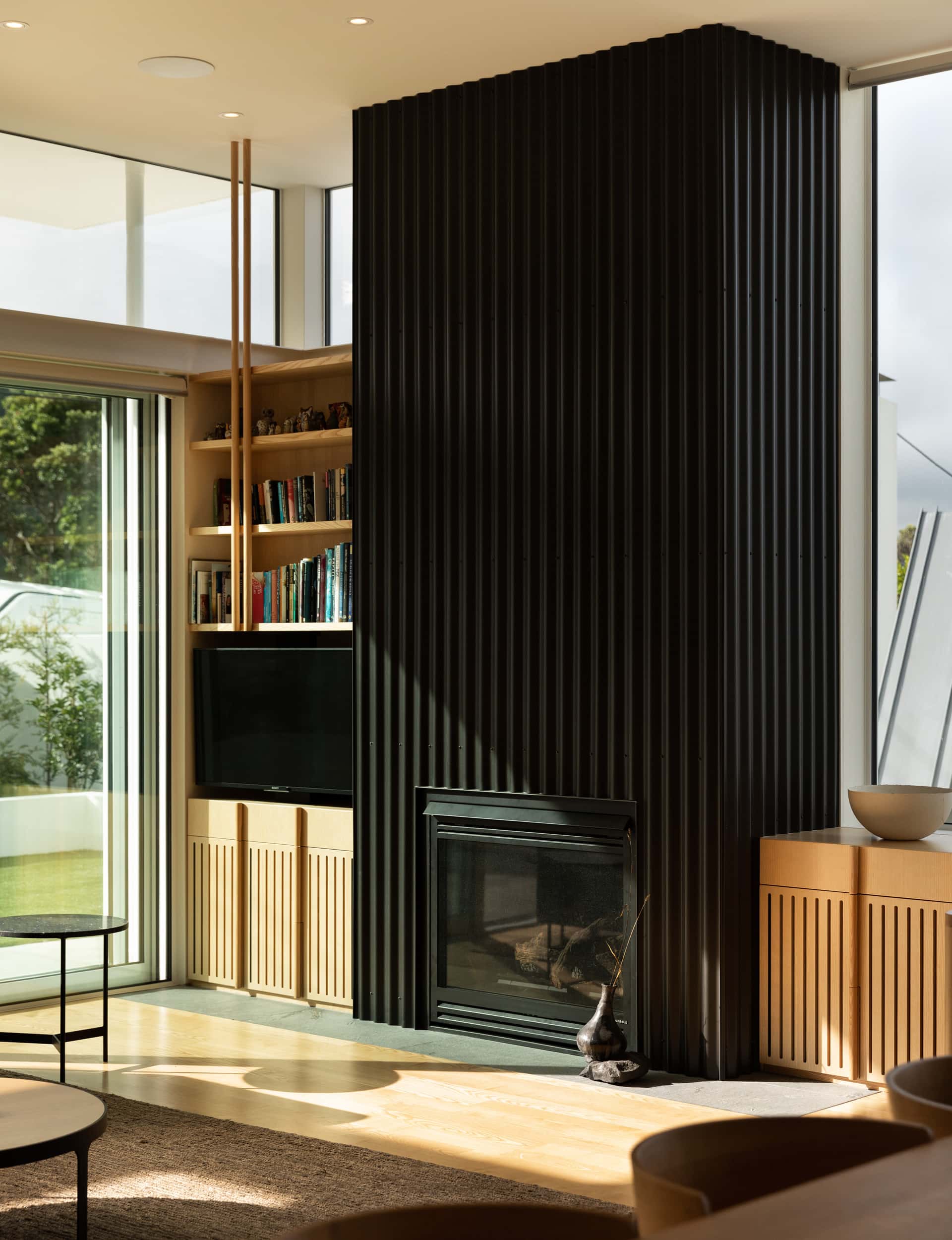
The plan is designed to Passive House principles. Each apartment has three bedrooms, and each has a living space that bends in a gentle curve northward to harbour views and to capture afternoon sun through sliding glass windows and doors. The same design language, specifications and materials – including the American ash floors, granite benches and colour palette – have been applied throughout both.
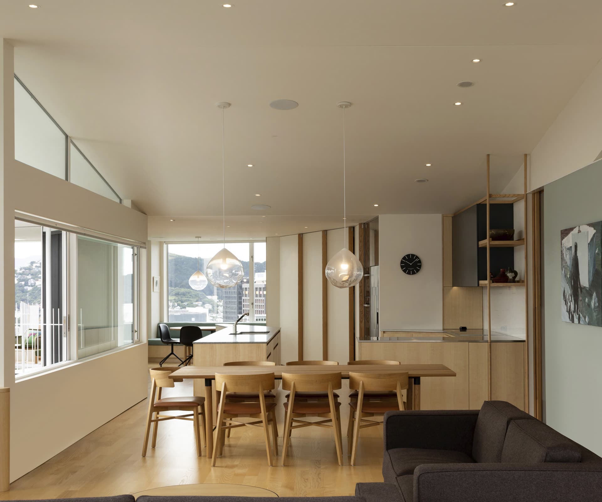
But the apartments are not twins. The lower space is smaller and almost as light and bright as the upper floor. It features a street-level double garage with a hydraulic lift to the home. The upper apartment’s living area is enhanced by a roof that slopes up to the west, giving the space an airy volume and affording those views of Tinakori Hill from deep inside the home.
Inevitably, there was a tension between opening living spaces up to embrace the light and view, but also protect possible – each apartment from the other, as well as the neighbours. The architects used a number of strategies to achieve this, including pushing out the upper apartment’s floor a little over the lower’s front terrace, and by using tall ribbons of a sea-green polycarbonate mesh, called ‘Kaynemaile’, for screening on the building’s northern and western sides. These mesh screens give privacy, provide solar screening and add a splash of colour and texture to the design. There’s also planting around the upper apartment’s wintergarden, which will soon provide more seclusion.
“To end up with a good result you have to consider privacy,” says Parsonson. “When we submitted for resource consent, council planners were concerned about privacy as well. It’s a balance: not blocking things up too much and not opening them up too much. You’re trying to hit that sweet spot.” All those fabulous views suggest he and Burt found it.
Words by: Greg Dixon. Photography by: David Straight.
