The Concrete Design Series with Peter Fell
Architectural designer Alex Farrell and her husband Matt Farrell of Intact Construction reimagine a 1920s Auckland bungalow with coloured concrete.
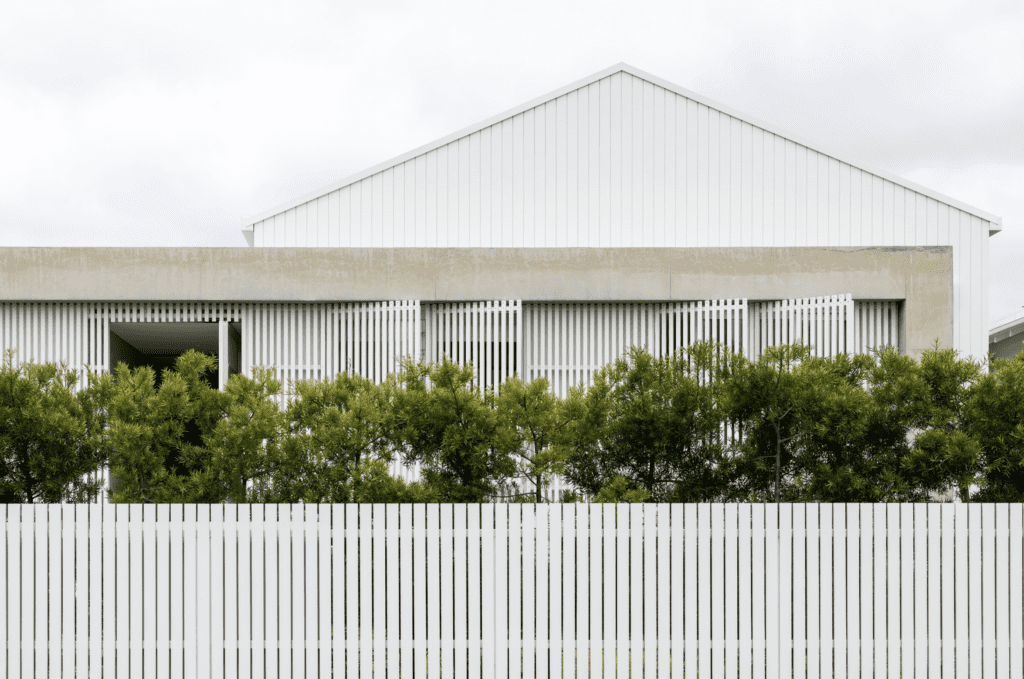
The original two-bedroom house in Point Chevalier sat closely between neighbouring properties on a small slice of Auckland suburbia. As a family home, it no longer worked for its occupants, Alex Farrell and her husband Matt Farrell, a builder who specialises in high-end residential construction.
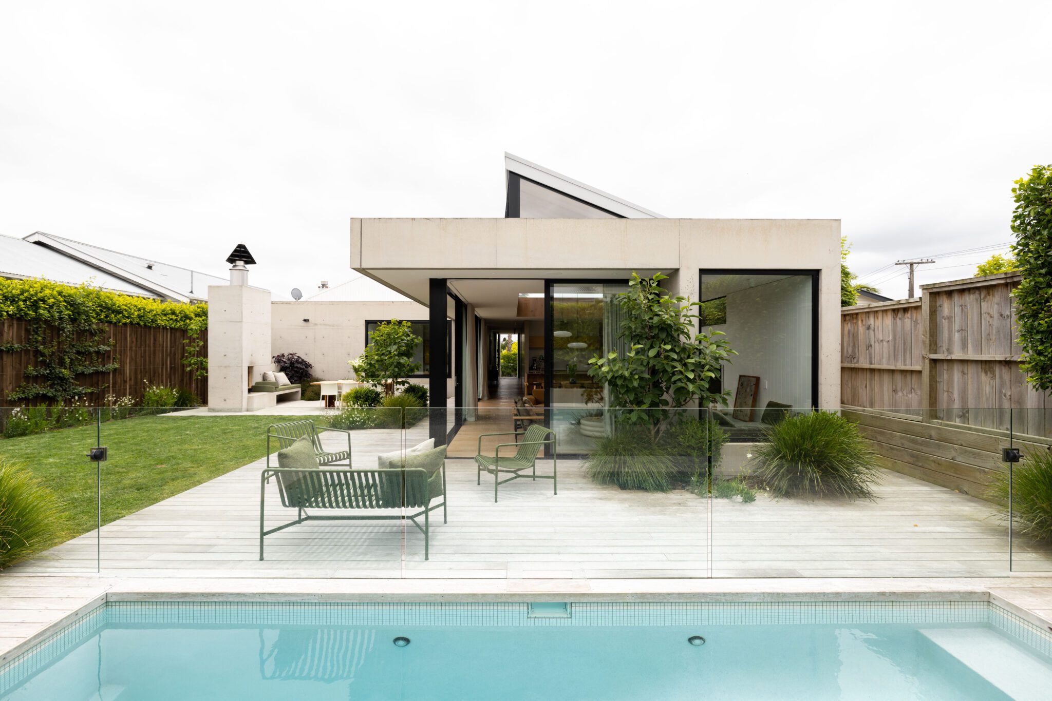
When it came time to extend the property to accommodate their growing family, the pair decided to embrace concrete, effectively wrapping the existing house in a T-shaped concrete form.
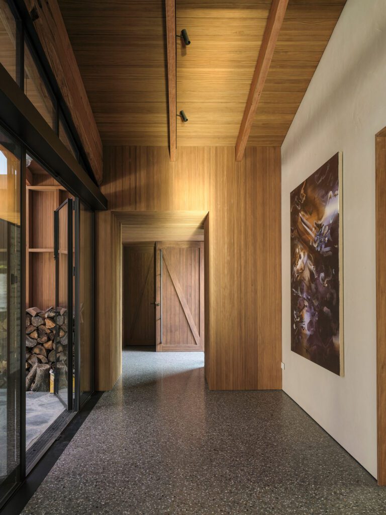
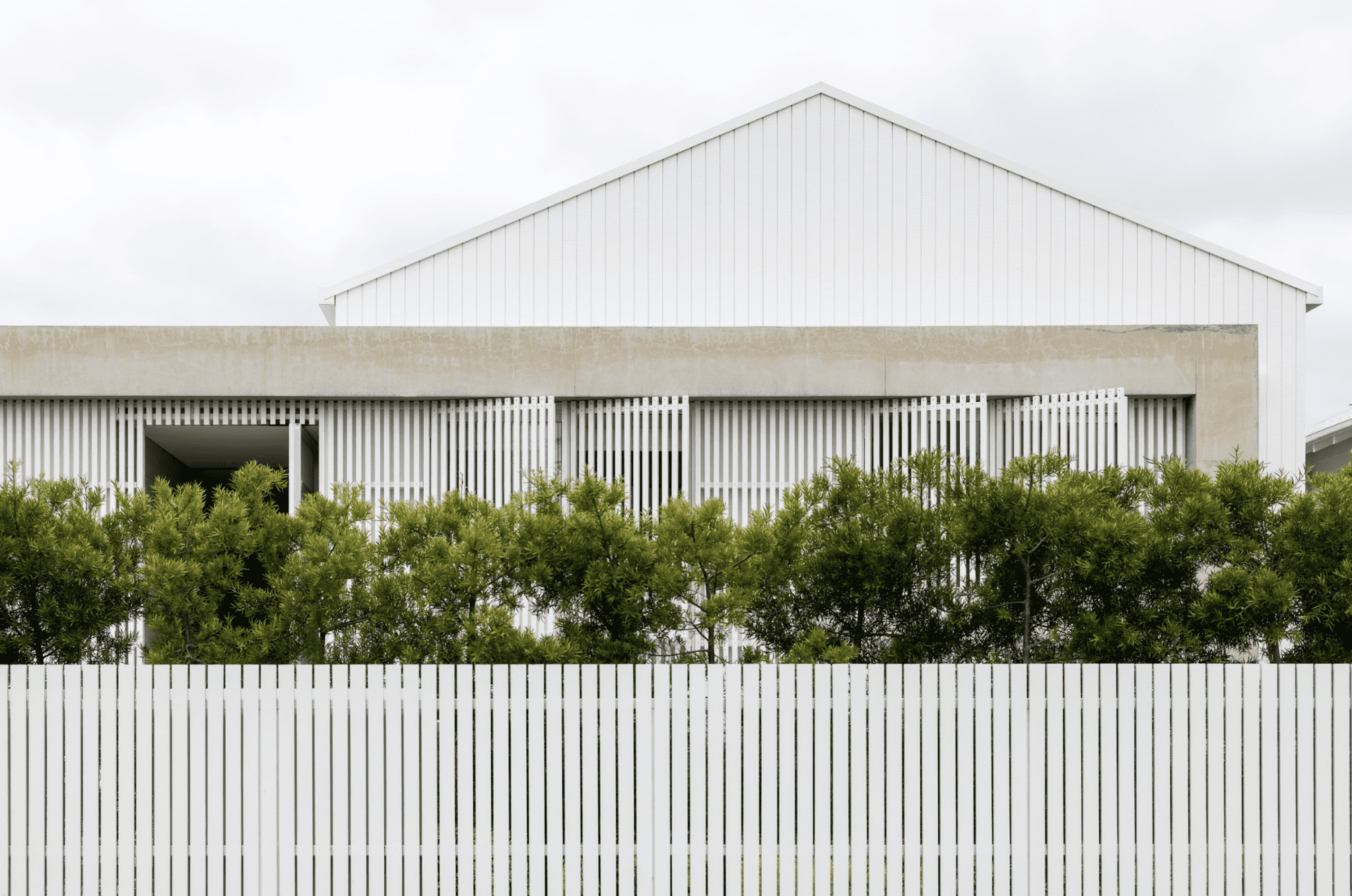
From the street, the original facade is no longer visible; instead, a linear concrete frame encloses a system of crisp cedar screens, behind which the entrance is concealed. A concrete spine wall draws visitors through the body of the house and out to the rear, where the main extension unfolds.
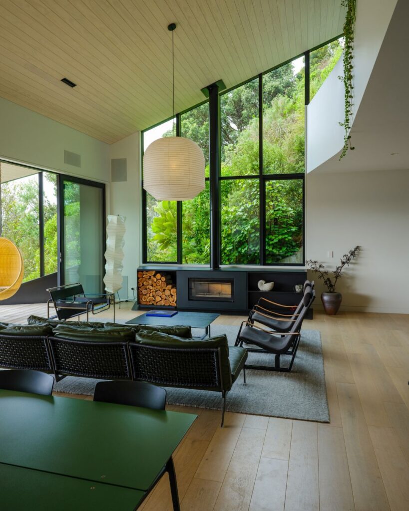
Here, a concrete pavilion is occupied by a new kitchen, living, and dining area. Overhead, the roof pops up in a small half-gable to mimic the roof of the original house; clerestory windows draw light deep into the interior.
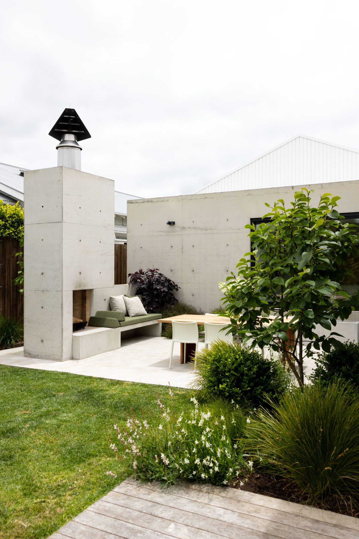
Running along the rear boundary is an inground pool; to the east is the hero: a concrete al fresco dining area anchored by a large in situ concrete fireplace.
The choice to use coloured concrete throughout (PeterFell 155) was a vital part of the design process.
“By using PeterFell coloured concrete, we were able to soften the tone of the material. PeterFell 155 has a subtle natural brown hue to it, which complements the band-sawn oak flooring and soft furnishings and textures within,” Alex tells us.
“As the concrete is a feature of both exterior and interior living spaces, we wanted to ensure it had a beautiful warmth to it. As you approach the house from the street, there’s something compelling about the neutral tone of the concrete. It feels permanent yet has a lightness to it, with the soft sandy tones picking up on the natural colours of the landscape. Step inside, and you’re drawn through this tactile space anchored by the same tones. Sitting around the fire or enjoying the sun during the day, the concrete has a Brutalist feel that defines the space; in that there is a sense of serenity – the coloured concrete changing as the light moves across it. At night, the flames throw flickering shadows against these walls and through the organic formation of the landscaping – there’s a real drama to it.
“There is something so permanent about concrete; it can be an unforgiving material but it is so rewarding to reveal and see the colour beautifully settle into the environment.”