This unusual home and office in a conservative Christchurch neighbourhood pushes the design boundaries
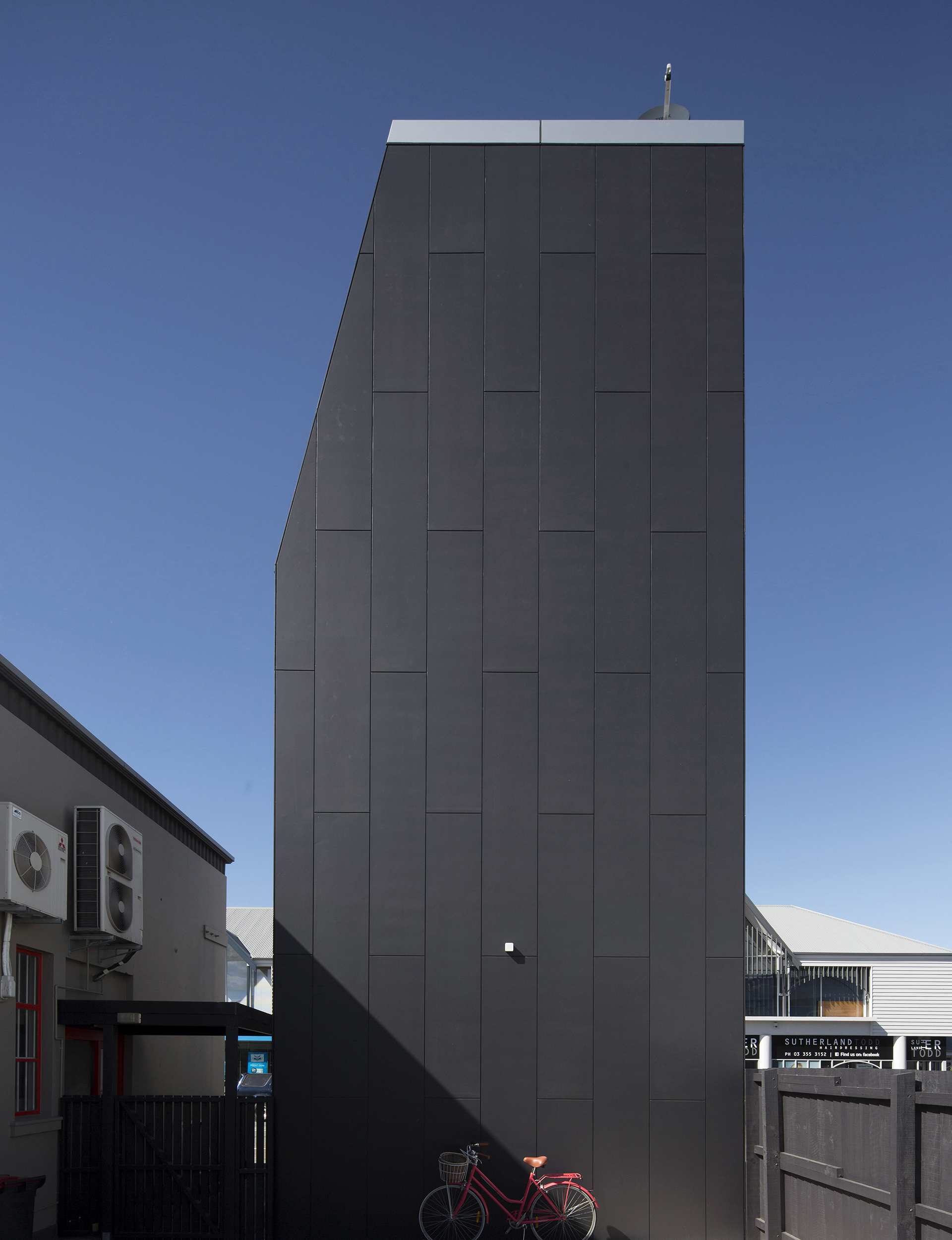
When a tall, thin, aluminium-clad tower rose between Christchurch’s Merivale post office and a supermarket, the locals were quietly astonished. It was built on the tiny five-metre by five-metre site of a former toilet block and its only windows faced south. It defied almost every expectation of what a New Zealand house should look like. Best of all, the supermarket sign metres away says “Fresh Choice”.
It was a building designed as a challenge: a chance to consider new forms of accommodation, and new typologies within Merivale village, one of the most conservative inner-city suburbs of Christchurch. It wouldn’t be at all out of place in Tokyo, but in Christchurch, it challenges expectations on a daily basis.
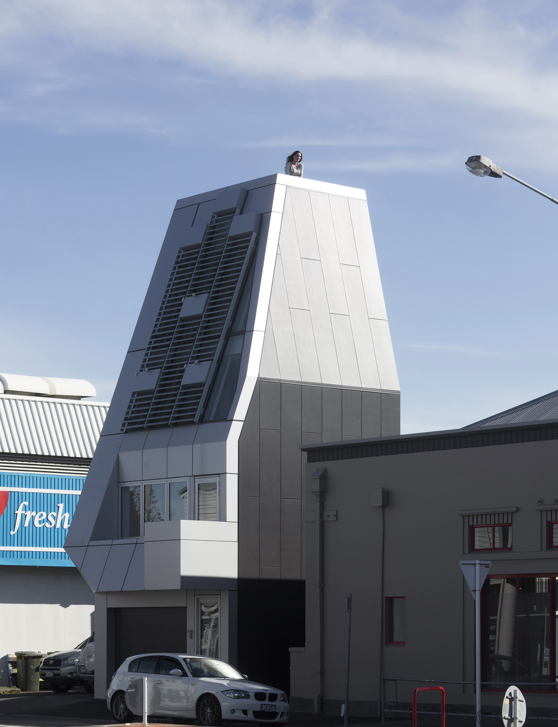
Architect Thom Craig and owner Paddy Cotter are happy with that. They both see an openness to architectural alternatives in post-earthquake Christchurch – “a cleared canvas” that has left room for people to experiment. And while some onlookers have simply shaken their heads in response to the tower, others have embraced it as a refreshing, exciting contrast that adds vibrancy and innovation to its street.
“Paddy has always pushed the architectural envelope as a developer,” Craig says. “He built the award-winning building at the opposite end of the same block with a roof that mimics a copper pleated skirt, so he was open to something that offered another commentary, something that suggests there may be other ways of bringing people into the city.”
It’s no surprise to learn that Craig is inspired by Japanese architecture, but also by the work of the American artist James Turrell and his preoccupation with light and space. To work within the council’s 14-metre height restriction, the tall, totem-like building tapers from its five-by-five metre base to a six-square-metre roof terrace five floors up (the ground and first floors measure 25 square metres, the second floor 22 square metres, and the mezzanine eight square metres).
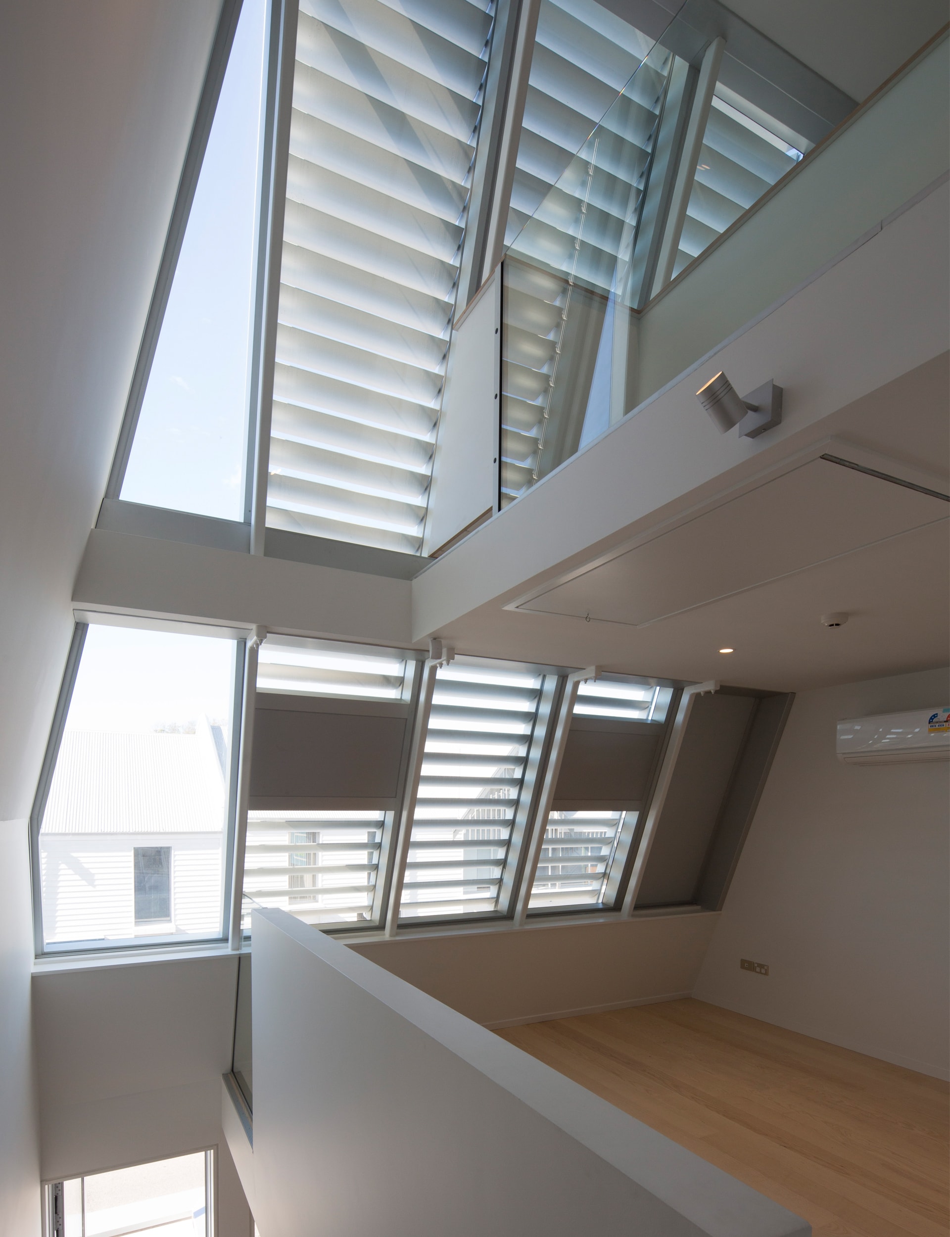
To enable flexibility of space, staircases sit on the east side of the building, changing form as they ascend each level. There is a solid timber stair from the ground (garage) to the first floor living/kitchen area; an open-steel stair to the second floor bedroom area; a retractable timber stair to the third floor office/storage/wardrobe area; and a fixed steel ladder from there to the roof terrace.
The building’s levels shrink as they rise, yet all are flexible enough to adapt to mixed uses. And what the tiny house lacks in size, it more than makes up for with creative planning and an unexpected flood of light that weaves all levels together as a cohesive whole.
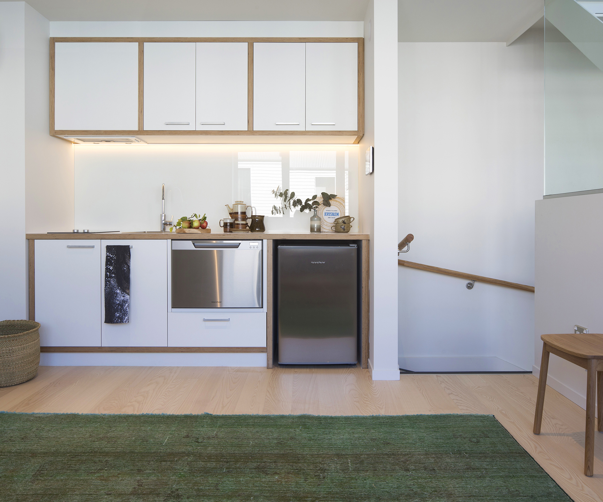
The interior, which features glass, white walls and light oak floors, is airy and expansive. Light filters down the stairwell from a top-level square skylight, and through transparent materials. Light is also drawn in from the south-facing windows. This southern aspect overlooks the street and external aircraft-like louvres, which are controlled from the inside, provide as much privacy and light as required. They also accentuate the sculptural aspect of the Alucobond skin, while side and rear external walls – black-painted ExoTec composite sheeting – provide a continuous finish that ‘slides’ out of view.
For Cotter, who plans to occupy the building himself, the dwelling perfectly expresses his desire for a sequence of flexible spaces that can double as an office/apartment space for him to live and work in. He gave his architect an open brief. “We’d worked together before and I was happy to let him go, to see what he could do to maximise such a tiny site – one I’d owned for 20 years. He was excited by the challenge,” says Cotter.
[gallery_link num_photos=”18″ media=”https://homemagazine.nz/wp-content/uploads/2016/08/getting-skinny-3.jpg” link=”/inside-homes/home-features/a-tall-thin-tower-home-in-christchurch-poses-a-design-challenge” title=”See more of this building “]
Craig acknowledges the unusual home isn’t to everyone’s taste, but he applauds his client’s openness to “pushing things” and wanting to give something back to the city that encourages dialogue. He says he has also enjoyed the freedom to play with ideas. “Designing for this tiny site has influenced my thinking on how I might interpret new housing briefs and how I might play with light and connectivity in future spaces,” he says. “But the best outcome is having a building out there that offers an alternative way of living.
“We can keep building big houses with three-car garages, but I think it’s important to start a conversation about architecture that goes beyond architecture – one that asks the philosophical questions about what constitutes space and how we live in that space.”
Words by: Adrienne Rewi. Photography by: Patrick Reynolds.
[related_articles post1=”44373″ post2=”44901″]
