Architect Gerald Parsonson reinvents a near-decrepit Kapiti Coast bach
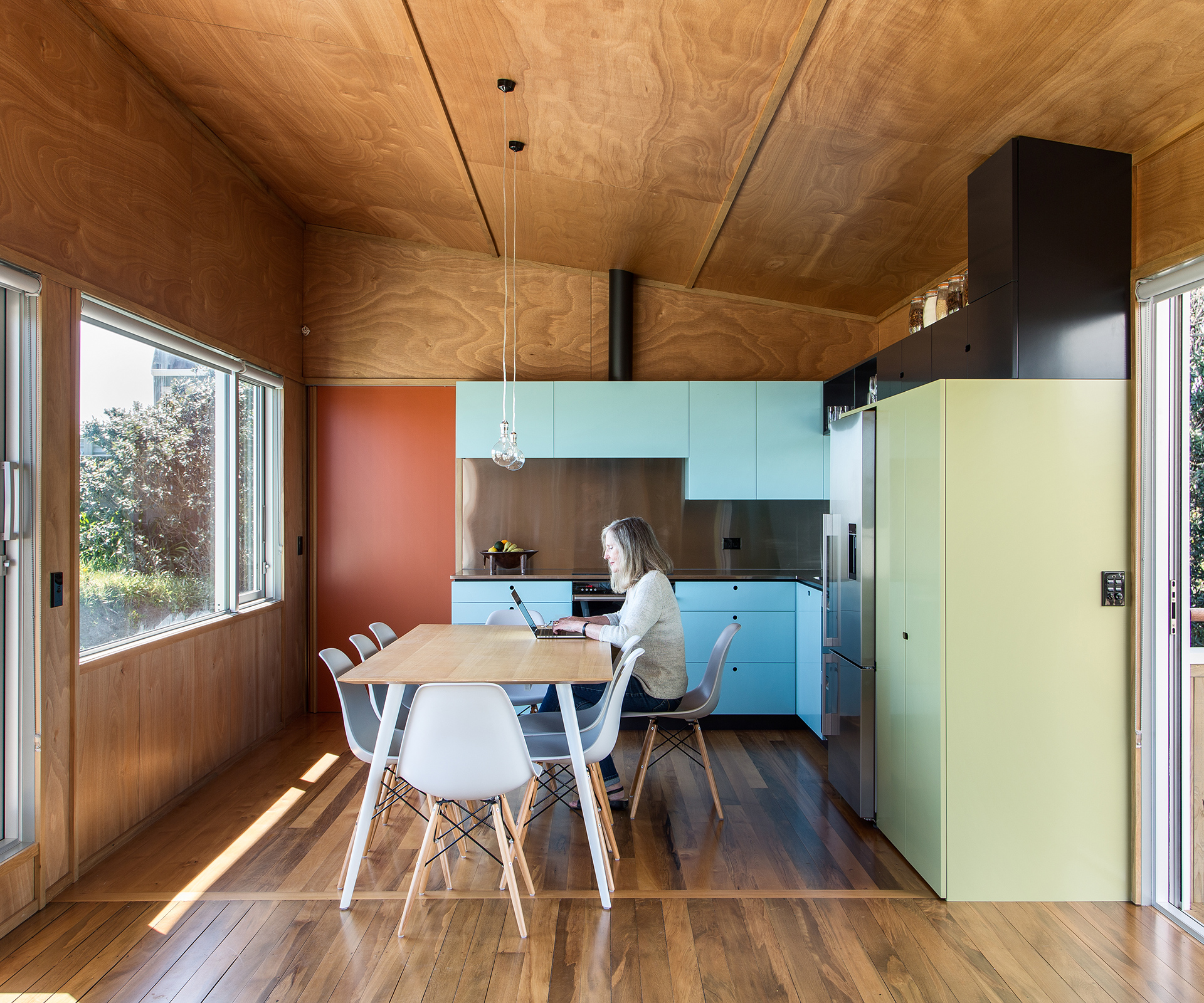
As invitations go, it wasn’t the most enticing. Rob and Helen Goldblatt were told by friends that the ugliest house on a Kapiti Coast beach was for sale – and that they should take a look. Eventually, they did so. Fast forward a little over 30 years, and they still own the property – although now, thanks to a recent renovation by Parsonson Architects, their old two-storey bach has been dramatically improved. “We like to take our time,” jokes Helen.
When they purchased the property, the couple would spend summers there with their three now-adult children. “We practically lived here in summer but hardly ever came in July and August, because there was no insulation and it was freezing,” says Rob. They contemplated tearing it down and starting again, but spent the last three decades never quite summoning the motivation to do so. In 2012, realising that the 75-square-metre 1960s dwelling was about to fall down around them, and wanting to spend much more time there in their retirement, the couple (a maths professor and a teacher educator) finally took the plunge. It was clear they needed someone with a powerful vision to transform the home.
Enter Wellington architect Gerald Parsonson of Parsonson Architects, who already knew the coast well. His own holiday home at Paraparaumu won this magazine’s 2001 Home of the Year award, and he has designed a string of others in the area since. Rob and Helen had seen a few of them. “We liked his open, casual and unpretentious approach,” Rob says. Adds Helen: “Gerald’s baches make the most of the views and location but, most importantly, they look like baches.”
[gallery_link num_photos=”15″ media=”https://homemagazine.nz/wp-content/uploads/2016/02/HE1215_HOMES_KapitiCoast_Goldblatt34.jpg” link=”/inside-homes/home-features/parsonson-architects-reinvigorate-a-near-decrepit-bach” title=”See more of this bach”]
When he visited the old bach, Parsonson realised he had his work cut out. “So many of last century’s houses were built with no consideration to their environs, so you end up with these suburban-style dwellings plonked next to the sea. The aim with Rob and Helen’s bach was to anchor it in its coastal setting, to use natural materials to create a relaxed home that family and friends love to visit,” he says.
To keep the budget under control, the configuration of the lower floor was left largely intact, although the two bedrooms and bathroom were insulated and new fittings and fixtures were added. A west-facing room which once housed the poky kitchen has morphed into Helen’s sewing room. The interior stairs were stripped of their original carpet and their risers daubed in ‘Parsonson Red Haring’, a bright red hue created by Resene in response to Parsonson’s request for a red like he’d found on a brochure advertising a Keith Haring exhibition. Up the red steps is where the real transformation has occurred. The upper level once housed a small sitting room with three modest windows that provided a glimpse of the sea. The space has been extended by 35 square metres to create what Parsonson calls a ‘pavilion’, featuring an open-plan kitchen and living area, and an adjacent main bedroom, a response to Rob and Helen’s desire for an apartment-like space that can be closed off from the rest of the building.
[quote title=”” green=”true” text=”I have a natural affinity with 50s modernism, so the tones here relate to the more playful colours of older baches” marks=”true”]
Despite a relatively modest footprint, the area feels spacious. A new kitchen table does double-duty as a bench, reducing the need for acres of counter-tops. And a carefully placed kitchen window means that whoever’s on dish-washing duty gets to rest their eyes on the Akatarawas which, in winter, are blanketed in snow. The less-is-more approach also works well in the living room, where the original rimu floorboards complement okoume plywood walls, as well as architraves which have been re-purposed from the home’s original weatherboards. Parsonson also designed the minimalist wall lights, crafted from squares of aluminium.
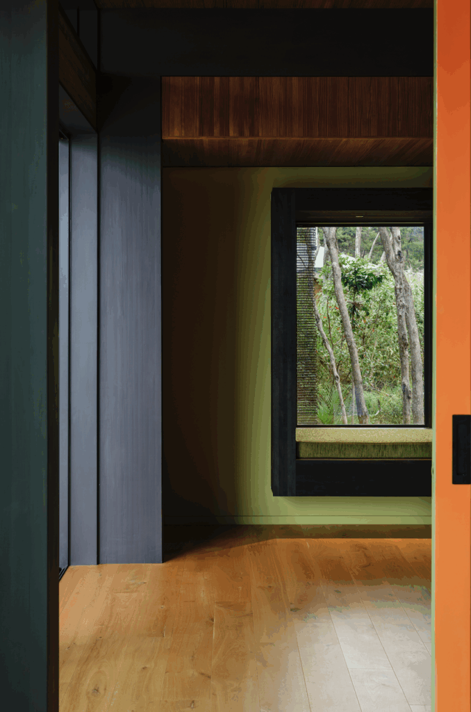
A bright orange door separates the main bedroom and the living area, and contrasts with the blue and green palette used elsewhere, including the exterior. Although Parsonson loathes the idea of a signature colour, the jewel tones are reminiscent of a nearby bach he designed, and which featured in this magazine in 2012.
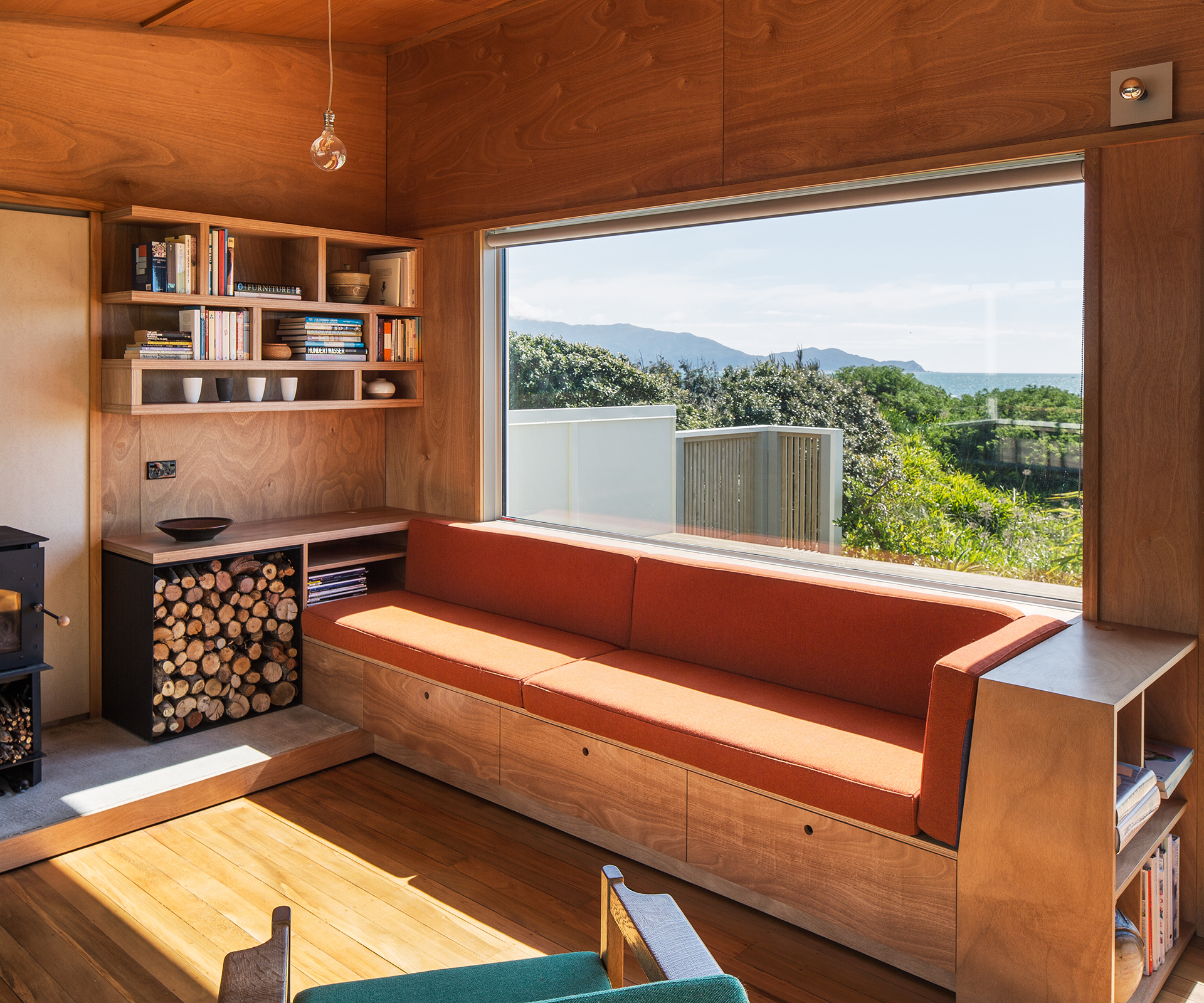
“I have a natural affinity with 50s modernism,” he says, “so the tones here relate to the more playful colours of older baches, helping distinguish the house from the cream, grey and beige of modern suburban transplants. The colours also have a strong relationship to the trees, sky and sea.”
Underneath the pavilion, a nine-square-metre storage locker corrals the tents, fishing gear and general paraphernalia of beach life. Storage was lacking in the previous home, so this feels like a luxury.
Parsonson’s suggestion to build dual decks has won favour with Rob and Helen, who say it’s the perfect solution to the region’s sometimes fickle weather. “When the norwesterly blows on the beach-facing deck, we can retreat to the sheltered street-facing deck, but still enjoy sea views,” Rob says. “The street-facing deck also gets great morning sun, so it’s a fantastic spot for breakfast.”
Viewed from the beach, Rob and Helen’s bach looks as though it has always been there. “Our previous place looked like a bus shelter dumped onto the sand, but the new building sits low and snug within the dunes and is totally in keeping with its environment,” says Helen.
Text by: Sharon Stephenson. Photography by: Paul McCredie
[related_articles post1=”42179″ post2=”39091″]

