A sensitive renovation of a heritage-listed Auckland apartment brings light and space without sacrificing any of its charm
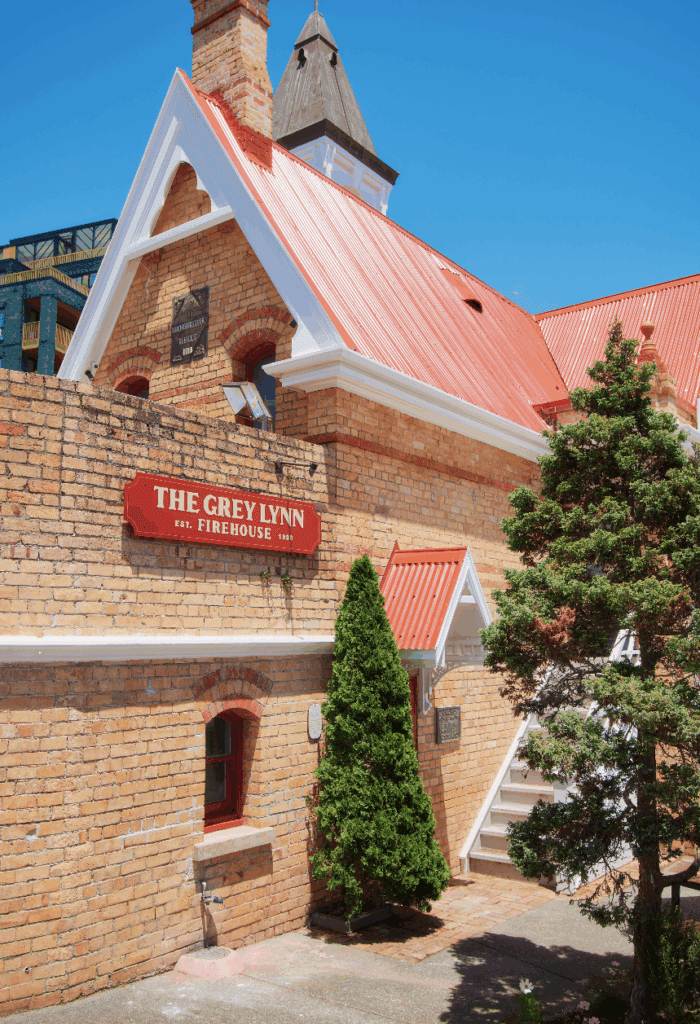
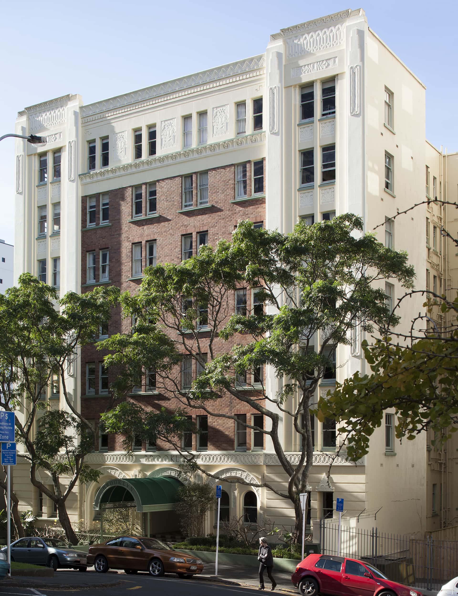
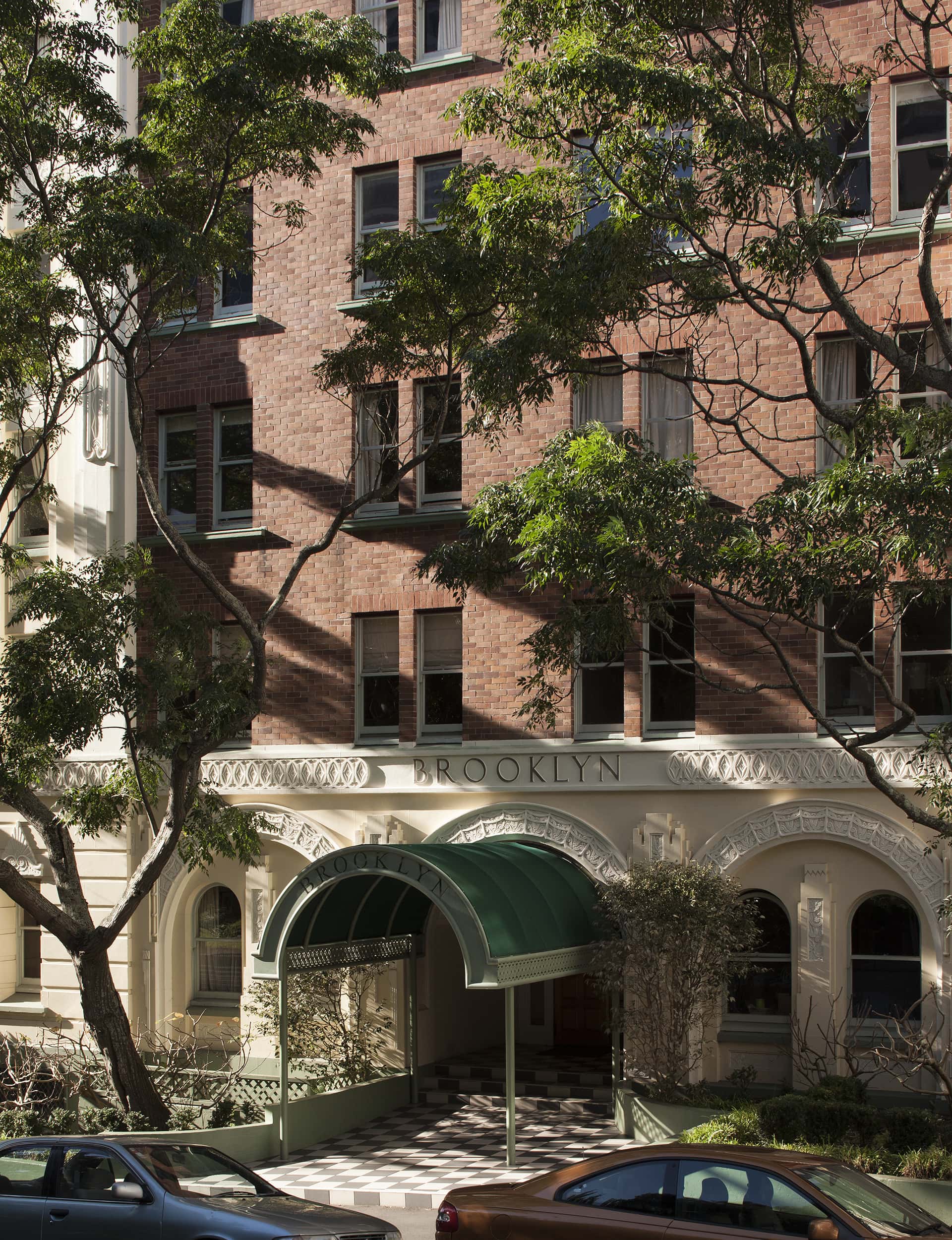
The Brooklyn building on Emily Place, Auckland
Auckland should be grateful to Sinclair O’Connor. The Fremantle-born architect designed a number of iconic apartment buildings around central Auckland at the start of last century, including both Courtvilles, Hampton Court and the elegant Espano flats at the top of Myers Park. Towards the end of the 1920s, he designed Brooklyn, a neo-Georgian pile on Emily Place with art deco flourishes and a façade punctuated by elegant sash windows. It was finished in 1936.
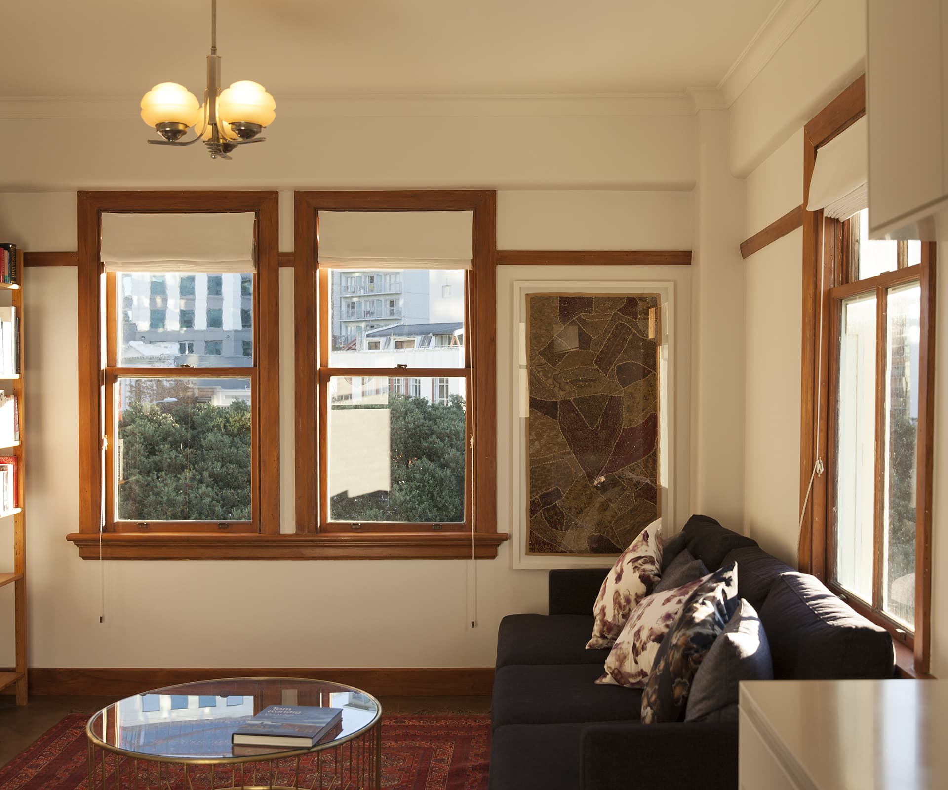
Eight decades later, architect Ben Lloyd of Lloyd Hartley Architects and his fiancée Phoebe Gibbons bought their two-bedroom apartment on the sixth floor. After a frustrating search for a home, which saw them looking further and further out into Auckland’s suburbs at houses that were increasingly less like what they wanted to live in, they came across this place. It had a west-facing living room, an east-facing kitchen, two bedrooms and a general sense of graceful solidity; the building is built from concrete and double brick. The view is to the towers of the city over a reserve filled with huge old pohutukawa and gingko trees; the sunsets are spectacular and so are the lit-up towers of the city at night.
There was an original Shaker-style kitchen with no oven or dishwasher and room for exactly one person at a time. Wiring ran along conduits on top of the skirting boards and the main bedroom was strangely oversized. “These must have been some great little bachelor pads,” says Ben. “There’s a metre of wardrobe space, so you would have had your three suits in there and not a lot else.”
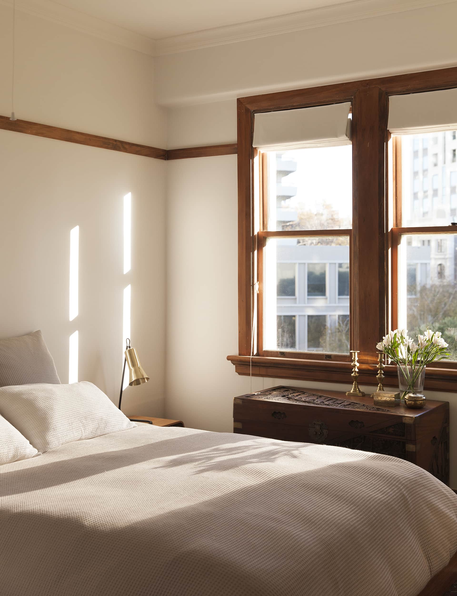
The couple painted over the dark red and mustard paint scheme, and then lived in the space for 18 months before they could stand the kitchen and wardrobe no more. “It was kind of cute and kooky,” says Ben. “But when you actually get in and do something you think, ‘Why did we wait so long?’”
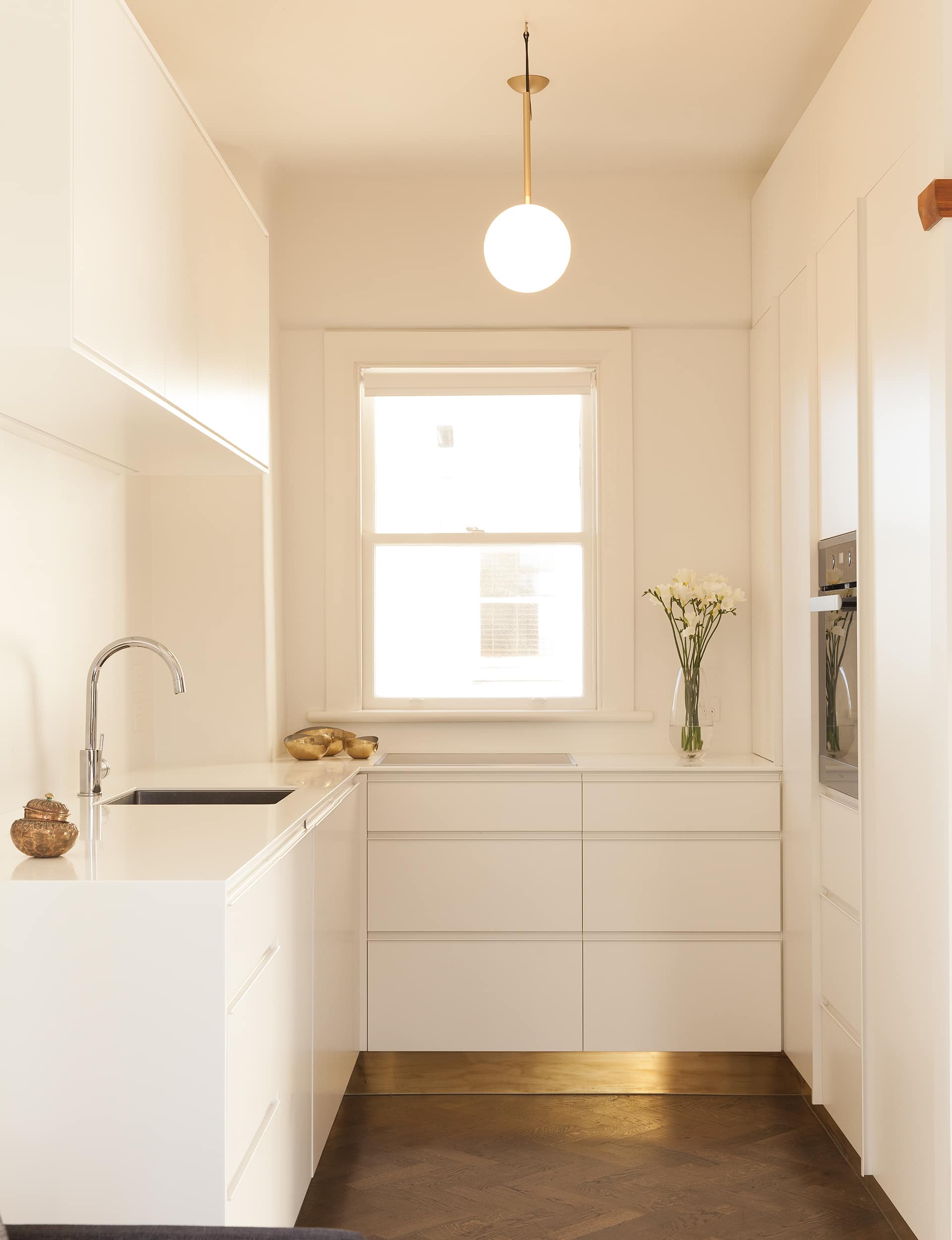
The building has a Category 2 heritage listing, which means nothing could be touched without permission from Heritage New Zealand, so Ben limited his changes to a few elegant moves. In the bedroom, he commissioned a free-standing steel wardrobe from IMO, which boxes in one end of the long space. In the living area, he convinced HNZ to let him demolish a wall to open up the space, closing over the old kitchen door and inserting a spare, contemporary galley kitchen. “I always hated walking in the front door,” he says, “and seeing straight into the kitchen.”
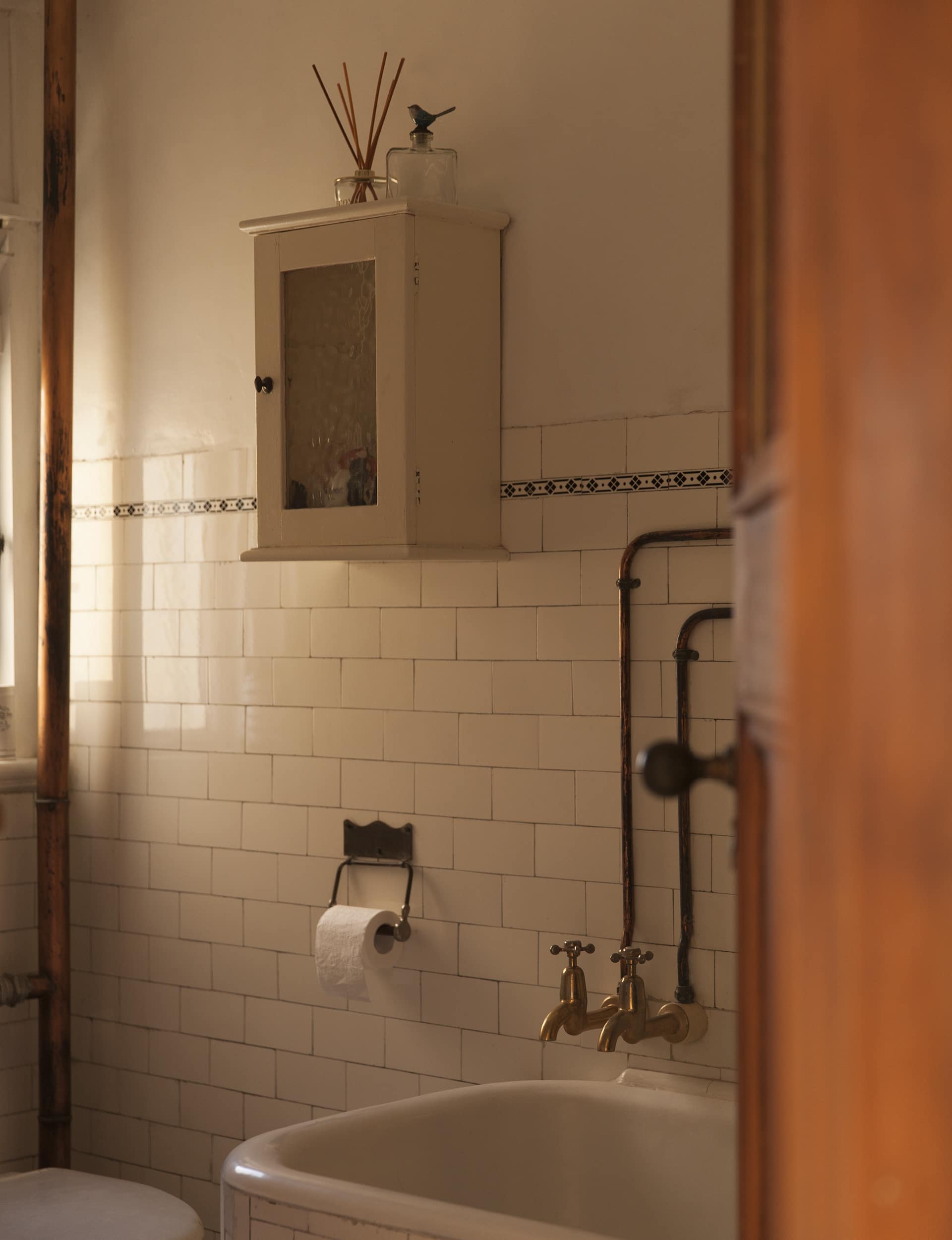
Not a wall was left untouched
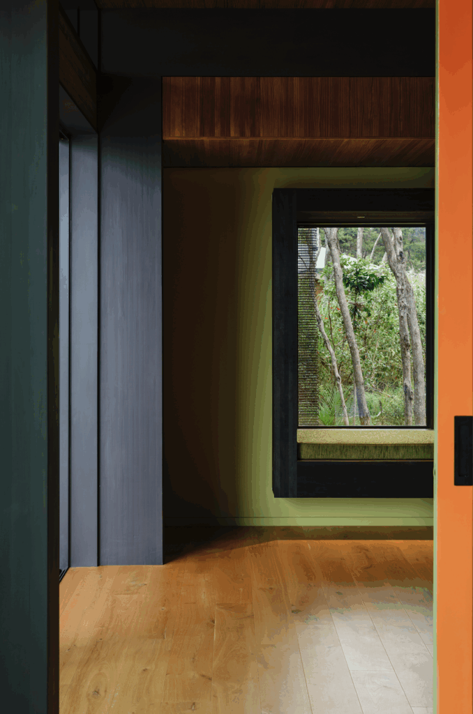
Now, you can barely see where things have changed even though they barely left a wall untouched. During the two-month renovation, Ben and Phoebe’s builders gutted the living areas: they carefully preserved picture rails and original mouldings, and chiselled channels for wiring and ultra-fast broadband behind the skirting boards. Then they painstakingly put everything back in, before installing a new French oak parquet floor that looks like it’s always been there.
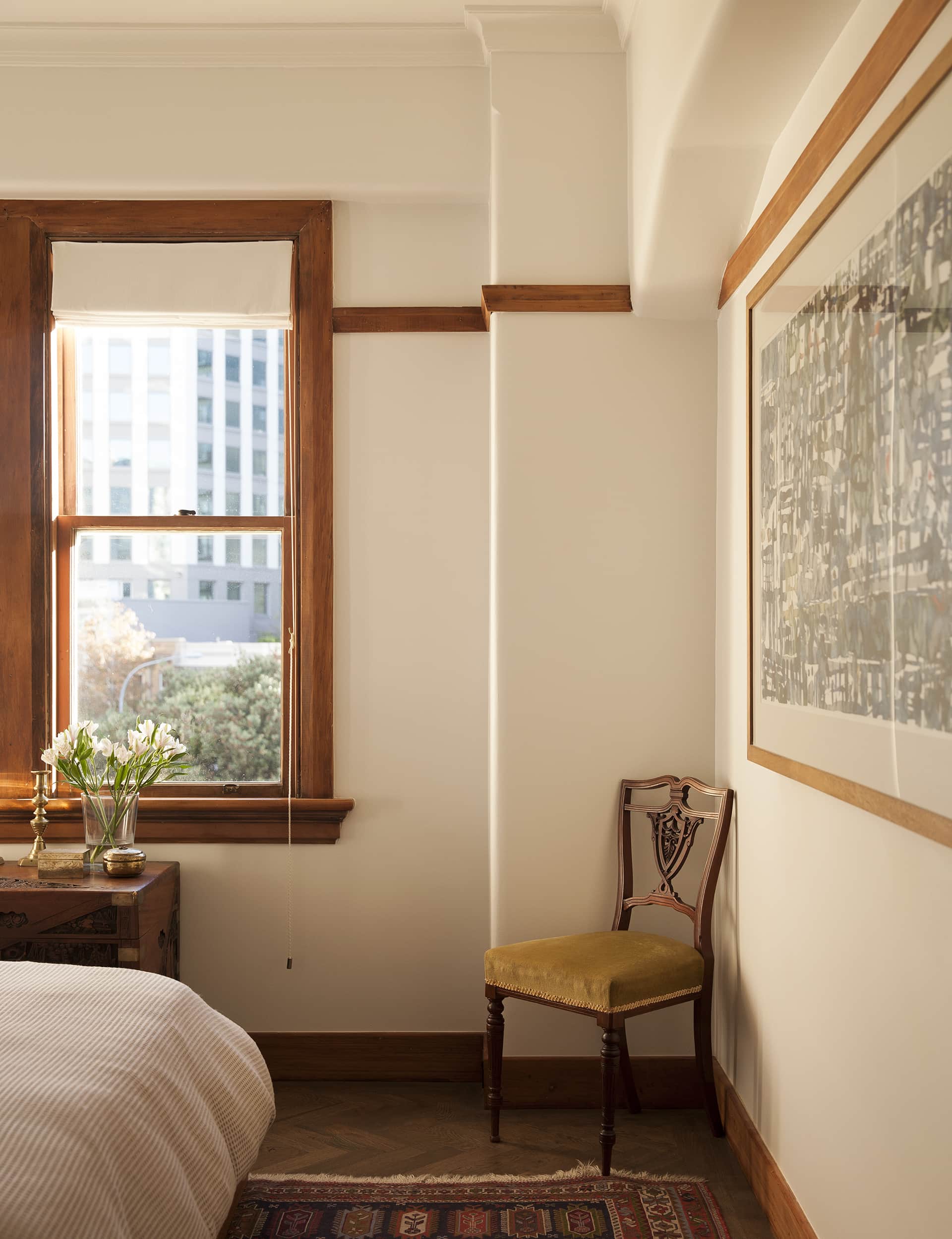
The living area now runs from one side of the building to the other: it gets light in the morning from the east and light in the afternoon from the west, and you stand in the living room and look at the harbour framed by the kitchen window in one direction and the bronze glass of the Fay Richwhite building in the other, and the light from this space bleeds from here back into the hall. Where once there was a clutter of small rooms, there are spaces that seem to expand past their small footprint. Which makes a little apartment feel positively generous indeed.
Words by: Simon Farrell-Green. Photography by: David Straight.
[related_articles post1=”53925″ post2=”54298″]
