On a show-stopping site near the Whangarei Heads, Herbst Architects create a holiday home for a family of four that could house 30 people
A lightweight holiday getaway by Herbst Architects
Auckland-based architects Lance and Nicola Herbst have been experimenting with the best way to live in and feel connected to the New Zealand landscape and climate for 15 years. The application of their skill has resulted in a diverse range of responses, from their own bare-bones beach shack on Great Barrier Island to the glassy, ethereal house in a pohutukawa grove beside Piha Beach that won the 2012 Home of the Year prize.
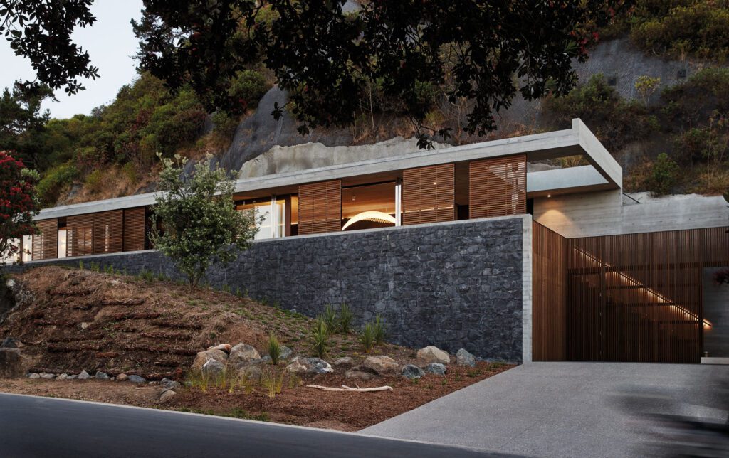
More recently, the husband-and-wife team designed this holiday home on show-stopping site near the Whangarei Heads, on a ridge line below the precipitous bluff of Castle Rock and just a few steps above a gorgeous pohutukawa-shrouded beach.
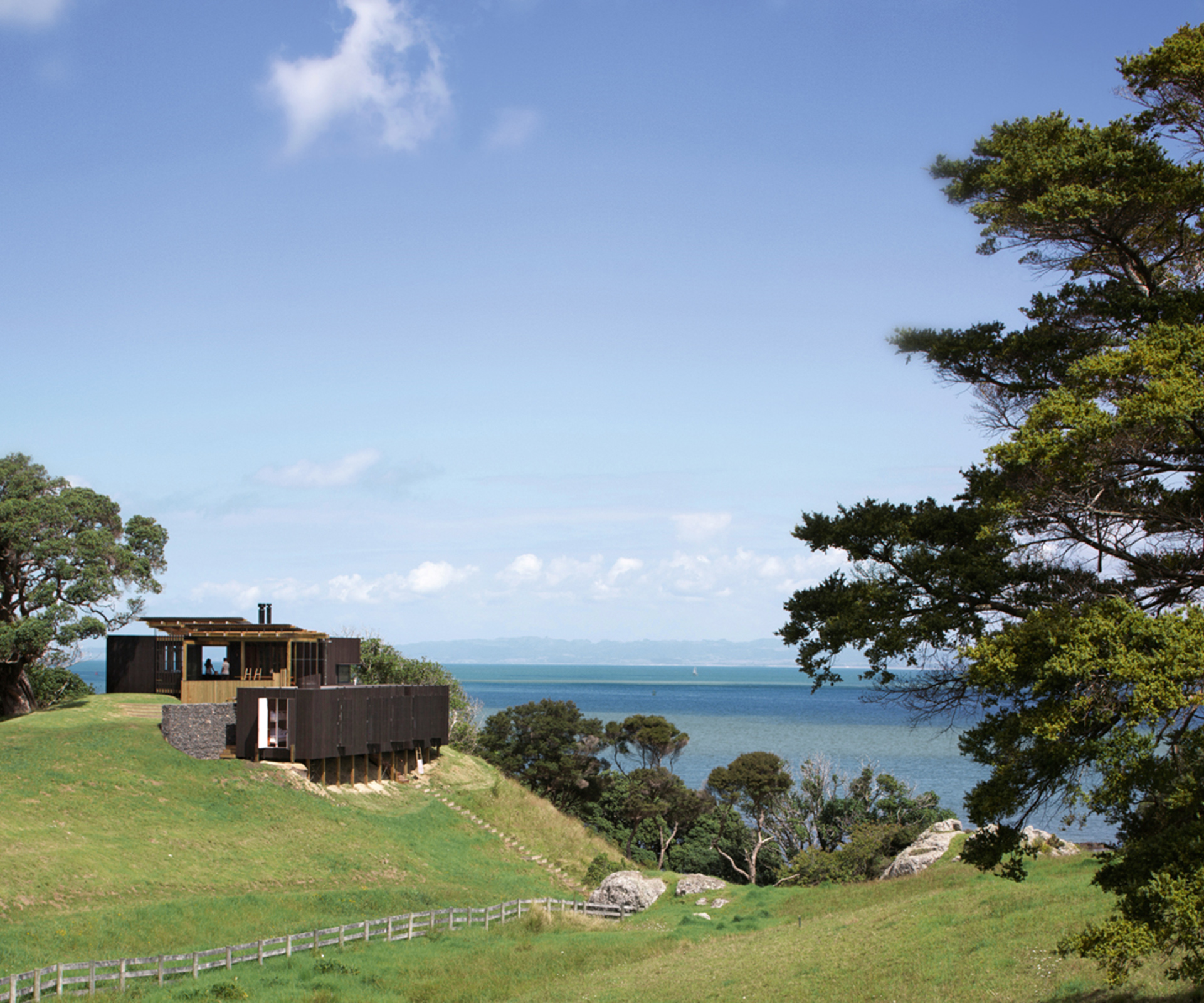
Here at Castle Rock they were asked to design a holiday home for a family of four from Auckland. The site was gorgeous, but came with a number of challenges. The building platform on top of the ridge was already prescribed by the rules of the subdivision, and was exposed to wind from every direction. The views out to sea and to the Whangarei Heads were to the south, but the views north to the top of Castle Rock were, in their own ways, just as worthy of contemplation.
There was an existing path on the site that the couple decided to utilise in their design. They decided to terminate the driveway about 70 metres from the house, necessitating a walk along the ridge line to the deck that also serves as a casual entry point to the home.
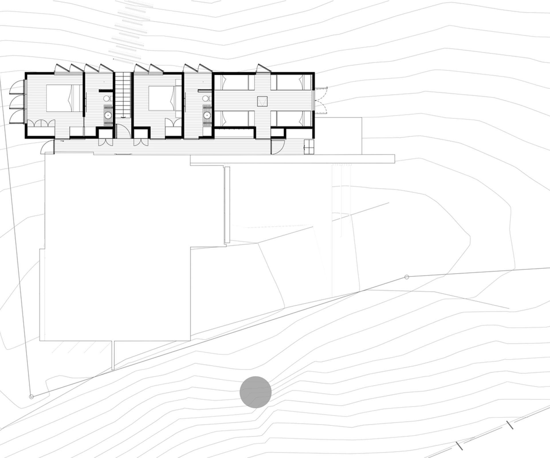
The journey through the home from this point is a rectilinear continuation of this path to the beach, as it turns right and drops down from the arrival area into a narrow staircase, through a gabion retaining wall and the bedroom wing, and onwards down to the shore.
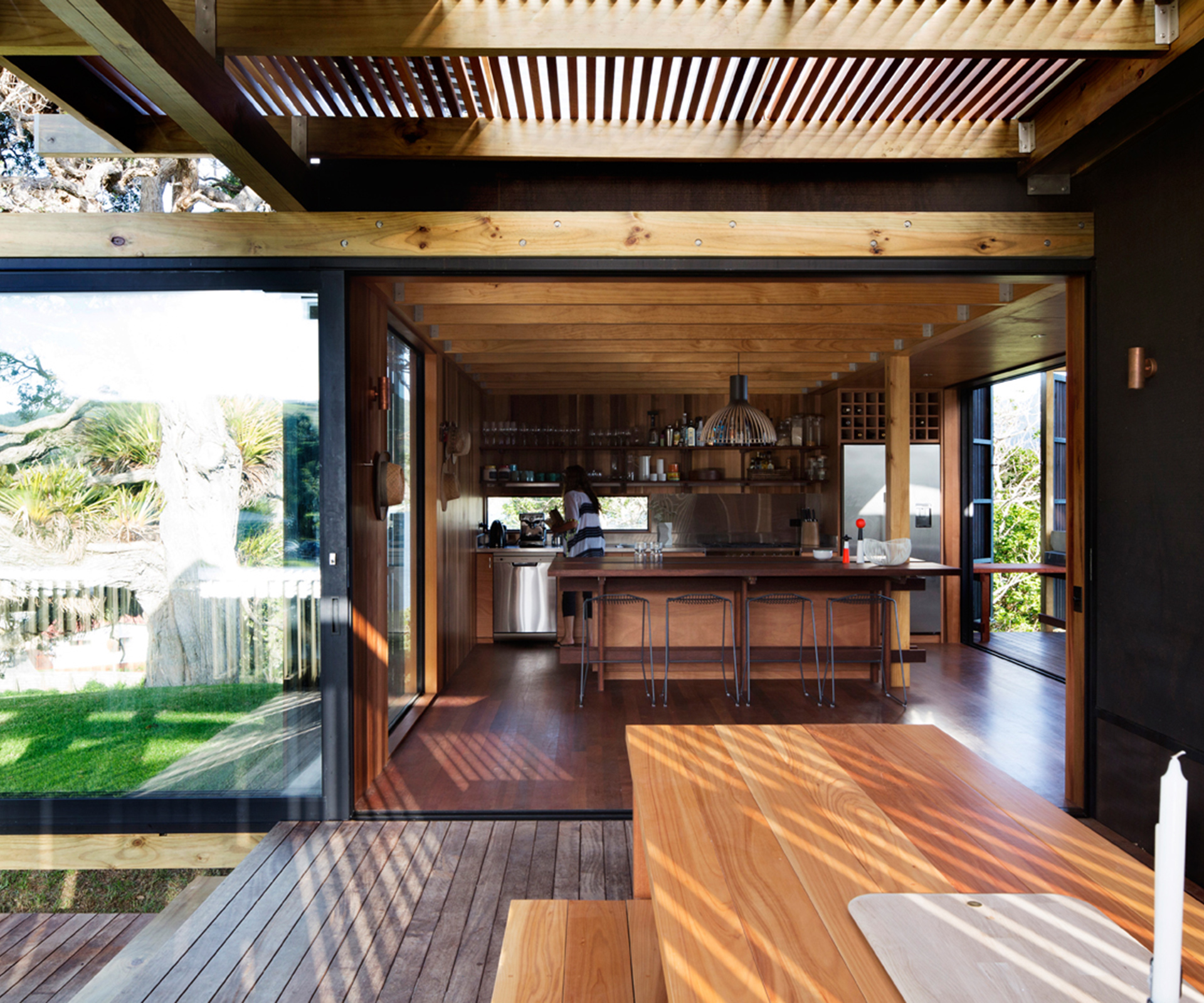
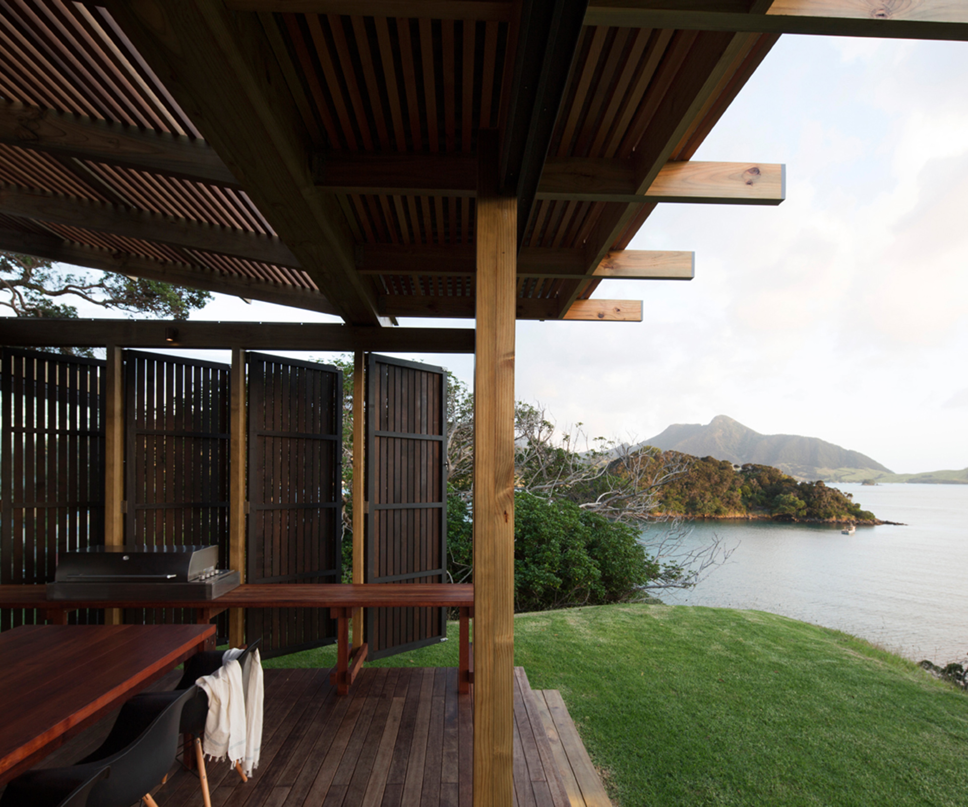
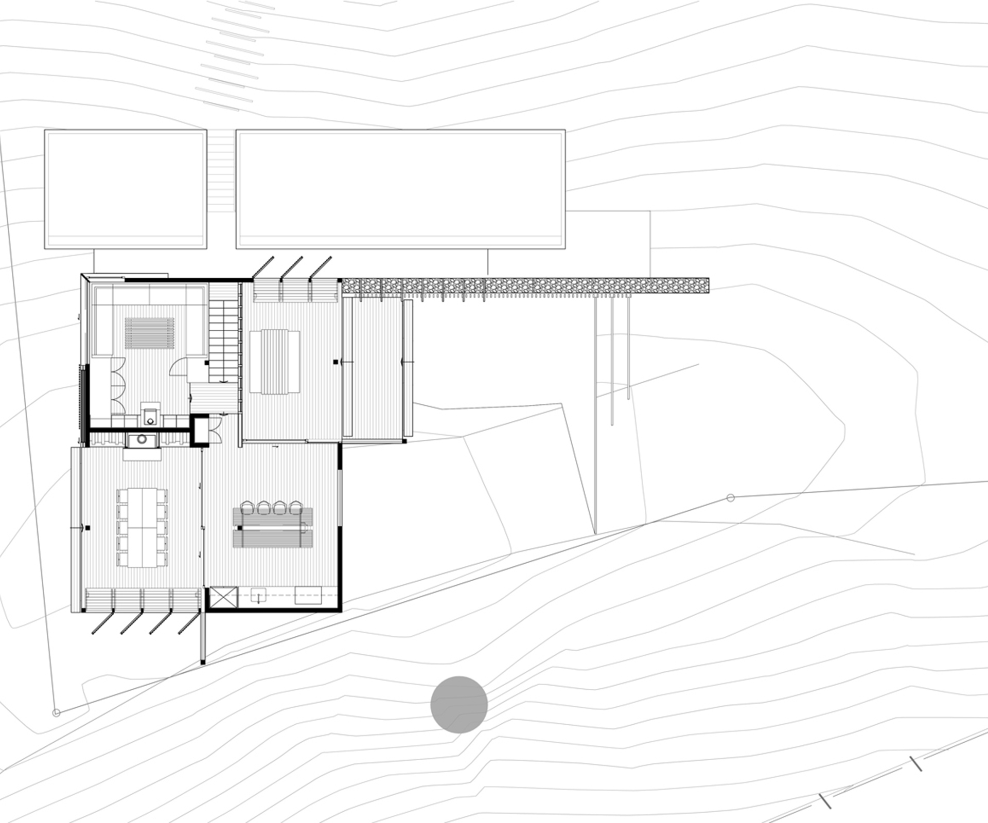
The home has a fabulous openness: it feels at times as if it is little more than a series of casual shelters on the way to the beach. In reality, the entry level of the home is made up of two decks and two rooms, each of them with an array of doors, shutters and screens that offer a variety of configurations between openness and closure. The entry deck faces north to the view of Castle Rock, and is therefore perfect for sheltering from southerly breezes.
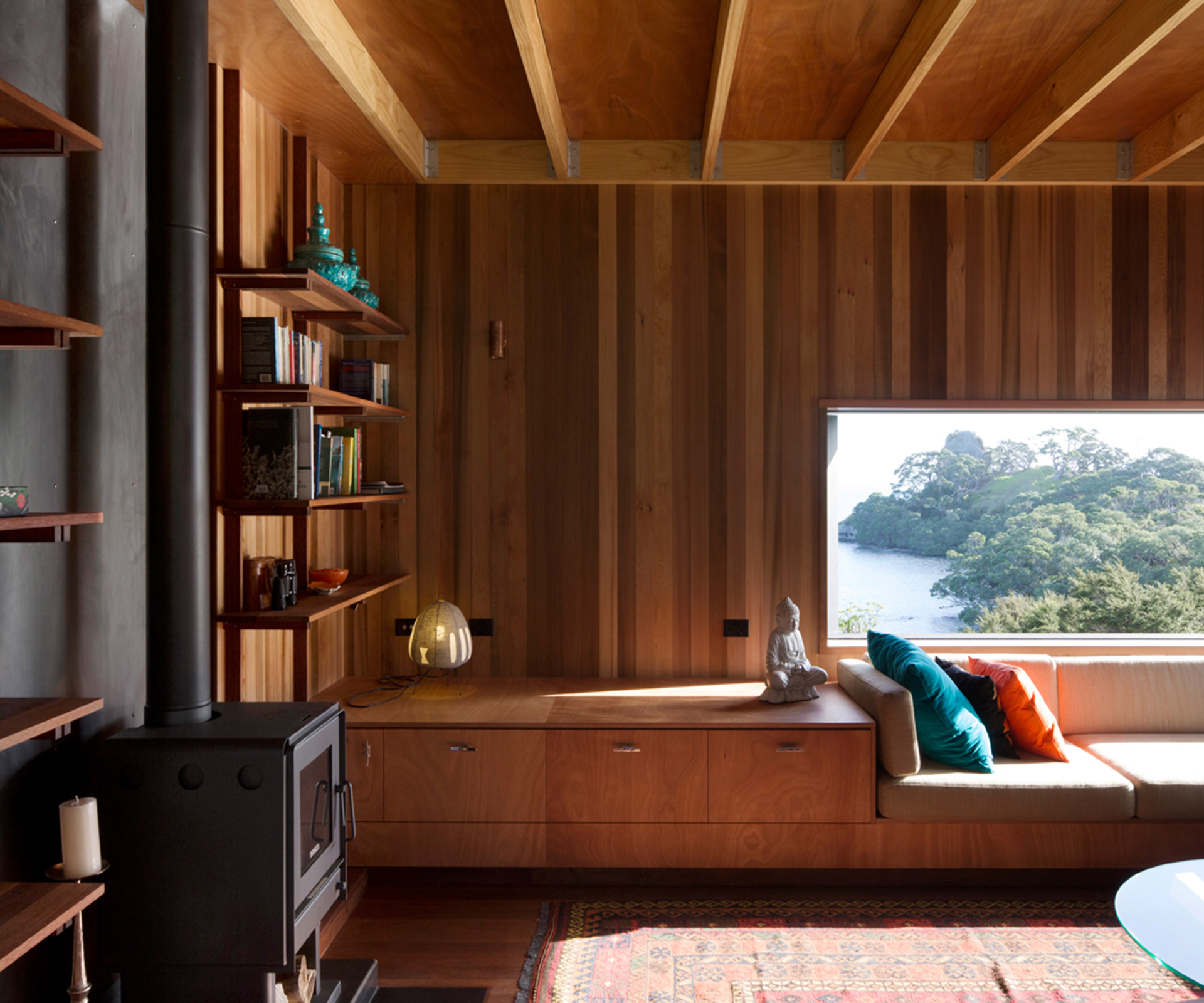
Like most of the doors on this level, the slider separating this deck from the kitchen disappears into a wall; so does the door on the other side of the kitchen, which connects to another deck with a fireplace and a view of the ocean. The idea is that there will always be a covered outdoor space to hang out in, but if the weather is truly terrible, access to both these decks can be closed off, and the owners can move easily between the kitchen and the snug living area, with its deep built-in seats and corner window overlooking the trees beside the beach.
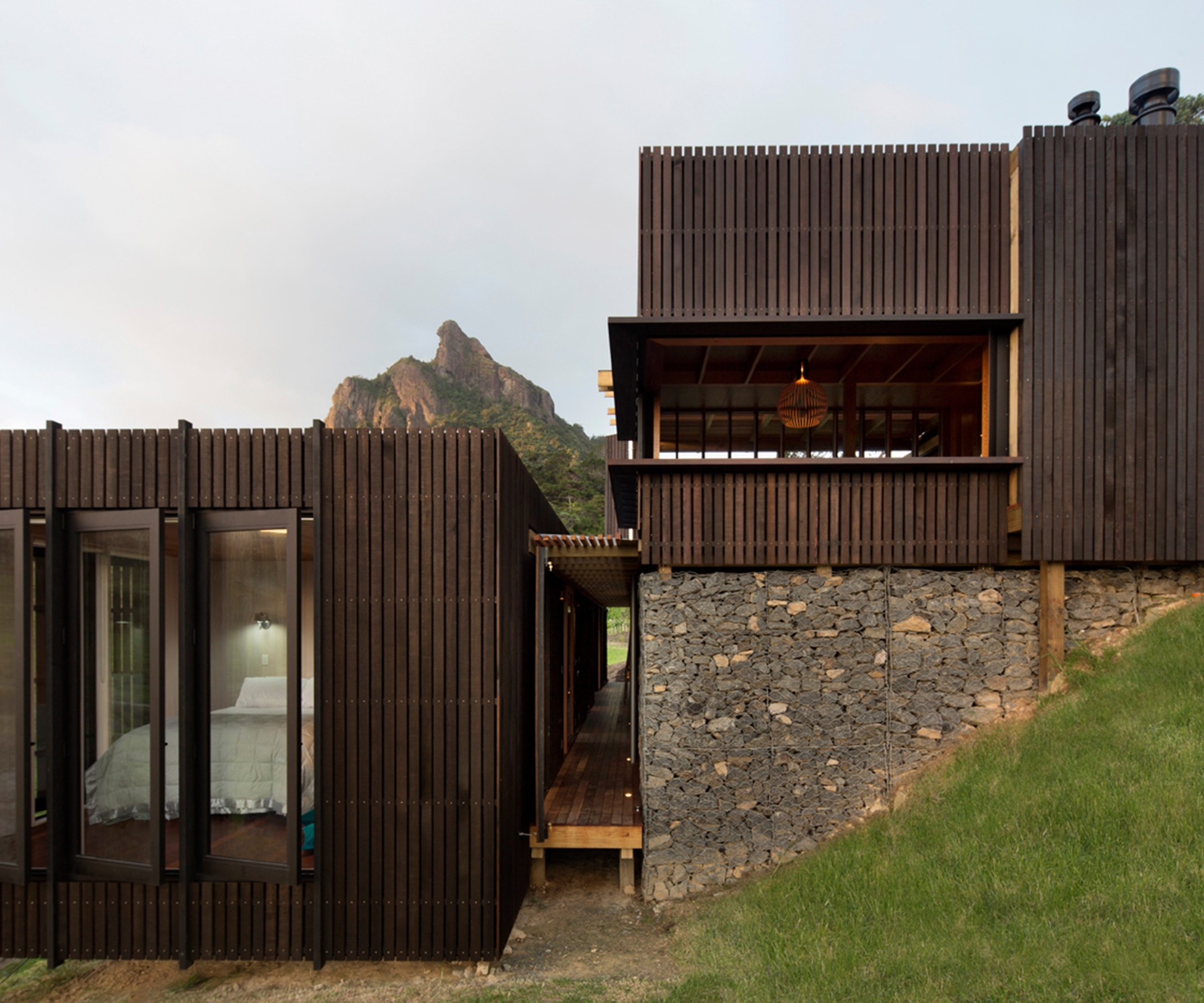
The home’s three bedrooms (including a six-berth bunk room for the kids, with a fun hatch through the floor) are contained in an almost separate linear wing that is adjacent to but a level below the living spaces. The aforementioned gabion retaining wall serves the dual purpose of stabilising the site and acting as the spine for a semi-open walkway connecting the bedrooms, a space that is covered but otherwise open-air.
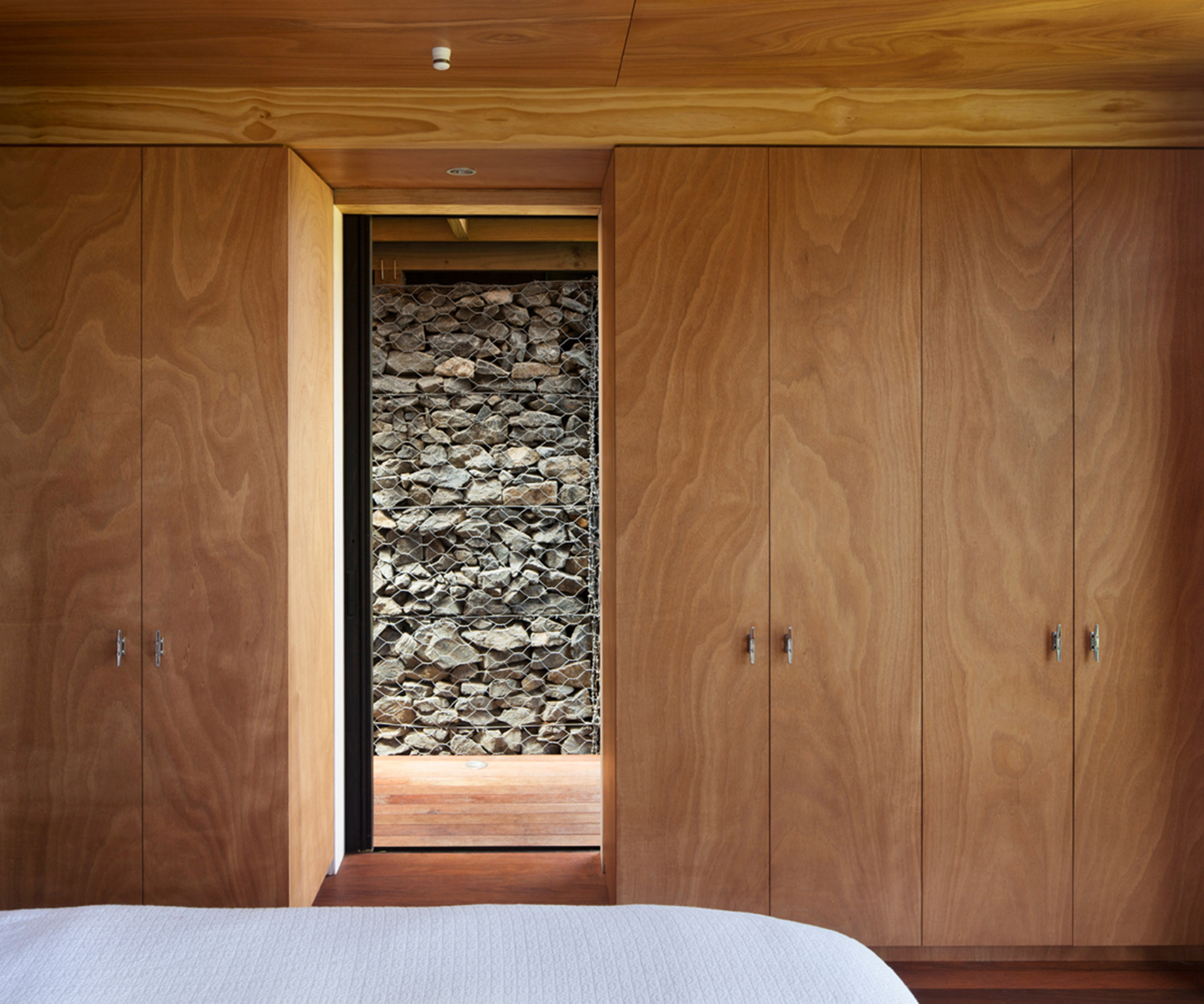
These materials – the gabion wall and the cedar-battened volume of the bedroom wing beside it – and the device of forcing the home’s occupants to engage a little with the elements will be familiar to fans of the Herbsts, but there’s a freshness about the way they’re deployed here, with the darkness of the walkway providing a cool contrast to the brightness outside, the heaviness of the wall lending a sense of solidity to an otherwise lightweight house. “We play with what’s inside and what’s outside to create a different experience to the city with that strong engagement with nature,” Lance says.
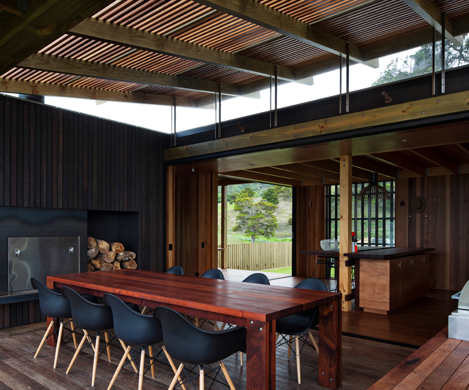
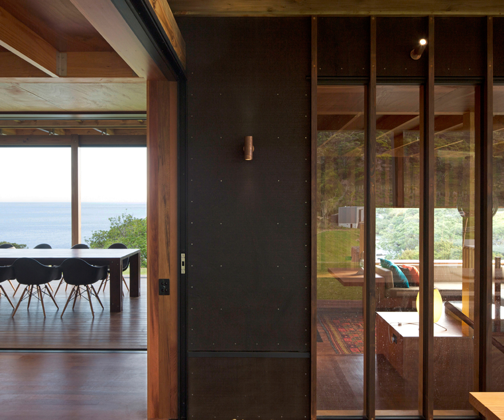
Managing the views from a site this spectacular was a luxury problem to grapple with, one the Herbsts decided to handle “like a degustation meal with lots of courses,” Nicola says. Adds Lance: “It’s so rich in view in all directions that it’s almost awkward, so we tried to use the house as a viewfinder to focus your view on certain areas.”
The kitchen features a slot window that reveals a view down to another postcard-perfect beach to the east to anyone seated at the kitchen island, while a cut-out window in the living room beautifully crops a slice of rocky headland. The bedrooms and two shower stalls (one an en suite, the other shared) have angular views towards the beach that also ensure privacy from neighbouring homes on a nearby ridge.
The owners, who have just had their first summer in the house, asked the Herbsts to design the home to absorb 30 people. Luckily, this didn’t mean they needed to create bedrooms for such a horde, as the extended family was happy to stay in tents they pitched on the property (the garage at the end of the driveway contains a laundry and small shower for campers).
The 100-square-metre holiday home (a measurement which includes decks) works perfectly, with its various spaces allowing adults and children just the right amount of separation without feeling as if they were being forced apart. (The home was built by Lindesay Construction.)
Now that it’s complete, does this home feel different to their previous work? “It’s a distillation of all that we keep doing with inside rooms and outside space,” Lance says. “It’s another chapter in a book. It’s a slow game, planning this stuff.”
If thoughtful buildings like this are what slow and deliberate get you, then it’s worth us putting our desire for reinvention aside and recognising that patience has far greater rewards.
Q&A with Nicola and Lance Herbst
HOME You had a prescribed building platform for this home on the ridge. How did you go about developing the design for it?
Lance Herbst, Herbst Architects We made an early decision to separate the cars from the house.
Nicola Herbst, Herbst Architects And we identified the journey, a 70-metre walk to the house.
Lance We didn’t want that impossible thing to deal with – a car right there.
Nicola We reinstated the existing track to create a journey through the house to the beach.
HOME This is also an exposed site, but with fantastic views in all directions.
Lance It’s so rich in view in all directions that it’s almost awkward, so we tried to use the house as a viewfinder to crop views, edit out certain areas, focus your view to certain areas. Regarding the exposure, we’ve found there’s no such thing as a prevailing wind condition in summer. The demands on these baches in terms of creating spaces that get away from the wind are more and more difficult. The strategy is to have two decks and even those decks need layers.
We play with what’s inside and what’s outside to create a different experience to the city, that strong engagement with nature, that feeling of being forced outside to go to the bathrooms. It was also important that the building had a lightness. We didn’t want to put a heavy building on a site that is a fragile environment. Practically and visually, you want a building that sits as lightly as possible.
HOME You’ve worked a lot in the bach genre. Is this house an extension of that work?
Lance It’s a distillation of all of this work that we keep doing with inside and outside space. This project has distilled it down to something concentrated. It’s a very strong articulation between inside and outside in one way, but in another way it’s almost the opposite. It’s another chapter in a book. [Architecture is] a slow game.
Words by: Jeremy Hansen. Photos by: Patrick Reynolds.
[related_articles post1=”44157″ post2=”1716″]

