On a prominent street corner in Herne Bay bordering the heritage zone, this rectilinear addition presents a new and mostly closed face — a bold architectural statement that gives way to refined interior spaces.
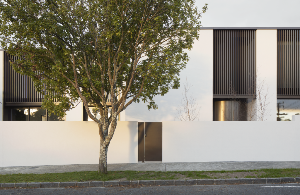
Architect Camden Pyke of Yoke was presented with a clear brief. His clients, a recently retired couple, wanted a city bolthole for the week; weekends would predominantly be spent on the coast north of Auckland. They wanted elements of formality, and space in which to hold the occasional meeting; there had to be privacy, and there was the desire to capture sea views. Above all, the house had to create a distinctive language within a low-maintenance environment.
“The original 1930s house had been added to over the years with additions that stepped down the site, so you felt like you were in a dark, damp cavern. The brief was to create something that achieved the opposite: a contemporary, warm home of light and bright spaces,” the architect tells us.
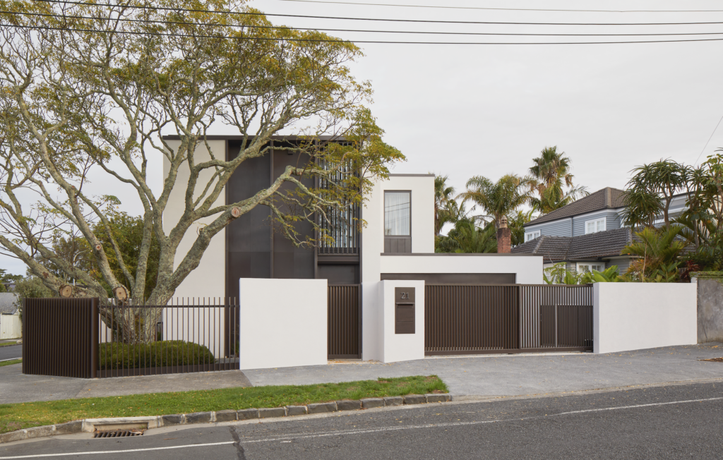
The corner site meant the building would always have a certain prominence in the street and, although it is overt in its rectilinear form, in tonality it creates a crisp dialogue with some of the older homes in the area.
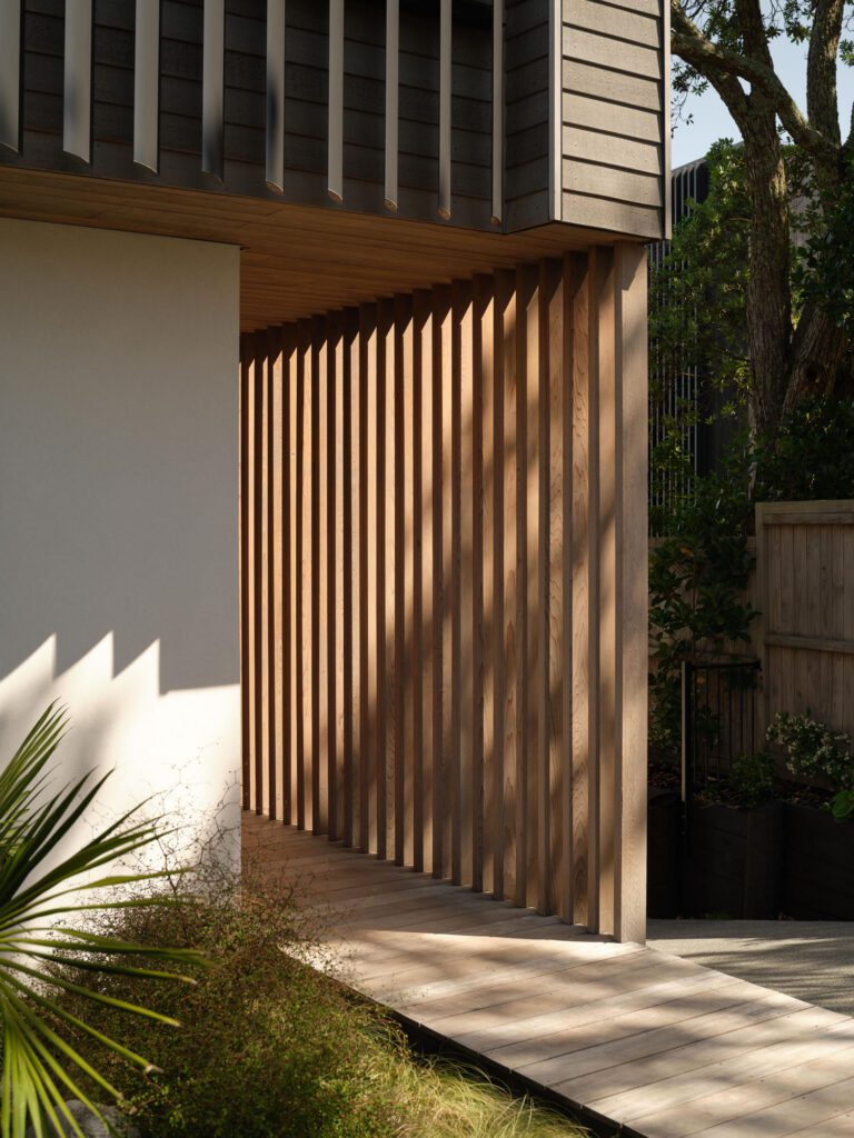
Adjacent to the southern and western boundaries, the public elevations are predominantly closed to the street; louvred vertical windows allow for minimal glimpses of the interior. Clad in a Sto plaster system broken with moments of dark bronze profiled metal, there’s a harmonious duality to this sophisticated exterior. Young poplars grow against the backdrop of the metal while a mature Melia tree defines the south-western corner of the site.
The exterior form follows the internal arrangement, which maximises outdoor connectivity at ground level. The closed facade of the entry, from the south side, gives way to a light, bright interior.
“The space unfolds from an office, through to a double-height sitting room and bar, and into the less formal kitchen and living space, which opens to a large deck and entertaining space centered around a Japanese maple tree,” Cam says.
The rectilinear language is broken with a central moment of curvature in the stair, above which a circular skylight intensifies the geometric abstraction of this space, and the notion of movement or transition between areas.
“We also curved the bottom two treads to reinforce the motif and really play on those elements. It’s a beautiful stair to walk up; it feels effortless,” Cam says.
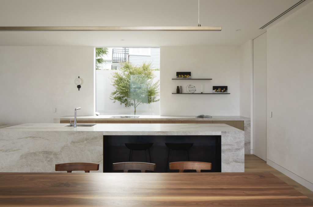
The neutral palette of the interiors speaks perfectly to the minimalism of the spaces, perhaps most strikingly in the kitchen, which runs along the eastern wall and comprises two anchoring objects: the rear bench and an island.
“There’s no overhead cabinetry, just two simple folded metal shelves,” Cam points out.
A sculptural light is the only other object on the kitchen wall. A large window frames a view onto another Japanese maple, offering an organic buffer from the neighbouring house. Above the dining table hangs a brass Lateral Light by Powersurge.
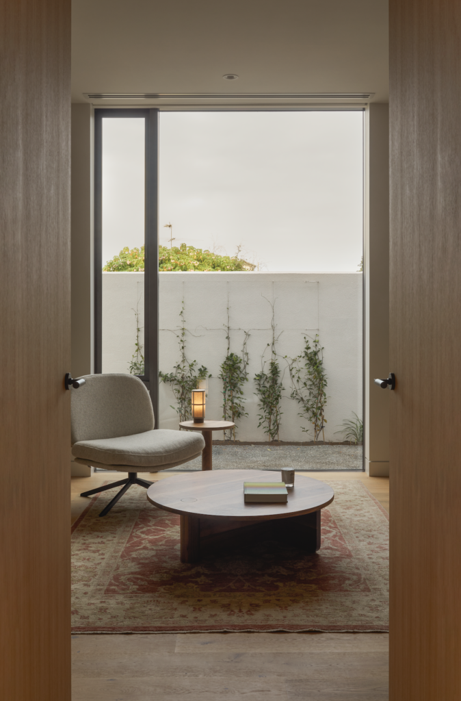
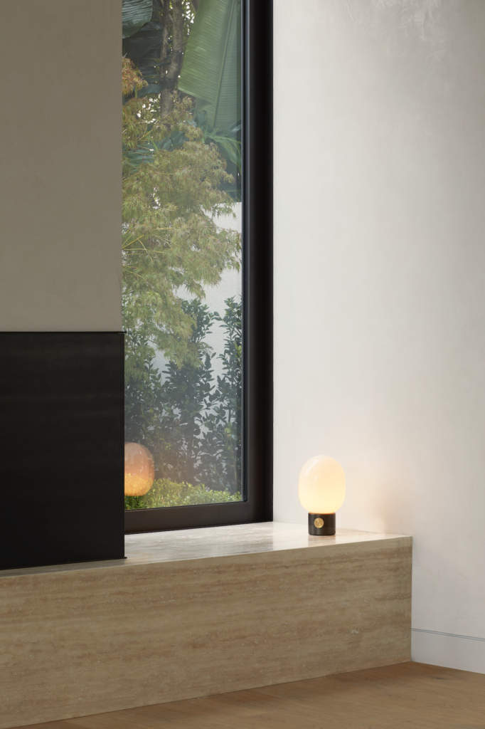
Both the rear bench and the island are a light-toned Taj Mahal Quartzite from CDK Stone; this motif continues into the informal lounge, where a plinth in the same material runs along the length of one wall and beneath a Jetmaster fireplace. Sto polished plaster covers the walls, allowing changing light to illuminate its subtle texture.
The second lounge (and bar) is a more intimate affair in dimension but set within a vast double-height void. “The void continues to the first floor, so you get the intimacy but within this expansive height,” Cam explains.
A double-height curtain is used to close the space off, introducing an element of softness and whimsy. A linear Escea fire becomes the focal point of this inward-facing space.
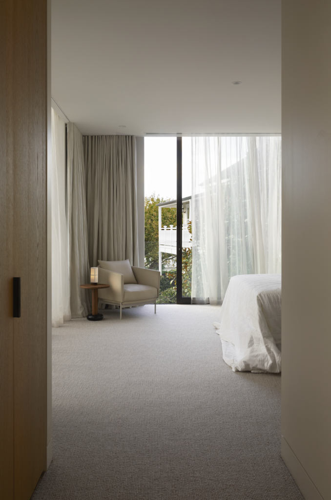
Upstairs, the neutral tonality and minimalism continue in an expansive main bedroom where views to the sea are perfectly framed. Located in the north-west corner, the room sits above the living/kitchen/dining area and covers the same footprint.
“This room was a key part of the brief. As the clients live here alone, they wanted this room to be a large space and take advantage of the views. The sheer curtains and the drapes create an intimacy when closed, but when [they are] open this room is experienced completely differently with the views and light.
“While the exterior is quite a bold architectural statement, we kept the envelope simple to create depth in the interiors. They are simple, clean responses resolved with fine detailing.”
The boldness to the street and entirely contemporary language is, perhaps, a sign of the slowly emerging face of this historic suburb. Equally, it is an alluring interpretation of interior architectural responses that deliver a cohesive series of spaces subtly delineated by volume and material.
