There’s a beautiful circularity to the opening of revered chef Michael Meredith’s new dining space, Mr Morris, in what was previously Café Hanoi – the first restaurant that Cheshire Architects designed in Britomart.
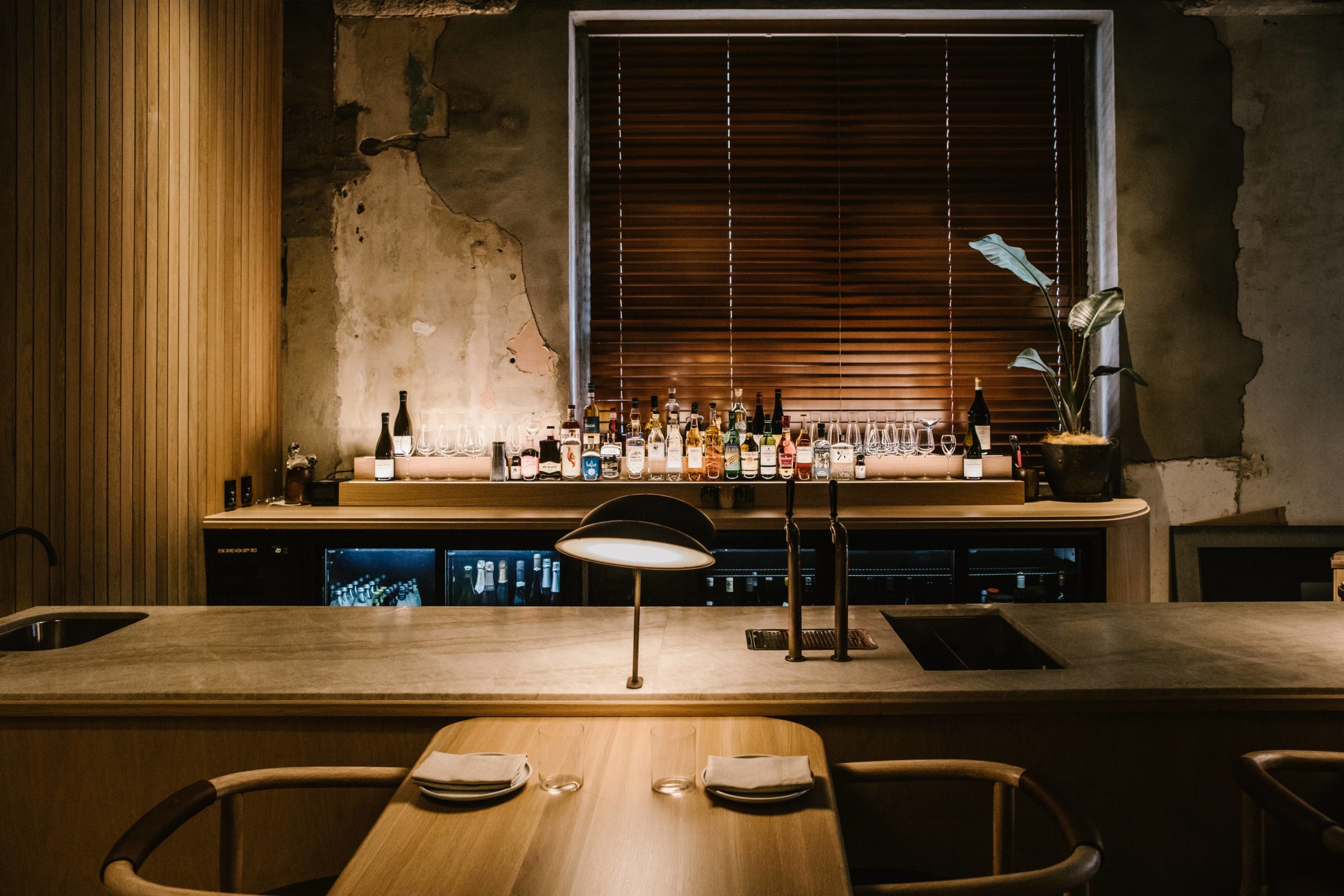
Nat Cheshire says at that time the energy around the transformation of the downtown Auckland precinct was dynamic, urgent and intense, and the aesthetic of the spaces reflected this.
But a decade or so on, and there was room for something different.
“I feel like at Mr Morris we gave ourselves permission to be a little quieter, a little softer,” he says.
The genesis of the restaurant came when Nat had a late night idea and fired off a very late night email to Lisa King, a good friend and Michael’s long-time business partner.
Nat wasn’t expecting a positive answer, and yet it came.
That was four years ago and the restaurant, named after a close family member who passed away last year, has been through many iterations since, before finding its resting point.
“It’s unrecognisable from the initial concept, but what has persisted and grown is the relationship between Michael and I and the values of care, gentle precision and hospitality that we share.”
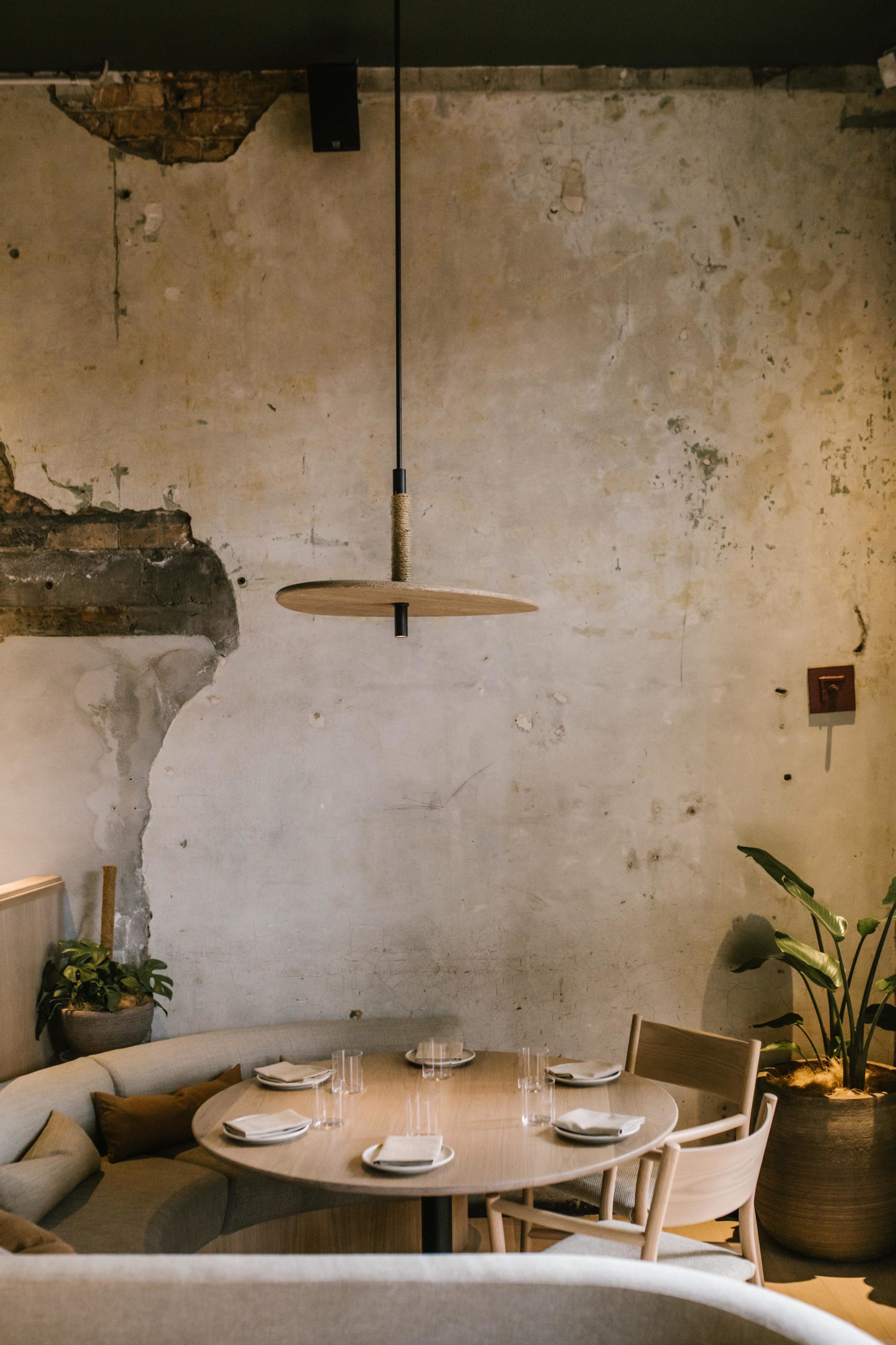
The physical manifestation of these values is a striking juxtaposition of soft, subtle and subdued elegance against a raw and pitted shell.
The building is roughly 140 years old and has had a layered history, which is evident in its well-weathered bones.
It was originally a warehouse and roaring trading house, then a bank, before being sliced in half to make way for what is now Commerce Street.

But rather than accentuate its industrial and commercial heritage, Nat enjoyed playing up the tension created by the dichotomy of brutal and gentle.
“It’s a very soft occupation of that space. We wanted a crisp, comfortable, welcoming dining room – a place where one might be equally happily in shorts at lunchtime and a dinner jacket after the opera.”
Hidden underneath the restaurant is another little surprise: Mrs Morris, an intimate room built into the former bank vault, and serviced by a private kitchen which caters to up to 20 diners.
Unlike Mr Morris which is light and open, Mrs Morris is a cave – “It’s a thrilling tension!”
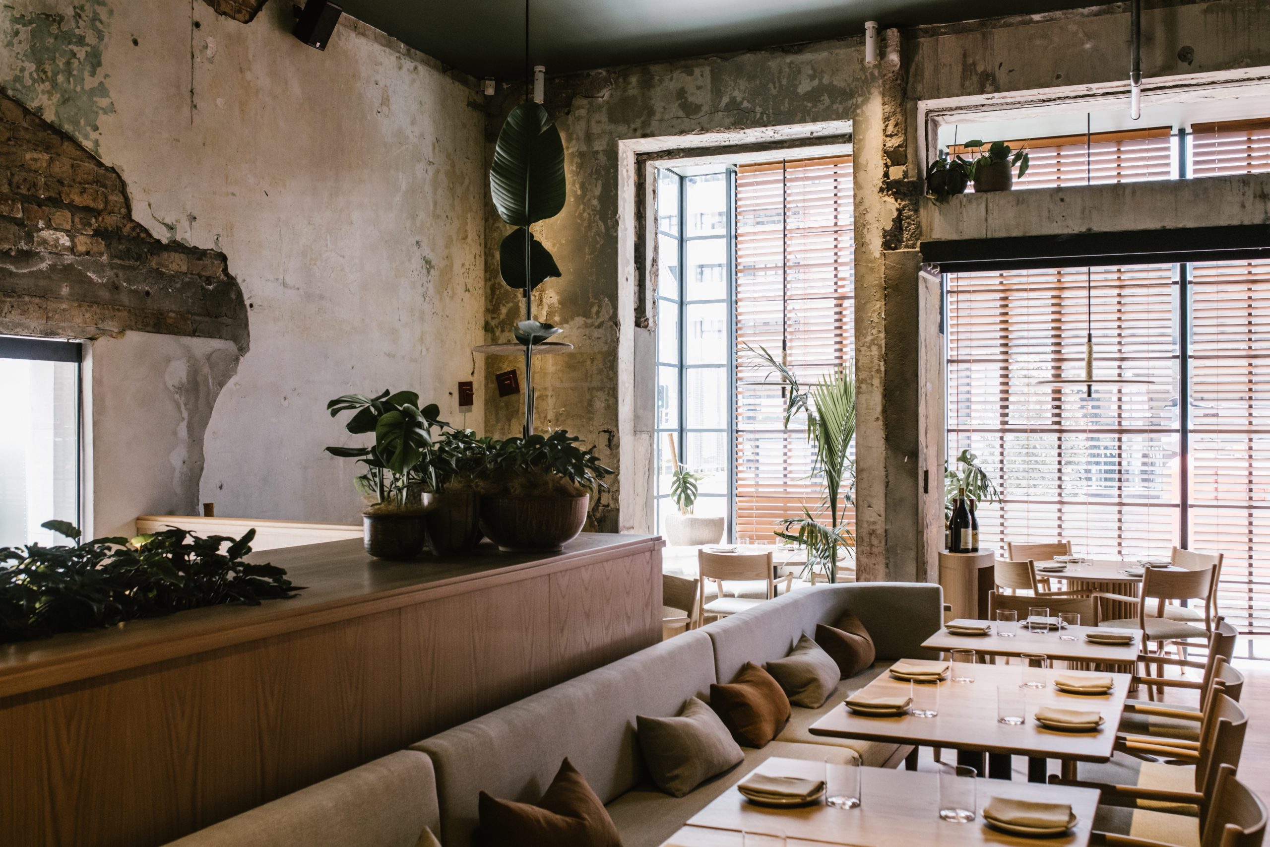
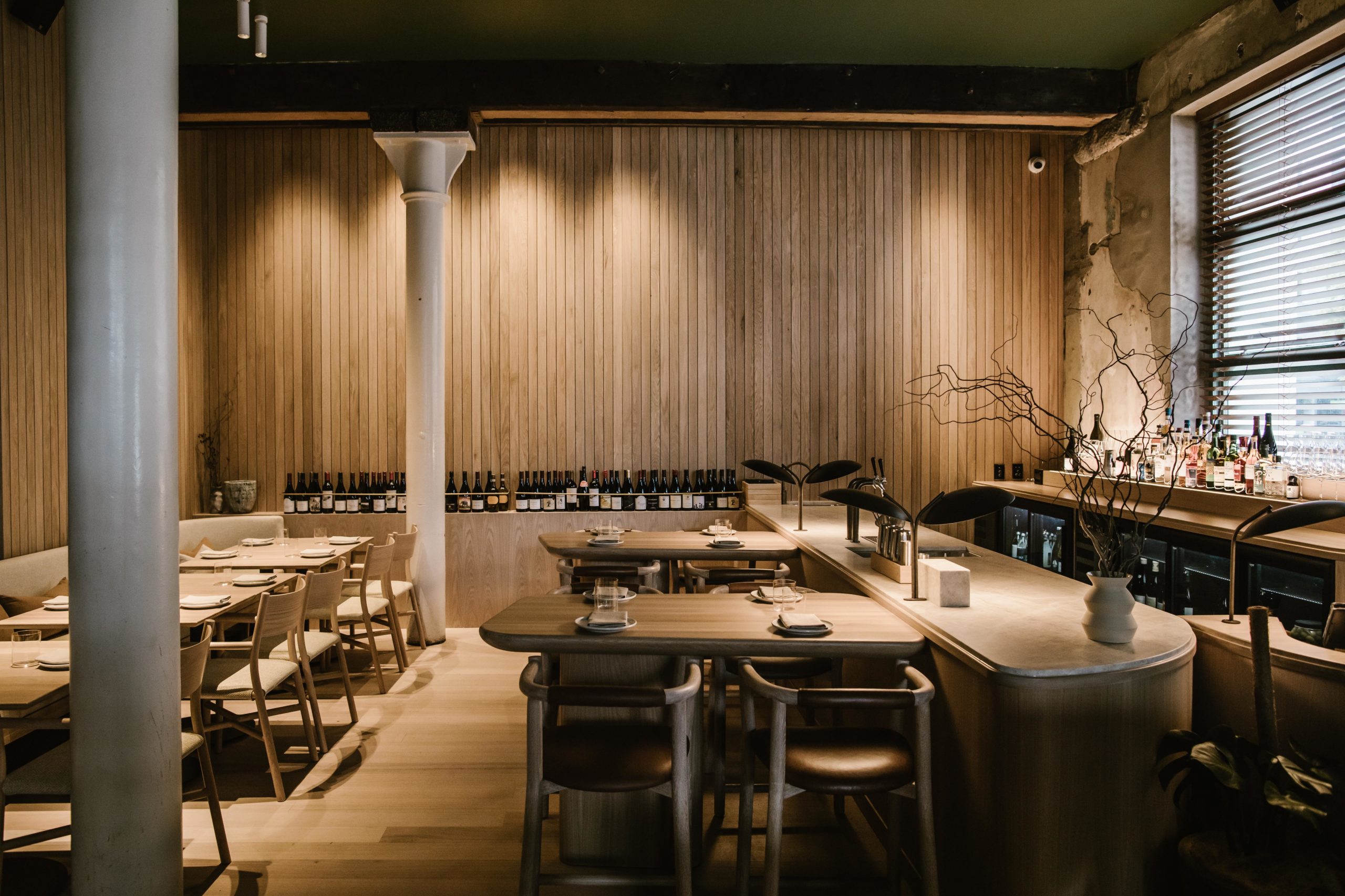
It’s a starkly different experience to the soft quietude in the main dining space, achieved by a highly unified material palette.
American oak is employed throughout and a series of soft linens in slight chromatic variations give the space uniformity, without being rigid.
“During the design process I was worried that the dining space ran the risk of being incredibly beige, and incredibly boring, in the context of Michael’s fearsome intelligence and creativity with food. There’s no big theme, no great idea, just a feeling. I was afraid it would turn out to be an appalling failure on my part.”
Thankfully, working alongside Nat was architect Dajiang Tai and his assistant James Ting. In a nod to the perfect circularity of the project, Dajiang assisted on the Café Hanoi project in his first job after graduating – learning the ropes during that intense period of Auckland’s downtown development.
Yet in this project, it was Nat who took the backseat, and was buoyed by the confidence of his talented colleagues.
“The restaurant itself feels a bit of a maturation of sorts. My fear was that taking some of the urgency and intensity out of it would leave it less special – but when I walk in it feels calm, brave, gentle and focused. Like Michael, I hope. And like Mr Morris.”

